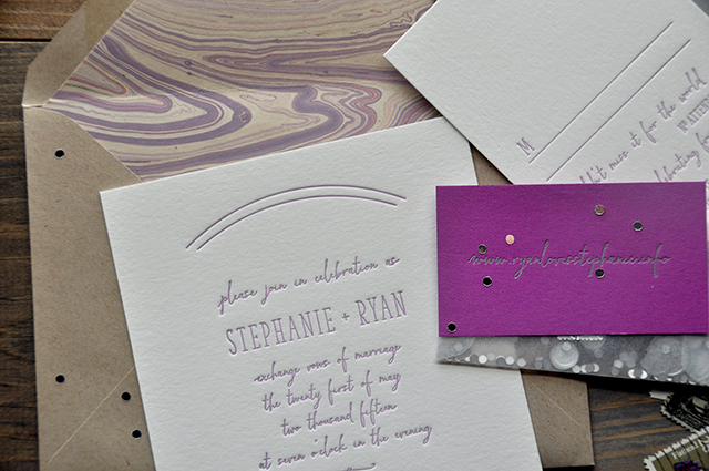
Pastels are having a major moment this fall – especially shades of pale lavender and lilac! Today we’re getting even more gorgeous pastel inspiration with these wedding invitations from Lauren at Darling + Pearl Letterpress. I’m especially in love with the lavender script text and pastel-colored marbled envelope liners!
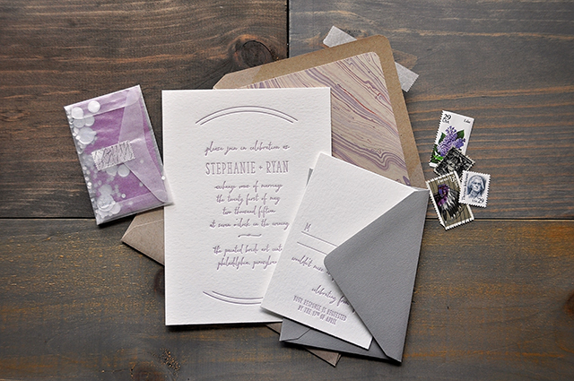
From Lauren: These invitations were originally created for The Big Fake Wedding in Philadelphia. The inspiration for these invitations was a mood board created by Ashley Buzzy Lettering and Press: a whimsical and dream-like scene with an array of pastel colors. It was really interesting working with visual inspiration that was not at all paper related. This process was much more organic and more about the feel and emotion of the event. Working through the design from that avenue was so enjoyable!
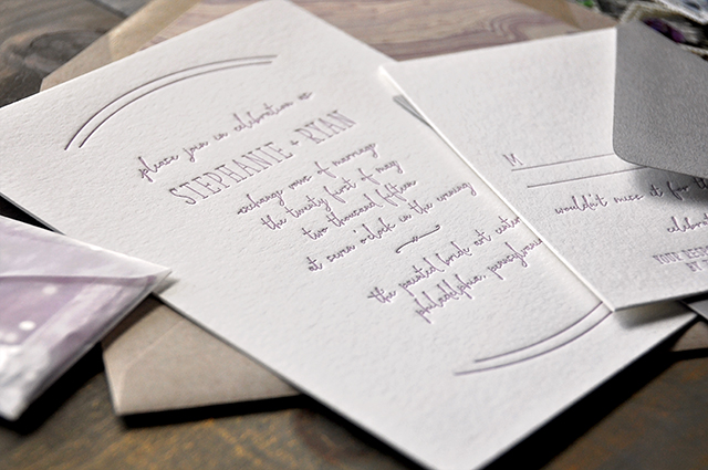
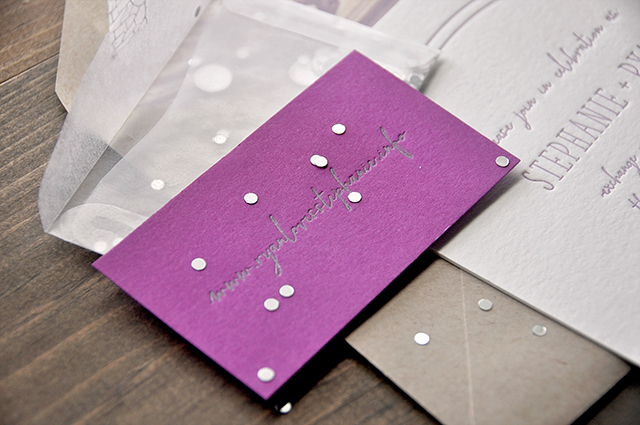
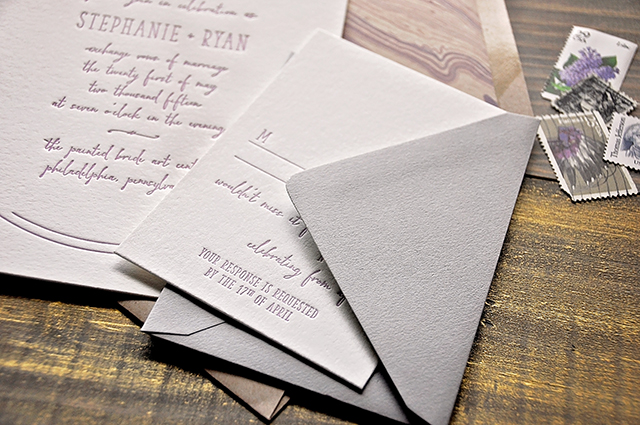
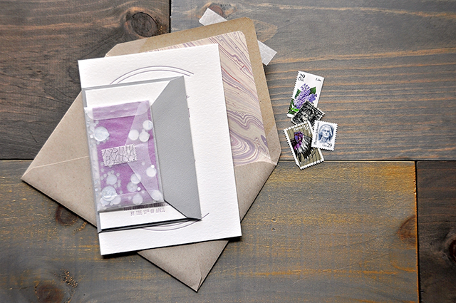
This entire suite was letterpress printed. The invitation and response cards were printed in lavender ink on double thick cotton stock. The website card was printed in silver on bright plum paper and set into a tiny vellum envelope along with silver confetti and sealed with some silver crackle washi tape. The light kraft envelopes were lined in beautiful pastel handmade marble paper that really tied the entire suite together. The warm gray response envelope added to the depth of the entire design.
I enjoy finding typefaces that complement each other and – every once in a while – I like the idea of letting the script take the “back seat” and handle the body text while the serif handles the name text. It’s a less traditional concept, but the aesthetic totally stands out.Â
Thanks Lauren!
Design and Letterpress Printing: Darling + Pearl
Check out the Designer Rolodex for more talÂented wedÂding inviÂtaÂtion designÂers and the real inviÂtaÂtions gallery for more wedding invitation ideas!
Photo Credits: Darling + Pearl
