Hi Everyone! I’m SO excited to introduce a brand new column – with a brand new contributing author – here on Oh So Beautiful Paper today! Jill DiNicolantonio is a life-long paper enthusiast, former paper rep, and the founder of Parse & Parcel, an online resource for print and paper samples. Jill is on a mission to help creatives find and use the right paper for their projects – which just so happens to be the focus of her column: Finding the Paper. Welcome Jill! –Nole
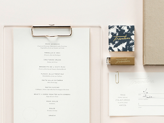
As if a James Beard Award winning chef isn’t enough of a reason to lure me in to Trentina, then this identity system by Cleveland Graphic Designer, Christine Wisnieski will definitely do it. Chef Jonathon Sawyer and his wife Amelia created an elegant and lavish dining experience for their patrons. Inspired by the cuisine of Trentino, Italy, where Amelia and her family originated, visitors are treated to a luxe, yet relaxed ambiance with glamorous design touches throughout. Christine created the logo and identity for Trentina, perfectly capturing the polished and expressive aesthetic of the restaurant and its owners.
This identity system is rooted in beautiful art, and expressive, voluptuous typography. The gold script logo is speed-infused, drawing inspiration from traditional Italian signage and crafted by hand. Metallic colors play a major role in the restaurant’s decor with mirrored tables and gold walls, and is echoed among the papers and finishes used throughout Trentina’s identity system.
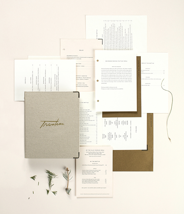
Trentina offers a variety of menus; brunch, lunch, dinner and a 12 course tasting menu. The menu system emulates the food — bold but delicate, expressive yet refined. The system smartly utilizes a mix of digital and offset printing processes, simplifying the task of  future menu edits. By employing the use of colored metallic papers, an added layer of elegance is achieved without the added expense of a metallic ink. The pearlescent finishes in Neenah Paper’s Esse and Stardream grades used for the menu cover and dividers, play nicely against subtle text and cover pages of the interiors in Neenah Classic Crest Classic Natural White 70# Text and French Construction Insulation Pink 80# Cover.
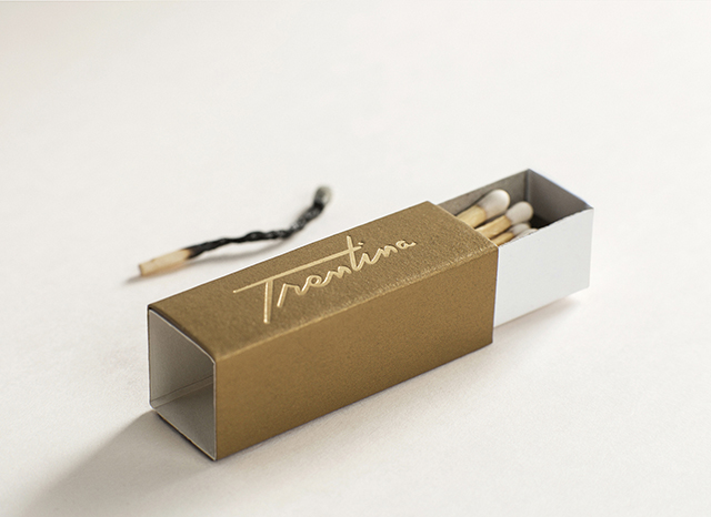
Other elements include the offset printed business card featuring a stunning gold gloss foil logo on Neenah Eames White Vellum in 100# Cover. And I adore the matchbook with the Trentina logo in a gold gloss foil stamp on the Stardream Antique Gold 80# Cover, such a striking combination. The check presenter pairs offset printing with a blind letterpress printed logo on Neenah Eames White Vellum in 100# Cover. This is definitely one identity system to raise a glass of prosecco to, cin cin!
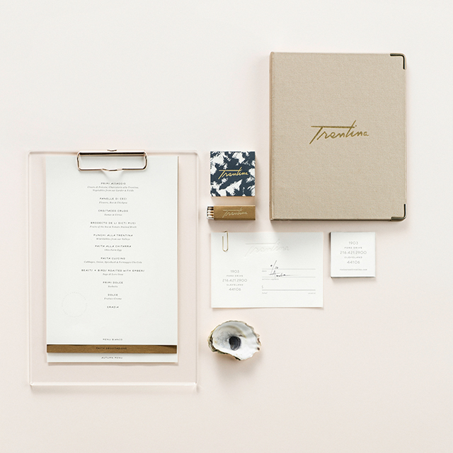
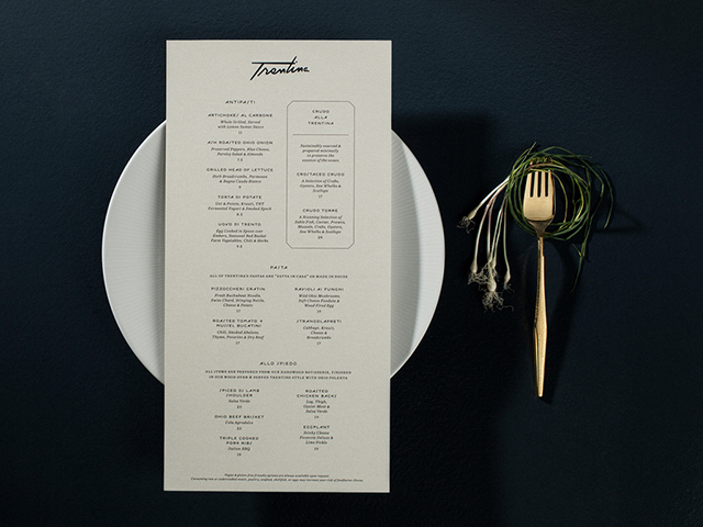
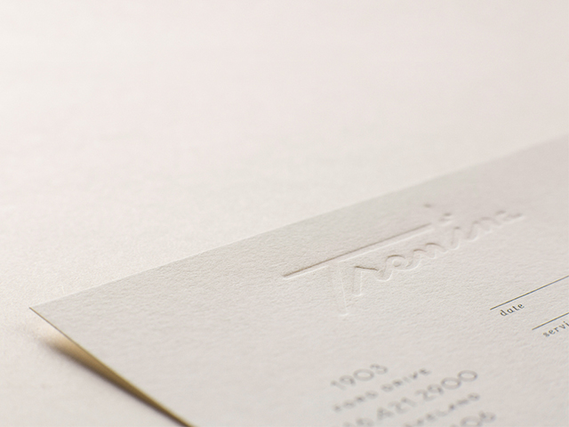
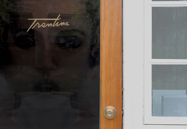
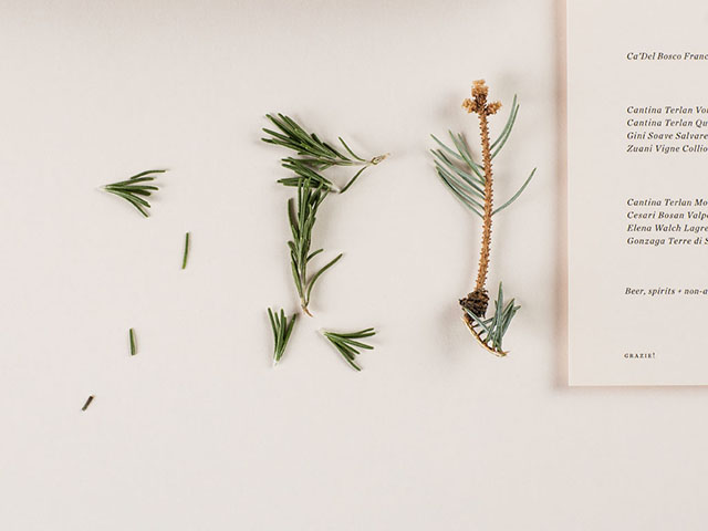
Photo Credits: Paul Sobota, BurkleHagen, Christine Wisnieski

YES, PLEASE & THANK YOU!!! I LOVE this new series, such a great resource! It would be awesome to see a post comparing a few types of less popular (ie. not Savoy or Lettra) letterpress paper options. I just ordered a ton of new sample packets because I want to try experimenting with some I haven’t used before and while a sample packet is great, I’m sure there are papers out there by smaller mills that I’ve never even heard of. So excited to see more of this series!
So glad to hear you’re enjoying the column! I’ll be sure to feature examples of non-traditional paper options for all types of print techniques – including letterpress. – Jill