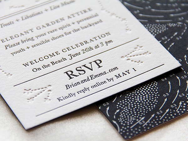
These beautiful wedding invitations from designer Emma Mällinen might appear to be a simple black and white design – when in fact they’re so much more! The invitation features silver screen printing on black paper, classic Baskerville text letterpress printed on white paper, blind deboss elements – and a truly stunning star map meets tidal chart design!
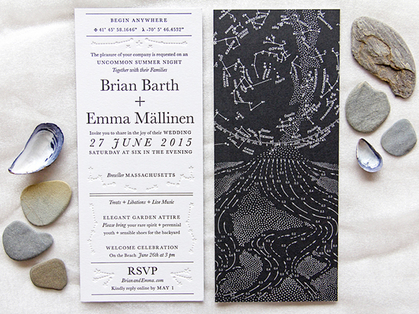
From Emma: Preparing for our wedding in June has been one of the most exciting times of my life. As a graphic designer I have felt like a kid in a candy shop. There are so many things to design or customize, and over the past year I have made everything from favor box labels, to conversation starters, to all of our event signage. I’ve treated myself to all the colorful visual possibilities. Romantic lettering? Check. Bold flowers? Check. Creative language? Check. But when it came time to design our wedding invitations it felt different, like a big responsibility.
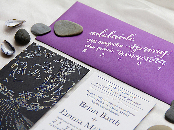
The invitations turned out to reflect us more than we could’ve even dreamed of. Our initial inspiration came from our wedding site on the Cape Cod seaside. It was Brian’s family house, overlooking the sweeping sand flats at low-tide. We loved the way the sky and the sea melded together for a few hours each day, and we thought this an apt metaphor for our own union in the same place.
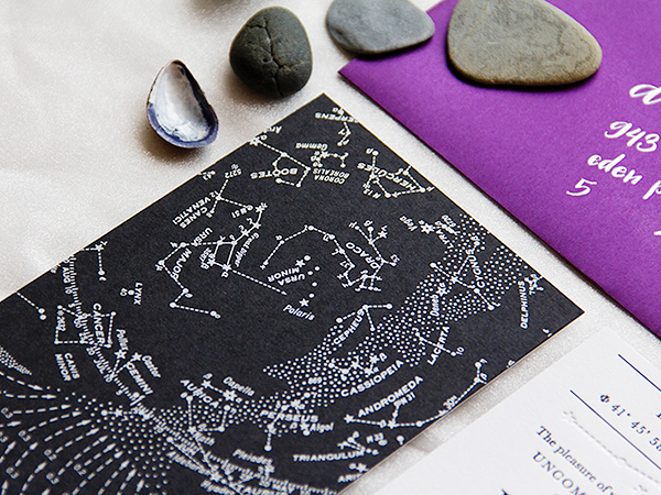
We created an image of a vintage star map and a tidal chart meeting – a reference to our evening ceremony overlooking the same view. For the reverse side, we took pieces of this illustration and used them as structural elements, printing them in blind deboss around our classically arranged text. The text design was based on historical treatise frontispieces and was set in Baskerville.
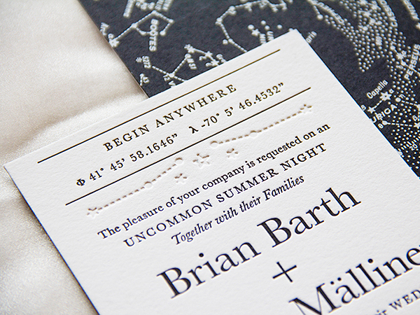
The wonderful people at Mama’s Sauce did an amazing job with the technically complicated order. The diagram of the vintage star atlas and coastal tide map were screen printed in silver ink on French Paper Poptone 100C Black Licorice. This paper was then duplexed to Crane Lettra 110C Cotton, on which our text was letterpress printed in black with accompanying blind deboss.
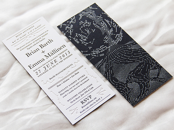
All of these choices reflected our unique relationship: the invitations were spiritual without referring to specific religious symbols; the language was our own colorful style; and the color palette was serious but playful with deboss. We added a purple silk envelope to bring a dash of color and sent off our invitations knowing they would be cherished for a long time to come!
Thanks Emma!
Design + Envelope Calligraphy: Emma MällinenÂ
Printing:Â Mama’s Sauce
Check out the Designer Rolodex for more talÂented wedÂding inviÂtaÂtion designÂers and the real inviÂtaÂtions gallery for more wedding invitation ideas!
Photo Credits: Emma Mällinen
