Sarah from Banter & Charm sent over these beautiful traditional wedding invitations that she created for a recent client – I love the subtle gray and white color palette paired with pink edge painting! Sarah decided to keep things simple with a typography-focused design letterpress printed on super thick paper. Always a classic combination!
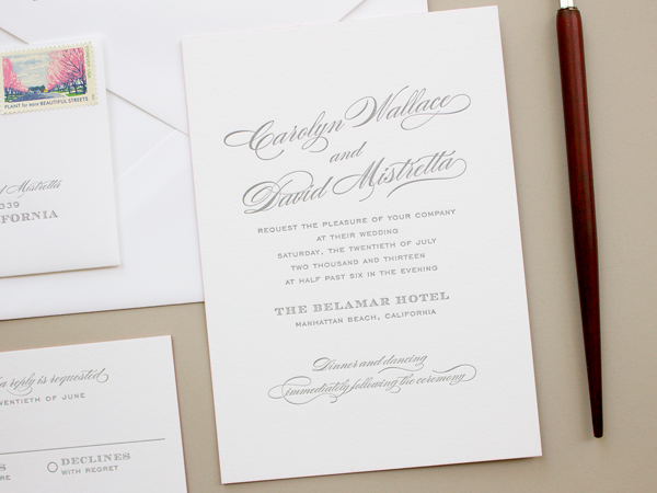
From Sarah: A self-proclaimed paper snob, Carolyn was looking for a traditional, yet romantic design on thick, luxurious paper. She shared her inspiration board with me, and after a bit of brainstorming we decided on a classy, typographic design with letterpress printing in gray ink on thick 220# cotton paper. For a subtle pop of color, we added pink edge painting to the invitation and RSVP. The return address and rsvp address were letterpress printed to finish off the invitation suite.
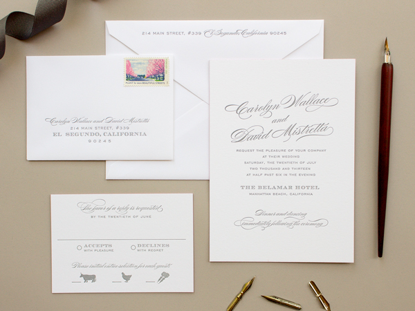
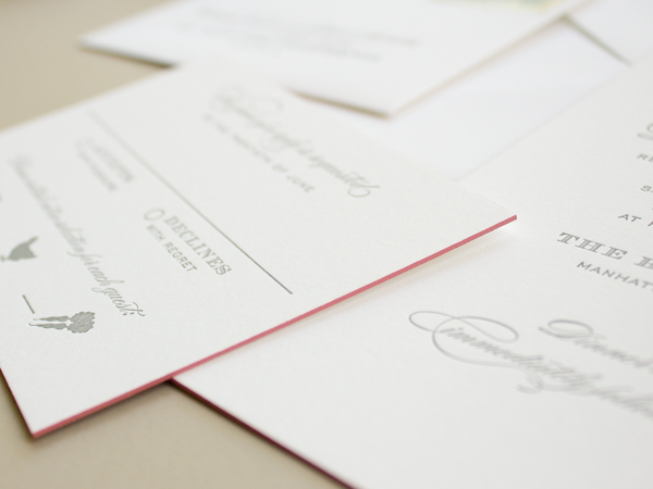
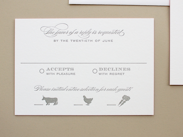
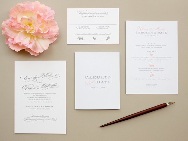
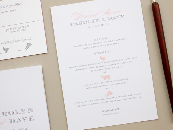
For Carolyn’s day of stationery, we went with a similar typographic design, and used pink again to add a romantic touch. For the menu and program we went with flat printing to stay within budget and on schedule. The meal choice illustrations made another appearance on the dinner menu to tie everything together.
Thanks Sarah!
Design:Â Banter & Charm
Letterpress Printing:Â Rohner Letterpress
Check out the Designer Rolodex for more talÂented wedÂding inviÂtaÂtion designÂers and the real inviÂtaÂtions gallery for more wedding invitation ideas!
Photo Credit:Â Banter & Charm

These are adorable. I love the simple cow/chicken/vegetarian options on the RSVP card.