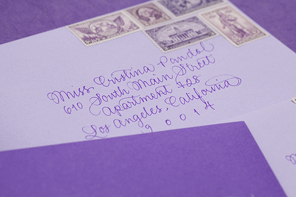
I’m loving this take on the ombre trend from designer Cristina Pandol: instead of a gradient on a single piece of the invitation, the entire suite progresses from dark to light purple! Cristina thought through every single detail of the suite, from the custom envelope liners to the purple calligraphy and vintage postage!
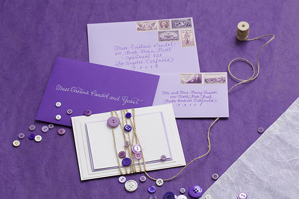
From Cristina:Â I’ve been dying to apply the ombre concept to stationery, but was waiting for the right project to come along. When Jessica reach out to me for her wedding and stressed how much she loves all shades of purple, I knew that she would love the concept. The wedding suite progresses from dark purple to light purple, and everything from the calligraphy to the postage is purple.
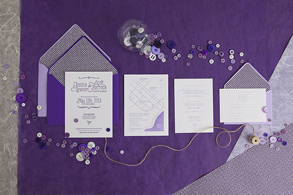
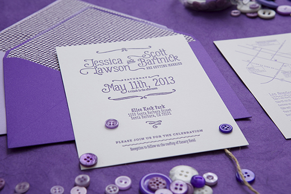
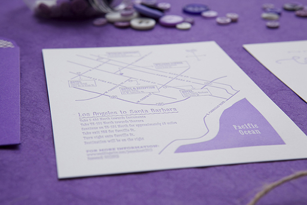
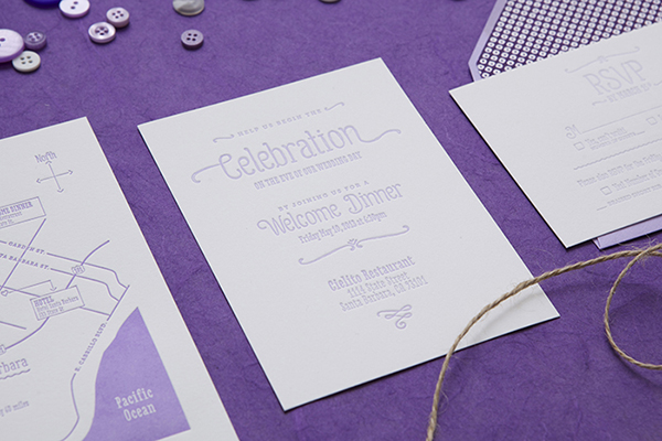
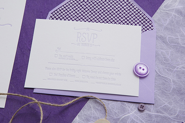
The design revolves around the pairing of three very different typefaces to show the couple’s playful and eclectic style. The primary type is Gulyesa, with Love Potion and Museo Slab used to compliment the primary type.
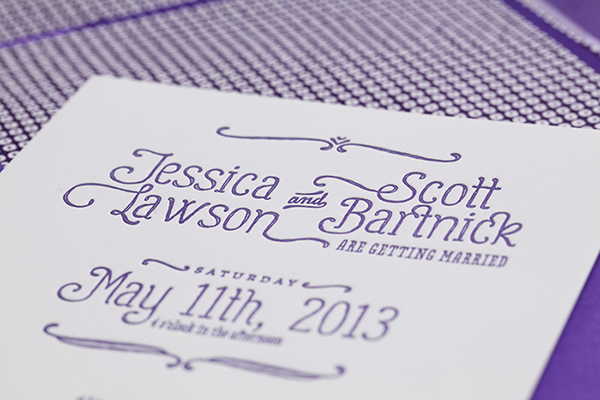
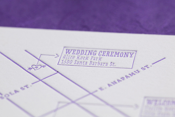
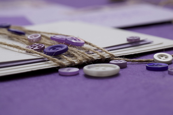
Every piece was letterpress printed with a fairly deep impression on a bright white French cotton paper. I wanted to make sure the pressing and ombre was done properly, so I rented a Vandercook machine and printed every piece myself. Jessica wanted to do some of the work herself and be part of the experience. I created a stencil for her to use to cut all of the envelope liners and Jessica secured all of the pieces together with string and buttons.
Thanks Cristina!
Design + Printing: Cristina Pandol via press rental at Lala Press
Calligraphy:Â Calligraphy Katrina
Check out the Designer Rolodex for more talÂented wedÂding inviÂtaÂtion designÂers and the real inviÂtaÂtions gallery for more wedding invitation ideas!
Photo Credits:Â Garr
