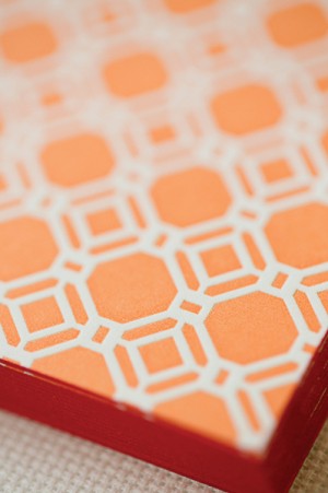
Nikki from Akula Kreative sent over this academia-inspired stationery suite that she designed for a wedding and event planning business – and the whole suite is absolutely stunning from start to finish! The color palette of bright orange and gray is so much fun, and the dictionary-theme letterpress printed business cards? So good!
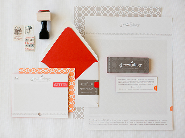
From Nikki: Jasmine, the owner/founder of Socialology, came to us with a Pinterest board filled with orange, salmon, gray, and taupe images, all inspired by academia. The photographs of pencils, erasers, vintage books, and dictionary pages in conjunction with her company name, Socialoogy, made it obvious from the get-go that we’d have the opportunity to expand on a theme with endless possibilities. From the edge painting and cotton paper to the four printing processes it took to make it, this stationery suite is all about quality and attention to detail.
 Â
First, we had to do something about the name.  The suffix “-ology” means “the study of,” so “Socialology” refers to “the study of being social.” An academic name for an academic theme. The hurdle, however, was getting people to SAY it correctly, as it was—and is—a bit of a tongue twister. And so we set out to create a logo that would not only be easy to read, but it would have to instruct people how to pronounce it. Enter Andy Luce, who created the beautiful lettering for the first half of the name. He actually came up with options for the entire name, but in the end we landed on a combination of calligraphy for “social” and a serif font for “ology.”
 Â
 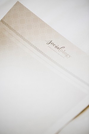
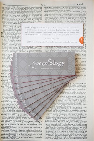
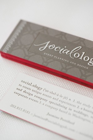
To drive the idea home, we went with a dictionary-themed business card. On the front, we used a multi-level sculptural die to deboss the “book plate” area around the logo. On the back, we letterpress printed the contact information in the form of a dictionary entry, complete with pronunciation cues, part of speech, and definition. In the bottom right, we foil-stamped a dictionary tab.
 Â
 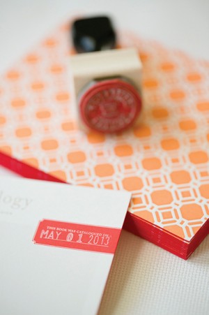
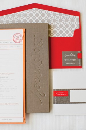
The postcard-style correspondence card mimics a library catalog card, using the phone number as the reference number. The red tab reads “This book was catalogued on” and leaves a space for a date stamp. At the bottom of the letterhead, we repeated the dictionary-style layout and orange tab, but our favorite feature is the ghost-like quality of the pattern that becomes visible when you hold it to the light. To top it all off, we ordered handmade fabric portfolio folders that Jasmine can use when presenting to potential clients. The outside features a blind deboss logo, and the inside features pockets for the 4″ x 1″ business card and a custom-made client intake form.

Thanks Nikki!
Design:Â Akula Kreative
Custom Calligraphy:Â Andy Luce
Printing: In to Ink and Senekeo
Photo Credits: Caroline Tran

Thanks so much to our team of awesome vendors! The custom fabric folders are by Kristin Dunn Bookbinding and Design.