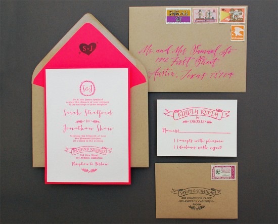
Neon is back in a big way. It’s been trending in fashion and home decor for a while now, so it’s fun to see the bright hues make a splash in the stationery world too! A while back, we shared a neon and kraft paper save the date design with you and today, we’re following up with a coordinating invitation suite! – Bailey and Emma of Antiquaria
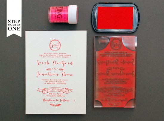
Step One: To achieve the vibrant neon effect for this suite, we utilize the embossing technique. This process creates a raised and opaque print that emulates the thermography printing you’d find in a traditional print shop. Place your A7 card on a stable and firm surface. Ink your invitation stamp (we used our Mod Invitation stamp) and center the stamp over your card. When ready, press the stamp down with moderate pressure to make the print. Lift the stamp off and quickly move on to adding your embossing powder.
Once you’ve made your print, immediately cover it with embossing powder by sprinkling it across the paper. Shift the powder around until you have covered the entire image. Now, you will pour the excess powder off of the card onto a scrap piece of paper so that you can reuse it for future prints. Heat set the print, using an Embossing Heat Tool. You will be able to see the powder melt into an opaque and solid color when it’s done. For more information about how to emboss using stamps, please watch this instructional video.
Note:Â One key thing about embossing is that it is wise to try to closely match your ink color with your powder color. By doing this, you will get much more crisp and opaque results.
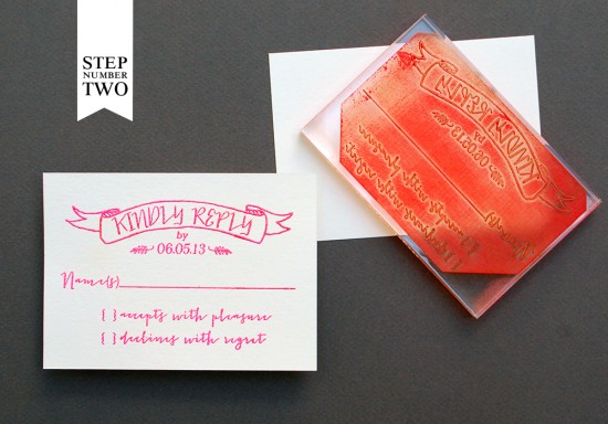
Step Two: Using the same technique as step one, you will print and emboss your reply card. We used our Mod Reply Card stamp on a 4Bar card for this piece.
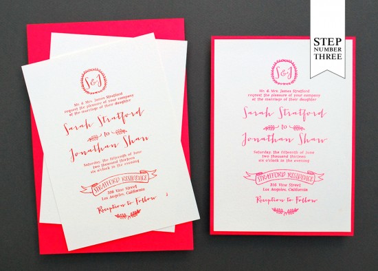
Step Three: A really great way to add luxurious thickness and a pop of color to your invitation is to add a card stock backer to the invitation print. Adding a backer to the invitation also helps to flatten out any warping/curling that sometimes happens from the heat tool. To do this, simply cut the colored paper to your desired size (ours was 5.25″x7.25″) and use double sided tape to affix the two piece together. *We like to put tape all along the outer rim as well as an “X” across the middle to make sure that there is a good bond.
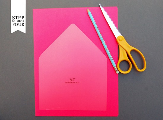
Step Four: By now, you all probably know that we love envelope liners! For this suite we used the same neon paper (except in text weight this time) to cut a liner for our kraft envelope. Simply trace the template on your paper, cut it out and use double sided tape or stick glue to affix it to your envelope.
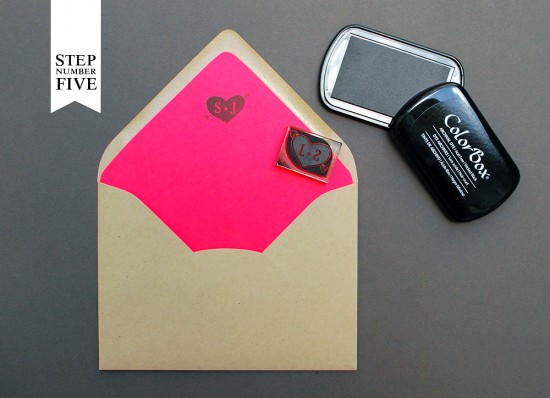
Step Five: For a little added flavor, we stamped our Cross my Hearts Initial Monogram stamp in black ink on the inside flap of the liner. It’s a fun surprise for your guests when they first open your invitations!
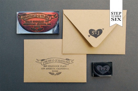
Step Six: For the reply card envelope, we kept things pretty simple and printed a matching address stamp (we used our Mod Banner Return Address Stamp) in black in on a 4bar kraft paper envelope. We also used the same monogram on the back flap that we used on the liner paper to carry the theme through the suite. We also used the same address stamp in black for the back flap of the A7.5 outer envelope, (not shown). For more detailed information on how to (properly) ink and print stamps, please watch this instructional video.
Step Seven: Once you’ve crated all of your pieces, it’s time to address the invitations, add postage (we used vintage postage from Verde Studio) and send them on their way! We guarantee that your guests will be very impressed by all of your handiwork and pumped to celebrate with your on your big day!
Materials:
“Mod” Invitation Stamp “Mod” Reply Card Stamp “Mod Banner” Return Address Stamp “Cross my Heart” Monogram Stamp
A7 Cards in Luxe White
A7.5 Envelopes (Outer Envelopes)Â in Paper Bag
4Bar Card 4Bar Envelope in Paper Bag
Stamp Pad in Picante Red
Stamp Pad-Wicked Black
Embossing Powder Embossing Heat Tool
Card Stock Backer Cut to 5.25 x 7.25, in Rocket Red from Astro Brights
Liner Paper 8.5″x11″ text sheets, in Rocket Red from Astro Brights
Pencil
Scissors
Double Sided Tape
Vintage Postage (from Verde Studio)
AntiÂquaria is a memÂber of the Designer Rolodex – you can see more of their beauÂtiÂful work right here or visit the real wedding invitations gallery for more wedding invitation ideas!
Photo Credits: Antiquaria

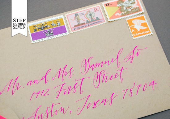
How were the addressed envelopes created? Calligraphy with an opaque bright ink? Thanks!
Hi Julie–Yes! The addressing was done with a calligraphy pointed pen and dip “ink.” I used artists gouache in a fluorescent pink color with a slight touch of white so that it would pop off of the kraft envelope. To letter with gouache, dilute the paint with water until it reaches the consistency of heavy cream. Hope this helps!–Bailey of Antiquaria
I was just wondering the same thing! Thanks for the tip. Love this style.
Haven’t tried to use neon papers for invitations like this but this one looks good. Thanks for sharing this tutorial 🙂