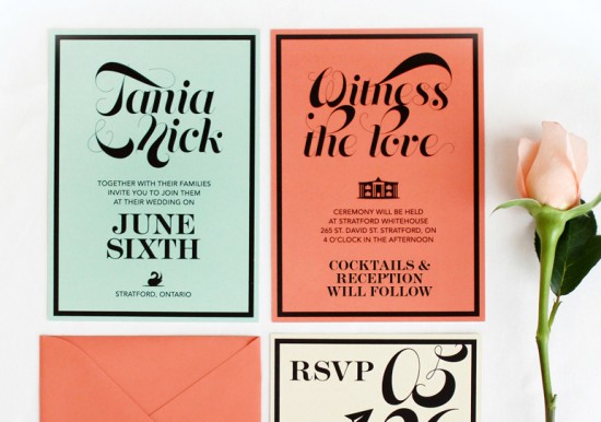
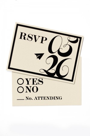
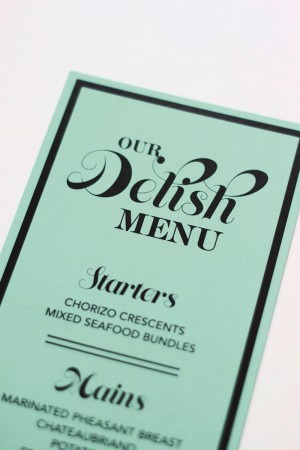
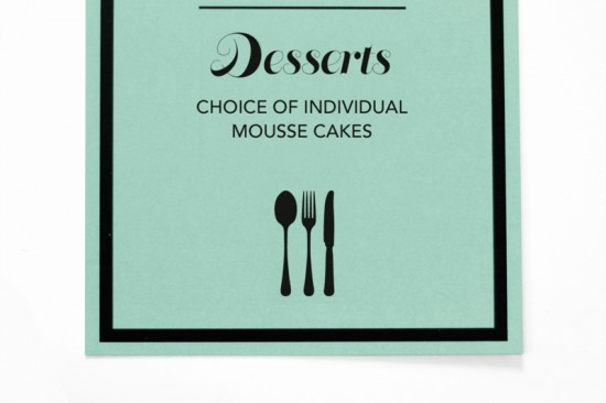
Coral and mint green happen to be two of my favorite colors at the moment – so how could I resist when James and Vinti of OOXX sent over these modern wedding invitations? In keeping with the bride and groom’s personalities, James and Vinti kept the design on the informal side with playful wording and the bright color palette.
From James and Vinti:Â Nick and Tania are a couple based out of Stratford Ontario. They are a really young couple who didn’t want their invitations to feel like they take themselves too seriously, especially since their are just having a small ceremony with their family and friends and then a cocktail reception to follow on a Thursday.
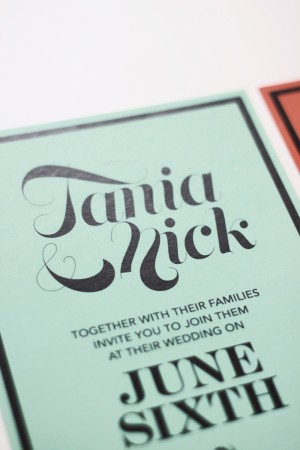
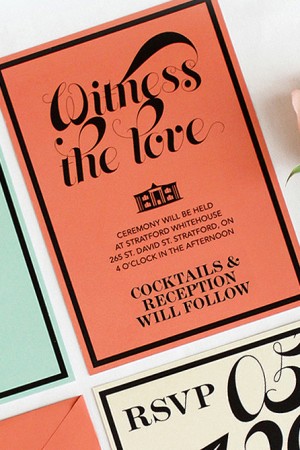
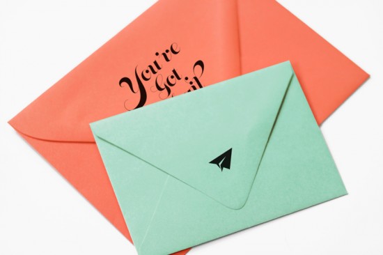
Their wedding colors were coral and mint and they wanted their invitations to reflect that, so we created this dynamic invitations using the different colors for different cards and this helped make this invitation more playful. We really love the simplicity and graphical elements in the design of this invitation. We used a great font with lots of movement to contrast the hard edges of the black borders.
Thanks James and Vinti!
Check out the Designer Rolodex for more talÂented wedÂding inviÂtaÂtion designÂers and the real inviÂtaÂtions gallery for more wedding invitation ideas!
Photo Credits: OOXX

Beautiful invitation set in a great color scheme. I’m always a little sad, however, when I find spelling mistakes! “Cocktails” has a K in it! 🙂
Simple, bright, and cute – what more do you need? :]
Ok so I was wondering about the spelling when I was designing them because I had it as coctails but everywhere I was looking it came up with a k so I left it in. Maybe it goes both ways?