We’ve always had a love affair with indigo – in fact, the wedding quilt that Emma’s mother created for her is made from scraps of vintage Japanese indigo fabrics. With its recent rise in popularity we decided that indigo would make the perfect inspiration for an invitation suite. The deep blue and white color scheme, mixed with floral elements and classic typography, makes it a design suitable for any season! – Bailey and Emma of Antiquaria
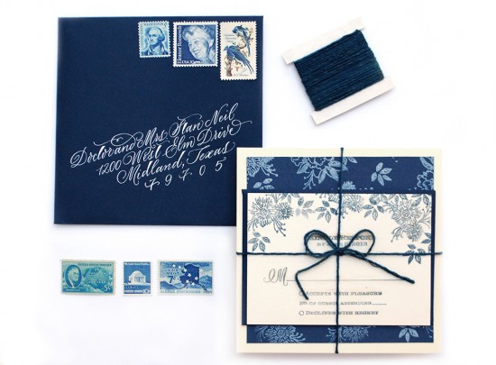
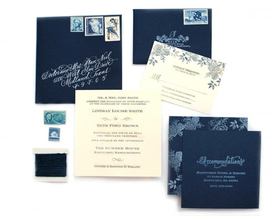
Tie the square invitation and enclosure pieces together with indigo dyed twine and your guests will feel like they’re opening a gift!
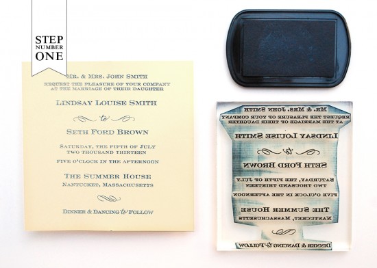
Step One: Lay a  5.5″ square card down on a firm surface. Ink your stamp (we used our Sophisticate Invitation Stamp) thoroughly and center it over your card. Once it is positioned correctly, press down to make a print. Use both hands to ensure even pressure. Lift off and let the print dry. For more information on this process go here.
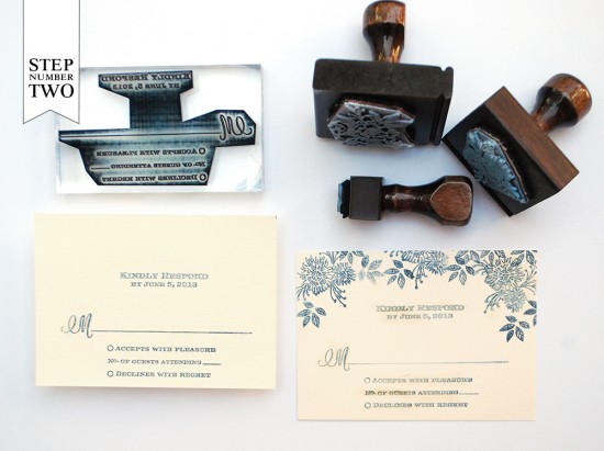
Step Two: You will repeat the printing technique from Step 1 for your reply card (we used our Sophisticate Reply Card Stamp) on a 4bar (3.5″x4.75″) card. Â This time, instead of centering the stamp, you will print it toward the bottom of the card. This leaves space to print the floral pattern (we used our Daisy Pattern & Small Leaves Pattern Stamps) at the top. It’s best to start with the larger pattern stamp and then fill in with the smaller leaf stamp.
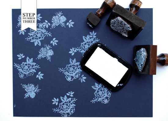
Step three: We love to incorporate patterns in to our invitation suites, whether it’s an envelope liner, backer or belly band…it adds so much style and personality to the design. We created this indigo pattern by randomly stamping pattern stamps (we used our Camellia Pattern, Daisy Pattern and Small Leaves Pattern Stamps) in frost white ink on 8.5″ x 11″ card stock. The effect that it creates is so lovely!
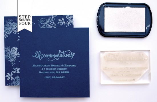
Step Four: To make the accommodations card, you will need to cut the 8.5″ x 11″ patterned paper into 5″ squares (you will get 2 per sheet). Next, ink and stamp your accommodations information (we used our Calligraphy Accent Accommodations Stamp) on the front of the navy blue card.
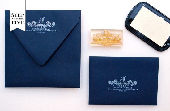
Step Five: Using the same printing technique as above, you will print your return address and reply address (we used our Wildflowers Return Address Stamp) on the outer and reply envelopes. Now all that’s left is to tie everything together, address your envelopes, add postage (we used awesome blue vintage postage from Verde Studio) and send them on their way!
Materials:
Calligraphy Accent Accommodations Stamp
Pattern Stamps – Camellia, Daisy, Small Leaves
Wildflowers Return Address Stamp
Stamp Pad – Frost White, Midnight
5.5″ Cards in Luxe Cream
5.75″ Envelope in Night
4bar Flat Card in Luxe Cream
4bar Envelope in Night
8.5″x11″ Cardstock in Night
String or twine
AntiÂquaria is a memÂber of the Designer Rolodex – you can see more of their beauÂtiÂful work right here or visit the real wedding invitations gallery for more wedding invitation ideas!
Photo Credits: Antiquaria

Love everything about these invitations – great post!
Thanks Carla:) We’re so glad that you like it!
xo
Bailey & Emma
What did you use to address the front of the envelopes? (If you used a white pen – which kind did you use?)
Gina,
The envelope was addressed with hand lettered calligraphy. For this address, we used a pointed pen (with a Nikko G nib) and Dr. Martin’s Bleed Proof White. Unfortunately, there isn’t any white pen on the market that we’ve found to be as opaque as the old school calligraphy approach. The closest may be a white gel pen, but you don’t get the thicks and thin strokes without a pointed nib. Hope this helps!
-Bailey