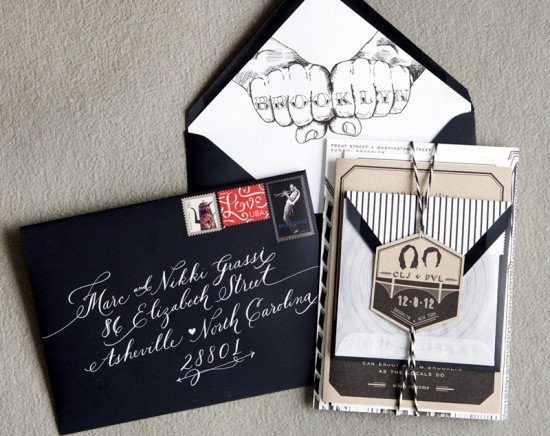
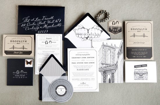
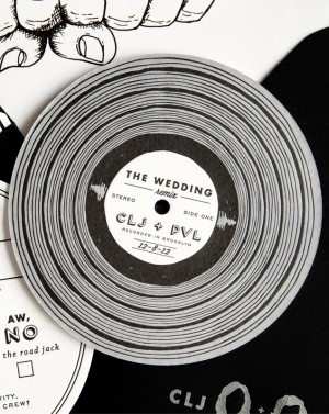
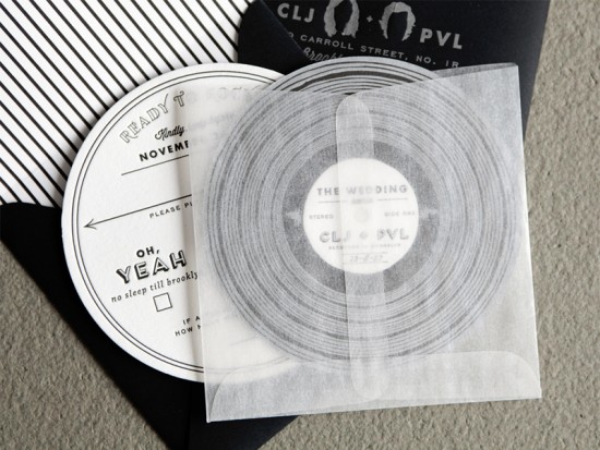
Happy Monday everyone! We’re kicking the week off with the totally awesome wedding invitations of Courtney from Swiss Cottage Designs! Courtney was inspired by her adopted home town of Brooklyn and her love of music to create a stunning black and white invitation suite with hand drawn illustrations, cute silhouettes, and even a miniature record rsvp card. So cool!
From Courtney: We didn’t really have a theme going into our wedding but one thing that kept coming up was music and the colors black and white. Our save the date was based on the Rob Base song “It Takes Two” so we weren’t afraid to get a little weird. For the actual wedding, I used a line from a Biggie song that ended up being a repeating theme throughout our invitations and day-of pieces.
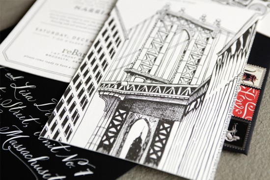
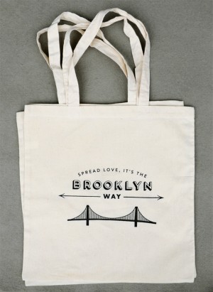
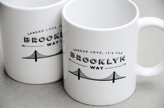
I knew I wanted the invitation to be focused around a hand drawn illustration since that is what I love to do. We got married in the DUBMO neighborhood of Brooklyn which has some pretty awesome views. There is one iconic street that showcases the Manhattan Bridge with the Empire State Building nestled below; I chose that as our main image.
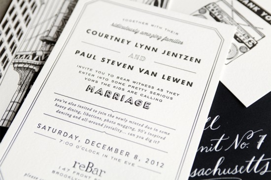
The invitation was printed in two parts then duplexed to #220 and printed on Crane Lettra. One of the important things for me was to have the invitation sound like the way we both actually speak. We have a very dry sense of humor and we really wanted that to come out in our invitation text. The ridiculously talented Jenna of Love, Jenna Calligraphy addressed our black envelopes in white ink.
My personal favorite detail was the envelope liner! My friend is a photographer and when looking through her pictures, I saw one of a guy with knuckle tattoos. I knew I wanted to incorporate that same idea into our suite somehow. One I realized that “BROOKLYN” fit on the knuckles, it was a done deal!
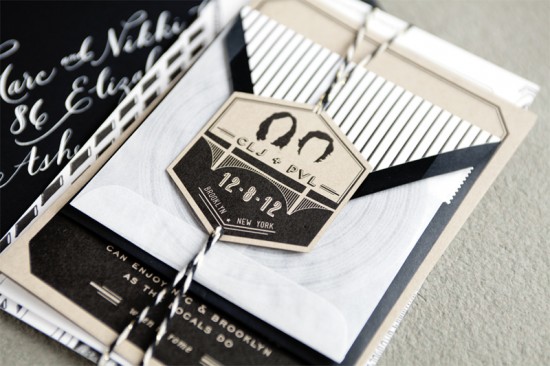
For the RSVP card, I created a letterpress printed mini-record complete with glassine sleeve. I paired this with a 4″ x 4″ square black envelope and had our return address letterpress printed in matte silver on the front. We also provided our guests with an insert with suggestions for spending a perfect winter weekend in NYC and Brooklyn. This was printed flat on kraft paper. I finished the suite with black + gold twine (from the awesome Knot & Bow) and had a die cut tag created to hold everything together.
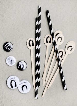
I love little silhouettes and created one of our hair to use throughout our suite as a continual theme. Overall, we wanted our invitations to feel classic, set the tone for our wedding, but most importantly to make our friends and family laugh.
So awesome – thanks Courtney!
Invitation Design: Swiss Cottage Designs
Calligraphy: Love, Jenna Calligraphy
Twine: Knot & Bow
Swiss Cottage Designs is a member of the Designer Rolodex – you can see more of Courtney’s amazing work right here or visit the real inviÂtaÂtions gallery for more wedding invitation ideas!
Photo Credits: Courtney Jentzen | Swiss Cottage Designs


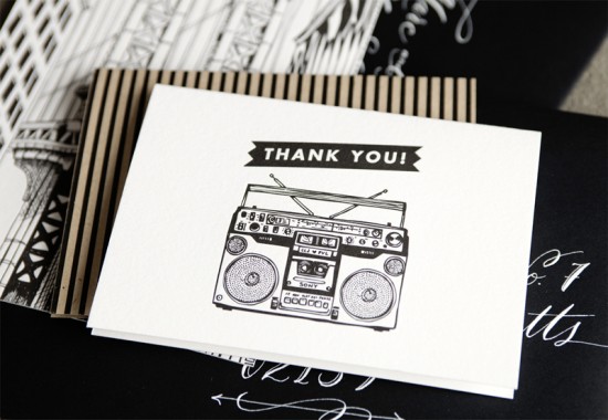
I don’t think I have ever seen a stationary suite so full of personality! I love love LOVE this!
Thanks for sharing our invitations Nole! xo
courtney, this is dope! i love all of the details and the variety of graphics and patterns.
WOW!I have never seen such individual wedding invitations! 🙂
Love all of it, especially the custom wooden stirrers with the silhouette! Where are those from?!