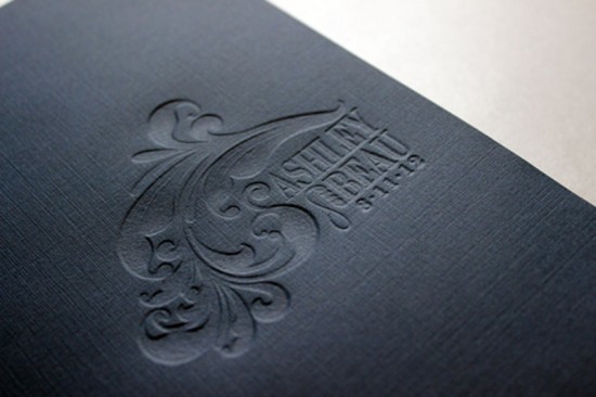
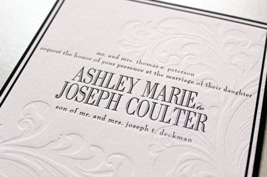
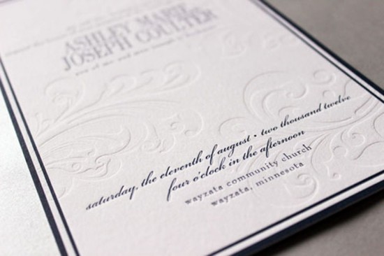
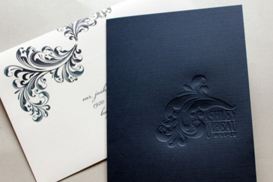
Navy and white is a classic combination, and it proved to be just right for achieving the balance of modern and formal in Ashley and Beau’s wedding invitations.  Designer Gretchen Berry chose classic fonts and an elegant blind deboss detail to complete the design.
From Gretchen: Ashley and Beau live in the preppy lakeside city of Wayzata, Minnesota. They were married at a church in Wayzata with the reception at the Lafeytte Country Club. They wanted their invitations to have the style and feel of the lake but without being too nautical: preppy and modern yet formal and classic.
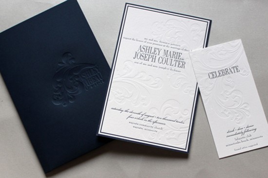
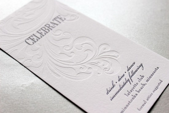
I created a custom two-pocket folder with Ashley and Beau’s logo blind debossed on the front. We used a navy linen card stock to create the folder, which was a great accent to the bright white cotton stock we used for the invitation pieces. The navy letterpress text in classic fonts makes a formal and masculine statement, while the blind debossed elements create a romantic and modern look.
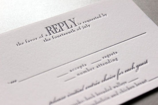
The long and narrow reception card showcases the plume of the debossed design. The reply card and map were simple one color letterpress pieces that complemented the invitation style.
Thanks so much Gretchen!
Check out the Designer Rolodex for more talÂented wedÂding inviÂtaÂtion designÂers and the real inviÂtaÂtions gallery for more wedding invitation ideas!
Photo Credits: Gretchen Berry Design Co.

This is a stunning stationery collection; seriously chic. I’m loving the navy, a colour I’m not usually fond of but it’s got a richness which stops it feeling “cold”. The debossing is beautiful too.
Thank you Wendy!