Happy Wednesday everyone! Â We’ve had the pleasure of featuring hundreds of amazing wedding invitations over the years, but wedding stationery doesn’t stop with the invitations. Â Today I’m thrilled to introduce a new column written by my friend Kelly from Studio DIY that is devoted to day-of wedding stationery inspiration, starting with some fun midcentury modern ideas!
Midcentury Modern design spans several decades and multiple styles.  Clean fonts, bold silhouettes, graphic patterns and offbeat color pairings are a signifying characteristics that come to mind.  Luckily, these qualities all translate beautifully from architecture and interiors into stationery!  If you dream of Eames or you just can’t bear to let this season of Mad Men end on Sunday, take a little cue from this once again popular style for your day-of wedding items!  Menus, place cards, table numbers and more… they all wear the midcentury hat quite well. — Kelly
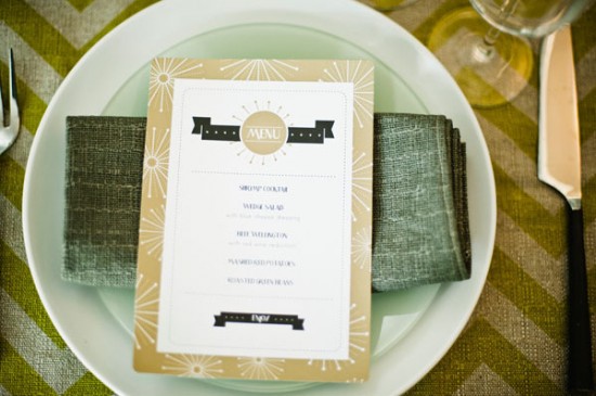
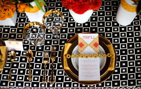
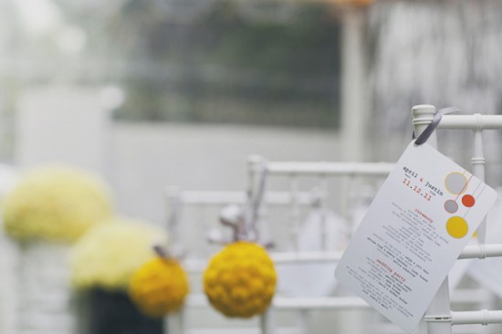
Photo by B. Mo Foto, Menu by TULIP Design Studio via Style Me Pretty
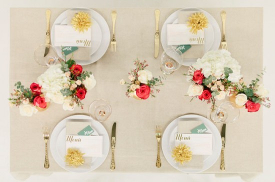
Photo and Menu by Brancoprata via Green Wedding Shoes
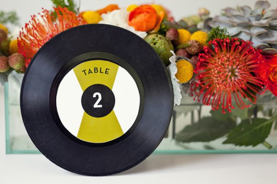
Photo by Andrea Hubbell, Table Number by Rock Paper Scissors via The Sweetest Occasion (left); Photo by Red White and Green Photography via Ruffled (right)
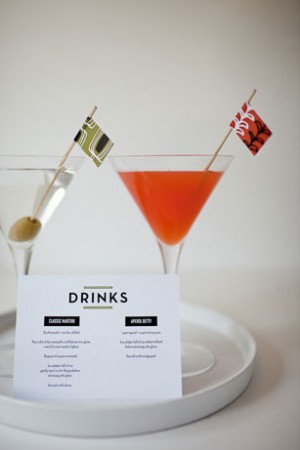
Photo by Jasmine Star, Menu by Wiley Valentine via Green Wedding Shoes
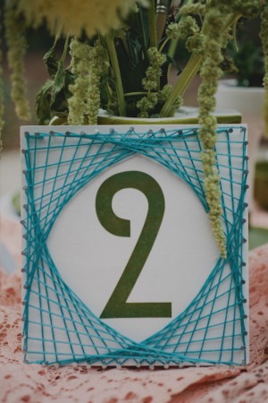
Photo by Andrea Hubbell, Table Number by Rock Paper Scissors via The Sweetest Occasion
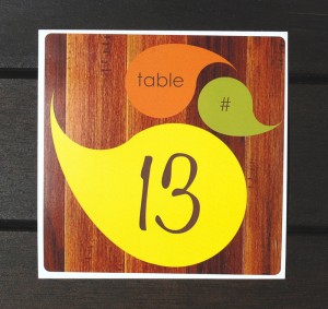
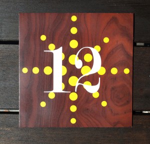
Table Numbers by Aubrey Doodle
Photo by Our Labor of Love, Program by Stelie Designs via Style Me Pretty
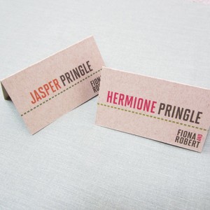
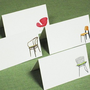
Place Cards by Nancy Nikko Design
Are any of you planning a midcentury modern-inspired wedding? Â We’d love to hear what styles and themes are inspiring you these days!
{images via their respective sources}

