Ed Note: Hi Everyone! I’m taking a quick break from National Stationery Show coverage today to get more photos and posts ready to share with you.  I’ll be back with more from the show tomorrow! – Nole
The thing I love most about calligraphy is its emotive qualities.  Sometimes, it seems we have enough trouble trying to put thoughts and feelings into words.  But to then have those words illustrate these things, simply through line and form, is pretty amazing; it’s quite the challenge.  Nancy of Nancy Hopkins Handlettering seems to enjoy the challenge by the looks of her portfolio.  With 15 years of experience specializing in commercial and event calligraphy, and clients like Saks Fifth Avenue, Bank of America, and Martha Stewart Magazine, she has certainly made a name for herself transforming the written word. – Julie
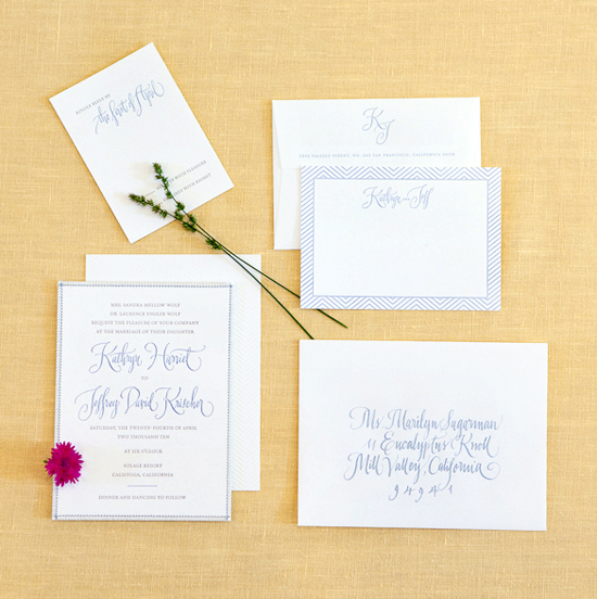
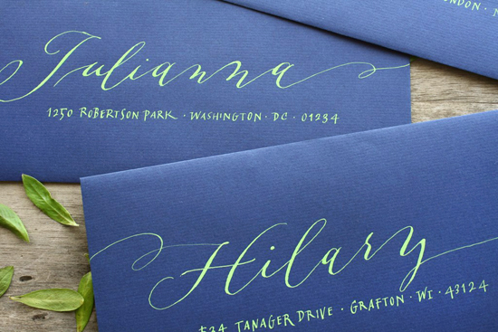
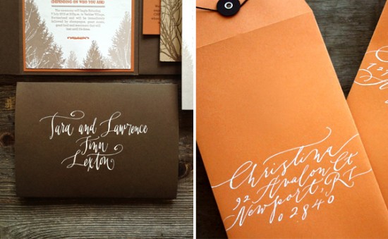
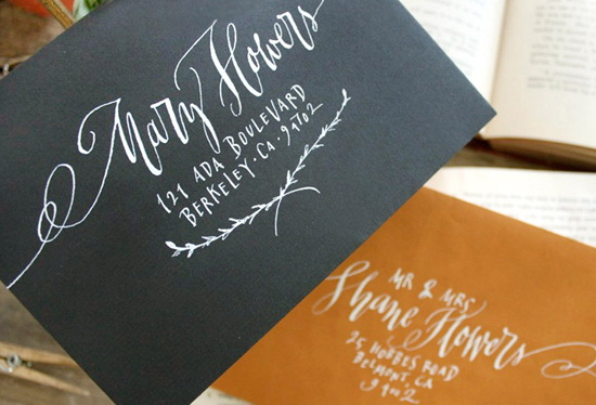
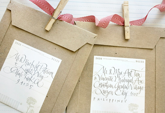
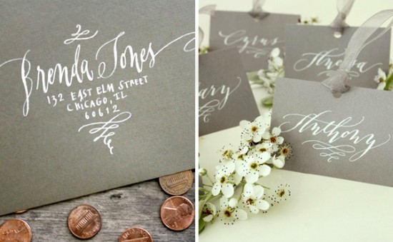
A mix of calligraphy and hand lettering along with a great use of space adds charm to addressed envelopes.
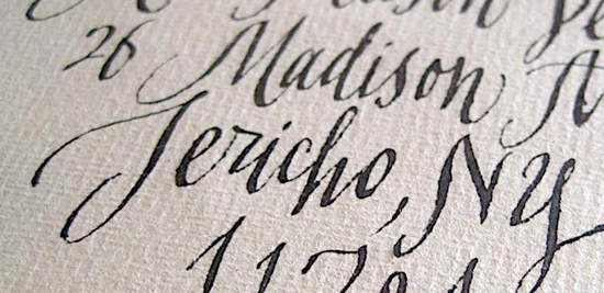
The perfectly imperfect line quality of some of her styles are swoon-worthy. Â The words are given such personality and texture, don’t you think?
Don’t forget to visit Nancy’s website for more of her work.  She recently updated the website – and with many fantastic examples and with 26 lettering styles available, it’s almost guaranteed that she has a style perfectly suited for your needs.
Letterpress printing: Olivia San Mateo
Photo Credits:Â Sabine Elser

Her work is absolutely lovely. I have been looking for a new design for my calling cards which will eventually become the header for my blog. I think I will contact Nancy. Thank you for the very timely share.
~M
These are really beautiful examples. The lime green ink on blue… wow!
Absolutely gorgeous!! Nancy does some amazing calligraphy, wow!