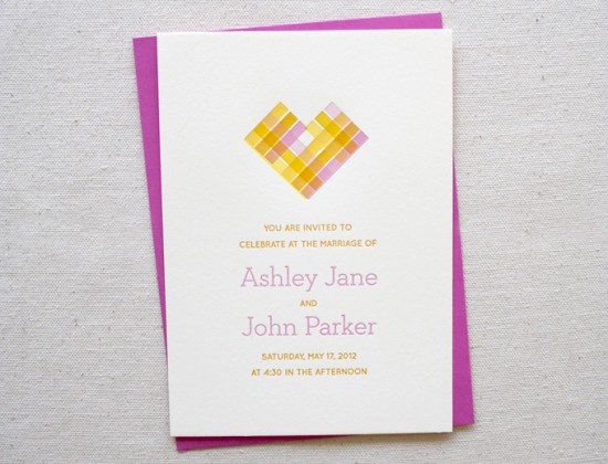
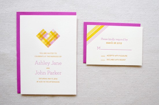
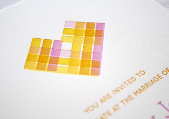
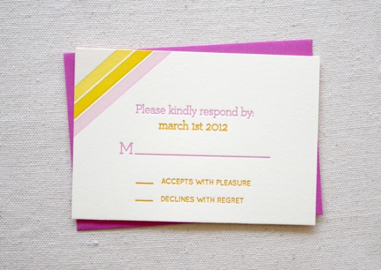
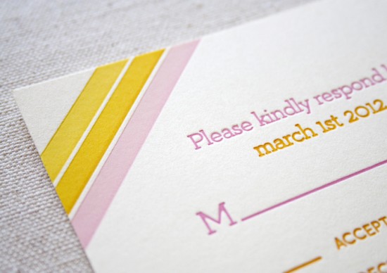
These invitations and bright, summery, and undeniably lovely.  The invitations were letterpress printed by Sara and Brad of Constellation & Co. for their design intern Sarah Paulhus.  The main invitation incorporates a letterpress technique known as overprinting – where two different ink colors are layered during the printing process to produce a new color – to create the heart design in the main invitation.  Sarah selected pretty citrus-inspired colors of pink, orange, and yellow for the entire suite.  Beautiful!
From Sara of Constellation & Co.: Our summer intern Sarah Paulhus did the design for this fun invitation suite under our art direction, and then we produced them at the end of the internship for her portfolio.
Sarah described her inspiration this way: “My summer wedding concept was inspired by citrus!  Grapefruit, oranges, lemons – they all remind me of summer afternoons.  I wanted to take advantage of the letterpress process and add a vintage-y feel to the theme, which comes off in the paper choices and ink.  Overall, I want the design to be clean and fresh, breezy, but also warm and inviting.”  We think she did a great job – not bad for her first wedding invite!
Constellation & Co. is a memÂber of the Designer Rolodex – you can see more of their beauÂtiÂful work right here!
Photo Credits: Constellation & Co.

