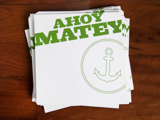
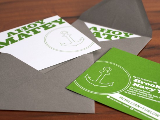
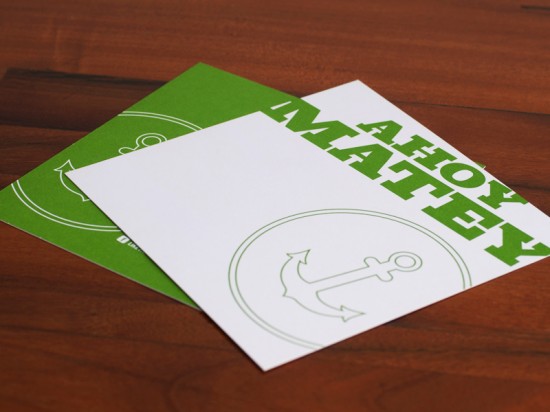
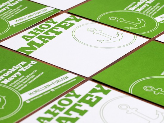
Lindsay from McMillian and Furlow, a Brooklyn-based design firm, sent over these modern announcements that she designed for the firm’s recent move to a new studio in the Brooklyn Navy Yard. Â Lindsay used the firm’s signature green and white color palette, but was inspired by the new studio location and decided to incorporate an anchor for a fun twist on a nautical theme.
From Lindsay:  When designing our moving announcements, I chose a nautical theme in an effort to honor our majestic new home in the Brooklyn Navy Yard.  Spread out over 300 acres on the Brooklyn waterfront, this modern industrial park with such rich history, emerging business, and creative energy, is a welcome environment for M+F.  I’ve always loved the anchor as an icon, whether used in logos, tattoos, t-shirts, street art, etc., so I jumped at the chance to incorporate one into the layout of our moving announcements.
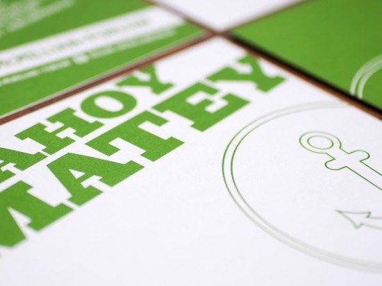
The balance between the slab serif industrial font and the delicate style of the anchor, along with the angled typography and playful vernacular, creates a cheerful design, communicating a sense of excitement and enthusiasm for our new home. Â I printed the announcements on a heavy stock bright white paper with a smooth finish, using our Pantone green, and completed the suite with charcoal gray envelopes.
Thanks Lindsay!
Photo Credits: McMillian and Furlow

Awesome work (as per usual) M&F!
I agree with Amanda. I am always excited to see the latest work from the design team at M+F
Lovely! I really like the bold graphic style, great work.