Today we have more wedding day stationery ideas to share – this time focusing on wedding menus.  Menus are one of my favorite details at a wedding, and I love seeing how the bride and groom choose to give their guests a sneak peek of the meal to come. Whether you go with a menu at each place setting or as part of the centerpiece, I’ve gathered some of the best ideas to share with you!
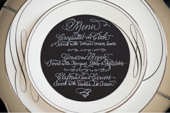
A classic round menu with beautiful calligraphy by Calligraphy Katrina. Photo by Krista Mason via Grey Likes Weddings.
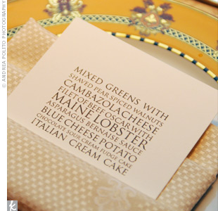
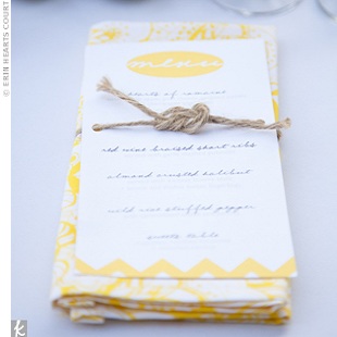
This modern type menu (left) would be so easy to DIY. Photo by Andrea Polito Photography via The Knot.  I also love the idea of tying the menu to a coordinated napkin with a piece of twine (with a love knot, of course!) for more a casual wedding (right). Photo by Erin Hearts Court via The Knot.
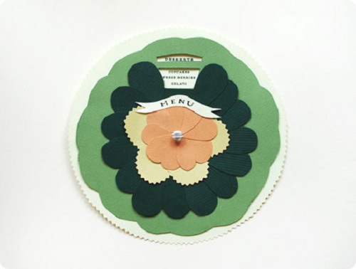
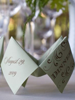
I think just about everyone around the blogosphere fell in love with Anna Bond’s DIY wedding menu wheel – and for good reason!  Details and instructions on Design Sponge.
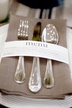
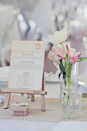
This napkin wrap menu (left) is so creative and modern! Design by Wiley Valentine, photo by Aaron Delesie via Gina DeDominici. Â And these tiny art easels are perfect for making your menu part of table’s centerpiece (right). Photo by Poppy Lane via Style Me Pretty.
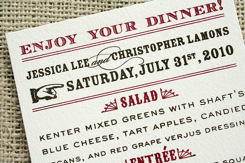
Having a western themed affair? Â Carry it throughout all of your wedding stationery for a cohesive look. Â Designed by Things Are Better with a Parrot.
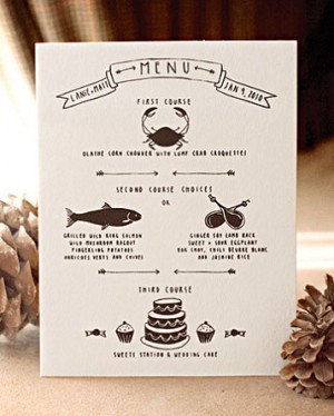
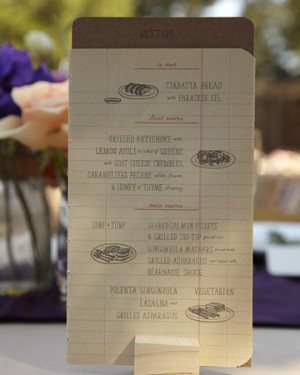
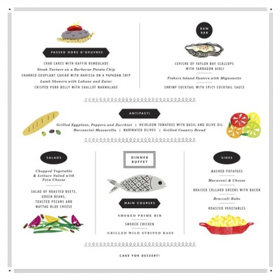
Hand-illustrated menus have become really popular and they I think they add a great personal touch. Check out these examples:
Stationery by Christine Schmidt of Yellow Owl Workshop and photo by Aaron Delesie, via MS Weddings (Left). Â Notebook sketch menu designed by the groom, Erik Marinovich, and photo by Thayer Photo, via MS Weddings (Right).
Artwork by Erin Jang via her blog, The Indigo Bunting.
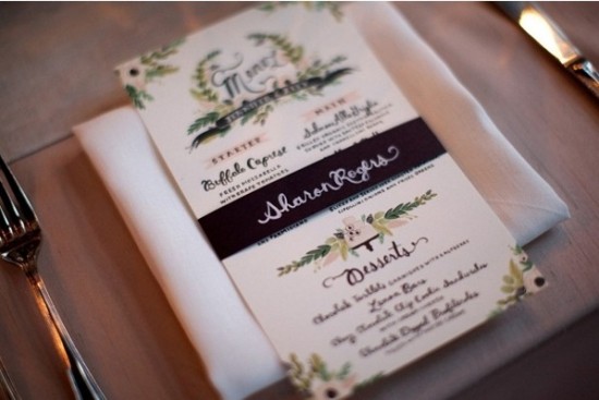
Another beautiful custom menu by Anna Bond of Rifle Paper Co. Photo by Weddings by Two via Style Me Pretty.
These two ideas are genius! An “interactive” menu photographed by Jennifer Roper via The Knot (left); and a menu that doubles as a favor bag designed by Good On Paper Design, photographed by Janae Shields, via Snippet and Ink (right).
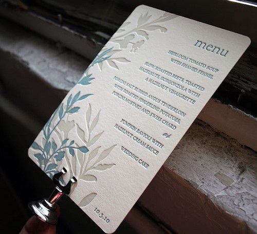
Smock has some beautiful letterpress printed menus; this is the Engadine design with one of my favorite color combinations.
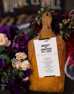
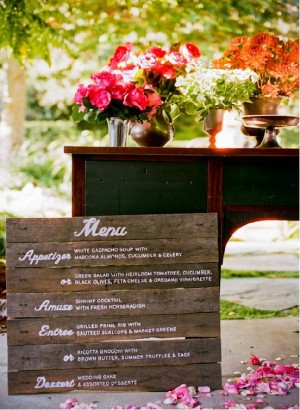
I’m in love with both of these rustic menu designs! Â Cutting board centerpiece menu designed by Blue Pool Road and photographed by Bonnie Tsang via Snippet and Ink. Â Wood menu created by Melangerie and photographed by Docuvitae via Style Me Pretty.
And while they’re not completely paper-related, how could I leave out chalkboard menus? Â Here are two examples of how they can be done in a creative and stylish way.
Colorful chalkboard menu (left)photographed by Kamp Photography via Green Wedding Shoes. Sundae chalkboard menu (right) features calligraphy by Love, Jenna, photographed by Scott Clark via 100 Layer Cake.
Thanks so much for joining me today! I hope you’ve enjoyed this round up of creative and stylish wedding menu designs, and if you missed our earlier round-ups of wedding escort and place card ideas you can find them here and here. I hope this serves as some inspiration for you as your plan your big day!
{images via their respective sources}
*Smock is a sponÂsor of Oh So BeauÂtiÂful Paper.  For more on my ediÂtoÂrÂial poliÂcies, please click here.


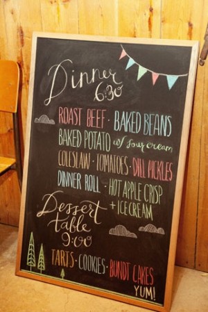
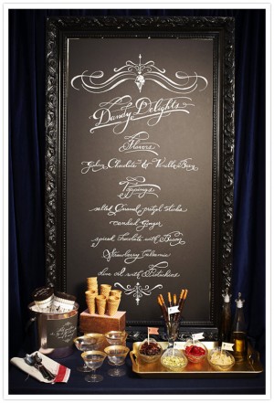
I am doing a chalkboard menu for my wedding. How in the WORLD do they get them to look so NICE?! Is it a special kind of chalk? When I do it, I can’t get the nice fine lines pictured above.. any ideas would be greatly appreciated 🙂
What a great round-up! So many beautifully executed ideas!
LOVE the napkin wrap menu & the modern type menu! So many great ones though I have no idea how I’ll pick one! Thanks Kelly for the great inspiration!
Brittany it looks like the chalk board on the right they used bistro chalk. It is more liquidy, almost like a marker, but comes off with water. This is what they use at Starbucks. You can find the chalk at Paper-Source, or even at Michaels.
those are some amazing menu ideas! thanks for sharing.
it makes me a little sad to see this lovely post. i made a menu in my style and font for our wedding and then when i sat down to dinner i saw that it was something entirely different! i guess they “couldn’t find it” and so they used all those traditional fonts and styles…
…you KNOW what i mean! lol
i love that first one, the shape and the simple palette with the amazing font…i could just eat that up!
Great collection – I especially love The Knot.
Hey Brittany, Try dipping the chalk in water before writing, we used to do that at a cafe I worked at 🙂 hope you have a fabby day
Thank you for including our black and white menu from our styled shoot!
thank you for sharing.they’re beautiful!
Try this
This shop Article 11 has some really nice chalkboards for seating plans, etc