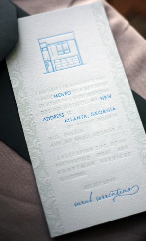
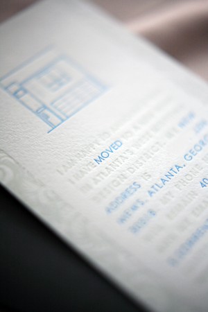
After last week’s moving announcement post, Sarah from Foglio Press sent over the letterpress moving announcements from her own recent move to a new home. They’re so clean and minimalist, which is so different from most moving announcements. Â Aren’t they pretty?
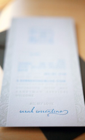
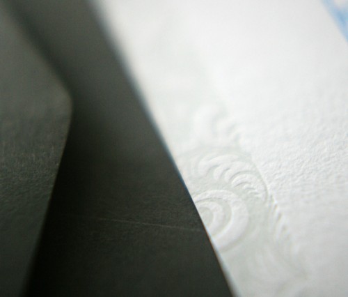
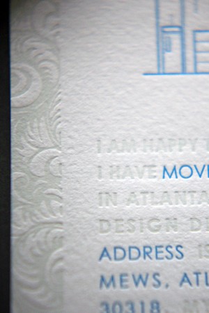
From Sarah:  I designed them and worked with Kseniya Thomas of Thomas Printers for the letterpress printing.  We used Arturo’s pale blue stock (inspired by the pale blue color of my new home!) and printed with a pop of turquoise complemented by a blind impression.  On the blind impression we used a clear varnish which actually ended up giving those design elements a bit of a greenish-blue tint against the blue paper – a happy accident which turned out really pretty and added a touch more contrast to the blind impression!
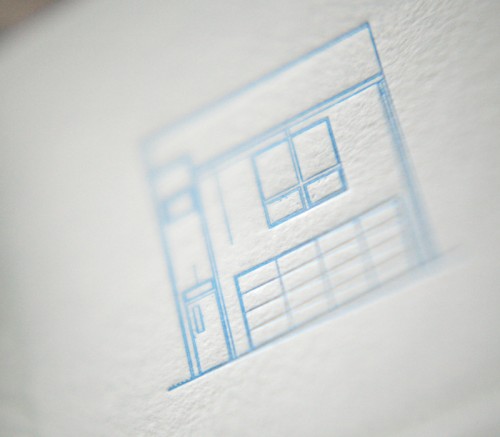
I chose a feathery, leafy pattern to go down the sides and add a little bit of a feminine touch to the otherwise minimal and modern design, and I designed the pattern so that the negative letterpress space would leave the pattern itself raised. Â The artwork at the top is the actual elevation of my home, scanned in from the floor plans.
Thanks Sarah!
Photo Credits: Foglio Press
*Thomas Printers is a sponÂsor of Oh So BeauÂtiÂful Paper; for more on my ediÂtoÂrÂial poliÂcies please click here.

Amazing! Sarah does such amazing work! She designed my wedding invitations a year ago and people still ask me about them! Beautiful, clean and inviting…makes me want to send out an announcement of some sort!
Gorgeous! I love the signature at the bottom.
Just Beautiful! Sarah’s designs are really a work of art!
Another “wow” from Foglio Press! The artistic and tasteful combination of minimalist design with traditional elements in her work is amazing and quite unusual. In a world of over-done designs and too much color, Sarah’s designs are refreshing and reflect a new elegance in stationary.
Beautiful, as usual!!
Really really really really well done. Classy, elegant, simple and understated with a hint of coup-de-sua.