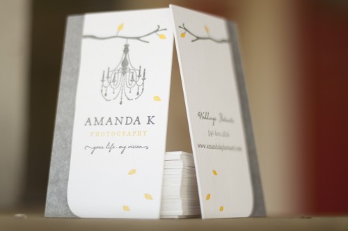
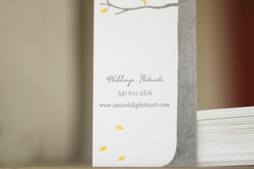
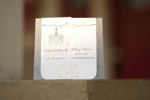
As promised, I’m back with a couple more stunning business card designs! Â First up, Matthew from A Fine Press created these lovely, rustic business cards for Amanda K Photography…
From Matthew:  Amanda brought me the branding that the amazing Jane Johnson did for her and asked me to help her realize this beautiful branding as a show-stopping business card. These are printed on both sides in two colors on Crane’s 220# Flourescent White Lettra. There’s a little bit of saltiness in the ink of the tree that, in my mind, brings just the right amount of rustic texture.
Photo Credit: Matthew Wengard | A Fine Press
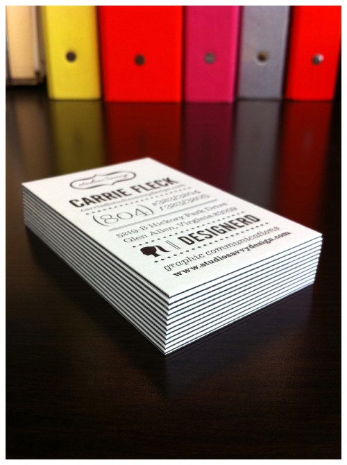
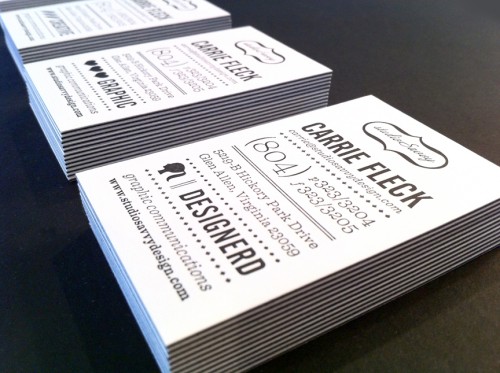
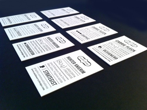
Next up, Carrie from studioSavvy sent over her super-fabulous business cards. Â I’m loving the crisp black and white of the layered paper stocks (more on that below) and the mix of complementary icons used by Carrie and her business partner…
From Carrie: The cards were printed on a privately-owned letterpress by a friend of a friend. Â We used 92# Reich Savoy for the top and bottom layers, and I had him sandwich in a 100# cover sheet of French Paper’s pop-tone in black licorice. Â Overall there are 8 cards involving 4 complimentary sets of icons for my business partner and me.
Photo Credit: studioSavvy
*A Fine Press is one of my fabulous sponsors; for more on my editorial policies, please click here.

The studio savvy business card are so awesome, I cant even conjure up words my brain just had a melt down. Can I be friends with the friend who has a friend with a letterpress?
Oh my gawd, those buisness cards are gorgeous! I love the layering of the paper, it’s given me a great idea for some future projects! Can’t wait to get on my press and try this out!
How lovely! I’ve always felt that business cards are such an important part of any branding strategy, and are too often an afterthought. These are such beautiful + unique offerings. Thank you for sharing!
These business cards are fabulous!