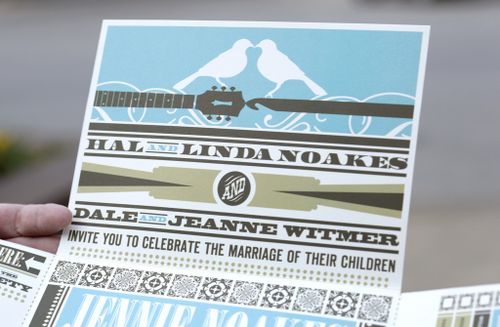
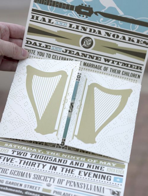
Lately I've found myself drawn to wedding invitations that combine different typefaces as the main design element, or at least one of the primary design elements. Like these fold-out poster-style wedding invitations by Jordan Gray Creative:
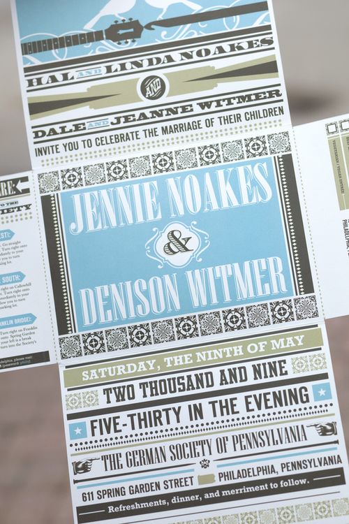
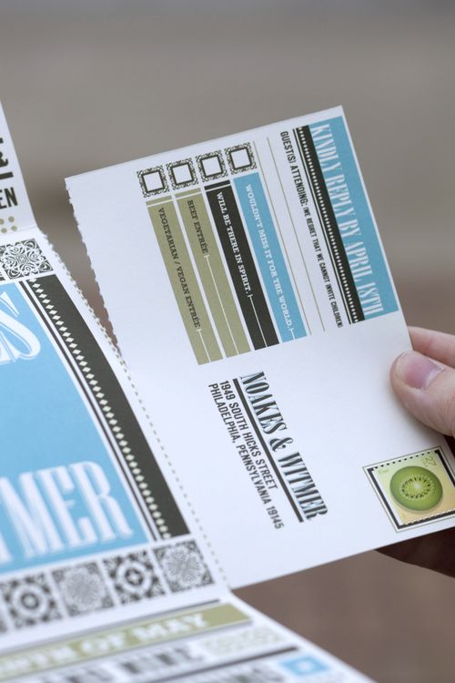
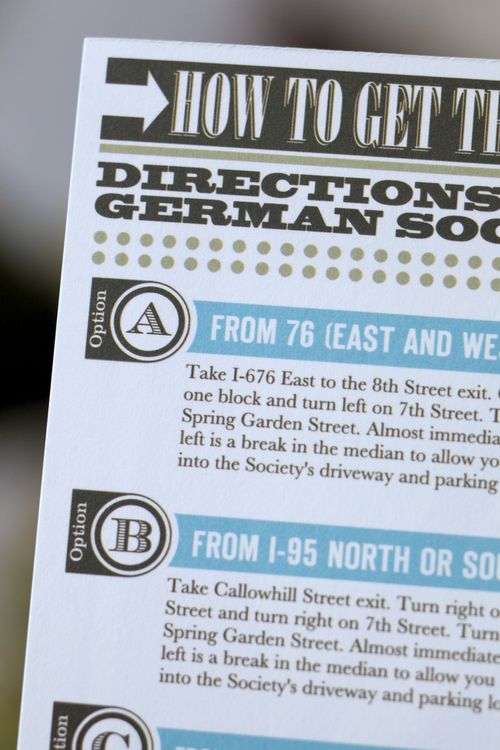
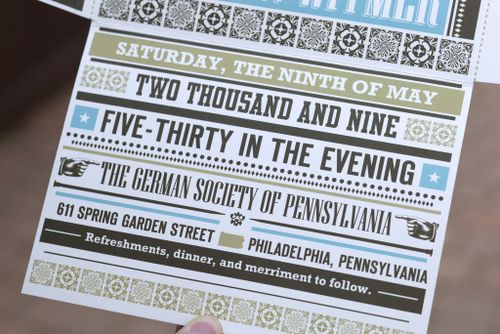
The guitar, harp, and bird details are all beautiful, but it's really the typography that gets me in this invitation design. I also love the way the directions and rsvp card fold out from the main poster of the invitation – such a cool detail! The entire invitation folds down to fit into a 5" x 7" envelope. Check out a bit more right here.
{image credits: Gabe Hopkins for Jordan Gray Creative, found via freshly blended}

All I can say about this is WOW. WOW WOW WOW.
(I never have very eloquent comments for you, Nole, because you present us with these amazing paper finds that just drop my jaw!)
those are wicked sweet<3
i love the perforated parts that guests can pull off. so neat! thanks for sharing!
Is that a crochet hook across from the guitar? Very cool!
LOVE this..its almost like newspaper headlines..very eye appealing. great job!!!
Actually, I think the entire thing folds into itself and mails as is — it is its own envelope!