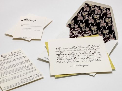
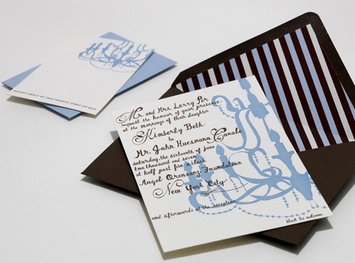
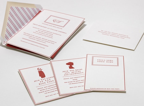
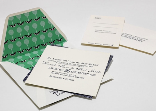
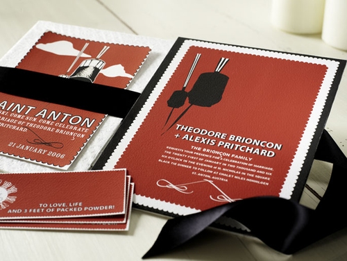
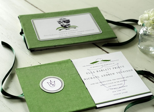
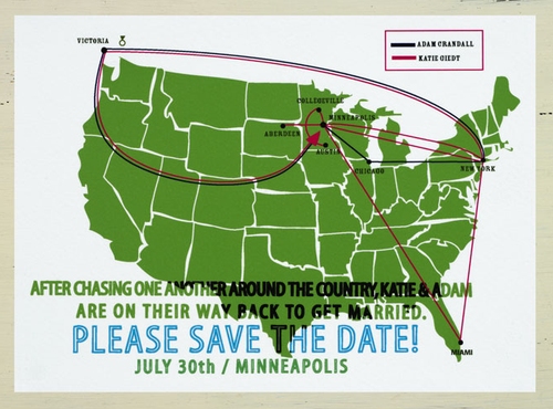
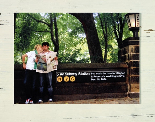
You’ve probably already seen the work of Mr. Boddington’s Studio featured in Martha Stewart Weddings and elsewhere – but their work is just so classically chic that I couldn’t help but feature it here. These are a few of my favorites from the wedding and Save the Date portfolio:
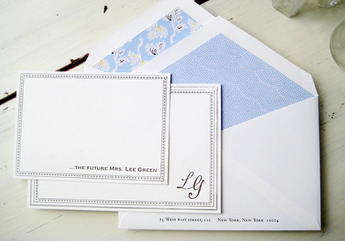
View the full collection right here. And although not entirely wedding related, isn’t this custom stationery set just oh so sweet?

I love that green crest card– fabulous!
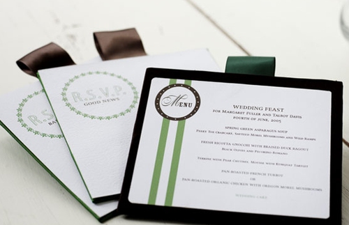
I love that green crest card– fabulous!
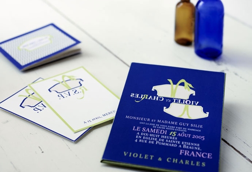
I love the font type of the top two…very whimsical. The green crest card is so unique and regal looking.
You always bring us such beautiful things! I love your blog (and recently gave you props).
Love the company. All the envelope linings are so sweet.
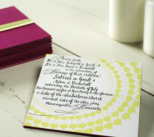
The white square invitation with black writing and lime green circular pattern is very cool. Very different- has some style and an arty flare to it. Would love to see the entire set!
The white square invitation with black writing and lime green circular pattern is very cool. Very different- has some style and an arty flare to it. Would love to see the entire set!
The white square invitation with black writing and lime green circular pattern is very cool. Very different- has some style and an arty flare to it. Would love to see the entire set!
Is there anything sweeter than a lined envelope? I’m going to say no.
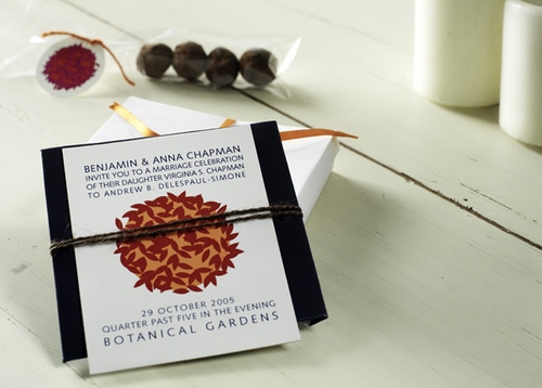
Oh! Number 2 down (the Chandelier) is from MY WEDDING! We worked with the owner, Rebecca of Mr. Boddington’s to custom design it.
She was incredible to work with and it perfectly fit our 125 year old space – complete with homage to the old chandeliers in it.
Check out my blog header at http://www.inspiredgoodness.typepad.com to see it!