Behind the Stationery: Banquet Workshop

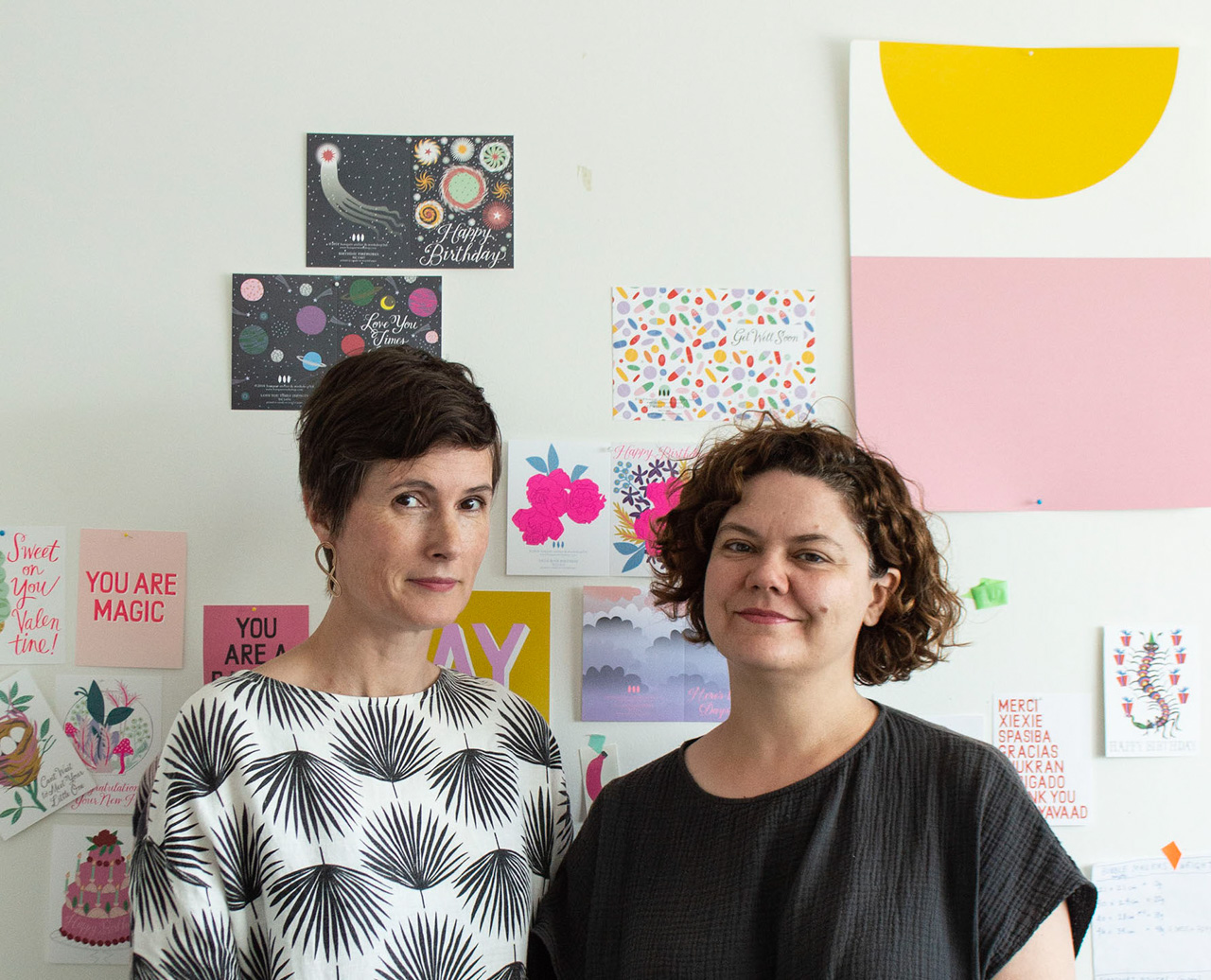
For our next installment of Behind the Stationery, we’re headed to Vancouver to talk with Sarah and Tammy of Banquet Workshop! A mainstay in the stationery world for 8 years and counting, Banquet Workshop’s graphic illustrations are bright and bold (and never quiet) have been translated into everything from art prints and everyday stationery to clothing and jewelry. Sharing about their lives before Banquet Workshop, the strong influences in their work and the importance of staying flexible, here is Sarah and Tammy! —Megan Soh
Behind the Stationery: Banquet Workshop

Tammy: Before Sarah and I started working on Banquet Workshop together I was working in development for a television production company whose main focus was documentary and reality-type television. Think adventure cooking shows, family swaps, life a fighter pilot as well as documentaries that tackle issues around homelessness, political prisoners, civil rights cold cases and local food movements. It was definitely interesting and fun work, but once I had my first child I realized that a more flexible job would be in my family’s best interest. I also always loved being my friend’s hypewoman and had a love of stationery since I was young. It seemed like a natural jump to work with Sarah on Banquet where I can combine both these things!

Sarah: I had worked as an artist and in both commercial and not-for-profit galleries, but had always done design and hand-work on the side. Banquet started with our Sea Animals of the Pacific Northwest screen print, and from there it was a natural segue to partner with Tammy and move into stationery.

We met through a friend when Tammy moved back to Vancouver from living in Montreal and Sarah was working at an artist run centre. We had many (too many!) ideas that we wanted to work on including sun suits for kids, becoming hand bag designers, making kid’s craft kits (which we did do!), but Sarah had already been making prints and cards. We realized quickly that we could build something bigger with making paper products that could potentially support our families. That said, we still freelanced for the first four years or so of starting our business – Sarah doing design and Tammy working in TV.
Behind the Stationery: Banquet Workshop

We are located in beautiful Vancouver on the west coast of Canada where we are surrounded by oceans and mountains. Our location definitely informs our work. When you are 20 minutes to the beach and forest there is definitely no way to avoid the influence. We also have a strong community of creative women that are forever discussing business, art, fashion, colour theory as well as the politics of the day, and they really motivate us as mothers, creatives, and entrepreneurs.

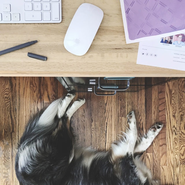
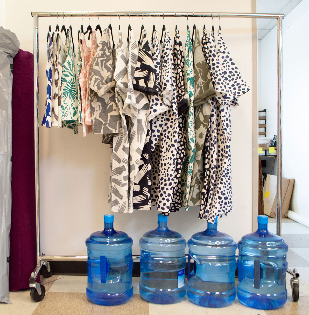
We have a good sized studio with a view of a luxury car dealership and the mountains, where we pack and ship our orders. Tammy works here mainly with our awesome employees. A lot of the magic happens at Sarah’s house in her home-based studio where she can focus on the creative inspired by her garden, a vast collection of vintage books and textiles, and fueled by too much coffee.
Behind the Stationery: Banquet Workshop

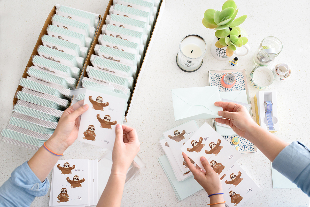
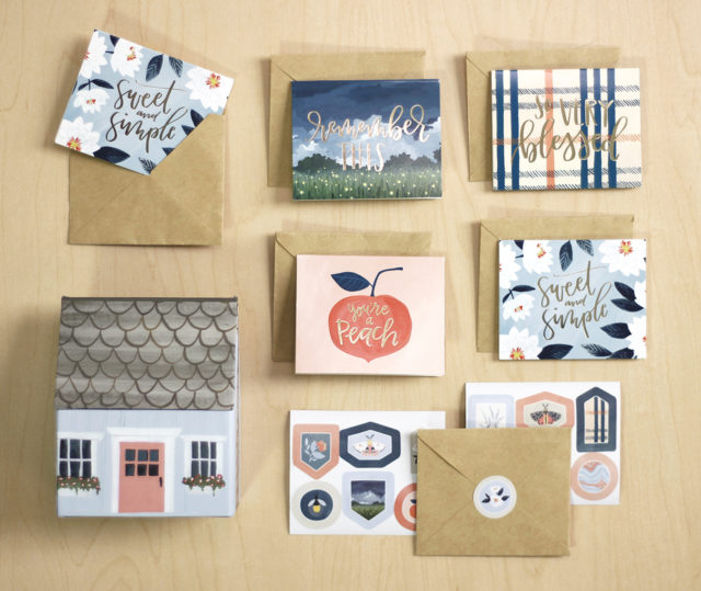
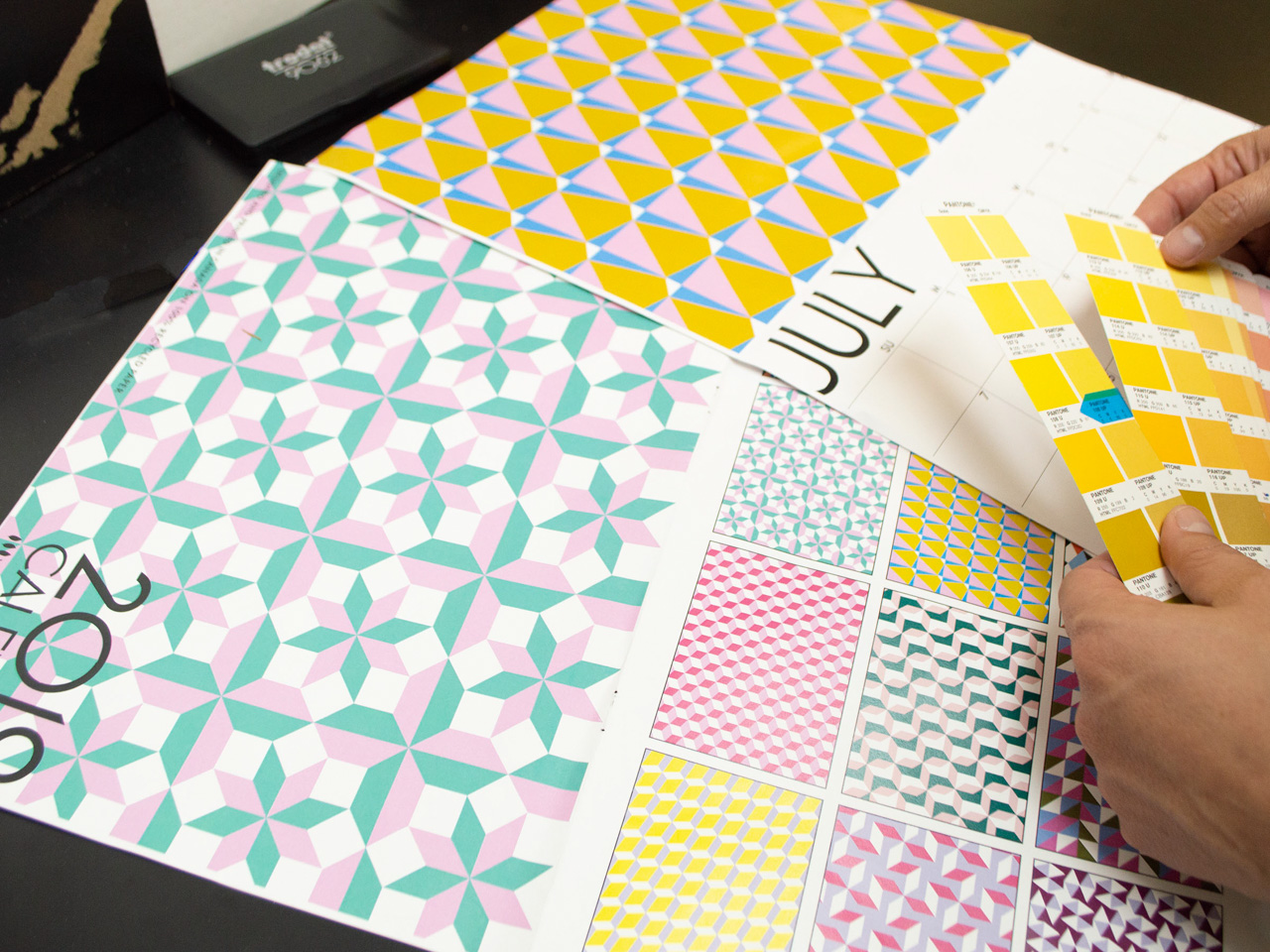
We print a few different methods: screen printing for posters and yardage, offset printing for cards, and letterpress for our garlands/ gift tags. All of our printers are truly passionate about what they do and we love the collaborative production process.

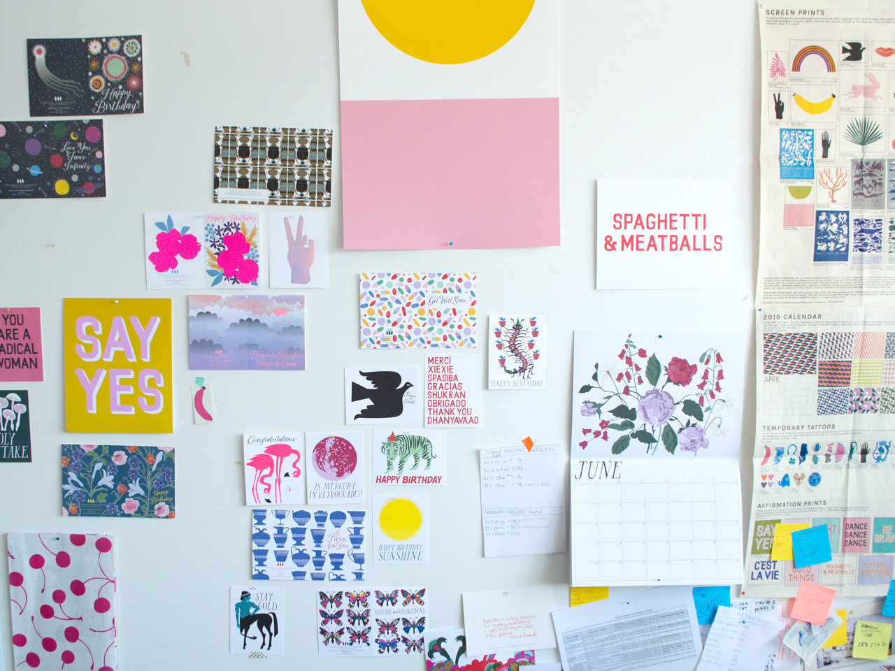
If we had to say what makes us unique (such a hard question for two humble Canadians to answer!) it would be our flair for colour and a distinct graphic style. We are also able to charge ahead when inspiration hits and are not often tied to trends. We really do what we want to do and are always looking to make our business more sustainable and interesting. We have now been in business for over 8 years and haven’t run out of new ideas that we want to do! The list grows longer by the day.
Behind the Stationery: Banquet Workshop

Every day is different for each of us but the main things that need to happen always are new products and sales!!! All the other tasks lead back to this—whether it’s reaching out to new retailers or making sketches for new products. We are always trying to figure out if what we want to make fits into the brand. At the heart of everything we do is a desire to put quality goods into the world that are useful, bring happiness, and make people feel good.

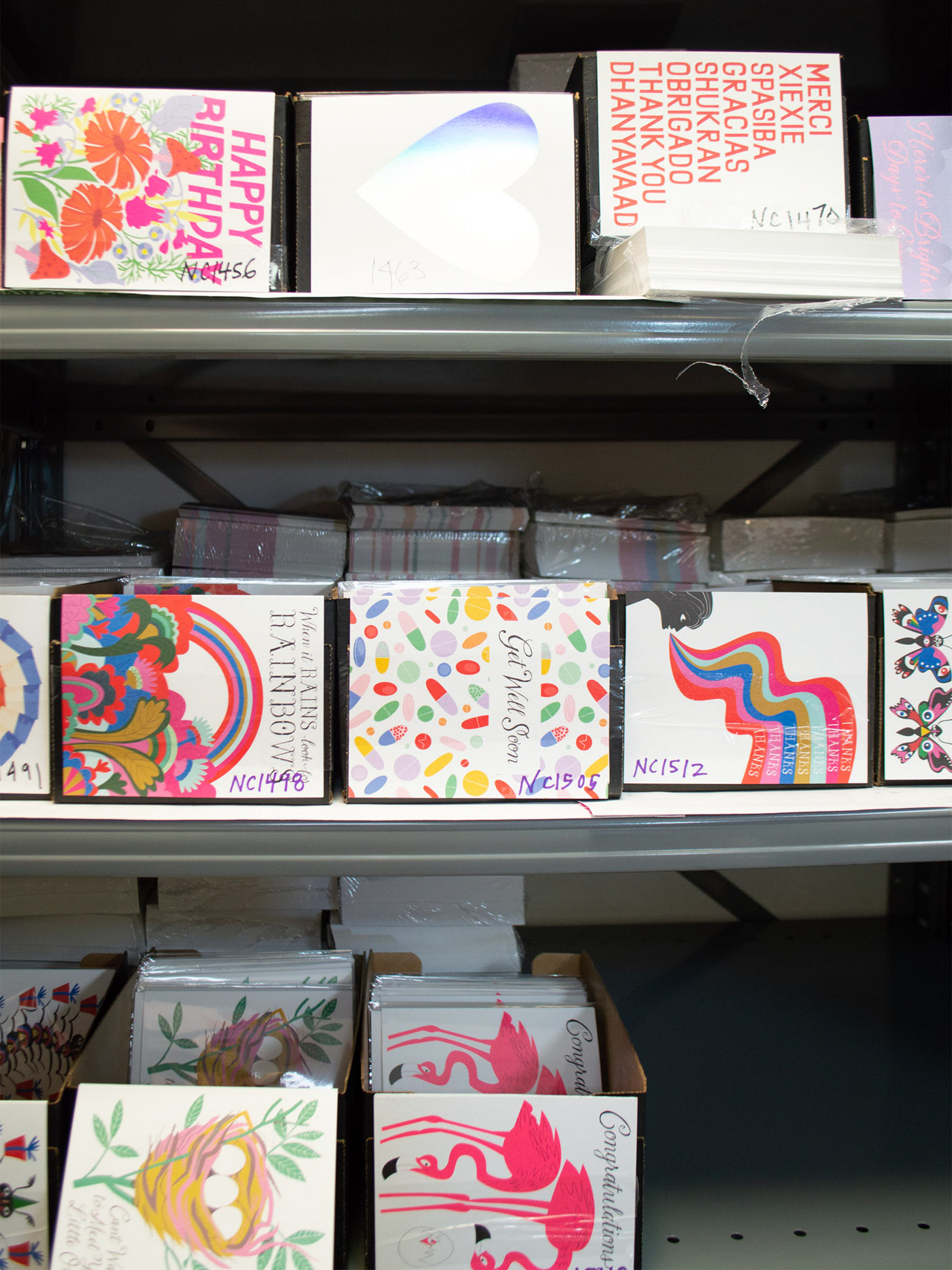
We do not really have a daily/weekly schedule but we talk about it all the time! We do need to have Christmas cards ready in May and are tied to the yearly holiday and tradeshow schedule but I think having variety and fluidity is the key for us being able to be flexible.
Behind the Stationery: Banquet Workshop

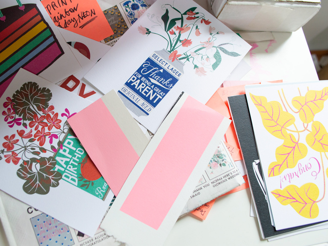
Part of the creative process is always looking and being open to inspiration no matter where we are. Some of our best sellers have come from a hand-lettered sign spotted at the mechanics, a hilarious anecdote from one of our kids, or an amazing new-to-us houseplant at a friend’s house. Getting outdoors is everything, but then actual libraries are of course our happy place, and colour is always a favourite. It’s amazing what a hit of neon pink can do!
Behind the Stationery: Banquet Workshop

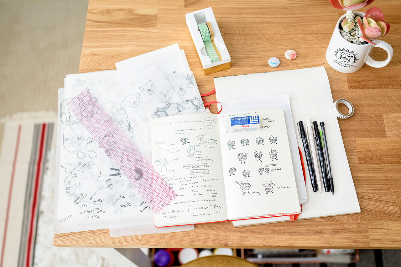
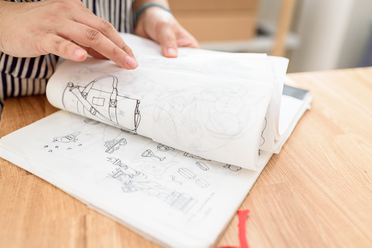
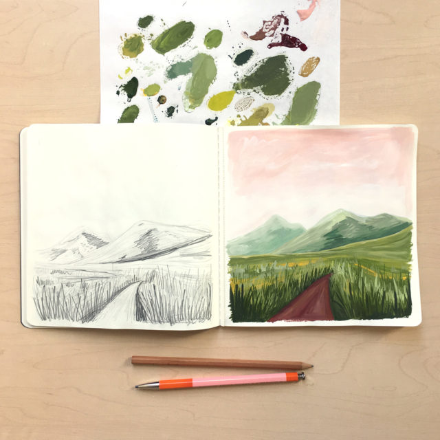
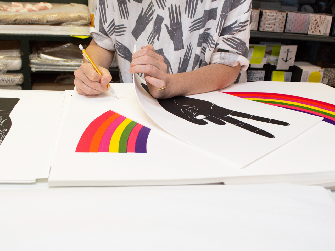
Then it’s a lot of drawing: because we work mostly with vector-graphics, we draw a lot by hand as the initial process and to try and keep things warm. Even with the computer we try to keep that loose feel, quirks and all. All of our type is hand drawn too, with fonts kept as libraries within Illustrator. Colour is where we really get to play, with a specific palette we go back to again and again, dropping in new favourites as we see fit.
Behind the Stationery: Banquet Workshop

Jumping around is an important part of the process too. Sometimes we need to focus on finding a new way to say happy birthday (not so easy!), where at other times we get to work on repeat patterns and styling an entire table setting with our linens, or doing special projects like a recent 4 x 22 metre banner for the Vancouver Board of Parks and Recreation featuring eight specific water-birds spotted in False Creek, a central Vancouver waterway. Variety is what keeps the design process interesting.

Photos courtesy of Banquet Workshop.

Want to be featured in the Behind the Stationery column? Reach out to Megan at megan [at] ohsobeautifulpaper [dot] com for more details.

Inspiring Calligraphers: Manayunk Calligraphy

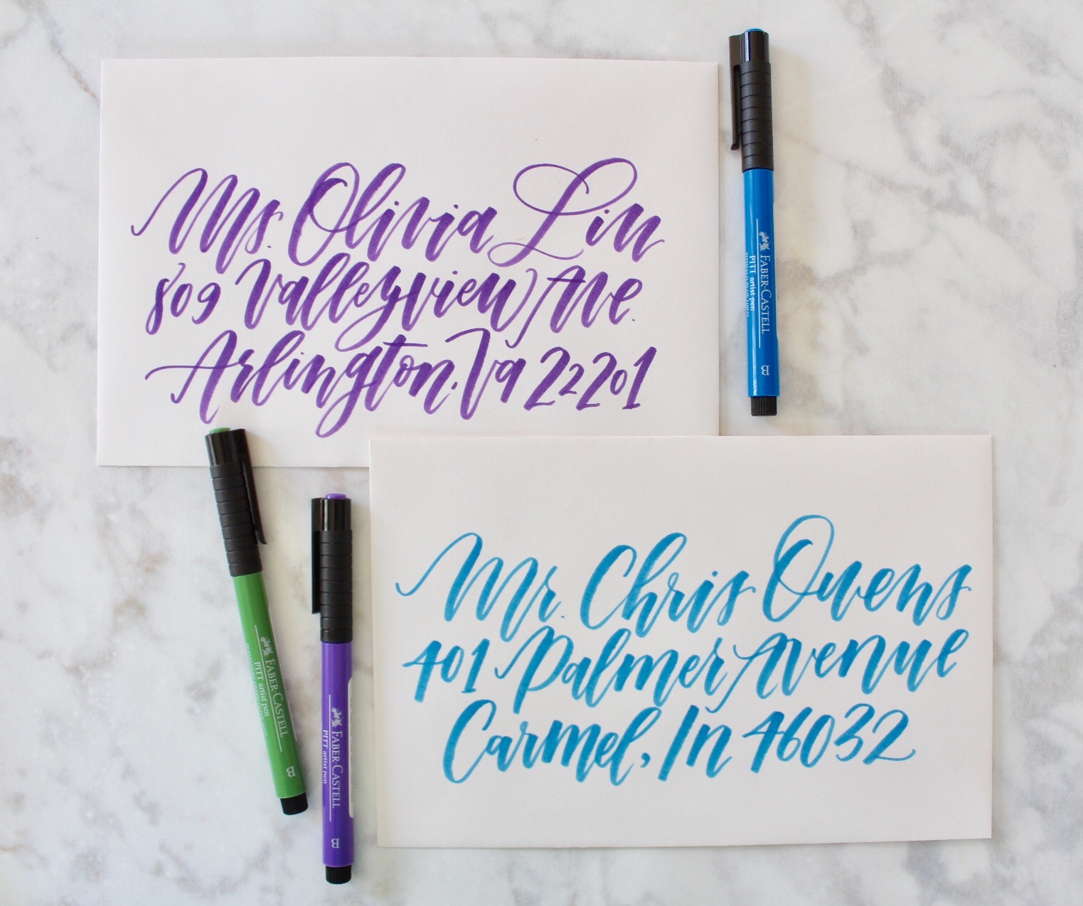
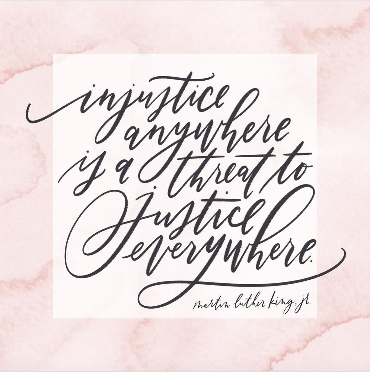
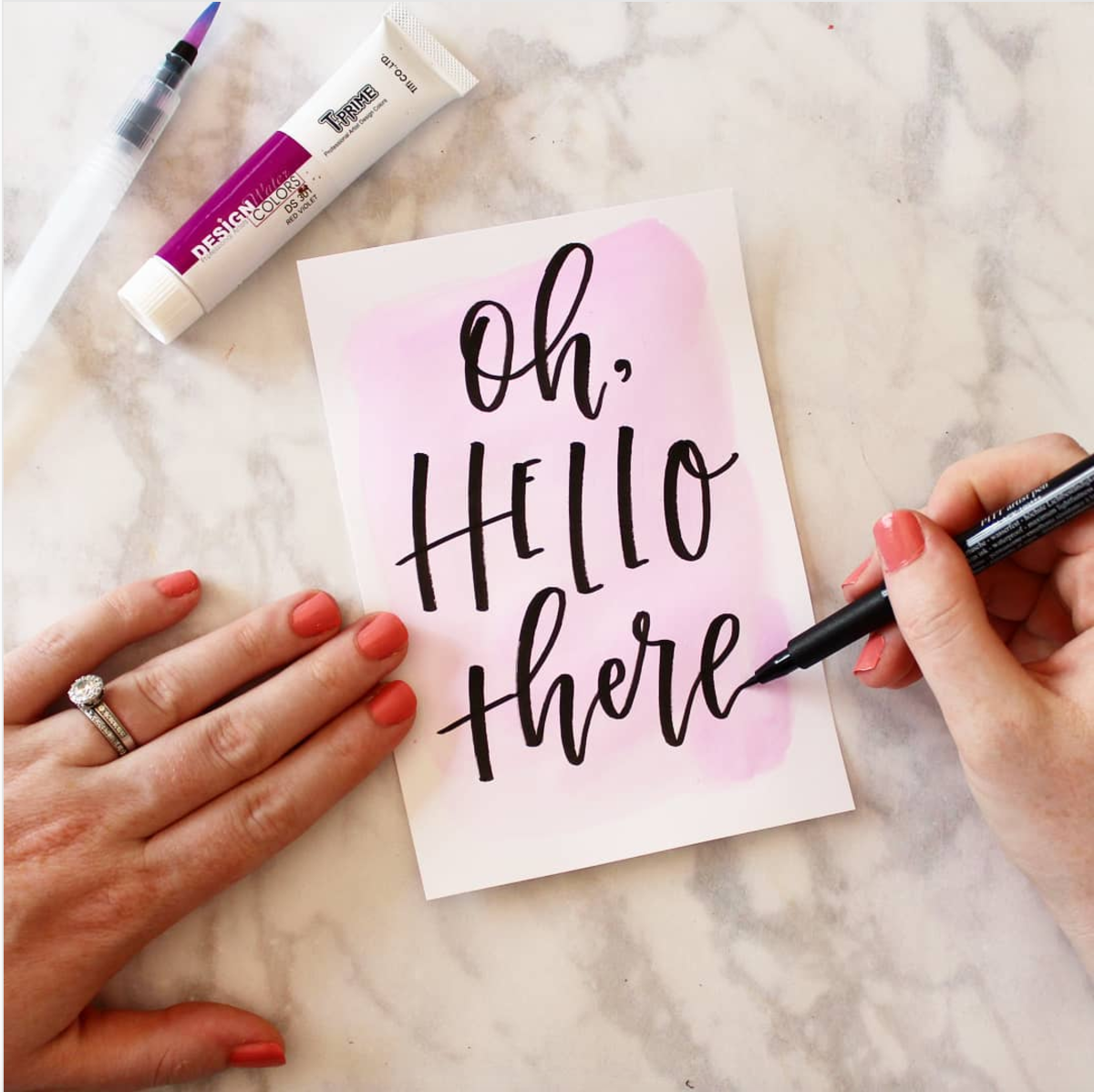
Hey everyone! I’m honored to share the work here of a new favorite calligrapher, Kim Shrack of Manayunk Calligraphy. I love that Kim’s work has dabbled in using calligraphy for the everyday, calligraphy for special moments, calligraphy for super fun projects (hello, a Bachelorette nursery!), and calligraphy to give voice to a cause she feels passionate about. Let’s dive in! Jen

Inspiring Calligraphers: Manayunk Calligraphy

Inspiring Calligraphers: Manayunk Calligraphy

Inspiring Calligraphers: Manayunk Calligraphy

Inspiring Calligraphers: Manayunk Calligraphy

Photo Credit: Molly Carr Photography

Bachelorette fans, take note…

Inspiring Calligraphers: Manayunk Calligraphy

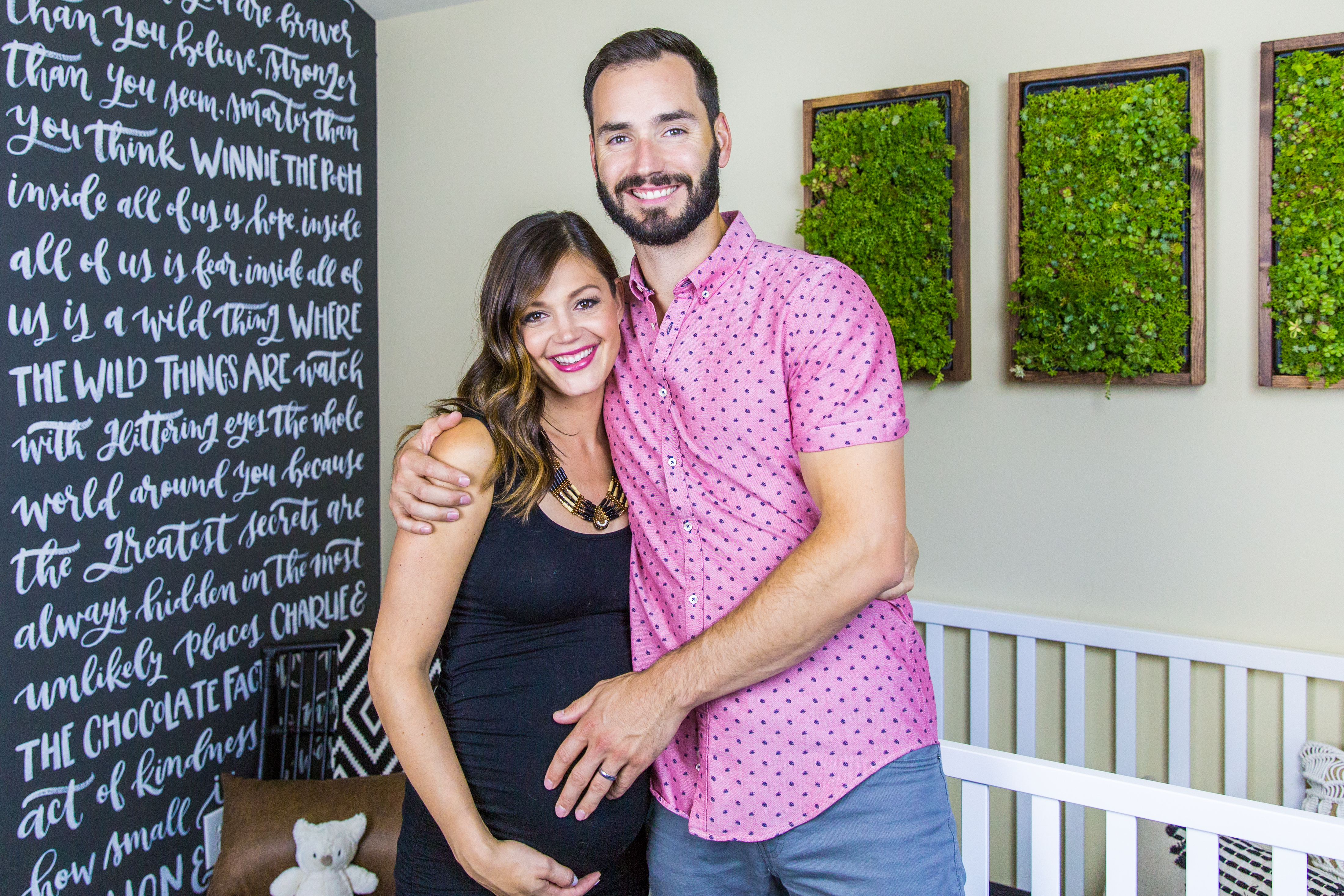
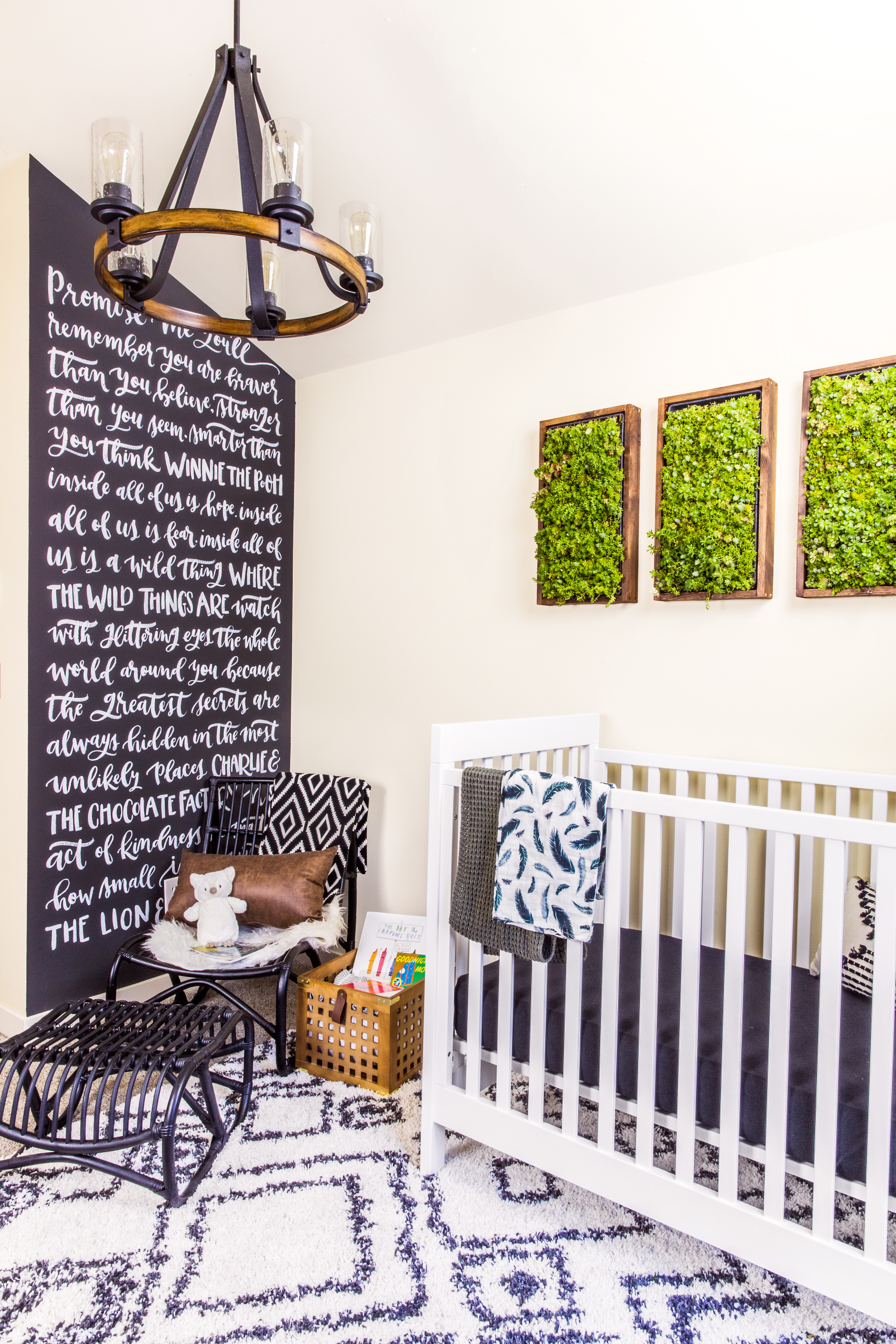
Here’s a peek at one of Kim’s favorite projects to work on! She created a calligraphy mural for none other than the former Bachelorette Desiree Siegfried (née Hartsock) and her husband Chris. Monica Mangin from The Weekender was tasked with designing a Pacific Northwest-style nursery for the couple, and Kim was pulled in to create an accent wall. Kim shares, “I pulled quotes from some of my favorite children’s books for the design. What I loved about this project is the idea that as their baby grows and learns to read, he’ll be surrounded by those words everyday – words that encourage him to be strong, kind and brave. It’s such a huge honor to be a small part of that.”

Inspiring Calligraphers: Manayunk Calligraphy

Photo Credits for nursery: Kyle Powers for Us Weekly Magazine.

“I absolutely love doing murals!” says Kim.

Inspiring Calligraphers: Manayunk Calligraphy

Inspiring Calligraphers: Manayunk Calligraphy

Inspiring Calligraphers: Manayunk Calligraphy

Photo Credits: Stacy Able

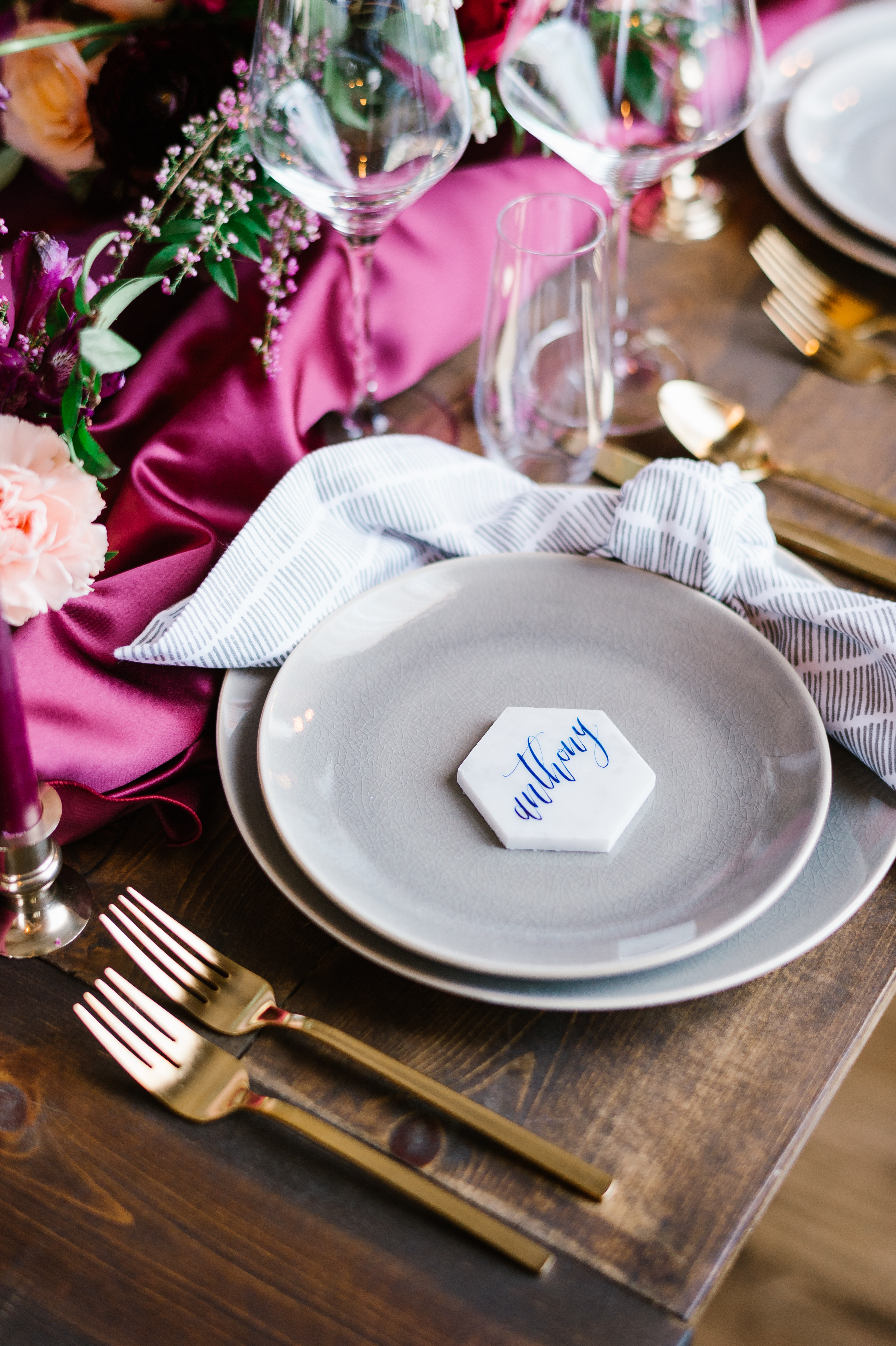
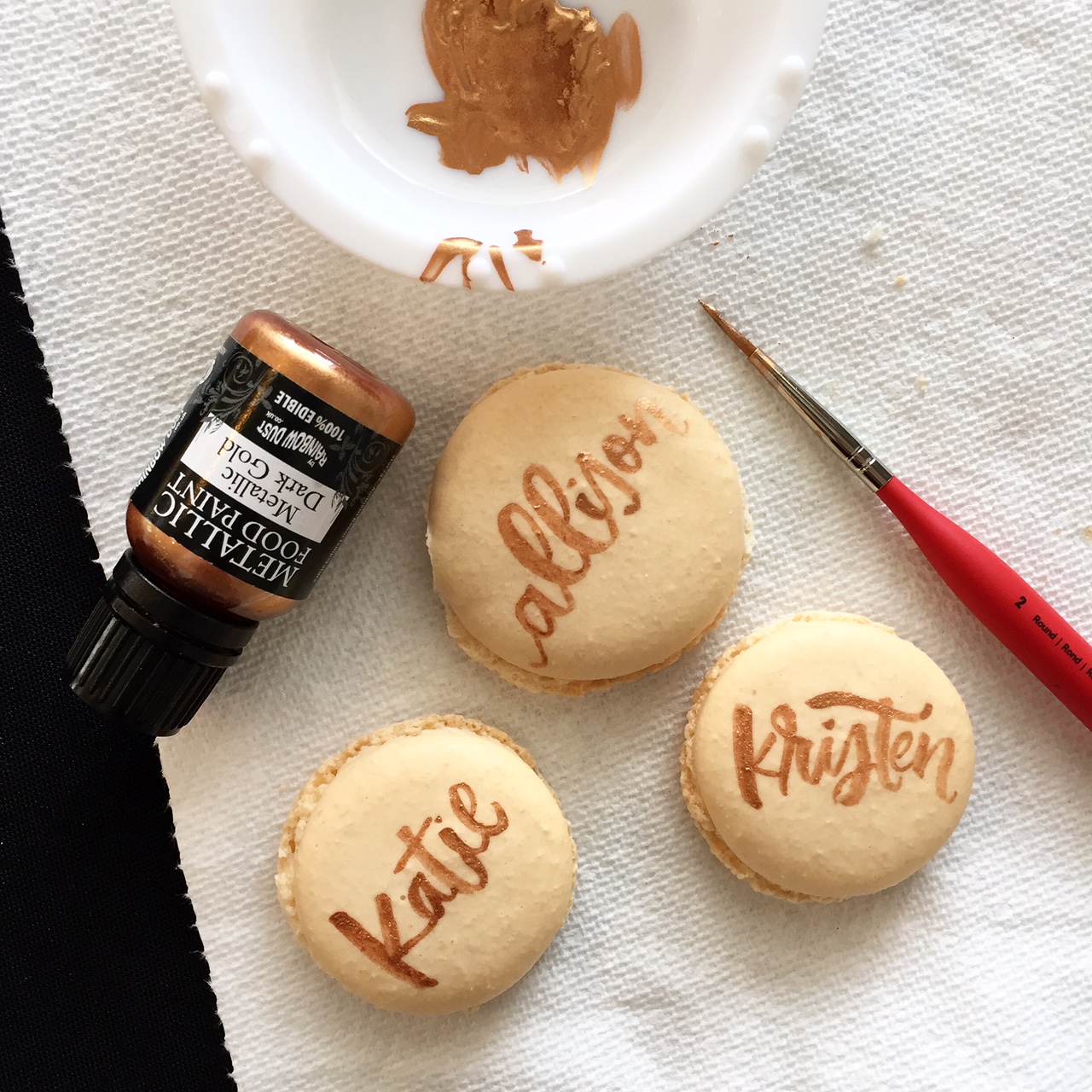
On creating lettering work beyond paper, Kim shares: I love working on non-paper surfaces. I’ve done lots of non-traditional place cards, so calligraphy on materials like marble, slate, etc. But by far my favorite non-paper place cards have also been the sweetest – macarons! It’s a very delicate process involving teeny tiny brushes, luster dust and a steady head – but the results are oh so lovely.

Inspiring Calligraphers: Manayunk Calligraphy

Inspiring Calligraphers: Manayunk Calligraphy

Photo Credits: Gabrielle Cheikh

Inspiring Calligraphers: Manayunk Calligraphy

In addition to all the lettering work Kim produces, she also teaches calligraphy courses on Skillshare. Her courses have been named Staff Picks (a designation for the top 1% of all classes) and she’s been named a Teacher to Watch (go Kim!). The two available classes are Modern Brush Calligraphy for Beginners and Develop Your Own Calligraphy Style.

Inspiring Calligraphers: Manayunk Calligraphy

Inspiring Calligraphers: Manayunk Calligraphy

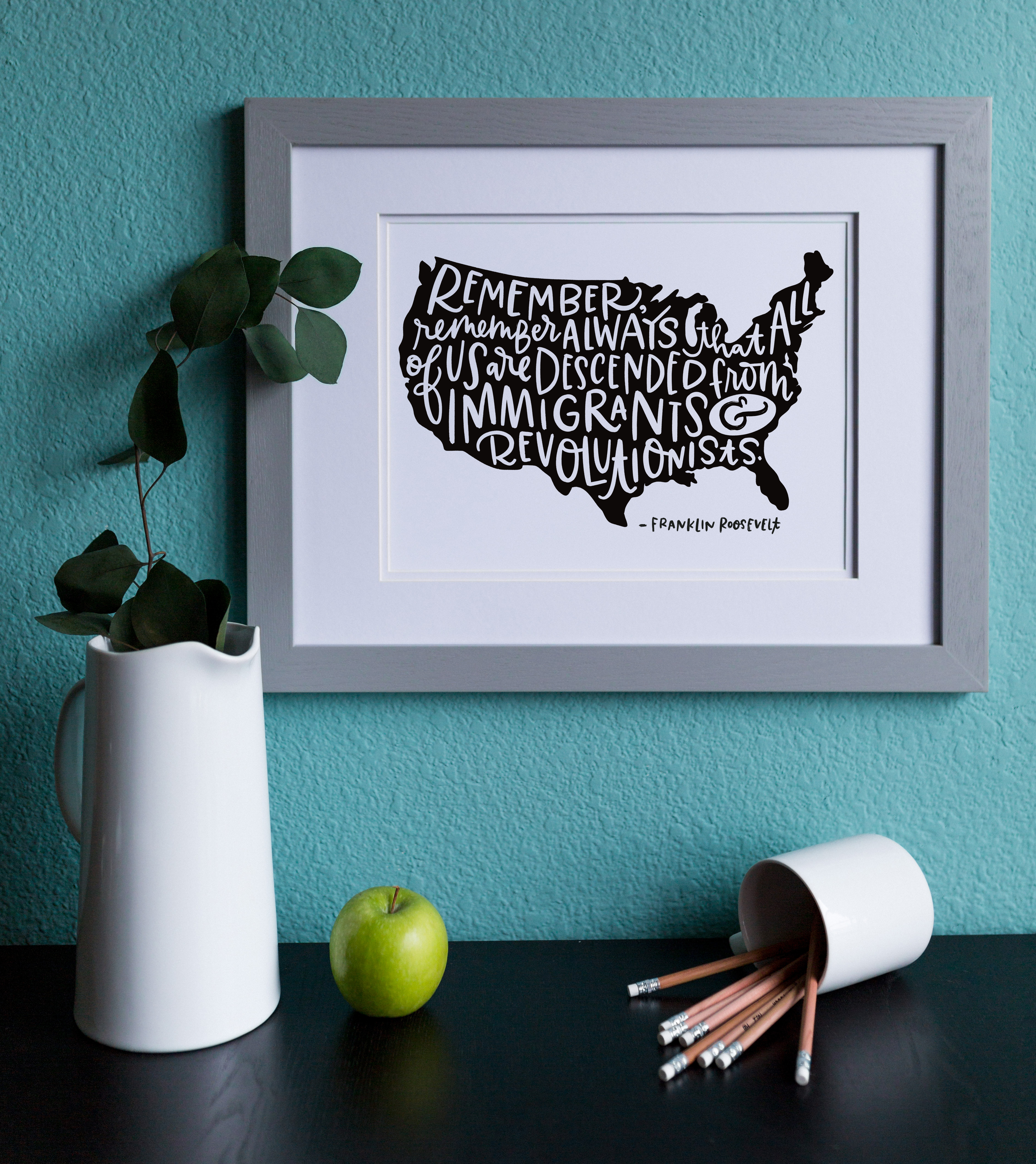
Finally, Kim created this print (and there are tote bags) benefitting RAICES. Here’s what she had to say about this fundraising project and using her voice in this way as a creative artist who’s also a business owner.

Kim shares: Like an overwhelming number of people, I was very affected by the news that families who were entering the US seeking asylum were separated at the border. As an American, it disturbed me. As a new mother, it ripped out my heart. I researched organizations that were working to reunite families, and that’s how I found the Refugee and Immigrant Center for Education and Legal Services, or RAICES. I learned that those parents who were detained were unable to be reunited with their children until they could pay their full bond — which is a minimum of $1,500. So I created a special collection of designs to benefit RAICES. 100% of the profits from the sale of these items when to RAICES, and I am thrilled to say that through the sale of these items on my website and in-person fundraisers by the Glenside Women for Progress, and a direct fundraiser on Facebook, we were able to raise $1,537 — enough to bail one person from detention and reunite a family.

Common sense says that it’s not smart to mix business and politics. I get that. Posting on this issue led directly to a loss of followers and subscribers. But here’s the thing: human rights are not political. Period. As human beings, we have an obligation to one another. When you see something that isn’t right, you can’t just “stay out of it.” Speak up. Donate your time or your money or both. Someday, my daughter, who is 9 months old, will learn about this period of American history in school. When she comes home and asks my husband and I what we did, I’m not going to say that we stayed out of it. That is was impolite to talk about such things. That is was bad for business. Instead, I’m going to tell her that I used the skills I had to try and do something. And more than that, I’m going to tell her that thanks to a group of people whose only commonality is that they like calligraphy, we were able to reunite a family. That’s worth more than any follower.

A big thank you to Kim for sharing her work!

Photo Credits, except where noted: Manayunk Calligraphy

Want to be featured in our calligraphy column? Reach out to us at submissions [at] ohsobeautifulpaper [dot] com with the subject line “Calligraphy Feature” for more details!

Behind the Stationery: ilootpaperie

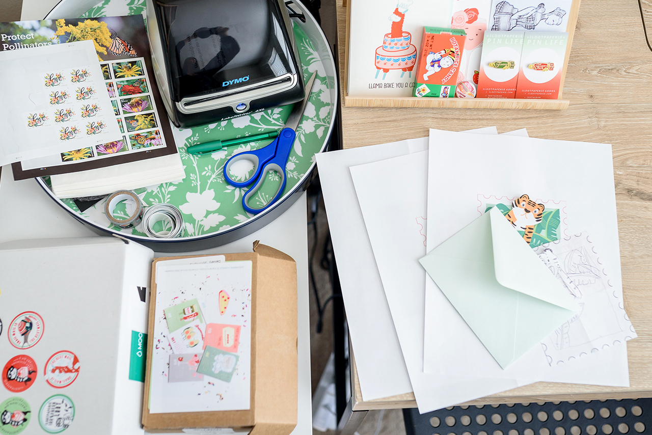
We’re bringing you a sister act on today’s installment of Behind the Stationery! Alice and Doris of ilootpaperie recently moved into a dedicated space this year in Pasadena, California (congrats!) and their greeting card and pin designs are full of vibrant colors and puns galore. They’re here to share their story—from their experience in finding a local printer to outsource their printing needs to the different methods they use to sketch and render designs—take it away, ladies! —Megan Soh

Behind the Stationery: ilootpaperie

From Alice: Our foray into the stationery world had its beginnings, funnily enough, in wedding invitations for some of our close friends. We found quickly that the part of the process that we were drawn to the most was designing the accompanying thank you cards we included with the invitations as part of our gift to the couple. This realization shaped the beginnings of Ilootpaperie when we launched in December of 2010 as a passion project with just six designs on Etsy. This all took place before the advent of the phenomenal of the side hustle, so we simply thought of it as taking steps to get an idea Doris and I had daydreamed about off the ground in case she moved to London for a position she had been applying for at her day job in the finance industry.

During this time, I was working in marketing and design for a shoe design company. After making it through several rounds of layoffs due to company restructures, at the end of August 2013, I was laid off and this set off an unexpected course of events in which we eventually decided I would apply my full effort to help grow the company.

With the advice of our fellow entrepreneurial creatives in mind — that few part-time projects can take off without full-time attention applied to it — we embarked on this ever-challenging but also ever-fulfilling endeavor. We have found ourselves to be a small part of a very special industry filled with fantastically talented kindred spirits that we have the honor of working amongst and calling our friends. Doris continues to work at her day job, so we often joke there is 1 and 1/4 of us getting things done!

Behind the Stationery: ilootpaperie

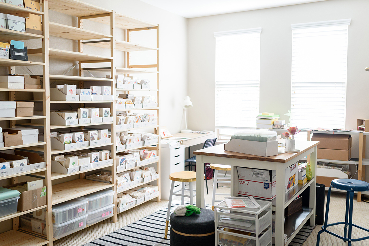
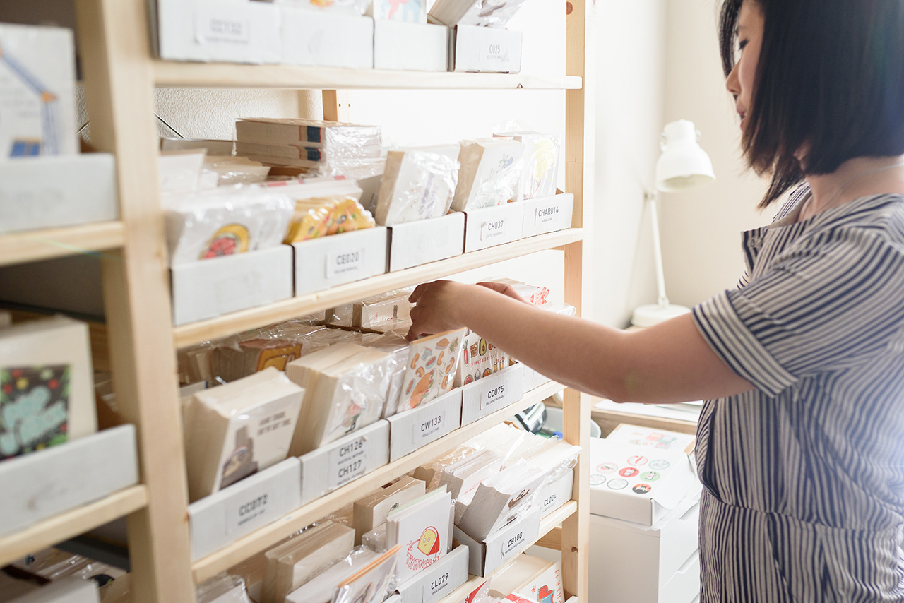
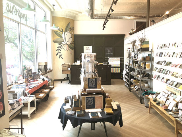
We are based out of Pasadena, California and just moved into a new place this past January. This move was a huge deal for us because for the first time since Ilootpaperie sprung into existence, our little endeavor finally has its own dedicated space. We converted the master bedroom into our working studio and there are two tall windows that let in a flood of beautiful natural light during the day—oh! and we installed an extensive shelving system along one of the walls to hold our inventory, something we’ve dreamt of for years.

Behind the Stationery: ilootpaperie

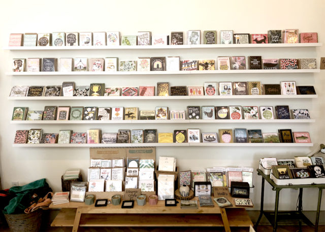
Our first real card shelves were handmade by Joel Kvernmo of the awesome Iron Curtain Press (it was their previous shelving) and it was a milestone we hold dear because those shelves made us feel like a legit card company. Rosanna’s encouraging words when we met her to pick up the shelves from their beautiful shop Shorthand stayed in our minds as we prepped for our first trade show. Those first shelves dominated the living room of Doris’ tiny studio apartment.

Behind the Stationery: ilootpaperie

So the idea of this converted studio space has been quite thrilling as we’ve always been about scrappily making it work (card inventory thoroughly infiltrated both our living rooms by time we had moved) and we can’t wait to unpack in the next couple months to create a more centralized studio area with the goal of finding more opportunities to streamline our day-to-day processes. We’ve had to put unpacking on hold to focus on prepping for the National Stationery Show (which took place at the end of May), fulfilling NSS orders, and then NSS show unpacking! As you can see, we’re in a bit of a transitional state. It can be challenging and frustrating at times, but we are learning to be patient with ourselves, to stay focused on current tasks and look to new possibilities just on the horizon to stay motivated as we settle into the new space.

Behind the Stationery: ilootpaperie

From Doris: In 2015, when we started to seriously consider attending the National Stationery Show in New York, we began researching to outsource the printing and production of our designs. We wanted to educate ourselves on the how-to’s of scaling up should the need arise following the trade show — it was a process of reaching out and learning about the various printing capabilities of printing companies near and far from us, and this definitely took some persistence. We’ve always had a subtle linen texture in the paper stock we used for the line even when we were printing in-house so we wanted to be able to carry that textural brand element forward. In the end, one of the local Pasadena printers (top notch!) with diligent effort was finally able to source a premium linen paper stock that we loved, and the pop of the colors they were able to achieve for the samples we printed for NSS sealed the deal, so voilà! Here we are.

Behind the Stationery: ilootpaperie

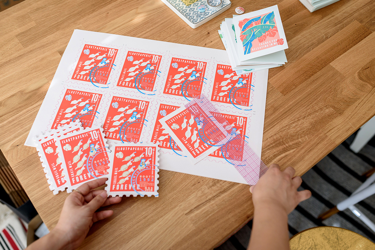
Due to the colorful nature of our designs, our collection is printed on an HP Indigo digital press on the beautiful premium linen stock in white or natural white depending on the design. Certain designs will then go to our second printer, who is also located in Pasadena and specializes in die cutting, foil printing, embossing and debossing. We love being able to build concepts around new design elements we are excited to incorporate be it a new foil color or a technique new to the line (i.e. embossing, debossing). From the printers, everything comes back full circle to us for packing, packaging, finishing and fulfillment.

Being able to work closely with our local printers in Pasadena has been integral to our growth and we feel these strong working relationships with our printing partners have helped us to be able to sustain the order volumes and levels that we had dreamed to achieve when we began attending the National Stationery Show.

Behind the Stationery: ilootpaperie

Doris: We believe what really shines through in our cards and sets us apart is how much fun we have when we are coming up with our card designs. There are lots of laughs involved behind the concepts that are full of humor and heart. Even the vetoed concepts tend to make at least one of us giggle while we try to sell it to the other person. We aim to have a good time with it and believe that that’s what makes our products memorable; and that this shared laughter and connection extends beyond just the two of us is a gift.

Behind the Stationery: ilootpaperie

Doris: Each day is different depending on the deadlines that we’re working on so there isn’t really a typical work day—our days are generally filled with pulling items and packing them up for retail and wholesale orders, working with our various printers/vendors to submit new orders for new designs and restocking orders to keep our inventory stocked! Concepts for new cards, pins, and products is an ongoing conversation that happens throughout all of this.

Like many other small business owners, we struggle to find enough time in the day to get everything that we would like to get done completed as there’s an ever-growing list of to-dos that need to be balanced with the fun we’d like to have, the art we’d like to create, and other life obligations that can’t be ignored for long. Moving into the new space has definitely helped us move toward achieving efficiencies in our processes to move quicker and be able to do more. In talking with other creatives in the industry, there are definitely more opportunities and workflow tools that we can continue to explore when we have a little more time on our hands (the irony!). It’s definitely a work in progress.

Behind the Stationery: ilootpaperie

Alice: Our concepts are the sparks that set off our design process. We aren’t always able to set aside a specific time aside to concept so that has always been a constant on-the-flow process for us, even from the beginning. Ideas come about through every day conversations and text conversations back and forth when we aren’t together (inspiration really is everywhere!) and often times in the car on the way to drop off post or while running errands. Things that we feel deeply about also contribute to this flow of inspiration.

Behind the Stationery: ilootpaperie

We keep a running list via email / phone notes /sketchbook list of our half-baked concepts and taglines, and we review the list prior to a print job or placing a pin/ notebook / button order to see which ones we should fully explore and execute. Admittedly there are times when I will take a 4am detour in the midst of designing at night and there will be a surprise concept when Doris wakes up in the morning (I tend to be a night owl when it comes to the creative side of things). We like to keep the design and brainstorming loose and open to playful impulses to keep things lively!

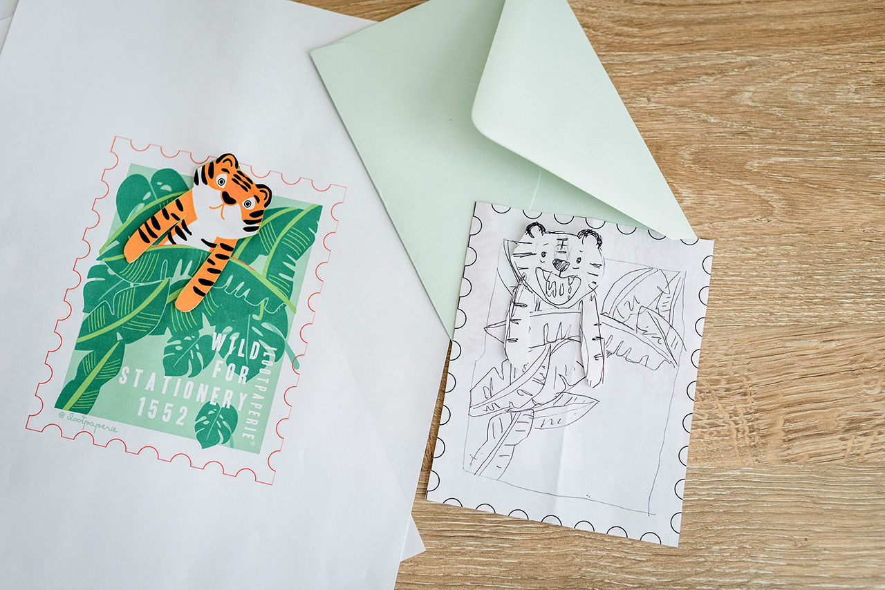
Once a concept has been moved into the “Let’s Execute” list, I often find myself researching lots of images of animals doing funny things (usually for the concept, but sometimes to procrastinate because it is always a little nerve-wrecking to begin a design). When we first started, Doris and I had throughly discussed and agreed we wanted to allow the brand’s visual voice to come into its own. So, especially in the beginning, I incorporated different mediums like watercolor, pencil sketches mixed with vector and text elements, and even thumbprint art when executing the designs.

Behind the Stationery: ilootpaperie

As of late, all designs have begun with a hand sketch but then fall into two main methods of execution. Our enamel pins now all tend to be vectored in detail (meaning point by point by mouse) to give me more control over the small details. For certain card concepts we like the flat clean graphic quality of vectored lines as well, so they are also rendered point by point after the initial sketch like our enamel pins. My second method of execution starts with an ink pen sketch usually on tracing paper or in my sketch book, which I snap a photo of with my phone to take into Photoshop where I then composite my favorite parts of the sketches and clean up the lines. I like the hand-drawn feel that is preserved in these designs. From there these sketches get taken into Illustrator to be vectored using the software’s tools and then I start put together the colors and the composition with the text.
Sometimes your initial instinct is spot on, other days there’s a lot of nudging, and tweaking and pushing to get to the final design. The first test print is always very exciting—we get an idea of where the colors/ tones fall and check the spacing and composition as it lives on the physical space of the card. Then comes more tweaking. When the designs are finalized, they go to our printer and next comes the proofs! At this crucial point, I check to see if we need to make any corrections / notes for printing. Ideally we don’t, and it moves into production.

Behind the Stationery: ilootpaperie

Our overall design process is very much about shaping the physical lines I’m able to achieve toward the idea I have in my head. I never went to proper art school, so what I do is a mishmash of techniques and tricks I learned on the job and in classes I took after work while I was still in marketing.

Behind the Stationery: ilootpaperie

With everything we do for Ilootpaperie, from our product and packaging design to shop window and craft show display designs (and even painting our first mural at our first NSS booths), there is a strong element of improvisation and constant problem solving. We take what we know and mix in a whole lot of research, trial and error, terror and gumption to keep going—it is often terrifying and exciting all at the same time.

Thanks so much for allowing us to share our little piece of our cheeky universe with everyone, Nole and Megan. We cannot fully express what a thrill it is, to be a small part of OSBP as it has inspired us so much always. We pinch ourselves every time!

You can shop all of our cheeky paper, pins and more at ilootpaperie.com and follow along in our day to day shenanigans on IG @ilootpaperie.

Behind the Stationery: ilootpaperie

Photos by Michelle Nicole Photography.

Want to be featured in the Behind the Stationery column? Reach out to Megan at megan [at] ohsobeautifulpaper [dot] com for more details.
Behind the Stationery: 1Canoe2

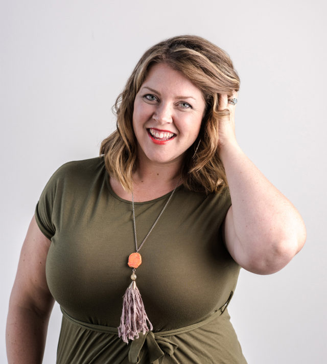
Happy Tuesday! We’re back with another installment of Behind the Stationery featuring one of the best in the business, Beth Snyder of 1Canoe2! Beth moved back to her small town roots and shares how this is so important to her daily life and business. Having been in the business for 10 years and now managing 10 employees, Beth is here to share how she keeps the look and feel of 1Canoe2 consistent and each collection consistent across the brand after all this time. Take it away, Beth! —Megan Soh

Behind the Stationery: 1canoe2

Photo by Drew Piester Photography

From Beth: I have always been a visual person. I don’t remember a time when I didn’t love to draw, look at photos of far away lands in my parents’ National Geographic magazine, do crafts, and generally “make stuff.” This love of art mixed with my tendency to dream really big led me to start several little companies which served as a vehicle to sell my creations and enhanced the planner side of my personality.

I got a BFA in Graphic Design and Fibers from the University of Missouri (Mizzou) and while I was there, I worked almost full time at the local NBC affiliate TV station doing every kind of design work you can imagine. And when you work at a small company and show some initiative, you get to have a lot of responsibility! I designed TV sets, graphics for the news, logos, signage, and marketing materials. When I graduated I looked around and didn’t think I could find a creative job close to home, so I headed to Nashville, Tennessee (before it was the hot thing to do) and worked at the CBS affiliate there for 6 years. I won an Emmy for graphic design in television, and I also met my husband!

Behind the Stationery: 1canoe2

I never lost my intense sense of homesickness for gravel roads, big open skies, and being a small town dweller. We moved “back home” to our sweet little town of Fulton, Missouri (population: 12,000).

I’ve always had a penchant for selling a little something that I made. At the end of my stay in Nashville, I got a tiny Kelsey Excelsior 5×8 letterpress and learned everything I could from blogs, a friend, and internet forums. Pretty soon, I called up my childhood friend who was a talented artist and told her to send me some of her drawings and I would make plates which we could print together. 1canoe2 was born! That was almost 10 years ago, and studio locations and iterations of the business structure have come and gone. Now we have 10 employees, our own building in our historic town, and a following of really devoted fans who love to see what we’re up to on Instagram!

Behind the Stationery: 1canoe2

I’d love to tell you a little bit about our corner of the world, because we believe it’s at the very center of our success. We’re based in the middle of a rural part of the Midwest. There’s a grand total of 40,000 people who live in our county. A mile from my house in the middle of town, you’ve got dirt roads and corn fields—and I love it! I can go out rainbow chasing and post it on Instagram before it’s faded.

Behind the Stationery: 1canoe2

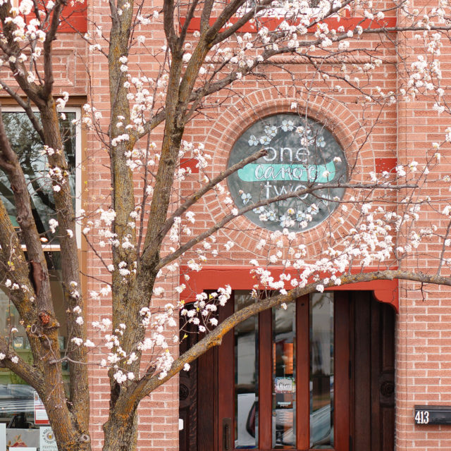
I live just 4 blocks from our studio/warehouse/paperie, on the same street which allows me to walk or ride my bike to work. It’s in an historic home near the downtown Brick District and we love it a lot. My husband, daughter, and our dog Trixie and I walk downtown at least once almost every day. All the little small town parades go right past our front porch. If you’re gonna go small town, do it up!

Behind the Stationery: 1canoe2

Our studio space is 5,000 square feet right in the middle of the historic business district and it was built in 1902. When I purchased the building in 2016, it hadn’t been inhabited for about 9 years, but in previous lives it had been a bank, a lawyer’s office, and an insurance company. It was definitely a space that required major vision to see through the 12 (!) layers of wallpaper, drop ceilings, maroon carpet, and the 1980s wallpaper. But from the moment I first stepped in the building, I saw a few architectural details that hinted to the treasures that had been concealed with generations of bad taste and small budgets. My favorite discoveries were the intact 14-foot pressed tin ceiling that was actually hidden above an 8 foot ugly fluorescent light drop ceiling, and the curved corner wall on which we painted a mural in the Paperie.

Behind the Stationery: 1canoe2

Now we have a bright sunny office for our team, and a little shop that is a benefit to the community, that is also the most incredible playground for me as a designer and product developer. It’s also amazing to experience the wholesale industry from the side of the buyer – who is our main customer! It’s made us much better at customer experience for sure.

Behind the Stationery: 1canoe2

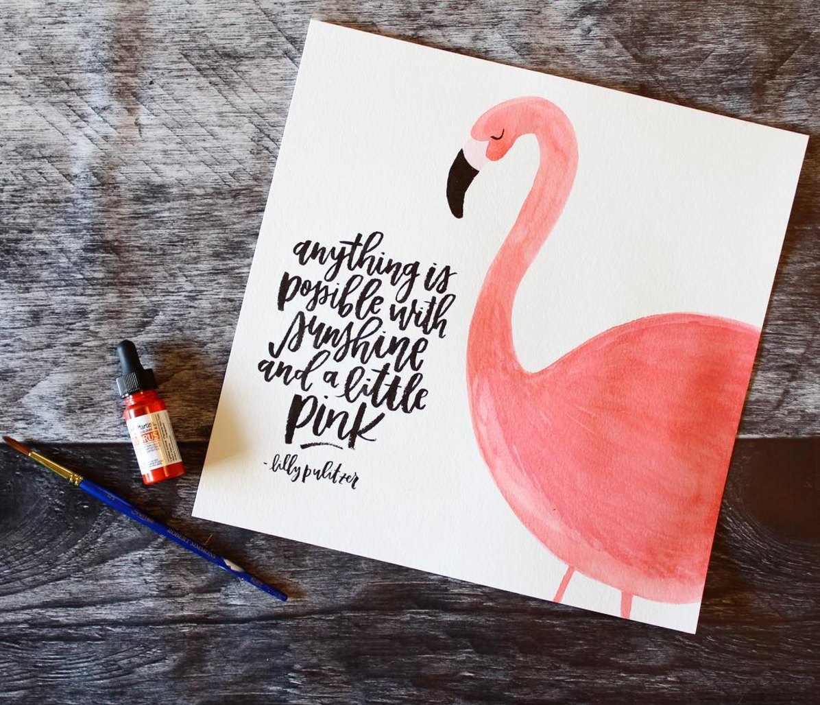
We are artists and, first and foremost, an illustration company. We happen to sell our artwork on stationery like cards, calendars, planners, etc., because paper is our passion. We started out as a letterpress company with a couple of presses in a barn, and now we use an offset printer to produce our full-color illustrations.

Behind the Stationery: 1canoe2

Our business is unique because of our signature style and the influences that surround us here in the rural Midwest. We hope that our fans could see a card in a shop and immediately know it’s ours. We put a lot of heart and soul into the artwork, and we lead with our paintbrushes.

Behind the Stationery: 1canoe2

Our creative process is collaborative, and starts with a brainstorming session with every member of the team from shipping and production up to me. We all throw out ideas that we think might make interesting cards — either visuals or wording. The actual design process then goes to the art team, which consist of me as the creative director (and I do a little of the art) and two artists who paint to their individual strengths.

Behind the Stationery: 1canoe2

Behind the Stationery: 1canoe2

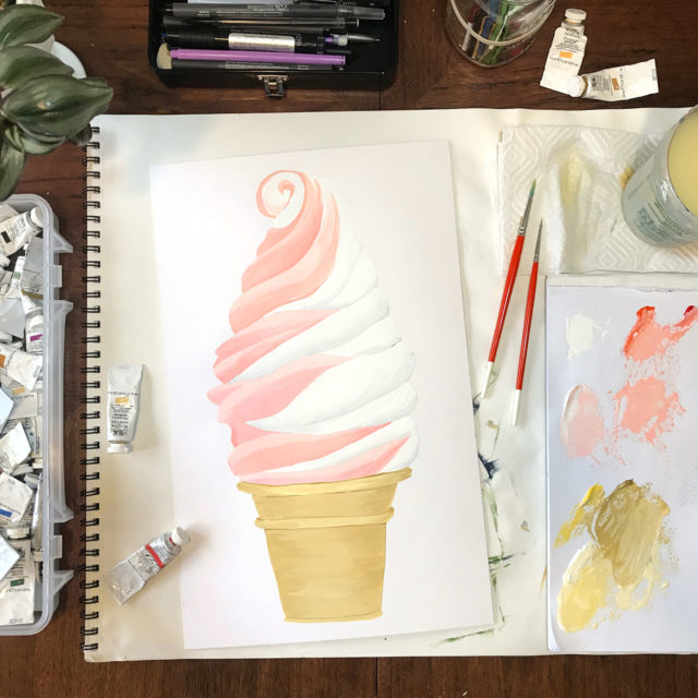
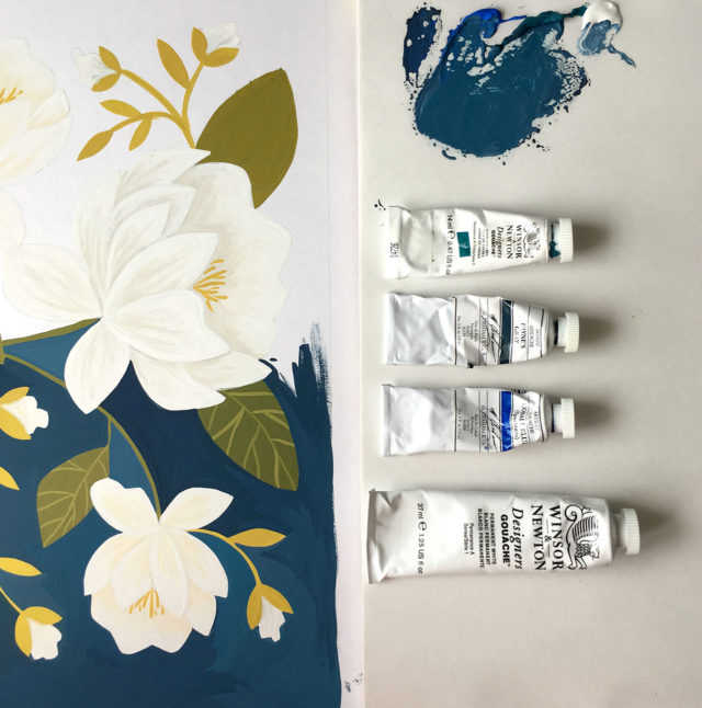
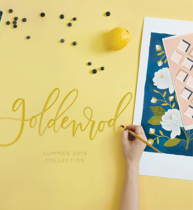
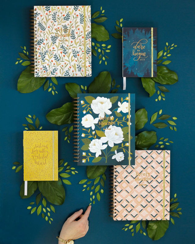
Since we’re three individuals working as a team to create a cohesive look, we have had to hone our process. For our big collections, like the new Goldenrod which we just launched, we work for about a year from a creative brief. Last summer I was really inspired by all the warm, peachy-golden light at the end of August; so I created a creative brief that listed out all the visuals that came to mind and created a vision board of sorts. During one of our art meetings, I presented the concept to Haley and Kate and over the next couple of weeks they went out and pulled their own inspiration images and phrases and added to the brief. We reconvened, and started making artwork based on this creative brief.

Behind the Stationery: 1canoe2

Behind the Stationery: 1canoe2

It’s definitely a fluid process, and we’re fine tuning it for our next collection, but I think we achieved our goals of creating an exciting, cohesive collection that has a clear intention. As we’re working on new products for the year, we’re painting new artwork and also using other artwork from the collection to put onto sketchbooks, notepads, cards, etc. But when it’s time to release all the new products, we have a massive library of artwork that can be used for future projects.

Behind the Stationery: 1canoe2

We thrive on a flexible work environment, but we have a lot of projects and we work as a team, so we have meetings. Generally, everyone is at the office on Mondays. We have staff meeting in the morning, and creative meetings in the afternoon. I personally spend a lot of time on big ideas and licensing partnerships. I think it’s my job to keep the company moving forward and creating amazing new things for our audience. I don’t know if it’s possible to accomplish all the big dreams we have, but our team is dedicated to trying!

Behind the Stationery: 1canoe2

All photos courtesy of 1Canoe2 except where noted.

Want to be featured in the Behind the Stationery column? Reach out to Megan at megan [at] ohsobeautifulpaper [dot] com for more details.
Modern Hand Painted Sumi Ink Invitations

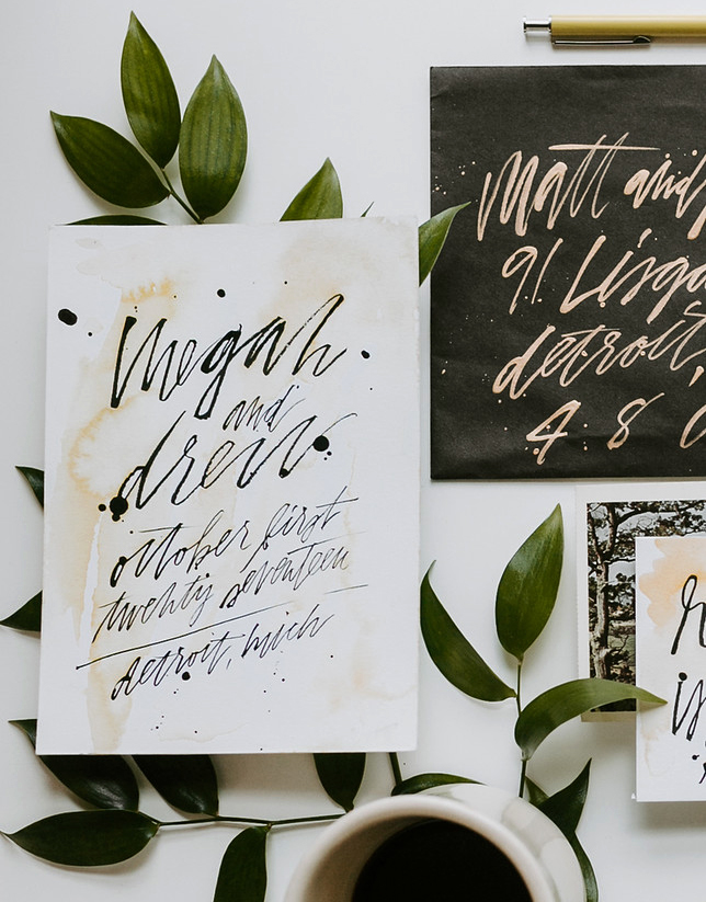
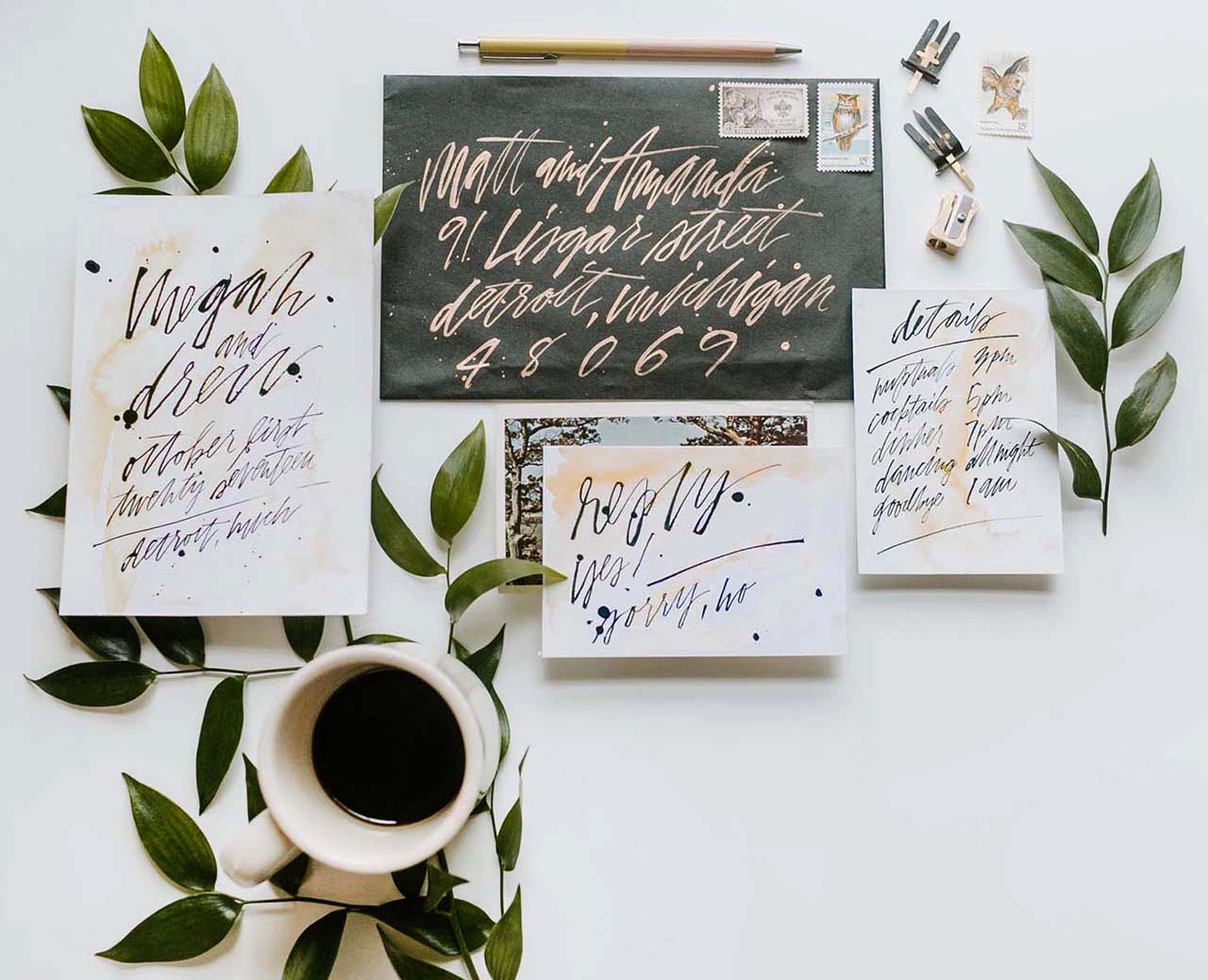
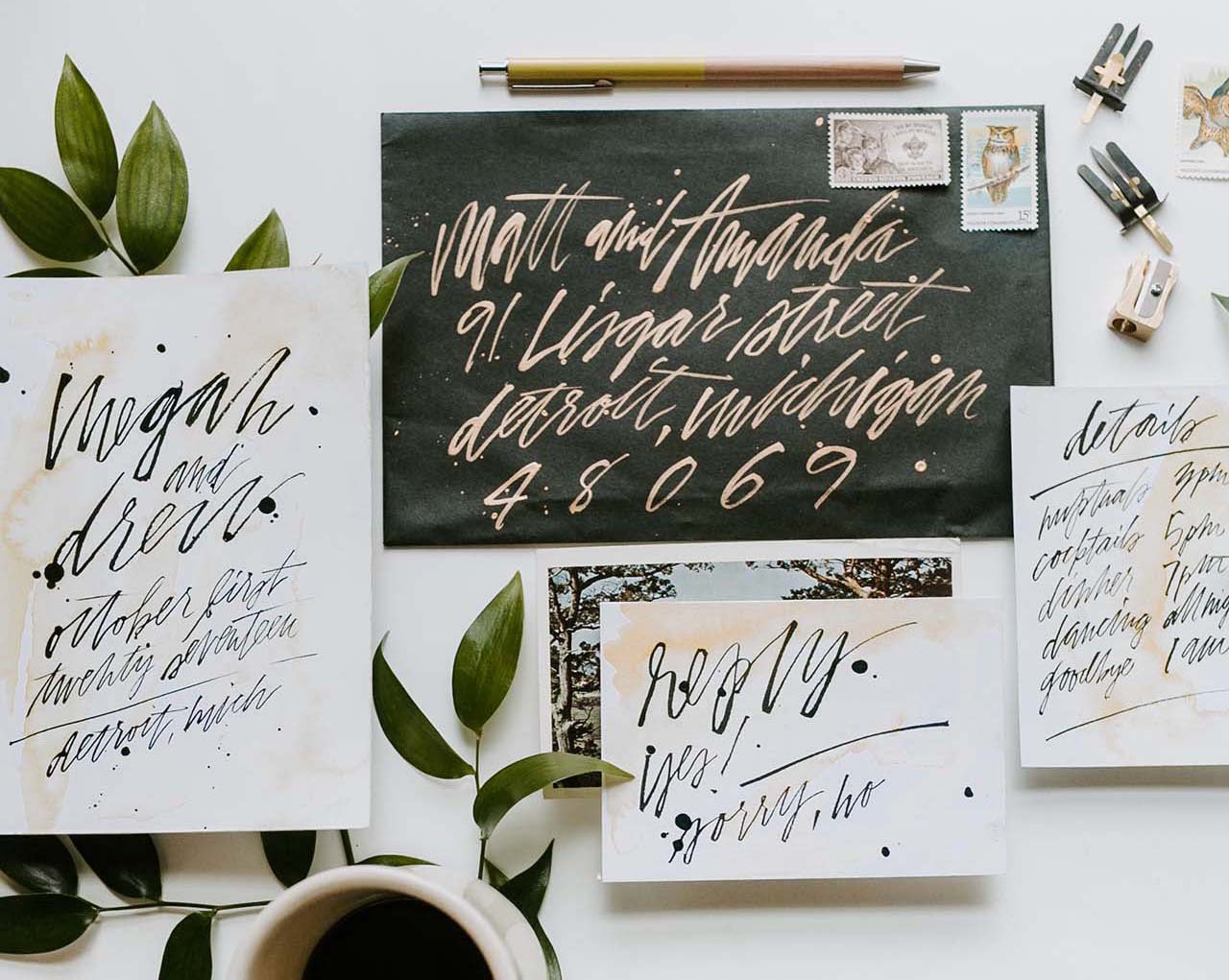
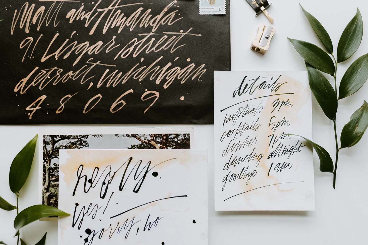
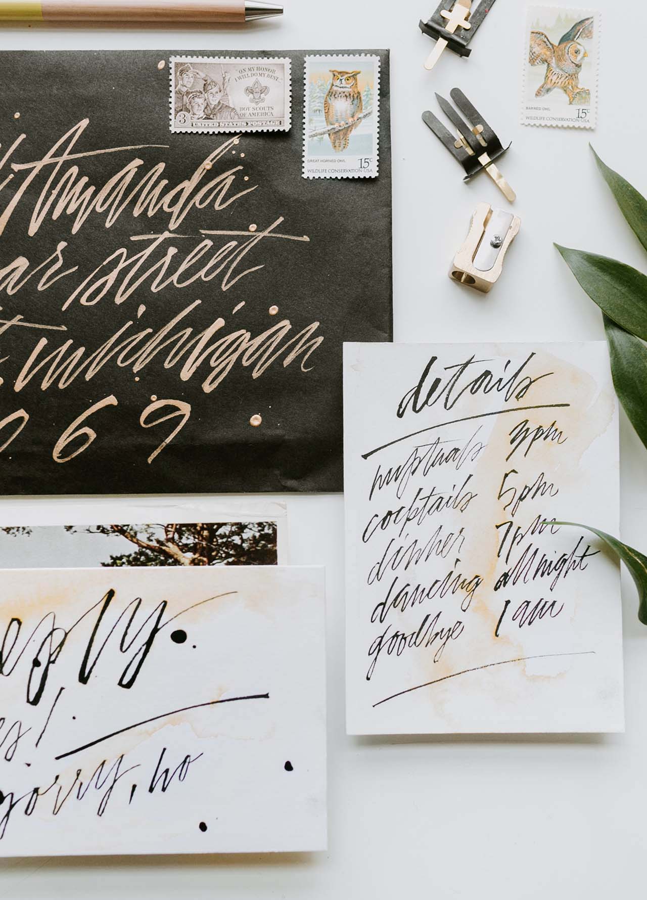
There are lots of rules for wedding invitations, along with plenty of traditions, etiquette, and details to consider. But for a vow renewal, all rules go out the window! Megan and Drew chose to celebrate their marriage with an intimate ceremony and reception (with a super small guest list of close friends) that was a better reflection of their style than their wedding years before. They worked with Rachael of Hazel + Dolly to create these VERY cool and eclectic modern hand painted Sumi ink invitations. Each individual piece in this suite was hand painted, from the invitation to the RSVP card to the envelope! So creative and unique!
Modern Hand-Painted Sumi Ink Invitations by Hazel and Dolly

From RachaelThis invitation suite was for a vow renewal for a small group of friends of the couple. Each individual invitation, reply card, detail card, and envelope was hand painted. Every card had a unique watercolor wash using an amber-colored watercolor and lettering in dark black Sumi ink. Originally, I proposed this idea as a letterpress invitation suite, but when I found out how small the guest list was, we decided to do hand painted. The couple and I agreed that this added both a personalized and eclectic touch to the suite.
Modern Hand-Painted Sumi Ink Invitations by Hazel and Dolly

The couple, Megan and Drew, got married several years ago before the wedding industry really took off to become what it is today, and they were able to re-live that wonderful moment in their lives with an intimate ceremony and reception that was focused on their unique style. It truly evoked their love and the couple they’ve grown to be.

Modern Hand-Painted Sumi Ink Invitations by Hazel and Dolly

The paper used here is Savoy 236# (if you have familiarity with letterpress, this is my go-to for business cards and invitations because of its juicy thickness that allows for a deep impression). It’s also really wonderful for watercolor washes, which many of my brides want. The bright white offers a perfect background for the watercolor.

Modern Hand-Painted Sumi Ink Invitations by Hazel and Dolly

I used Sumi ink and a script liner brush for the lettering on the suite. For the envelopes, I used a script liner brush and Dr. Ph. Martin’s Gold Iridescent Ink – it has a gorgeous sheen but is still opaque enough for envelopes. The suite paired nicely with some stamps of my vintage stamp collection, and because so there were so few guests, I was able to add vintage postage to each envelope. I always consider envelopes with vintage postage to be mini art galleries, and always try to encourage my brides to go this route!

Modern Hand-Painted Sumi Ink Invitations by Hazel and Dolly

Thanks so much Rachael!

Design: Hazel + Dolly
Styling: Ever Ours Events
Paper: Savoy Bright White 236#

Check out the Designer Rolodex for more tal­ented wed­ding invi­ta­tion design­ers and the real invi­ta­tions gallery for more wedding invitation ideas!

Photo Credits: Sage + Fern Photo