Sheebani + Devin’s The Darjeeling Limited-Inspired Wedding Invitations

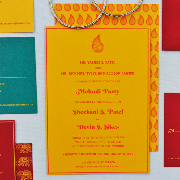
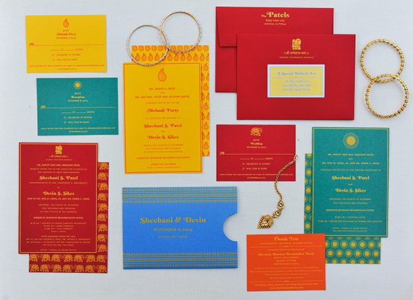
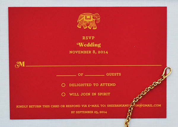
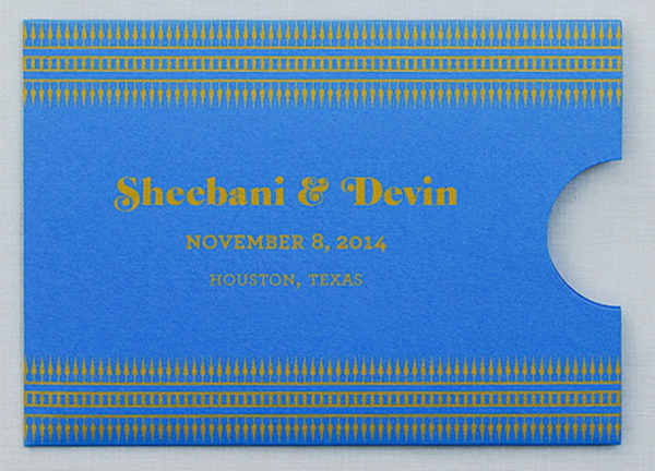
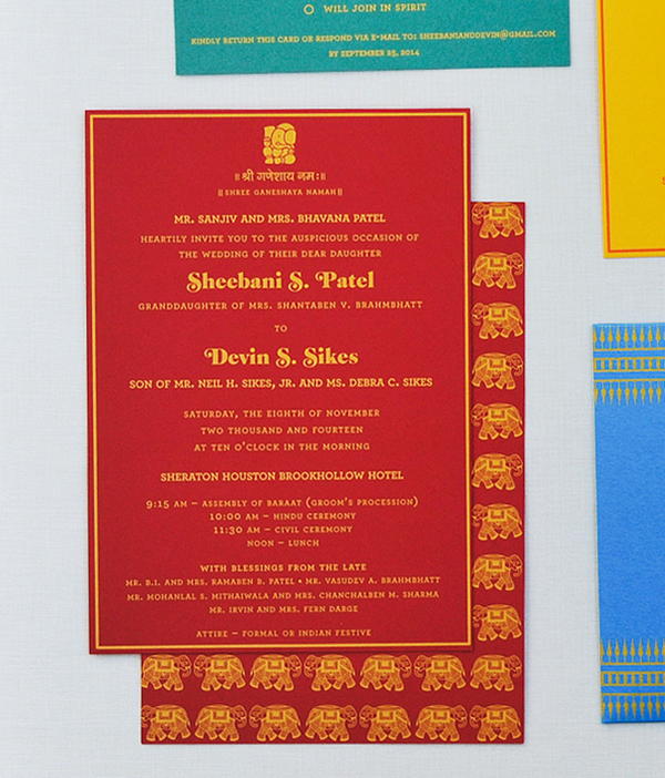
These screen printed wedding invitations from Reshma of Marigold Paper are so bright and fun – and with a color palette inspired by The Darjeeling Limited! Reshma combined illustrations inspired by traditional Indian wood block stamps with modern typography for this festive fusion wedding. Love!

The-Darjeeling-Limited-Wedding-Invitations-Marigold-Paper-OSBP8

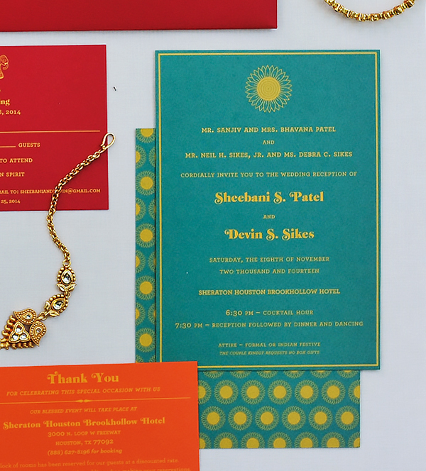
From Reshma: This wedding invitation suite was designed for my friend, Sheebani Patel, and her then-soon-to-be husband, Devin Sikes. The theme and color palette (red, blue, orange, green and yellow) for their wedding was the film The Darjeeling Limited by Wes Anderson. With this being a fusion wedding, the invitation needed to blend the design sensibilities of India and America. This was achieved with three custom illustrations of a paisley, elephant and a sunflower (the groom is originally from Kansas), which were inspired by traditional Indian wood block stamps.

The-Darjeeling-Limited-Wedding-Invitations-Marigold-Paper-OSBP3

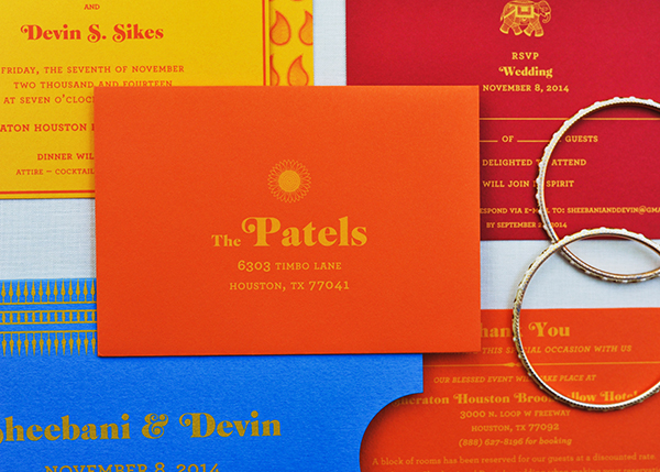
These illustrations were then combined with modern typography and bold colors and used on the event invitation and RSVP cards. All the pieces were then housed in a sleeve, which was placed in a red mailing envelope with recipient address labels.

The-Darjeeling-Limited-Wedding-Invitations-Marigold-Paper-OSBP2

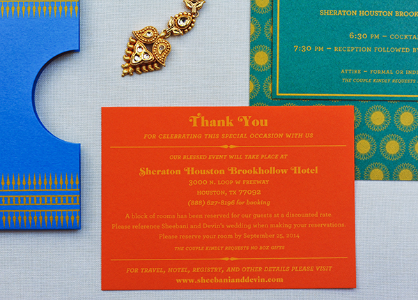
Each piece of this suite was screen printed on Colorplan paper by Mama’s Sauce. The event cards were screen printed in 1-color on the front and back, and the RSVP card is screen printed in 1-color on the front. The blue sleeve was custom die cut and 1-color screen printed with an illustrated border, the names of the couple, location and date of the wedding. The RSVP envelope and mailing envelope were also screen printed in 1-color.

The-Darjeeling-Limited-Wedding-Invitations-Marigold-Paper-OSBP4

The-Darjeeling-Limited-Wedding-Invitations-Marigold-Paper-OSBP

The-Darjeeling-Limited-Wedding-Invitations-Marigold-Paper-OSBP6

The-Darjeeling-Limited-Wedding-Invitations-Marigold-Paper-OSBP7

The-Darjeeling-Limited-Wedding-Invitations-Marigold-Paper-OSBP9

Thanks Reshma!

Design: Marigold Paper

Screen Printing: Mama’s Sauce

Check out the Designer Rolodex for more tal­ented wed­ding invi­ta­tion design­ers and the real invi­ta­tions gallery for more wedding invitation ideas!

Photo Credits: Natalie Seeboth Photography

Robin + Sergei’s Floral and Gold Foil Wedding Invitations

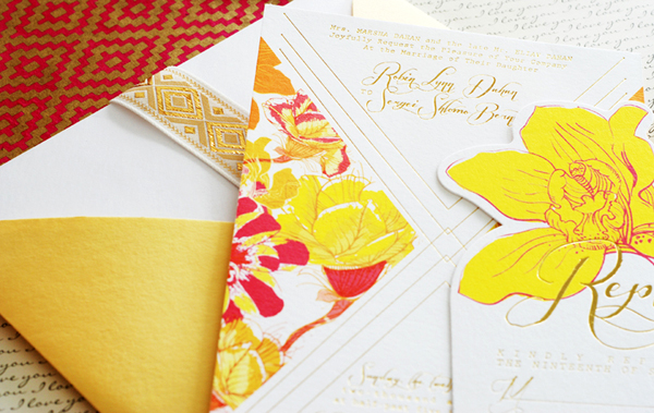
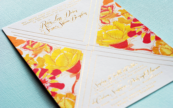
Maybe it’s the influence of summer, but I can’t get enough bright and bold color these days! Luckily, Nicole from Umama sent over these colorful wedding invitations. The invitations pair a deep vivid pink, marigold yellow, and graphic floral elements – along with some shiny metallic gold foil! So pretty!

Colorful-Floral-Gold-Foil-Wedding-Invitations-Umama-OSBP

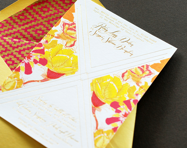
From Nicole: Robin was super excited and passionate about all the little design details in the invitation. The invitation combines a deep, vivid pink and a bright marigold yellow, along with gold foil to bring out the flowers.

Colorful-Floral-Gold-Foil-Wedding-Invitations-Umama-OSBP8

Colorful-Floral-Gold-Foil-Wedding-Invitations-Umama-OSBP4

Robin took the time to learn the basics of Illustrator to create her own custom monogram. She also learned how to revise fonts in order to achieve just the right flourish. We explored paper options for the envelope liners until we truly captured the vivid vibe with a touch of gold to bring in that extra element. It was truly a melding of two minds that resulted in something we were both excited about.

Colorful-Floral-Gold-Foil-Wedding-Invitations-Umama-OSBP3

Colorful-Floral-Gold-Foil-Wedding-Invitations-Umama-OSBP9

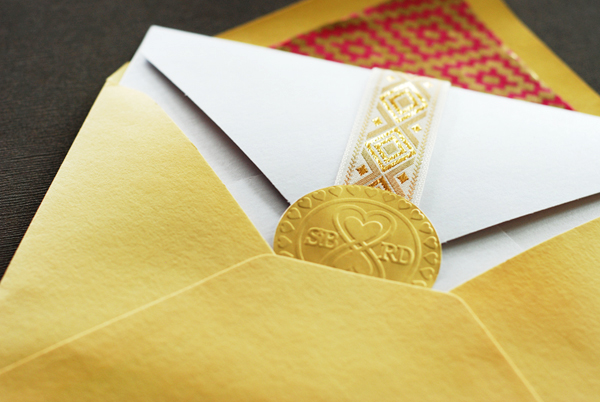
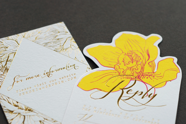
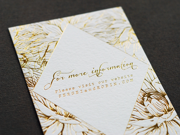
The end product is digitally printed on Crane cotton Lettra paper with a second printing of gold foil by Boxcar Press. The reply card was printed similarly, with a custom die cut around the floral design. The insert card was printed entirely in gold foil. The three pieces were wrapped in a gold patterned ribbon and sealed with the embossed monogram designed by Robin.

Colorful-Floral-Gold-Foil-Wedding-Invitations-Umama-OSBP7

Thanks Nicole!

Design: Umama

Digital + Gold Foil Printing: Boxcar Press

Check out the Designer Rolodex for more tal­ented wed­ding invi­ta­tion design­ers and the real invi­ta­tions gallery for more wedding invitation ideas!

Photo Credits: Umama

OSBP At Home: Garden Update

It’s been well over a year since we moved into our house, and while progress inside the house has been a bit slower than I would have liked, I’ve been spending a lot of time out in the garden. It’s the first time I’ve had any real gardening space since I moved to DC more than 10 years ago, and I’m really really enjoying it. Last year I shared some of my plans for our outdoor space. Time for an update!
OSBP-At-Home-Garden-Update-Summer-2014-23

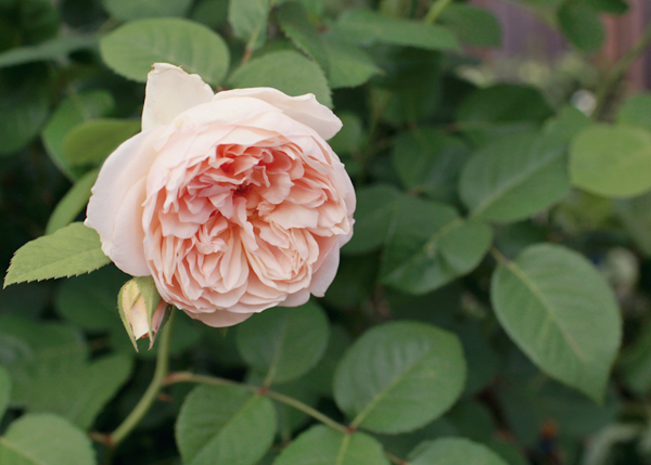
Our house is a typical DC rowhouse: long and narrow. We don’t have a ton of space to work with, but I’ve been trying to maximize what we’ve got. We have a small garden bed in our backyard patio, which I’ve filled with lilacs, peonies, roses, and a few other perennial varieties. I save annuals for pots arranged along the fence on the other side of the patio so that I don’t have to worry too much about them once the cold weather sets in.
OSBP-At-Home-Garden-Update-Lilacs-Instagram

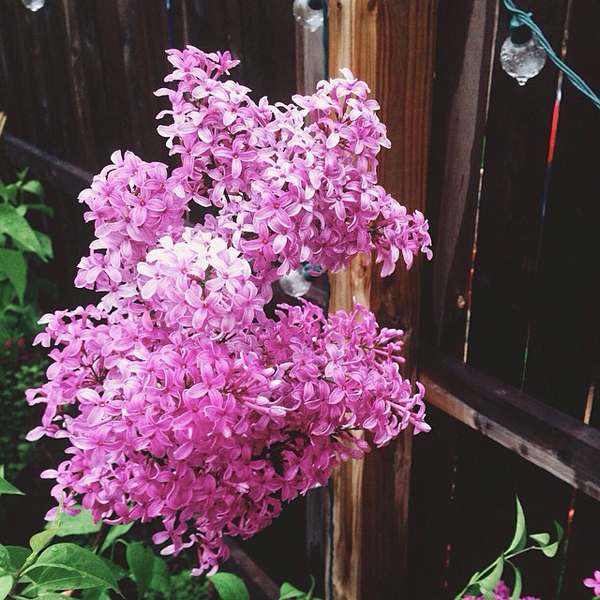
Our backyard garden is my happy place in mid-to-late spring when the peonies and lilacs are blooming. Everything was late this year thanks to the neverending winter, but once the warmer weather arrived in April everything just exploded – especially my lilacs. I have a total of four lilac bushes, all planted in the back of the garden bed closest to the fence, and the smell was positively intoxicating when they all bloomed. I wish they lasted forever!
OSBP-At-Home-Garden-Update-Peony-Coral-Instagram

OSBP-At-Home-Garden-Update-Peony-Hot-Pink-Instagram

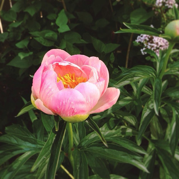
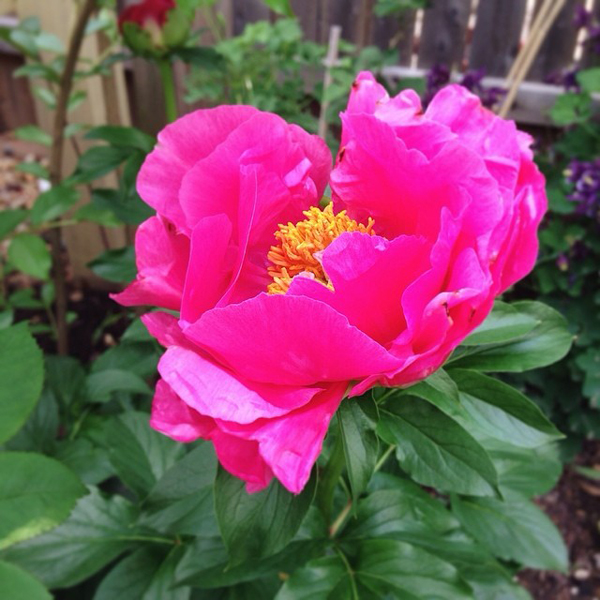
The lilacs were quickly followed by peonies – I have five plants in varying colors of white and pink (pale pink Sarah Bernhardt, Coral and Gold, and a hot pink variety whose name I’ve forgotten). This was the view that greeted me when I came home from the National Stationery Show in late May:
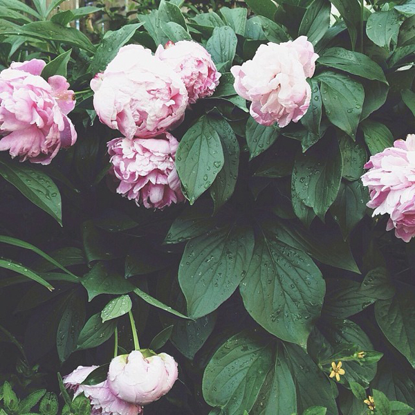
OSBP-At-Home-Garden-Update-Peonies-Instagram

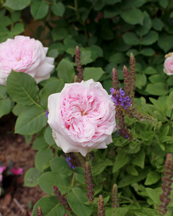
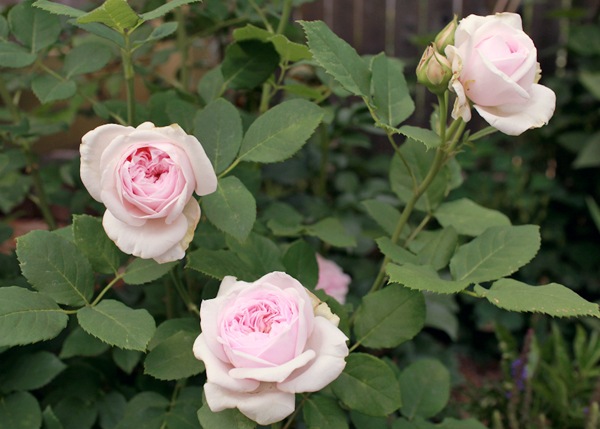
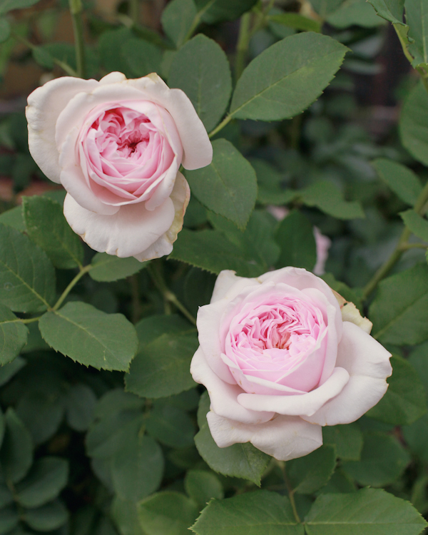
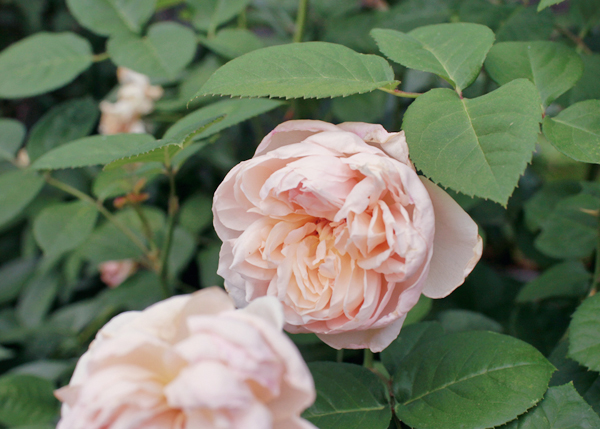
I snapped some more photos a few weeks ago, at the very tail end of peony season, and with the exception of the peonies most of these flowers are still going pretty strong in the garden. We planted a border of pink and purple saliva in the garden bed, and my David Austin rose bushes bloom frequently as long as I deadhead regularly. I planted some impatiens under the rosebushes for a bit of added color, all of which seem to be growing quite happily. There is a small white crape myrtle in the back corner, which has been in bloom the last few weeks and I hope will grow to provide some much-needed shade over the next couple of years. Since these photos were taken, some yellow dinner plate dahlias have grown in around the peonies and are slowly taking over the garden much to my dismay – I need to do more research on (successfully) growing those big monsters!
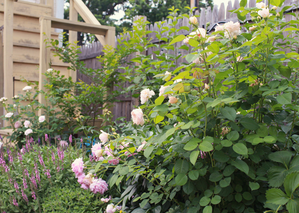
OSBP-At-Home-Garden-Update-Summer-2014-5

OSBP-At-Home-Garden-Update-Summer-2014-16

OSBP-At-Home-Garden-Update-Summer-2014-19

OSBP-At-Home-Garden-Update-Summer-2014-18

OSBP-At-Home-Garden-Update-Summer-2014-22

OSBP-At-Home-Garden-Update-Summer-2014-7OSBP-At-Home-Garden-Update-Summer-2014-8

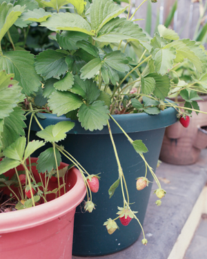
We also have a few potted strawberry plants – Sophie LOVED picking the fresh berries when they were in season. There’s a small bed that runs along the stairs down to our unfinished basement, where I’ve planted a wisteria vine – which surprised me by blooming the tiniest little wisteria this spring! – and a few other partial-sun perennials. I’d love to eventually build a pergola over our back door and train the wisteria to grow over it. I also have a small potted viburnum; I’m waiting for it to get a bit larger before transplanting to its permanent home in the front garden.
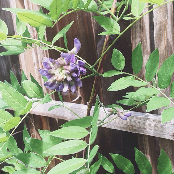
OSBP-At-Home-Garden-Update-Wisteria-Instagram

OSBP-At-Home-Garden-Update-Summer-2014-24

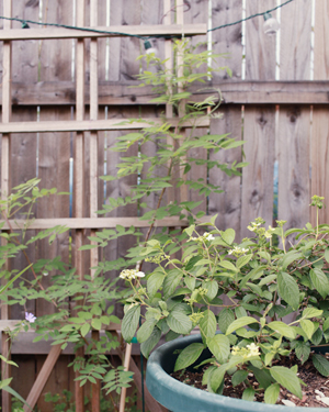
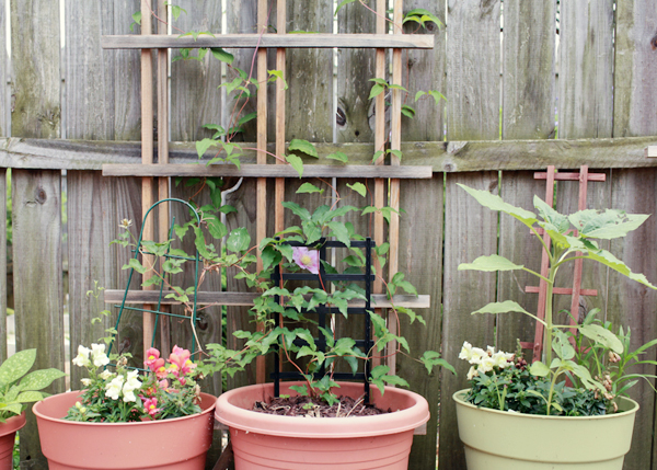
Potted plants along the fence on the opposite side of the backyard. We recently added a few marigolds (to help deter flower-eating pests), a dark purple opal basil plant, and a couple of zinnia for some additional summer color. The clematis vine is one of my favorites in the entire garden. The flowers are so romantic! Future plans for this area include a vertical herb garden and possibly a small vertical vegetable garden – next year!
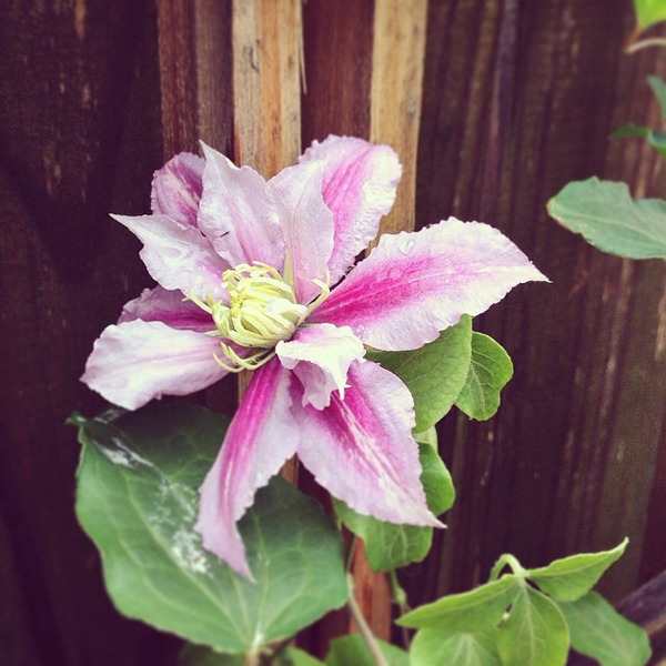
OSBP-At-Home-Garden-Update-Clematis-Instagram

OSBP-At-Home-Garden-Update-Summer-2014-29

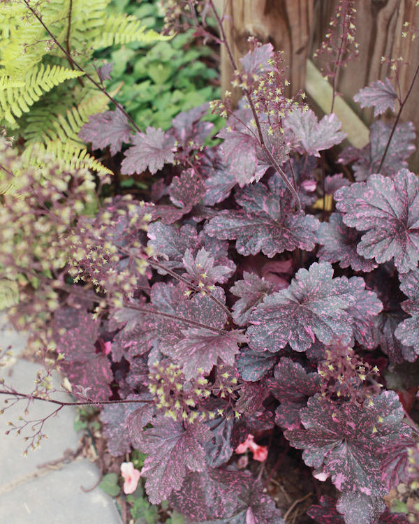
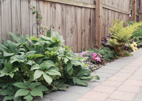
Finally, another small partial sun garden bed that runs along the path next to our garage. I planted a hellebore, some jasmine, a couple of Japanese painted ferns, some impatiens, begonias, purple coral bells, and a bleeding heart all the way in the back (which is now the size of a small hydrangea!). I love love love the combination of the painted fern and impatiens!
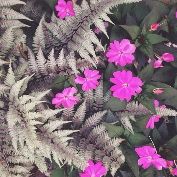
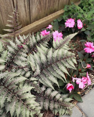
OSBP-At-Home-Garden-Update-Japanese-Painted-Fern-Instagram

OSBP-At-Home-Garden-Update-Summer-2014-33OSBP-At-Home-Garden-Update-Summer-2014-36

OSBP-At-Home-Garden-Update-Summer-2014-41

And that’s our garden – at least for the moment! Sadly, along with DC summer heat and humidity, the mosquitos and earwigs have arrived in force. The mosquitos in particular make it difficult to enjoy the backyard for long periods of time, so I haven’t been spending as much time outdoors as I’d normally like to. I’m trying to learn more about garden pest control in general, since I’ve also battled rose slugs and normal slugs in the backyard. We’ve also been contending with an infestation of the horrible-sounding Dead Man’s Fingers in one corner of the garden bed. It pre-dates any of the plants in the garden bed (we started fresh when we moved in last year), so I’m worried there might be some dead tree root buried deep in the soil causing the fungus. Anyone out there have any experience successfully battling Dead Man’s Fingers?? I have so much to learn about gardening!

All photos by me, via my Canon DSLR and via Instagram
Stationery Show Sneak Peek: Studio Carta + Moontree Letterpress

It’s officially less than two weeks before the National Stationery Show!  I can’t wait to walk around Javits Center and see what many of my favorite designers have been up to over the last year.  In the meantime, over the next couple of weeks I’ll be sharing a few sneak peeks into some of the new collections making their debuts at this year’s show.  First up, the brand new line of Leaf and Straw notecards from Moontree Letterpress and Studio Carta!
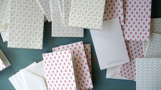
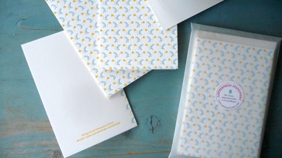
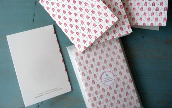
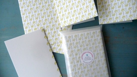
The Leaf and Straw collaboration began with a 2012 calendar, expanded to a collection of hand bound notebooks, and now these beautiful notecards!  The cards are letterpress printed in two colors on cotton paper and come with a matching envelope.  Available as single cards or in a set of six packaged in a glassine envelope, the cards are available in three lovely color combinations: red and gray, chartreuse and gray, and marigold and blue.  So pretty!

You’ll see lots more in a couple of weeks, but in the meantime you can check out Studio Carta and Moontree Letterpress!

Photo Credits: Studio Carta

Inspiration — Nate Williams

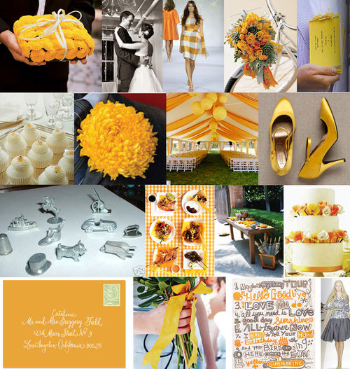
I was browsing through some of Kathryn’s old boards on Snippet & Ink recently, and came across the absolutely amazing work of Nate Williams in this board based on a marigold and gray color palette (Nate’s work is the lettering in the third image on the bottom row):

SnippetInk70

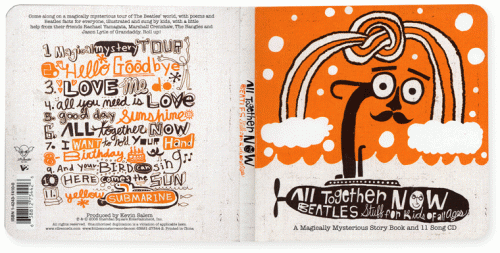
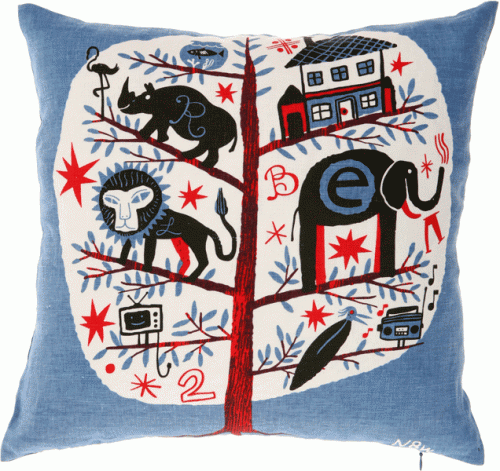
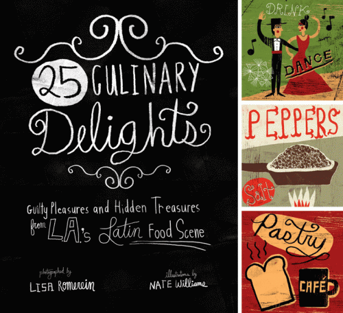
Nate is an illustrator and designer based in Buenos Aires, Argentina — and as you can see, he’s just loaded with talent:

Nate-Williams-Illustration

Nate-Williams-Hand-Lettering

Nate-Williams-Hand-Lettering-Pillow

Nate-Williams-Hand-Lettering-Layout

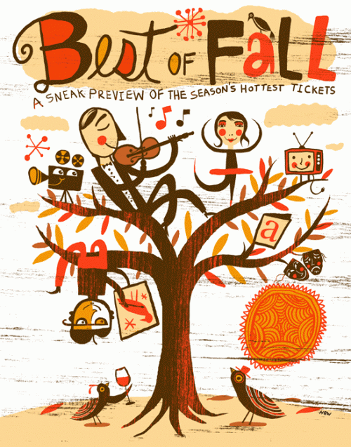
Nate really only does commercial work, but his graphic style and illustrations would make great inspiration for wedding invitations – or even a wedding invitation poster (such a great idea!):

Nate-Williams-Hand-Lettered-Poster

For more of Nate’s work, check out his portfolio and blog – lots of good stuff there!

{Inspiration board via Snippet & Ink, all other images from Nate Williams}