Search Results for: edge painting
Inspiring Calligraphers: Sable and Gray Paper Co.
Hello everyone! I have something light and bright to share with you, and of course, it comes in the way of paper inspiration. We’re focusing on the work of Kristin Hussey, a calligrapher who runs Sable & Gray Paper Co. I think you’re going to love this uplifting inspiration as we take a peek at her lettering work. Let’s dive in! – Jen

Photo Credit: Tifani Lyn Photography
From Kristin: I got my degree in Architecture, and after I graduated from school, I worked for a firm that I had dreamed of working at. It was fascinating and such a great opportunity, but I didn’t realize the reality of being a modern-day architect until I was working there: it had become a very computer-driven career with all of the models and drawings being done in computer programs. I really missed working with my hands so I decided to try out a different career path that would be more hands-on. So I got a job at a florist, which was just the change I needed. While I was working there, the florist merged with a stationery company, and asked if I would take over the custom stationery designs since I had a background in design, and I completely fell in love.

Photo Credit: Luxlight Photography
About a year later I went off on my own and started Sable & Gray, which has been such a beautiful adventure. I try to make each invitation a real work of art, incorporating as many hand-crafted details as possible. It only felt natural to learn calligraphy as well so I wouldn’t need to rely only on predesigned fonts. I took a calligraphy course from Molly Jacques (who is a true modern calligraphy legend!) about 4 years ago and never looked back!

Photo Credit: Luxlight Photography
I’ve developed my calligraphy style over the past four years with a goal to create a look that is elevated, yet approachable (and also legible!). I’ve looked up to other calligraphers like Molly Jacques (who taught me pointed-pen calligraphy) and Jenny Sanders (who is just amazing), but have tried to develop a style that is uniquely my own.

Photo Credit: Elizabeth Laduca Photography
Here’s a peek at Kristin in her element:

Photo Credit: Corey Weber Photography
I love to incorporate calligraphy into my custom wedding invitation designs and will tweak my style a bit to fit the mood and aesthetic of each invitation suite. I especially love doing watercolor brush calligraphy because it’s so beautiful seeing the gradient and watching the colors bleed together throughout each word. They really look like a little piece of art in and of themselves.

Photo Credit: The Weber Photographers

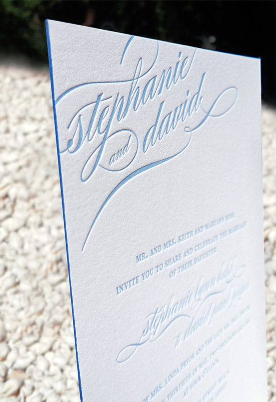
It’s tough to pick a favorite project! I really love this custom invitation suite that features a combination of watercolor brush calligraphy and letterpress printing on double-thick paper (and it has gorgeous dusty-blue edge painting, too!). The custom die-cut Michigan-shaped response card is an extra special cherry on top of this dreamy suite.

Photo Credit: Luxlight Photography

Thanks so much for sharing your work, Kristin! Looking for even more beautiful calligraphy? Check out our calligraphy archive right here!
Photo credits, except where noted: Kristin Hussey of Sable & Gray Paper Co.
Want to be featured in our calligraphy column? Reach out to us at submissions [at] ohsobeautifulpaper [dot] com with the subject line “Calligraphy Feature” for more details!
Rainbow Watercolor Wedding Stationery Inspiration
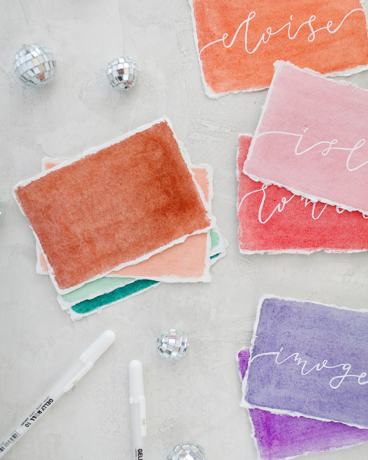
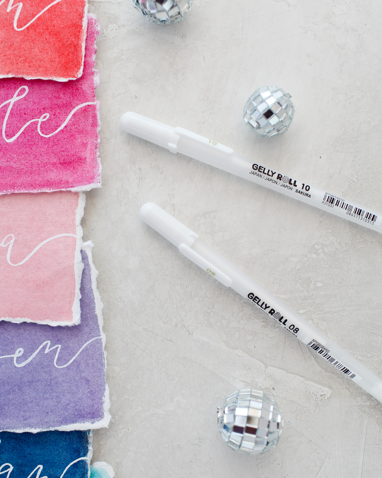
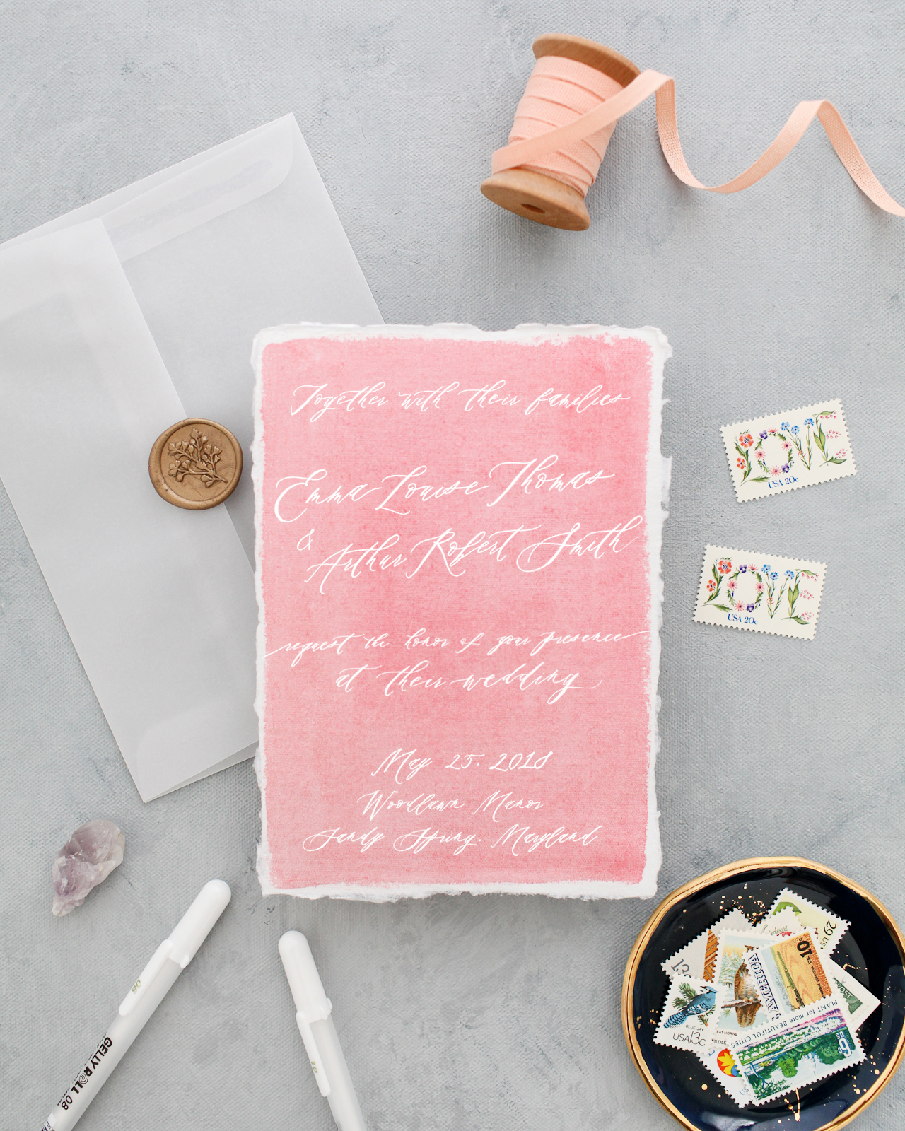
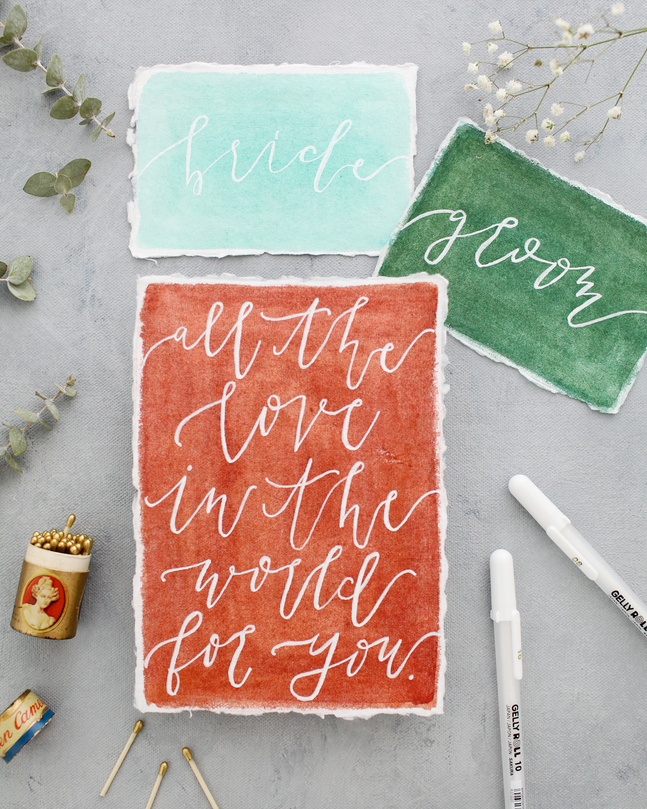
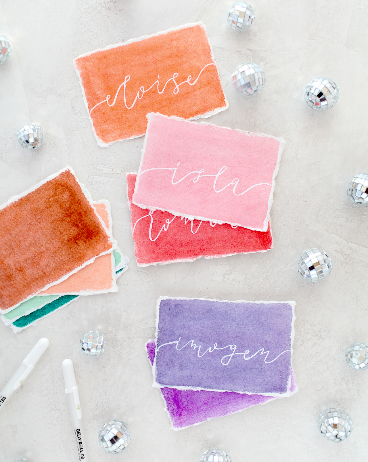
You guys, I am SO excited for today’s post! I’m a big fan of anything rainbow (who isn’t??) and I love the look of white ink on bright colors, and this idea brings those two favorite things together! This concept came out of these DIY colorful watercolor envelopes that we did two years ago (!!), and I’m so excited to partner with Sakura of America to bring this rainbow watercolor wedding stationery inspiration to life. I enlisted Molly from Alchemy Calligraphy to work her calligraphy magic using Sakura’s Gelly Roll® Classic™ White pens (now available in three different weights!) on pieces of handmade paper that I painted with Sakura’s Koi Water Color Field Sketch Travel Kit. I’m so excited to share the results with you, along with the how-to so you can create beautiful rainbow watercolor stationery at home!
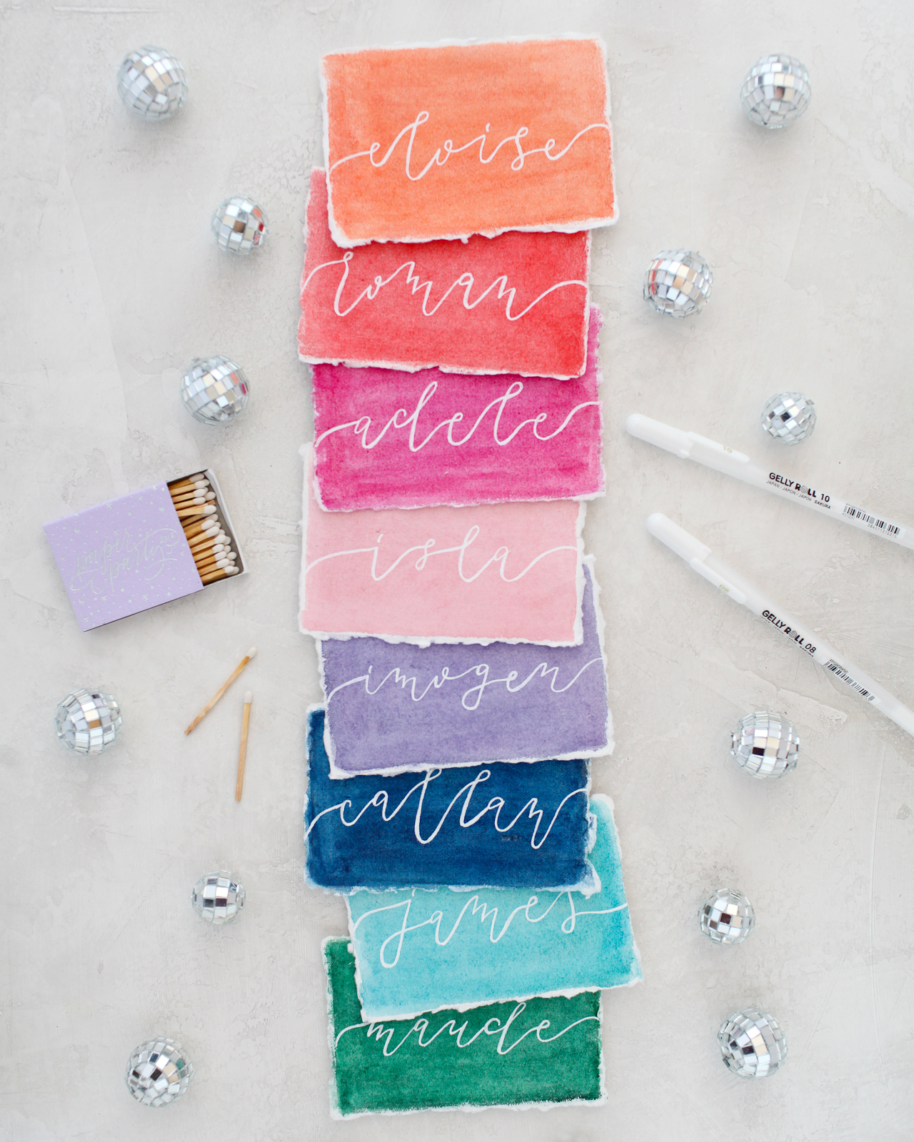
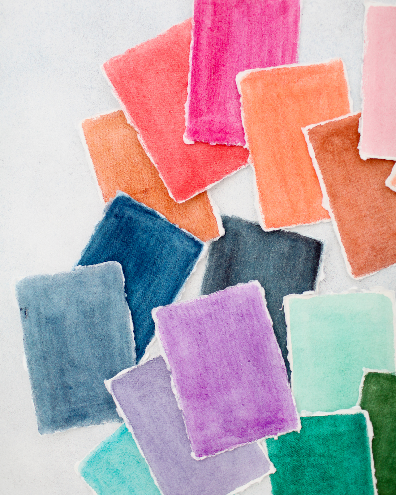
Okay, so there are two super exciting things happening here: first, the Sakura Koi Water Color Field Sketch Travel Kits allowed me to mix my ideal rainbow color palette. Since so many pieces of paper were involved, I wanted to translate my rainbow inspiration into several different hues of each color, from the palest pink to the deepest blue and plenty of non-traditional hues in between. I’m seriously loving the terra cotta color under the quote piece below, especially paired with shades of pale pink, peach, and deep blue. So good! And second, the different weights of the Gelly Roll Classic White pens are the perfect tool for creating different lettering styles and illustrations on the watercolor paper – and the white ink is totally opaque, so it’s super clear and crisp!
I mean, if you’re going to send out colorful watercolor envelopes, you probably want to incorporate some color into your wedding stationery, right? You can also totally use these ideas for baby showers, birthday parties, or any other event! Every party needs a bit of color and texture, no matter the size of the party! You can go full rainbow like I did, or focus on a few colors from your own color palette – with watercolor, you can easily mix your any color, so the sky is the limit! And the opaque white ink ties everything together so the entire look is cohesive.
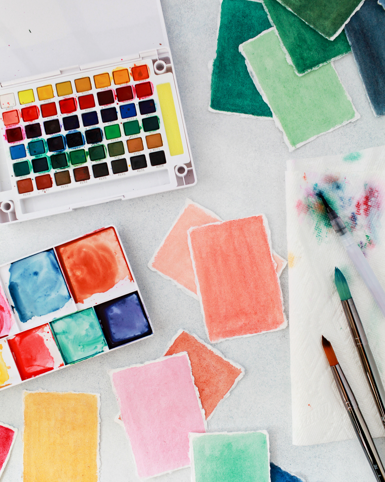
To create the rainbow watercolor wedding stationery, we used Sakura’s new 48-color Koi Watercolor Field Sketch Travel Kit to mix and paint dozens of different colors on handmade paper in varying sizes. I used Sakura’s refillable water brush to mix the paint colors in the detachable easel, then a larger, wider brush to paint the watercolor onto the paper in smooth strokes – leaving the tiniest white border around the edge. Also, the amount of water that you use helps determine the vibrancy of the colors. I used less water when I wanted really deep or bright colors, and more water when I wanted a lighter or more pastel color. Keep a test sheet of paper handy so you can test colors first before painting, since the colors can look different in the pan than on paper!
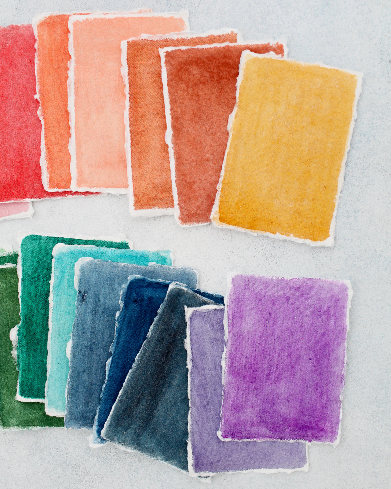
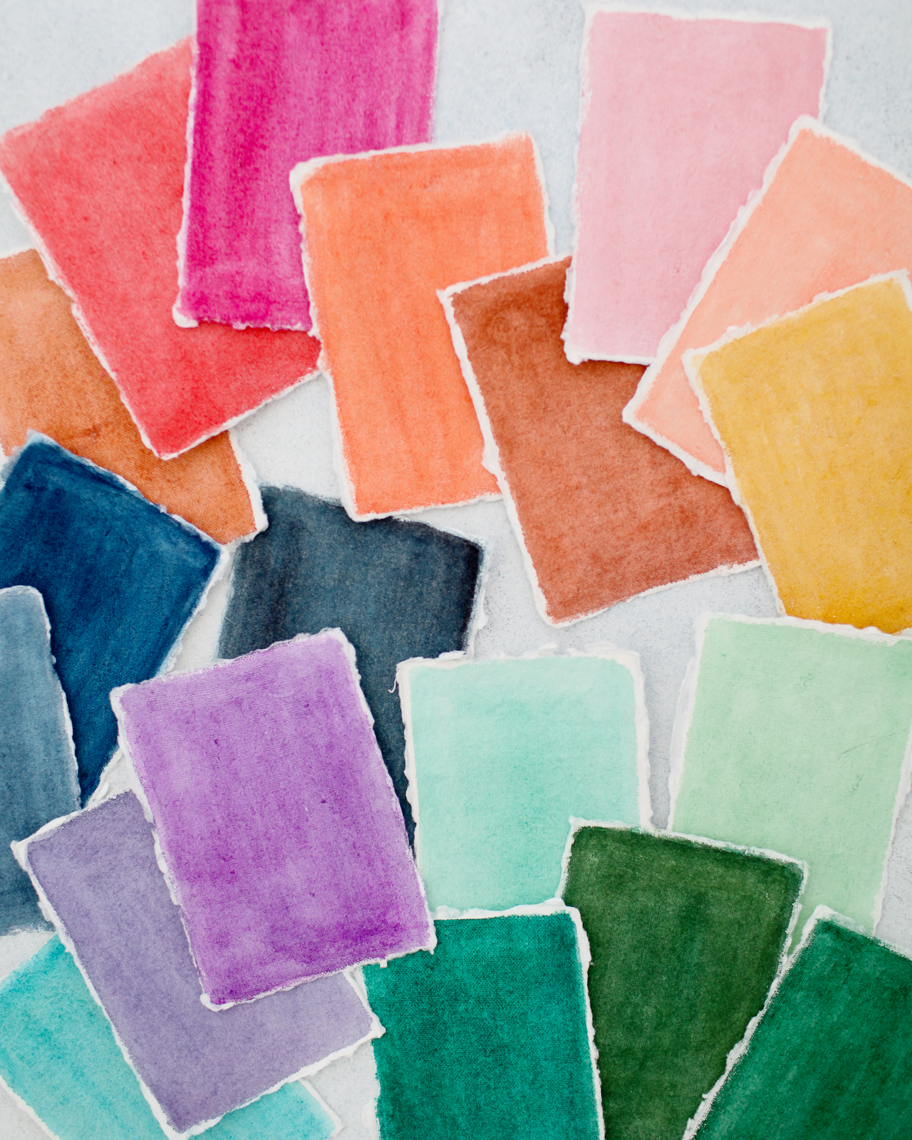
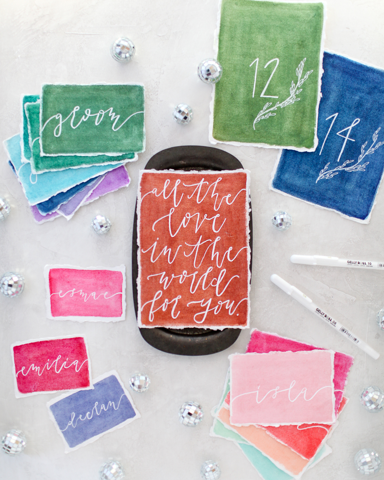
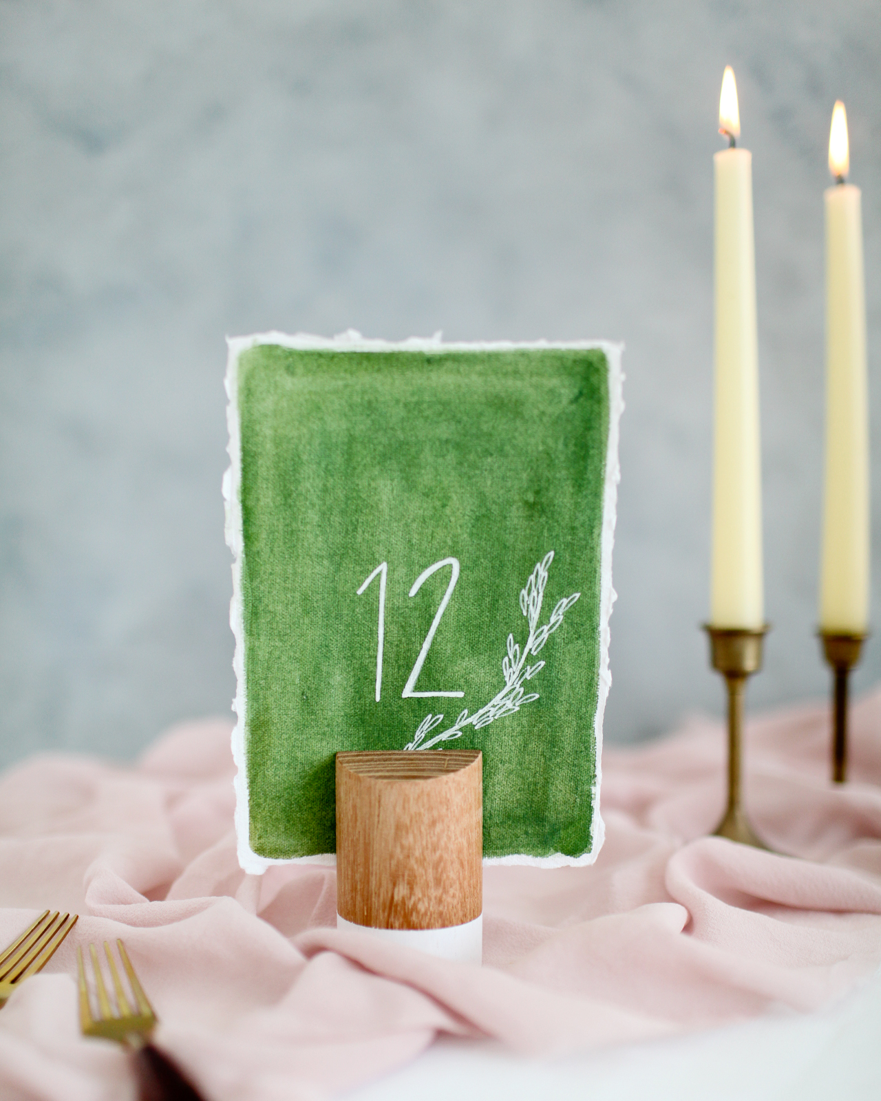
So much rainbow gorgeousness! I had place cards, menus, and table numbers in mind when choosing paper sizes, so we used mostly 2.5×3.5″ pieces and a few 5×7″ pieces. The key to achieving really bright and vibrant colors is to use handmade cotton rag paper – mine came from Fabulous Fancy Pants and Silk & Willow. I tried painting on store-bought watercolor paper but just really wasn’t able to get the colors that I wanted! The handmade paper totally did the trick.
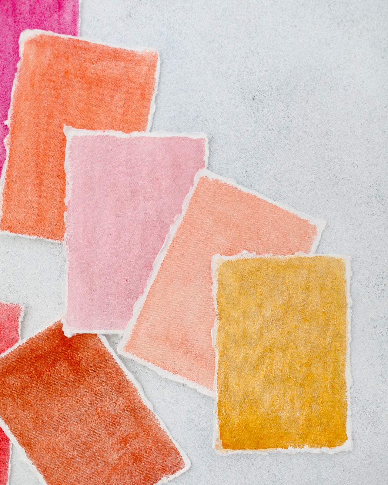
That mustard yellow right there is just singing to me! So good!
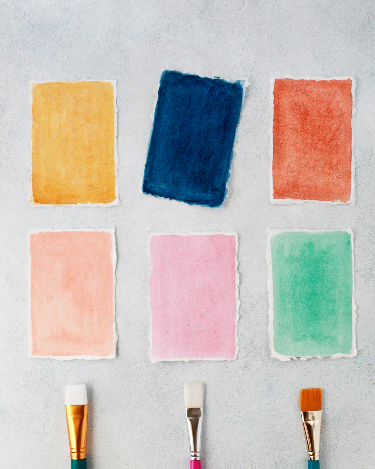
Once everything is fully dry, you can start lettering! The Gelly Roll® Classic™ White pens come in three different weights – 05 fine (0.5mm), 08 medium (0.8mm), and 10 bold (1.0mm) – so you can really have fun with different lettering styles and calligraphy. Fine lines are perfect for elegant calligraphy on a wedding invitation, while the medium and bold lines are fun for more non-traditional lettering on place cards and menus. You can also mix different lettering styles, from script to serif to all caps – the most important thing is to have fun with whatever styles you choose!
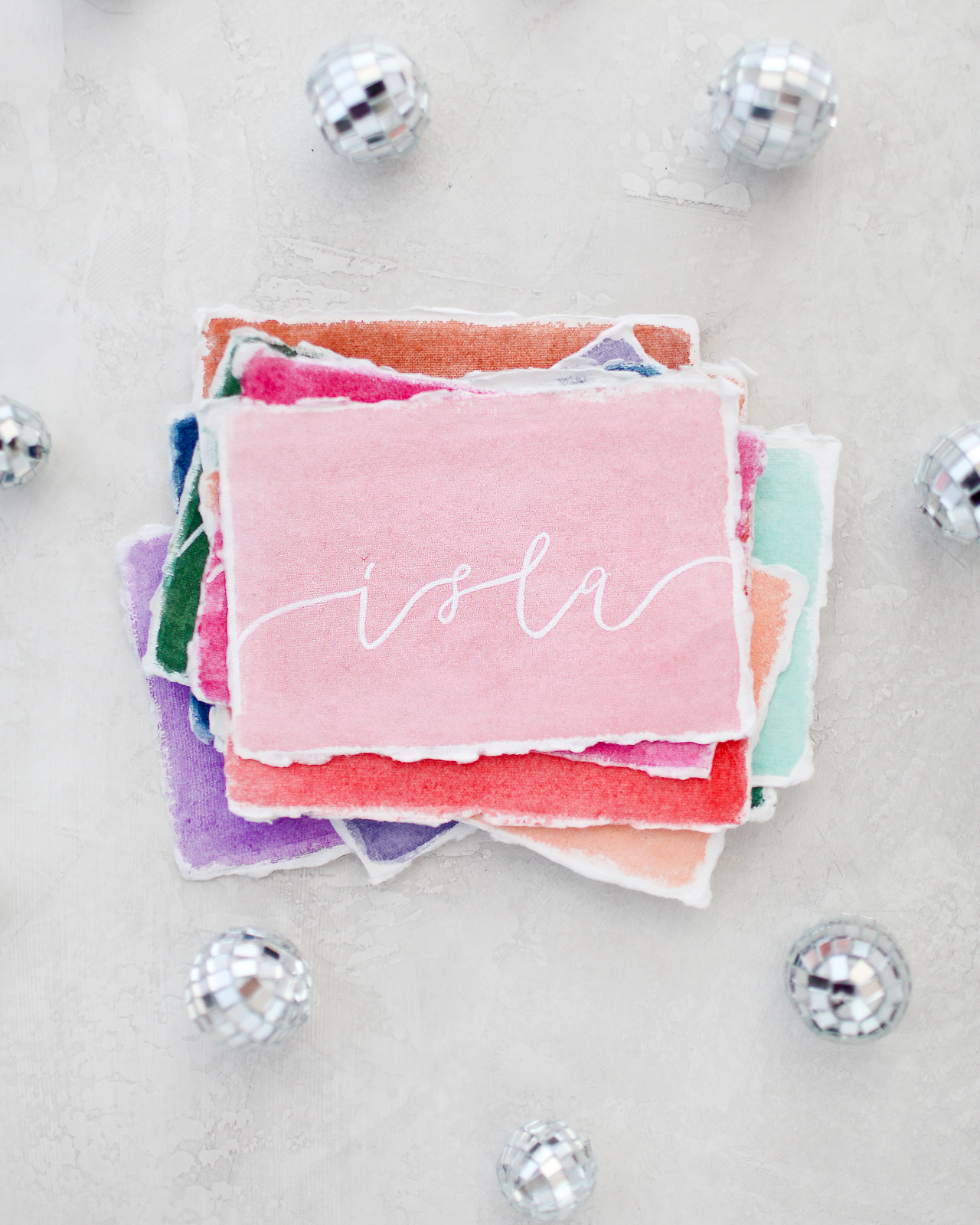
Is there anything better than beautiful watercolors combined with soft deckled edges? It’s just the perfect combination!

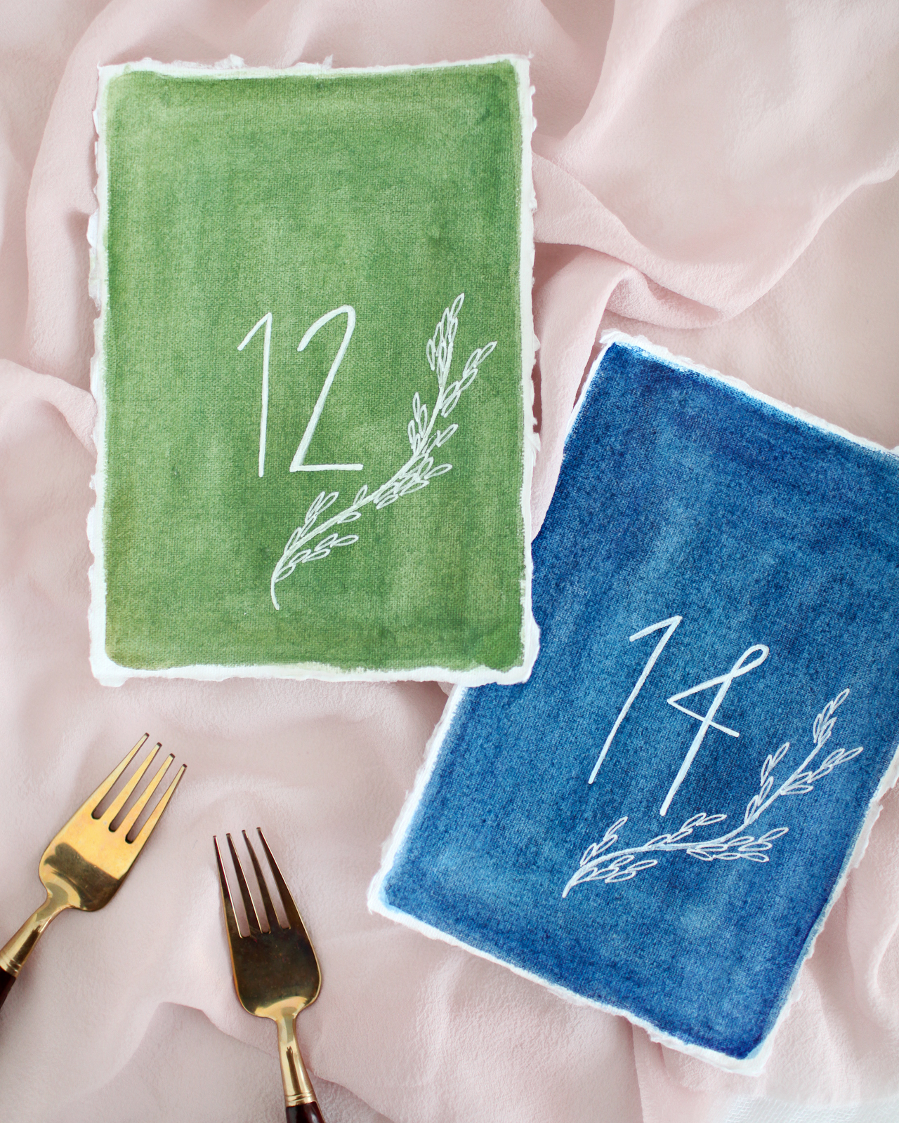
I love the way Molly from Alchemy Calligraphy added these sweet botanical illustrations to the table numbers! Such a fun way to dress up a simple table number design. I love the way the white ink pops against the watercolor, and the texture of the handmade paper also adds such a special and unique touch.
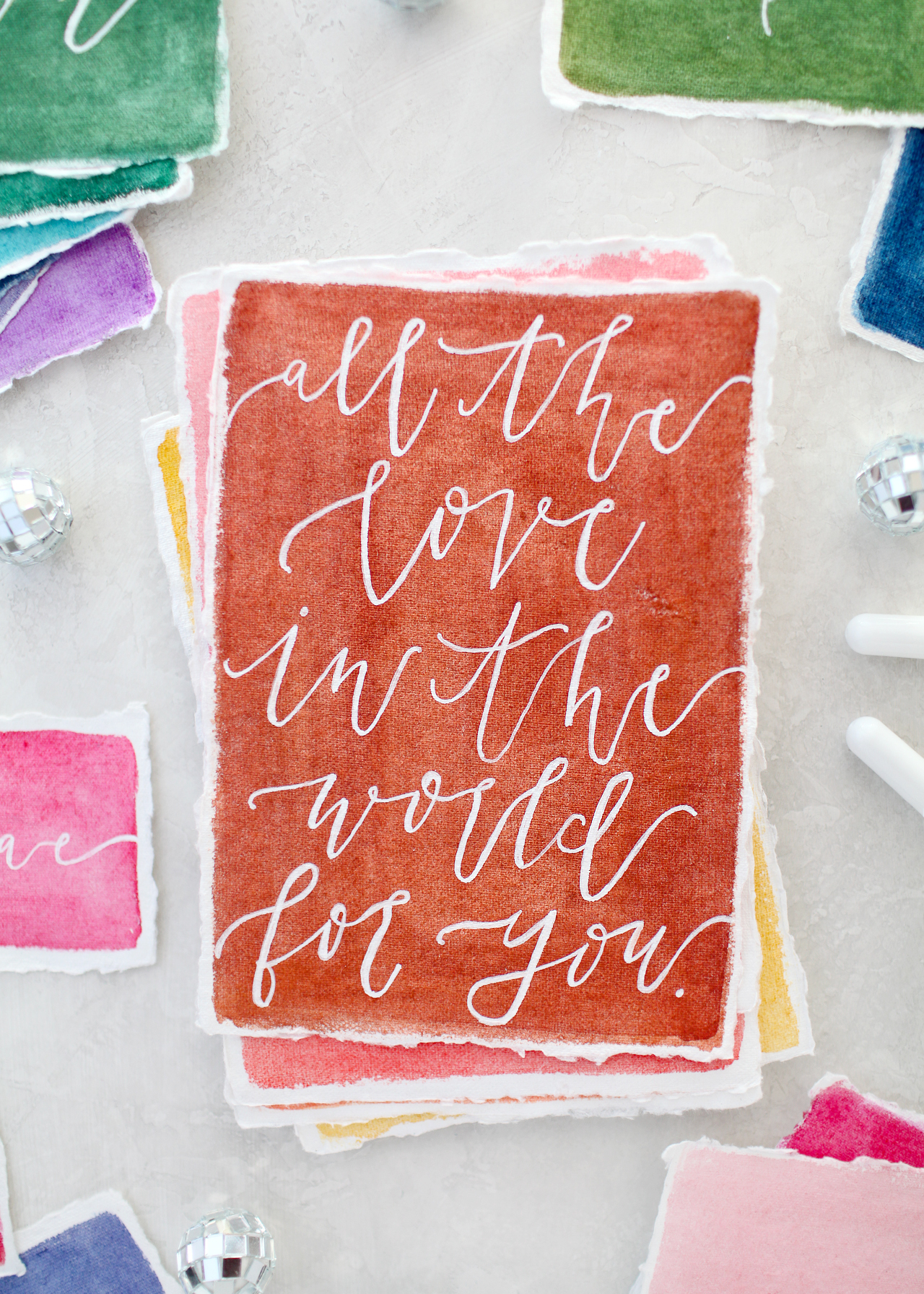
I feel like this quote would be perfect for a guest book, right? Ask guests to leave a note with their favorite marriage advice or even their own favorite quote about love!

So much fun rainbow watercolor wedding stationery inspiration, right??? You can pick up your own 48-color Koi Water Color Field Sketch Travel Kit here and Gelly Roll Classic White pens here – you’ll have so much fun creating beautiful and colorful stationery for your wedding or event!
Supplies: Sakura of America 48-color Koi Water Color Field Sketch Travel Kit and Gelly Roll Classic White pens
Calligraphy: Alchemy Calligraphy
Handmade Paper: Fabulous Fancy Pants and Silk & Willow
Photos by Nole Garey for Oh So Beautiful Paper
This post is sponsored by Sakura of America. All content and opinions are my own. Thank you for supporting the sponsors that make Oh So Beautiful Paper possible!
Bright and Cheerful Floral Watercolor Wedding Invitations
With spring (hopefully) around the corner, we’re loving these bright and cheerful floral watercolor wedding invitations from J. Gregory of Grey Snail Press! This beautiful suite features illustrated florals inspired by the bride’s wedding flowers – including on the envelope liner! – and whimsical hand lettering. The pink and navy blue envelope colors are a fun added element and everything ties together in such a fun and festive way!

From J Gregory: I’ve had the pleasure of knowing this sweet bride for several years, so I was thrilled when I was asked to create the wedding invitations for her wedding in the Smokey Mountains. Hannah is unfussy by nature and really down-to-earth. To say she was easy to work with is an understatement; she was completely open and flexible with the design, letting me take her ideas and run with them.

She elected not to do a rustic or mountain-themed invitation suite, despite their mountain venue. Instead, she wanted something simple, that would include her wedding colors of navy and pink, with lovely, loose florals. I was immediately inspired to get out my watercolors (my new obsession) and start painting. I painted a variety of pink and blue flowers with greenery for the invitation itself, being careful to tie in the colors of her wedding palette. I chose different portions of the original floral design to carry over onto the other cards, focusing on smaller blue flowers for the rsvp card cascading off the top and sides of the card.

All lettering was done by hand and kept very simple and clean with a mix of script and print. We chose to print all text in navy blue ink. Hannah even came up with her own creative wording for the invitation to make it special for them.

Invitations and the corresponding rsvp and reception cards were all printed digitally on white 110lb. Classic Crest card stock, so they were nice and thick. The bright white provided the perfect background for the watercolor florals to really shine while keeping with the simplicity she desired.

With a little input from her mom and sister, the bride chose a cotton candy pink outer envelope for the invitation and navy envelope for the rsvp card. She elected to include a matching floral envelope liner for the invitation envelope. I was so pleased when I discovered that because of the shape of the envelopes, we could actually get an additional envelope liner for the smaller rsvp envelope out of the scrap paper left over from the larger liner. What a bonus not to have any waste!

Instead of having the rsvp envelopes calligraphed, we placed a rectangular return address label on the rsvp envelopes with some flowers peeking around the edges to complete the suite. This can be a fun way to save a little money in the budget. Plus, they’re super easy to assemble and completely customizable. It was truly a labor of love creating this suite for Hannah and Jason, and I really love how they turned out!

Thanks J!
Design: Grey Snail Press
Printing: Zebra
Check out the Designer Rolodex for more talÂented wedÂding inviÂtaÂtion designÂers and the real inviÂtaÂtions gallery for more wedding invitation ideas!
Photo Credits: Grey Snail Press
Purple Watercolor Floral and Calligraphy Wedding Invitations
These beautiful wedding invitations combine two major trends for 2018: Pantone’s 2018 Color of the Year (Ultraviolet!) and a beautiful vellum overlay! Victoria of Design House of Moira created these vibrant purple watercolor floral and calligraphy wedding invitations with intricate floral illustrations on handmade paper. And that gorgeous hand painted envelope liner! Such a fun way to bring rich color to a wonderful winter wedding.

From Victoria: The bride was torn between two different design paths: a simple suite with monochromatic lettering and artwork and something more moody to reflect the winter wedding…so we did both! She wanted to keep the invitation formal, elegant, and subtle while still incorporating some of the darker tones that reminded her so much of winter.

Created on Arpa paper, a Spanish handmade paper with gorgeous, soft deckling on the edges for a natural and organic look, we designed the main pieces of the suite with modern calligraphy, simple type, and line botanical artwork. To bring in the moody feeling, we created watercolor artwork in deep plums and burgundies as well as a contemporary landscape tree painting reflective of the bride and groom’s hometown and the views from the bride’s parents home, where the wedding was held. We incorporated the darker tones into the vellum overlay, envelope liners, and custom postage.


The save the dates were a tri-fold design, slipped into a small envelope lined with the berry artwork and bound with a thin band of vellum printed in the floral pattern. The ceremony program design, a personal favorite of mine, consists of a vellum cover and is on a smaller scale at 3×5 inches. The booklet was stitched along the spine in pale blush thread.


The entire suite was mailed with custom postage featuring two different artwork styles: one with the darker plum tones and one featuring the line botanicals used throughout the printed pieces. Each of the three envelopes in the suite featured different envelope liners: the save the date opened to the plum artwork, the reply card to the line botanical art and the main invitation featured the landscape painting in dark purple and plum hues.

All of the line and watercolor artwork and modern calligraphy was created by hand for this suite by Design House of Moira.

Thanks Victoria!
Design & Calligraphy: Design House of Moira
Arpa paper: Orange Art
Check out the Designer Rolodex for more talÂented wedÂding inviÂtaÂtion designÂers and the real inviÂtaÂtions gallery for more wedding invitation ideas!
Photo Credits: Design House of Moira