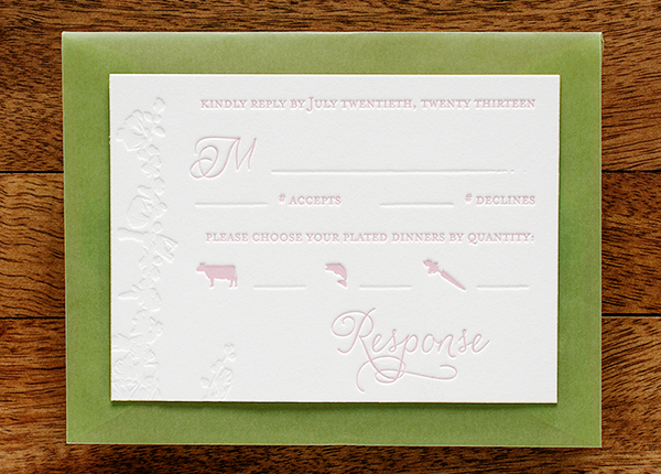
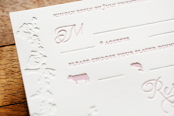
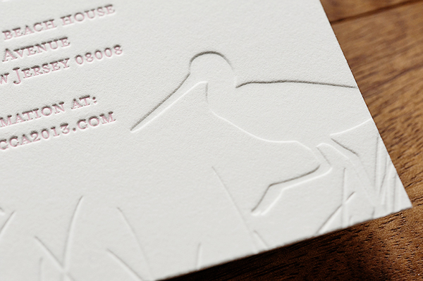
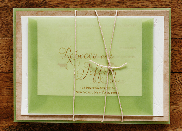
So what do I do when the temperatures dip to sub-zero levels? Dream of the beach! Nina from Tweedle Press sent over these windswept beach letterpress invitations for a summer wedding on the Jersey shore. The invitations feature pale pink text in a feminine script, blind impression background imagery, and a thin piece of wood veneer to evoke the feeling of driftwood.
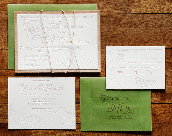
From Nina: When I first met with Rebecca last year to discuss her invitations, she was very clear that, although their wedding would be at a beach location in New Jersey, they did NOT want any cheesy, theme-y, overdone imagery. We discussed muted colors, driftwood, beach grass, and shore birds. She also mentioned that she really liked the idea of bringing in a sea green and a feminine, pale pink. I could tell that they were putting together a very romantic and yet modern wedding, so I set to work using a flowing script font and subtle imagery.
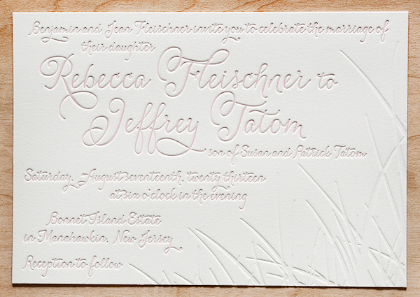
This was one of my favorite wedding invitations I worked on all of last year because it so beautifully showcases the best of what letterpress printing has to offer. The inkless or “blind” impression of the background scenery on each of the pieces, pressed into the thick cotton paper, looks delicious enough to eat.
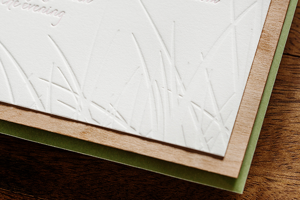
To bring in the driftwood concept, we affixed the main invitations to a very thin slice of a wood. The translucent green envelopes gave the whole package an incredibly airy feel, and guests could see the natural twine wrapping before even opening the envelope. I love these invitations!!
Thanks Nina!
Tweedle Press is a member of the Designer Rolodex – you can see more of their beautiful work right here or visit the real inviÂtaÂtions gallery for more wedding invitation ideas!
Photo Credits: Tru Studio
I never thought pink and green would go well together but in this case, they’re a perfect match! My favourite part is the pale pink letterpress font, it just made the invitations look modern yet classy..Well done!
Congrats Rebecca and Jeffery for your wonderful beach wedding, You both have think very creatively about your wedding invitation and i is very well designed also,the color combination of your is unexpected but you have mix it very well together and two shore birds are looking so cute.Thanks for sharing such a wonderful designs with us as i keep this record in my collection.