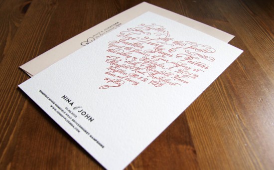
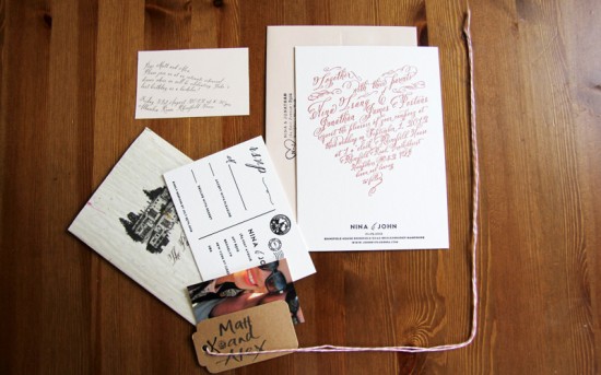
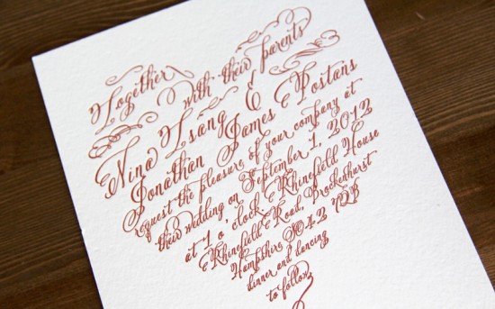
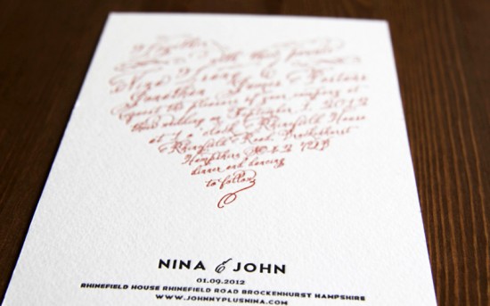
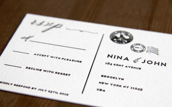
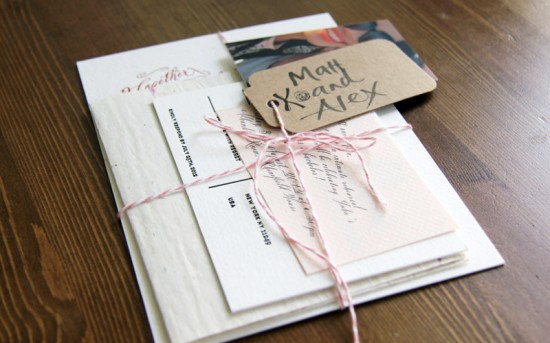
It takes a very brave bride to DIY her own letterpress wedding invitations, and that’s exactly what Nina decided to do!  She kept things manageable by using one of my favorite calligraphy fonts – Belluccia – and limiting herself to a two-color design that fit with her vintage romance wedding theme.  After taking a letterpress course at The Arm in Brooklyn she was ready to get printing, and here’s how the invitations turned out!
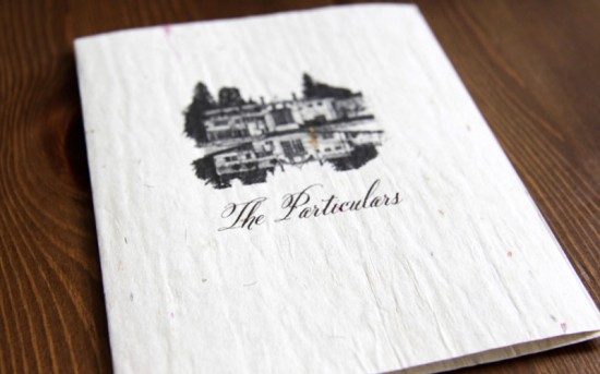
From Nina: I  designed my own wedding invitations using the fonts Telegrafico and Belluccia, then took a letterpress course at The Arm in Brooklyn where I later created these invitations.  I love the texture of paper – we used a super thick 600 gsm weight paper for the main invitation.  I also picked up some beautiful kraft paper from Paper Presentation in New York for some of the enclosures.
We used two letterpress colours: a custom made red and a standard Pantone Black. Â My theme is based on a Midsummer Night’s Dream and vintage romance, so I wanted a lot of muted pale blushes and lilacs. Â The red in the main invitation is a nod to my Asian roots (red is the colour for Chinese weddings!).
Great work Nina – congratulations!
Check out the Designer Rolodex for more talÂented wedÂding inviÂtaÂtion designÂers and the real inviÂtaÂtions gallery for more wedding invitation ideas!
Photo Credits: Nina Tsang

Wow! I LOVE this invitation! The unique design really shows off all of my Belluccia fonts curves. Thank you Nina!
These are gorgeous. I love the calligraphy and the romantic feel created by the heart shaped content.
Thank you – pleased you liked them…feel awful in saying this but had more fun making these than shopping for the dress!
I love this invite! My Fiances name is John and as you can see my name is Nina so it really draws my attention!