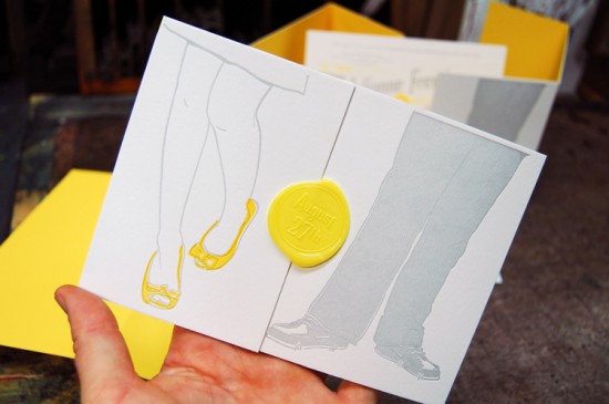
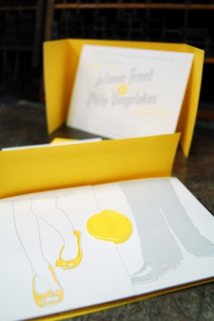
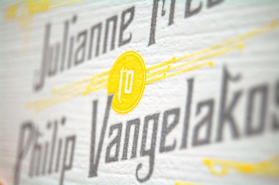
The folks down at Mama’s Sauce are really on a roll lately! Â First they create some seriously cool business cards, and now these awesome wedding invitations. Â Nick from Mama’s Sauce came up with the concept of basing the invitation design around an illustration of the couples’ shoes by Itchy Illustration, then incorporated the design into a horizontal tri-fold layout with a sunny yellow wax seal. Â Love it!
From Nick: The couple wanted their printed materials to be a balance of playful & classic.  When it came time to design the wedding invitations months after our first consultation, Julianne’s love affair with her shoes was still stuck in my mind.  I quickly sketched a scene of the couple standing side by side with a bright popping yellow, highlighting Jewel’s shoes.  Not your typical wedding invitation, but typical isn’t what the couple wanted.
I am especially in love with the tri-fold wrap. Â 110# Pearl White Lettra Duplexed to French Paper Lemon Drop, we experimented with a type of die cut that allowed the wrap to fold and expose the yellow paper underneath creating a tri-colored edge. Â A subtle detail that the most aesthetically sensitive recipients will surely appreciate. Â Add a wax seal and the wrap is complete.
A collaboration with our friend & officemate, the talented Brian Boesch of Itchy Illustration, Julianne & Phil’s save the date and wedding suite are amongst our favorites that we’ve designed and printed this year.
Very cool – I love the layered effect with the yellow tri-fold die cut wrap, and of course that wax seal!  Thank you so much Nick!
Photo Credits: Mama’s Sauce


Aw, yay!!! I LOVE MAMA’S SAUCE!! So great to see locals from my hometown get the great recognition & exposure they deserve!
Love them! Tres chic! Such a great idea, keep it up.
This are just incredible, and they use two of my favorite papers!
oh this is gorgeous love it!