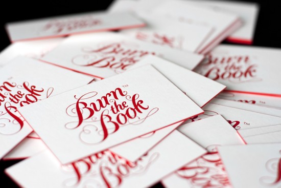
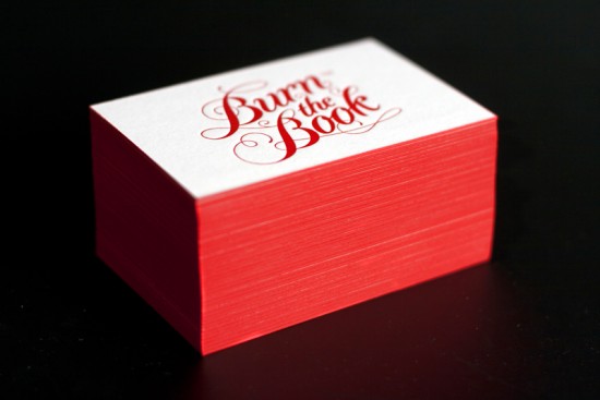
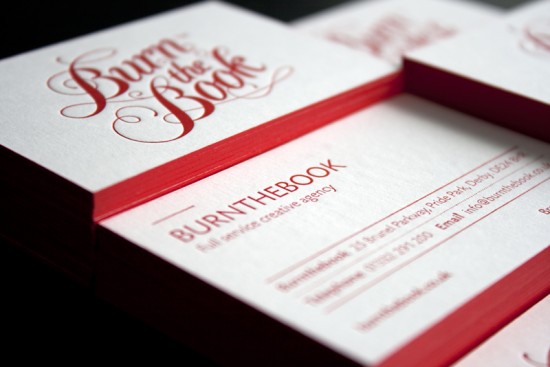
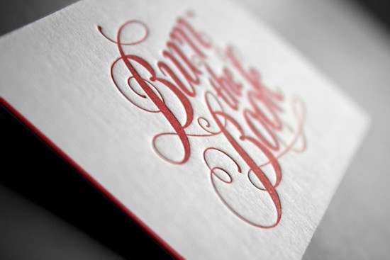
These letterpress business cards from Bobbie at Burnthebook, a creative studio in the UK, are all kinds of awesome – from the beautiful logo to the crisp red and white color palette.  Burnthebook has a background in publishing, so they incorporated red edge painting in a nod to the painted edges of antique books, which just makes me love the use of this particular technique even more!
From Bobbie:  Our studio is called Burnthebook. We’re a full service creative agency in the UK with a background in publishing.  So when we created our new branding and stationery, it made sense to develop ideas surrounding bookbinding and traditional printing techniques.  Our branding is based on traditional publishing marks, whilst the business cards themselves are letterpress printed.  The coloured edges are reminiscent of the painted edges found on antique books, but we’ve used a bold crimson and white for a contemporary twist.
Thanks Bobbie!
Photo Credits: Burnthebook


Beautiful caligraphy and the red around the border really makes it POP!
wow what a beautiful design …….. really its wonderful
These are totally all kinds of awesome! I love the gilded edge!!
I LOVE the lettering and the edge. So simple but so well executed.