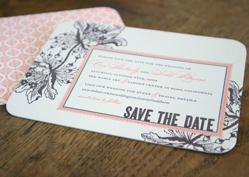
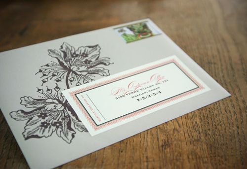
So today is apparently all about color palettes! Earlier it was shades of blue, and this afternoon it’s all about coral - one of my favorite colors this spring! These invitations were created by Dauphine Press for the wedding of their art director, Erin, in California last fall. First up, Erin’s Save the Dates, which mixed a lighter coral and espresso brown inks from her original Latin-inspired wedding vision:
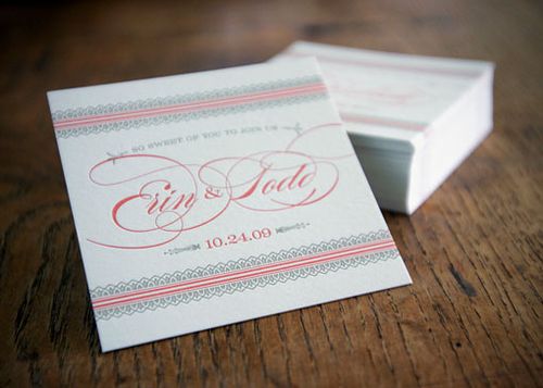
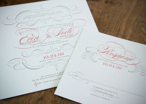
Erin’s theme evolved as the wedding planning process continued, so for her invitations she went with a more romantic and sophisticated design – again using the bright pops of coral but paired with a more subdued pewter ink and ornamental flourishes:
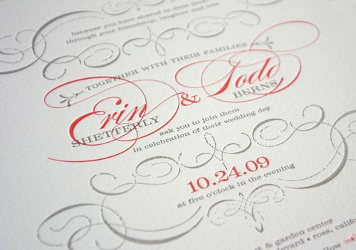
So lovely! You can read more about the design process and influences on the Dauphine Press blog right here – and check out photos from Erin and Todd’s wedding here.
{image credits: dauphine press}
these are stunning! absolutely stunning!
Beautiful colors. I especially love the Save the Dates.
Gorgeous! We had this same color palette. To save on letterpress, we only used grey ink, then painted the edges pink ourselves. 🙂 I think we used the same font, too!
These are lovely!