Today's first giveaway features another long-time favorite here on OSBP — Sycamore Street Press! From their collection of super-awesome greeting cards to playful letterpress prints, not to mention gorgeous wedding invitations, it seems like I can never get enough Sycamore Street Press letterpress goodies.
I had the pleasure of meeting Eva and her husband Kirk at this year's NSS and I'm thrilled to include Sycamore Street Press in the week's celebration. For this giveaway, Eva and Kirk are offering one lucky reader their choice from the Sycamore Street Press collection of letterpress prints. Yay!
So here's how to enter: head on over to the Sycamore Street Press etsy shop and browse through their selection of letterpress prints. Choose your favorite, then come back here to leave a comment letting me know which print you've chosen and where you would hang the print if you win. You'll have until 11:59 p.m. EST tomorrow, September 11 to enter. Bonne chance!
UPDATE: Congratulations to Frances! With 110 entries (!!), I selected a winner via random.org and Frances came up as lucky #81. Frances, you'll be getting the La Vie En Rose print that you really, really wanted. Enjoy!

{image credits: Sycamore Street Press}
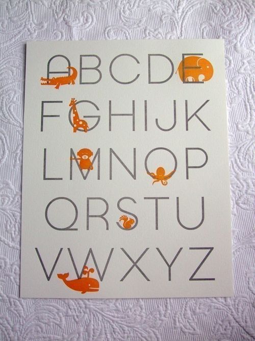
What a lovely collection of prints! My favourite has to be “Letterpress Alphabet Poster. Chocolate/Apple. 11×14”. My daughter starts big school next term so this will go in her playroom where I shall be drilling her until first day starts 🙂
Oh my this is such a great contest. 🙂
I LOVE the ‘heart on my sleeve’ print.
I truly adore it.
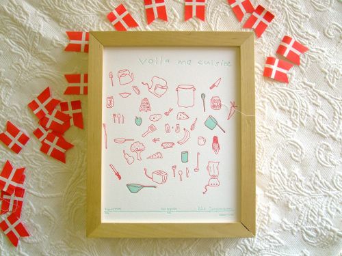
I have been admiring the Kirk Jorgenson AUG 09 “voila ma cuisine” print.
As Kirk says “…lists, inventories, food + cooking..”
aahhh.
Hapy Aniversary!
Definitely the Letterpress Alphabet Poster. in Chocolate/Apple. I have been eying it for sometime as it is adorable and perfect for my son Oliver’s room, done in apple, chocolate, orange and sky blue.
me & Oliver,please!
the tulip/water color combo for the alphabet print is amazing. nice work!
Oh! I love the Alphabet poster in chocolate and green apple! I would give/hang it in my new nephew’s room, I think it would be such an adorable touch to a nursery (and eventually a kid’s room)!
I love so many of Sycamore Street’s prints – I think my favorite is La Vie En Rose – which would be perfect in my living room.
It’s funny, but from taking a walk through my home you’d never know I was an artist – well except for all the supplies in my workshop. I mean that I have surprising little art hanging in my home. And since I not only have a love affair with letterpress, but with Sycamore Street Press as well and their quirky style I’m thrilled for a chance to win one of their lovely prints!
My personal fav is the July ’09 print. I just love it. It’s so visually pleasing to me – the shapes, the scrolls, the color choices. I can already picture it hanging in my living room and picking up the orange in the rug. That’s the thing about choosing the right art, it makes your secondhand decor looked thought out and wonderful.
I’m keeping fingers crossed for this giveaway!!
First of all.. oh how I love this giveaway week at OSBP! 🙂 Happy Anniversary, Nole!
I would definitely hang Kirk Jorgenson’s “Voila Ma Cuisine” in my kitchen but the “Letterpress Alphabet” and the “La Vie En Rose” are so beautiful, too!
Such an interesting and fun collection. I think the “Fancy Seeing You Here” peacock print is just adorable. I picture it hanging right by my front door and delighting me and my guests as we leave my home.
I love the letterpress number poster. Wonderful giveaway!
The Letterpress Alphabet Poster in Graphite/Tangerine is perfect! I’ve been looking for a few things with a pop of orange for my son’s bedroom. Thanks for hosting such wonderful giveaways!
I love the numbers in tangerine. The kangaroos with joeys in the pockets are the best! I know a 1-year-old whose bedroom needs this.
Happy Anniversary and thank you for all the giveaways! My husband and I will hopefully be starting a family next year and I think the Letterpress Numbers Poster in Chocolate/Apple would look just beautiful in our baby’s room.
I love the “La Vie en Rose” print! I think it will look very lovely on my bedroom door…..
I’ve always been a fan of their “fancy meeting you here” Peacock print!
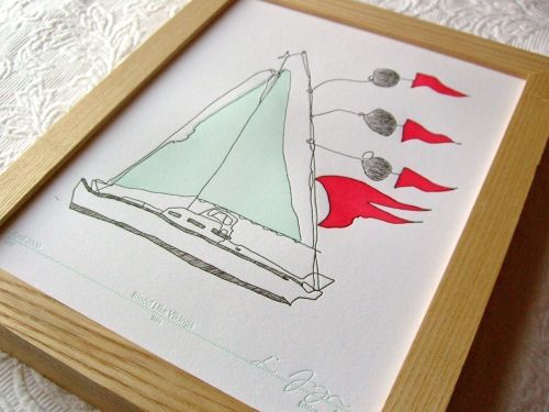
We absolutley LOVE the Little Turquoise and Red “April ’09” Sailboat. My fiance and I are getting married next weekend on the water. Our colors are turquoise and red/fushchia and he actually has a sailboat boutineer from Fritts Rosenow! http://www.rosenowfloral.com/frittsrosenow/
This would be the PERFECT wedding gift to tie everything together. We’d hang it in our bedroom, next to one of wedding photos!
Thanks so much!
my favorite is july 09.
i would hang it up here: http://rubyurl.com/Re1z
I’ve admired this shop for a while now! The alphabet letterpress poster is definitely my favorite. Thanks!
I just love the Peacock – Fancy seeing you here print. It would be so perfect for my home office that I’m in the process of redecorating. Crossing my fingers!
For me it would be the numbers poster (Orange/Graphite). I would hang it up in my studio to inspire me to create every time I see it.
I love the Letterpress Alphabet Poster. Modern Design. Graphite/Tangerine. . . . I would love to do nurcery with purple and orange . . . and this poster would just be so cute in a nurcery! I love it.
Love Kirk Jorgenson’s “Voila Ma Cuisine” print especially since I love to cook. This would definitely go in my kitchen or dining area. Thanks!
my favorite is the April 09 Limited Edition Kari Jorgensen print!
Thats a tough one to pick… all their prints are so lovely! My favourite though is the April 09 print (boat)… I would hang it above my bedside table to remind me of the sea when am drifting off to sleep…
I love love love the peacock and alphabet prints. The alphabet would be for a nursery but alas, no children yet, so I would want the peacock one to hang in our kitchen-a prime gathering place for people we love.
I love love the Letterpress Numbers Poster. Chocolate/Apple. 11×14.
The April 09 Letterpress print of the boat would be absolutely perfect in my godsons nursery. My future sister in law is a fabulous decorator and painted a gorgeous mural of boats and planes on the wall. We’ve been searching for complimentary artwork to hang and this is it! I would love the chance to surprise her with it.
My favourite is the July 09 Meredith Prevot Print. It’s beautiful and would work perfectly in my bedroom!
My fiance’s best friend (and the best man in our wedding next year, if he can make it!) just told us he and his wife are expecting their first child, and their due date is our wedding date! I would absolutely love to give them the Alphabet print in the Tulip/Water combination. It would be perfect in their new nursery and his wife loves letterpress as much as I do!
I love most the letterpress alphabet print in gray and tangerine. We have orange accents in our home office, so it would be perfect for us.
Thank you for the opportunity to win your amazing work!
I am so excited to see this as a giveaway! I follow their blog religiously and love their art! My favorite right now has got to be the Blood Like Vikings print by Kari Jorgensen. It would look wicked in my sunroom between my two bookshelves. There is a huge blank wall space that I have been waiting to find the perfect piece of artwork to hang there.
YAY again for choosing this giveaway!
ooo what a great giveaway! I chose the chocolate and
apple numbers print for my new nephew who should be here by christmas
YAY! SSP! They are fabulous.
OK, I would choose the Letterpress Alphabet in chocolate/apple, and I would give it to my sister to hang in my baby niece and nephew’s nursery. 🙂 It perfectly matches the colors of their room, and it’s (obviously) ADORABLE.
Thanks for yet another awesome giveaway!
YAY! SSP! They are fabulous.
OK, I would choose the Letterpress Alphabet in chocolate/apple, and I would give it to my sister to hang in my baby niece and nephew’s nursery. 🙂 It perfectly matches the colors of their room, and it’s (obviously) ADORABLE.
Thanks for yet another awesome giveaway!
I love the apple/chocolate alphabet print! So lovely!
I would probably put it in an entry way or even up by my desk area. I dunno… it would look stellar anywhere!
I think I would choose the Letterpress Numbers Poster in Graphite/Tangerine. Of course, then I would have to buy the matching Alphabet Poster, but that’s OK. I love Sycamore Street Press!
the March 09 limited edition. I love those colors. Or La Vie en Rose. Merci for posting this!
I love the whiskers poster. It’s clever and adorable! I would hang it in my bathroom right next to where my husband shaves.
My favorite is April ’09. Letterpress Limited edition of 100. 8×10″. Original Print. Kari Jorgensen, and I would hang it in my bathroom. =)
I LOVE Sycamore Street Press! I actually just (like 3 days ago) bought their “Blood Like Vikings” print by Kari Jorgenson. Before I checked out, I had the July ’09 “Après Soubise” print by Meredith Prévot in my cart, but I took it out at the last minute because (sadly) food won out over art. If I won this, I would LOVE the “Après Soubise” print.
As for where I would hang it….my husband has been working non-stop to refinish the original oak floors in our home. When they are all done and we have painted, we are going to turn our hallway into a mini art gallery. The print would hang there so I could look at it multiple times a day.
the sail boat. for sure. i love the saying that goes along with it. “This is the tattered and brave little boat I took sailing around the whole world. In my dreams.” — Kari Jorgensen.
I would put it in our guest bathroom that is a soft blue (i think its a match for the print!)and gray and has white accents. the punches of red would be PERFECT! I already have a white 8×10 frame in there (on the wall, infact) and I havent been able to find antyhing worthy enough to put in it….until now! 🙂
I would choose: http://www.etsy.com/view_listing.php?listing_id=30686658 And it would hang above my desk where I work from home…more to inspire me!
They do such LOVELY work! <3
Oh dear. That whiskers print makes me giggle. I would hang it in the kitchen, over the stove, because I hate cooking but it might be a little better with whiskery men and kitties staring back at me.
My favorite is “Bon Appétit/Voila Ma Cuisine.” This print reminds me of Richard Scary books that I loved as a child. I would hang it in either my kitchen or dining nook and enjoy scanning over the food items each day.
They have such gorgeous things. I really love the letterpress alphabet.
I would get the Tulip/Water Alphabet print and give it to my friend who will be having her first baby soon. It would be a great print for her nursery!
I love the Letterpress Numbers Poster in Graphite/Tangerine as well! So pretty.
Oops, I forgot to include where I’d hang the Alphabet Poster (my fave!) if I win – we have a new home to decorate, and I’d love to find a spot for the print in it, near something turquoise 🙂
I choose the Alphabet poster in tulip and water, since I am obsessed with letterpress, and my 3-year-old daughter is obsessed with both blue and the alphabet. It would go in her nursery of course!
I have the perfect happy home for Kirk Jorgensen’s “Bon Appétit” on a currently too-bare yellow wall in my kitchen! It would be perfect over the kitchen table, away from the splatter of the stove!
i would choose the alphabet print to hang above my little one’s bookcase!
OMG I have been admiring Katie Kortman‘s March 09 Print since, well March! I would put it in my bedroom, right above my dresser where I keep my jewelery box– the colors match my room‘s decor perfectly and the design reminds me of a necklace my grandmother gave me!
The numbers print in tangerine would be lovely for any home with a young child!
My Favorite-April 09. Letterpress Limited edition of 100. 8×10. Original Print. Kari Jorgensen
I would hang it in the downstairs of our bathroom in our new house when we move in on september 30th!
I love the print by Meredith Prévot. I am a designer myself, so I would hang it in my office with all the other pieces that inspire me on a daily basis.
I would love the La Vie En Rose! It is so chic. I would hang it in my studio. Love Eva’s stuff
This is an awesome giveaway. I love the April ’09 letterpress print. The colours are amazing and it reminds me of a big sea creature.
i am all about that chocolate/apple alphabet print. 🙂
I think Sycamore Street Press was the first shop I ever favorited on Etsy, so this is pretty much the most exciting giveaway ever! My favorite piece is the Heart on Sleeve poster. I would frame it and add it to my living room wall. The wall currently displays several pieces and I’m always looking to add more! THANKS!
I love the August 09. Letterpress Limited Edition of 100. 8×10. Original Print. Kirk Jorgensen. Definitely hang in my kitchen!
I love the La Vie en Rose print. Rose was my great grandmother’s name so its a special name in our family! I would hang it above my craft desk.
Any of the alphabet one – particularly the chocolate and apple one. My one-year-old niece has that color green in her bedroom and would love it!
The La Vie en Rose Poster. I would hang it in my bathroom.
this is so exciting! i’ve been eyeing the Letterpress La Vie en Rose Poster for awhile now!
Oh, La Vie en Rose is stunning! I’d hang it in our home office.
Love the April 09 sail boat by Kari Jorgensen. It would look lovely in my new office.
I’ve been drooling over the alphabet poster for a while now – in chocolate and apple. I have the perfect spot for it in the kitchen where everyone who comes over can love it too!
My favorite one is the peacock one. I think it would look very nice hung in my entryway.
I would definitely get the Alphabet Print in Tulip Red 🙂 My friend (who’s due date was 9.9.09) is expecting her first baby & it would go PERFECT in their little nursery. As fellow type nerds, we expect to educate the little one early 😉 And it’d be the perfect color pop for the room!
How many beautiful things Sycamore Street Press has right now. I especially love the Letterpress Alphabet Poster in graphite/tangerine!
I had already purchased one of the alphabet posters for my sister – she’s due in October and I wanted her to have something cute to decorate her nursery! For myself though I actually like the March 09 Limited Edition – Eva said it was based off a doodle she did from a boring work meeting. I would definitely love to have this hanging at my work space to ease my boredom!
What a great company! I would choose the letterpress alphabet poster for my friend Holly. She’s having a baby in February and is about to start painting the nursery. The color of the poster would depend on her decor. 🙂
I’ve been oogaling over the print done by Katie Kortman but then I can’t stop thinking about the heart/sleeve print. Love it all.
The peacock poster is both beautiful and quirky, which I LOVE. I would be thrilled to display it in my apartment.
Voila Ma Cuisine! Because my fiance and I love to cook and experiment with foods! Sometimes I call him in to take a look because its beautiful and sometimes because I’ve created something so awful! It would go in our kitchen!
The Heart on Sleeve is my absolute favorite, probably because that’s exactly where I wear mine! I’d love this hanging in my studio so I can look at it while I work.
I’ve been admiring the alphabet poster for over a year now and would love the chocolate/apple print to hang in my 2 year old’s room.
I love the tangerine and grey alphabet print and would give it to my godson Ellis for his room.
LOVE the peacock print — i’d hang it in my new bathroom not only b/c it’s beautiful, but b/c the phrase would just be funny in a bathroom anyway 🙂
http://www.etsy.com/view_listing.php?listing_id=30710301
I love the peacock! I would hang it in my office.
really? really? I enter every single Sycamore Street press giveaway. wishful thinking, all the time. I would have to say my favorite is the La Vie en Rose. Love the detail and color.
Lovely letterpress…I am really digging the May 09 Ikumi Watanabe print. It’s so cute and would fit perfectly in our hallway!
Feb. 09 print, fo sho
i love the peacock print! i would hang it on the wall above my desk, for inspiration of course!
I love the July 09 print. I’d put it in my office at work – it needs a little umpfh
i’ve totally been digging the new ‘ma cuisine’ print since they released it a few weeks ago.
thanks!
I love the ma cuisine (Aug. 09) for our kitchen but would also LOVE the Feb. 09 for the living room. So many great choices!
Letterpress Alphabet Poster (Chocolate/Apple) in my guest room where my nephew frequently stays. He’s turning 2 on the 29th and is always surprising me with how many new words he knows and how far he can count. Since green is his favorite color, we’ve been working on incorporating that in the decor and this would fit so nicely!
With strong Scandinavian roots I could not pass up Jörmungandr. I think that this piece would be great inspiration in my studio space.
I would hang the fabulous “La Vie En Rose” in my bathroom. My husband and I live in a very rustic 1200′ cabin in the woods, and unlike the rest of the house… the bathroom is all mine. Deep soak tub, light dreamy colors, very girly girl… and filled with all things lovely and graceful. This print would be the most perfect addition!
The chocolate/apple alphabet would be perfect for my son’s room. I love Sycamore Street Press!
I think that the “fancy seeing you here” is wonderful and I think it would look cute as a button hung up in my entry way. I mean what a message to be sending to you loved ones when they stop over to visit!!!
I adore the “La Vie en Rose” print. Absolutely gorgeous!
i love the july 09 letter press print. i would hang it above my workspace in my tiny apartment. the color will brighten things up!
The Sycamore Street Alphabet posters have been on my wishlist for a while. That was, until I saw the Heart on Sleeve poster. I guess if I win one I’ll just have to buy the other.
I’m a sucker for letters and, at the moment, orange and gray! I would hang this in my foyer, where it and the cute creatures could meet everyone coming in!
I love the “La Vie en Rose” poster. It would go perfectly in my soon to be little girl’s nursery.
the tulip/water alphabet poster. drool!
these are great! i love the sleek designs! the rose/watermelon color alphabet immediately stuck out. the color is so pretty and girly. it immediately reminded me of my adorable 2 1/2 year old niece who lives clear across the country now. my sister said she’s sad that she doesn’t get to go to school with her big brother and it’d be real fun to give her an alphabet to put in her bedroom.
My fave is the La Vie en Rose Poster, which I would hang in my bedroom! Great giveaway!
I love la Vie en Rose, been waiting for a little extra spending money to purchase it! The voila ma cuisine is really great, too– good job Kirk!
My favorite is the Kari Jorgenson April 09 print of the sailboat. I absolutely love the quote in the item description. I also love the March 09 Katie Kortman print. The drawing and colors are amazing. I would hang either of them in my hallway, where I’m starting a gallery wall of prints and photos that are inspiring to me.
The green alphabet is so cute!
I’ve been coveting the alpha & numeric posters in Red/Pool forever! They are so perfect!
I do love the new cooking print by Kirk and I have a nail in the wall in my kitchen where I would hang it, right above my toaster oven! It would compliment my kitchen perfectly;)
My choice would be March 09. Letterpress Limited Edition. 8×10 original print. Katie Kortman. I would definitely hang this in our room to give it more color and to counter all the electronic gadgets we have. 🙂
April ’09. It would be perfect in my new baby’s room!
The “August 09. Letterpress Limited Edition of 100. 8×10. Original Print. Kirk Jorgensen” would be perfect in our newly painted kitchen … when we get it painted 🙂
The Alphabet in Water/Tulip! Where will it hang? In my newborn godson’s room, of course!
Oh so many great ones to choose from. I’d probably pick the August 2009 print (Voila Ma Cuisine). I think its the little spatula that really gets me 🙂