Calligraphy Inspiration: Plurabelle Calligraphy

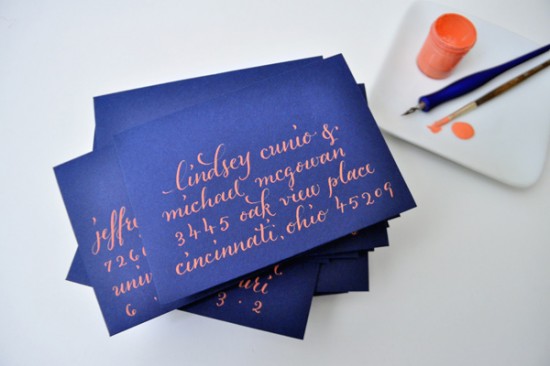
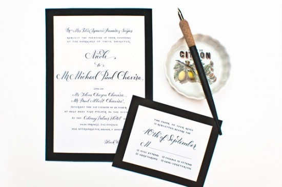
I’m met with an appeased feeling when I see calligraphy with personality; when a lettering style and a colour palette paint a picture in your head of what the person would be like as you look at it.  When I first came across the work of Molly Suber Thorpe of Plurabelle Calligraphy, I got that feeling.  What captured my attention was how unique each project felt.  Some sincerely whimsical, while others strikingly sophisticated.  Molly works closely with individuals to ensure their desires are met, creating beautiful calligraphy for her clients. – Julie
Plurabelle blue addressed envelopes

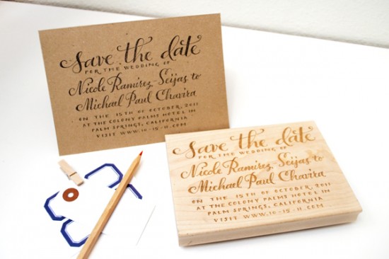
Plurabelle Save the Date stamp
The array of beautiful ink and envelope colours in her portfolio may inspire the palette for your own event.  When it comes time for the invitations, try a simple custom approach like the save the date stamp above.

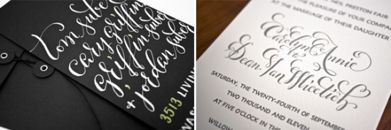
Plurabelle calligraphy details

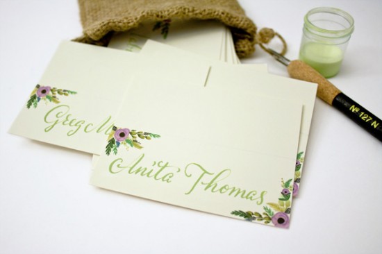
Plurabelle place card

Some cards from Rifle Paper Co. and the perfect shade of green set these place cards apart from the rest.  A match made in heaven, don’t you agree?

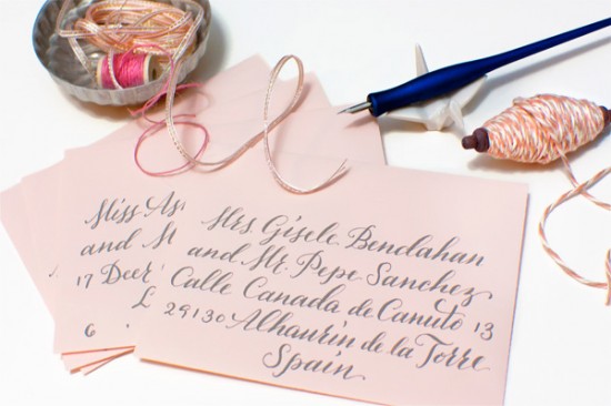
Plurabelle pink addressed envelopes

Plurabelle black & white wedding

With a background in graphic design, Molly also offers custom invitation design.  Be sure to stop by her website, her Etsy shop for a stamp of your own, and her blog for more inspiration.

Photo Credits: Plurabelle Calligraphy

Inspired by: Aqua

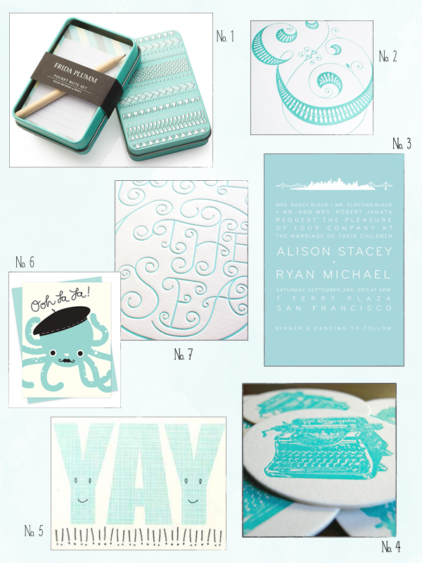
I usually think of aqua as a summer color, but I’ve come to love this gorgeous hue any time of year.  In the winter, aqua pairs wonderfully with my favorite holiday color palette of gray, red, and white, and it also looks amazing with sparkly metallics.  In warmer weather it also looks amazing with bright yellows and oranges (Tangerine Tango, anyone?) and soft neutral beachy tones.  The possibilities are endless, so today I thought I’d do a little round up of awesome aqua paper goods and accessories!

No. 1 Frida Plumm; No. 2 Ampersand print by Jessica Hische; No. 3 San Francisco skyline wedding invitation by Hello!Lucky; No. 4 Coasters by Paisley Tree Press; No. 5 Hello!Lucky; No. 6 Night Owl Paper Goods; No. 7 Studio on Fire

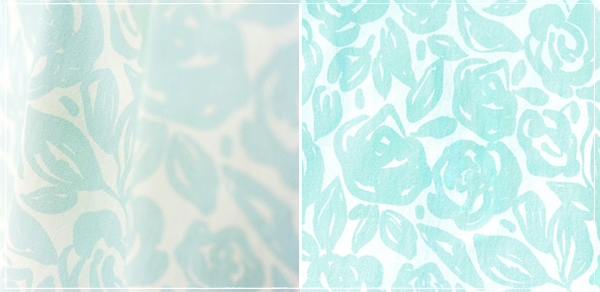
I’ve also had a huge crush on this light aqua floral fabric from Rubie Green for months now.  I recently bought a couple of yards for a project that I’m working on and it’s even more beautiful in person!

Hello!Lucky is a mem­ber of the Designer Rolodex â€“ you can see more of their beau­ti­ful work here!

{images via their respective sources}

*Paisley Tree Press and Hello!Lucky are some of my fab­u­lous spon­sors; for more on my edi­to­r­ial poli­cies please click here.

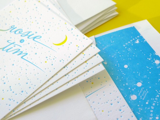
Rosie + Tim’s Constellation Engagement Party Invitations

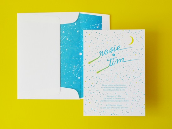
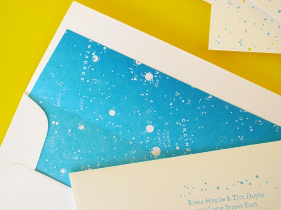
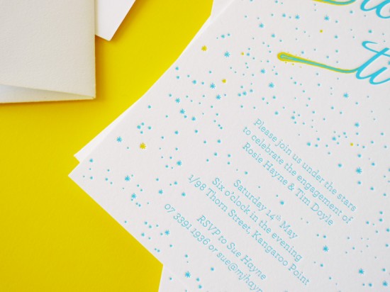
I’ve had a thing for constellations, well, pretty much forever – so naturally, I’m completely in love with these constellation-inspired engagement party invitations by The Hungry Workshop.  Simon and Jenna from The Hungry Workshop were inspired by the clients’ description of the night as a “celebration with friends under the stars,” incorporating shooting star details and a matching custom envelope liner fashioned from an antique constellation map.  So beautiful!

For Rosie and Tim’s names, Jenna modified La Portenia into two shooting stars, with the remaining type set in Archer Light.  Simon illustrated and arranged the stars for the background.  The entire invitation suite was letterpress printed on Crane Lettra 300 gsm cotton paper.

For the envelope liners, Jenna and Simon found an old star map in the New Concise Atlas of the Universe, which they modified and letterpress printed on text weight paper in the same matching blue ink used in the invitation.

Lovely!  For more from The Hungry Workshop, check out their portfolio and blog!

Check out the Designer Rolodex for more tal­ented wed­ding invi­ta­tion design­ers and the real invi­ta­tions gallery for more wedding invitation ideas!

Photo Credits: The Hungry Workshop

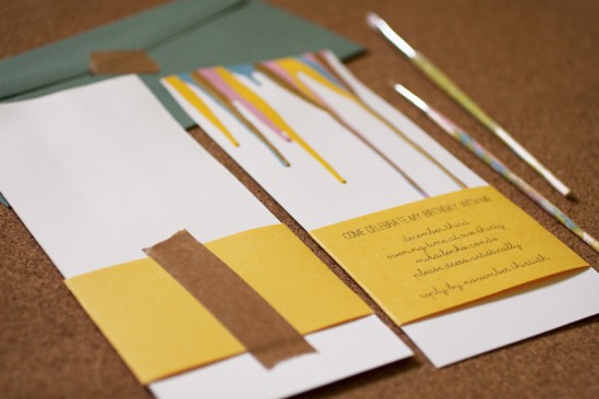
Anastasia’s Paint Drip Birthday Party Invitations

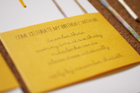
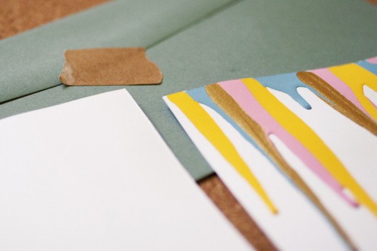
You might remember Anastasia’s bright and colorful Kate Spade-inspired birthday party invitations from last year, and today Anastasia is back to share the invitations for this year’s birthday party!  I love the simple inspiration behind these invitations: Anastasia simply dipped into her personal paint supply and let a few drips run down a trimmed sheet of paper!  Anastasia printed all the relevant details on a yellow belly band, using kraft paper tape to secure the two pieces.

From Anastasia: I found some super thick paper that I had lying around and picked out four colors of paint (sunny yellow, ocean blue, pink, and metallic gold) from my craft box.  I squeezed the paint onto the trimmed thick paper, letting the excess roll down the invitation.  All the party info was printed on yellow paper and trimmed just so I could wrap it around the invitation.

I secured the yellow strip with super sticky kraft tape on the back.  I also added puff tape underneath the front portion of the strip to give it a bit of lift.

So fun!  Thanks Anastasia – and happy birthday!

Photo Credits: Anastasia Marie

Josh + Lauren’s Illustrated Letterpress Wedding Invitations

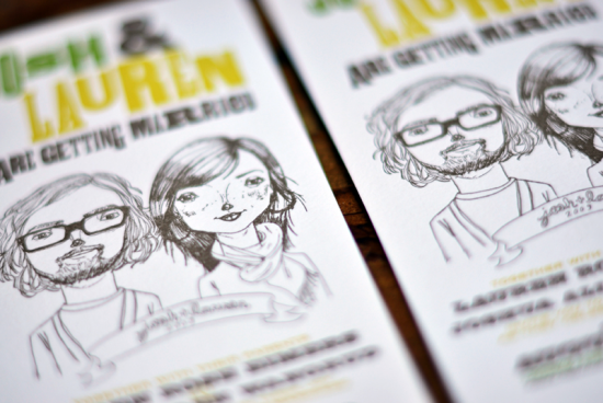
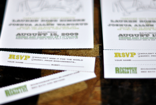
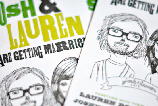
Around this time every year, I start going back through all my pins and bookmarks – all the pretty things that have caught my eye throughout the year.  Last night I came across these invitations over on The Mandate Press – designed by art director Josh Wangrud for his own wedding, with an adorable custom illustration by Merilee of Tuesday Mourning.  The invitation features a simple vertical layout with a perforated rsvp at the bottom.  So sweet, don’t you think?

Check out more from The Mandate Press right here and a couple more images over on Josh’s website.

Design: Josh Wangrud
Letterpress Printing: The Mandate Press
Illustration: Tuesday Mourning

Check out the Designer Rolodex for more tal­ented wed­ding invi­ta­tion design­ers and the real invi­ta­tions gallery for more wedding invitation ideas!

Photo Credits: The Mandate Press