It’s the ladies of AntiÂquaria, back with another fabÂuÂlous and creÂative DIY project for you all!  This week they show us how to use rubber stamps to create beautiful custom stationery!
How on Earth can you achieve the high end look of engraving on a shoestring budget?? Â Answer: Embossing!
When we first launched our rubber stamp collection, we tried everything we could think of to achieve a legible white ink on dark (or kraft) paper and we quickly found out that regular inks don’t do a very good job. Â We were thrilled when one of our clever customers used this technique on the cover of her wedding programs, embossing white on navy paper. Â From there we started experimenting and found it looked awesome on all sorts of colorful paper!


You can use this embossing technique on lots of different projects, such as these fabulous and simple gift tags. Â We also used it to create a set of custom stationery, perfect for thank you notes!! Â For the gift tags, we used our Calligraphy Names Stamp.
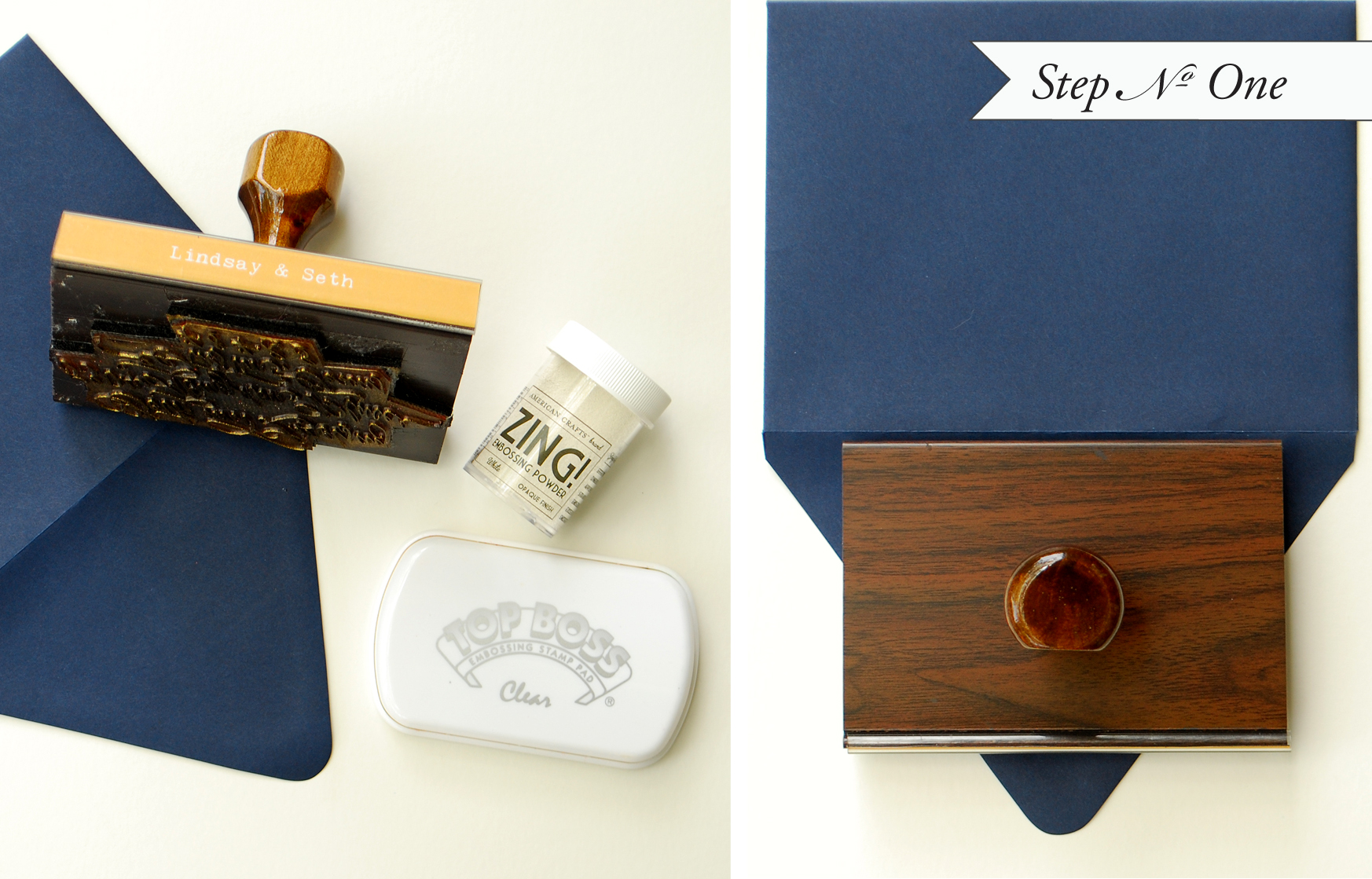
Step One: Get your supplies ready.  Unscrew the top to the embossing powder and uncover the stamp pad.  Make sure your envelope is set on a (really) hard surface, with a piece of scrap paper set underneath (to catch excess powder).  Using the embossing (clear) stamp pad, ink the stamp thoroughly.  Center the stamp and press down with even pressure.  We used our Calligraphy Return Address Stamp on this envelope.
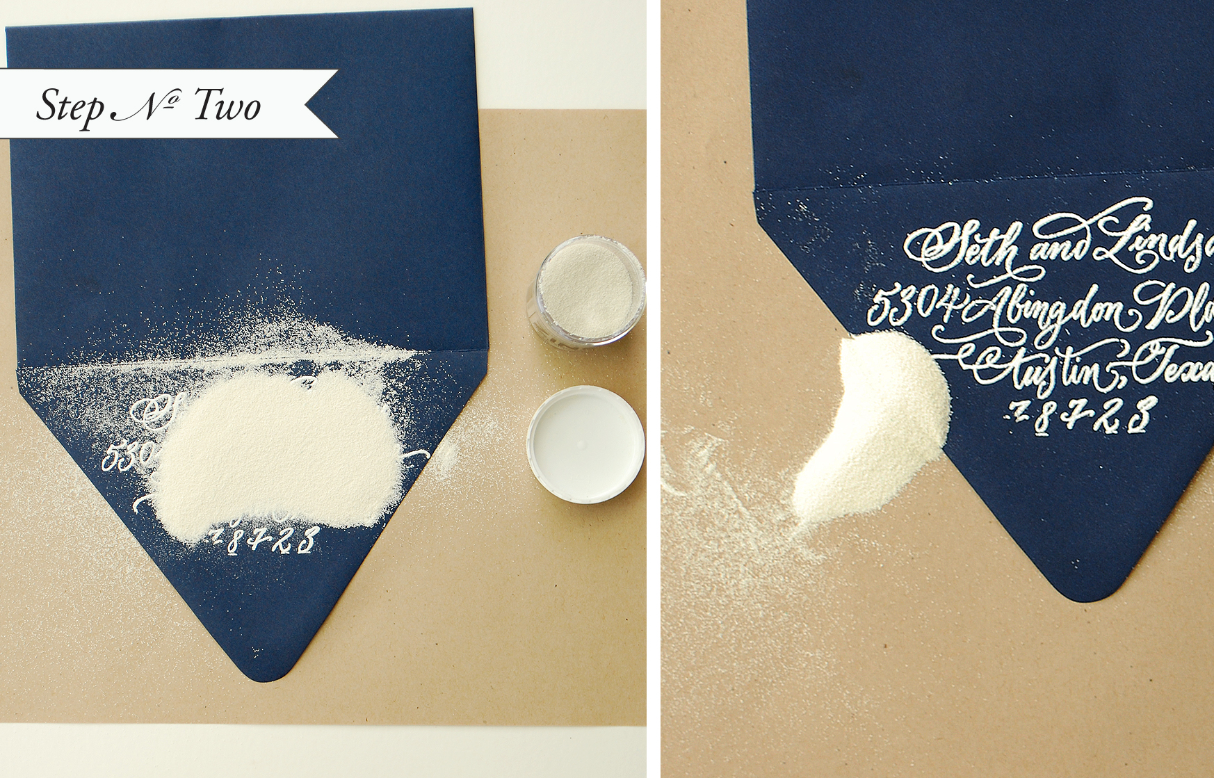
Step Two: Immediately following stamping the image, pour on a healthy amount of embossing powder. Â Shift powder around a bit to ensure your image is completely covered. Â When you are satisfied, pour the excess onto the piece of paper underneath and lightly tap off any excess (not too hard or the powder will loose hold of the sticky ink). Â Pour the powder back into the jar.
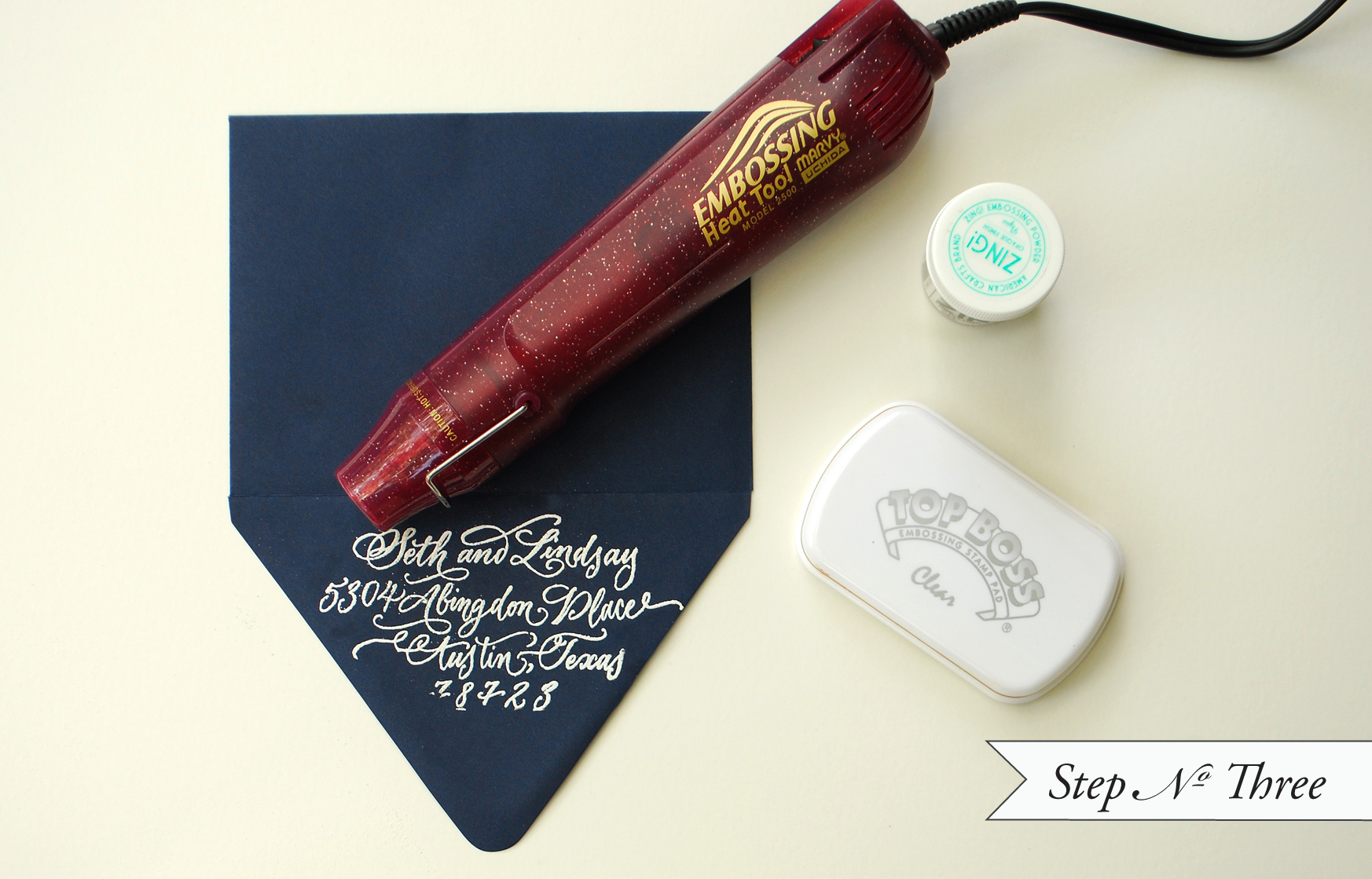
Step Three: Â Using your embossing heat tool, heat image (holding the gun 3-5 inches from the surface) until the powder has melted into a solid, approximately 30 seconds. Â Let cool.
*Be careful not to burn yourself on this very hot tool. Â Also, if you hold the embossing heat tool too close to the paper, it could scorch or warp.
Materials:
Rubber Stamps: We used Calligraphy Names Stamp and Calligraphy Return Address to create the personal stationery and gift tags.
A2 Envelopes in Navy
For Gift Tags:
Photo Credits: Antiquaria


