Watercolor Floral Baptism Invitations

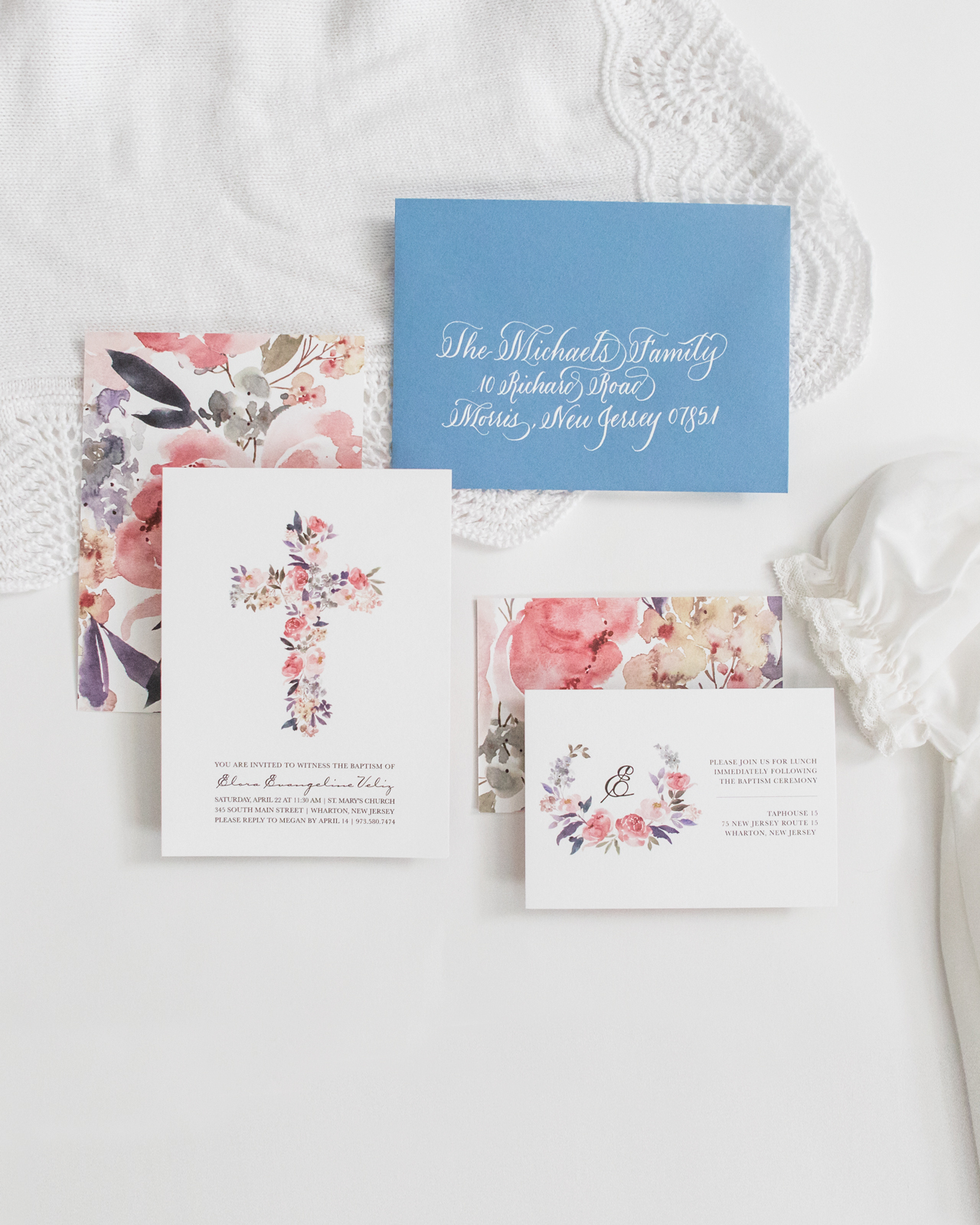
These charming watercolor floral baptism invitations are so sweet! Megan of Honeybee Paper Co. created these invitations for her daughter Elora’s baptism – drawing inspiration from the peace, joy, and serenity that Megan feels as Elora’s mother. We love the cheerful color palette, bespoke calligraphy, and well balanced white space that make the watercolor floral illustrations truly shine. What a beautiful and symbolic suite!

Floral Baptism Invitations by Honeybee Paper Co.

From Megan: When it came time to have my daughter, and first child, baptized we really wanted the invitation suite to reflect the feelings she gave us — serenity, peace, and joy. We wanted a soft color palette to represent the beautiful sacrament she would receive.
Floral Baptism Invitations by Honeybee Paper Co.

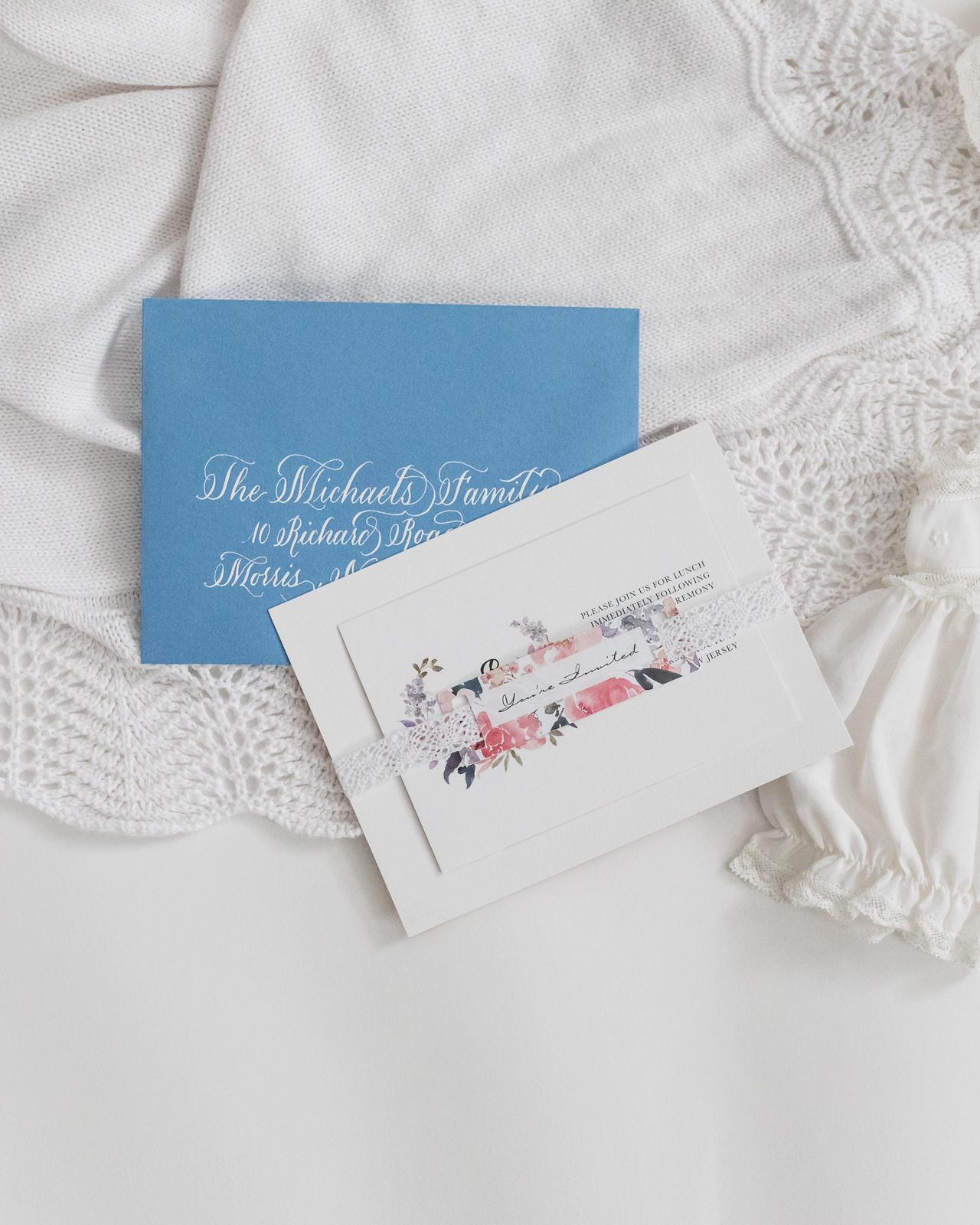
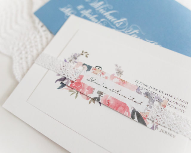
She was baptized in the same gown I wore when I was christened as a baby, so I wanted to pull inspiration from the delicate lace that trimmed the gown. I chose to use crochet ribbon to wrap the invitation and enclosure as a gentle nod to the gown, which threaded through the matching “You’re Invited” tags. The cards were printed on white cotton paper to add an additional layer of texture.
Floral Baptism Invitations by Honeybee Paper Co.

Floral Baptism Invitations by Honeybee Paper Co.

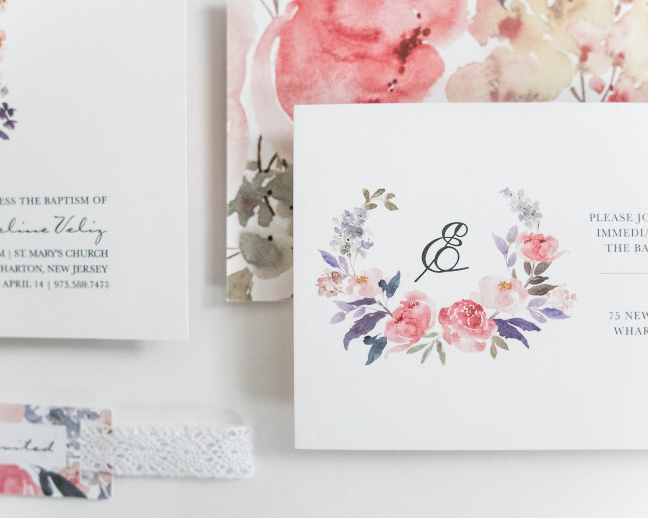
All the watercolor flowers were placed individually to create the shape of the cross, and I wanted to keep a lot of white space to let them shine. For the enclosure, we wanted to use her initial in the design, as my husband and I love her rarely heard name, Elora.
Floral Baptism Invitations by Honeybee Paper Co.

The backs of both the invitation and enclosure card featured the same florals enlarged, to create a nice contrast to all the white on the front. The light blue envelopes turned out to be a wonderful choice and were selected to complement the colors in the suite. The names and addresses of our friends and families were each calligraphed by myself in white ink.
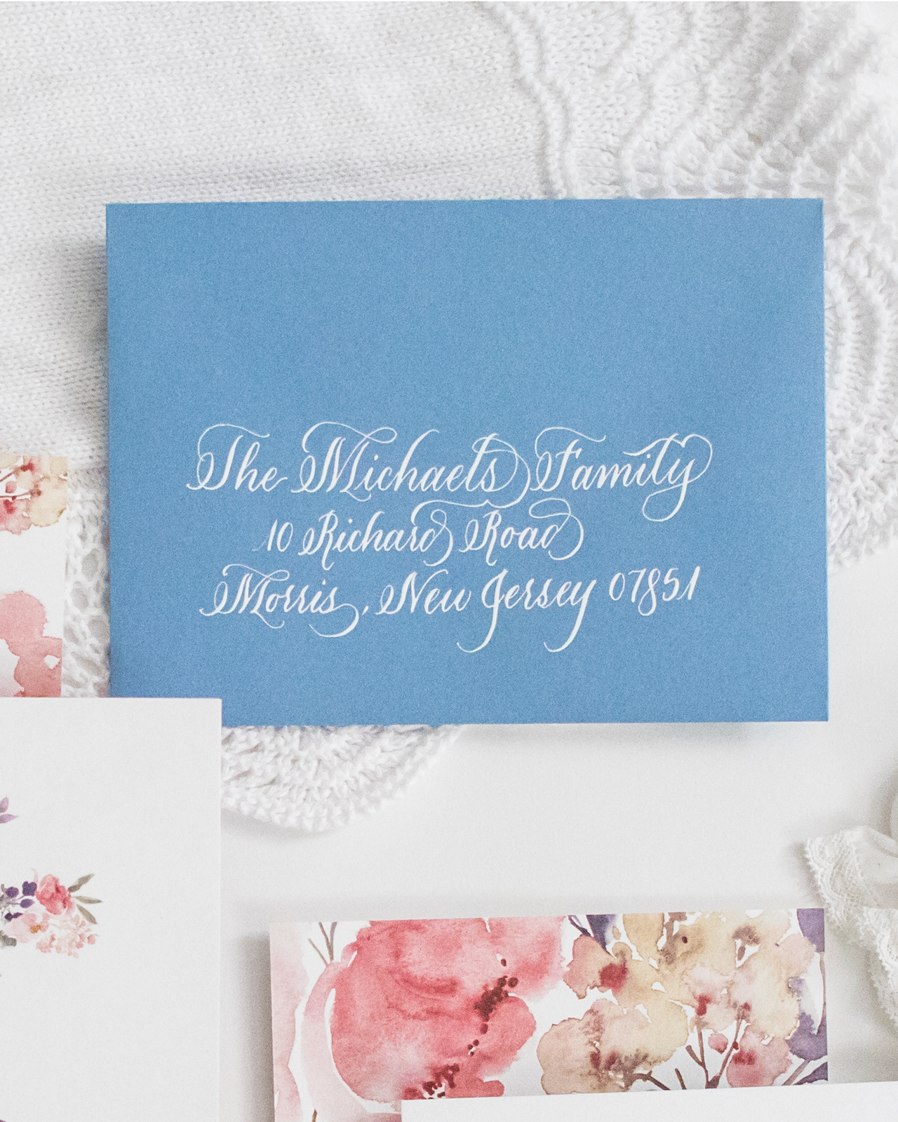
Floral Baptism Invitations by Honeybee Paper Co.

This invitation was such a joy for me to design as it was meant to celebrate such an important little person. Each detail was delicately selected. I loved these watercolor botanicals so much I even had a custom cake topper ordered to match! These invitations set the tone for what turned out to be a wonderful day with friends and family to celebrate a truly wonderful little girl. 
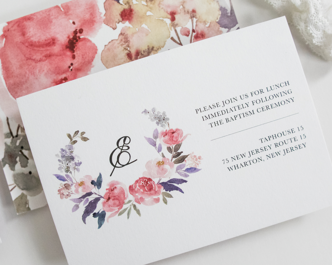
Floral Baptism Invitations by Honeybee Paper Co.

Thanks Megan!

Design: Honeybee Paper Co. 
Printing: StationeryHQ

Photo Credits: Megan Veliz

Bright and Cheerful Floral Watercolor Wedding Invitations

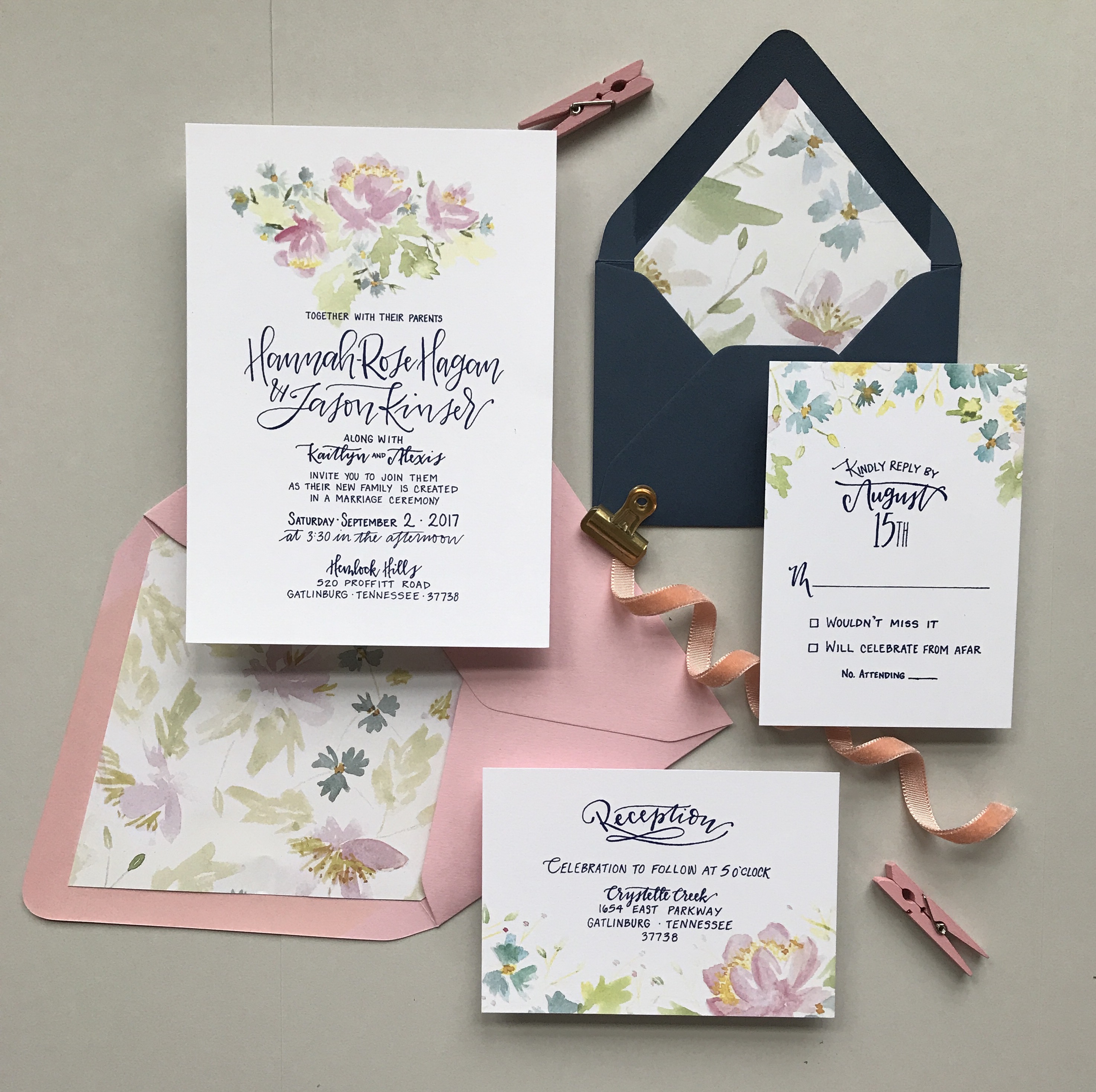
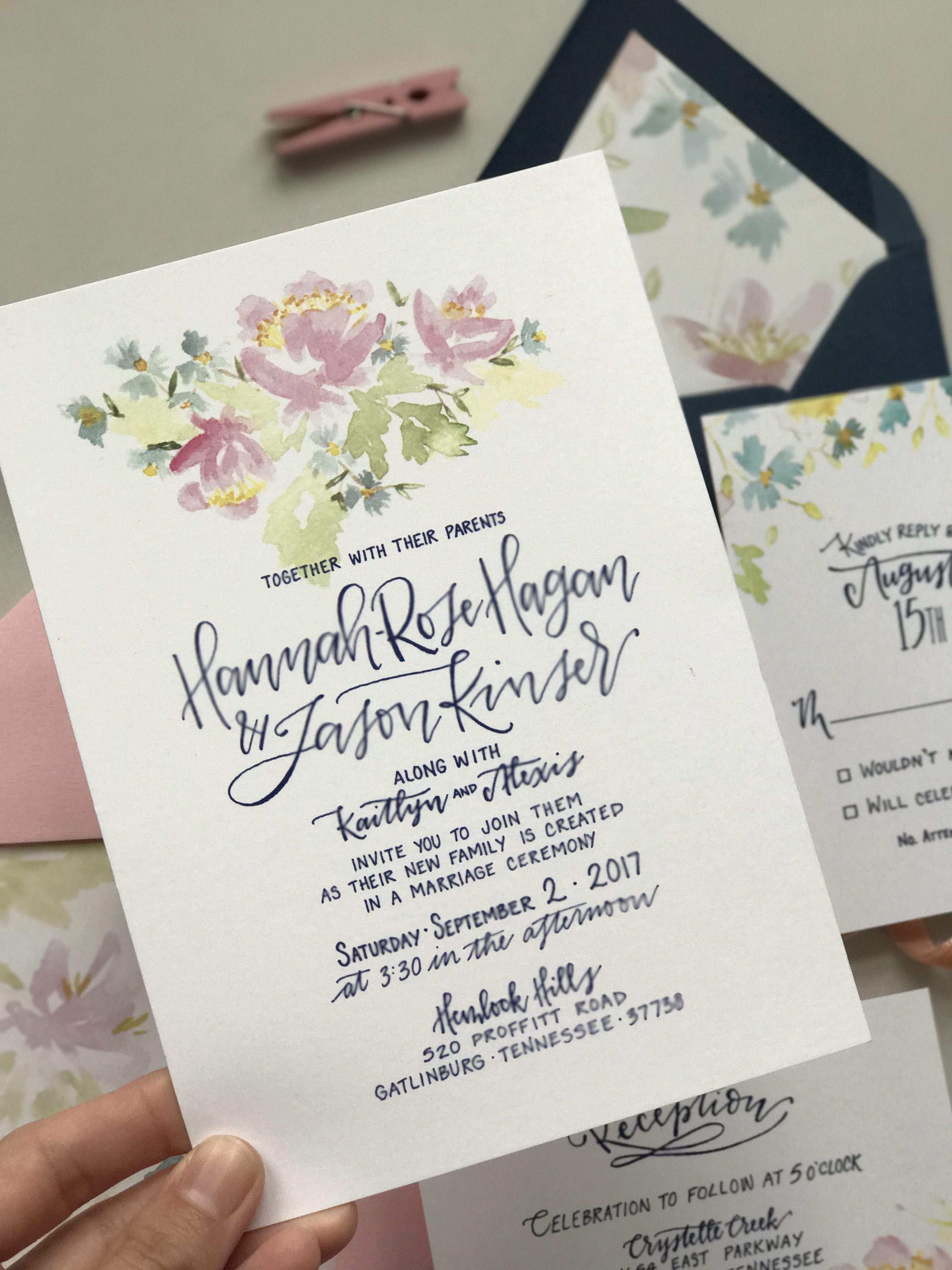
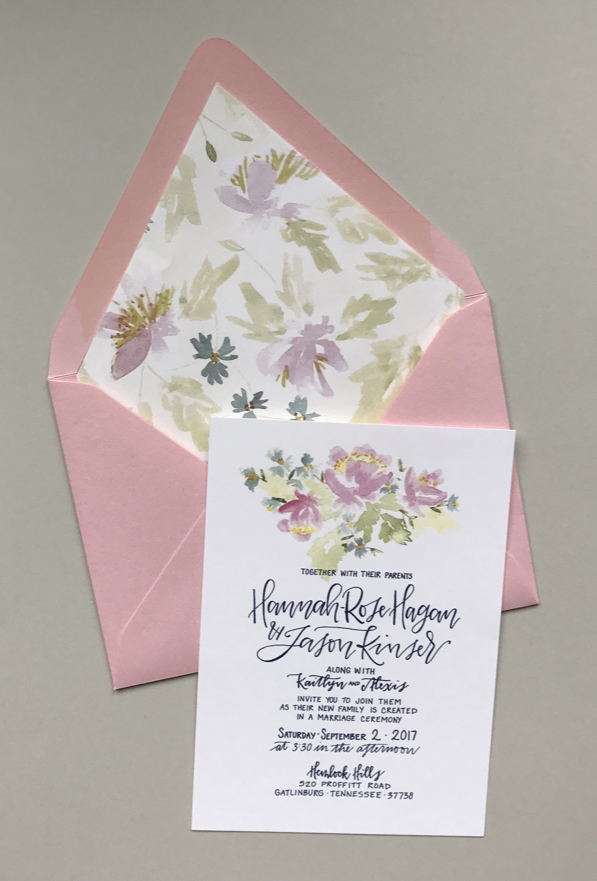
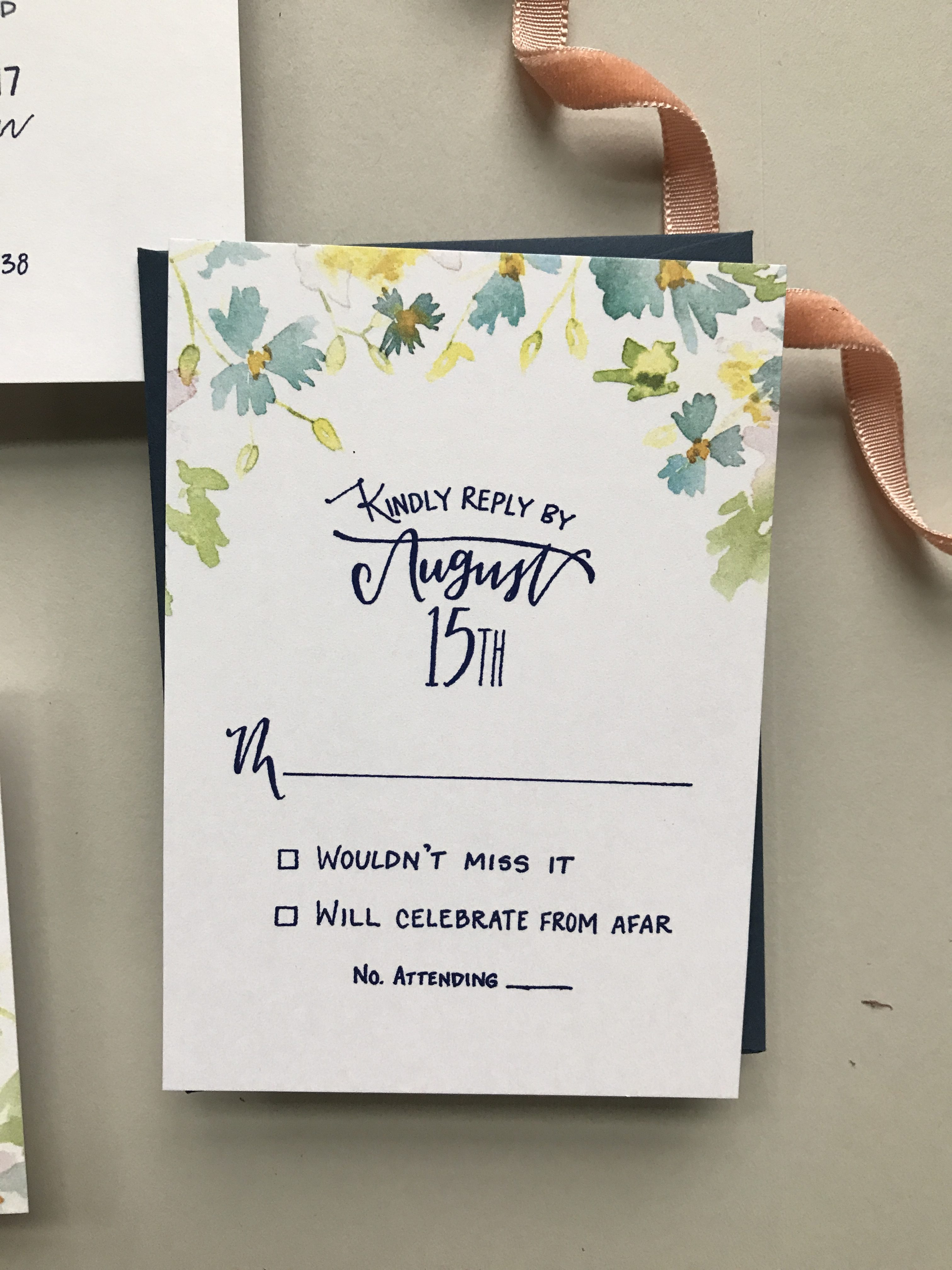
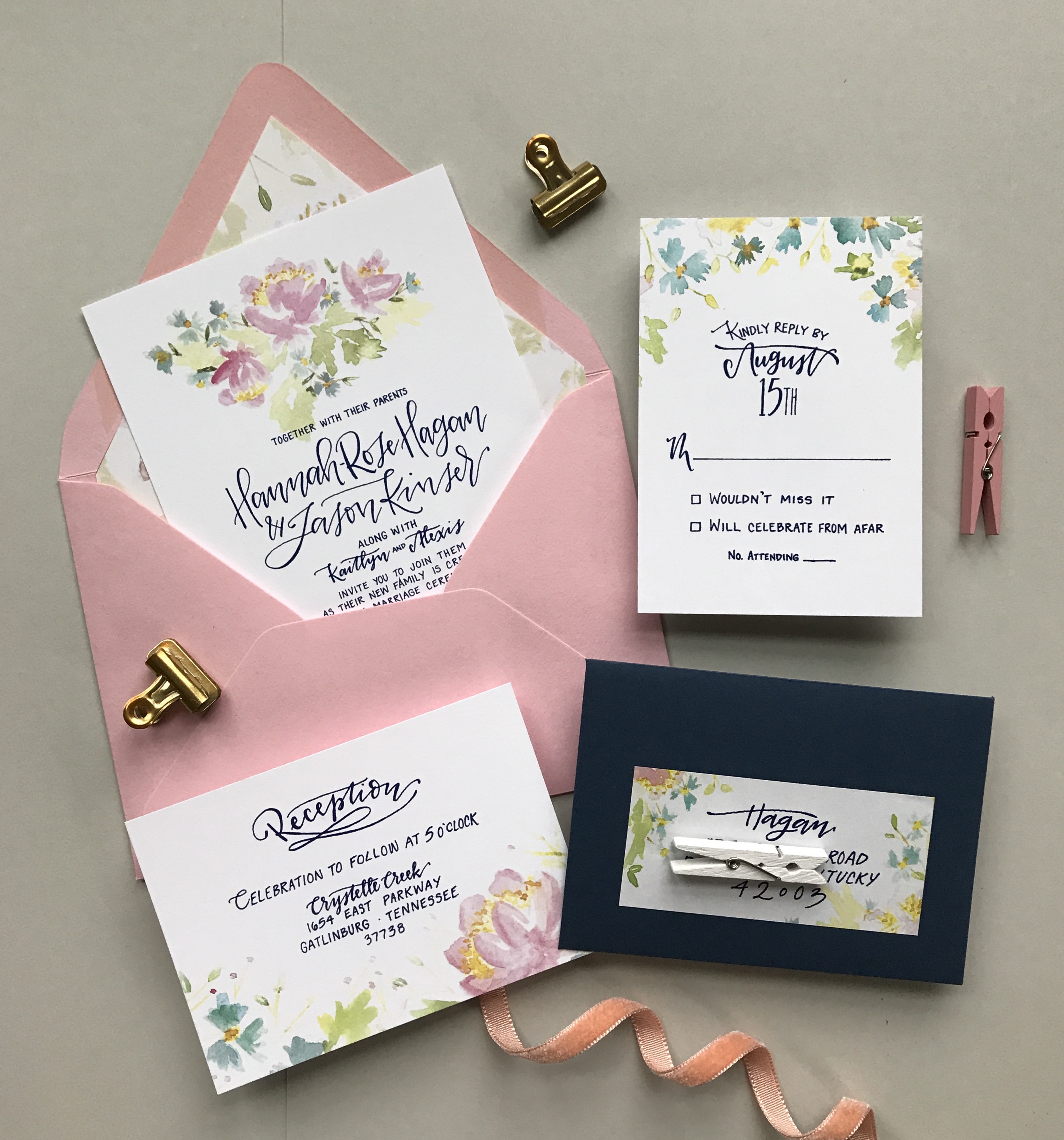
With spring (hopefully) around the corner, we’re loving these bright and cheerful floral watercolor wedding invitations from J. Gregory of Grey Snail Press! This beautiful suite features illustrated florals inspired by the bride’s wedding flowers – including on the envelope liner! – and whimsical hand lettering. The pink and navy blue envelope colors are a fun added element and everything ties together in such a fun and festive way!

Bright and Cheerful Floral Watercolor Wedding Invitations by Grey Snail Press

From J Gregory: I’ve had the pleasure of knowing this sweet bride for several years, so I was thrilled when I was asked to create the wedding invitations for her wedding in the Smokey Mountains. Hannah is unfussy by nature and really down-to-earth. To say she was easy to work with is an understatement; she was completely open and flexible with the design, letting me take her ideas and run with them.

Bright and Cheerful Floral Watercolor Wedding Invitations by Grey Snail Press

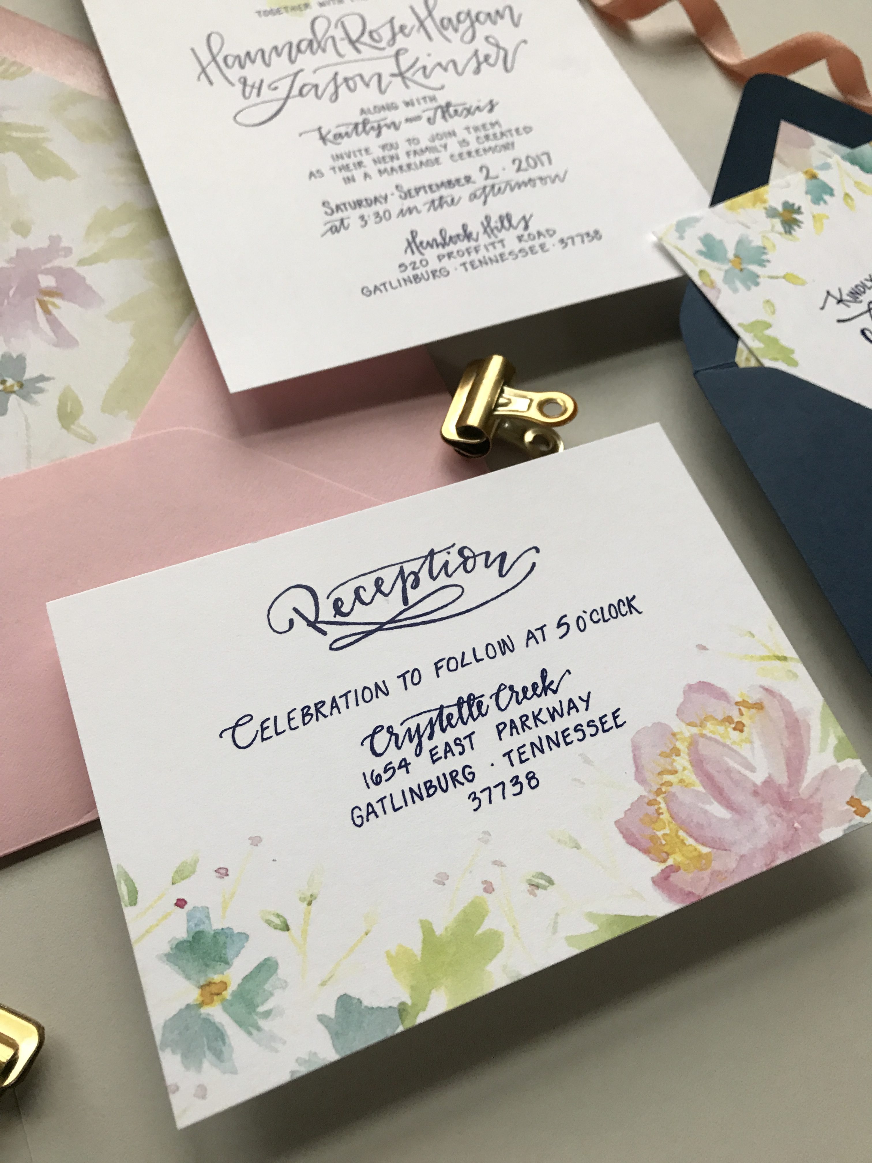
She elected not to do a rustic or mountain-themed invitation suite, despite their mountain venue. Instead, she wanted something simple, that would include her wedding colors of navy and pink, with lovely, loose florals. I was immediately inspired to get out my watercolors (my new obsession) and start painting. I painted a variety of pink and blue flowers with greenery for the invitation itself, being careful to tie in the colors of her wedding palette. I chose different portions of the original floral design to carry over onto the other cards, focusing on smaller blue flowers for the rsvp card cascading off the top and sides of the card.

Bright and Cheerful Floral Watercolor Wedding Invitations by Grey Snail Press

All lettering was done by hand and kept very simple and clean with a mix of script and print. We chose to print all text in navy blue ink. Hannah even came up with her own creative wording for the invitation to make it special for them.

Bright and Cheerful Floral Watercolor Wedding Invitations by Grey Snail Press

Invitations and the corresponding rsvp and reception cards were all printed digitally on white 110lb. Classic Crest card stock, so they were nice and thick. The bright white provided the perfect background for the watercolor florals to really shine while keeping with the simplicity she desired.

Bright and Cheerful Floral Watercolor Wedding Invitations by Grey Snail Press

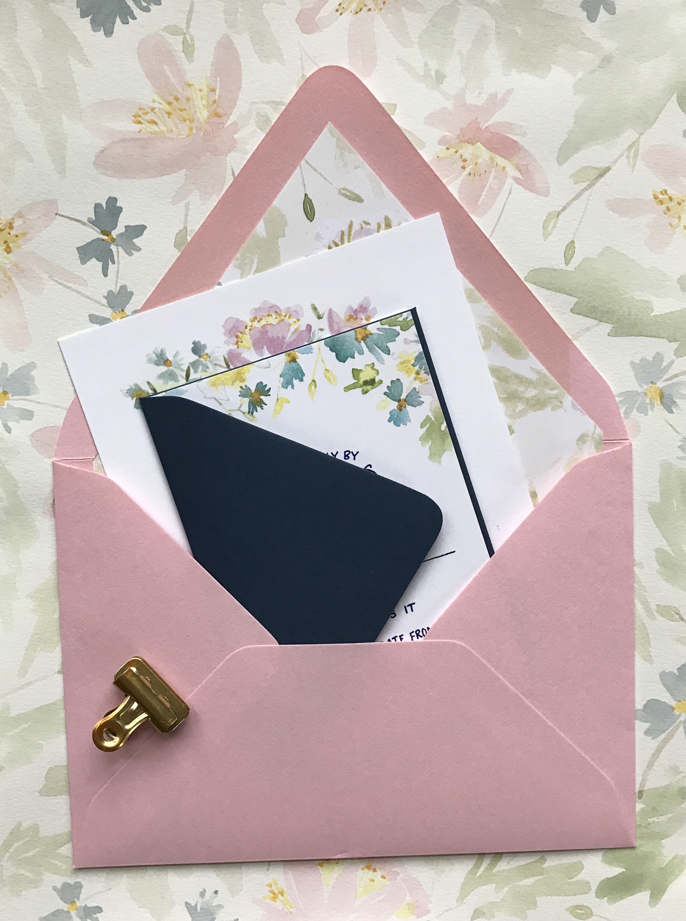
With a little input from her mom and sister, the bride chose a cotton candy pink outer envelope for the invitation and navy envelope for the rsvp card. She elected to include a matching floral envelope liner for the invitation envelope. I was so pleased when I discovered that because of the shape of the envelopes, we could actually get an additional envelope liner for the smaller rsvp envelope out of the scrap paper left over from the larger liner. What a bonus not to have any waste!

Bright and Cheerful Floral Watercolor Wedding Invitations by Grey Snail Press

Instead of having the rsvp envelopes calligraphed, we placed a rectangular return address label on the rsvp envelopes with some flowers peeking around the edges to complete the suite. This can be a fun way to save a little money in the budget. Plus, they’re super easy to assemble and completely customizable. It was truly a labor of love creating this suite for Hannah and Jason, and I really love how they turned out!

Bright and Cheerful Floral Watercolor Wedding Invitations by Grey Snail Press

Thanks J!

Design: Grey Snail Press
Printing: Zebra

Check out the Designer Rolodex for more tal­ented wed­ding invi­ta­tion design­ers and the real invi­ta­tions gallery for more wedding invitation ideas!

Photo Credits: Grey Snail Press

Happy Weekend!

Happy Friday everyone! We made it through the first FULL week of the year! Before I get to this week’s links, if you haven’t already – please take a couple minutes to fill out our 2018 Reader Survey! We use the survey to help determine our content for the year (and beyond!), so your input is enormously helpful. And after you complete the survey, leave a comment on this post to enter to win a pack of stationery from me! Yay! But in the meantime…

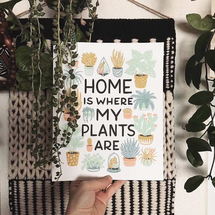
Home is Where My Plants Are / Wild Hart Paper

Image from Ms. Vintage Nicole via Wild Hart Paper in #dailydoseofpaper

…a few links for your weekend!

Serena Williams on marriage and being a new mom. My favorite line: “I think sometimes women limit themselves. I’m not sure why we think that way, but I know that we’re sometimes taught to not dream as big as men, not to believe we can be a president or a CEO, when in the same household, a male child is told he can be anything he wants. I’m so glad I had a daughter. I want to teach her that there are no limits.”

Totally obsessed with this gorgeous tassel chandelier

Feeling the love for neutral vintage rugs

10 of the world’s most beautiful road trips (who wants to go with me?)

These blush pink dining chairs are so pretty – I wish I needed new chairs!

Interesting: Facebook says it will start showing more content from friends and family, less content from brands and advertisers. What do you think? Is this a move in the right direction?

This modern cut glass decanter would look so lovely on any bar cart

The holidays may be over, but that won’t stop me from enjoying this mulled latte (it sounds delicious!)


This week on Oh So Beautiful Paper:

Glamorous mixed metals wedding invitations

Behind the Stationery with Baltic Club

Did you sign up for the Blueprint Model 2018? Let me know!

Beautiful first birthday party invitations inspired by The Little Prince

So much inspiring calligraphy from Hello Maurelle

Don’t forget to take our 2018 Reader Survey!


That’s it for me this week! I hope you have a wonderful weekend, and I’ll see you back here next week! xoxo

The Little Prince First Birthday Party Invitation

Hi everyone! Just a quick housekeeping note before we jump into today’s post: Registration for the Blueprint Model 2018 closes at 11:59 pm TONIGHT! Check out my blog post with all the details from earlier in the week, or go here to register!

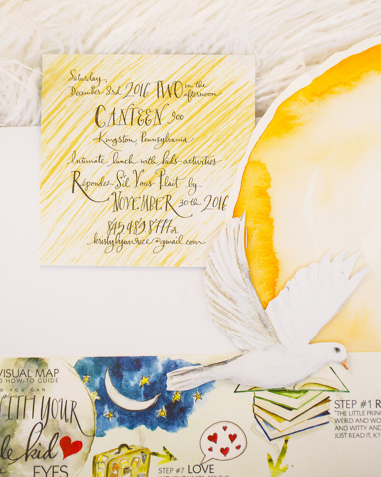
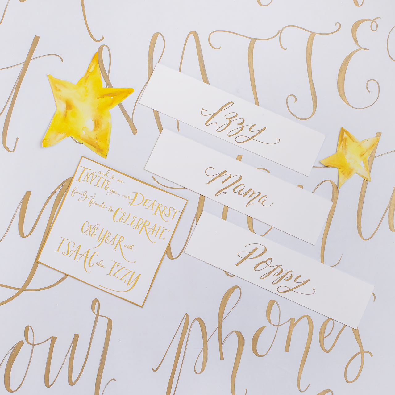
We can all agree that The Little Prince is one of our all-time favorite children’s books, yes? I love that artist Kristy Rice of Momental Designs used this beloved book as the inspiration for her son’s first birthday party invitation! If you’re familiar with Kristy’s work, then you know that she always goes the extra mile to create the most special and thoughtful invitations. You’ll just have to read below to see all the details she incoporated into this “The Little Prince” first birthday party invitation – it’s absolutely dreamy!

The Little Prince First Birthday Party Invitations by Momental Designs

From KristyIzzy’s beautiful and unique first birthday invitations were a high art twist on Antoine de Saint-Exupéry’s beloved children’s story “The Little Prince.” All of the artwork for the stationery was developed in a more detailed and realistic style compared to the original book’s illustrations.

The Little Prince First Birthday Party Invitations by Momental Designs

The Little Prince First Birthday Party Invitations by Momental Designs

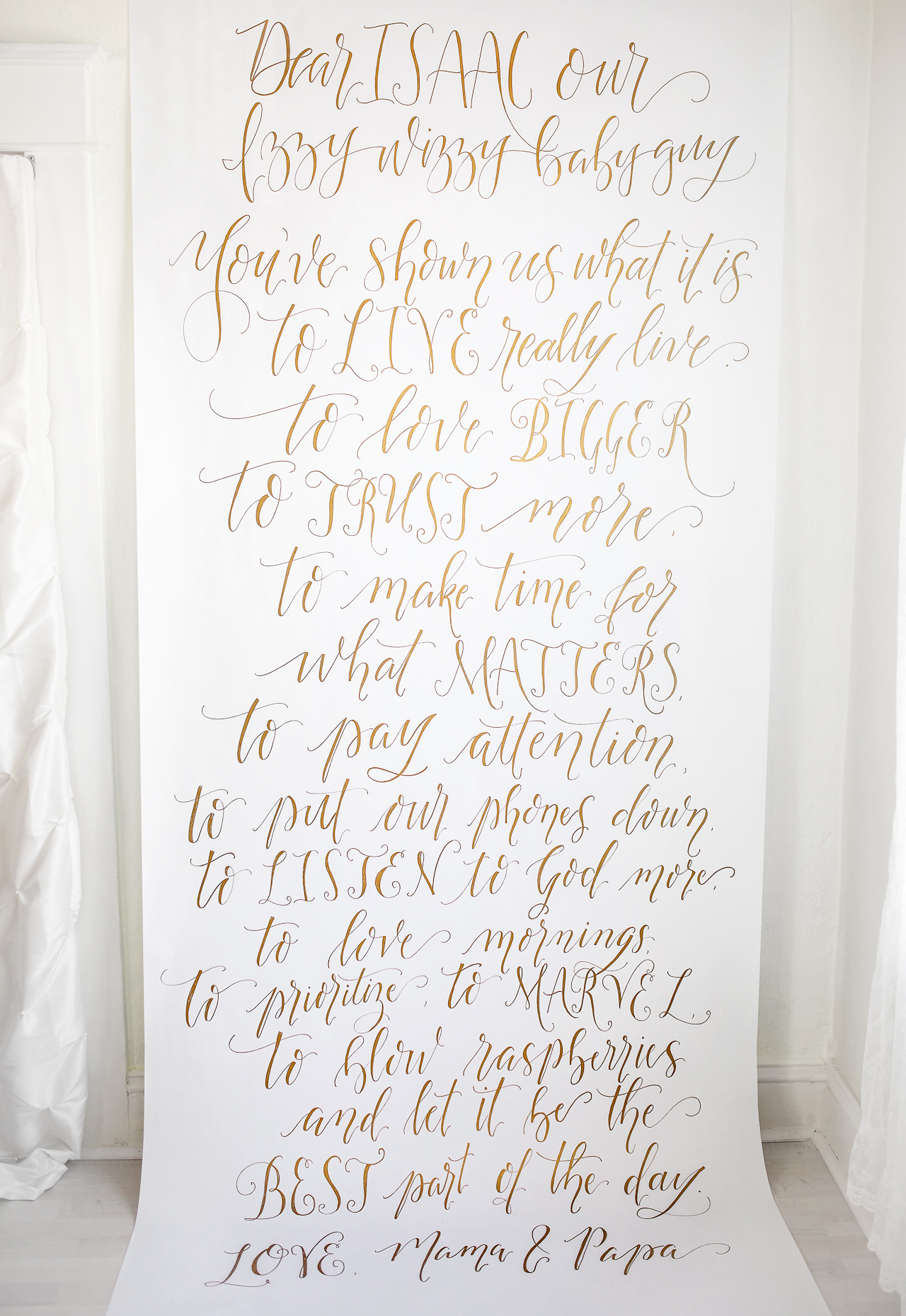
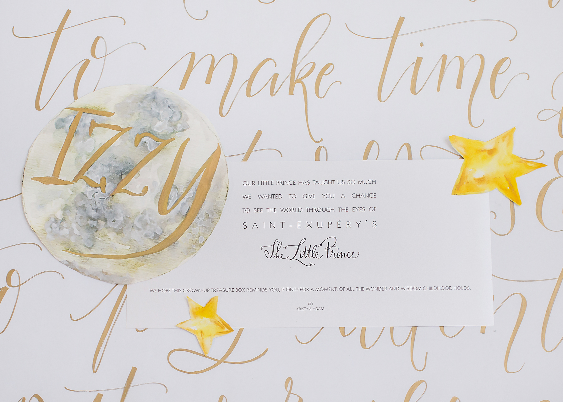
Perhaps the most special piece for the whole event was a calligraphy backdrop written by Sarah of Flourish Grace. We wrote a letter to Izzy and gave her the text, so all guests could share in our sentiments to him. Here is what we wrote:

“Dear Isaac our Izzy Wizzy baby guy,

You’ve shown us what it is to live, really live…to love bigger, to trust more, to make time for what matters, to pay attention, to put our phones down, to listen to God more, to love mornings, to marvel… to blow raspberries and let it be the best part of the day. 

Love, Mama and Papa”

The Little Prince First Birthday Party Invitations by Momental Designs

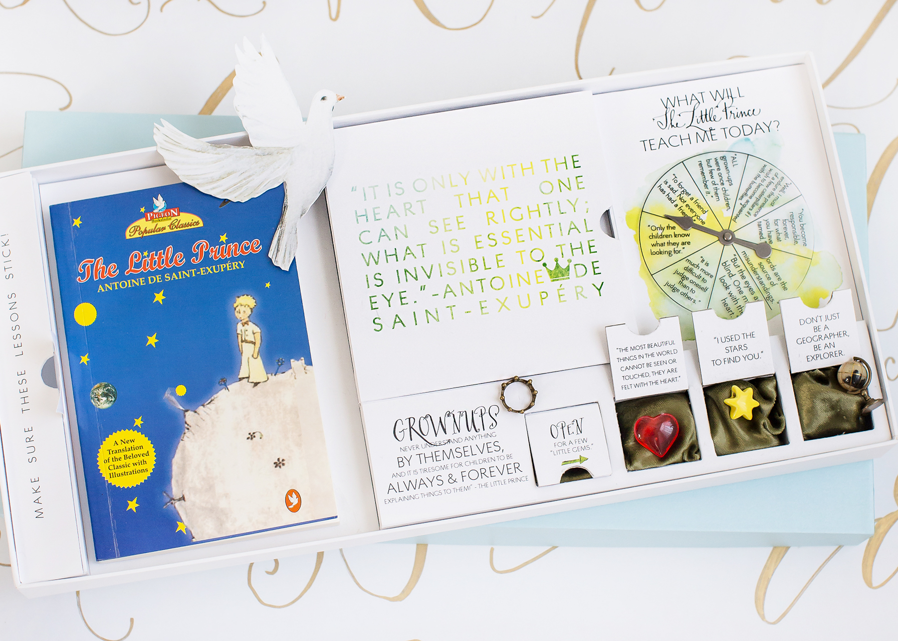
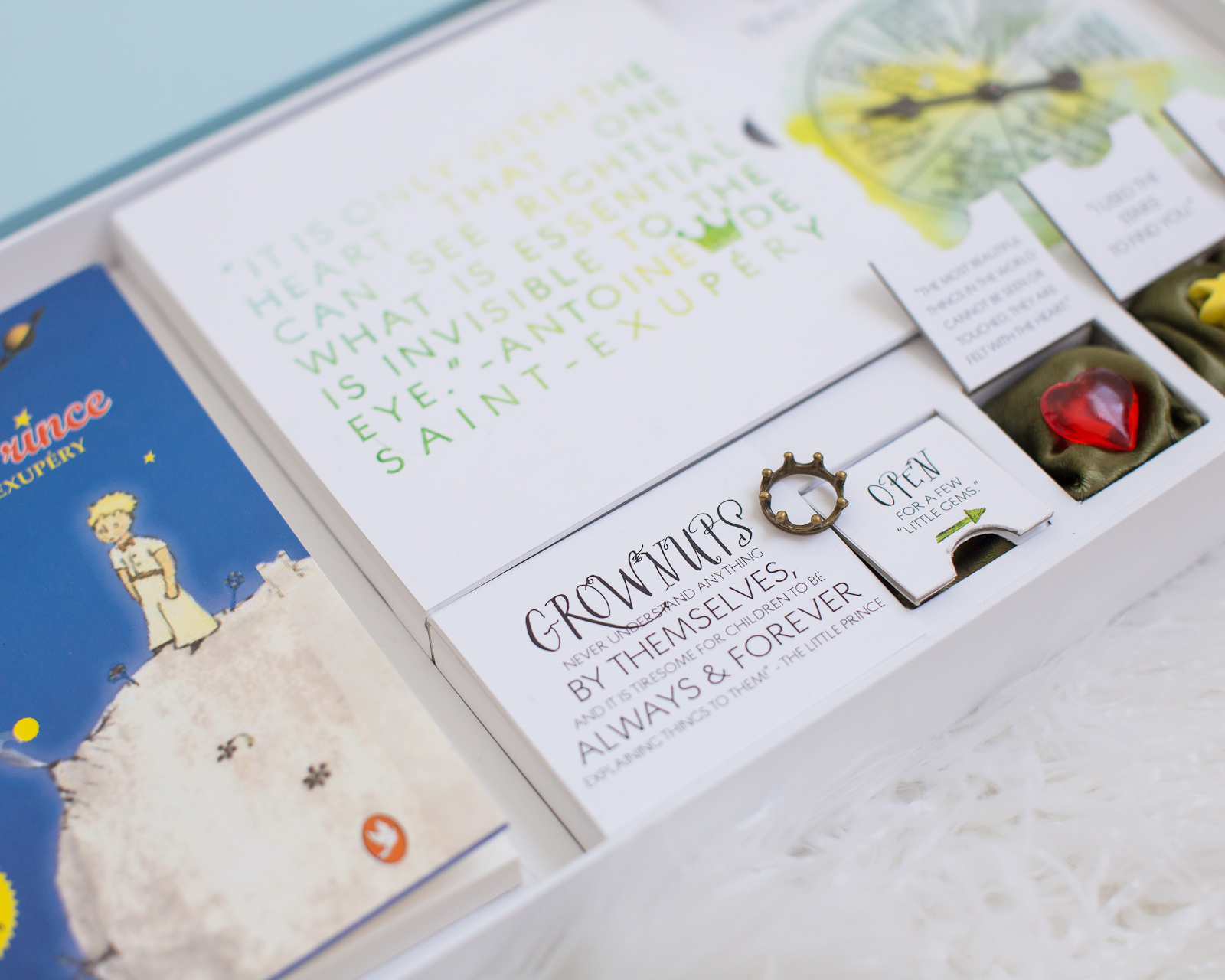
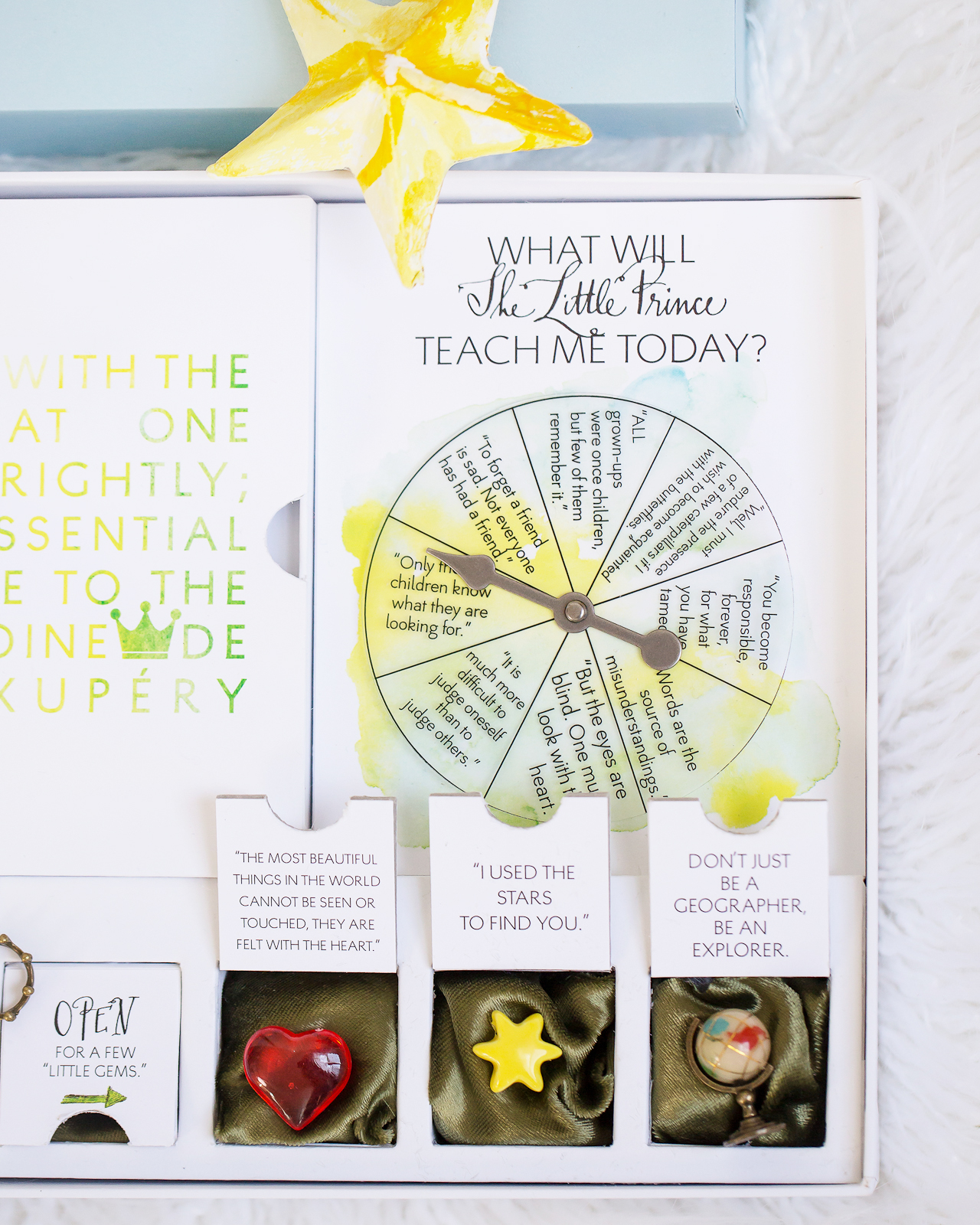
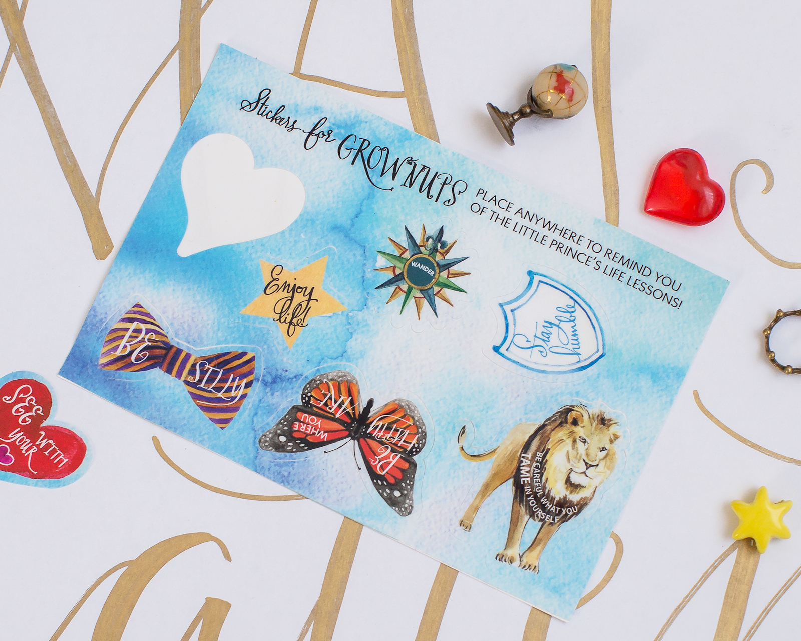
For the invitation itself, we created a custom game board-style box inspired by the Little Prince. At 17 inches by 10 inches, it was even the size of a board game! A spinner asked guests “What will the Little Prince teach today?” and allowed them to indulge in a bit of play as the explored the invitation. Each box had specially sized compartments to hold a copy of the book, a sheet of custom watercolor stickers, and small trinkets inspired by Antoine de Saint-Exupéry’s beloved words.

The Little Prince First Birthday Party Invitations by Momental Designs

The Little Prince First Birthday Party Invitations by Momental Designs

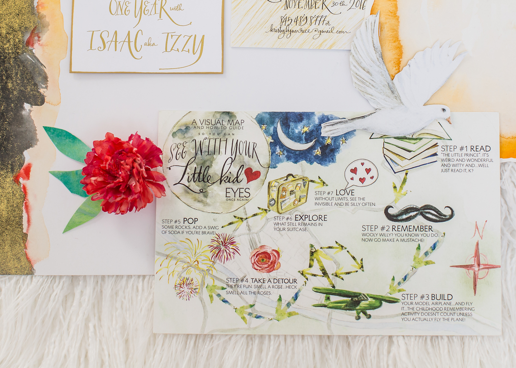
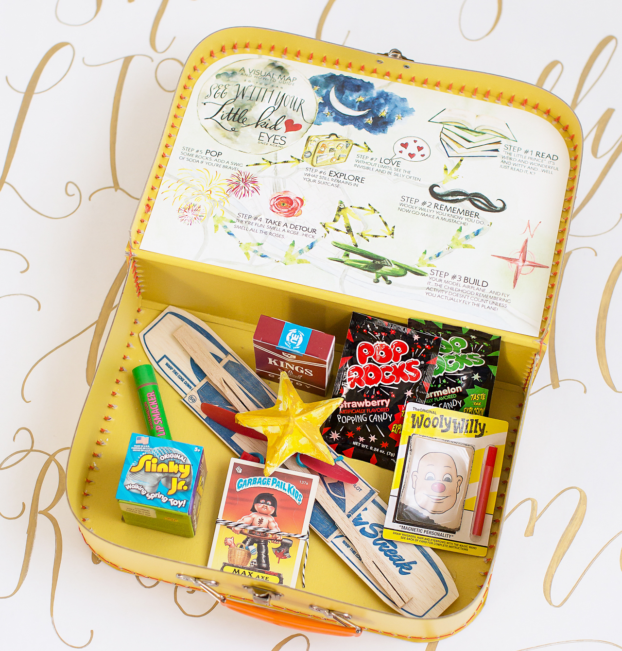
And we could not send our guests home without special favors! We curated a case full of fun stuff, with the title “A Visual Map and How-to Guide to Seeing with Your Little Kid Eyes.” Each mini suitcase was stuffed with time-honored goodies guaranteed to turn back the hands of time, even just for one afternoon; candy cigarettes, garbage pail kids, balsa wood airplane, bazooka bubble gum, Lip Smackers lip balm, Pop Rocks and a Slinky!

The Little Prince First Birthday Party Invitations by Momental Designs

In the lid a watercolor map was custom fitted, calling out the “steps” to revisiting your childhood fun! To name a few: “Pop some rocks and swig some soda if you’re brave”, and “Read The Little Prince, it’s weird and wonderful and witty, just read it…k?” We really wanted our guests not only to read the book, but to experience the lessons of this classic story in a fun and interactive way, and to take a child-like perspective on life, even just for a few minutes.

The Little Prince First Birthday Party Invitations by Momental Designs

The Little Prince First Birthday Party Invitations by Momental Designs

The Little Prince First Birthday Party Invitations by Momental Designs

Thanks so much Kristy! BTW – you can see Kristy’s whimsical adoption baby shower invitations right here!

Design: Momental Designs

Calligraphy: Flourish Grace

Momental Designs is a member of the Designer Rolodex – you can see more of their beautiful work right hereor visit the real invi­ta­tions gallery for more wedding invitation ideas!

Photo Credits: Dolci Momenti Photography

Glamorous Mixed Metals Wedding Invitations

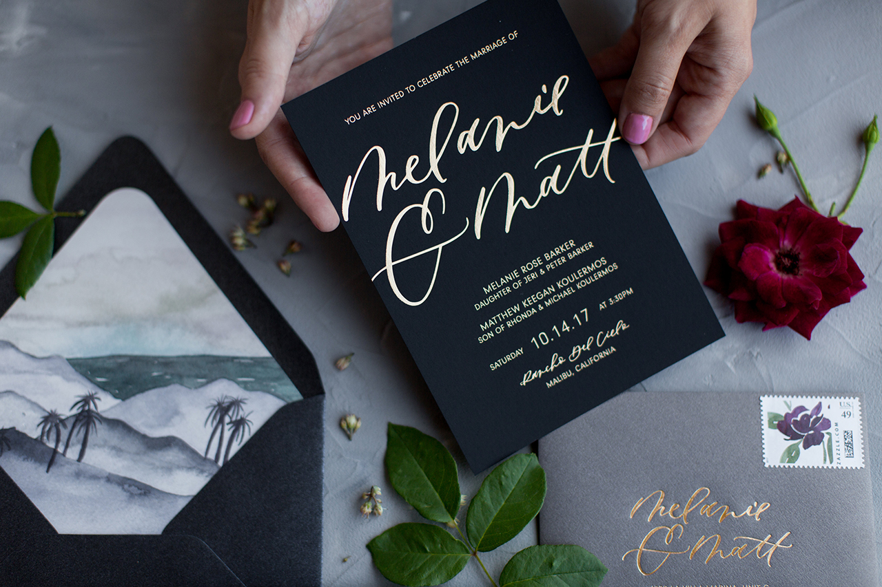
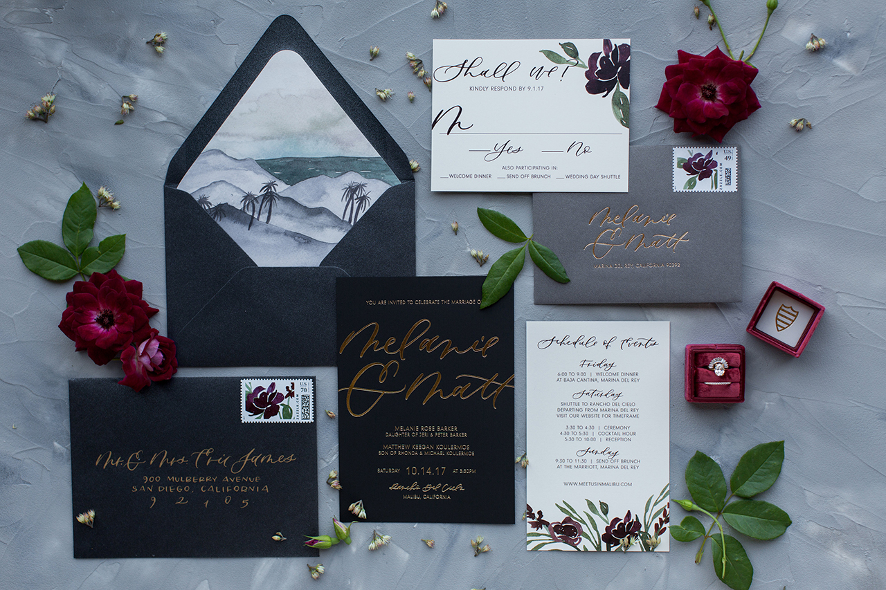
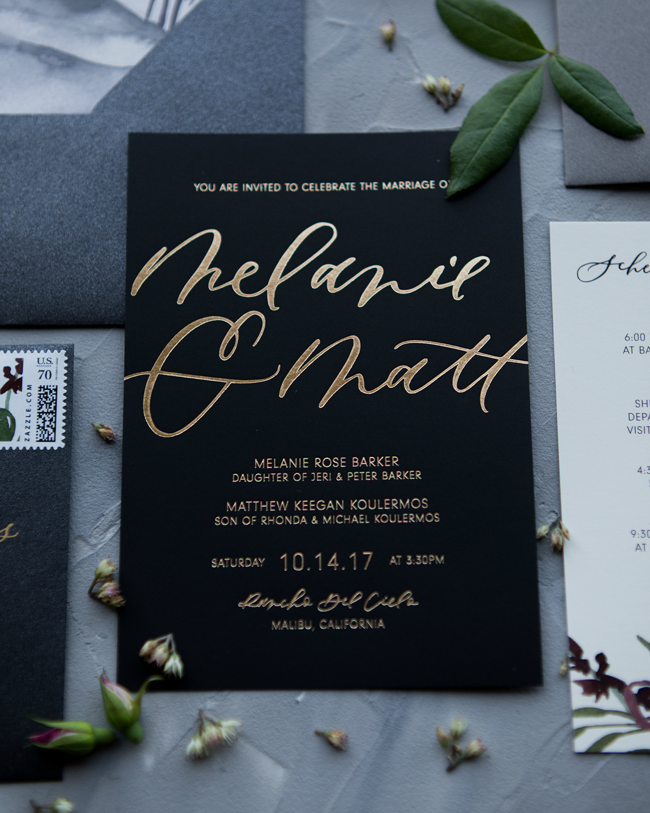
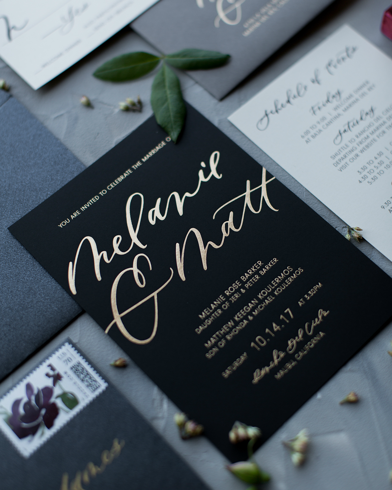
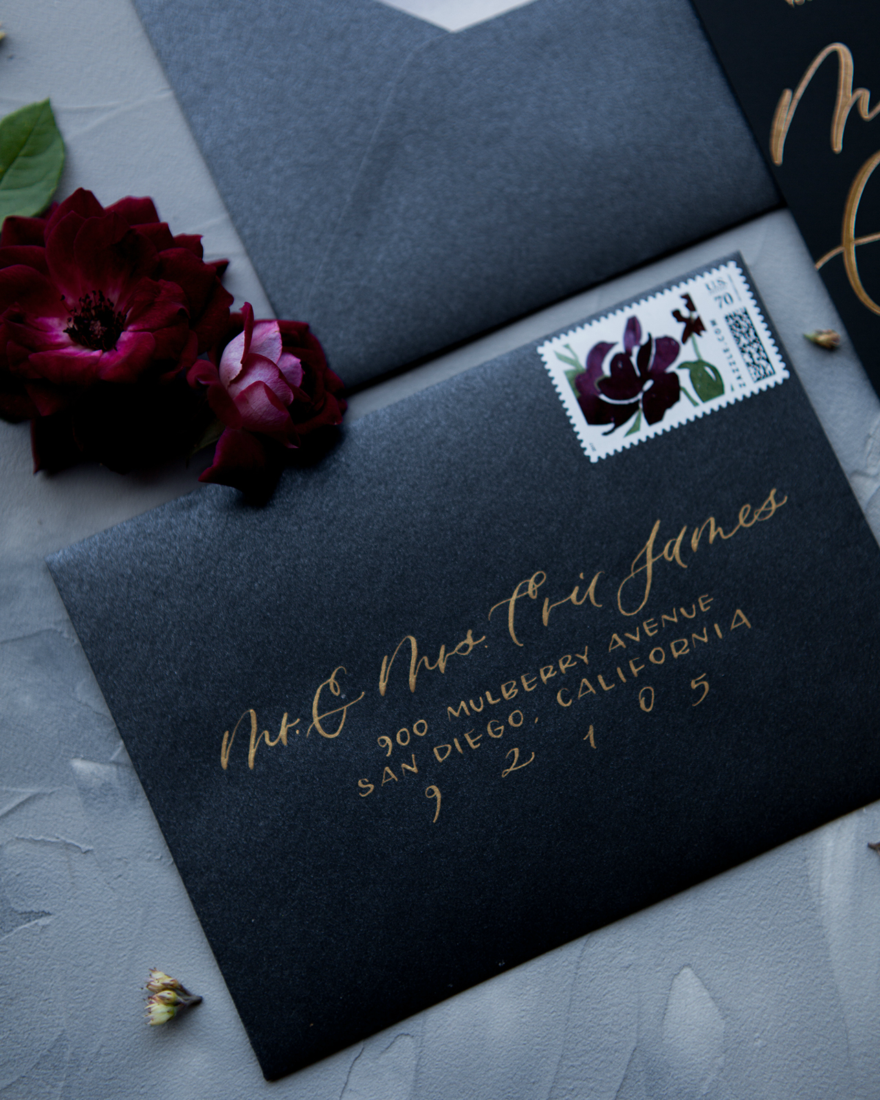
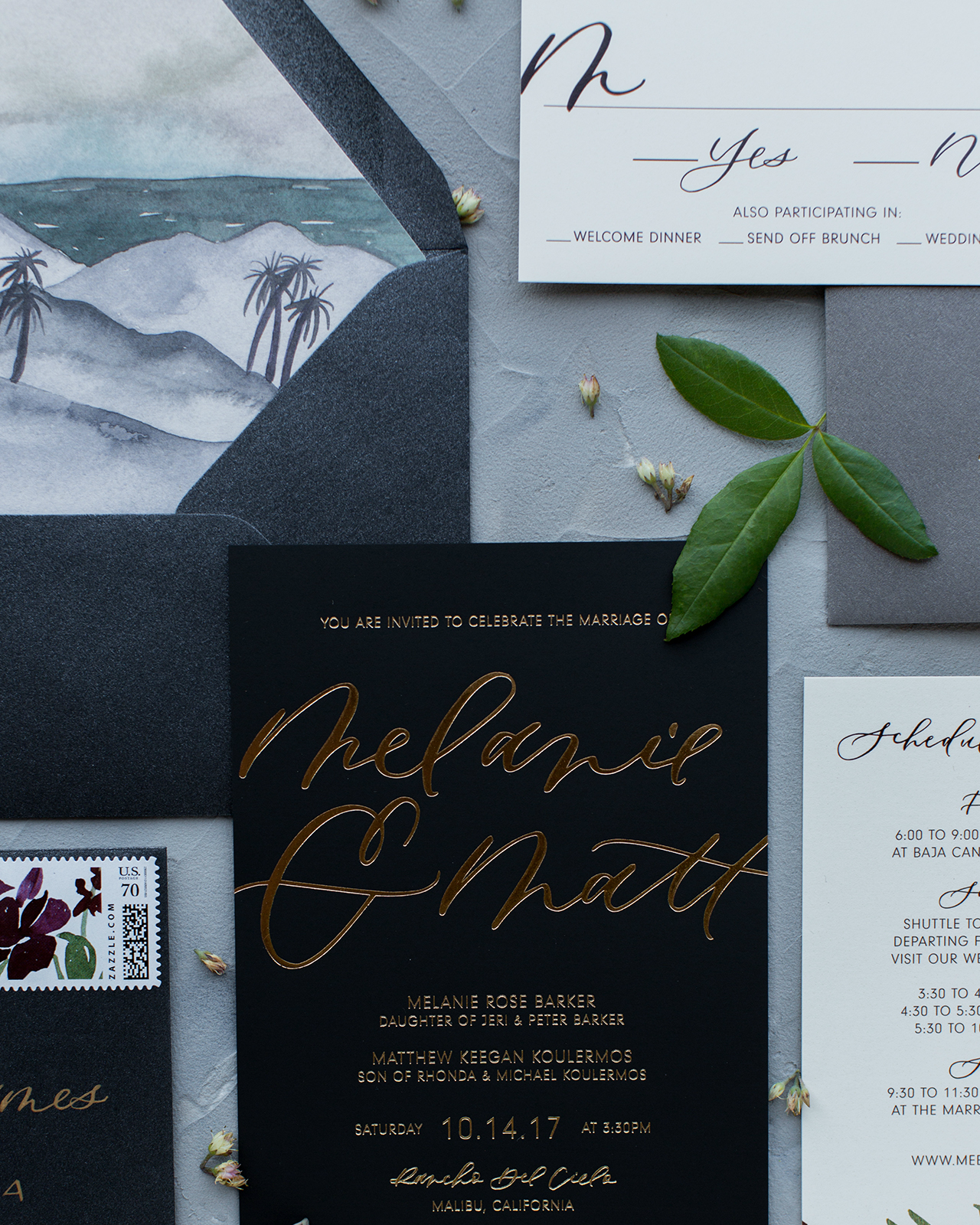
It’s the first wedding invitations of 2018 – and we’re going glam! These glamorous mixed metals wedding invitations from Taryn of Twinkle & Toast bring an extra dose of sultry drama, with gorgeous gold foil on matte black and metallic gray paper. And can you believe these invitations were created for a wedding in Malibu, California?? We love that Taryn and her clients chose to deviate from a typical bright and cheery aesthetic for a darker, moodier aesthetic. To round out the look she included amazing custom stamps and a custom watercolor envelope liner she painted herself!

Glamorous Mixed Metals Wedding Invitations by Twinkle and Toast

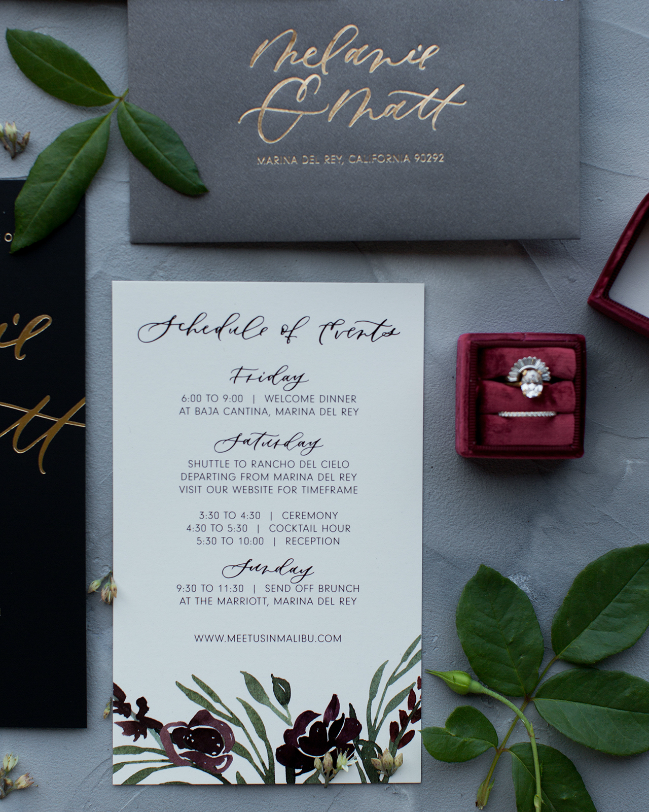
From TarynMelanie and Matt are both from the east coast, but currently reside in Southern California. Since many of their family and friends still live on the east coast, this was going to be a destination wedding for several of their guests, and they really wanted to create a special, effortless California evening. They found the most beautiful venue in Malibu: a working olive tree farm that overlooked the ocean in the rolling hills. It was romantic and charming with breathtaking views. Their wedding was in October, which called for lots of moody dark colors of burgundy, gray, and black with mixed metals and vintage flair. This couple had a laid-back attitude and a great eye for design (the groom is an art director himself).

Glamorous Mixed Metals Wedding Invitations by Twinkle and Toast

Glamorous Mixed Metals Wedding Invitations by Twinkle and Toast

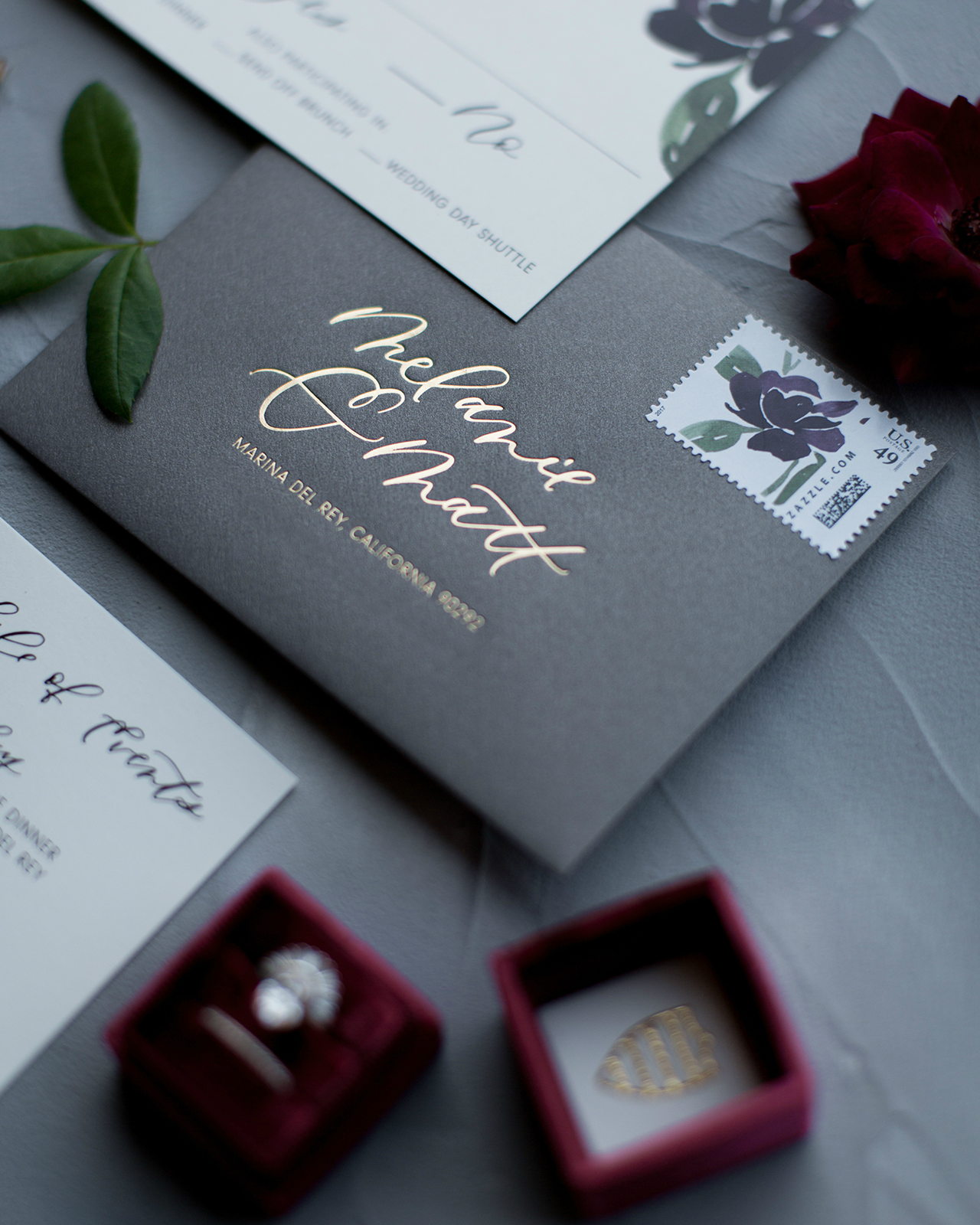
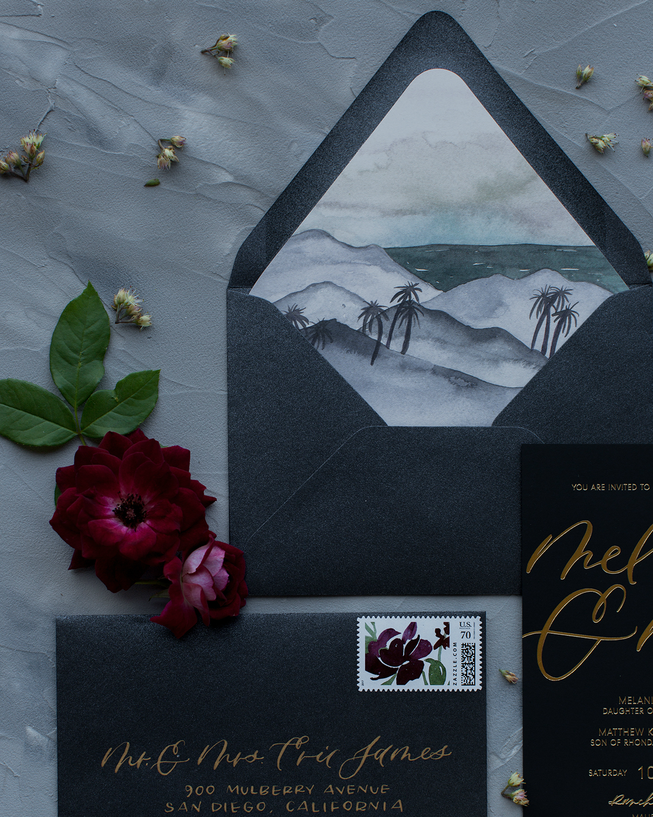
The whole invitation suite featured custom oversized spot calligraphy throughout. The main invitation had a pale gold foil print on a super silky pitch-black noir paper. To incorporate some burgundy, we had custom painted deep florals featured on their RSVP card and insert card. The accompanying cards were printed on a smooth ivory paper to tie in their vintage touch. The main envelope was a metallic black and the RSVP envelope was metallic gray, which gave it a smoky dark feel. Both metallic envelopes had a pale gold foil stamp return address, with metallic gold pointed pen calligraphy ink for the guest address.

Glamorous Mixed Metals Wedding Invitations by Twinkle and Toast

Glamorous Mixed Metals Wedding Invitations by Twinkle and Toast

Glamorous Mixed Metals Wedding Invitations by Twinkle and Toast

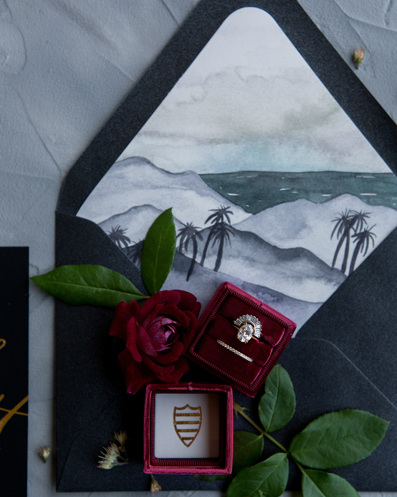
We also designed custom postage stamps with the burgundy floral design on both envelopes. One of my favorite features was the custom painted envelope liner on the main envelope. We wanted to showcase the Malibu setting, but do it in a dark and moody way. Instead of a bright and airy sunset, I painted a sunset with hues of purple, black and blue, showing both the ocean and mountain setting surrounding Malibu.

Glamorous Mixed Metals Wedding Invitations by Twinkle and Toast

Glamorous Mixed Metals Wedding Invitations by Twinkle and Toast

Overall their vibe was moody, chic, sultry and romantic. The invite really set the tone for an intimate, elegant autumn evening for everyone meet in Malibu.

Glamorous Mixed Metals Wedding Invitations by Twinkle and Toast

Glamorous Mixed Metals Wedding Invitations by Twinkle and Toast

Thanks Taryn!

Invitation Design: Twinkle & Toast
Florals: Catalina Neal 
Ring Box: The Mrs. Box
Styling Surface: Simply Rooted Surfaces
Postage: Zazzle (custom designed) 
Rings: Marrow Fine

Check out the Designer Rolodex for more tal­ented wed­ding invi­ta­tion design­ers and the real invi­ta­tions gallery for more wedding invitation ideas!

Photo Credits: Jenna Joseph