Behind the Stationery: Ferme à Papier

Happy Tuesday! I’m thrilled to bring in Cat Seto for this next installment of Behind the Stationery. I met this lady way back when I showed with Fig. 2 Design at the National Stationery Show and she was our booth neighbor! Ferme à Papier is her newest endeavor and she’ll be sharing the way her brand grew and evolved from Cat Seto to Ferme à Papier. She has since collaborated on projects with many esteemed brands including Chronicle Books and GAP. Here’s Cat! â€“Megan

Behind the Stationery: Ferme à Papier / Oh So Beautiful Paper

Hello! My name is Cat Seto and I am the owner and creative director of Ferme à Papier, a design and stationery company based in San Francisco. For several years prior I had a paper goods and custom wedding collection under my name, but a trip I took to Paris three years ago for stress relief changed it all. I had never been to Paris and I was overtaken by the architecture and the mod Parisians interpreting plaid. I even took some side trips to biodynamic farms in the countryside.

Behind the Stationery: Ferme à Papier / Oh So Beautiful Paper

I came back and thought, “Wow…that was an amazing trip,” and set out to continue doing business as usual. Instead, I began to obsessively sketch and paint for three weeks and I was soon looking at dozens of little paintings that looked nothing like my old collection. Dark navy blues, grays, stripes and artisanal themes appeared when I was previously working with pastels, pops of color, and florals. It was a genuine and sincere surprise. That’s when I decided to re-brand and call the new collection Ferme à Papier.

Behind the Stationery: Ferme à Papier / Oh So Beautiful Paper

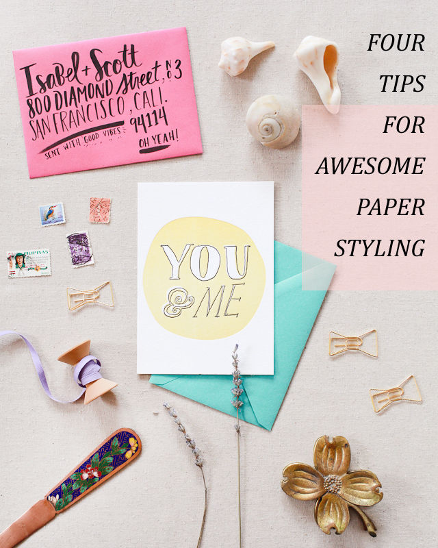
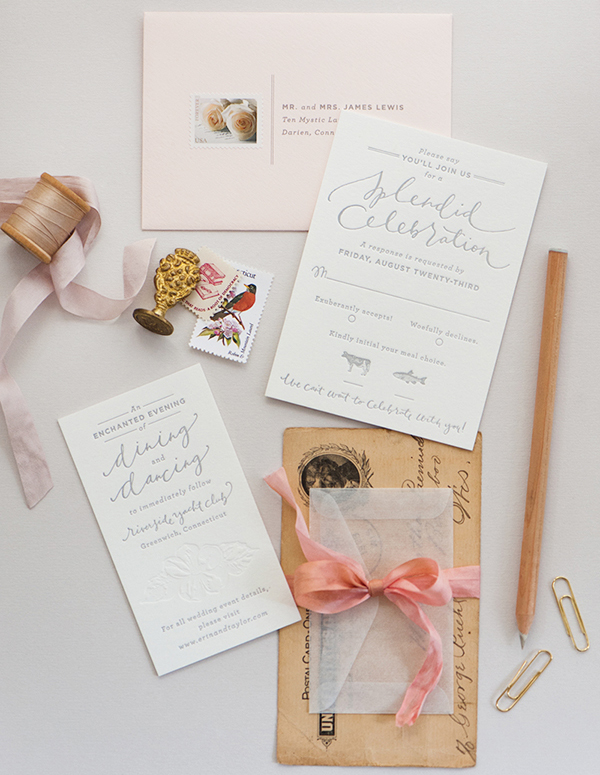
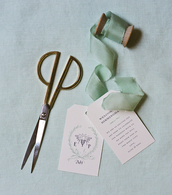
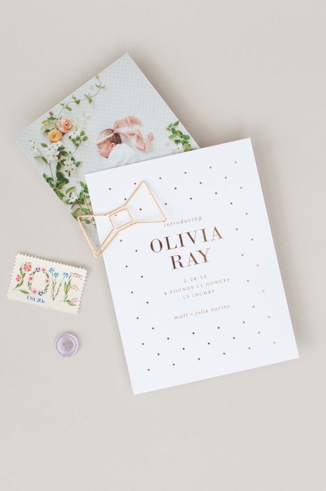
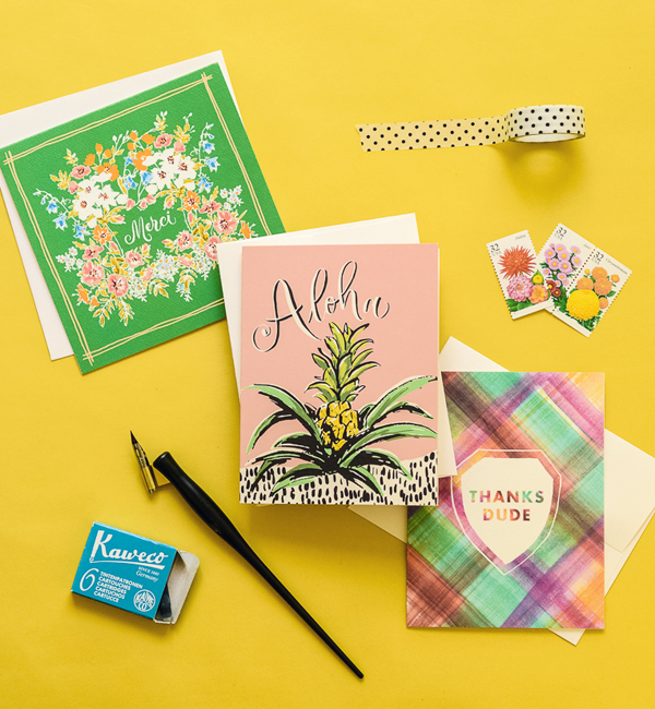
Ferme à Papier has a Paris-meets-Brooklyn kind of feel. We create greeting cards, art prints, calendars, planners, gift tags, gift wrap, and they are all first hand illustrated. Our products are eco-friendly and 100% PCW, Chlorine free. I have a wonderful family-style team who see to the flow of the studio, design support, and production.

Behind the Stationery: Ferme à Papier / Oh So Beautiful Paper

Our products are packaged and inspected here at the studio before going out to our retailers. We have a several hundred retailers in the U.S. and internationally ranging from small independent shops and bookshops to museums and larger retailers like Anthropologie and Paper Chase. There’s a lot to do in a day as our studio operates a curated retail shop in the front to support local designers and artists, but we wouldn’t have it any other way as we get to be inspired by the the vibrant community of San Francisco on a daily basis.

Behind the Stationery: Ferme à Papier / Oh So Beautiful Paper

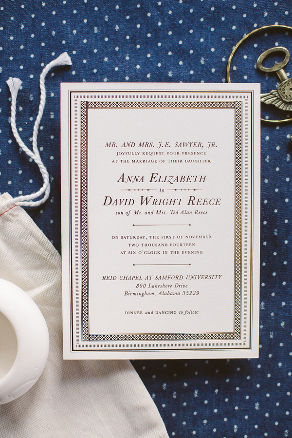
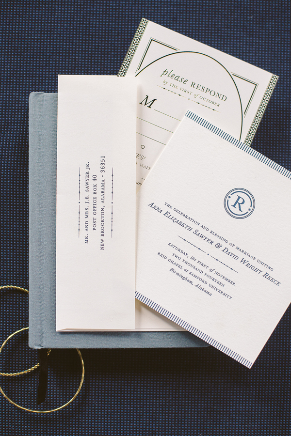
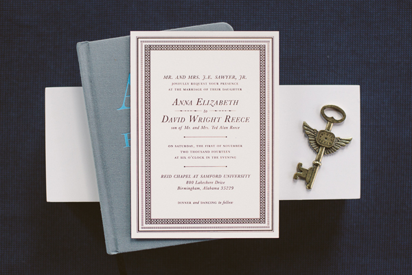
In addition to designing for our wholesale retailers, I collaborate with publishing companies, private clients, and corporations. I have clients whom I’ve worked with for years to create custom illustrated portraits and invitations, a service I hope to expand and offer more of. It has also been a true joy to work on several projects with the beloved Chronicle Books including Mom, Inc., a book on starting a creative business and being a mother (co-authored with Meg Ilasco), and a stationery collection called Joie Du Jour.
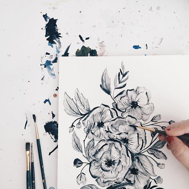
Behind the Stationery: Ferme à Papier / Oh So Beautiful PaperPhoto by Lyn Aldana

One of my favorite collaborations was with Gap – where I got to design decals for their jeans for their back-to-school campaign. My son was able to go to one of the events and pick out his own decal, which was a lot of fun. I believe collaboration and mentorship is key in this day and age for any designer. It’s important to work with talented folks and to share information, inspiration and ideas to push your creative realms. And for young designers, I always advise to mentor with someone to keep it real and develop a humble work ethic!

Behind the Stationery: Ferme à Papier / Oh So Beautiful Paper

A day in my life starts off with dropping my bouncy six-year-old off at school, then I do a hardcore workout – it’s truly the best way for me to get energy and organize my schedule for the day. After that it’s getting down to the business of paring down and answering as many emails and correspondence as I can. We split our duties into several buckets, but the two main ones are design and production.

Behind the Stationery: Ferme à Papier / Oh So Beautiful Paper

We have calendars with forecasts for deadlines involving trade shows, when retailers expect new products, and when we should prepare the studio shop for seasonal offerings. We have a production workflow document that spells out all of the quality control measures, and the team is responsible to upholding and supporting one another on this. Our days are always variable and there are many times a press deadline or an urgent large order from a retailer comes through that takes precedence and we try to budget for that.
Behind the Stationery: Ferme à Papier / Oh So Beautiful Paper

Design and art happen for me after work and in the night when I think the world is asleep. I think my grad school days of pulling all nighters are numbered, but I always warn my team not to panic when they see emails coming from me at 1 or 2 in the morning. 🙂 There are always a lot of plates in the air, but it has been a true lifestyle choice. As hectic as it is, I feel very lucky to be able to share my dreams with others and it is beyond rewarding to think it might bring a smile to someone’s day.

Interested in participating in this column? Reach out to Megan at megan(at)ohsobeautifulpaper.com for more details about Behind the Stationery.

Unexpected Business Card Ideas

As far as I’m concerned, business cards are tiny works of art. A beautiful business card makes a huge impression, and I would argue that the business card is even more relevant in today’s world of email, cell phones, and social media. Here are a few unexpected business card ideas for creating a beautiful – and unforgettable – business card!

Unexpected Business Card Ideas

Oh So Beautiful Paper Watercolor and Letterpress Business Cards / Design and Printing by Gus & Ruby Letterpress

A Bit of Shine

Metallics are the new neutral. And they look amazing on a business card! The options are endless – from shiny metallic foil logos and type to more abstract applications. And the metallic foils themselves come in every hue imaginable, from classic gold to of-the-moment rose gold and copper to trendy hologram silver!

En Route Photography Gold Foil Business Cards / Design by Belinda Love Lee

En Route Photography Gold Foil Business Cards / Design by Belinda Love Lee

Hand Painted Details

What could possibly be more unique than a hand painted business card? A splash of semi-transparent watercolor pairs perfectly with letterpress printed type, whether layered over blind impression (no color) text or as a modern swash underneath the key details. You could even DIY your own business cards using a custom rubber stamp over a watercolor painted background!

Satsuki Shibuya Watercolor and Blind Impression Letterpress Business Cards / Printed by PresshausLA

Satsuki Shibuya Watercolor and Blind Impression Letterpress Business Cards / Printed by PresshausLA

Akula Kreative Rubber Stamp and Watercolor Business Cards

Akula Kreative Rubber Stamp and Watercolor Business Cards

Colorful Edges

The edge is the perfect place to incorporate a bright pop of color – or even stripes of different colors! You’ll want to use double-thick paper ( at least 220lb) to maximize the visual effect, but it’s well worth the extra effort!

Oh Happy Day Stripe Edge Painted Business Cards

Oh Happy Day Stripe Edge Painted Business Cards

Or Shiny Edges!

Did you know that you can put shiny metallic foil on the edges of business cards and wedding invitations? Well, you can! It’s a very specialized printing method, but perfect for a card that is already full of color or wants an even bigger visual impact.

Oh So Beautiful Paper Gold Foil Edge Business Cards / Foil Edging by Boxcar Press

Oh So Beautiful Paper Gold Foil Edge Business Cards / Foil Edging by Boxcar Press

Unique Shapes and Layouts

Who said that a business card has to be rectangular? I’m a big fan of square business cards, circular business cards, even hexagon cards! Or stick with the rectangular shape but go with a vertical layout. Anything goes!

Trentina Navy and Gold Foil Business Cards / Design by Christine Wisnieski

Trentina Navy and Gold Foil Business Cards / Design by Christine Wisnieski

Go Double Sided

A double sided business card is a great way to create visual impact while keeping all of your contact information in one place. You can have the reverse side printed or adhere patterned papers – like vintage wallpaper, gift wrap, and scrapbooking paper – to the reverse side using spray adhesive.

Jessica Comingore Floral Double Sided Business Cards / Printed by PresshausLA

Jessica Comingore Floral Double Sided Business Cards / Printed by PresshausLA

Jessica Comingore Floral Double Sided Business Cards / Printed by PresshausLA

Light on Dark

I love the look of light text against a dark background – so unexpected! Metallic foils and matte white foil look amazing against dark navy blue and black paper.

Clementine Rose Gold and Navy Business Cards / Design by Sara Jensen / Printed by Iron Curtain Press

Clementine Rose Gold and Navy Business Cards / Design by Sara Jensen / Printed by Iron Curtain Press

Unique Materials

I thought I had seen everything – but then I saw a leather business card and thought it was the most amazing idea! You can letterpress print, foil stamp, and screen print on leather, making it as versatile a medium as paper. I’ve also seen paper business cards that incorporated embroidery and fabric. The sky’s the limit!

Arnsdorf Leather Business Card

p.s. More creative business card ideas right here!

This post was created in partnership with eBay. All content and opinions are my own. Thank you for supporting the sponsors that make Oh So Beautiful Paper possible!

Four Tips for Awesome Paper Styling

Last week I mentioned my new partnership with eBay. They asked me to curate some shopping collections around my favorite topics. And I’ve been having so much fun pulling them together! My first two collections featured home bar essentials and a fun group of cocktail picks, stir sticks, and paper straws! I also thought it would be fun to share a few of my favorite paper styling props and some tips for awesome paper styling! I know through experience that even the prettiest wedding invitations and birth announcements can be really hard to photograph. But with the right technique and a few styling props, you can take your paper photography and styling to the next level!

Tips for Paper Styling / Oh So Beautiful Paper + eBay

Start with the Right Conditions

A great photo starts with good lighting conditions and a few pieces of equipment. Always take photos using bright and even natural light, ideally on a table placed near or next to a large window. Buy the highest quality camera you can afford and invest in a great 35 mm or 50 mm lens. A few basic pieces of inexpensive equipment, like light diffusers, reflectors, and white foam core, can help you create a makeshift light box and avoid harsh shadows or bright spots.

Elegant Blind Emboss Calligraphy Wedding Invitation by Coral Pheasant and Brown Linen Design

Photo Credit: Coral Pheasant

Choose Your Backdrop

I always recommend styling and photographing paper against a flat surface placed on the floor or a table near a window. White or colorful foam board makes a fantastic neutral backdrop. You can also choose a neutral linen or fabric in a complementary color to elevate your photographs. If you’ll be taking lots of photos, consider investing in a styling surface – Erickson Surfaces, Woodville, and One Stone West are all great places to start.

Mint and Navy Calligraphy Wedding Invitations / Photo Credit: Mandy Busby Creative / Design by Holly Hollon

Photo Credit: Mandy Busby Creative / Design by Holly Hollon

Style it Up!

I always return to the same favorite props for my own styling needs. Choose items in a variety of shapes, sizes, and dimensions to direct the viewer’s eye and fill negative space. Vintage postage stamps, brass paperclips (especially in unique shapes!), twine, silk and cotton ribbon, washi tape, brass scissors or letter openers – anything with texture or that adds a vintage patina is perfect for adding character to photos! Natural elements like seashells and dried lavender also make fantastic styling props.

Gold Foil Polka Dot Birth Announcements by Lauren Chism Fine Papers

Photo Credit: Lauren Chism Fine Papers

Avoid a Grid

Paper styling and photography should be fun! Try to photograph everything straight on, with a few fun props scattered around to add visual interest. Have at least one thing (and maybe three) slightly off-kilter in each image. Square or rectangular paper pieces turned on a slight angle feel playful and whimsical. Have some elements touch or overlap in the photo to create depth and texture. Ribbon and washi tape can also run off the image to create movement and add visual interest.

Antiquaria Design

Photo Credit: Antiquaria Design Studio

Finally, don’t forget to take photos of the full paper suite, especially for wedding invitations and birth announcements, along with plenty of detail shots of individual pieces. And those detail shots are a great excuse to rotate and add in new props!

For any stationers out there, whether you have a wholesale stationery line or specialize in custom design, you’ve probably heard about the importance of styling a million times over. And to be honest, it’s a huge factor when I’m deciding which submissions to feature here on Oh So Beautiful Paper. Great styling can really help elevate a beautiful design and make it stand out from the crowd!

This post was created in partnership with eBay. All content and opinions are my own. Thank you for supporting the sponsors that make Oh So Beautiful Paper possible!

Happy Weekend!

Happy Friday everyone! This weekend I’m heading back up to New York for the summer NYNOW market – be sure to follow me on Instagram and Snapchat (I’m @beautifulpaper over there) for my favorite finds and behind the scenes peeks from the show! I’ll be sure to share some highlights here, too, of course. But in the meantime…

Shannon Kirsten Black and White Floral Painting via Instagram / Oh So Beautiful Paper

Image by Shannon Kirsten via Instagram

a few links for your weekend!

This week on Oh So Beautiful Paper:

Check back this afternoon for this week’s cocktail recipe! I hope you all have a wonderful weekend! I’ll see you back here on Monday! xoxo

Navy and Gold Foil Stamped Wedding Invitations

Navy and gold is such a classic color combination – and for good reason! For these timeless wedding invitations, Sam and Kelly of Deliver combined shiny gold foil with classic typography and ornate borders to create a truly elegant design!

Navy and Gold Foil Stamped Wedding Invitations by Deliver Paper Studio / Oh So Beautiful Paper

From Sam and Kelly: Anna Beth had clear vision and great taste. She knew right away she wanted her invitations to include lots of gold and touches of navy, which we were happy to work with. She loved a more traditional look with classic typography and intricate details. We love line work and she encouraged us to push it further in hopes of creating an ornate, yet sophisticated design.

Navy and Gold Foil Stamped Wedding Invitations by Deliver Paper Studio / Oh So Beautiful Paper

The borders came alive when they were foil stamped as you could interact and feel the texture of all the detailed lines. We also created a simple logo to incorporate on smaller pieces to tie loose ends together – it helped create a sense of identity for Anna Beth and David’s new life together. The entire suite was foil stamped in metallic gold and her programs and envelope addresses were digitally printed in navy ink.

Navy and Gold Foil Stamped Wedding Invitations by Deliver Paper Studio / Oh So Beautiful Paper

Navy and Gold Foil Stamped Wedding Invitations by Deliver Paper Studio / Oh So Beautiful Paper

Navy and Gold Foil Stamped Wedding Invitations by Deliver Paper Studio / Oh So Beautiful Paper

Navy and Gold Foil Stamped Wedding Invitations by Deliver Paper Studio / Oh So Beautiful Paper

Navy and Gold Foil Stamped Wedding Invitations by Deliver Paper Studio / Oh So Beautiful Paper

Thanks Sam and Kelly!

Design: Deliver

Printing: Eagle Printing

Check out the Designer Rolodex for more tal­ented wed­ding invi­ta­tion design­ers and the real invi­ta­tions gallery for more wedding invitation ideas!

Photo Credits: Ali Takes Photographs