Neutral Modern Minimalist Wedding Invitations

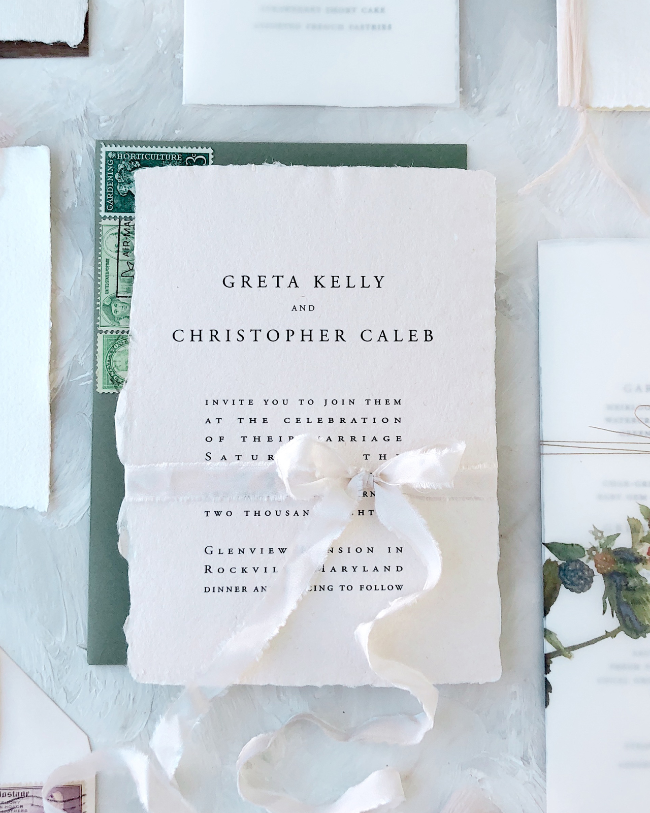
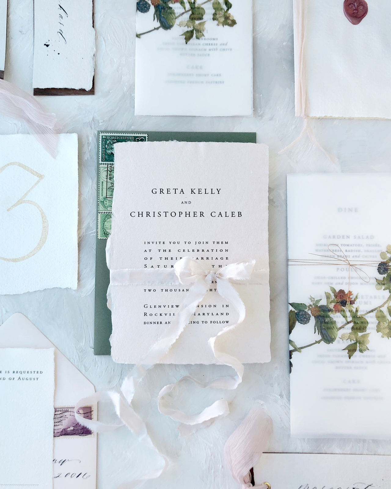
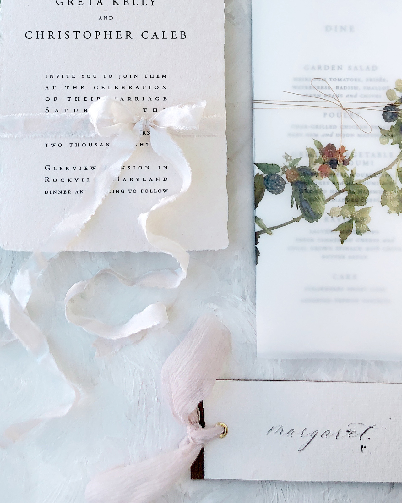
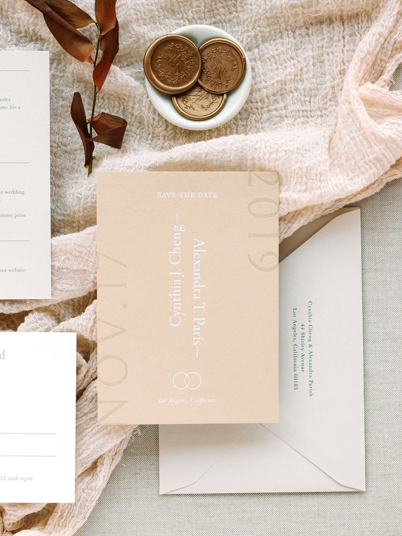
I’ve been on a bit of a minimalist design kick lately. I first caught sight of the gorgeous save the dates in these neutral modern minimalist wedding invitations from Cindy of Owl Post Calligraphy and fell in love with the way Cindy had played around with the type size and orientation, not to mention the beautiful white foil over a slightly darker neutral paper. I asked Cindy if she’d be willing to share the full suite with all of you, and luckily she agreed! In addition to the fun minimalist type, I love the way Cindy combined slightly different paper colors for a beautiful and tonal neutral color palette. So perfect for fall!

Neutral Modern Minimalist Wedding Invitations by Owl Post Calligraphy

From Cindy: This suite is one of my semi-custom invitation collections called “Sacred Vows.” I was inspired by the traditional vows that are said during the wedding ceremony – hence the name!

Neutral Modern Minimalist Wedding Invitations by Owl Post Calligraphy

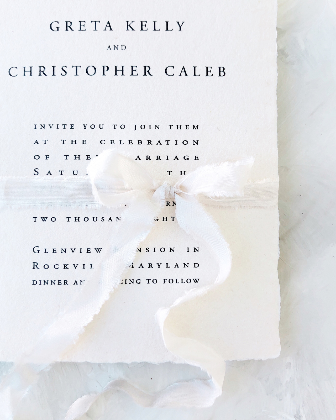
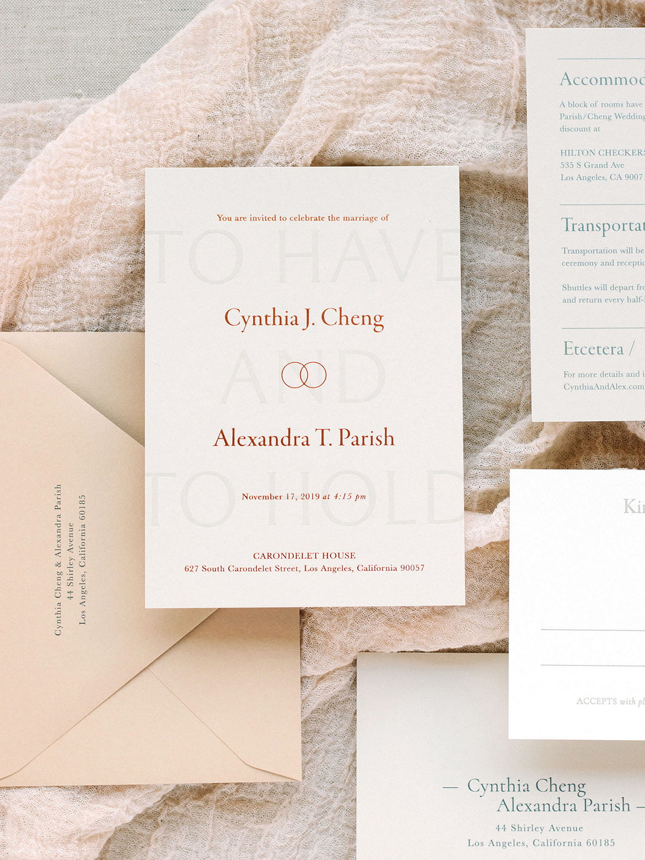
Unlike many of my other suites, this one does not contain any calligraphy and was done with all typographical design concepts. The suite is meant for the minimalist but not “boring” couple. Playing with text placement, direction, and size, the element of play is what makes this suite one of my favorites!

Neutral Modern Minimalist Wedding Invitations by Owl Post Calligraphy

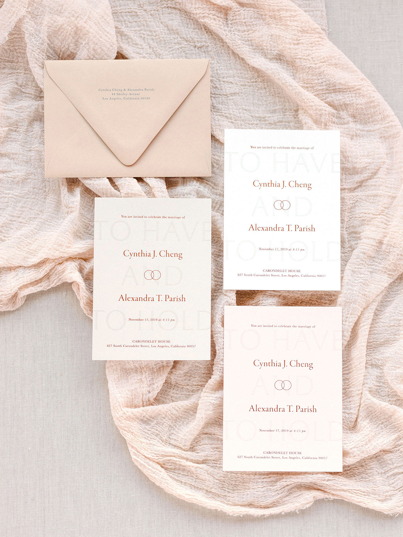
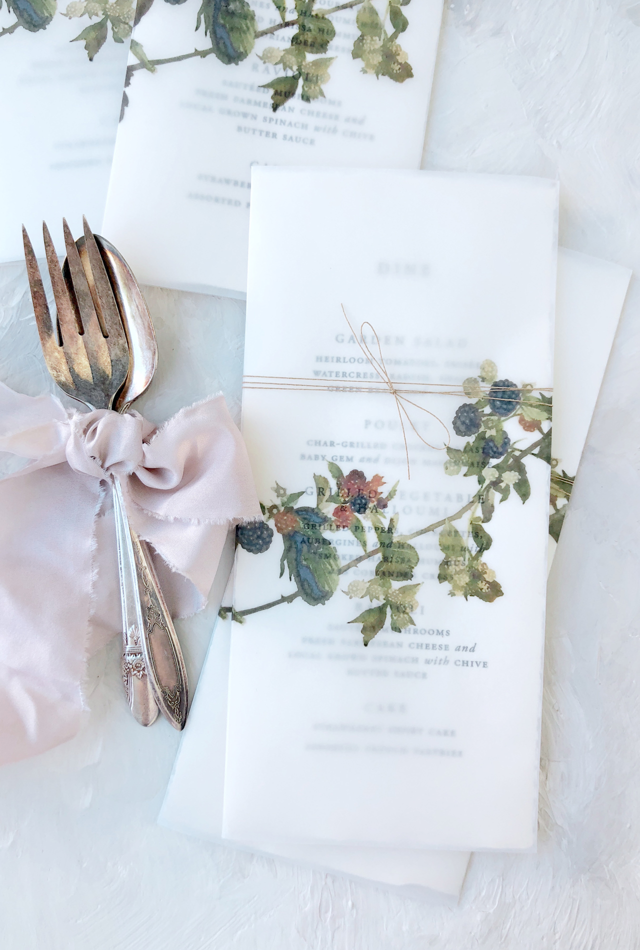
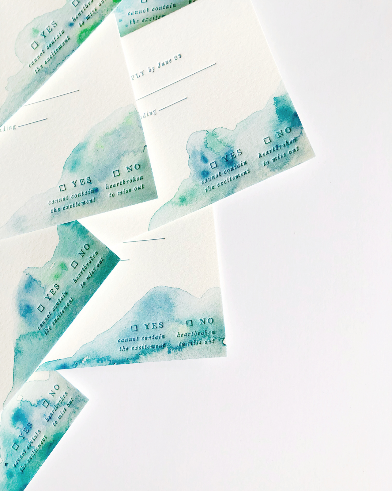
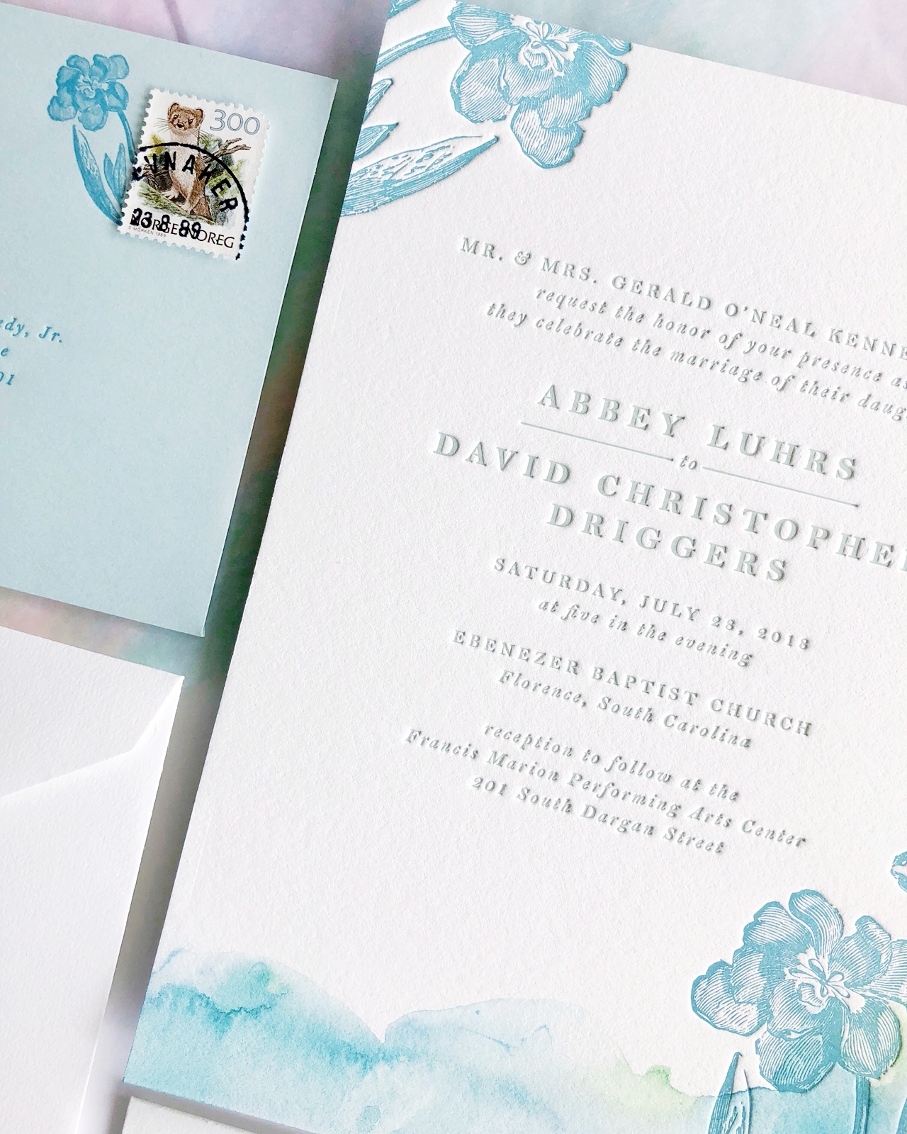
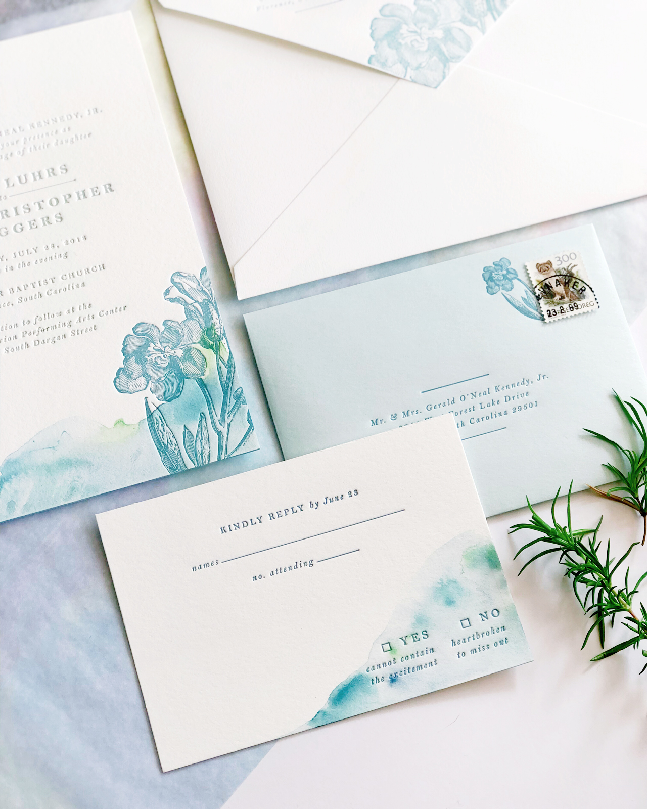
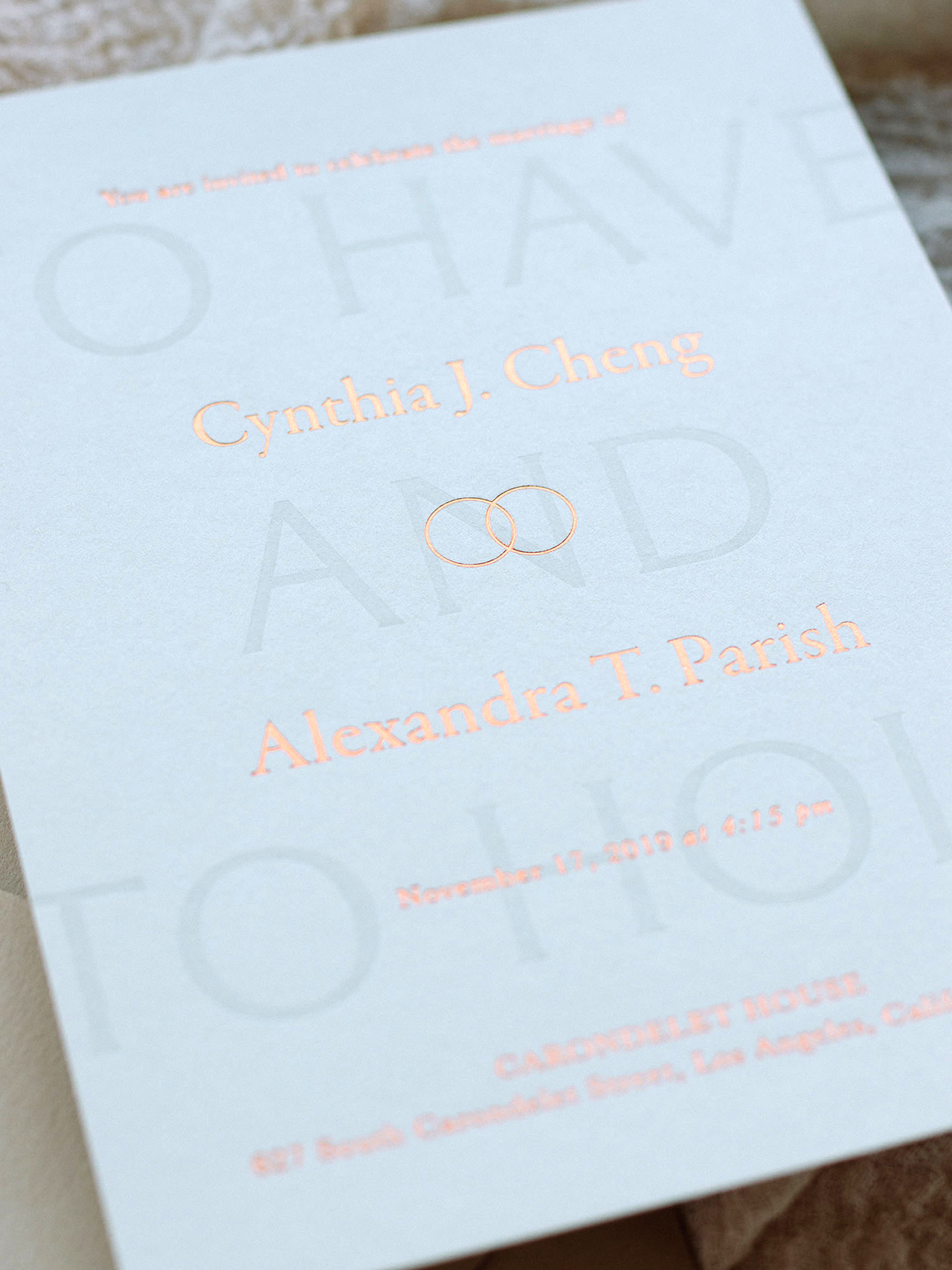
The save the date and main invitation card have multiple print processes (foil and letterpress) to add dimension. The details card and reply card are simple and clean so as to not overpower the rest of the suite. The theme of two rings runs throughout the suite as a small emblem on the invitation card and save the date. The age old saying “to have and to hold” is letterpress printed onto the background of the main invitation card.

Neutral Modern Minimalist Wedding Invitations by Owl Post Calligraphy

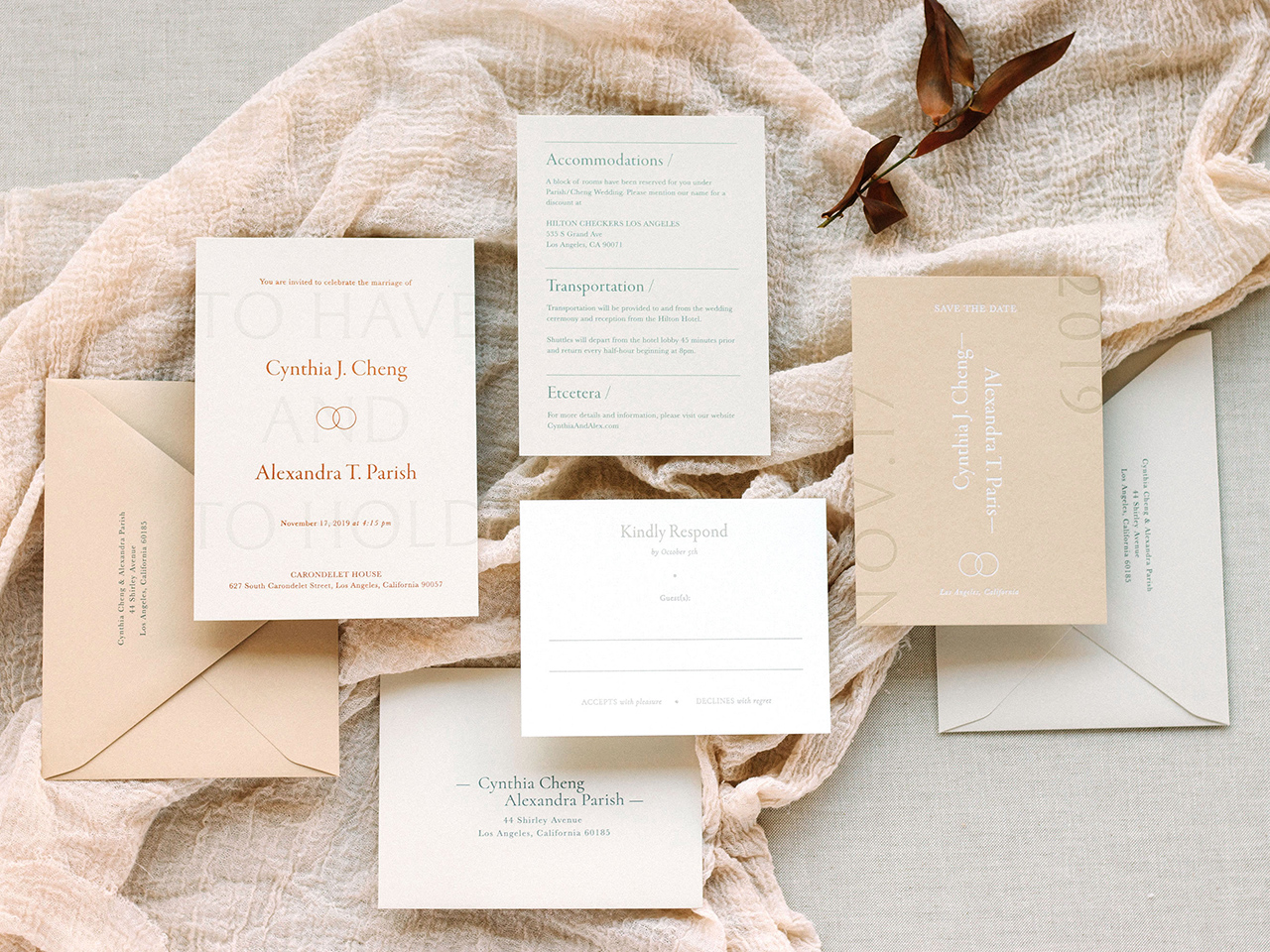
This suite can be printed in multiple ink and foil colors and paper colors, but the photos I have included represent a beautiful neutral palette that is not the usual eggshell white suite but still neutral enough for timeless elegance. It is the perfect palette for fall weddings! A lot of couples think that all cards and all envelopes have to be the same color but switching it up a bit can really add a lot of intrigue to a suite! If you are afraid of it looking too complicated with all the colors, my favorite this to implement is a tonal palette (like this one) where the papers are only slightly different in the same color family. When creating my semi-custom collections for this year, I really wanted to cater to ALL couples so I made sure that I had same-sex couples represented, including this one!

Neutral Modern Minimalist Wedding Invitations by Owl Post Calligraphy

Thanks Cindy!

Design: Owl Post Calligraphy

Printing: Copper Willow Paper Studio

Looking for more wedding invitation inspiration? Visit our wedding invitations archive for more custom wedding invitation ideas!

Photo Credits: Owl Post Calligraphy

Inspiring Calligraphers: Virginia Lucas Hart

Hey everyone! Sometimes it helps to look for inspiration from the masters. And in the calligraphy world, Virginia Lucas Hart is definitely one of them. As a published author of a calligraphy book on creative lettering, a teacher of modern calligraphy, and a calligrapher who’s worked with some big names (Estee Lauder, The Knot, Sotheby’s, and the New York Design Center, to name a few), she’s officially a calligrapher with skills. But as any paper lover knows, beautiful lettering is a mix of talent and heart. And as an artist, Virginia pulls both together in her work. So let’s dive in with some inspiration of the lettering sort. – Jen

Inspiring Calligraphers: Virginia Lucas Hart

Inspiring Calligraphers: Virginia Lucas Hart

Virginia offers a range of lettering styles, but she says her hand lends itself to looks that are playful and whimsical. “Even though I frequently practice the rules I’ve gleaned in my professional education, I’m truthfully always looking for ways to break them, allowing my lettering to be fresh and fun,” says Virginia. “My favorite calligraphy styles are those infused with a lot of personality.”

Inspiring Calligraphers: Virginia Lucas Hart

Inspiring Calligraphers: Virginia Lucas Hart

Virginia has written on loads of different non-paper surfaces, but her favorites include large-scale mirrors or any sort of tile or agates for place cards. “They truly become keepsakes for your guests!” says Virginia.

Inspiring Calligraphers: Virginia Lucas Hart

Estee Lauder sign: Photo by Jane Houle

“When my clients grant me some creative control on a direction of a custom piece, I love pulling inspiration from a few places,” shares Virginia. Besides the obvious social media spaces to reference, she also pulls inspiration from simply browsing stores in NYC. “Whether it’s paper goods or fashion accessories, a simple color combination can inspire a whole direction,” says Virginia. But once she has a vision in mind, everything starts with a pencil, a piece of paper, and a giant eraser.

Inspiring Calligraphers: Virginia Lucas Hart

Inspiring Calligraphers: Virginia Lucas Hart

Other highlights: “I was beyond thrilled to calligraph Met Gala invitations earlier this year for those wearing Prabal Gurung!” shares Virginia.

Inspiring Calligraphers: Virginia Lucas Hart

Inspiring Calligraphers: Virginia Lucas Hart

And for anyone looking to learn calligraphy, Virginia wrote a book, published by Ulysses Press, that came out at the end of 2017. “Although it’s a children’s book, it’s truly a great resource for all ages,” she adds. “I share all of my favorite supplies, tips and tricks, and break things down into easy-to-follow steps.”

A big thanks to Virginia for sharing a peek into the different types of calligraphy work she’s doing. So inspiring!
Photo Credits:: Monica Chimes did the florals around the large mirror photo. All images via Virginia Lucas Hart except where noted.

Want to be featured in our calligraphy column? Reach out to us at submissions [at] ohsobeautifulpaper [dot] com with the subject line “Calligraphy Feature” for more details!

Minimalist Type-Driven Wedding Invitations on Handmade Paper

Happy Monday everyone! We’re going to kick off the week with a serious stunner of an invitation suite: minimalist type-driven wedding invitations on handmade paper by Nicole of Every Little Letter! When I first saw this invitation suite, I was captivated by the combination of a minimalist type-driven design and handmade paper with super soft deckle edges. I love calligraphy, but the minimalist serif type feels so classic and beautiful! Add in a gorgeous vellum overlay with blackberry botanical illustration on the menus and a few silk ribbons, and you’ve got one seriously romantic wedding invitation!

Minimalist Type-Driven Wedding Invitations on Handmade Paper by Every Little Letter

From Nicole: I created this invitation suite for a styled shoot with photographer Erin Tetterton. I was so excited to see lots of beautiful blackberries and a moody disposition in the mood board. My idea was to create a clean, type driven invitation that played off the tones of Fall (one of my favorite seasons and I am so excited it’s on its way!).

Minimalist Type-Driven Wedding Invitations on Handmade Paper by Every Little Letter

I wanted to use a mix of papers to show texture, Pressed Paper was perfect both for the tone and subtle deckle. I used Frou Frou Chic ribbon to offset the strong black type and layout. I wanted to create an invitation that was very clean and simple with only emphasis being the typeface and justification – I love the use of this white space and justified paragraph of details. One of my favorite details is always use of vintage postage, so I was careful to pick tones that complimented the suites soft blush tones and mid-green accents.

Minimalist Type-Driven Wedding Invitations on Handmade Paper by Every Little Letter

To continue the mix of materials, I chose handmade paper for the menus but decided to use soft transparent vellum with a printed botanical illustration as the cover, wrapped with fine paper twine to keep the two pieces together.

Wedding Menu with Vellum Overlay by Every Little Letter

For each suite I design, it’s important to me to create a cohesive look that’s unique and timeless but also how to incorporate color and texture, this minimalist type-driven wedding invitation suite hit all the fun sweet spots! When designing for a styled shoot, it’s also important for me to be able to create a suite that a real bride would be able to recreate – so many times a bride reaches out with a suite she’s found and loves, but would be way too expensive to reproduce for a larger guest list. This suite has the makings of a unique layout that could be remade for a real wedding very easily!

Minimalist Type-Driven Deckle Edge Wedding Invitations by Every Little Letter

Thanks Nicole!

Design and Printing: Every Little Letter

Handmade Paper: Pressed Paper

Ribbon: Frou Frou Chic

Looking for more wedding invitation inspiration? Visit our wedding invitations archive for more custom wedding invitation ideas!

Photo Credits: Every Little Letter

Inspiring Calligraphers: Li Ward Calligraphy

Hey everyone! It’s been a hot summer in many places so I thought it only fitting to pull some inspiring calligraphy work with a true summertime vibe. Here’s a look at the work of Li Ward Calligraphy. I love the mix of her lettering work and watercolor and illustration, and how each wedding suite looks so fitting for the destination. With that, let’s grab a lemonade and check out Li’s beautiful calligraphy! Jen

Inspiring Calligraphers: Li Ward Calligraphy

Photo Credit: Cambria Grace Photography

Inspiring Calligraphers: Li Ward Calligraphy

On how she got her start, Li shares:

I started calligraphy about 6 years ago, using traditional pens with nibs that you dip into ink. I started doing spot lettering for other stationery designers whose clients requested some hand lettering for their invitations. Two years ago when I began dabbling in watercolors, I decided to go “full service” with invitation design: I would take care of not just lettering, but full design which would include watercolor illustrations, hand lettering, envelope liner design, paper choice, and printing.

Inspiring Calligraphers: Li Ward Calligraphy

Inspiring Calligraphers: Li Ward Calligraphy

What inspires Li? She gets inspiration from Jane Austen, scratchy old-fashioned script, Edward Gorey’s irreverent sense of humor, Matisse’s bold color palettes, stained glass designs — just to name a few. “I’m still really new to this and constantly trying new things out,” says Li.

Inspiring Calligraphers: Li Ward Calligraphy

“One of my favorite suites is the Catskills wedding suite (Zoe and Sam), which included Save the Dates, folded maps, and illustrated menus,” says Li. “The couple had already commissioned Happy Menocal to design their crest. Happy just happens to be one of my favorite artists, so I was really thrilled when they asked me to design the rest of the suite that would complement Happy’s design. I took inspiration from Edward Gorey’s illustration style and Happy’s of course, threw in block font mixed with cursive, went with a more is better frame of mind. And it’s kind of been the basis of my style going forward. I’m definitely all about bold colors and shapes!”

Inspiring Calligraphers: Li Ward Calligraphy

Inspiring Calligraphers: Li Ward Calligraphy

As much as I love Li’s illustration work, I’m also a big fan of this kraft brown wedding suite she designed. The white lettering on kraft brown paper has a modern organic vibe that feels casual, yet cool.

Inspiring Calligraphers: Li Ward Calligraphy

Inspiring Calligraphers: Li Ward Calligraphy

Another favorite style? Li loves to do “seamless” designs. “If you were to put two cards side by side, the design from one card would match up with the design on another,” says Li.

Big thanks to Li Ward for sharing a a peek into her world of lettering!

All photos by Li Ward, except where noted

Want to be featured in our calligraphy column? Reach out to us at submissions [at] ohsobeautifulpaper [dot] com with the subject line “Calligraphy Feature” for more details!

Aquamarine Watercolor and Letterpress Wedding Invitations

Whenever I look at a wedding invitation, I always look for that one special detail that stands out from everything else. Sometimes it’s hand lettering or calligraphy. Sometimes it’s the carefully chosen vintage stamps. In the case of these gorgeous aquamarine watercolor and letterpress wedding invitations from Shana of Iris and Marie Letterpress, it’s the beautiful and ethereal hand painted details that Shana added to each invitation. So perfect for an oceanside wedding!

Aquamarine Watercolor and Letterpress Wedding Invitations by Iris and Marie Letterpress

From Shana: Abbey’s July wedding in Florence, South Carolina was hot, but these cool ocean blues and greens gave her guests a breath of fresh air before the big day. Each invitation and reply card was hand painted with acrylic paint using a special water technique. The design was letterpress printed on a 1920s Chandler & Price letterpress using Crane Lettra cotton paper for the invitation and Cards & Pockets Aquamarine envelopes for the reply envelopes. Three colors were used throughout the suite: medium dusty teal, dark dusty teal & grey-green.

Aquamarine Watercolor and Letterpress Wedding Invitations by Iris and Marie Letterpress

The reply card and envelope featured the darker teal of the suite, where as the invitation and outer envelope featured the medium dusty teal that Abbey picked out. The dusty teal used matched her bridesmaids’ dresses perfectly! To go along with her chill vibe, the grey-green was used on the text of the invitation to compliment the blues going on everywhere else.

Aquamarine Watercolor and Letterpress Wedding Invitations by Iris and Marie Letterpress

At the bottom of each invitation is the hazy water painting created uniquely for each invitation with subtle hints of a bright green. The grey-green ink really helped pull those bright greens out & made the invitation colors flow together. The really cool thing about hand painting each piece of paper is that each guest gets a different suite which in turn makes each invitation feel like its own art piece.

Aquamarine Watercolor and Letterpress Wedding Invitations by Iris and Marie Letterpress

Abbey definitely was excited to see each suite come together and see how every invitation was different than the next. She also wanted to add a floral element, but didn’t want them to overpower the hand painted details. So we printed floral illustrations on top of the painted piece to add extra texture.

Aquamarine Watercolor and Letterpress Wedding Invitations by Iris and Marie Letterpress

Can you spot the other little floral element peeking out from the stamp? Instead of having a plain corner of her reply envelope where a stamp would go, we opted to have a cute little flower coming out of the stamp for some extra personality. Flowers were also added to the outer envelopes by being printed to bleed off the envelope flap to give guests a little insight to what is inside.

Aquamarine Watercolor and Letterpress Wedding Invitations by Iris and Marie Letterpress

There are so many fun elements going on in this one suite that you might think that this wedding definitely does not have a “relaxed” vibe. Heck yes it does! Don’t the blue-greens make you want to sit by the ocean? If I were to give this wedding a new theme it would be: relaxed by the ocean with a flower in one hand and sea glass in the other.

Aquamarine Watercolor and Letterpress Wedding Invitations by Iris and Marie Letterpress

Thanks Shana!

Design and printing: Iris and Marie Letterpress

Envelopes: Cards & Pockets

Looking for more wedding invitation inspiration? Visit our wedding invitations archive for more custom wedding invitation ideas!