Matt + Brijit’s Whimsical Booklet Wedding Invitations

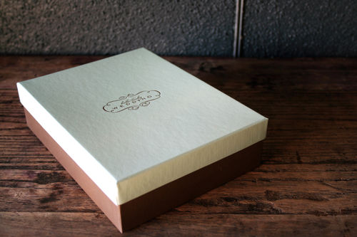
A couple of weeks ago I featured these engagement party invitations from itsmematt, but the wedding invitations and Save the Dates are just as fabulous!

B+M_save
{Matt and Brijit’s Save the Date poster}

I asked Matt if he’d be willing to tell us about the design process in creating their invitations, and here’s what he had to say:

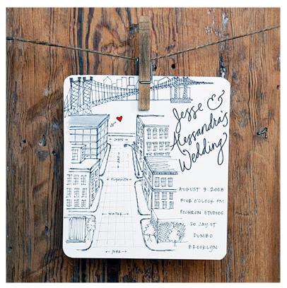
When I proposed to my now wife, I knew before hand that I would be designing all of the invites and additional goodies.  I feared that, designing for myself, like most designers can attest to, is extremely hard to do.  So I treated the invites like a collaboration for an event that I wasn’t partaking in.  That sounds stupid right?  Well I knew that if I designed it as though it were my wedding I might seize up.  I mean seriously, I was getting married!?  It’s one of the most frightening/exciting things you can go through in life, I couldn’t add being my own harshest critic on top of that.  So what I did was treat it like my wife was the client (after all, she should be in love with everything for the big day).  Boy oh boy did that make it easier to get started.

BM6

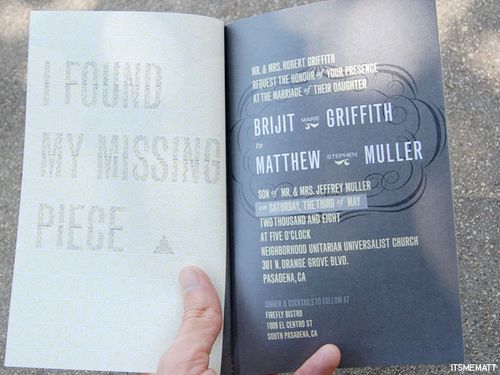
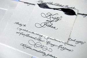
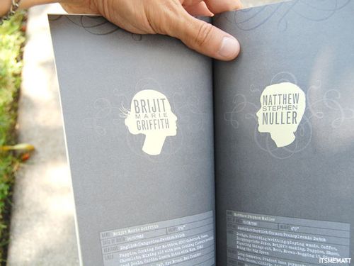
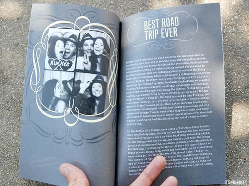
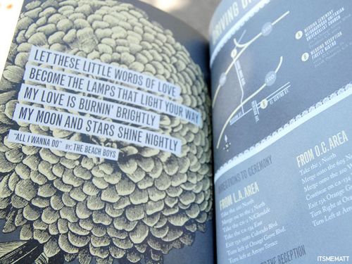
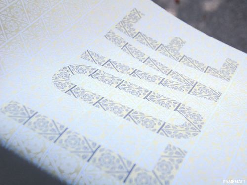
She picked a color scheme: grays, yellow and white.  She then showed me some silhouettes she liked and some calligraphic flourishes she really liked.  I then went to town making silhouettes of the two of us and scanning in some really cool French calligraphy.
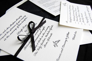
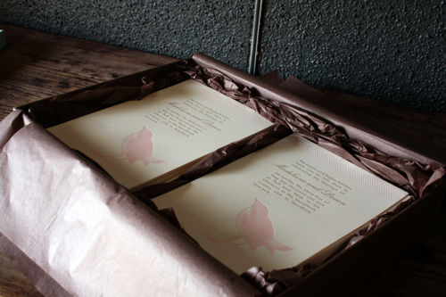
BM7

The design process went easy.  We wanted to make a booklet from the get-go and so instead of the traditional
saddle stitch we went for a more personal approach and we sewed each one along the left side.

BM8

I used a typewriter font for a personal story of how the proposal went down to tie in the fact that our guest book at the reception would be an old typewriter with a roll of paper attached.

BM9

BM11

It was such a great process from start to finish and it was so well received from everyone in attendance.

BM10

I love the way Matt and Brijit took a more personal approach, using their wedding invitations to tell their story in a completely unique way.  For me, that’s one of the biggest advantages of having an invitation booklet, and I’m so happy to see more and more couples moving in this direction.  Thanks so much Matt, for sharing your invitations with us!

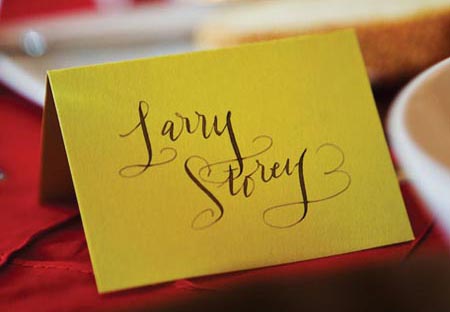
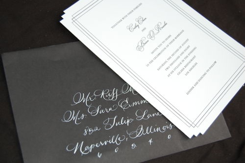
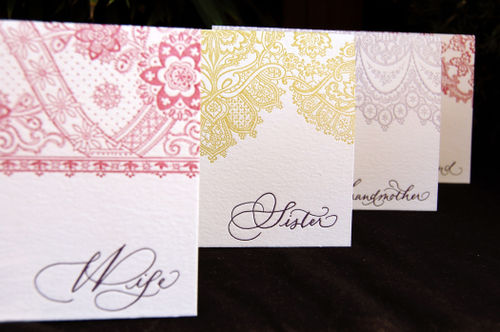
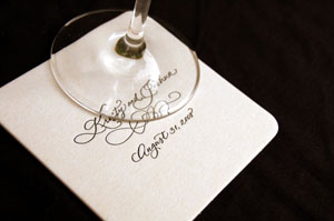
{images via itsmematt}

Calligraphy – paperfinger

Last week, I received an e-mail from Bryn introducing me to her calligraphy service, paperfinger.  Based in Brooklyn, paperfinger focuses on modern and playful calligraphy styles, offering a valuable resource for brides seeking an alternative to
traditional calligraphy. 

Bryn will provide handwritten and
illustrated work for everything from weddings and events to keepsakes
and custom projects.  Here are a few examples from the paperfinger portfolio:

Picture 1

Picture 3

Picture 4

Picture 6

{envelopes}

Picture 5

Picture 7

Picture 8

{seating cards}

Picture 9

{guest book inscription}

Picture 10

{table cards}

Picture 11

{wedding map}

Picture 12

Picture 13

{custom save the date and birthday party invitation}

Picture 14

{custom address stamp}

For more from Bryn's portfolio, as well as information about her rates and process, don't forget to check out the paperfinger website and blog.

{images via paperfinger}

Calligraphy Love

I was one of those girls whose handwriting changed at least once a year in middle school. By the end of high school, I think I pretty much got my handwriting sorted out, but I still have a different style for when I'm writing a grocery list, or journaling, or addressing a letter. So it's probably no surprise that I really love calligraphy. L-O-V-E it. I think elaborate scripts with zillions of flourishes are gorgeous, but I also think playful and simple and sweet styles can be just as wonderful. In no particular order, here are some of my favorites.

Laurahooper
Laura Hooper "Ella" script.

Jennahein
Jenna Hein.

Tarajones
Tara Jones "Maggie" script.

Emiliefriday2
Emilie Friday.

Calligraphy
Left: Maybelle Calligraphy
Right: Linea-Carta

Crystalkluge
Crystal Kluge.

Betsydunlap
Betsy Dunlap "Jill" script.

Be sure to check out these ladies' websites and blogs for even more inspiration! This is just a tiny sampling of their incredible work.

Calligraphy — Copper Willow Studio

I haven’t featured calligraphy recently, so I jumped at the chance to feature the lovely work below from Jill, the creative force behind the custom letterpress and calligraphy design studio Copper Willow Studio:

Calligraphy

Copperwillow-lace

DSC_0070s

DSC_0083s

DSC_0106

Bridal timeline s

The next two photos aren’t calligraphed, but I love them too much not to include them here:

DSC_0656s

silhouette-calendar-wedding-save-the-date

I love calligraphy, and the combination of custom calligraphy and letterpress is just about heaven for me.  To see more from the Copper Willow portfolio and learn about their design services and pricing structure, just click here.

{all photos via Copper Willow Studios – thanks Jill!}

Maddy + Devon’s Vintage-Inspired Letterpress Wedding Invitations

Maddy, of the fabulous wedding blog Inspired Bride, and her fiancé Devon are planning an afternoon wedding for the end of May.  When I first discovered that Maddy is a graphic designer and was planning to design her own letterpress wedding invitations, I begged her to let me feature them here.  Well, the invitations are just in from the printer, so you’re getting the first look here!  Here’s the full invitation suite:

pink-bird-silhouette-letterpress-wedding-invitations

Maddy also sent over some information about the inspiration behind the design.  Here’s what Maddy had to say:

Since I’m a graphic designer, I knew from the outset that I would design my own invitation.  The concept we came up with from the outset was “vintage modern” – we have very contemporary taste in general but wanted to bring in antique elements as a nod to something old and something new.  My dress, for example, is an antique champagne color, and has vintage style detailing:

pink-bird-silhouette-letterpress-wedding-invitations

pink-bird-silhouette-letterpress-wedding-invitations

The color scheme was originally pulled from Sophia Coppola’s Marie Antoinette.  The first palette was pink, peach, and antique gold.  The color scheme was modified to pink, green and antique gold after my parents decided they didn’t want to wear pink.  The color change gives it a little more of a modern spin, so I think it still works pretty well.  For the purposes of the invitation, I wanted to keep the palette simple and restrict it to only two of the colors.

pink-bird-silhouette-letterpress-wedding-invitations

pink-bird-silhouette-letterpress-wedding-invitations

You’ll notice the invitation envelope is missing from the suite.  All of my envelopes were directly shipped to my calligrapher, Laura Hooper, who is matching the Lucia Script in an antique gold.  They look exactly like the RSVP envelopes, except the addressing is on the front.

pink-bird-silhouette-letterpress-wedding-invitations

pink-bird-silhouette-letterpress-wedding-invitations

I went through over fifty designs before I got to this one.  I knew the “something old” I wanted was in the printing method and the “something new” was in the typography and overall graphic treatment.  The typefaces I used were Avenir and Lucia Script, which I thought paired together well without looking too casual.

pink-bird-silhouette-letterpress-wedding-invitations

The invitations were printed by Hello!Lucky, and I would highly recommend them to any graphic designer looking for someone to letterpress his or her work.  Alex from HL was so incredibly helpful and patient.  She was a great resource and was happy to send me any samples I needed or answer any questions I had.

pink-bird-silhouette-letterpress-wedding-invitations

pink-bird-silhouette-letterpress-wedding-invitations

In addition to sending over these gorgeous photos of her invitations, Maddy was also kind enough to include some fabulous advice for other brides thinking about designing their own invitations:

If you’re planning to design your own invitation, I’d highly recommend researching your printing options first. Certain design elements were scaled back or modified because of letterpress limitations. If you know who is printing it before designing it, you’ll have less of a chance of having to let go of design elements you’re attached to later on. Also, make an inspiration folder with images of designs you like but aren’t totally you. Reference these whenever you’re having a design block so you can recall what you’re looking for in your ideal invite.

I love the chic and simple elegance of the design – from the pink and gold color palette to the bird graphic that is just so perfect for a springtime invitation!  Thanks so much Maddy for sharing your invitations, and for sharing such helpful insights into your design process!

Check out the Designer Rolodex for more tal­ented wed­ding invi­ta­tion design­ers and the real invi­ta­tions gallery for more wedding invitation ideas!

{all photos by Maddy Susser}