Colleen + Paul’s Illustrated Cartography-Inspired Wedding Invitations

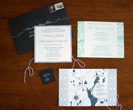
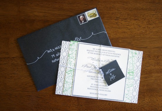
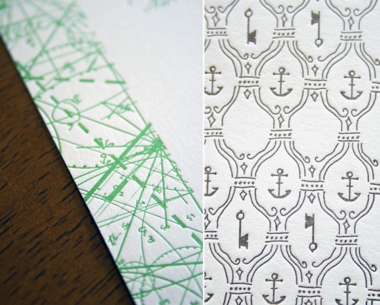
I couldn’t end the week without featuring these beautiful cartography-inspired wedding invitations, designed by the bride and groom and printed by the lovely Colleen Ellse.  You might remember Paul and Colleen’s silhouette save the dates from a few months back, and the wedding invitations continued the illustrated feel along with the gray and green color palette.  I’m loving the cartography border on the information card and the anchor illustration on the hand drawn map.  The bride also did the calligraphy – isn’t it so pretty??

Modern-Cartography-Letterpress-Wedding-Invitations

Modern-Cartography-Letterpress-Wedding-Invitations-White-Calligraphy

Modern-Cartography-Letterpress-Wedding-Invitations-Detail

Get the full details over on Colleen‘s blog, Craft Lovely.

Photo Credits: Colleen Ellse | Craft Lovely

*Colleen Ellse is one of my fab­u­lous spon­sors, but she had no idea I was going to write this post today; for more on my edi­to­r­ial poli­cies please click here.
Arabic Wood Greeting Cards from Natoof

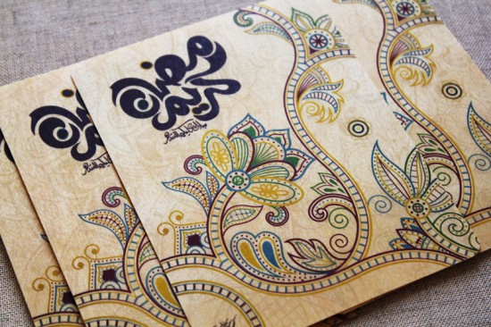
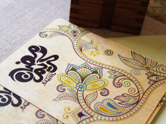
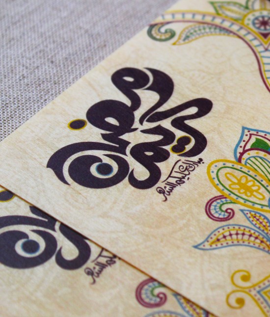
Mariam from Natoof, a creative studio based in Dubai, sent over these lovely cards that she designed for the month of Ramadan.  The flat note cards feature Miriam’s botanical illustrations with Arabic calligraphy, all printed on eco-friendly birch.  The intricate designs are so beautiful!

From Mariam: It’s always exciting to find a new material for our artwork.  Though we love paper and we love wood laser engraving, these flat birch eco-friendly wood cards are absolutely fabulous.  We thought of trying it for our season’s greeting cards and it turned out great.  Having colors printed on wood is a blast, the card is printed with beautiful flowery illustrations in the shades of dark purple, blue, yellow, green and with Arabic typography.

Thanks Mariam!

Photo Credits: Natoof

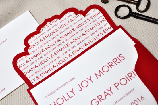
Red and White Modern Letterpress Wedding Invitations

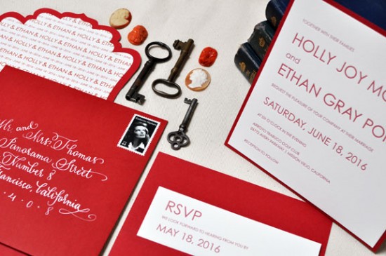
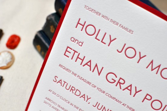
Theresa from b.t. elements sent over these beautiful red and white invitations from her brand new letterpress collection.  Theresa chose a minimalist and crisp design for the main invitation while bringing in a unique die cut outer envelope and bold white calligraphy.  Theresa even did the beautiful calligraphy herself – so pretty!

From Theresa: I love the beauty of the letterpress printing process and wanted to design an invitation that was clean and simple, working with just the relationship of small and large type.  The crisp design of this invitation was really inspired by the printing method itself.  I’m always inspired by strong bold colors that stand well on their own – red is one of those colors.  It’s bold, striking, and just a timeless color.

At b.t. elements we’re known for our custom pockets and folders, so I added in a very simple back pocket – you always need a place to tuck in those extra enclosures.  And we never overlook the envelope.  Our fancy cut envelopes are new this year and a big hit.  It’s so wonderful to see that envelope come in the mail.

The handwriting on the envelope is my own; I’ve been trying to teach myself calligraphy so I’ll take any practice I can get.  I love the contrast of the white on red.

Lovely!  Thanks Theresa!

Photo Credits: b.t. elements

{happy weekend!}

Happy Friday everyone!  I’m still trying to figure out how the week went by so quickly, but I’m glad to be back home in DC after spending a few days in New York and New Jersey.  Right now I’m looking forward to a night out with friends this evening followed by a lazy weekend.  But in the meantime…

…a few links for your weekend!

This week on Oh So Beautiful Paper:

And a big thanks to Jan from Poppytalk for asking me to stop by today with a recap from the Gift Fair!  That does it for me this week – I hope you all have a wonderful weekend, and I’ll see you back here on Monday! xoxo

Photo Credit: Beth Retro via Design is Mine

Ashley + Peter’s Yellow and Gray Patterned Letterpress Wedding Invitations

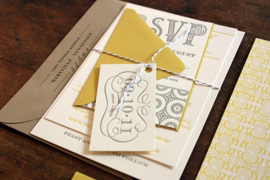
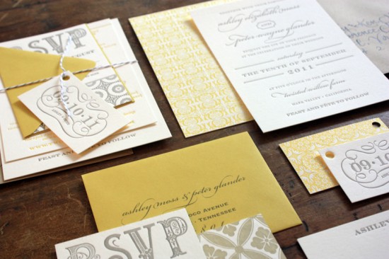
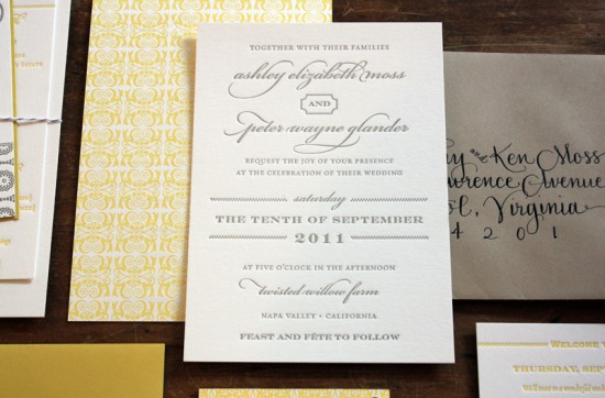
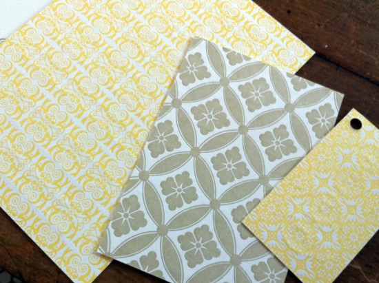
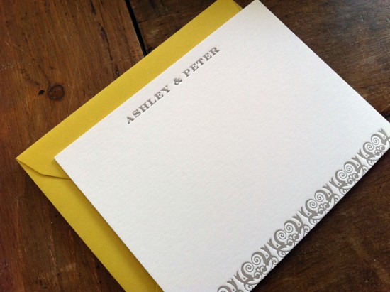
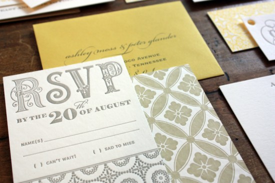
As far as color combinations go, yellow and gray will always be one of my favorites.  Sarah from The Happy Envelope created these gorgeous wedding invitations for a destination wedding in Napa Valley.  She paired elegant script and serif fonts with beautiful patterns for an overall design that is both laid back and sophisticated – and completely stunning.

Yellow-Gray-Patterned-Letterpress-Wedding-Invitations-Twine

From Sarah: This wedding is a Napa Valley destination event.  The upbeat color palette of yellow, gray and taupe brings a sense of cheer to the whole suite.  All pieces were letterpress printed on weighty conservation board — thick enough to allow for letterpress printing on both sides of the invitation.  All pieces were printed in a warm putty gray on the front, with various patterns printed in warm yellow ink on the back of the invitation, the reply card, and the hangtag.

Yellow-Gray-Patterned-Letterpress-Wedding-Invitations-Suite

The entire suite is wrapped in oyster gray twine paired with a neutral khaki envelope and hand-lettered black ink calligraphy.

Yellow-Gray-Patterned-Letterpress-Wedding-Invitations-Suite

The bride wanted a laid-back, California feel but with an understated, simple aesthetic.  The invitation itself is fairly understated on the front with a mixture of type and a light dotted line motif.  The punch to this invitation is the bold pattern printing on the reverse side of select pieces.

Yellow-Gray-Patterned-Letterpress-Wedding-Invitations-RSVP

Yellow-Gray-Patterned-Letterpress-Wedding-Invitations-Reverse

Yellow-Gray-Patterned-Letterpress-Wedding-Invitations-Thank-You-Cards

So pretty!  Thank you so much Sarah!

Photo Credits: The Happy Envelope