Quick Pick: Floral Explosion

Happy Monday everyone! DC has apparently decided that ALL the flowers should bloom at the same time: lilacs, tulips, azalea, wisteria… everywhere I look there is something in bloom! And the iris, peonies, and roses aren’t that far behind. After months of winter, it’s so nice to have color in the world again! We’ve been spending our weekends visiting our favorite botanical destinations in the area, from the U.S. Botanic Garden to Dumbarton Oaks Gardens to George Washington’s Mount Vernon Estate. Today I thought I’d celebrate my favorite season by rounding up a few floral stationery favorites, from art prints to greeting cards to notepads!

Quick Pick: Floral Explosion! / Oh So Beautiful Paper

1. Floral everyday notepad by Rifle Paper Co.

2. Neon pink and mint letterpress floral birthday card by Parrott Design Studio

3. Paper cut flower and dot card by Evermore Paper Co.

4. The Earth Laughs in Flowers gold foil art print

5. Floral thank you card by Antiquaria

6. Poppies thank you card by Our Heiday

7. Floral embroidery by Happy Cactus Designs

8. Botanical love card by Amy Heitman

9. Watercolor peony art print by Julie Song Ink

10. Navy and pink floral birthday card by Wild Hart Paper

Elegant and Classic Navy Wedding Invitations

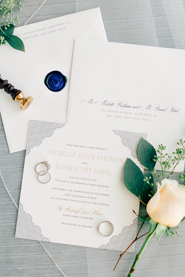
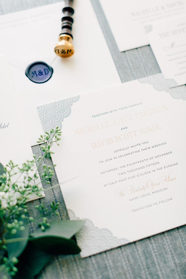
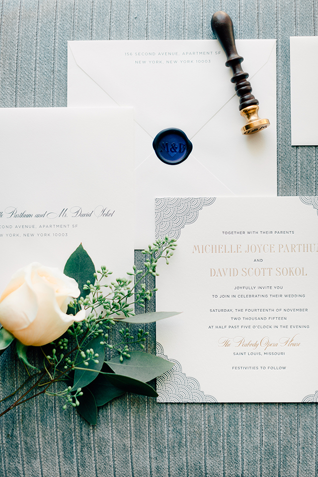
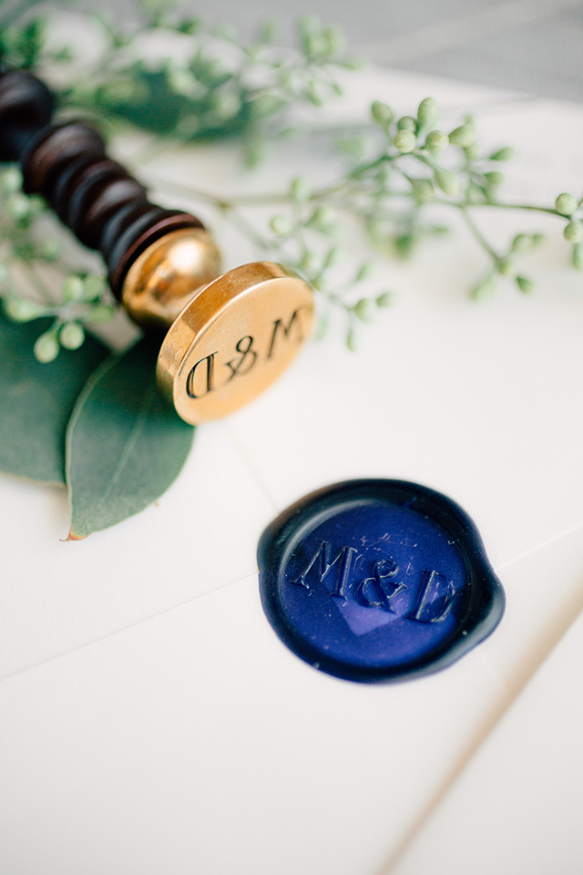
These elegant and classic navy wedding invitations from Patricia at Fourteen-Forty have two of my favorite things: a whimsical dot pattern and a wax seal! Seriously, how gorgeous is that pop of dark navy blue wax against the off-white envelopes? The navy blue of the dot pattern is especially beautiful paired with a subtle dose of champagne foil in the invitation text. And I love the combination of clean and classic text with a more modern – and attention-grabbing!– square invitation shape.

Elegant and Classic Navy Wedding Invitations by Fourteen-Forty / Oh So Beautiful Paper

From Patricia: Michelle’s invitations were a true collaboration. She had seen our dot envelope liner pattern and loved it, so we decided to incorporate the dots front and center in the invitations, while working variations into the other pieces. It worked out really well with the venue, as they evoke opera curtains in a subtle and beautiful way.

Elegant and Classic Navy Wedding Invitations by Fourteen-Forty / Oh So Beautiful Paper

Letterpress printing was key in bringing out the important details, along with a little foil shine. And then the blue – we used a subtle two tone color palette that was continued in her reception items and florals, which were a combination of soft peaches, light blues, and whites. Her bridesmaids dresses were also a deep and elegant navy blue. We absolutely love when we can coordinate all these pieces from beginning to end so that a cohesive look is created.

Elegant and Classic Navy Wedding Invitations by Fourteen-Forty / Oh So Beautiful Paper

Another thing to notice is the more unique square shape of the invitation. They give the invitations a bit more grandeur – guests just can’t help but take notice at the special size. And the wax seal is definitely difficult to overlook. The dark blue was just a stunning pop of color on her off-white envelopes and they always make such a lovely keepsake.

Elegant and Classic Navy Wedding Invitations by Fourteen-Forty / Oh So Beautiful Paper

Thanks Patricia!

Invitation Design: Fourteen-Forty

Flowers: Randy Felkey

Check out the Designer Rolodex for more tal­ented wed­ding invi­ta­tion design­ers and the real invi­ta­tions gallery for more wedding invitation ideas!

Photo Credits: Mike Cassimatis

Finding the Paper: Brass Union

With spring officially here, that means trade show season will be upon us before we know it. Things around the studio have been hectic, between shipping The Parcel, filling samples and a bit of business travel, I barely even noticed the hellebores blooming. Before we get too busy, I wanted to share this brand identity for Brass Union that draws on the history of its surroundings for its design inspiration. – Jill

Finding the Paper: Brass Union Business Stationery, Business Cards, and Menus / Parse & Parcel for Oh So Beautiful Paper

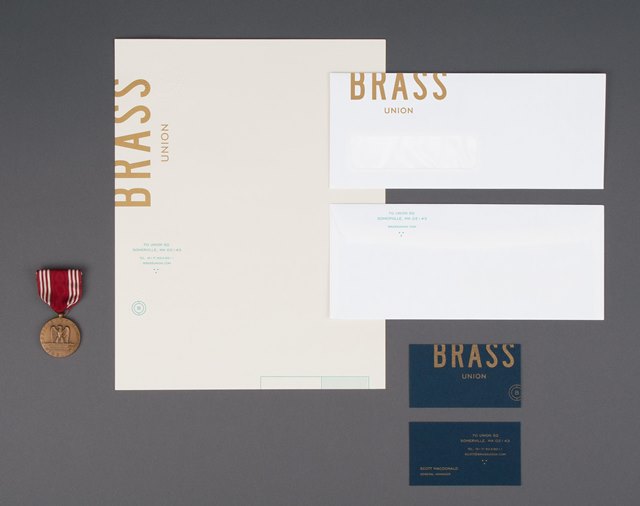
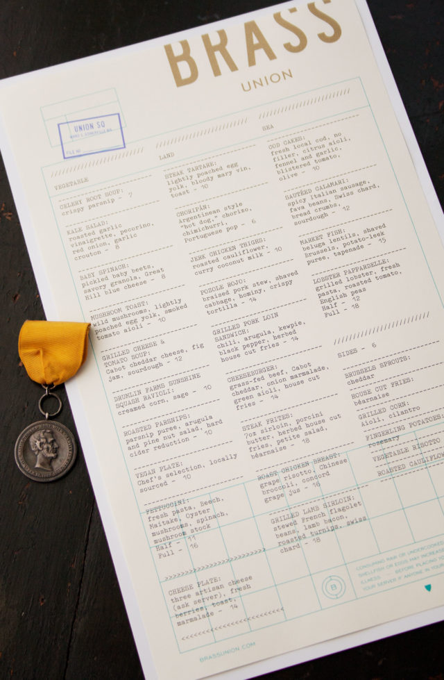
With a cohesive brand identity that pays homage to the building’s history, Brass Union is a pub housed in the former police station in Union Square’s Somerville neighborhood. Designed by Rory & Jen at Oat, Brass Union’s brand identity is a great example of the stellar results that can be achieved when mixing different paper stocks, textures, type and production techniques. The team at Oat utilized the building’s history to channel bureaucratic and administrative in a subterranean hideaway, housed in a historic police station.

Finding the Paper: Brass Union Business Stationery, Business Cards, and Menus / Parse & Parcel for Oh So Beautiful Paper

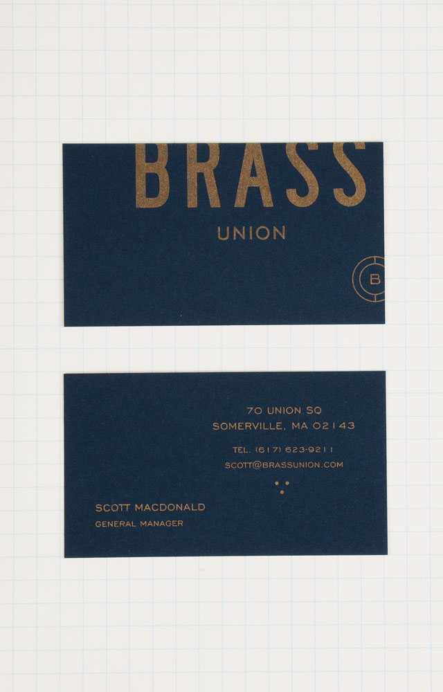
Gold metallic ink pairs beautifully on the deep blue shade of the business cards, offset printed in one color on French Paper’s Construction 100# Cover in Midnight Blue.

Finding the Paper: Brass Union Business Stationery, Business Cards, and Menus / Parse & Parcel for Oh So Beautiful Paper

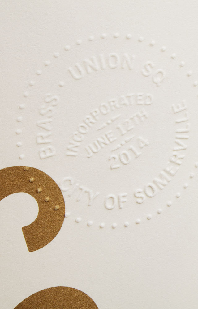
The letterhead feels official with a blind embossed seal on text weight paper, printed offset in two colors on Mohawk Via 70# Text in 100% PC Cream White. Accompanied by a standard bright white #10 window envelope, giving the stationery suite a utilitarian look.

Finding the Paper: Brass Union Business Stationery, Business Cards, and Menus / Parse & Parcel for Oh So Beautiful Paper

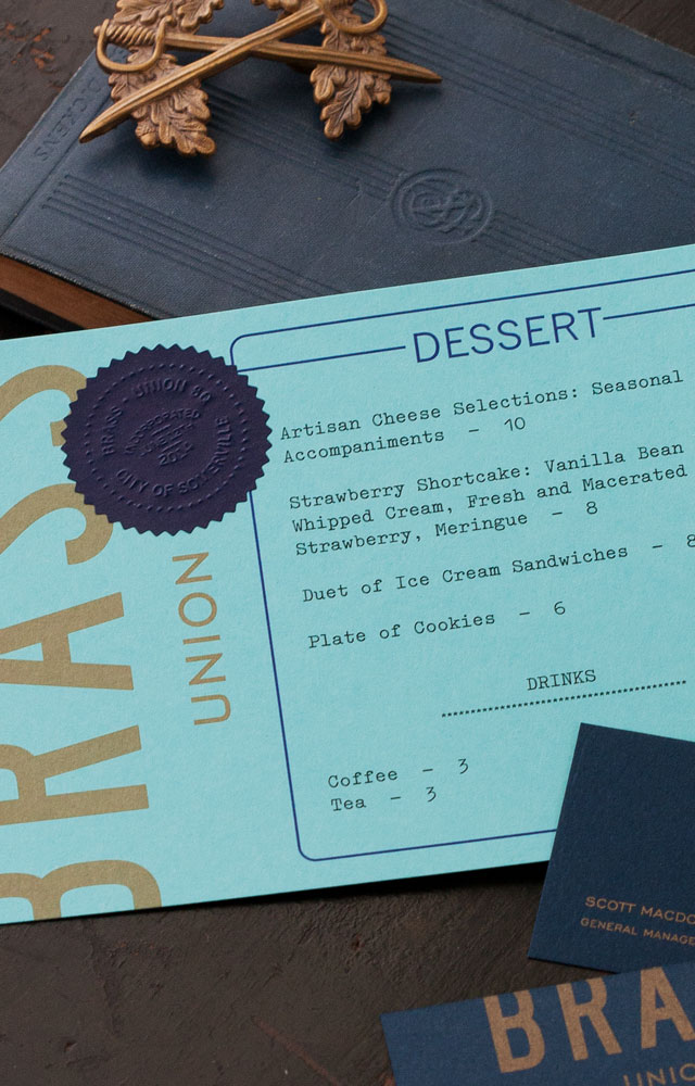
The menu system echoes the details of the stationery, with main menu printed offset on the same stock as the letterhead in metallic gold and blue. The drink and dessert menus carry through with the cropped type treatment, bringing in a bit of color. The drink menu is printed on Mohawk Via Light Pink 70# Text.  The metallic gold on the dessert menu pops, printed on French Poptone 100# Cover in Blu Raspberry and sporting a blind embossed navy seal.

Finding the Paper: Brass Union Business Stationery, Business Cards, and Menus / Parse & Parcel for Oh So Beautiful Paper

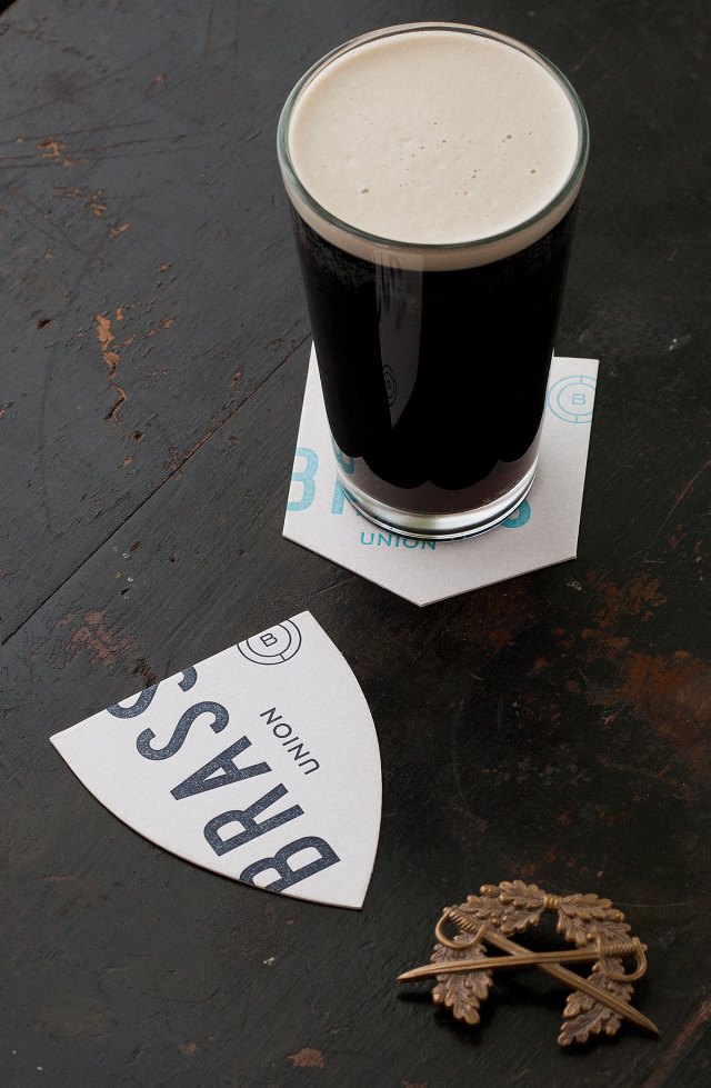
With die-cut, badge shapes and cropped type in shades of blue, the coasters tie in perfectly to Brass Union’s identity and space. Cheers!

Finding the Paper: Brass Union Business Stationery, Business Cards, and Menus / Parse & Parcel for Oh So Beautiful PaperFinding the Paper: Brass Union Business Stationery, Business Cards, and Menus / Parse & Parcel for Oh So Beautiful Paper

Photo Credits: Oat

Seven Pretty Ring Dishes

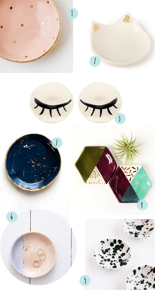
I’m absolutely obsessed with pretty ring dishes. I can’t stop myself from buying one whenever I see a new beautiful dish! Of course, I don’t just use ring dishes to hold jewelry. Some help organize paperclips and vintage stamps on my desk, one holds loose change by the front door, while others frequently hold small components of a DIY project on the kitchen table. I just love seeing these little ceramic dishes around the house – and here are a few of my favorites!

Seven Pretty Ring Dishes / Oh So Beautiful Paper

1. Love the sweet gold polka dots against a peach background from Up In the Air Somewhere

2. A cat ring dish! From Catbird, naturally

3. I’m completely obsessed with these bold black and white eyelash ring dishes by BDB NY (available for purchase here)

4. Unique colorblocked hexagon ring dishes from Quiet Clementine

5. A fun black and white splatter pattern from Paper and Clay

6. Two of my favorite colors: lavender and peach, with the most delicate gold line down the middle, from Redraven

7. I would happily buy just about anything from Suite One Studios, but I’m completely powerless when it comes to her ring dishes! Dark navy with gold splatters? Iridescent glaze? A deep emerald green or rose pink with gold rims? Yes, yes, yes, and yes.

Dusty Blue Letterpress and Copper Foil Wedding Invitations

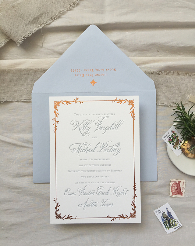
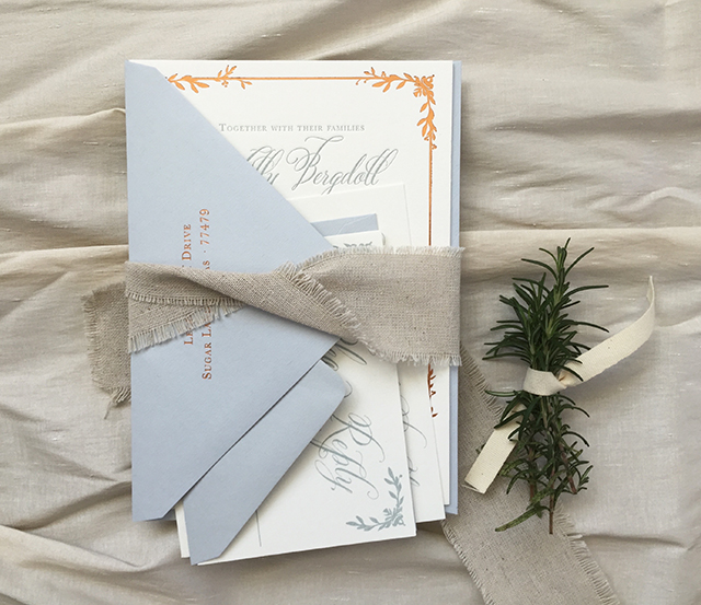
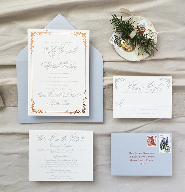
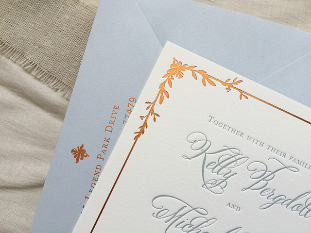
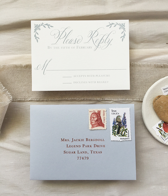
I love unexpected color combinations! We’ve seen some gorgeous navy blue and copper wedding invitations, but this is the first time I’ve seen copper foil paired with a medium blue gray! Lauren from Charm & Fig designed these dusty blue letterpress and copper foil wedding invitations for a romantic and rustic wedding in Austin, Texas. The dusty blue feels like the perfect fit for a Texas wedding – it reminds me of bluebonnets! – and looks great against the warm and shiny copper foil in both the invitation border and return address. So pretty!

Dusty Blue Letterpress and Copper Foil Wedding Invitations by Charm and Fig / Oh So Beautiful Paper

From Lauren: As Kelly and Michael were planning their wedding, they knew they wanted a romantic Texas Hill Country affair with the slightest rustic touch.

Dusty Blue Letterpress and Copper Foil Wedding Invitations by Charm and Fig / Oh So Beautiful Paper

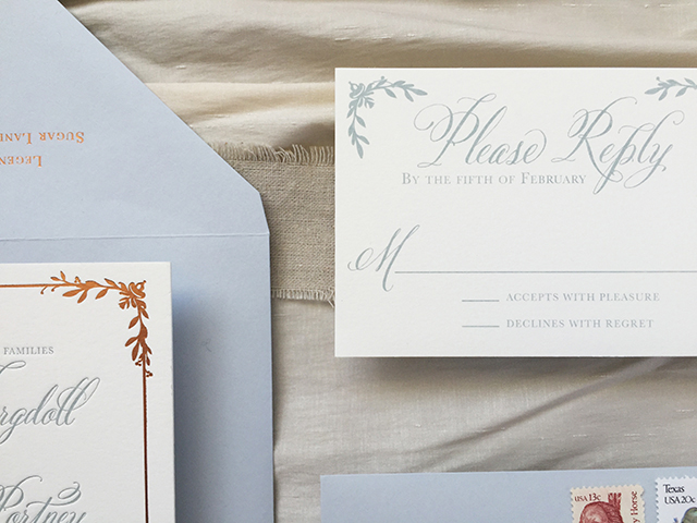
The invitation text was letterpress printed in a dusty blue gray inspired by the muted tones of desert succulents. The rich copper foil balanced out the lightness of the blue and was a subtle wink to the famous burnt orange of bride’s alma mater… hook ’em horns! For the invitation, we selected Crane’s 100% cotton Lettra paper as the base for the letterpress printing and foil stamping called for in our design. The RSVP and accommodations cards were offset printed in the same dusty blue gray as the invitation text.

Dusty Blue Letterpress and Copper Foil Wedding Invitations by Charm and Fig / Oh So Beautiful Paper

For the graphics, we used a gorgeous, sweeping calligraphy typeface for the names and key text, surrounded by a structured border with vines sprouting in and around the corners. We wanted the vines to bring an organic element to the invitation design, with no two corners alike.

Dusty Blue Letterpress and Copper Foil Wedding Invitations by Charm and Fig / Oh So Beautiful Paper

Dusty Blue Letterpress and Copper Foil Wedding Invitations by Charm and Fig / Oh So Beautiful Paper

Dusty Blue Letterpress and Copper Foil Wedding Invitations by Charm and Fig / Oh So Beautiful Paper

Thanks Lauren!

Design: Charm & Fig Paper Goods

Letterpress: Quality Printing Company

Foil Stamping: Gold Leaf Embossing

Check out the Designer Rolodex for more tal­ented wed­ding invi­ta­tion design­ers and the real invi­ta­tions gallery for more wedding invitation ideas!

Photo and Styling Credits: Lauren Covington | Charm & Fig