Nautical Navy and Gold Foil Wedding Invitations

Nautical aesthetics are so timeless and these nautical navy and gold foil wedding invitations, inspired by Cape Cod, are no exception! Laura of Paper & Honey designed this invitation suite with a simple, yet bold, color palette to complement the bride’s oceanside nuptials. Can’t you just smell the salty ocean air?!

Nautical Navy and Gold Foil Wedding Invitations by Paper & Honey

From Laura: Working on Megan and Gavin’s Cape Cod-inspired suite was a complete joy. With the current trends leaning towards lots of blush, greenery, and light, feminine details, it was so much fun to break out of that a bit and play with rich colored paper for an oceanside soiree.

Nautical Navy and Gold Foil Wedding Invitations by Paper & Honey

Together with her wedding planner, Cape Cod Celebrations, Megan described her wedding as a “romantic beach wedding with a touch of prep.” The perfect event to close out the summer! We worked with a color palette of deep navy, crisp whites, and the loveliest gold. The invitation and information card were stamped with white and gold foils, the RSVP card was letterpress printed and gold foil stamped. All pieces were delivered to guests in an envelope crisp with hand calligraphed addresses, gold envelope liners, and vintage postage stamps.

Nautical Navy and Gold Foil Wedding Invitations by Paper & Honey

Nautical Navy and Gold Foil Wedding Invitations by Paper & Honey

As an accountant living in Chicago, Megan loves to mix the preppy and traditional with modern new trends. She is a huge fan of bold, beautiful calligraphy, and wanted to scrap traditional wording etiquette in favor of a large and in charge hand lettered “Megan & Gavin.” We took this element and used it in the invitation and custom address rubber stamp, and even throughout their reception stationery via menus and wooden welcome signage.

Nautical Navy and Gold Foil Wedding Invitations by Paper & Honey

Nautical Navy and Gold Foil Wedding Invitations by Paper & Honey

While their wedding was held in historic Cape Cod, Megan didn’t want her suite to get too kitschy and nautical. We kept it simple with the color palette and use of bold stripes on several cards, as well as a navy and white striped ribbon to hold everything together. We were able to have some fun with the lobster bake rehearsal dinner invitation by including the littlest gold foil lobster! This tiny crustacean detail brought some amusement for an otherwise gorgeously preppy suite, and it just might be my favorite part of Megan and Gavin’s wedding invitation. 

Nautical Navy and Gold Foil Wedding Invitations by Paper & Honey

Nautical Navy and Gold Foil Wedding Invitations by Paper & Honey

Nautical Navy and Gold Foil Wedding Invitations by Paper & Honey

Nautical Navy and Gold Foil Wedding Invitations by Paper & Honey

Thanks Laura!

Design: Paper & Honey

Printing: Czar Press

Check out the Designer Rolodex for more tal­ented wed­ding invi­ta­tion design­ers and the real invi­ta­tions gallery for more wedding invitation ideas!

Photo Credits: Andrea Pesce

Modern Gemstone Copper Foil Wedding Invitations

Happy Tuesday everyone! I hope you all had a wonderful and restful three day weekend! Also, just in case you missed it on Friday, all of the vintage glassware over in Liquorary’s shop is 20% off through midnight tonight with the code LABOR20 – it’s a great time to stock up on some gorgeous vintage glasses! Anyway, we’re starting this new week with some beautiful and modern gemstone copper foil wedding invitations from And Here We Are. Navy blue and copper foil is one of my all-time favorite color combinations, and when you add in deep plums, slate gray, and other neutral tones you have a seriously gorgeous and sophisticated color palette!

Modern Gemstone Copper Foil Wedding Invitations by And Here We Are

From Meghan: We had so much fun working with Negin and Dan on their gorgeous Los Angeles wedding. Our theme was “modern chic” and the wedding color palette included deep plums, slate gray, navy/dark blue, and soft neutrals with copper accents. For their wedding invitations, we spun off of our watercolor gem wedding invitation suite with a different lettering style, updated color scheme and copper foil stamping.

Modern Gemstone Copper Foil Wedding Invitations by And Here We Are

Modern Gemstone Copper Foil Wedding Invitations by And Here We Are

When an interior designer and an architect get together, you know you’re in for a beautiful and well-planned event; but we hit the jackpot with this couple’s killer sense of humor. We got to insert all kinds of fun little drawings into their wedding paper like a tiny illustration of Lionel Richie, a pile of doughnuts, and the priest from The Princess Bride.

Modern Gemstone Copper Foil Wedding Invitations by And Here We Are

We then extended the styles through the day-of paper, including table numbers, dinner menus, a seating chart for the wedding reception, place cards, and wedding reception signage.

Modern Gemstone Copper Foil Wedding Invitations by And Here We Are

Modern Gemstone Copper Foil Wedding Invitations by And Here We Are

Modern Gemstone Copper Foil Wedding Invitations by And Here We Are

Modern Gemstone Copper Foil Wedding Invitations by And Here We Are

Modern Gemstone Copper Foil Wedding Invitations by And Here We Are

Thanks Meghan!

Invitation Design: And Here We Are

And Here We Are is a member of the Designer Rolodex – see more of their beautiful work here or visit the real invi­ta­tions gallery for more wedding invitation ideas!

Photo Credits: This Rad Love

Wedding Invitation 101, Part 3: Printing Methods

Wedding Invitation 101, Part 3: Wedding Invitation Printing Methods / Fine Day Press for Oh So Beautiful Paper

Hi guys, Ashley from Fine Day Press  here! Welcome back to our Invitation 101 series, all about wedding invitations. Today’s post covers the different wedding invitation printing methods. Be sure to check out our first post, about how to get started, and the second post, about when to send.

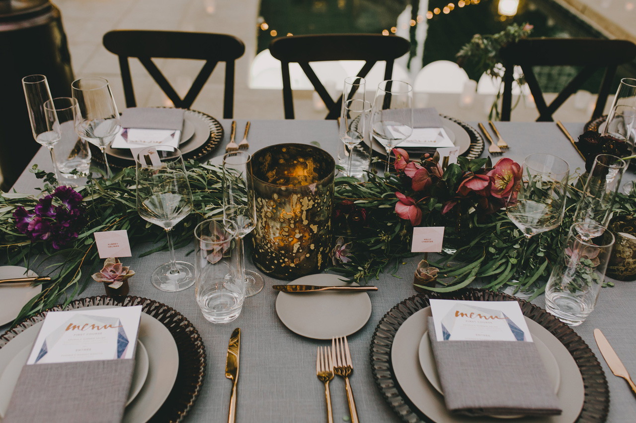
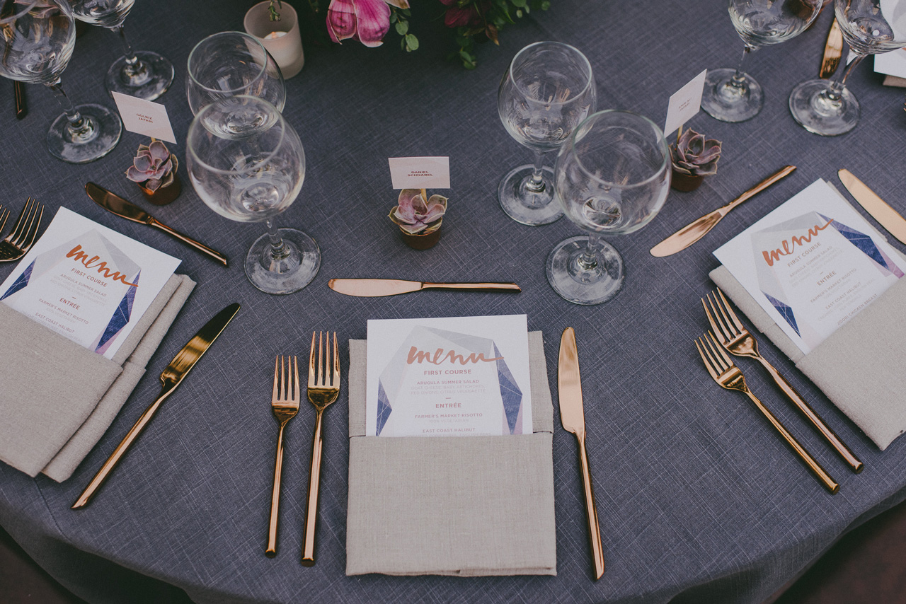
When it comes to printing wedding invitations, the options really are endless. Your budget will likely play a role in what printing method(s) you choose. If your stationery budget is on the smaller side, digital or 1-color letterpress could be the best option. For a no-holds-barred affair, on the other hand, you might combine a few different printing methods, like letterpress, foil stamping, and edge painting. If these terms have you scratching your head in confusion, read on!

FLAT PRINTING

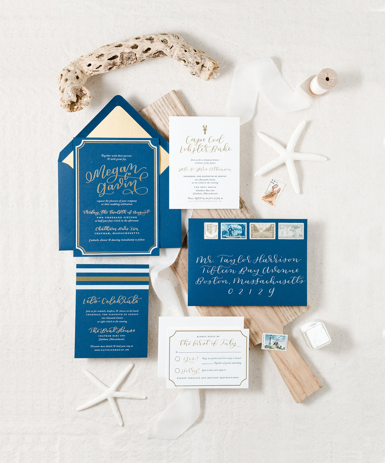
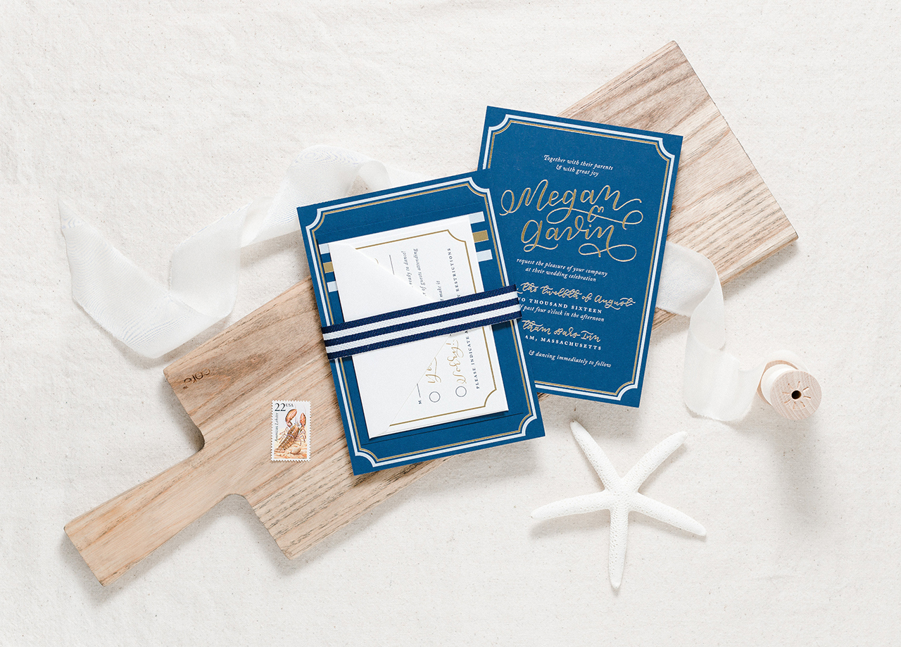
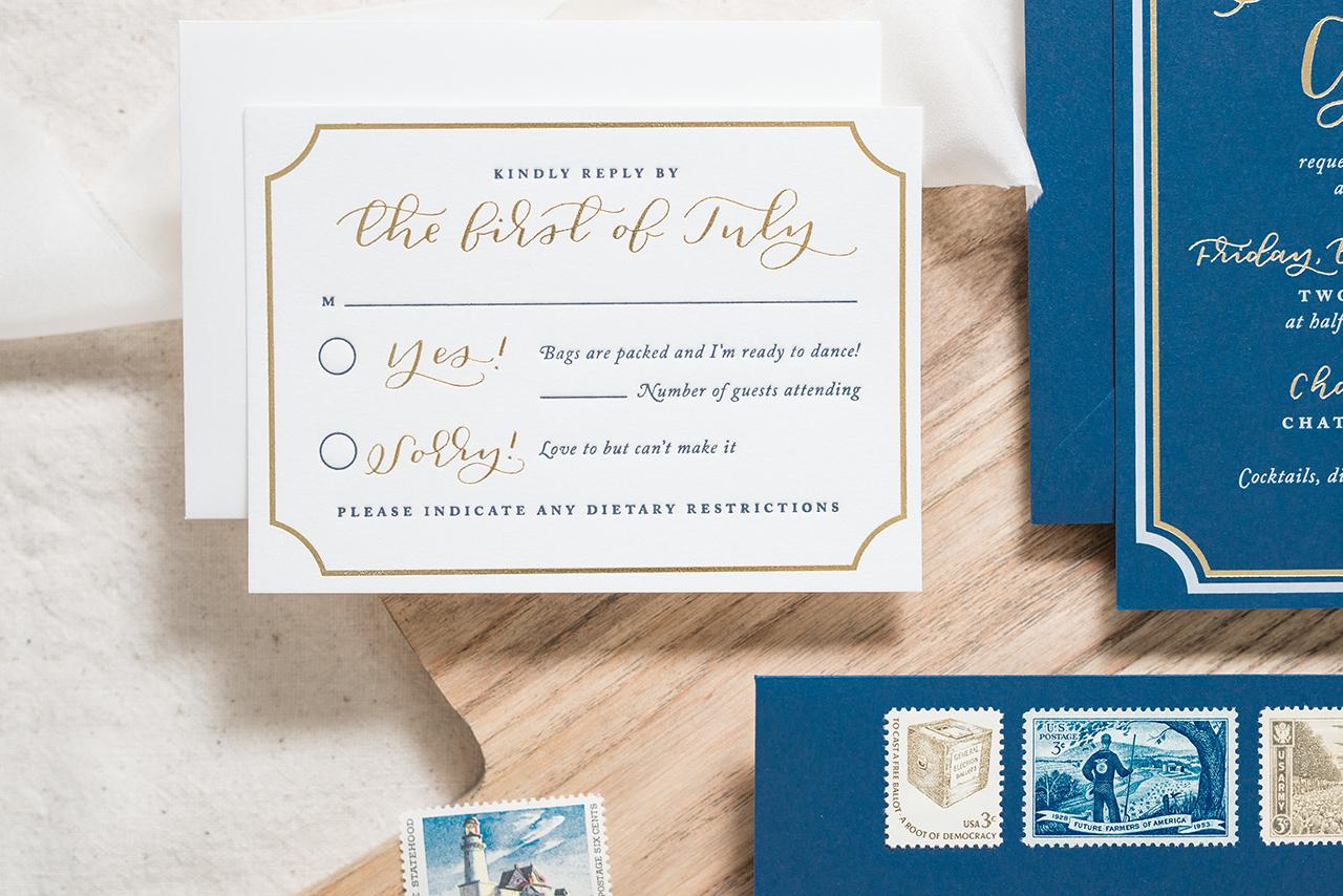
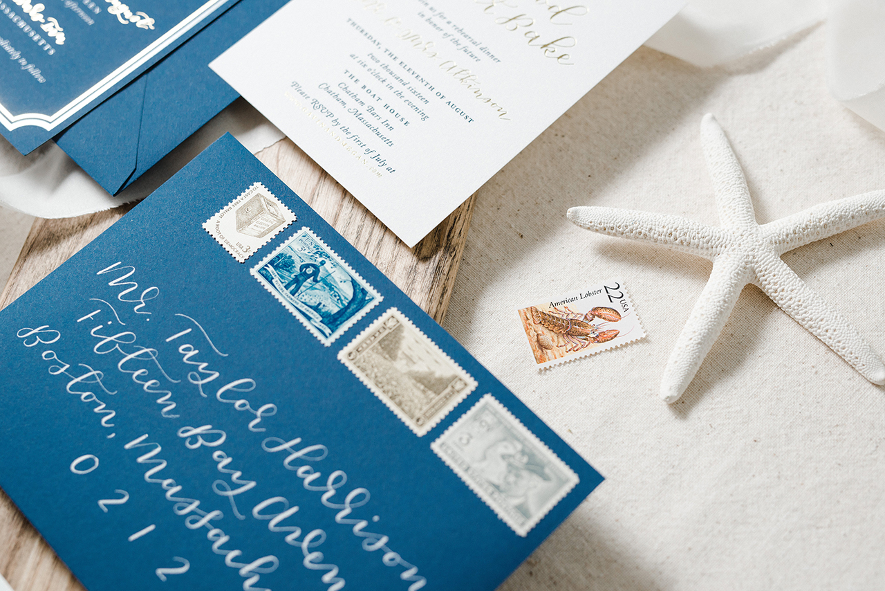
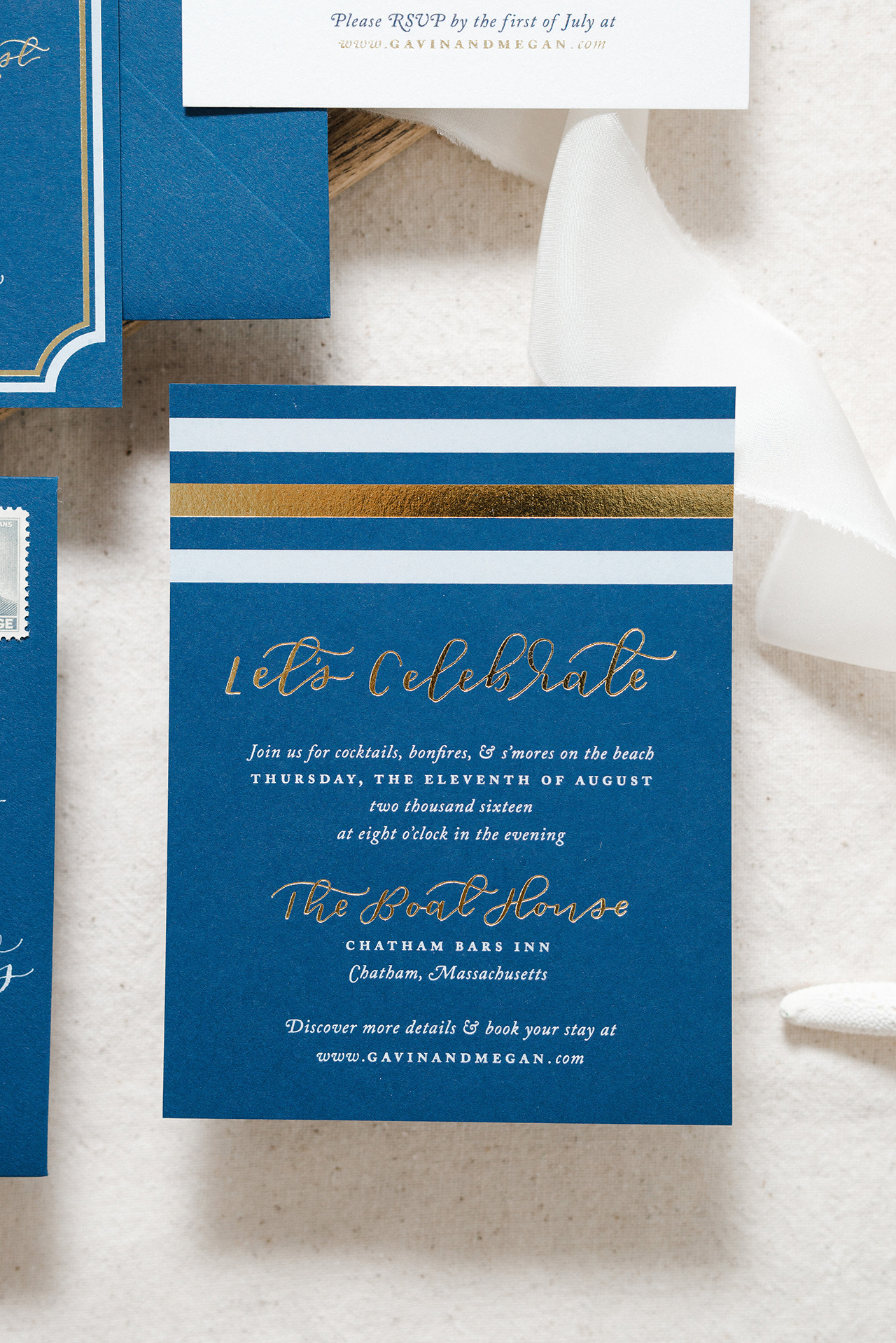
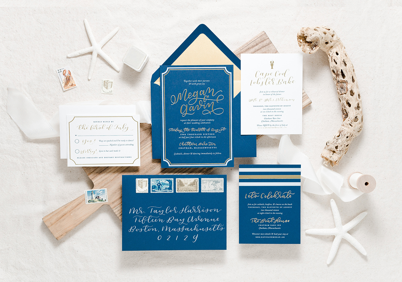
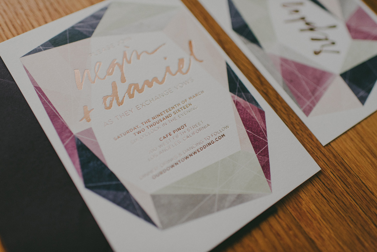
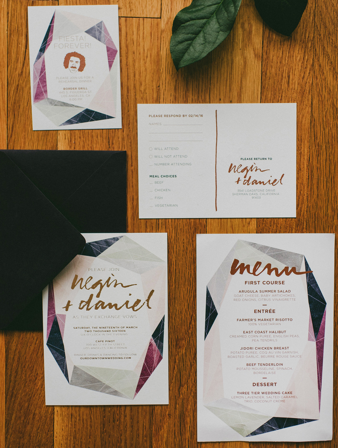
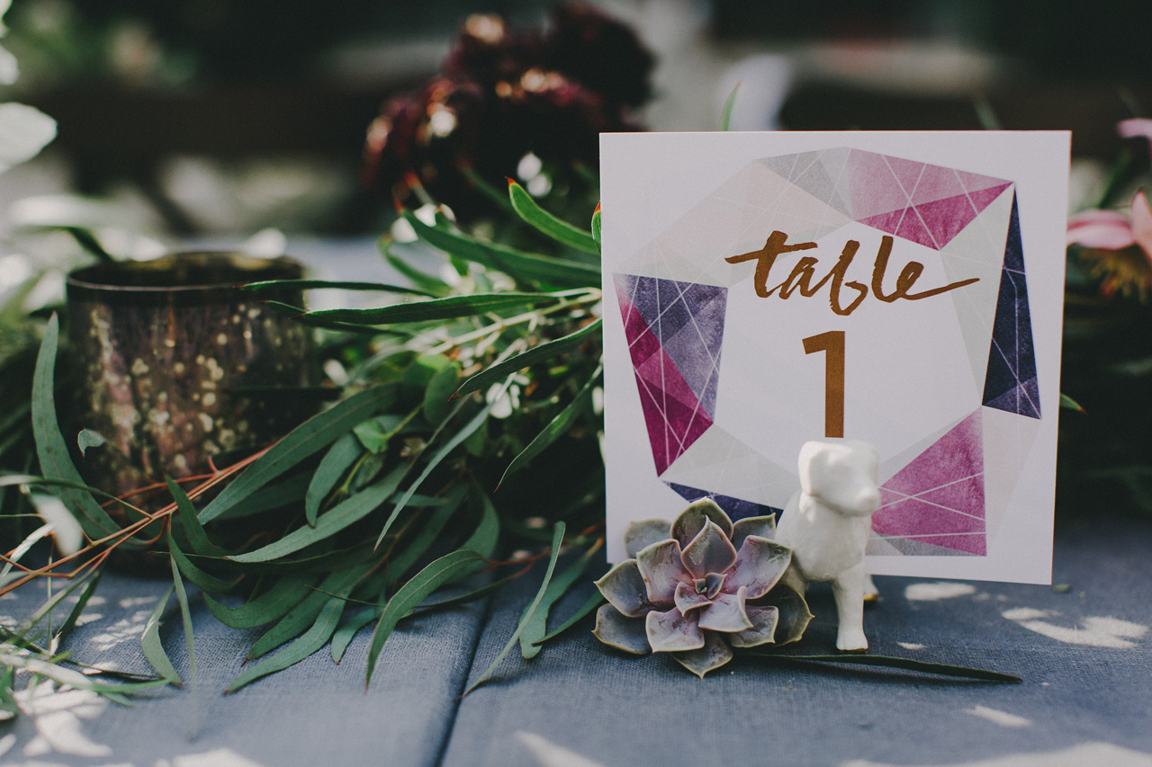
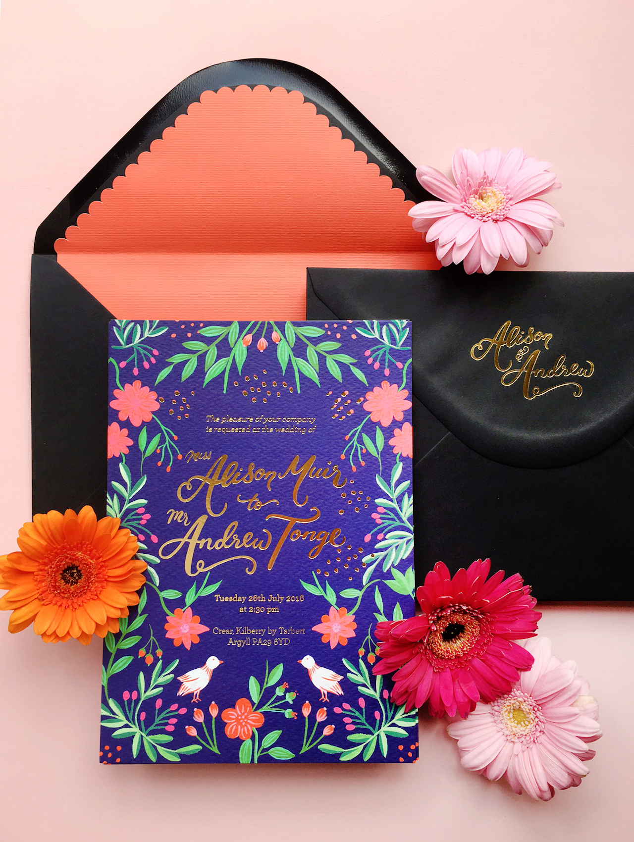
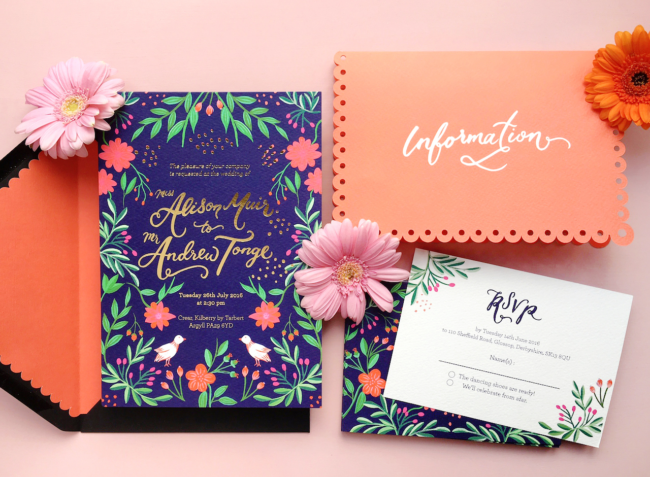
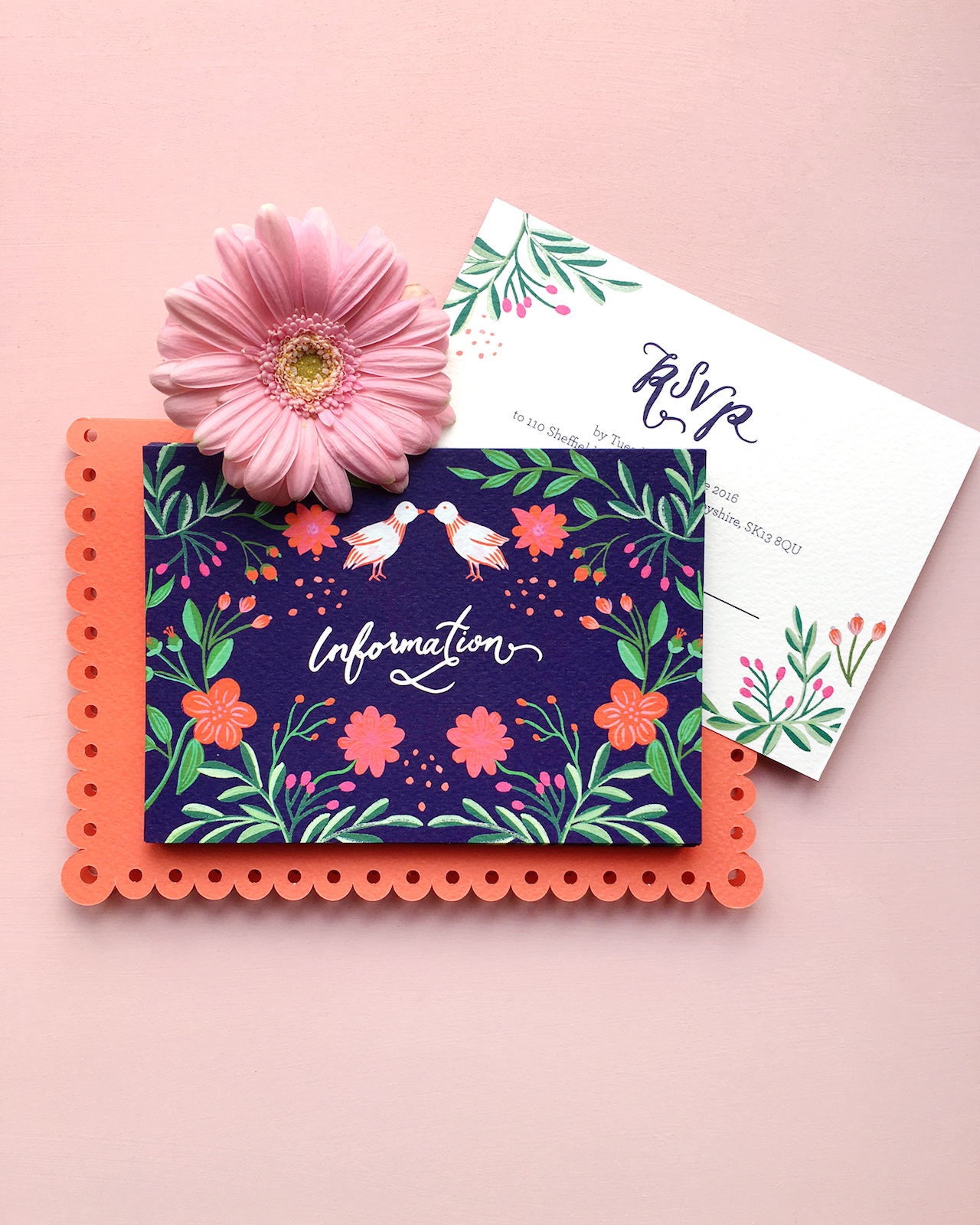
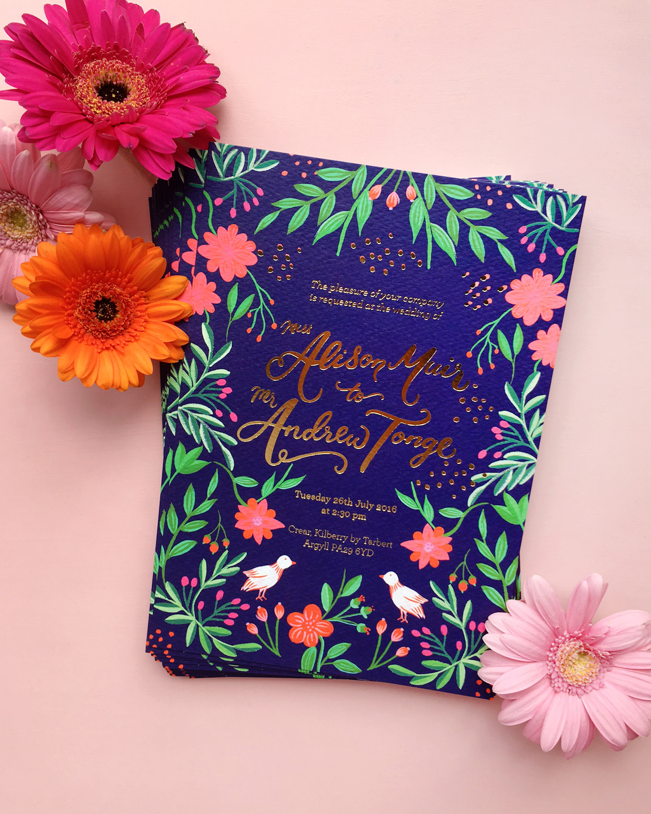
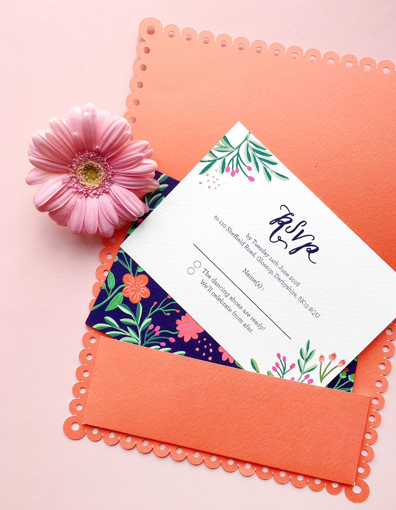
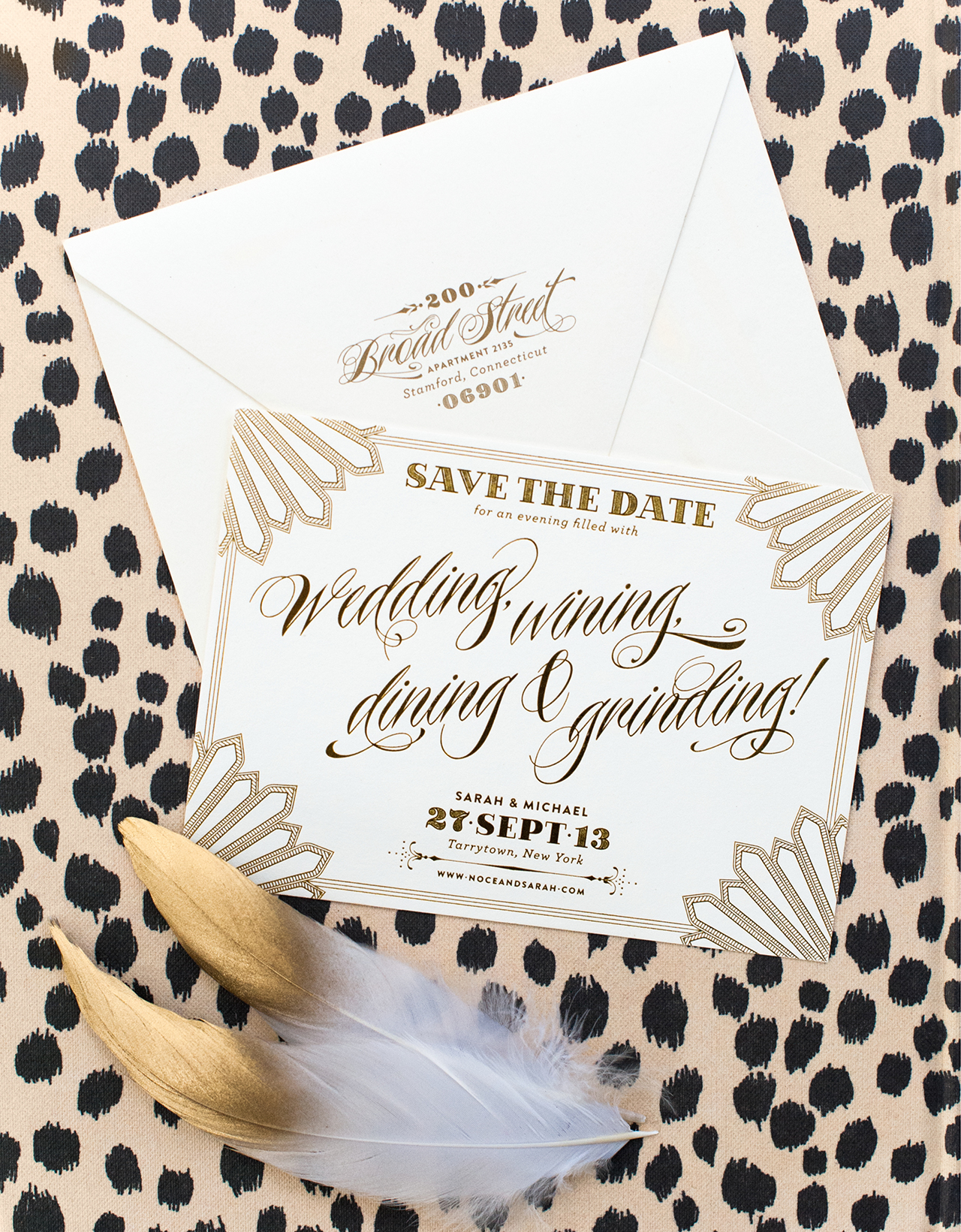
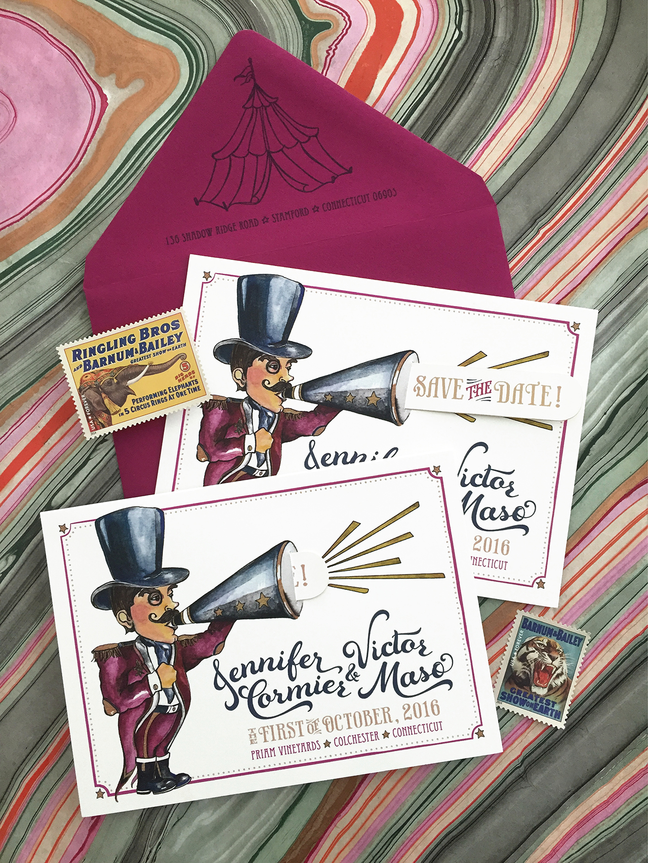
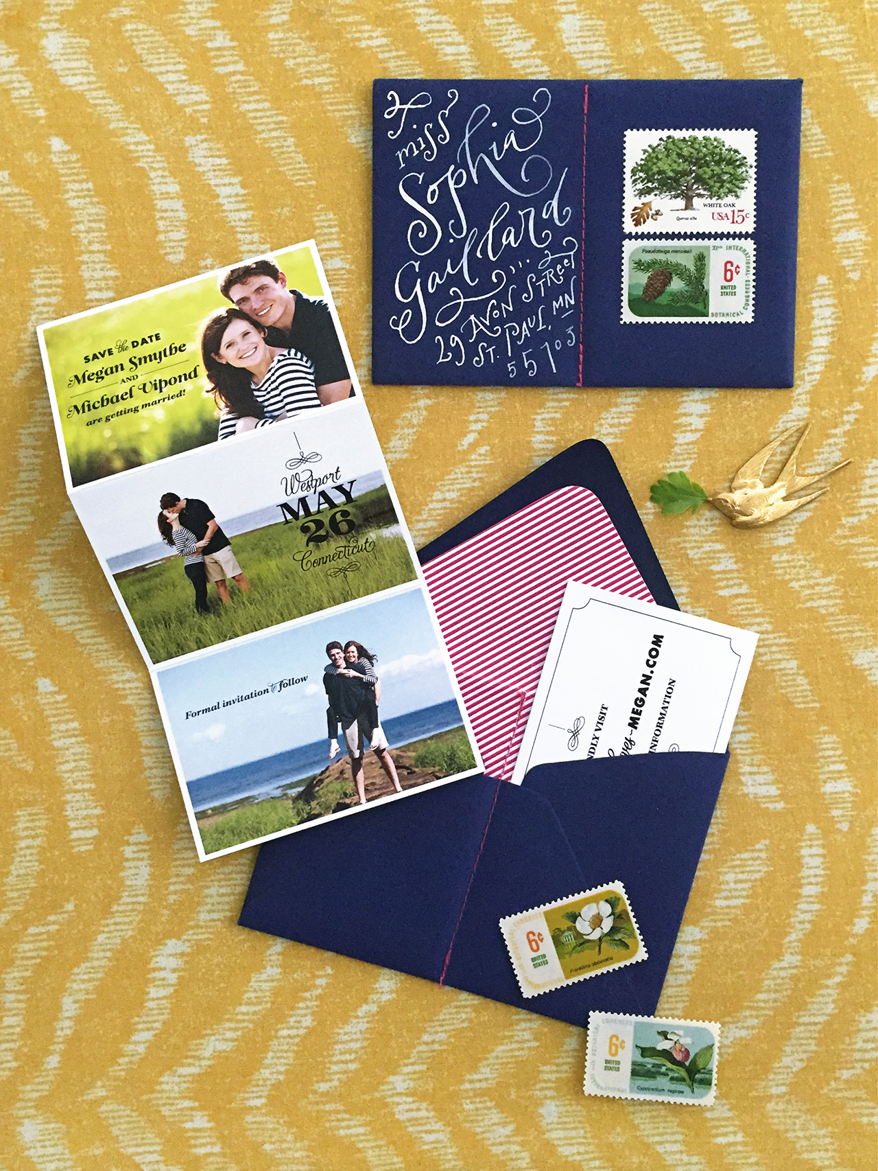
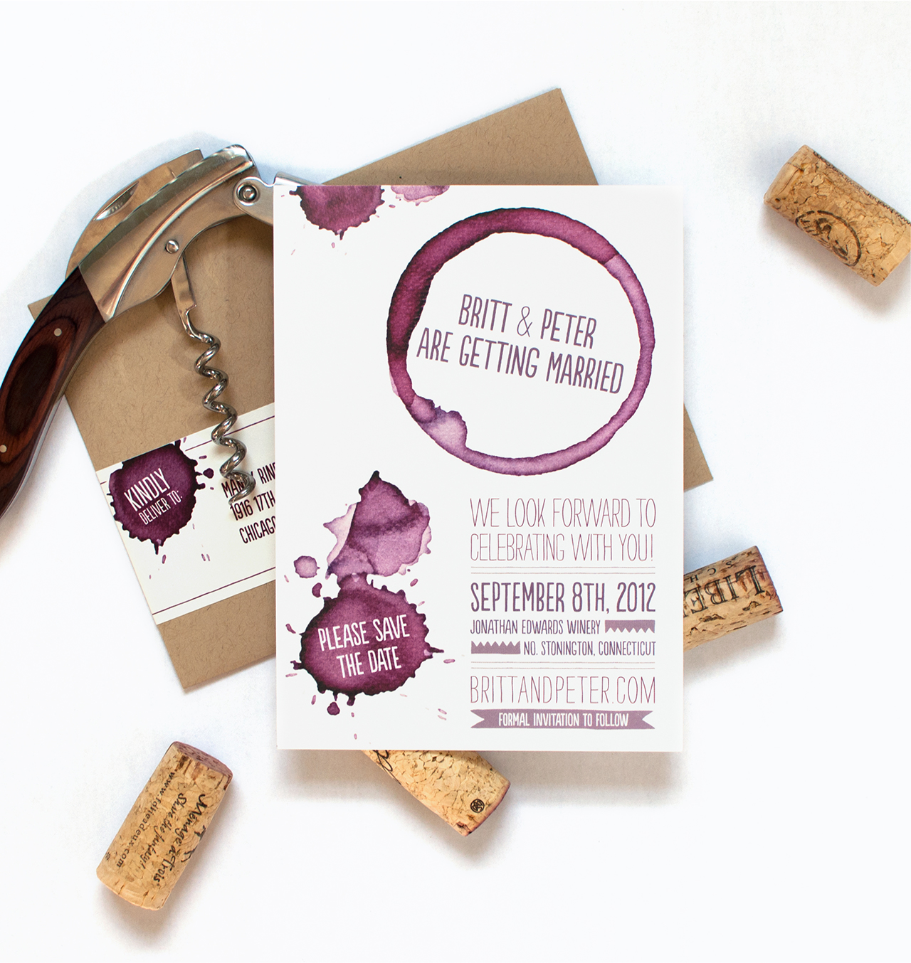
These days, the vast majority of invitations are flat – or digitally – printed. Digital printing has revolutionized the way we print invitations. It’s much more affordable, and the technology has come so far that the quality is very high. Plus, you can print with an endless amount of colors! You can even print on cotton stocks and heavier papers. Personally, I love the unlimited color capabilities that flat printing allows – it’s what gives our watercolor invitations their textural details. This look wouldn’t be possible with letterpress printing or screen printing. You can find examples of beautiful real wedding invitations that use digital printing here.

LETTERPRESS PRINTING

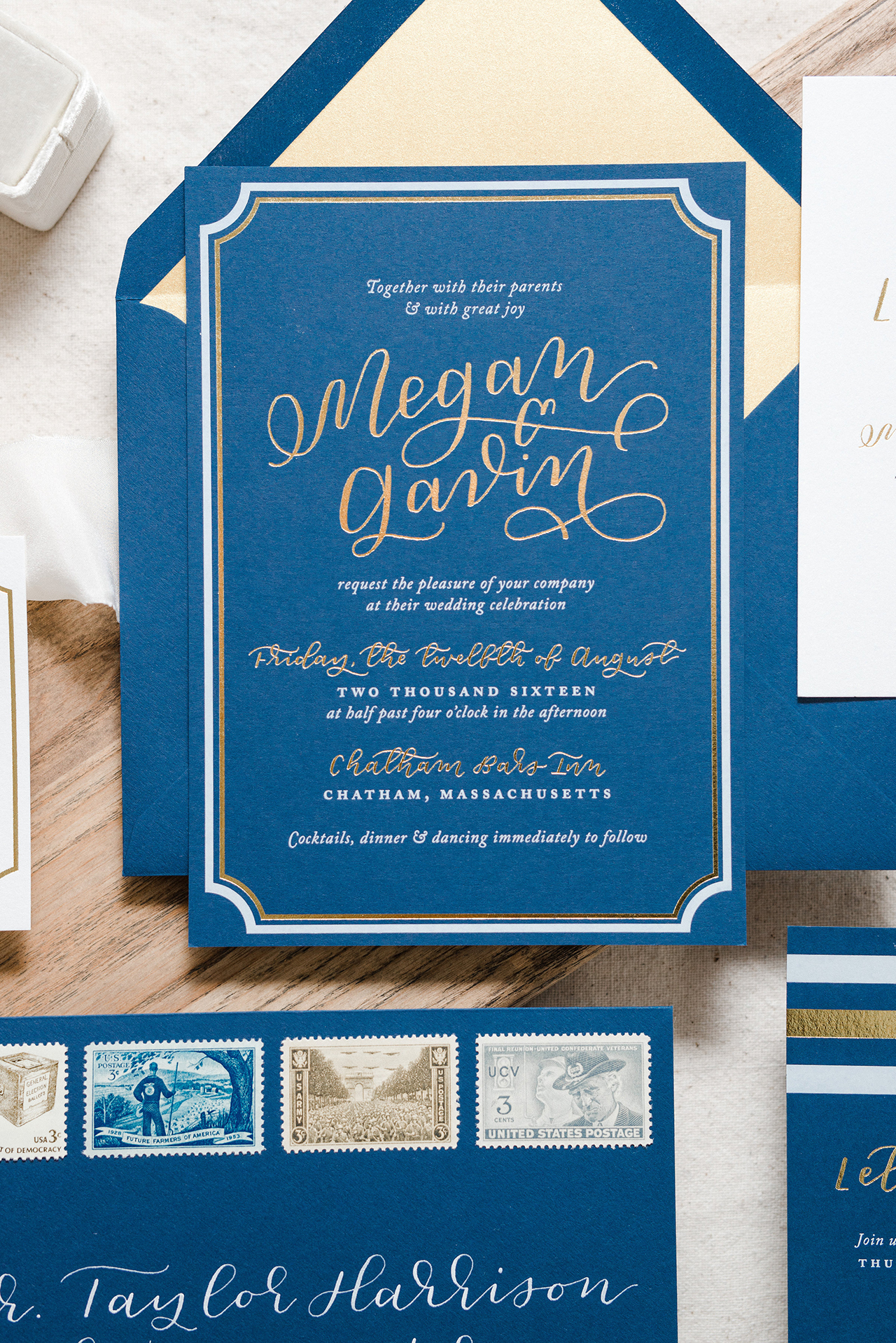
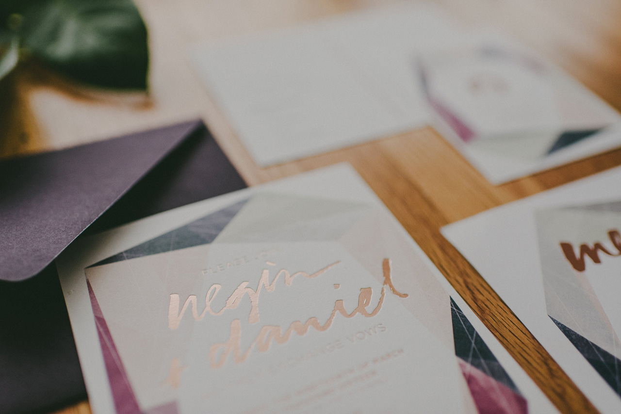
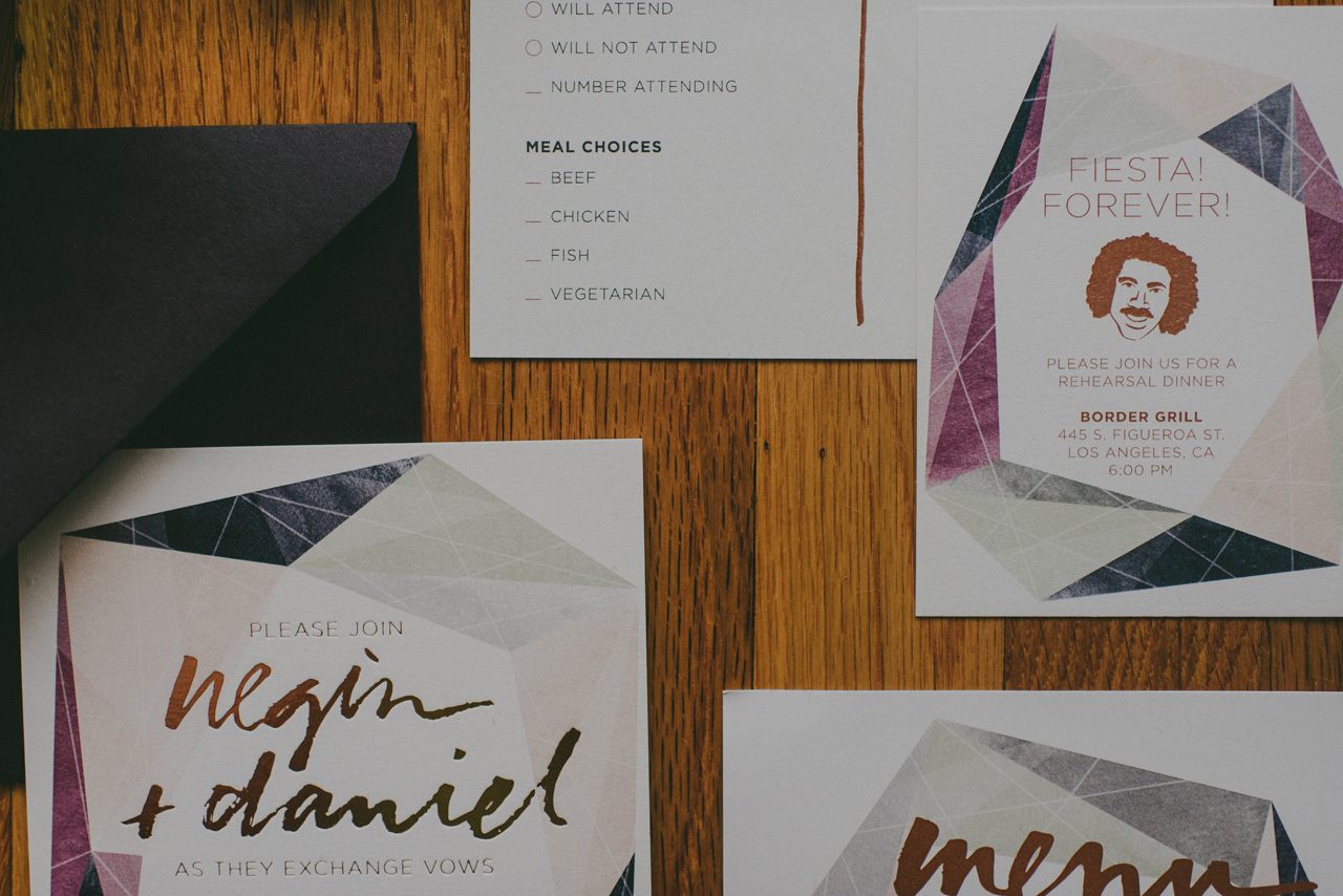
It’s hard to beat letterpress printing for sheer beauty; it has an amazing tactile quality that no other method conveys. Letterpress printing is a centuries-old technique in which ink is applied to a raised plate design and then pressed into paper – today often a thick cotton stock – resulting a wonderfully textured impression. Blind letterpress printing, or de-bossing, is created by stamping the impression onto the paper without using any ink and can be incredibly stunning. However, letterpress printing can be limiting in some ways. Because a new plate and press run is required for each color in the design, adding a second or third ink color can make already pricey letterpress printing exponentially more expensive. And because the design must be created from line art, you won’t get the subtle color changes and design variations that you can achieve with digital printing. You can read more about the letterpress printing process here.

Wedding Invitation 101, Part 3: Wedding Invitation Printing Methods / Fine Day Press for Oh So Beautiful Paper

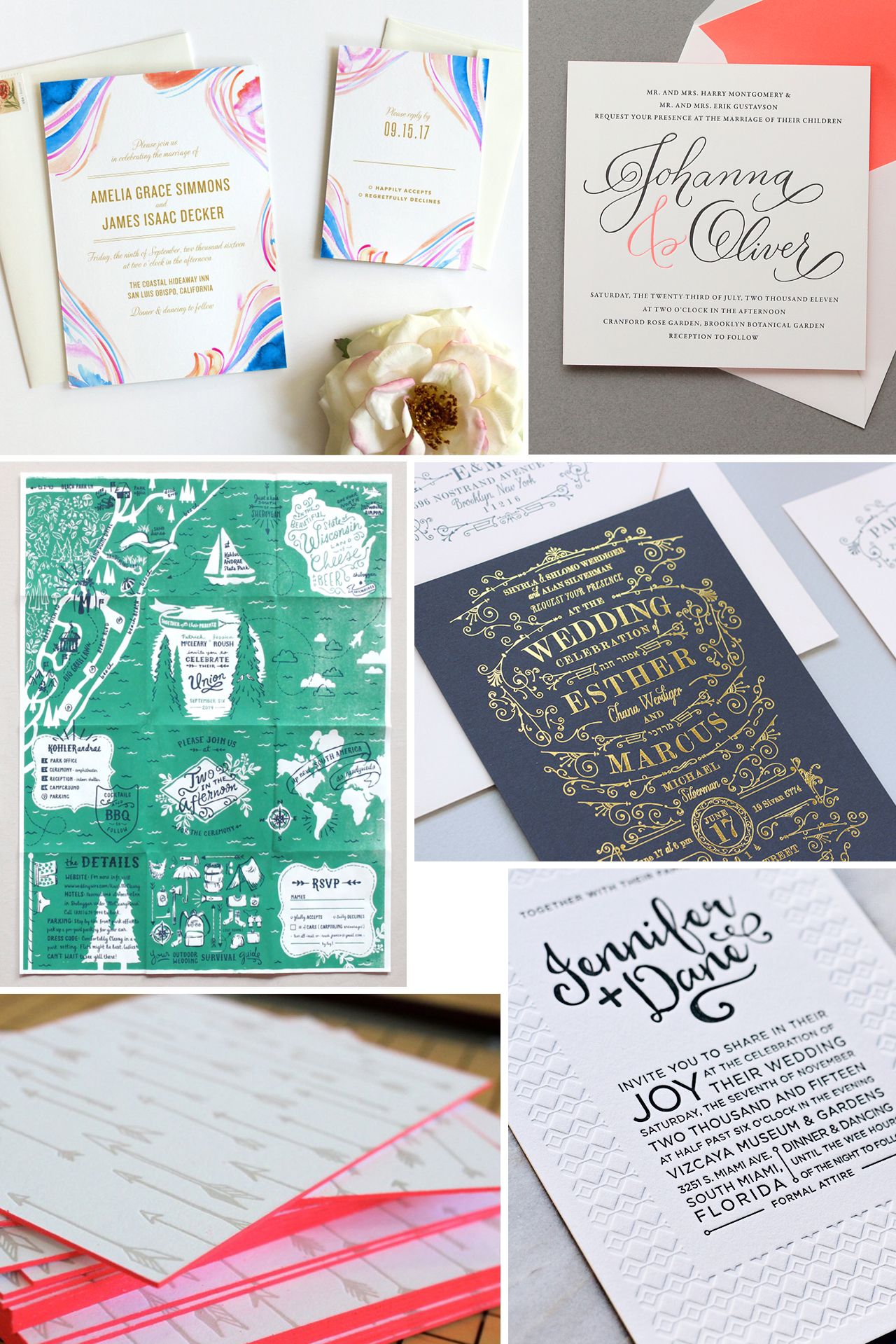
Clockwise from top left: Marble watercolor invitations by Fine Day Press; Two-color letterpress by Cheree Berry Paper; Gold foil on navy stock by Megan Wright Design Co.; Blind letterpress designed by Kate Holgate via this post; Edge painting by Ladyfingers Letterpress; Screen printed foldout map by Jessica Roush via this post.

SCREEN PRINTING

Screen printing is one of the oldest printing techniques and involves pushing thick, opaque ink through a fine mesh screen, resulting in a bright, tactile design that sits on the surface of paper.This method is great for using special inks like fluorescents and metallics, or for printing with opaque white ink onto a dark background color. As a result, screen printing can be a wonderful choice for vibrant and colorful modern wedding invitations. Screen printing also allows for printing on a variety of surfaces – like fabric or super-thick chipboard – so the possibilities for creativity run high. Budget-wise, it’s comparable to letterpress printing but can vary widely depending on the size of the screen and the number of inks. Each color requires its own separate screen so, like letterpress printing, a more colorful design means a higher overall cost. You can read more about the screen printing process here.

ENGRAVING

Engraving is the most classic of all wedding invitation printing methods – and most likely the method that your parents and grandparents used to print their wedding invitations! Engraving has fallen somewhat out of favor in recent years with the return of letterpress printing and improvements in digital printing, but it’s still one of the best options for a classic invitation design or black tie affair. Like letterpress printing, the engraving process transfers ink from a metal plate to paper by using intense pressure. However, unlike letterpress printing, with engraving the type and graphics are raised and create an embossed result. Engraving requires two metal plates etched with an image or text, which are then aligned on the press. Once aligned, ink is applied to the top plate and each piece of paper is then hand-fed through the press, receiving two tons of pressure and creating an embossed image with startling clarity, color purity and depth. You can read more about the engraving process here.

FOIL STAMPING, DIE CUTS, EDGE PAINTING, AND MORE!

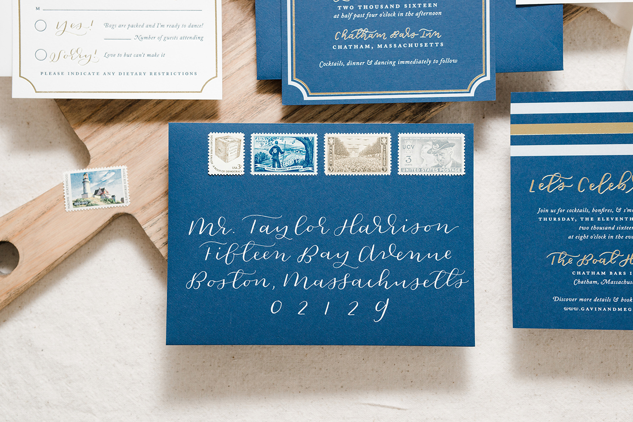
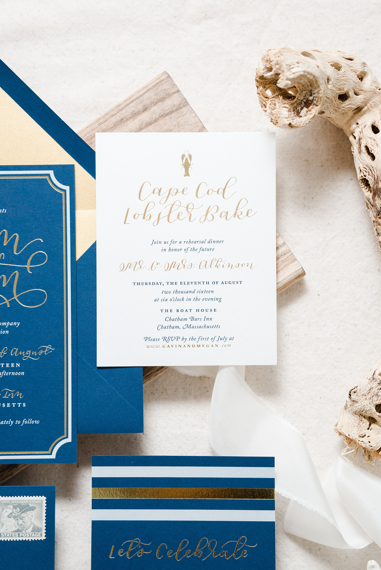
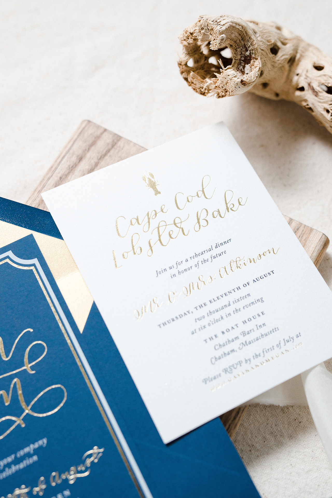
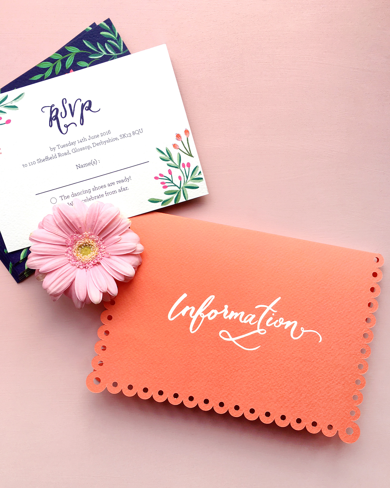
Special printing and finishing techniques include things like foil stamping, die cutting, perforations, edge painting, and duplexing. Foil-stamping adds a high shine factor and adds a super special touch – it can be used on its own to beautiful effect or combined with digital printing for an extra shine. Want your invitations in the shape of a heart or another funky shape? You’ll be needing a custom die cut. Duplexing is when 2 sheets of thick stock are glued together to give a double-thick result. If you are printing on a double-thick stock, consider edge-painting to add a bright or metallic color to the edges of the card. So pretty! You can also use duplexing to combine a two different colors of card stock, like ecru and navy, to create major impact on both the front and back of an invitation. You can read about edge painting here, die cutting here, and foil stamping here.

DIY

Yes, it’s possible to print your invitations by your own bad self! Going this route takes some gumption, design savvy, and a willingness to be hands on. If you and your fiancé are both crafty, this could be a really fun project to tackle together. For example, you might take a letterpress printing class and then rent time at a studio to print your design. Or you could have screens made and silkscreen the cards yourself. Keep in mind that, with these options, you’ll need to supply your own paper stock and take care of trimming the paper as well. You can take your printed invitations to a local print shop for trimming if you don’t own a paper cutter.

I’ll be back soon with a post about Wording & Etiquette – stay tuned and happy printing!

Colorful Mexican Fete-Inspired Wedding Invitations

Well, hello there! Last week ended up being a bit more of a rollercoaster for me than I had originally expected – first, with a trip to New York for the NYNOW trade show (did you follow along on Instagram??), and second, we ended up having to replace our car! We’re a single car family here in DC, but we use our car every day for school drop offs and the commute to the military base where my husband works. Our poor 13-year old car decided to call it quits on us the day after I got back home. We’re super happy to have a brand new car sitting in our garage, even though the whole process took us about three full days. Anyway! I thought we’d start off the week with these colorful Mexican fete-inspired wedding invitations from Erin of BerinMade! I’m loving the bright illustrated florals and pretty gold foil details!

Colorful Mexican Fete-Inspired Wedding Invitations by BerinMade / Oh So Beautiful Paper

From Erin: Alison and Andrew were a dream couple to work with! They approached me last year with a few inspiration images, and wanted their wedding stationery to be loosely based on a colorful Mexican fete, with illustrations of flower, nature, and foil details. The goal is to have these elements as a nod to their fun, playful celebration, without necessarily being too “themed” or feminine.

Colorful Mexican Fete-Inspired Wedding Invitations by BerinMade / Oh So Beautiful Paper

I pulled some inspiration images of Folk art, drawing inspiration from symmetrical patterns, very bright intricate floral patterns as well as papel picado, the art of paper cut flags.

Colorful Mexican Fete-Inspired Wedding Invitations by BerinMade / Oh So Beautiful Paper

I wanted these to be subtle influences, so we decided to have the symmetrical illustrations take centre-stage and to make a separate enclosure pocket with a scalloped edge as an elegant nod to Mexican paper flags.

Colorful Mexican Fete-Inspired Wedding Invitations by BerinMade / Oh So Beautiful Paper

We went for a color palette that was bright and happy without being garish, and set it against the navy background to ground all the colorful elements together. It was after finalizing the illustrations and layouts that we decided to also lift a bit of the illustrations to foil alongside their names and the invitation text!

Colorful Mexican Fete-Inspired Wedding Invitations by BerinMade / Oh So Beautiful Paper

Colorful Mexican Fete-Inspired Wedding Invitations by BerinMade / Oh So Beautiful Paper

Thanks Erin!

BerinMade is a member of the Designer Rolodex – you can see more of Erin’s beautiful work right here or visit the gallery for more real wedding invitation inspiration!

Photo Credits: BerinMade

Unique and Memorable Save the Date Ideas

The ring has been picked, the question has been popped, and the answer has been exclaimed: YES! Congratulations on your engagement! Now it’s time to make sure your nearest and dearest know about your upcoming wedding – assuming you have a venue and a date, of course. Small details people. You need a Save the Date of course! Here are a few unique and memorable Save the Date ideas to help get the inspiration flowing. –Nichole of Coral Pheasant

Often there is a push to get Save the Dates out as soon as pos­si­ble and it can be over­whelm­ing to make a quick deci­sion. A tried and true option is to use a favorite photo – and that’s great! Your friends and fam­ily will cer­tainly know whose wed­ding is com­ing up. But if there’s time to put a lit­tle more thought into your Save the Date, the result can be unique and mem­o­rable. Con­sider favorite mem­o­ries and past times. Maybe you met in col­lege or the two of you love sam­pling wines. Or if you have a solid sense of the cel­e­bra­tion you are plan­ning, take inspi­ra­tion from that. Below are a col­lec­tion of Save the Date ideas that break the mold and truly set the stage for a wed­ding not to be missed!

coral_pheasant_save_the_date_1_navy_laser_cut_tuxedo

It’s always a treat when a cou­ple has enlisted the help of a sea­soned event plan­ner. Bren­dan and Ryan hired Diana at Jubilee Events to design and coor­di­nate their upcom­ing wed­ding. Diana learned that Ryan, who works in fash­ion in NYC, was hav­ing a cus­tom navy blue Tom Ford tuxedo made. A light ­bulb went off and they had the idea to cre­ate a Save the Date inspired by the tux. When they shared the con­cept with me, I thought it would be a fun guest expe­ri­ence to be able to inter­act with the design. Here, the tuxedo is laser cut out of navy blue stock and the “shirt and bow tie” insert slides out to reveal the details of their day.

coral_pheasant_save_the_date_2_gold_foil_hollywood_regency_hip_hop

Sarah and Mike might just be the fun­ni­est clients I’ve had the plea­sure of work­ing with. Sarah’s vision for her wed­ding was a gor­geous affair inspired by Hol­ly­wood Regency details with lots of shim­mer­ing gold. And hip-hop. The two of them love their music and cer­tainly didn’t take them­selves too seri­ously. Their Save the Dates fea­tured a strong typo­graphic design with Regency details and slightly inap­pro­pri­ate language.

coral_pheasant_save_the_date_3_circus_carnival_illustration

When your wed­ding is inspired by a vin­tage car­ni­val, what bet­ter than to “announce” it with an illus­trated pull tab Save the Date?! The cus­tom illus­tra­tion by Myr­tle and Lloyd incor­po­rates the wed­ding col­ors and a small slit in the mega­phone allows for a tab that, when pulled, reveals “Save the Date!” The enve­lope was flipped upside down so that the cir­cus tent above their return address fit sweetly onto the flap.

coral_pheasant_save_the_date_4_trifold_preppy_connecticut

The first three exam­ples of Save the Dates were clearly derived from the couple’s indi­vid­ual wed­ding designs – but that’s not always the case. It’s per­fectly fine for your Save the Dates to be unique and sep­a­rate from your actual wed­ding. Megan and Mike wanted to use their engage­ment pho­tos and I – always lov­ing the chance to engage the guest – cre­ated a fold out card that showed sev­eral of them. The enve­lope was sewn in half to cre­ate two pock­ets. The photo card slipped into one side while the other pocket held a small card with their wed­ding website.

coral_pheasant_save_the_date_5_gold_foil_new_years_eve

When your wedding is on one of the most festive nights of the year, you werk it. New Year’s Eve, gold foil, festive language, fireworks. You get it. AmIright?!

coral_pheasant_save_the_date_6_yellow_blue_college_university_pennant

Kacie and Chris met and fell in love while stu­dents at Quin­nip­iac Uni­ver­sity. A cus­tom pen­nant in the university’s col­ors serves as their Save the Date. The pen­nant was rolled and mailed to guests in a mail­ing tube with a coor­di­nat­ing label and postage stamp.

coral_pheasant_save_the_date_7_lobster_clam_bake_nautical

This casual clam­bake lob­ster fest wed­ding was announced with step-by-step instruc­tions on how to chow down. Their upcom­ing nup­tials are cer­tainly claws for cel­e­bra­tion! (See what I did there?!)

coral_pheasant_save_the_date_8_purple_plum_art_deco_magnet

A new take on a mag­net Save the Date. The announce­ment was printed on double-thick stock and the mag­net was mounted within a printed frame.

coral_pheasant_save_the_date_9_blush_pink_marsala_rustic_vintage_trifold_confetti

Jor­dan and Mike’s rus­tic vin­tage wed­ding will be held at the bride’s fam­ily home in Sep­tem­ber. Their tri­fold Save the Date unfolds to reveal the details and a lit­tle glas­sine enve­lope filled with coor­di­nat­ing con­fetti and a card with their wed­ding web­site. A vin­tage flo­ral pat­tern in their event col­ors appears on the reverse (that’s the flo­ral pat­tern seen in the back­ground) and hints at the event design dreamed up by Diana of Jubilee Events.

coral_pheasant_save_the_date_10_boozy_wine

When Britt described her ideal wed­ding as a “big fun boozy party” I knew we would have some fun with her Save the Dates. For these oenophile’s (aka wine lovers!), wine rings and splat­ters announce their wed­ding at Jonathan Edwards Winery.

Photo Credits: Coral Pheasant