Paper Party 2018! Colorful Modern Abstract Art Party Inspiration

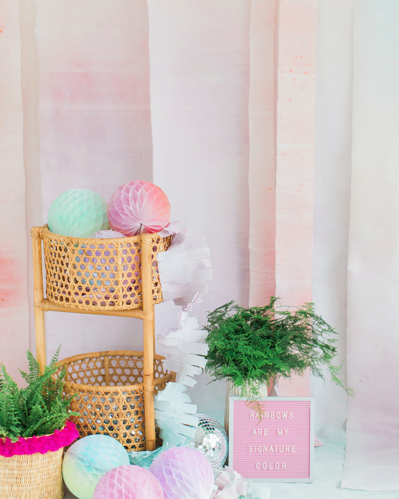
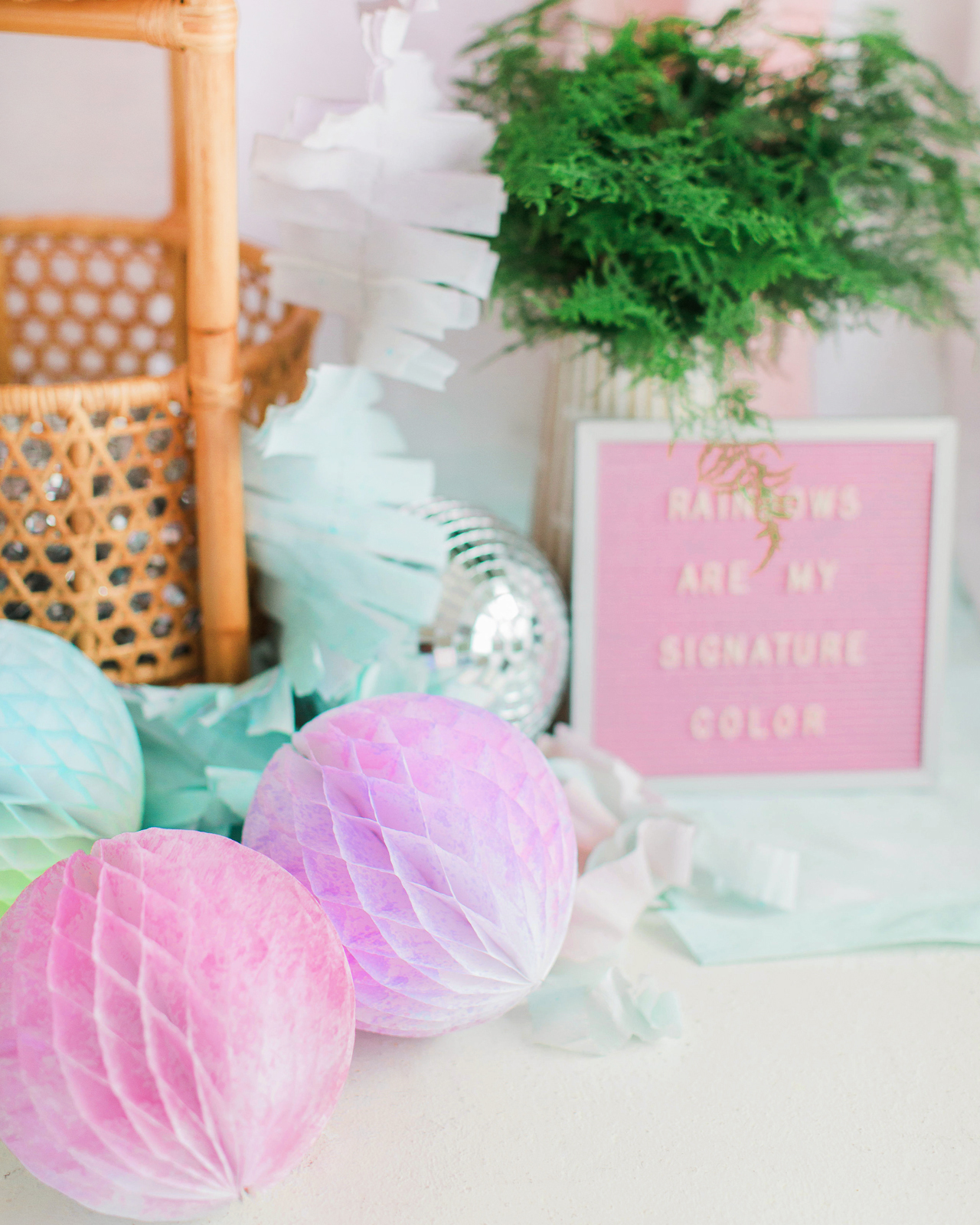
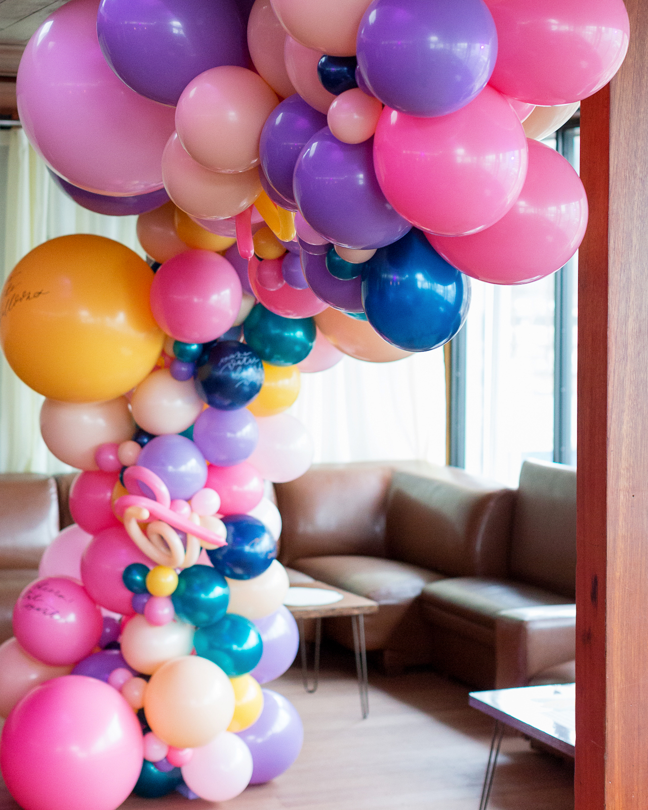
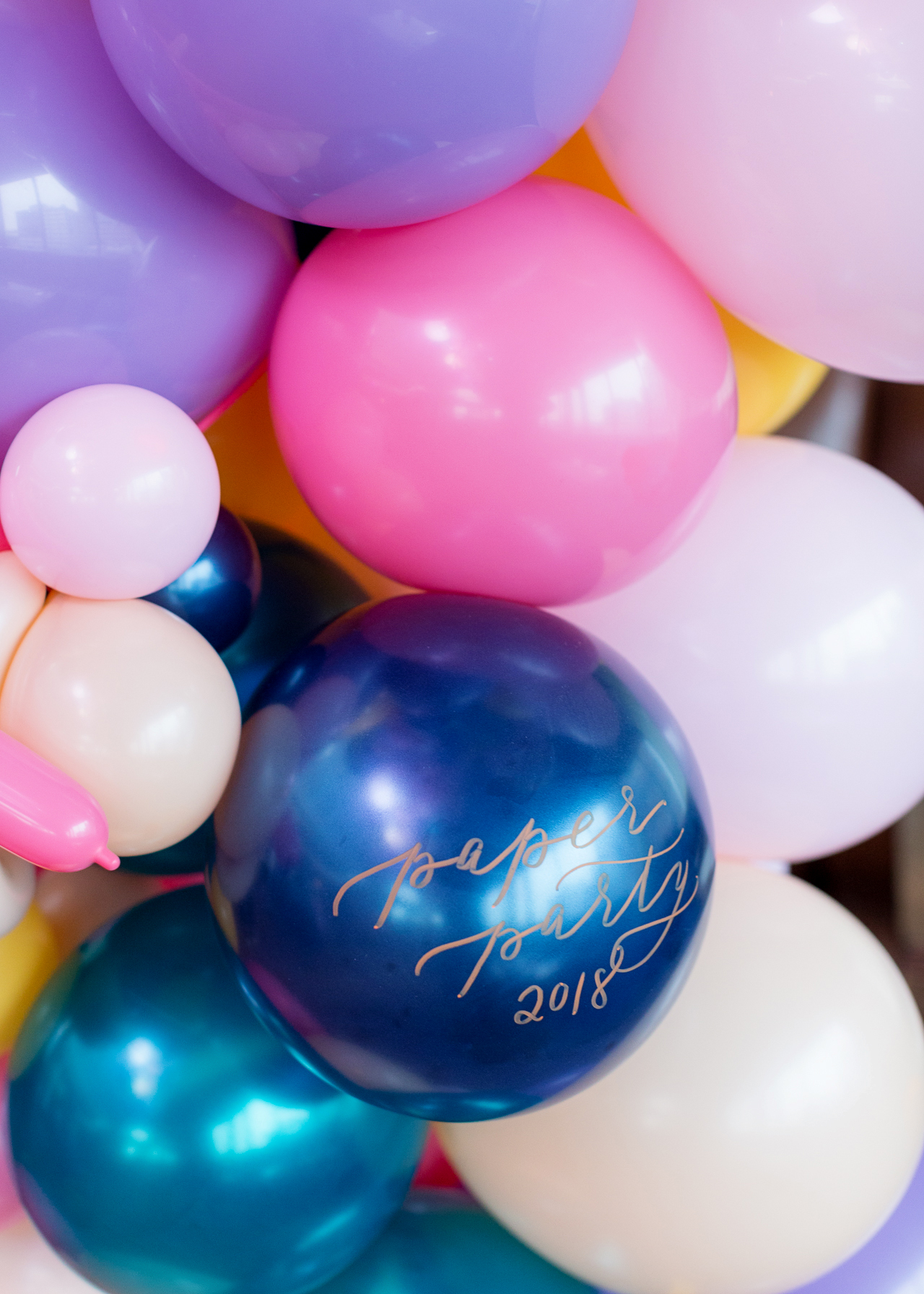
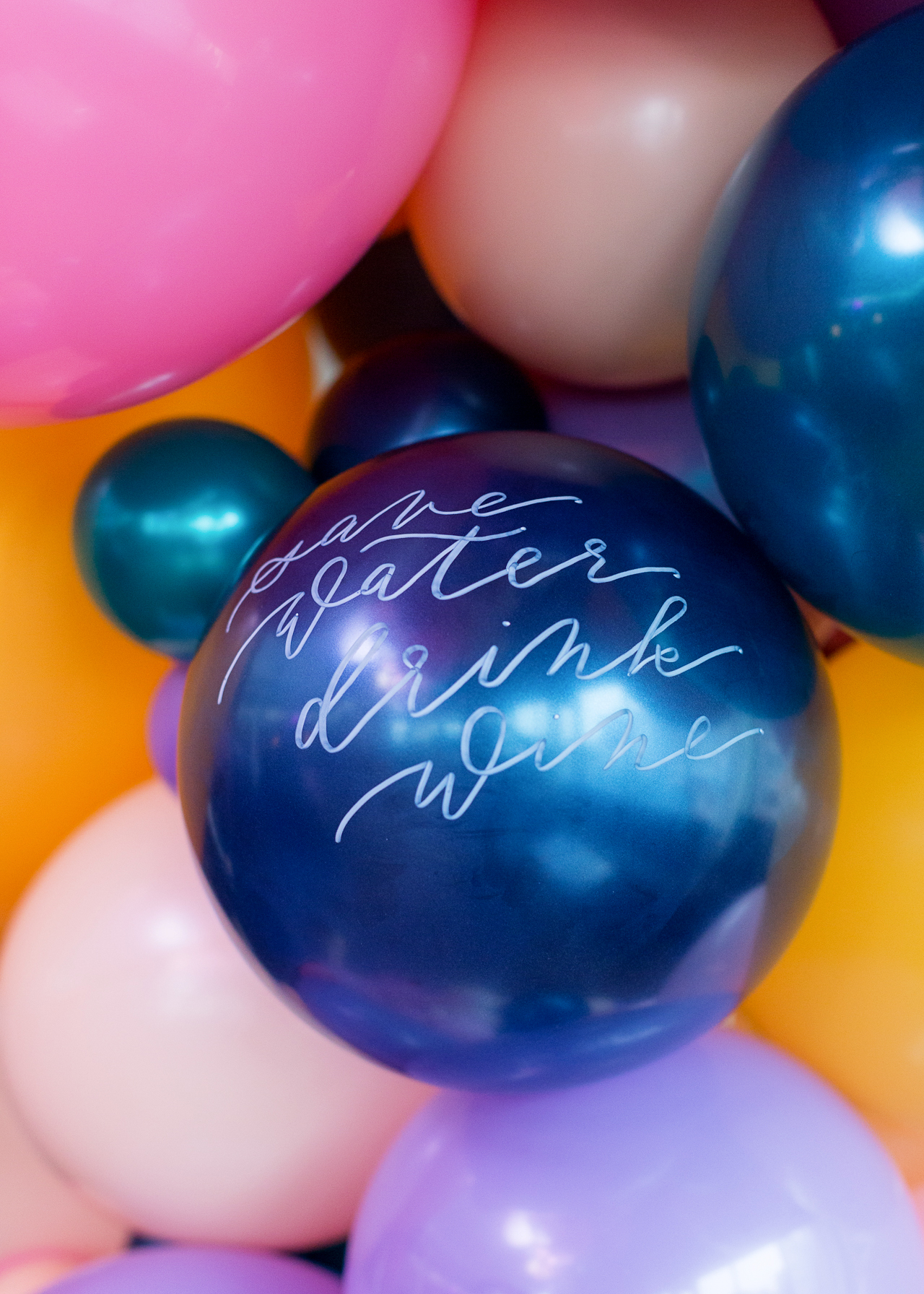
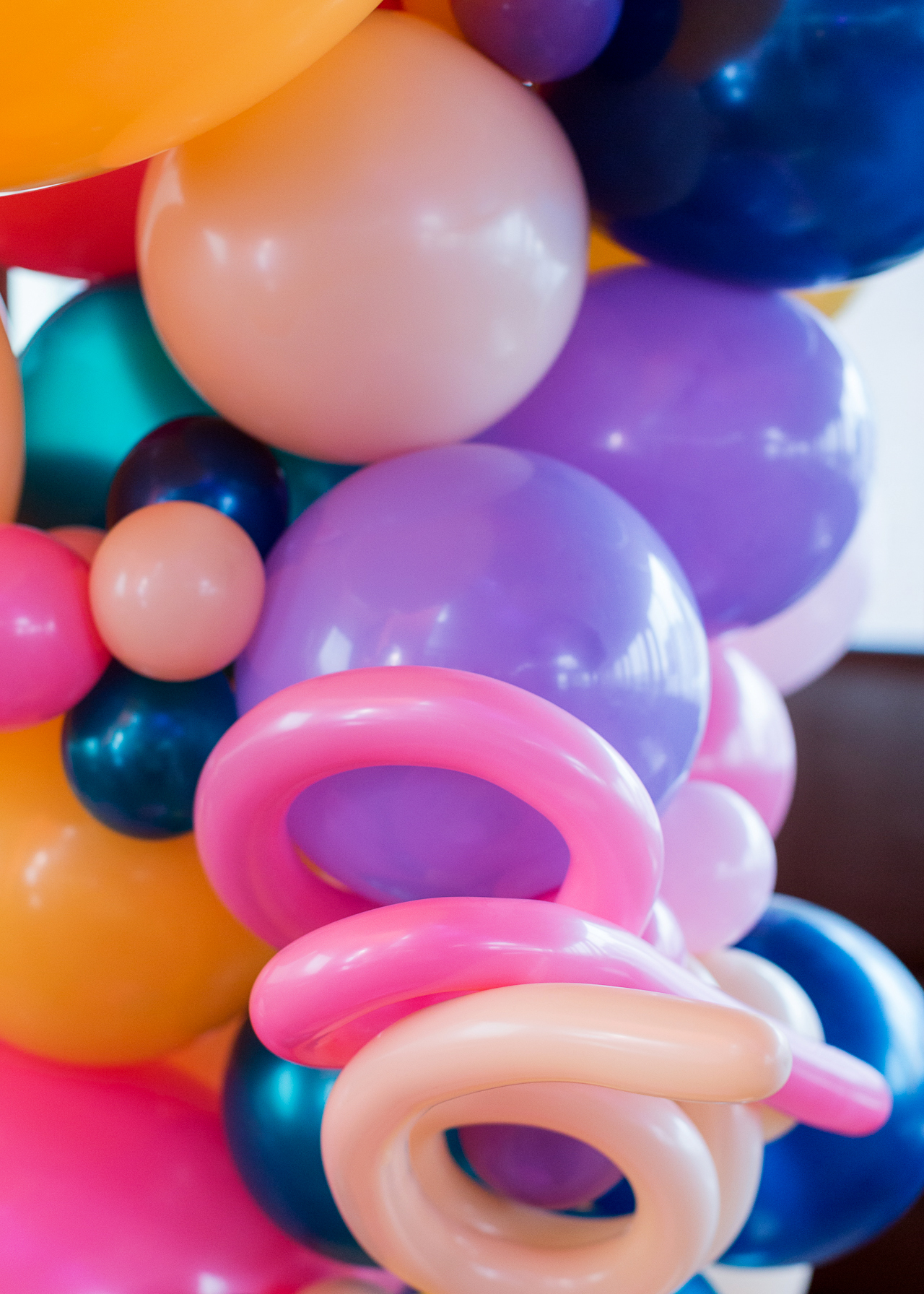
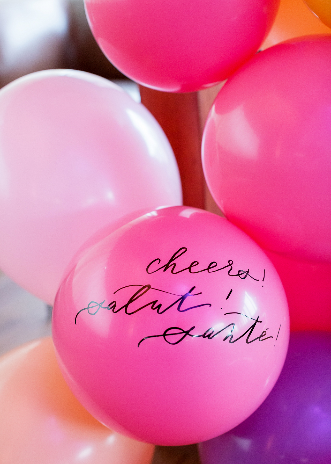
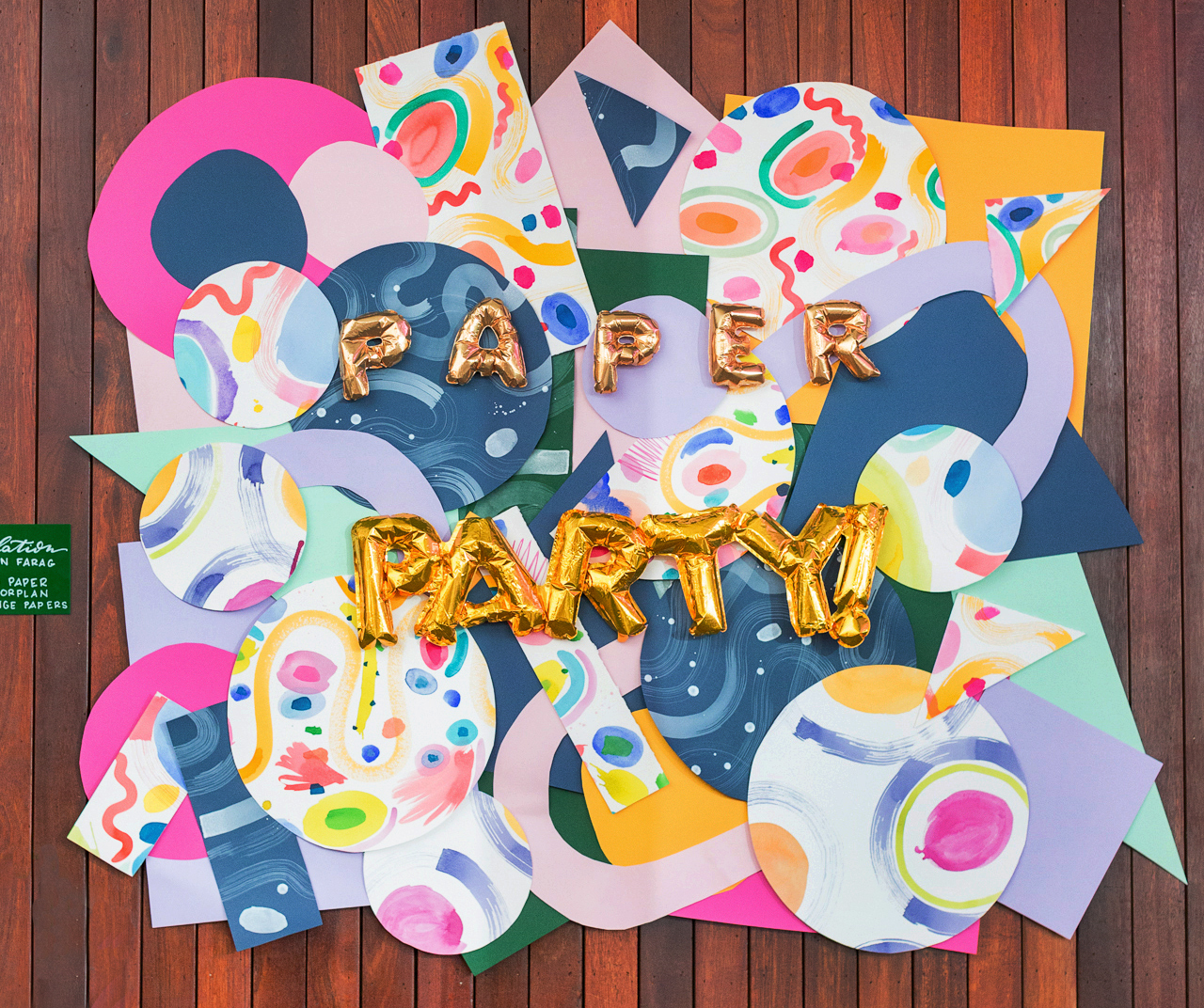
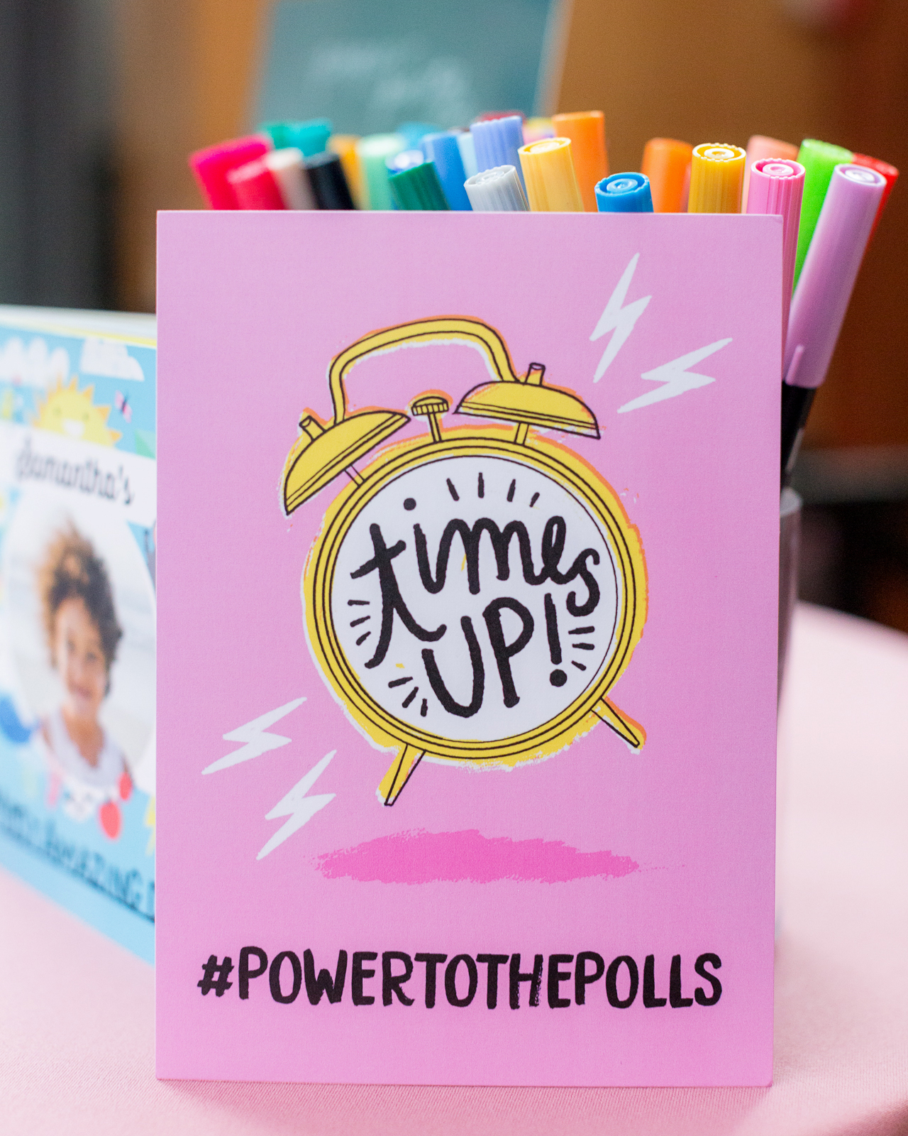
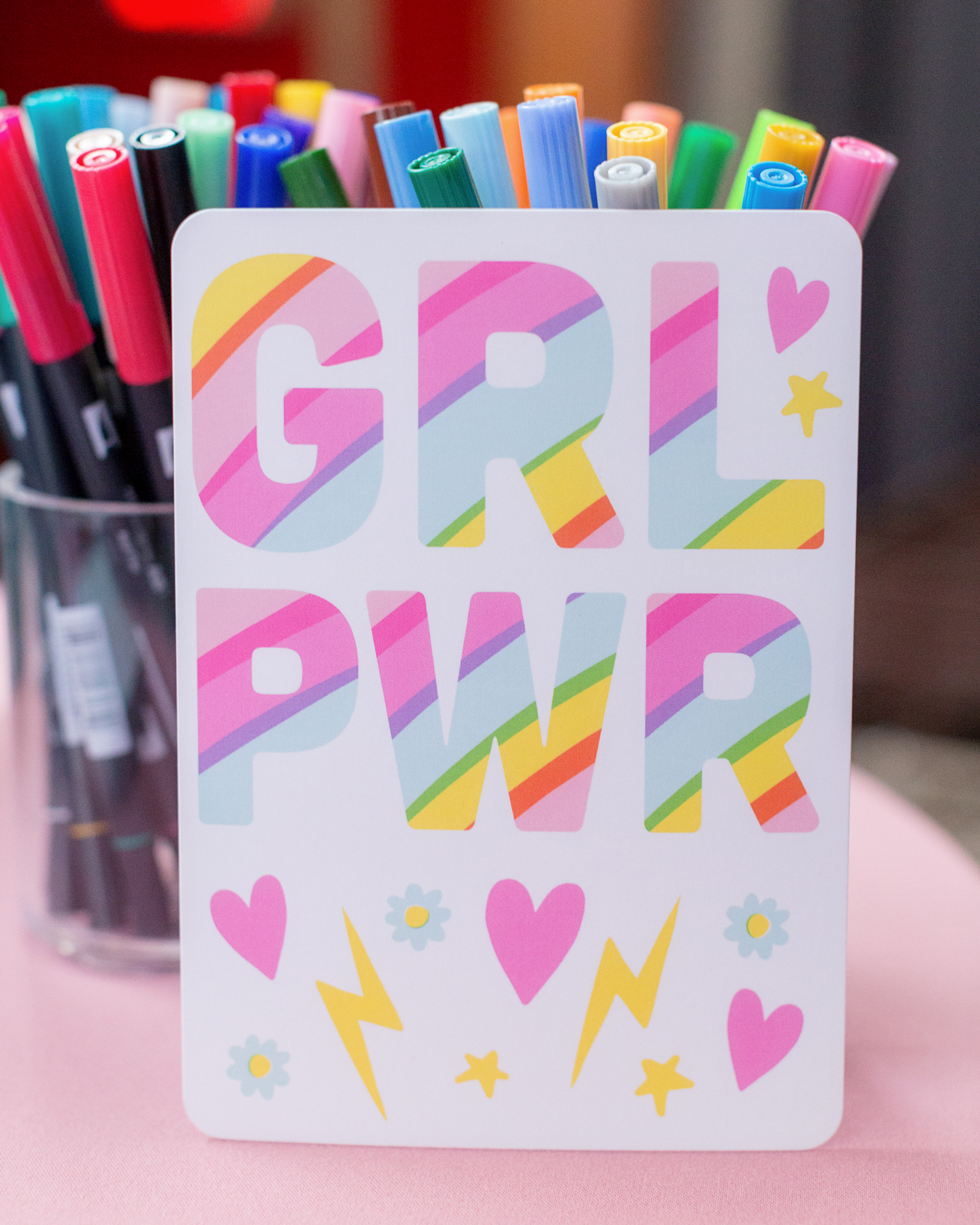
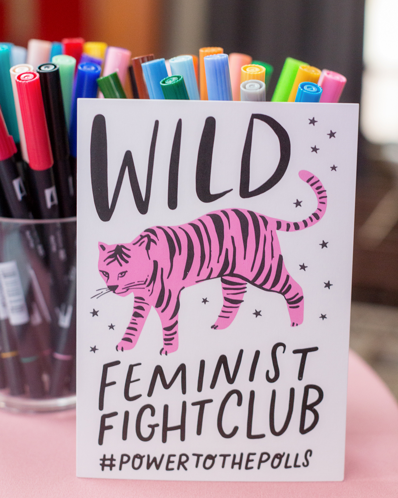
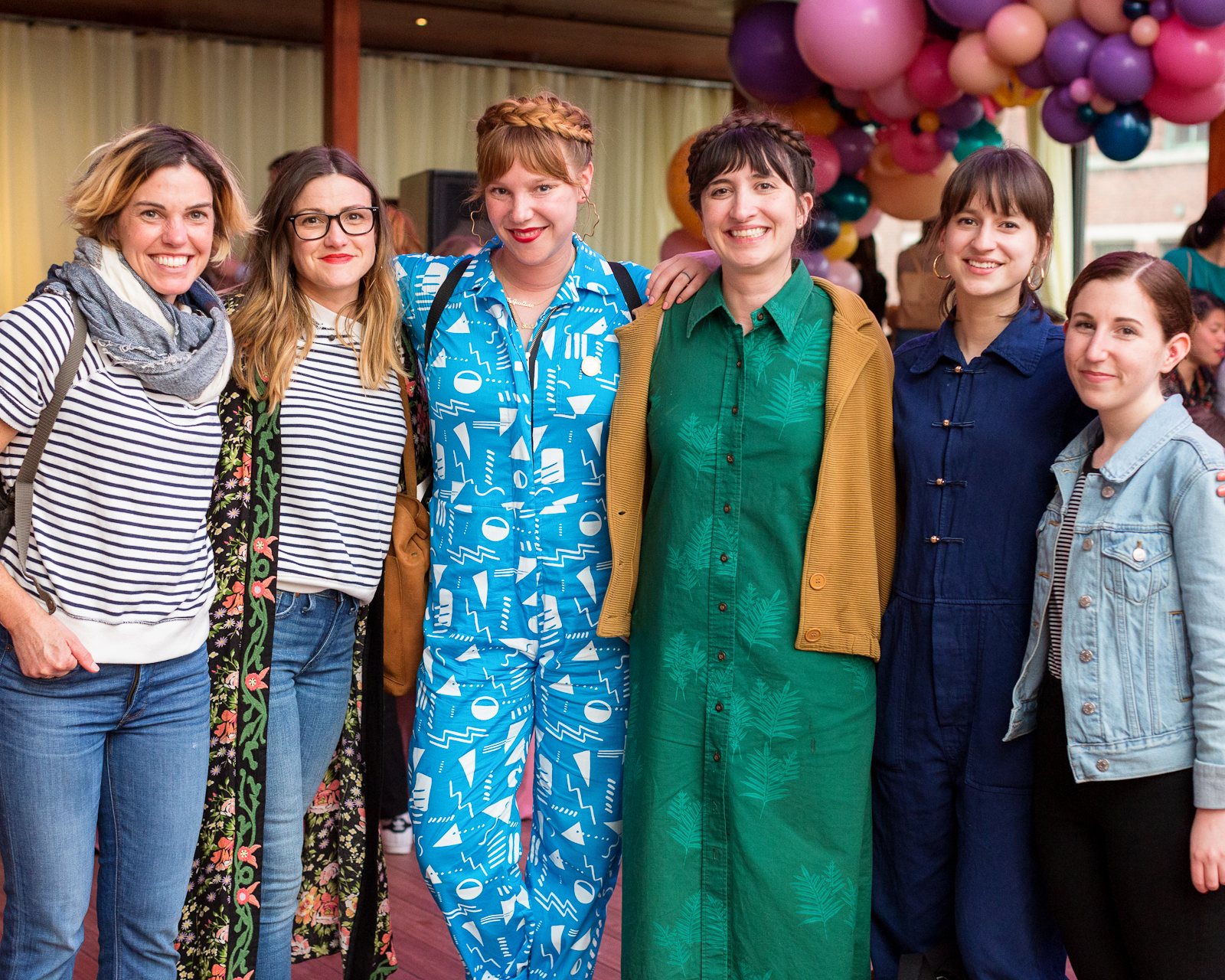
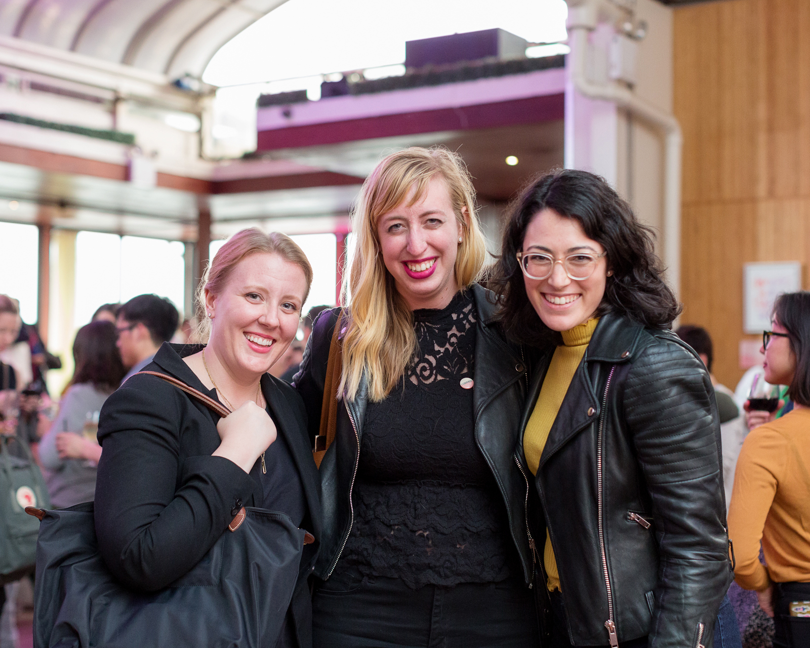
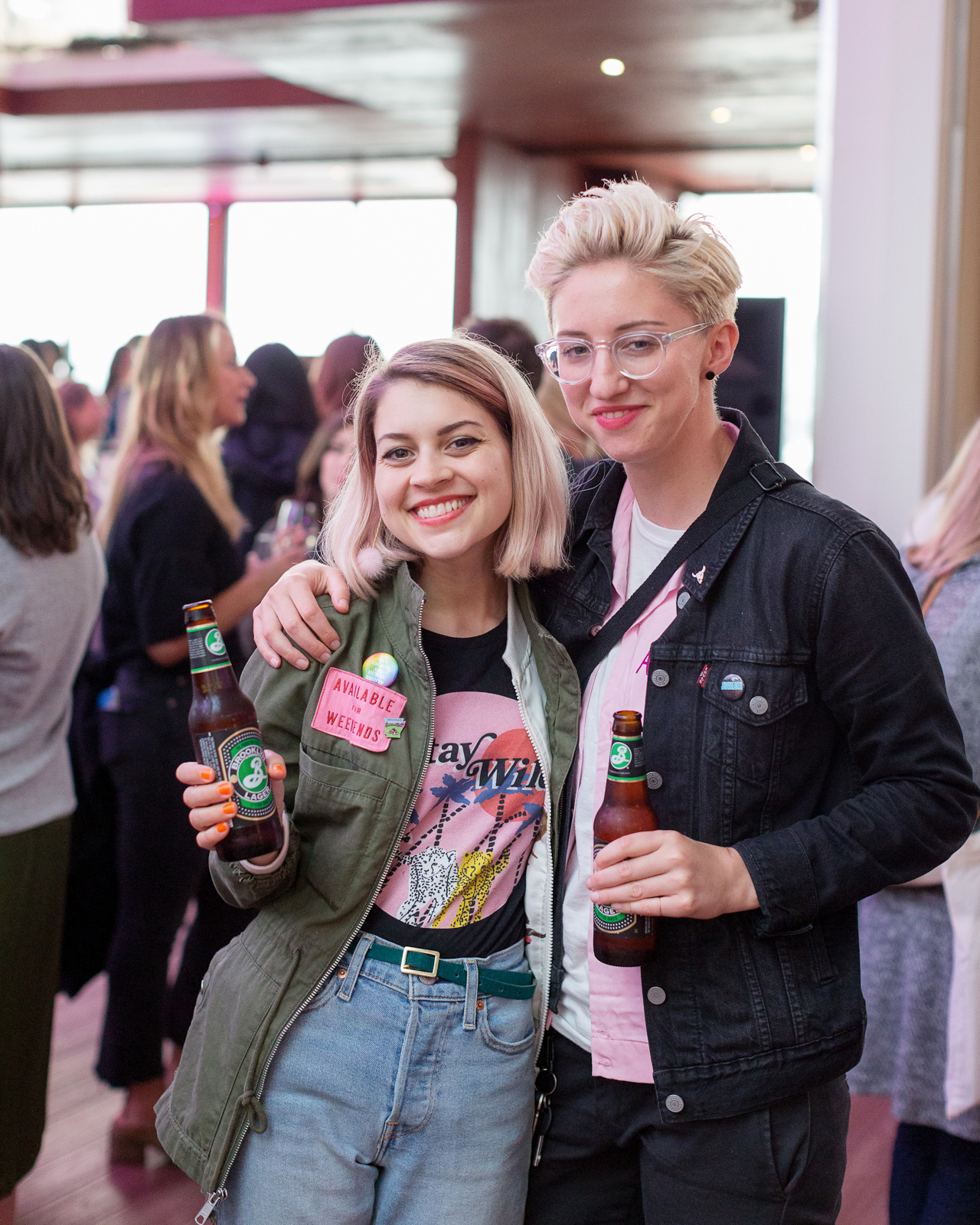
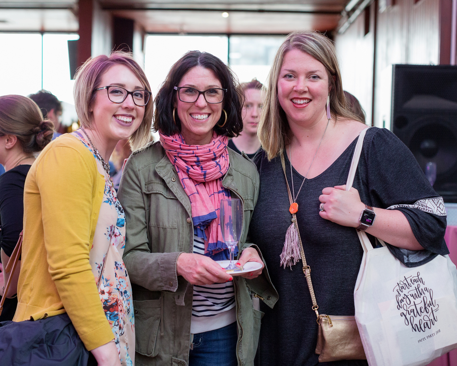
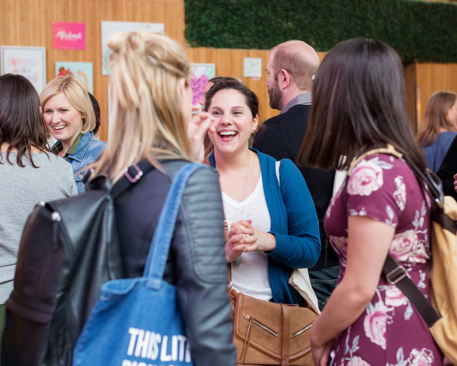
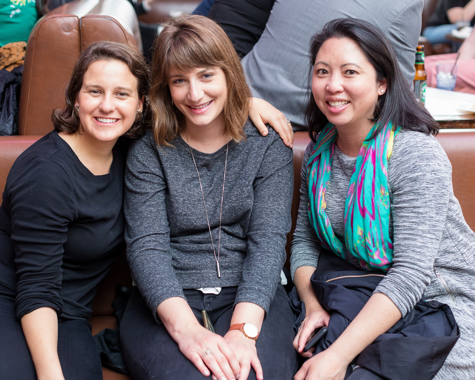
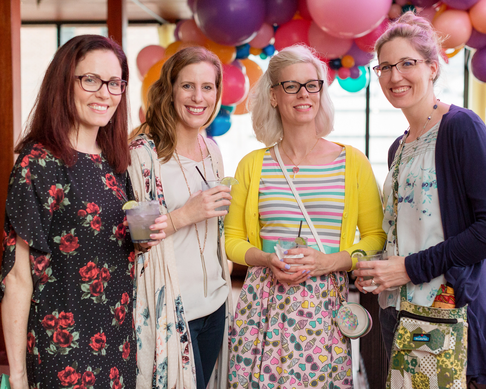
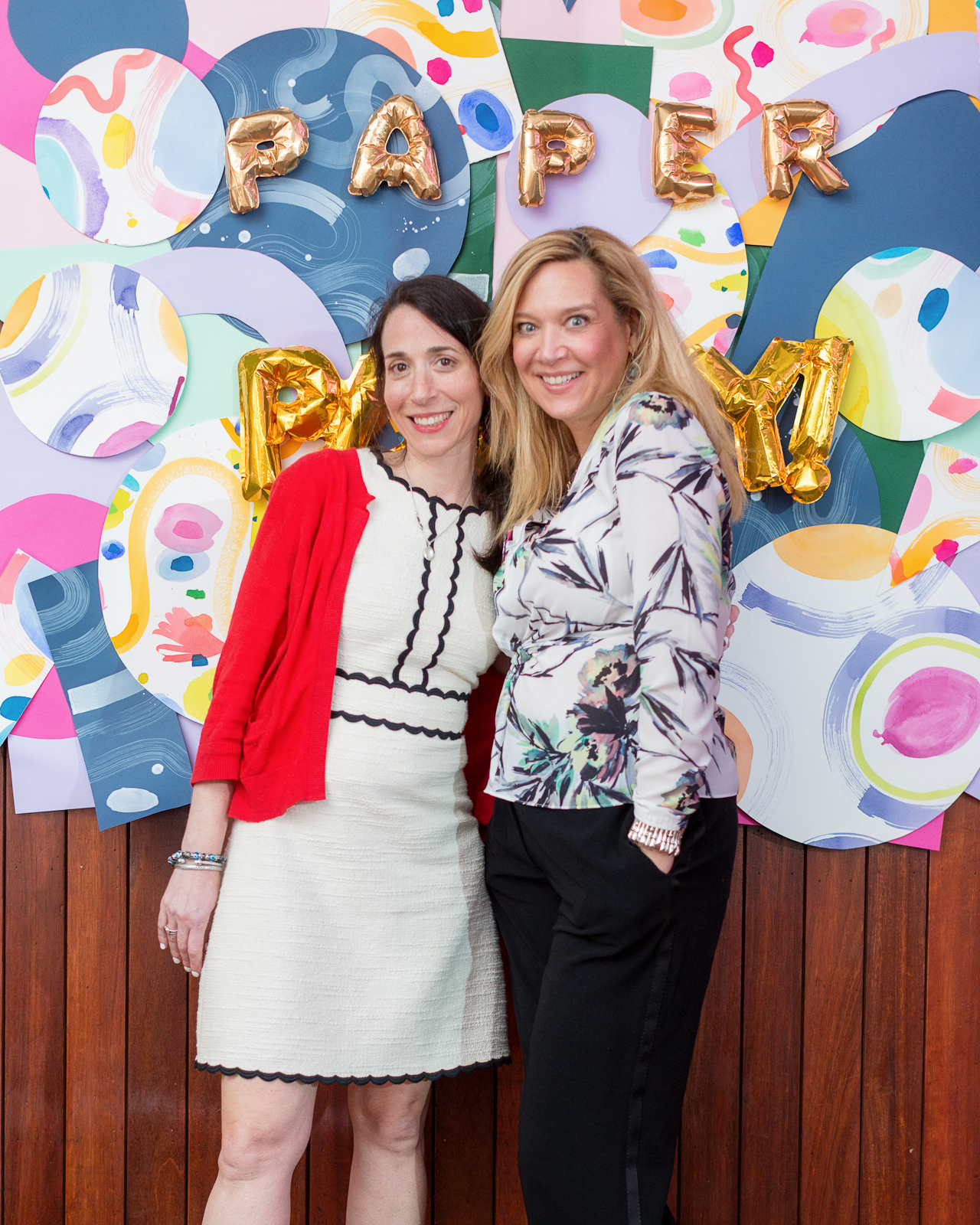
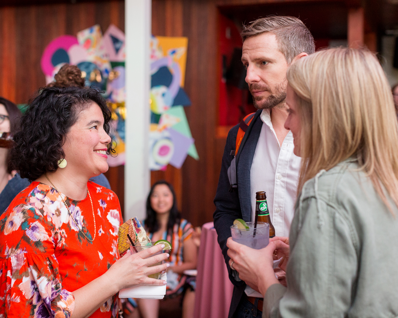
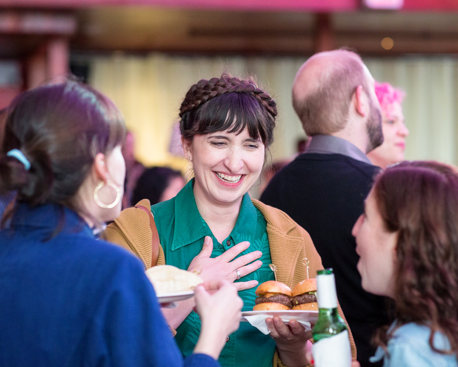
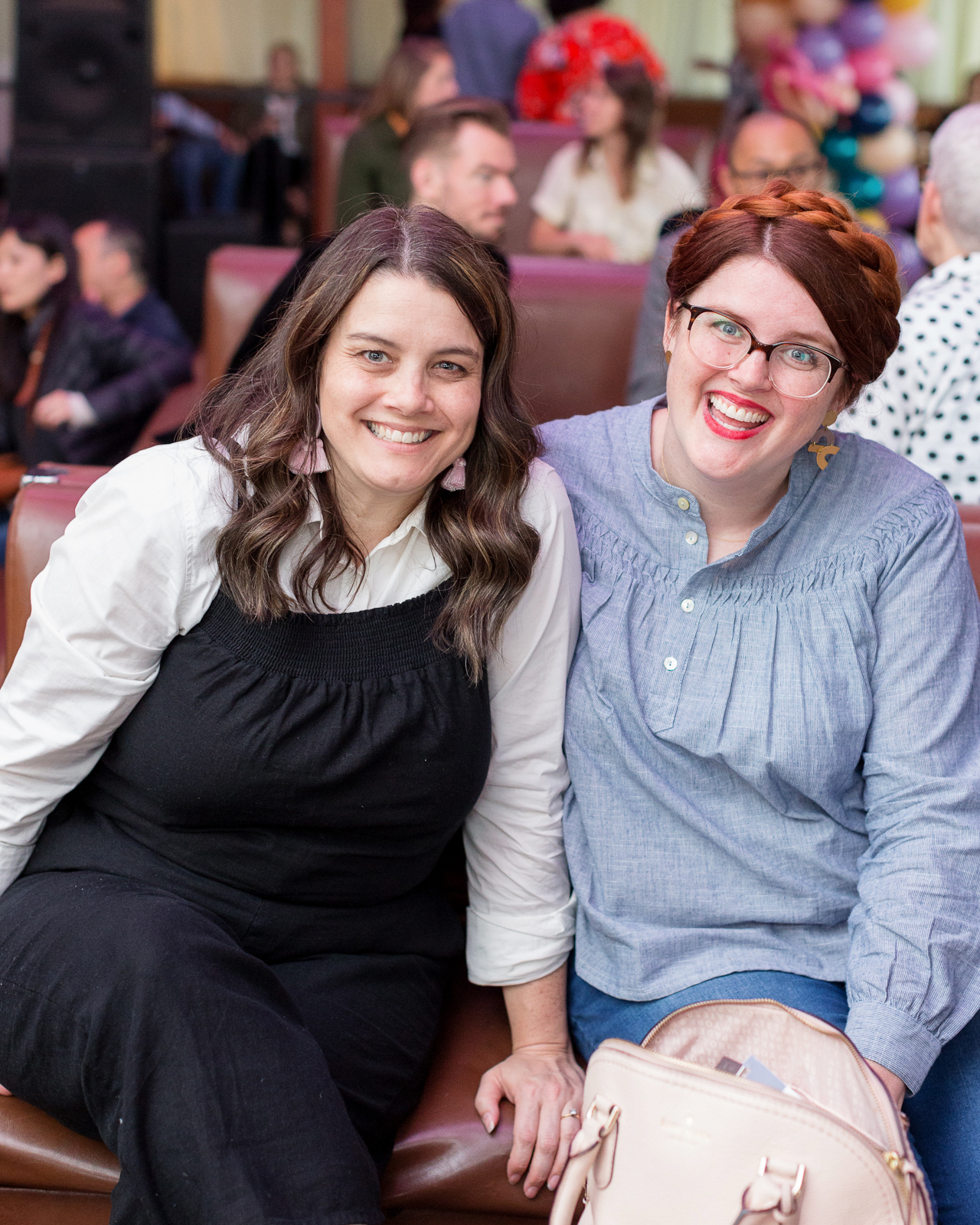
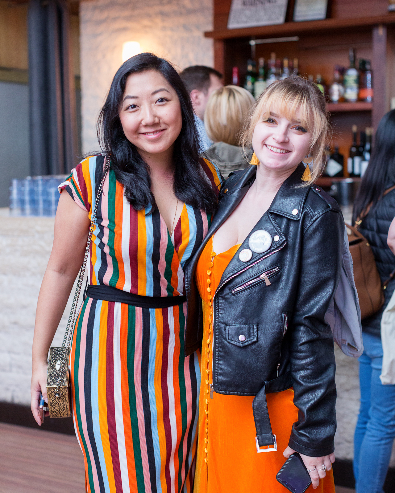
As promised, I’m sharing the photos from this year’s Paper Party during the National Stationery Show! As you saw with the invitations and save the dates, our party inspiration was driven by a non-traditional color palette – mustard yellow, pale pink, peach, lavender, navy blue, and forest green – and modern abstract shapes. For those of you looking for some colorful modern abstract art party inspiration, we’ll be sharing all the fun party details with you today! This year’s party featured a TON of balloons, a gorgeous art print wall, a hand painted paper art installation, and a calligraphy bar! It was such a wonderful evening with some of the most lovely people in the stationery industry, and together we raised more than seven thousand dollars to help support women’s empowerment and equal rights!

Paper Party 2018 / Colorful Modern Abstract Art Party Inspiration

Paper Party 2018 / Colorful Modern Abstract Art Party Inspiration

This was my fifth year organizing a major party for the stationery industry during the National Stationery Show. In the past, we’ve always done a free party, but this year I wanted to do something a bit different and find a way to give back in a small way. So I joined forces with Writes for Women, an advocacy group for the stationery industry that helps raise money for women’s empowerment and equal rights via the Ms. Foundation. We sold tickets to this year’s party and ended up raising more than $7,100 – more than I had ever imagined in my wildest dreams! Thank you, thank you, thank you from the bottom of my heart to everyone who came to the party for making this possible!

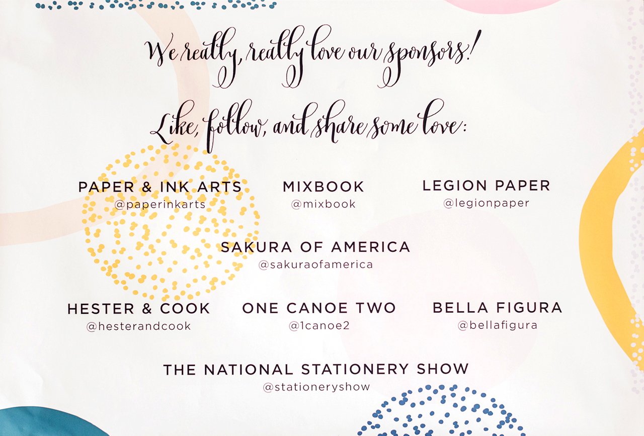
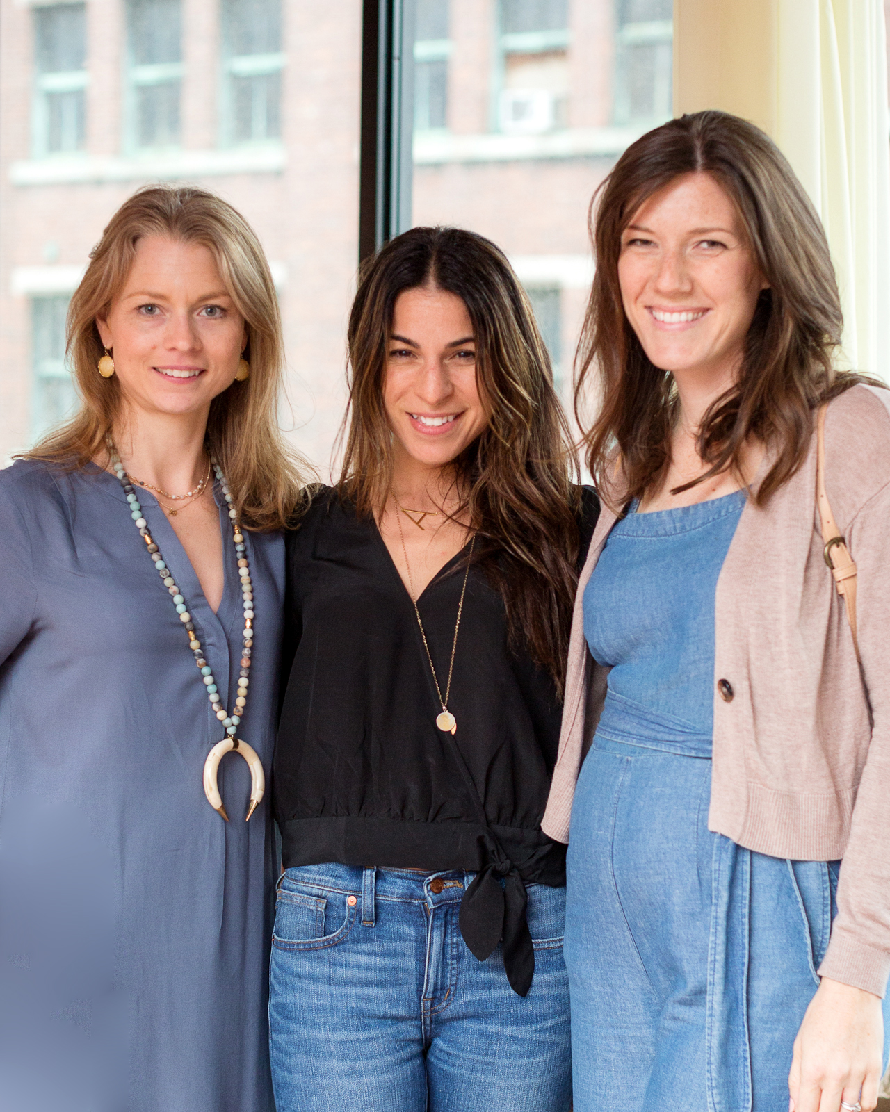
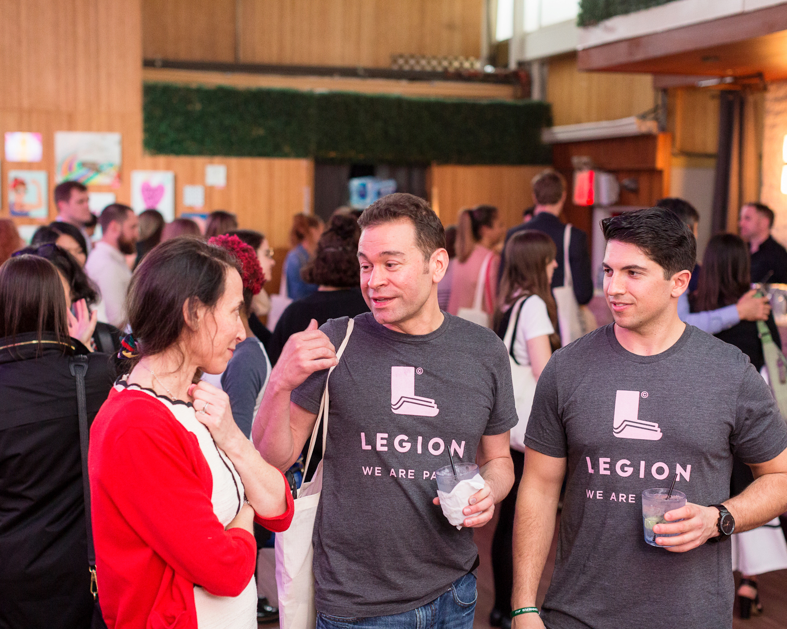
This year’s party was again held at Hudson Terrace on their rooftop terrace. My talented friend (and professional event planner) Janice from Bellwether Events helped me plan the party, along with Melinda of Lion in the Sun and Caroline of CW Pencils (my party planning partners in crime from Writes for Women). And of course the party would not have been possible without our amazing sponsors, including Paper & Ink Arts, Mixbook, Legion Paper, Bella Figura, Sakura of AmericaHester & Cook Design Group, 1canoe2, and the National Stationery Show, and our fantastic creative partners Ramona & Ruth, Sam Teich, Lillian Farag, Farmette Press, and Meant to Be Calligraphy. Let’s get to all the fun details!

Paper Party 2018 / Colorful Modern Abstract Art Party Inspiration

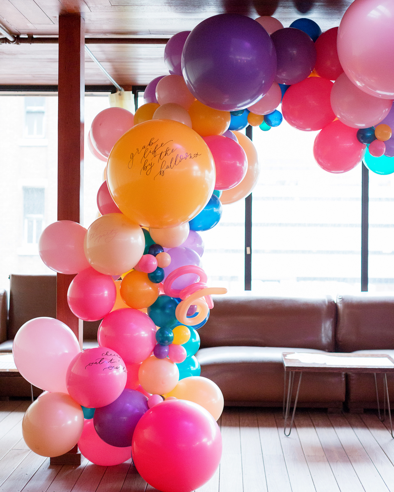
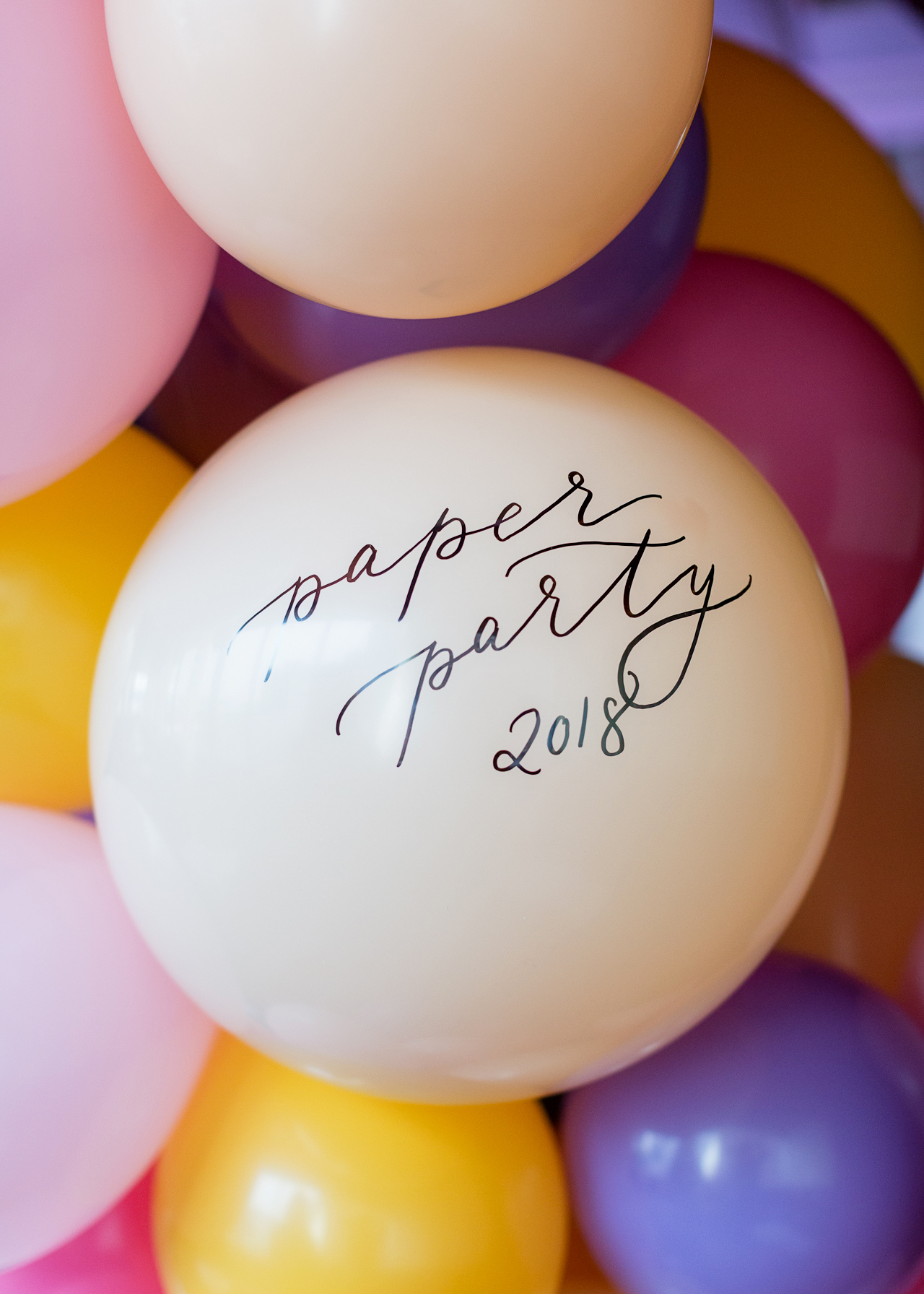
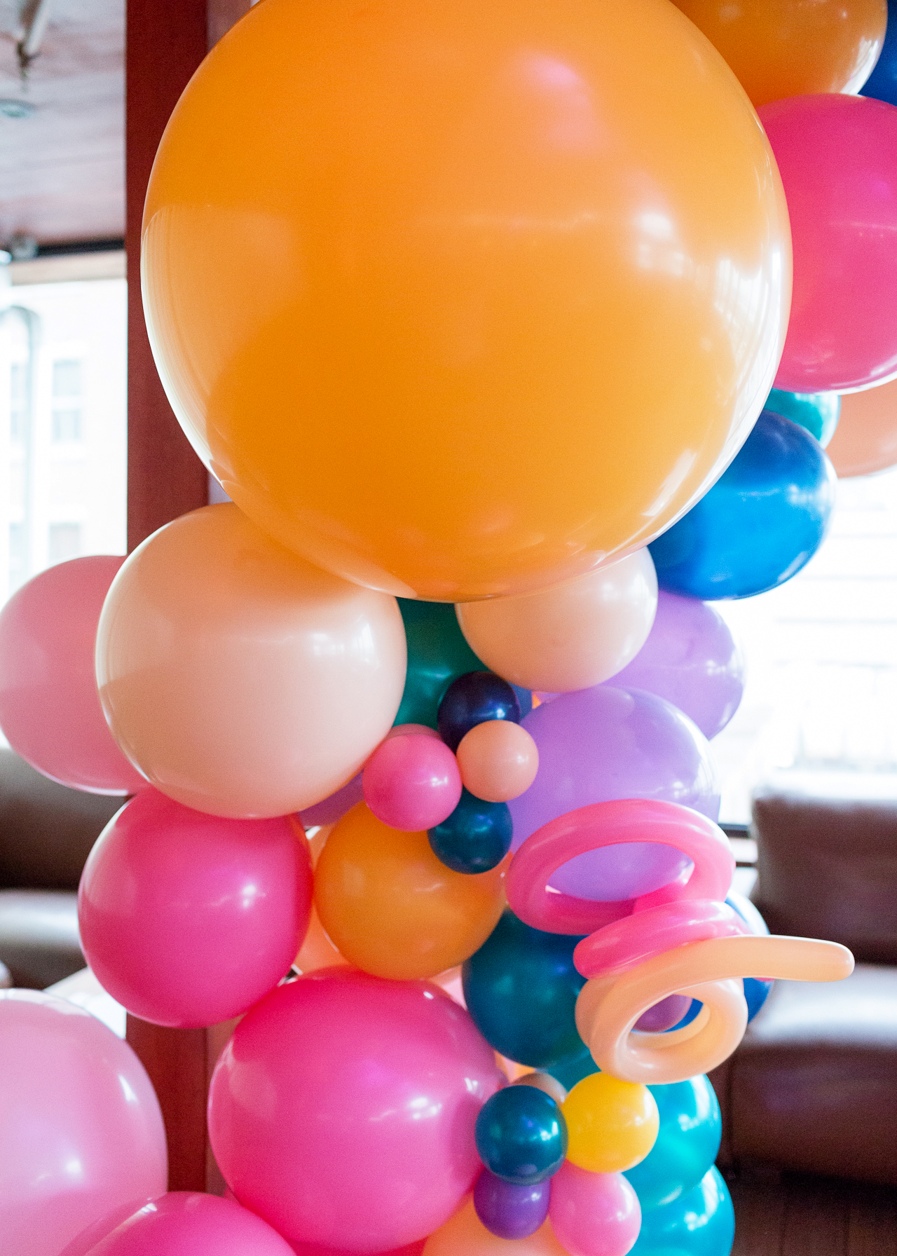
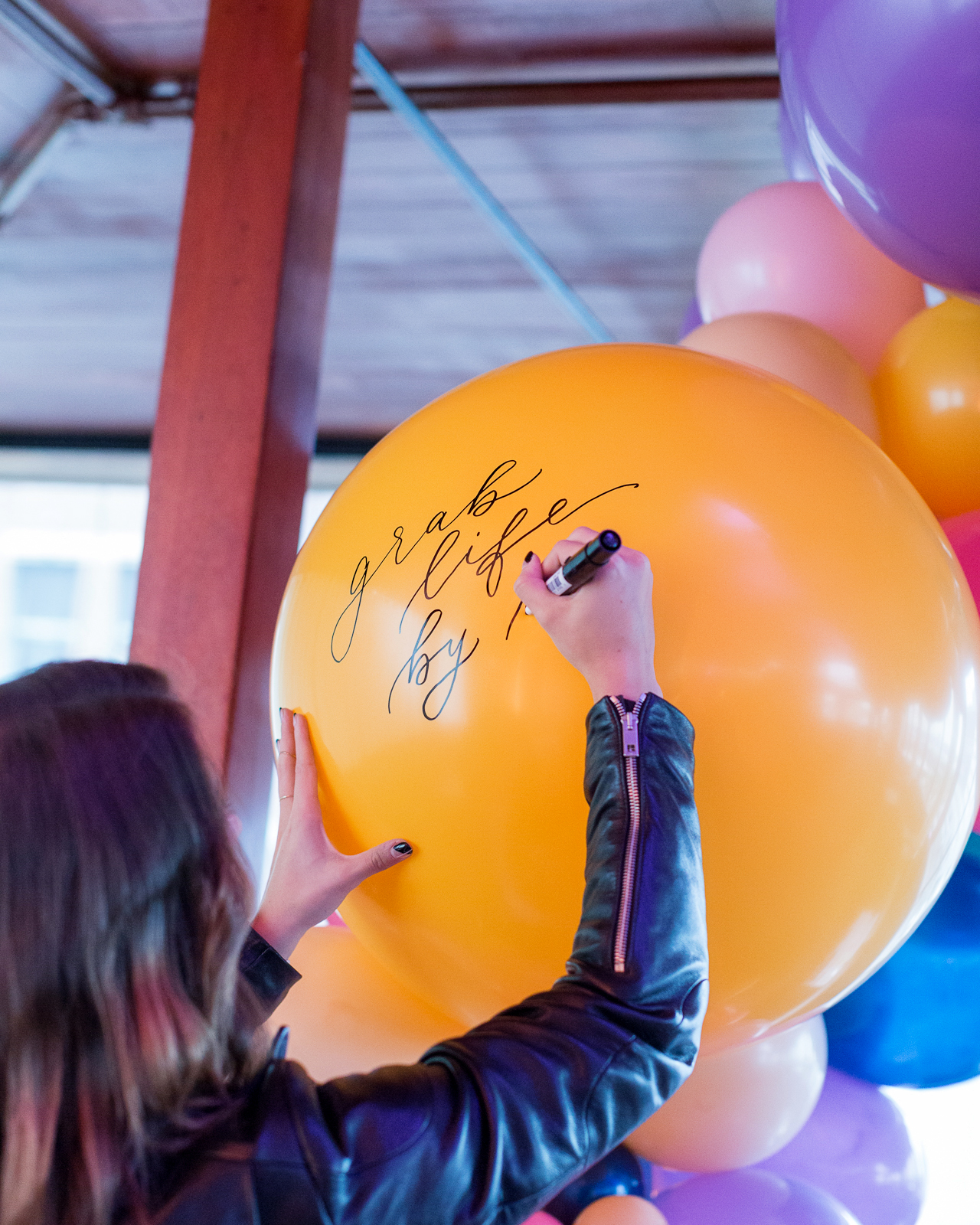
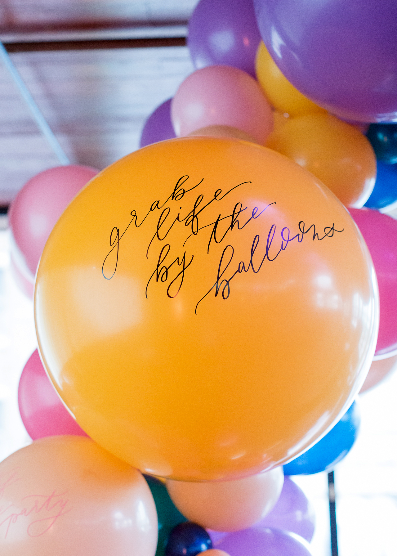
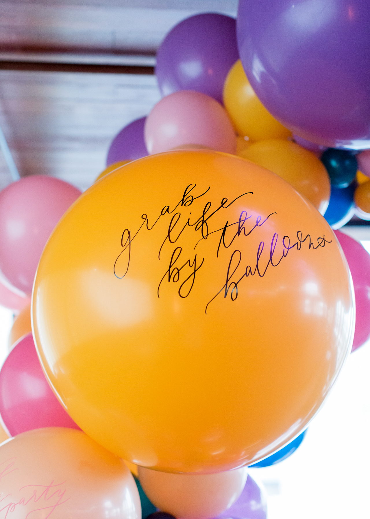
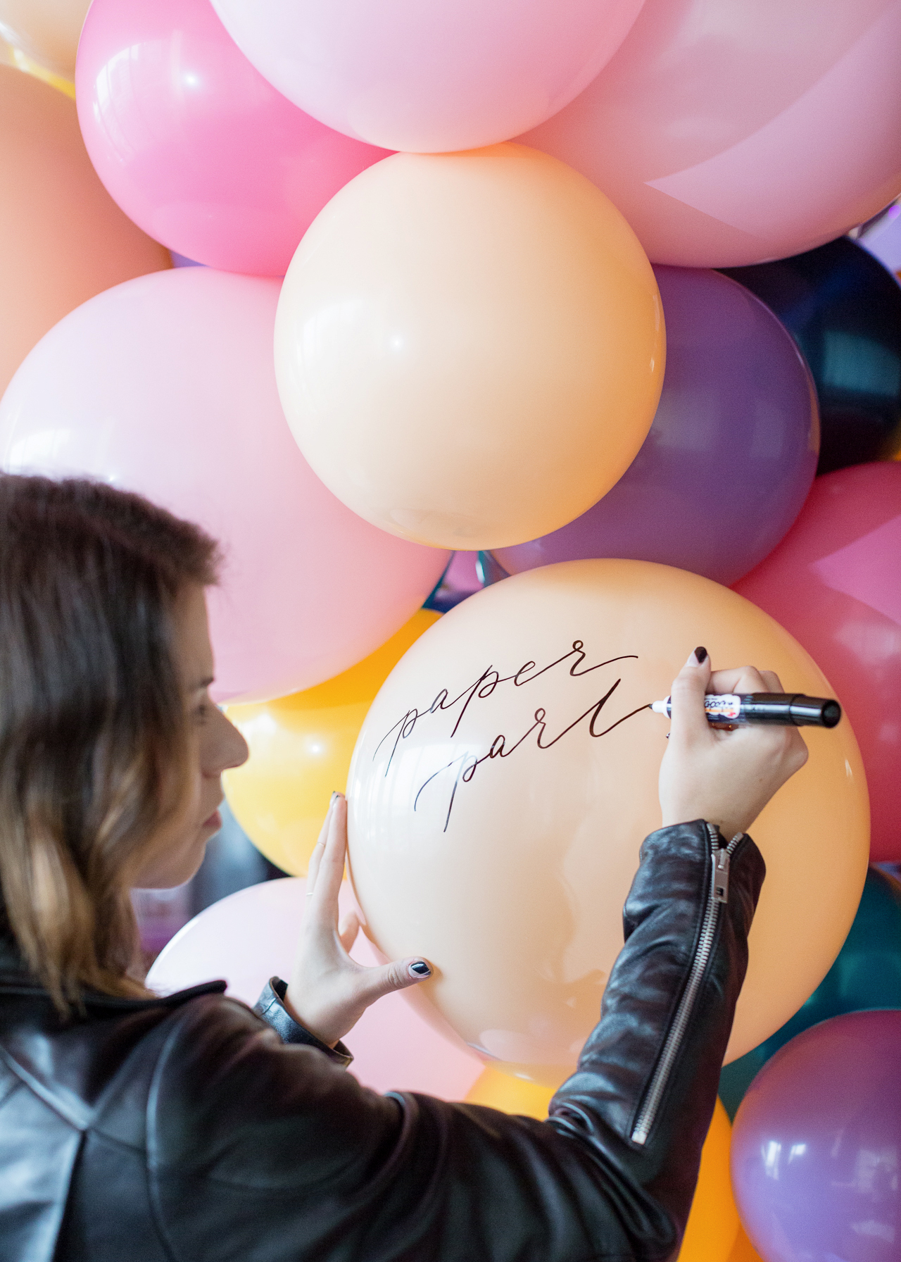
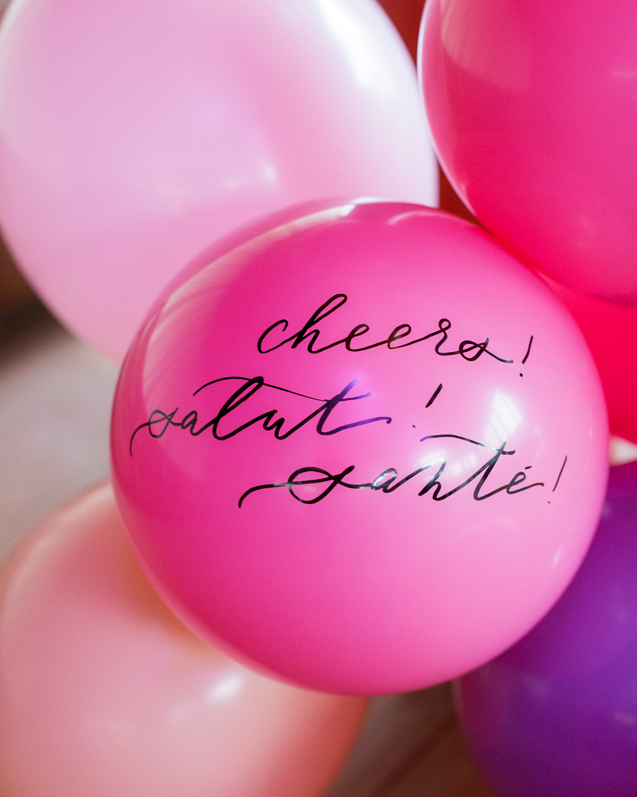
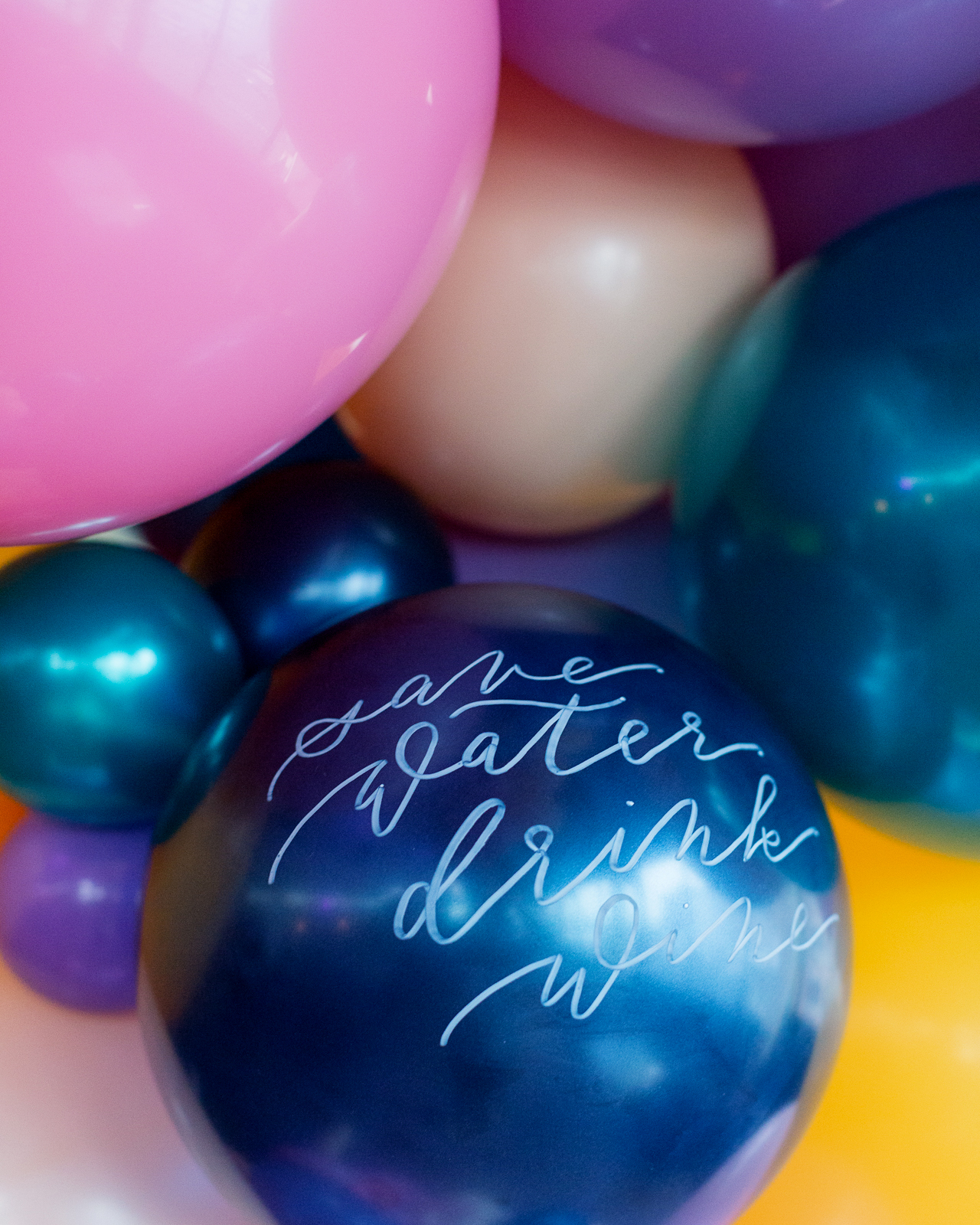
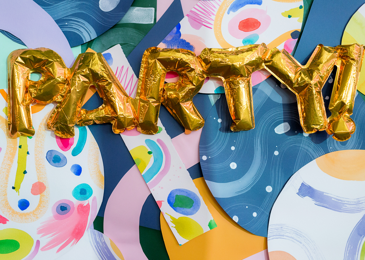
Okay, so first – the balloons! I knew that I wanted to incorporate a balloon installation into our party décor this year, and it turned out so fun and colorful! (We used Balloon Saloon for those of you who might need something similar in NYC) We used balloons in shades of pink, peach, deep yellow, teal, and purple – and calligrapher Sam Teich used some of Sakura of America’s Permapaque markers to letter a few fun party phrases on the balloons! It was super easy!

Paper Party 2018 / Colorful Modern Abstract Art Party Inspiration

Paper Party 2018 / Colorful Modern Abstract Art Party Inspiration

Paper Party 2018 / Colorful Modern Abstract Art Party Inspiration

Paper Party 2018 / Colorful Modern Abstract Art Party Inspiration

Paper Party 2018 / Colorful Modern Abstract Art Party Inspiration

Paper Party 2018 / Colorful Modern Abstract Art Party Inspiration

Paper Party 2018 / Colorful Modern Abstract Art Party Inspiration

Paper Party 2018 / Colorful Modern Abstract Art Party Inspiration

Paper Party 2018 / Colorful Modern Abstract Art Party Inspiration

Paper Party 2018 / Colorful Modern Abstract Art Party Inspiration

Paper Party 2018 / Colorful Modern Abstract Art Party Inspiration

Paper Party 2018 / Colorful Modern Abstract Art Party Inspiration

Paper Party 2018 / Colorful Modern Abstract Art Party Inspiration

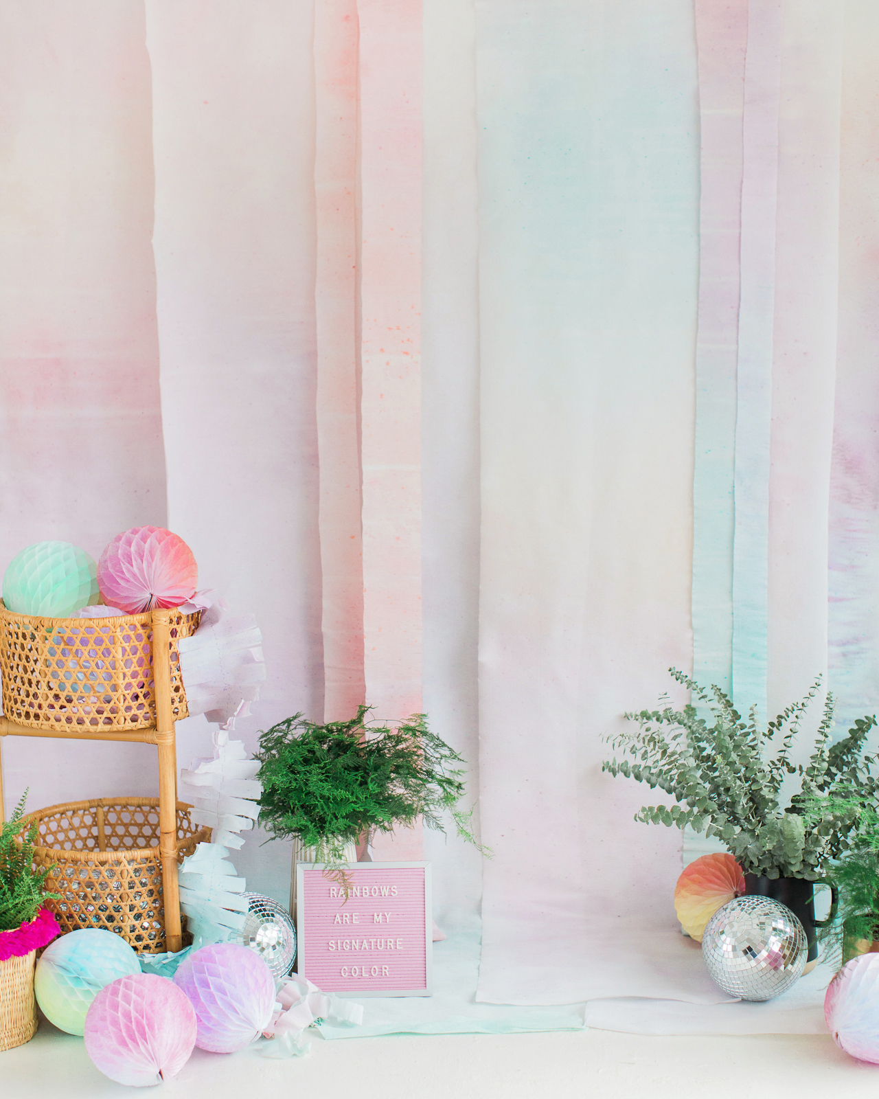
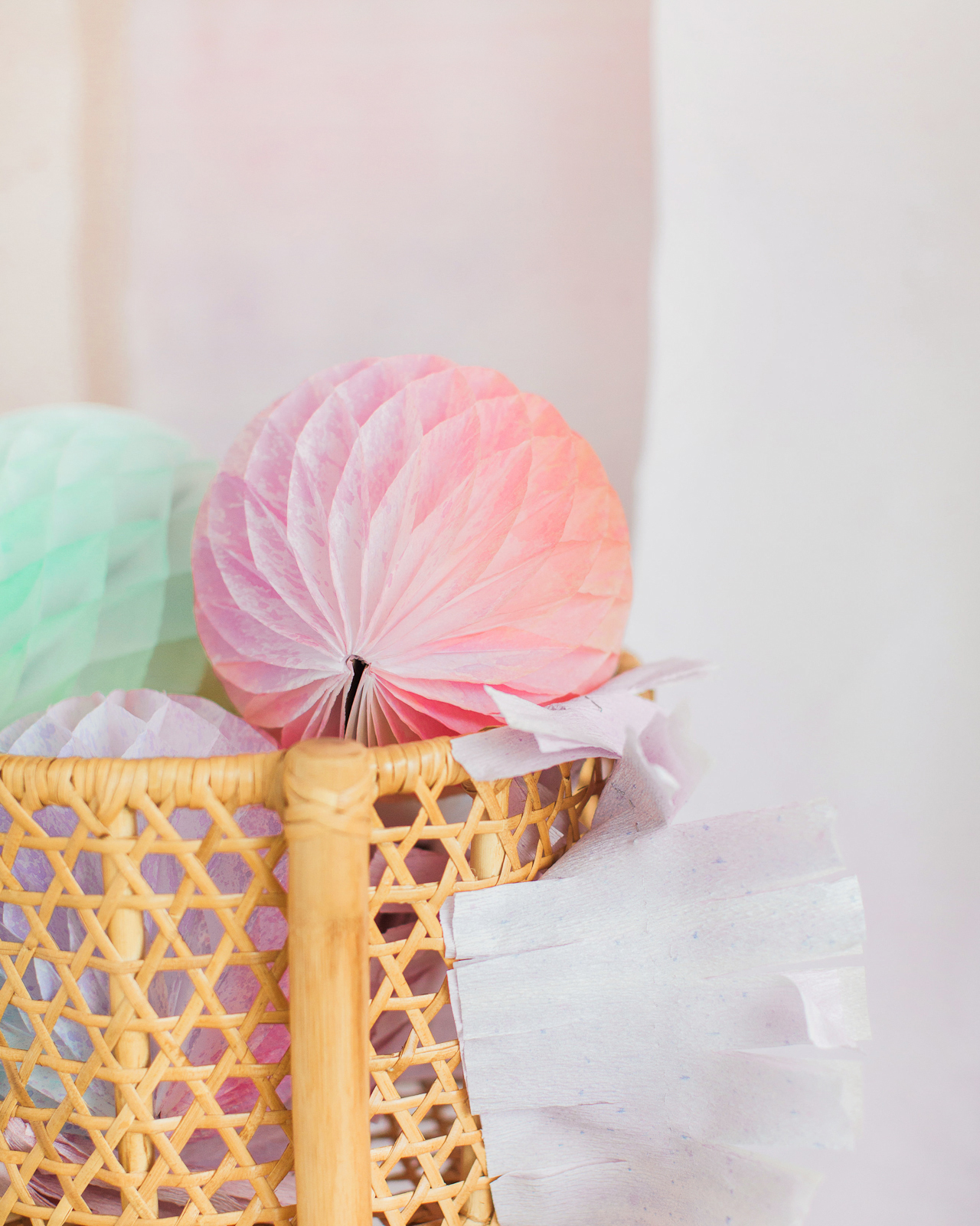
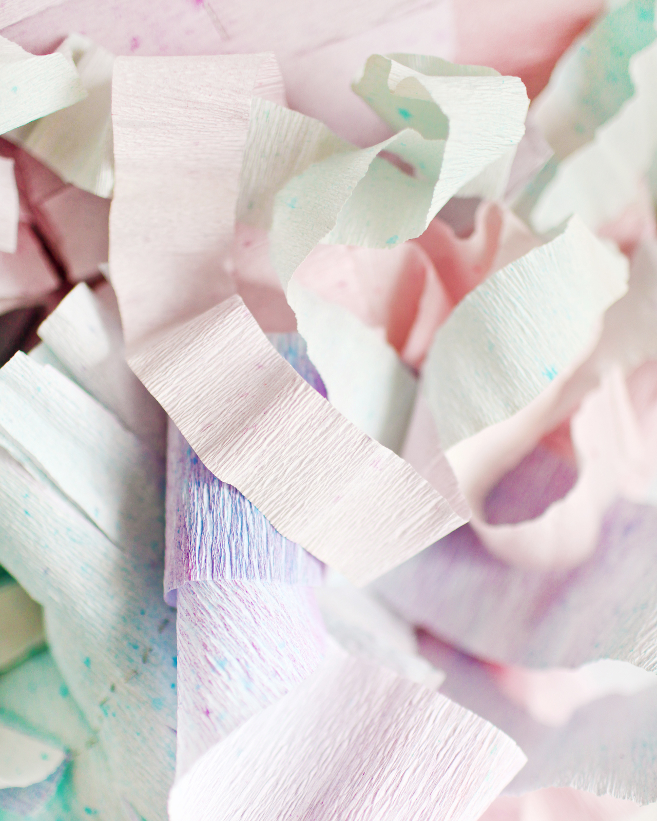
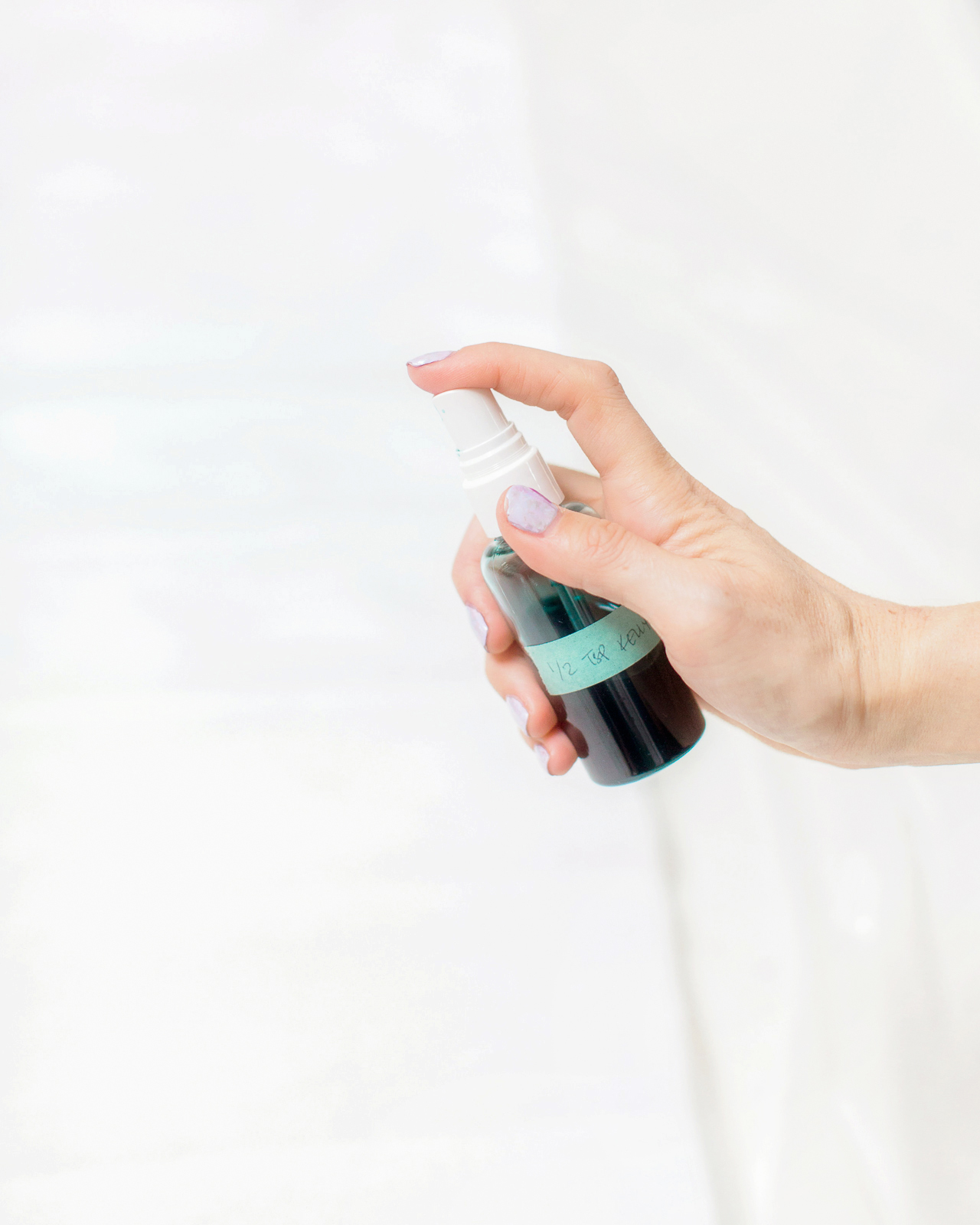
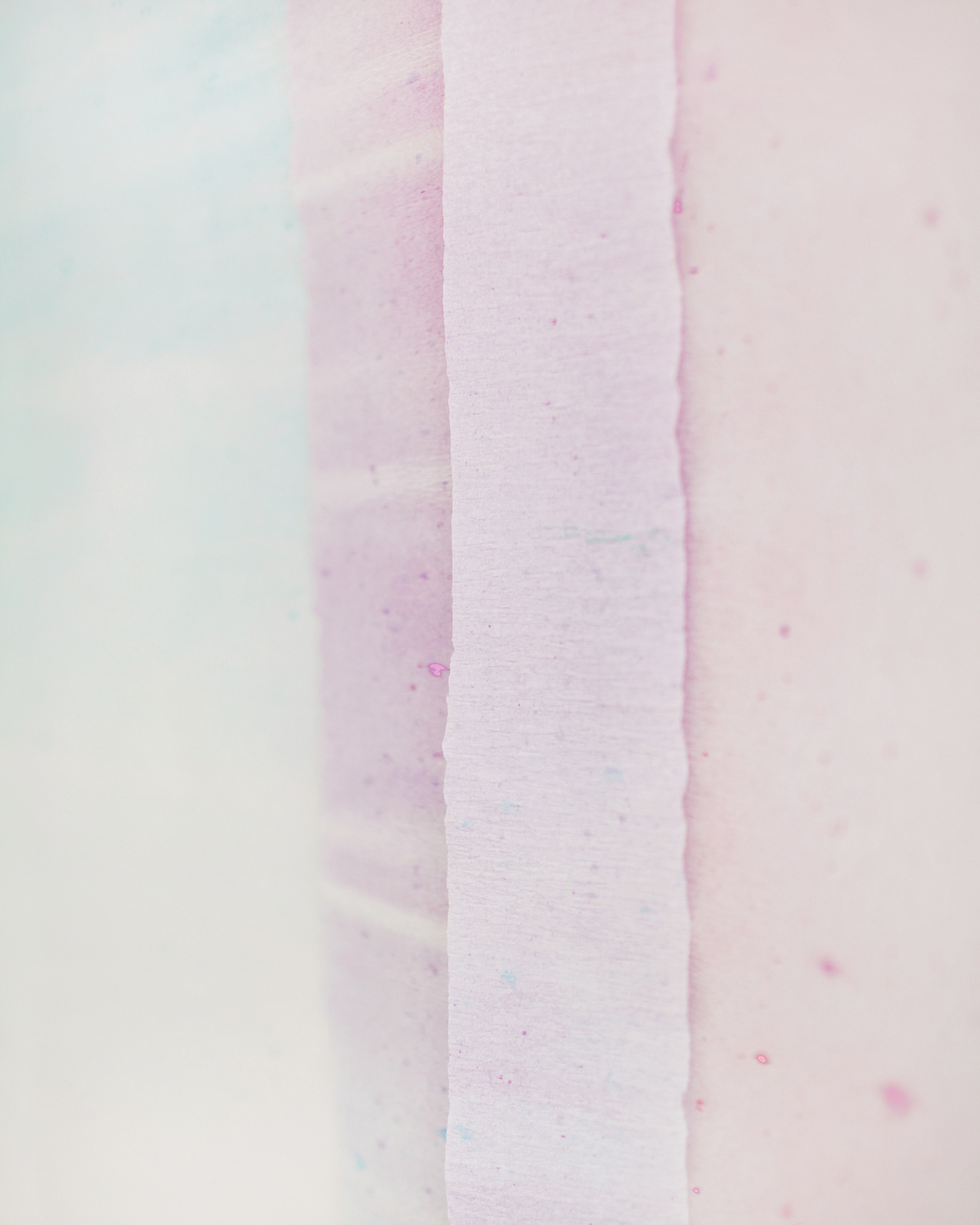
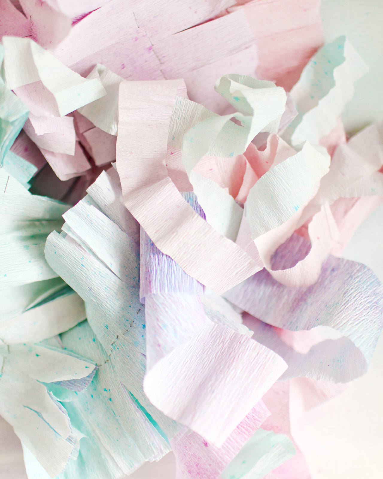
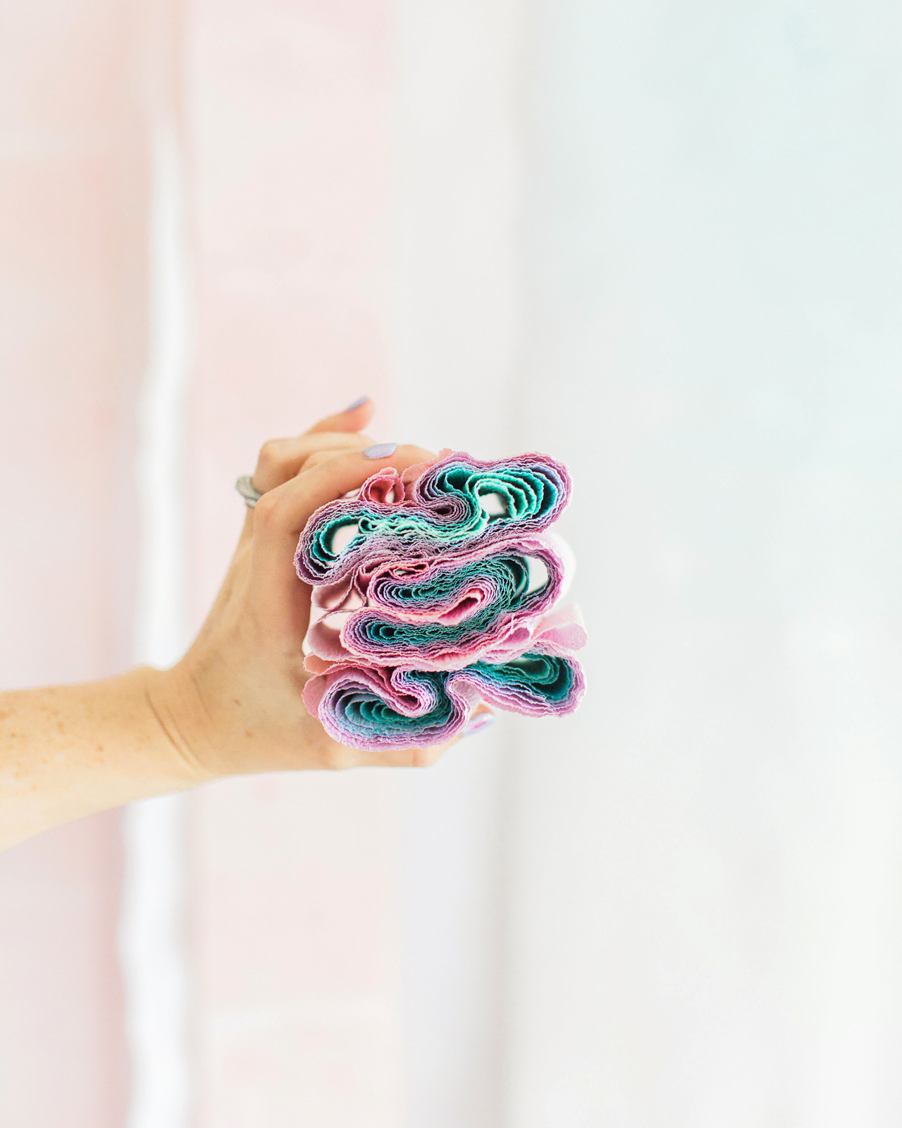
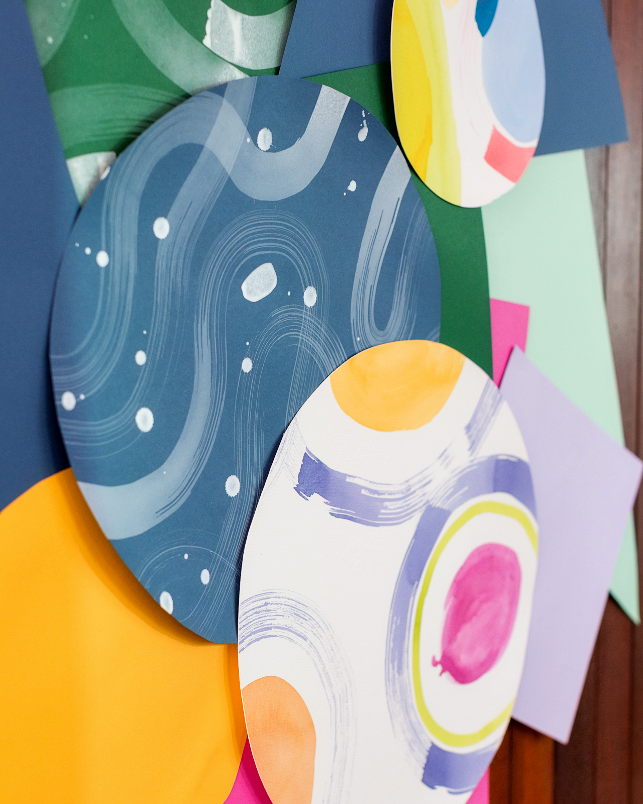
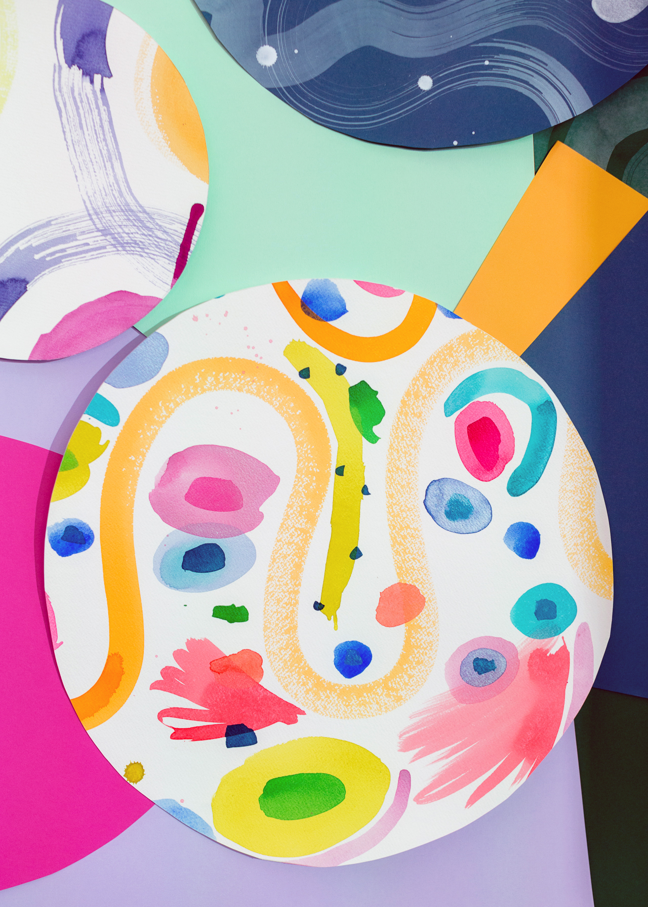
We also made this really fun paper art installation in collaboration with artist Lillian Farag and Legion Paper! I was feeling super inspired by our save the date and invitation design by Ramona & Ruth, so I came up with the idea of creating this installation using sheets of Colorplan and Stonehenge Aqua watercolor paper from Legion Paper. Lillian painted on the Stonehenge sheets in her signature free flowing style, and we layered Lillian’s pieces together with the Colorplan paper in lavender, candy pink, fuchsia pink, citrine, park green, forest green, and imperial blue. Stay tuned for a more detailed DIY post so you can create one of these installations for your own party!

Paper Party 2018 / Colorful Modern Abstract Art Party Inspiration

Paper Party 2018 / Colorful Modern Abstract Art Party Inspiration

Paper Party 2018 / Colorful Modern Abstract Art Party Inspiration

Paper Party 2018 / Colorful Modern Abstract Art Party Inspiration

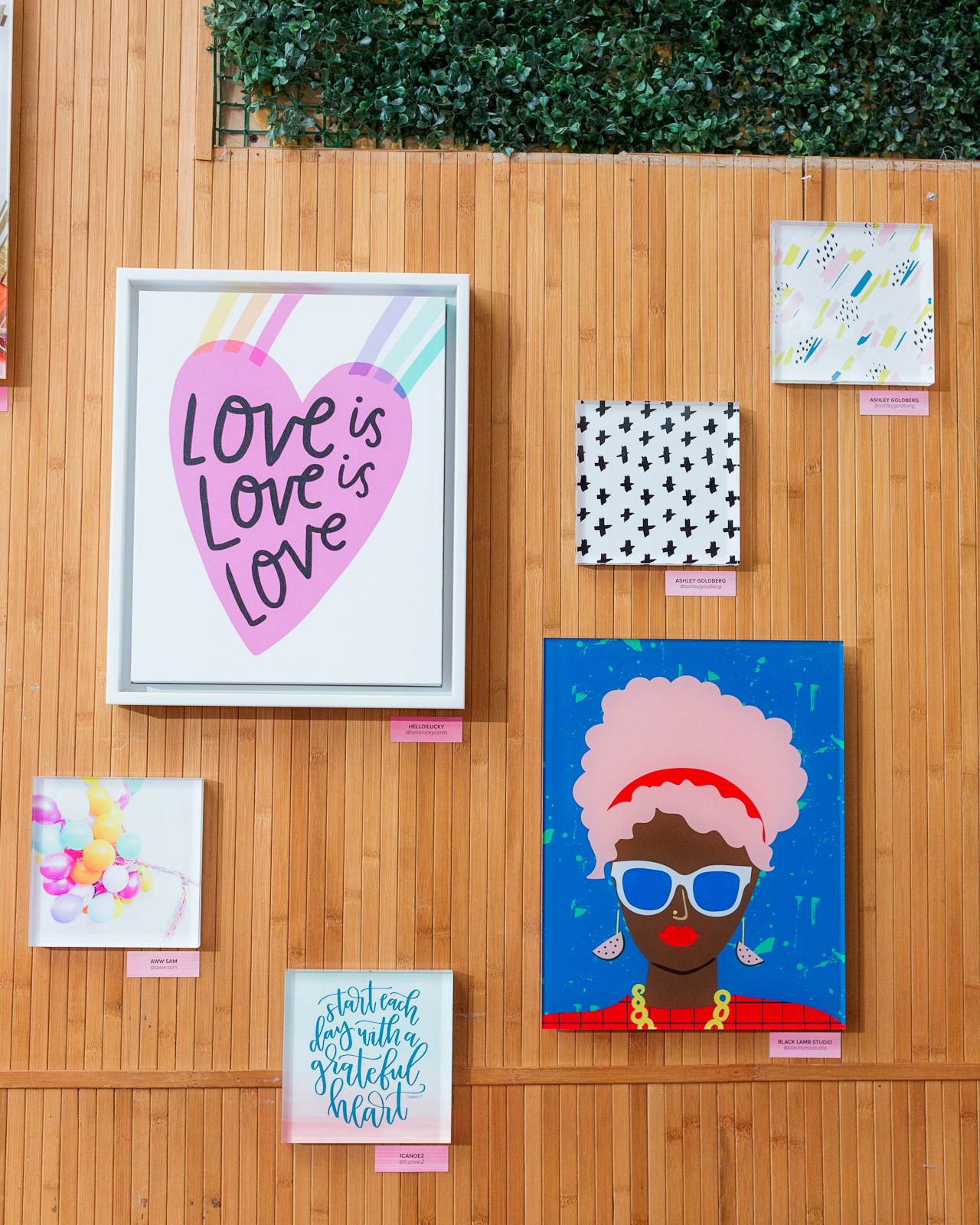
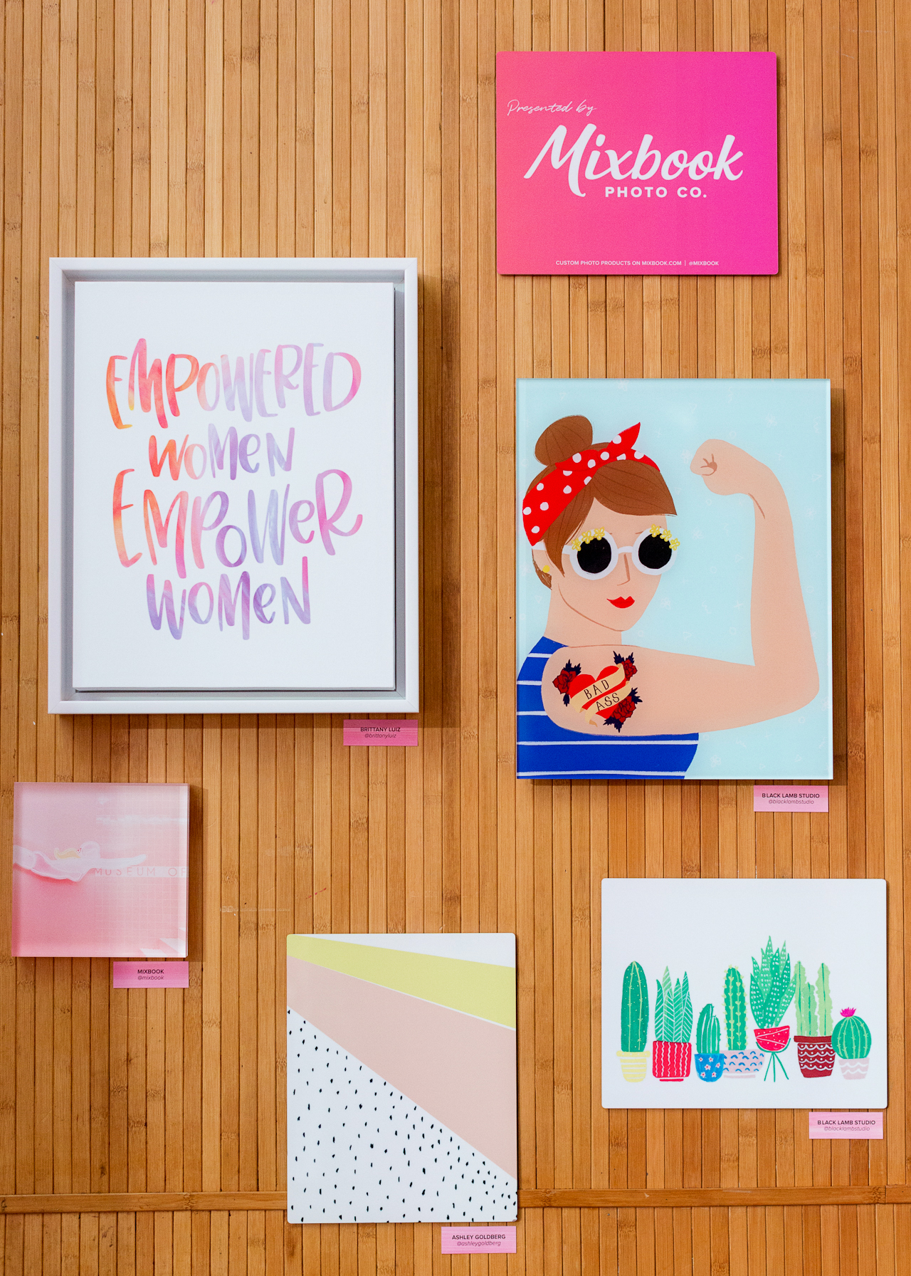
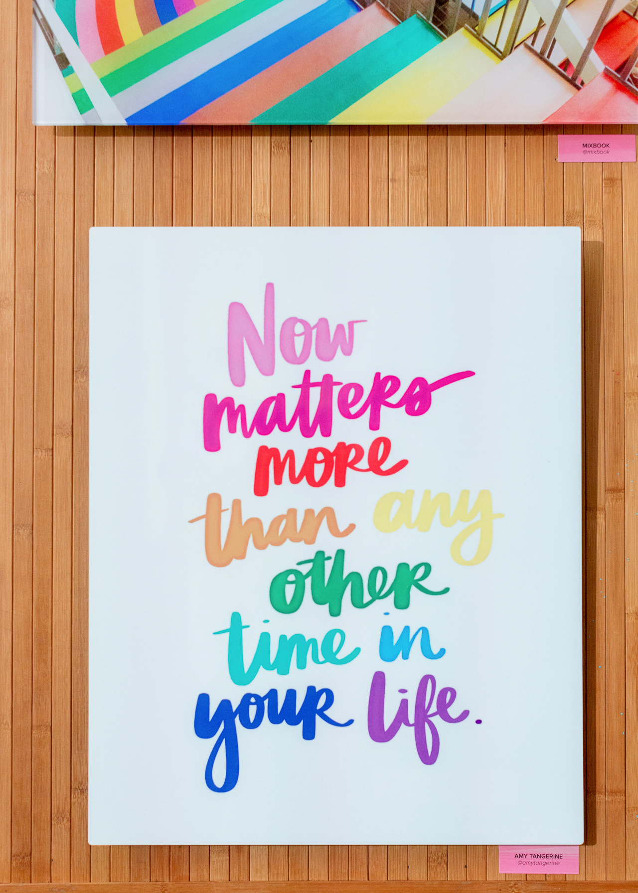
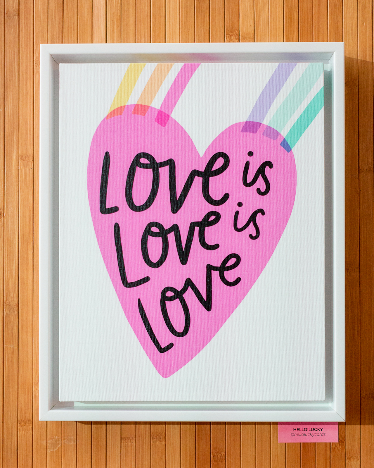
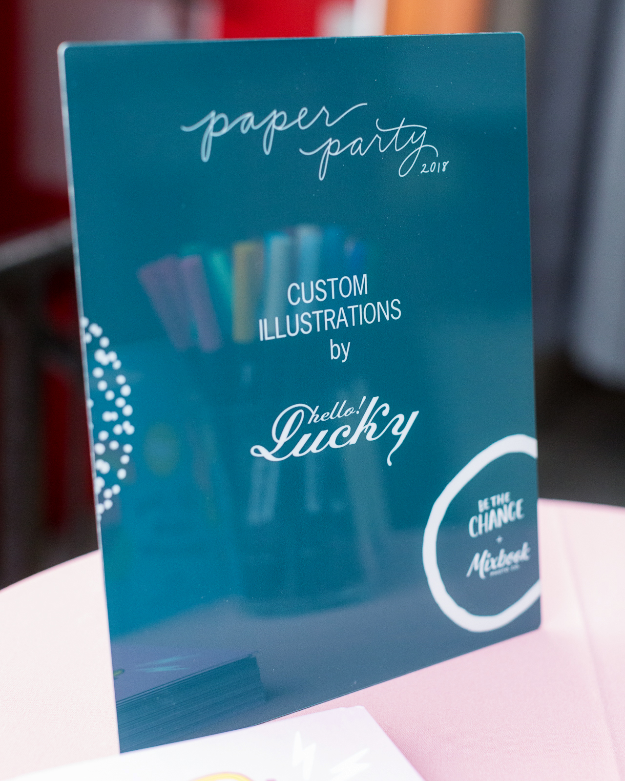
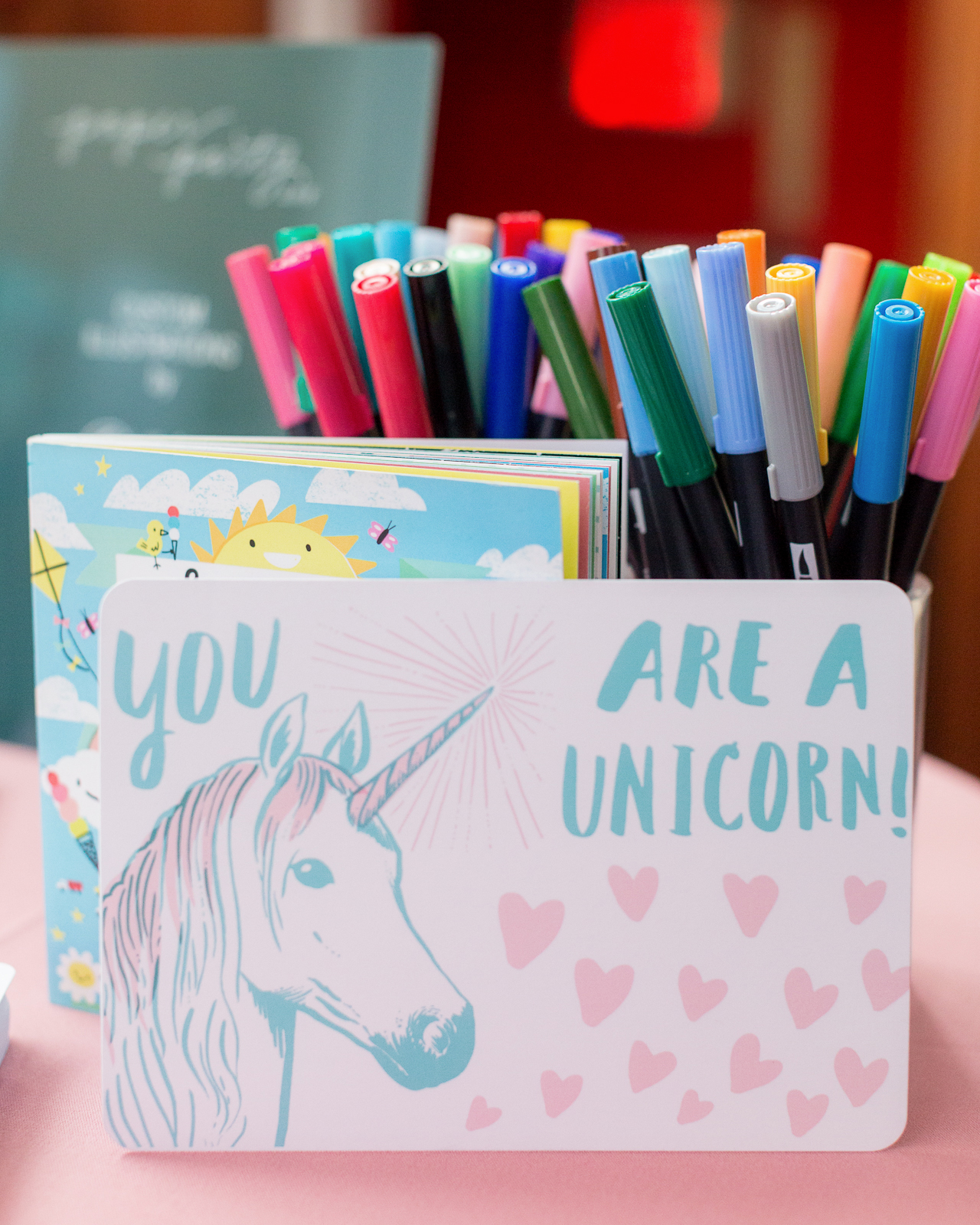
And can we talk about this Mixbook art print wall? So gorgeous! Mixbook works with an amazing roster of artists, including Hello!Lucky, 1canoe2, Black Lamb Studio, Ashley Goldberg, and Amy Tangerine – totally perfect for our colorful evening! The art print wall featured a mix of canvas prints and acrylic block prints, and each print was either super colorful or had a message of women’s empowerment – or both!

Paper Party 2018 / Colorful Modern Abstract Art Party Inspiration

Paper Party 2018 / Colorful Modern Abstract Art Party Inspiration

Paper Party 2018 / Colorful Modern Abstract Art Party Inspiration

Paper Party 2018 / Colorful Modern Abstract Art Party Inspiration

Paper Party 2018 / Colorful Modern Abstract Art Party Inspiration

Paper Party 2018 / Colorful Modern Abstract Art Party Inspiration

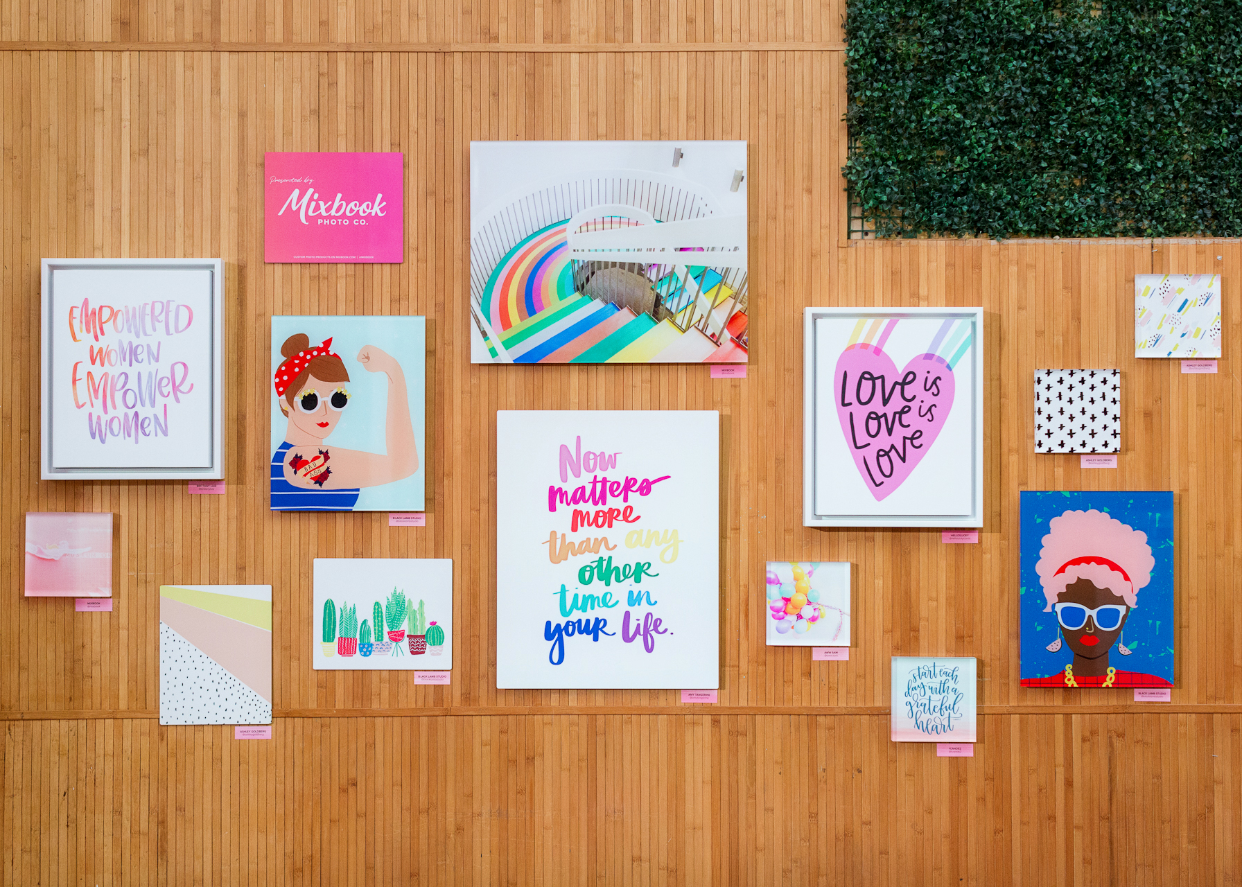
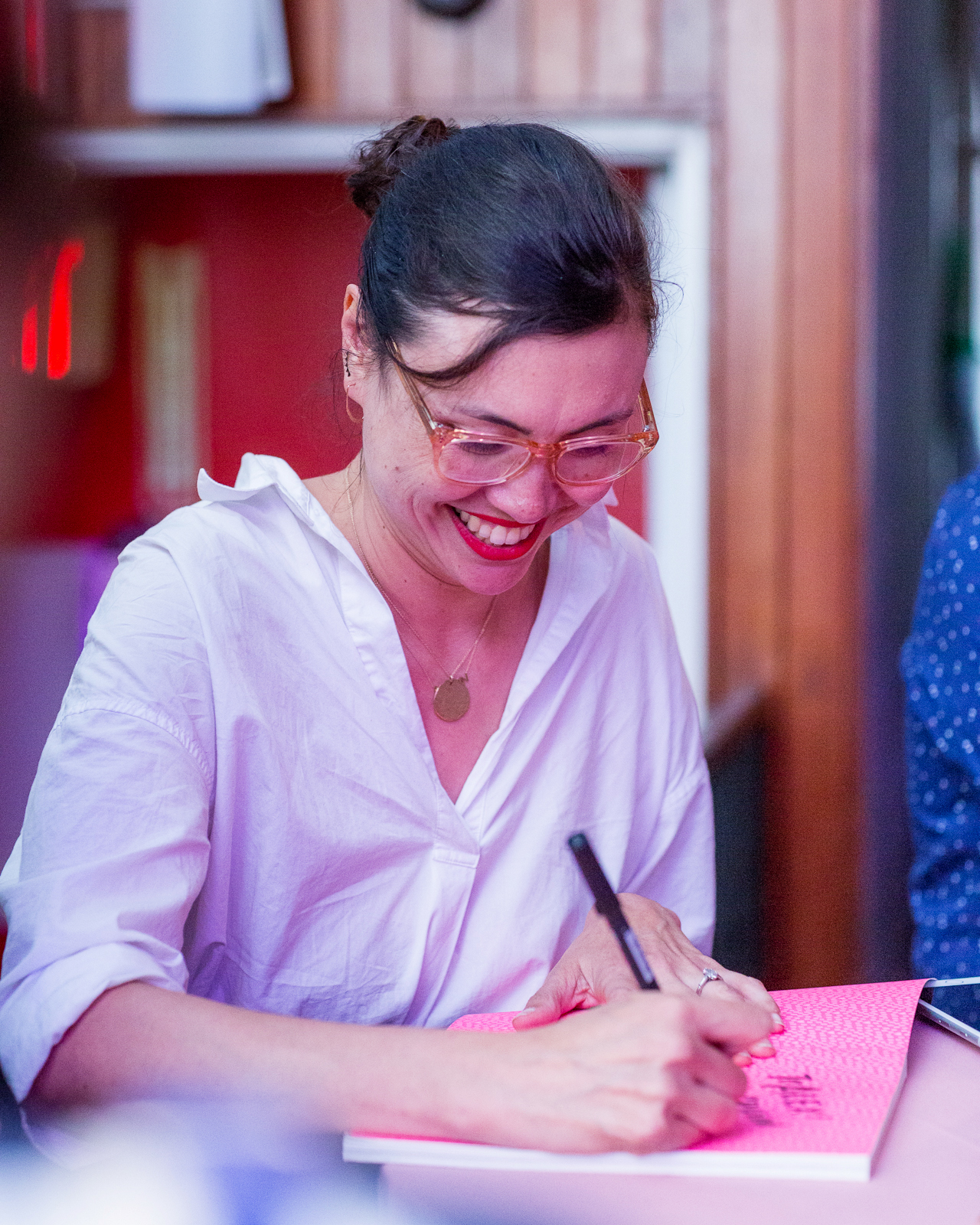
Oh! And Mixbook also brought Eunice from Hello!Lucky to sign copies of her brand new book, Be the Change, and do some illustrations on Hello!Lucky for Mixbook stationery. So fun!

Paper Party 2018 / Colorful Modern Abstract Art Party Inspiration

Paper Party 2018 / Colorful Modern Abstract Art Party Inspiration

Paper Party 2018 / Colorful Modern Abstract Art Party Inspiration

Paper Party 2018 / Colorful Modern Abstract Art Party Inspiration

Paper Party 2018 / Colorful Modern Abstract Art Party Inspiration

Paper Party 2018 / Colorful Modern Abstract Art Party Inspiration

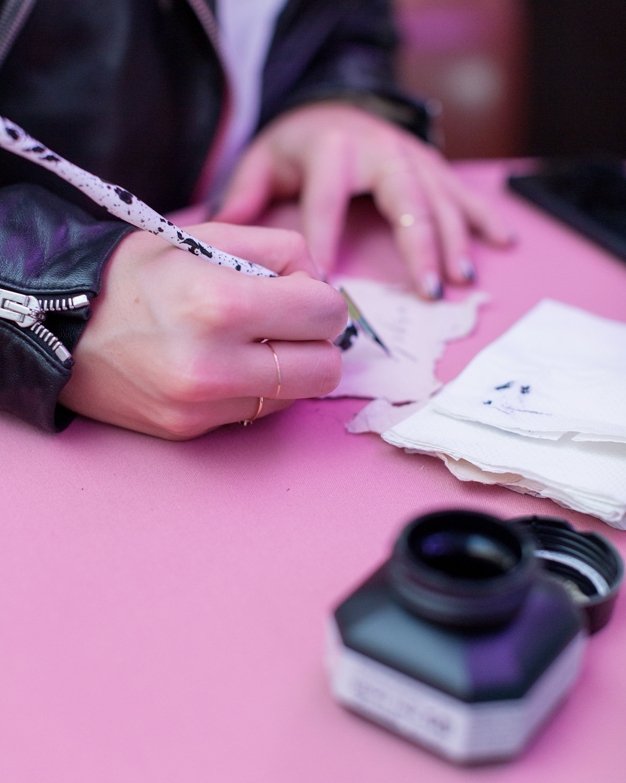
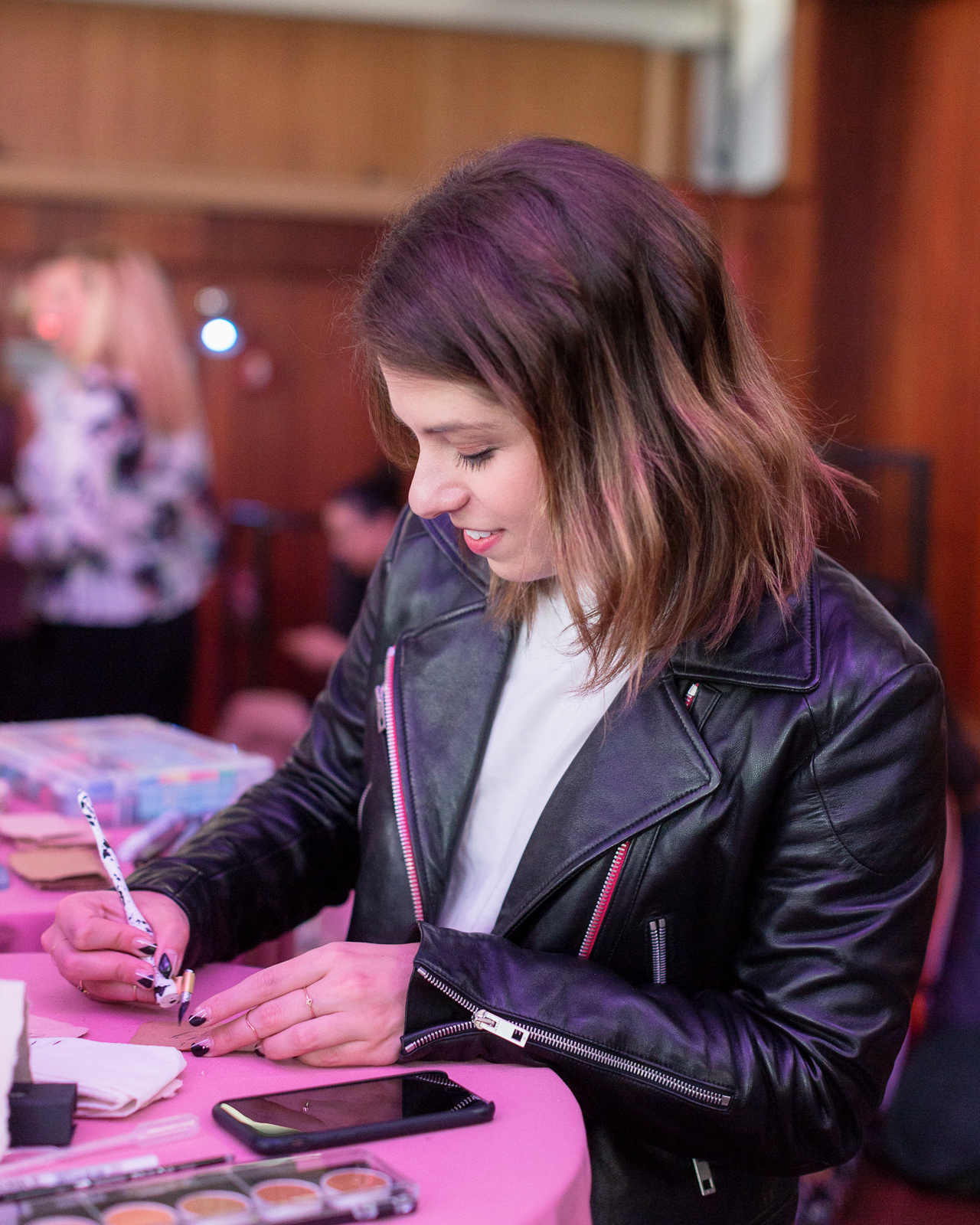
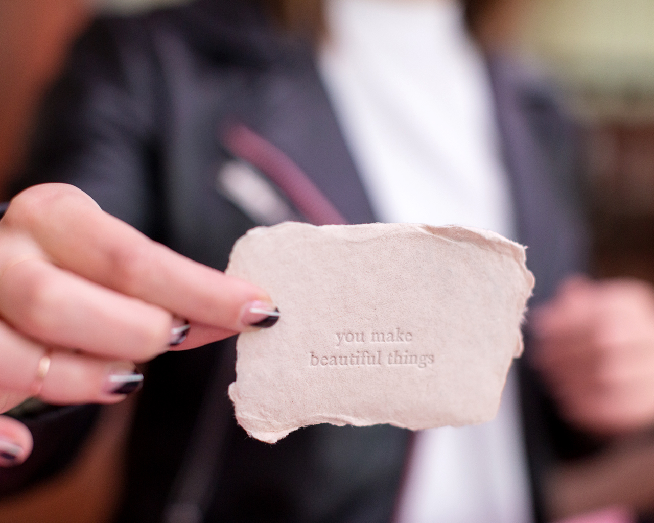
I also love having an interactive element at the party – and this year it was a calligraphy bar in collaboration with Paper & Ink Arts! The uber-talented Sam Teich hung out ALL night to do calligraphy demos using a variety of Paper & Ink Arts tools and materials, including this Paint Your Own Oblique Holder, this pointed oblique holder with a Tachikawa G Nib, a Fintec Metallic Palette, Ziller Ink in Wild Viola Violet and Wild Rose Pink, Sumi Ink, and a Size 1 Princeton Series Round Brush.

Paper Party 2018 / Colorful Modern Abstract Art Party Inspiration

Paper Party 2018 / Colorful Modern Abstract Art Party Inspiration

Paper Party 2018 / Colorful Modern Abstract Art Party Inspiration

Paper Party 2018 / Colorful Modern Abstract Art Party Inspiration

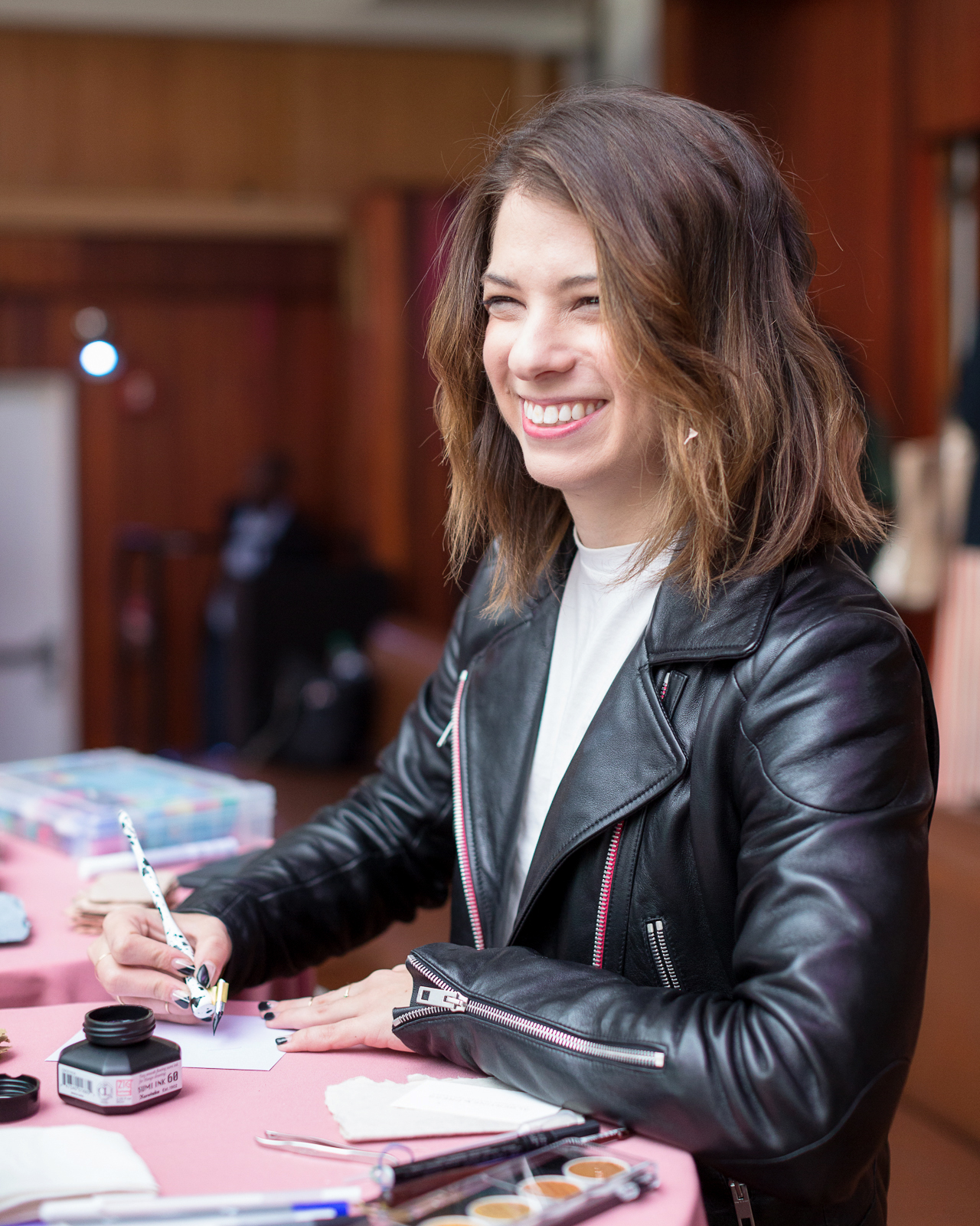
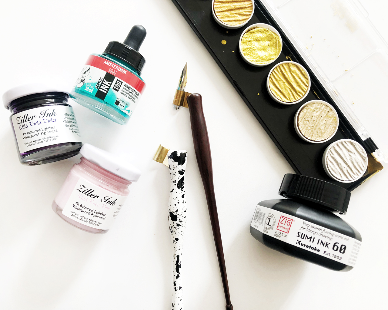
Farmette Press also sent an assortment of their GORGEOUS handmade papers for Sam to write on! They make the most beautiful paper in an amazing assortment of colors – I want them all!

Paper Party 2018 / Colorful Modern Abstract Art Party Inspiration

Paper Party 2018 / Colorful Modern Abstract Art Party Inspiration

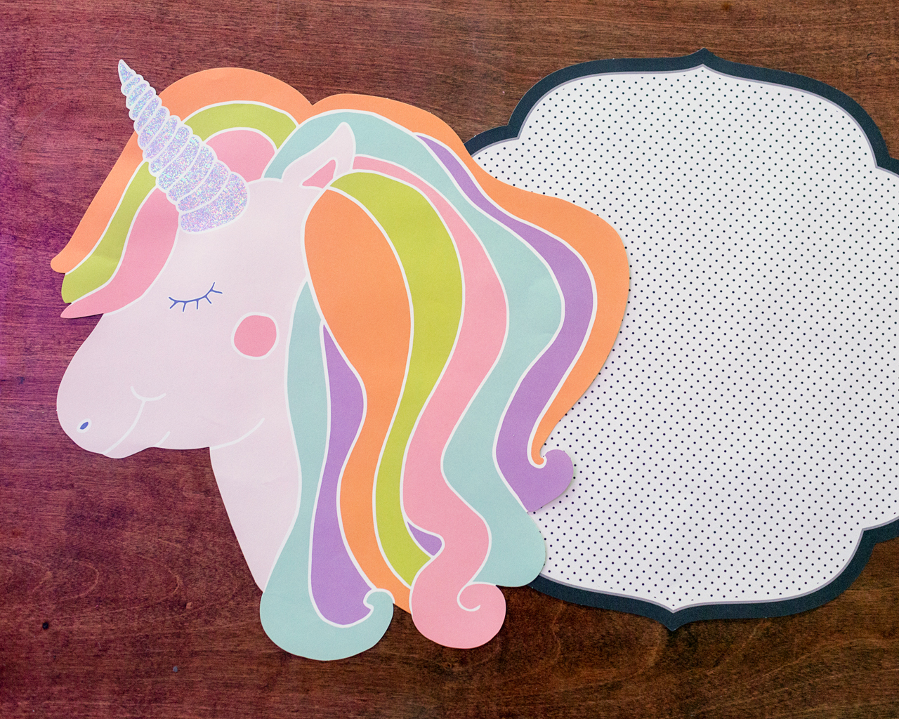
The CUTEST paper placemats from Hester & Cook! I couldn’t resist these die cut unicorn placemats – that hologram foil on the horn!! – and the black and white swiss dot placemats were perfect for our tall round cocktail tables. Pretty much everything in this Sorbet collection was perfect for the party!

Paper Party 2018 / Colorful Modern Abstract Art Party Inspiration

Paper Party 2018 / Colorful Modern Abstract Art Party Inspiration

Paper Party 2018 / Colorful Modern Abstract Art Party Inspiration

Paper Party 2018 / Colorful Modern Abstract Art Party Inspiration

Paper Party 2018 / Colorful Modern Abstract Art Party Inspiration

Paper Party 2018 / Colorful Modern Abstract Art Party Inspiration

Paper Party 2018 / Colorful Modern Abstract Art Party Inspiration

Paper Party 2018 / Colorful Modern Abstract Art Party Inspiration

Paper Party 2018 / Colorful Modern Abstract Art Party Inspiration

Paper Party 2018 / Colorful Modern Abstract Art Party Inspiration

Paper Party 2018 / Colorful Modern Abstract Art Party Inspiration

Paper Party 2018 / Colorful Modern Abstract Art Party Inspiration

Paper Party 2018 / Colorful Modern Abstract Art Party Inspiration

Paper Party 2018 / Colorful Modern Abstract Art Party Inspiration

Paper Party 2018 / Colorful Modern Abstract Art Party Inspiration

Paper Party 2018 / Colorful Modern Abstract Art Party Inspiration

Paper Party 2018 / Colorful Modern Abstract Art Party Inspiration

Paper Party 2018 / Colorful Modern Abstract Art Party Inspiration

Paper Party 2018 / Colorful Modern Abstract Art Party Inspiration

Paper Party 2018 / Colorful Modern Abstract Art Party Inspiration

Paper Party 2018 / Colorful Modern Abstract Art Party Inspiration

Paper Party 2018 / Colorful Modern Abstract Art Party Inspiration

Finally, a HUGE thank you to the wonderful sponsors and people who made the evening possible:

  • Infinite thanks to Janice, Melinda, Kelly, and Caroline, for their invaluable help over the past few months and throughout the evening – and our small army of friends who helped with set up before the party. We couldn’t have done it without you!

And of course a big thanks to CJ of Charlie-Juliet Photography for the gorgeous photos and Hudson Terrace for having us!

Photo Credits: Charlie-Juliet Photography

Soft Neutral Vineyard Wedding Invitations

Soft neutral hues never go out of style. Michelle of Honey Paper designed these soft neutral vineyard wedding invitations inspired by the gorgeous venue nestled in the California mountains. Add in some vinyeard-inspired botanical illustrations, gold wax seals, and curated vintage postage and you’ve got the recipe for one seriously elegant and refined wedding invitation!

Soft Neutral Vineyard Wedding Invitations by Honey Paper

From Michelle: Between the San Rafael and Santa Ynez Mountains the summers are warm and rainless, dense with thickets of shrub and stippled in gray pine, wild cotton and a long list of oaks. The narrow, steep ranges are considered young at five million years old. Alluvial soils of the valley bear the plants of myth: bay laurel, rosemary, grape and olive. The Santa Ynez Valley is vintner’s and an artist’s dream. Gravelly soil bakes white in the sun while the slender olive leaves shake and bristle like birds in flight. The villa at Sunstone Vineyards and Winery was built under a seafaring sky in the heart of this beautiful place.

Soft Neutral Vineyard Wedding Invitations by Honey Paper

Soft Neutral Vineyard Wedding Invitations by Honey Paper

When the Rice family founded Sunstone Vineyard and Winery it became one of the first organic vineyard estates in the region. Everything about their venture has remained true to the story of the land, from practicing sustainable viticulture to incorporating hillside caves among dense blankets of wild grasses and evergreen. Antique wooden beams, once privy to the smells and sounds of a Victorian lavender factory, were brought from England and integrated into the architecture. The villa is a testament to the materials and practices of the old world integrated seamlessly to meet modern standards. Thick walls of local stone were finished with imported French limestone and elegant terra cotta roof tiles. The villa is an architectural gem that simultaneously preserves the past and shapes the future.

Soft Neutral Vineyard Wedding Invitations by Honey Paper

We wanted the stationery to capture the essence of the light at Sunstone. We paired a pale clay-colored ink with soft white paper. Each piece of the suite and day-of details, including menu and escort cards incorporate the silhouette of slender olive leaves and branches. The subtle design is reminiscent of a sun print – light waves patiently breaking down the fragile color bonds leaving only traces of color. The envelope and invitation enclosure are a nod to sandstone – a rock whose only memory is of the sea. Each invitation was wrapped in a buttery white ribbon and completed with a golden wax initial seal.

Soft Neutral Vineyard Wedding Invitations by Honey Paper

Fine linens and freshly cut greenery were arranged on long tables with wooden benches and tawny pillows under the shade of the high walls. The wedding cake arrived: three tiered, quartz on sky on the softened teal of mountain bluebird. All of the details came together in this inspiring land of rocky outcroppings, sandstone, shale and limestone. A place where the sun leaves a trace of its brightness behind.

Soft Neutral Vineyard Wedding Invitations by Honey Paper

Thanks Michelle!

Design and Calligraphy: Honey Paper

Check out the Designer Rolodex for more tal­ented wed­ding invi­ta­tion design­ers and the real invi­ta­tions gallery for more wedding invitation ideas!

Photo Credits: Ashley and Erik Fine Art Photography

Dramatic Black Meets Romantic Mermaid Wedding Invitations

This is certainly a first! Dramatic black meets romantic mermaid wedding invitations, brought to us by Victoria of Design House of Moira. I never would have thought to pair rich black hues with subtle mermaid themed pastels, but it works OH SO WELL! What’s more, the flourished calligraphy and oversized wax seal are just the right amount of bold and beautiful for this over the top modern yet aquatic suite! What a fun and fresh look!

Dramatic Black Meets Romantic Mermaid Wedding Invitations by Design House of Moira

From Victoria: We had an unusual combination of requests from this bride: she wanted black, dramatic, foil printing, handmade paper, a large scale wax seal, unusual size, and mermaid paper (yes, mermaid paper).

Dramatic Black Meets Romantic Mermaid Wedding Invitations by Design House of Moira

Since size and handmade paper are the most difficult, we started there. We collaborated with Owl Post Calligraphy to create a custom order of black handmade paper in 8×11 inches. We wanted to be able to fold the invitation into thirds, so we paired it with inserts that were long and thin to fit inside the folded invitation. We choose a long envelope that opened with a flap rather than on the end of a #10 envelope.

Dramatic Black Meets Romantic Mermaid Wedding Invitations by Design House of Moira

The mailing envelopes were a gorgeous handmade paper from Spain with a lacy and delicate deckled edge, while the reply envelope was a deep matte black.The wording on the invitation was also unusual. The wedding was hosted by the bride, groom and their son, whose names are listed together as a family.

Dramatic Black Meets Romantic Mermaid Wedding Invitations by Design House of Moira

The additional inserts were all hand painted with watercolor in shades of blues, teals, and purples (mermaid colors!) on Italian paper with an extremely soft felt finish and delicate deckled edge. We selected the Italian paper for its cotton content and knowing that it wouldn’t buckle or warp with the watercolor.

Dramatic Black Meets Romantic Mermaid Wedding Invitations by Design House of Moira

Dramatic Black Meets Romantic Mermaid Wedding Invitations by Design House of Moira

We paired an extremely formal and flourished calligraphy style selected by the bride and with a simple sans serif. We then selected a pale silver with a slightly matte finish for the printing. We wanted to be able to use the same printing on all four paper types included in the suite – Spanish and Italian handmade paper, custom black handmade paper and the flat black envelope.

Dramatic Black Meets Romantic Mermaid Wedding Invitations by Design House of Moira

We created a logo for the couple of XX representing the day they decided to become a family. The XX logo was featured on the 2” wax seal as well as the return address and reply card envelope. The entire suite was folded and tucked inside the gorgeous, ivory Spanish paper envelope and addressed in matching formal calligraphy. We choose Oscar de la Renta postage with two stamps per envelope.

Thanks Victoria!

Design and Calligraphy: Design House of Moira
Foil Printing: Viking Printing 
Custom black handmade paper: Owl Post Calligraphy 

Check out the Designer Rolodex for more tal­ented wed­ding invi­ta­tion design­ers and the real invi­ta­tions gallery for more wedding invitation ideas!

Photo Credits: Design House of Moira

Understated Blush and Teal Wedding Invitations

The serif typography in these understated blush and teal wedding invitations is such a wonderful reminder that a well-curated serif typeface can make a stunning and modern statement. Designer Jaclyn Lee Bergmann, of her namesake Designed by Jaclyn, designed these beautiful invitations for her own special wedding celebration, with a gorgeous blush and teal color palette that is totally having a moment right now, rose gold and matte white foil, and dreamy vellum envelopes!

Understated Teal and Blush Wedding Invitations by Design by Jaclyn

From Jaclyn: As a visual designer, it was important to me that our wedding stationery reflect our personalities, relationship, and the laid-back elegance of our wedding day that we hoped to convey. Plus, it was such a personal (and indulgent!) experience to design for our very own wedding and our invitation suite now serves as the perfect reminder of that magical day.

Understated Teal and Blush Wedding Invitations by Design by Jaclyn

Understated Teal and Blush Wedding Invitations by Design by Jaclyn

While we were inspired by our redwood grove venue with its organic feel, we opted for something a bit more modern that both blended with and balanced out the rustic space. To do so, we paired clean lines, modern typefaces, and a hint of floral detail with a modern color palette of blush tones, rose gold, and rich dark teal to create our take on a fresh, modern elegant wedding invitation suite.

Understated Teal and Blush Wedding Invitations by Design by Jaclyn

A clean design for our main invitation let the gorgeous blush paper and rose gold foil shine, while the addition of our floral wedding logo added a lighthearted touch. Along with the main invitation we included a details card that featured a nature-inspired image from our engagement shoot and a screen-printed RSVP card in a rich dark teal hue. Together, the three pieces resulted in a playful range of texture and color.

Understated Teal and Blush Wedding Invitations by Design by Jaclyn

Understated Teal and Blush Wedding Invitations by Design by Jaclyn

To complete the suite, a printed vellum enclosure featuring our wedding logo held the three pieces together and added an elegant texture to the invitation. The printed vellum was folded to create a layered geometric look and allowed the recipient to see the layered stationery pieces upon receiving the invite. Lastly, each vellum enclosure was then sealed with a simple, yet bold rose gold sticker and slipped into an envelope.

Understated Teal and Blush Wedding Invitations by Design by Jaclyn

Understated Teal and Blush Wedding Invitations by Design by Jaclyn

We carried the layered approach of our invitation suite to our day-of wedding stationery as well, including our wedding programs and guest place cards. Our wedding programs featured three pieces of varying sizes and color paired with a simple rose gold paperclip, which when layered together created a clean, geometric look. While for the place cards, we layered blush and dark teal shapes to create a unique name tag for each guest.

Understated Teal and Blush Wedding Invitations by Design by Jaclyn

Our wedding stationery perfectly emoted the laid-back, modern elegant spirit we had envisioned for our wedding day and we love how it came together!

Understated Teal and Blush Wedding Invitations by Design by Jaclyn

Thanks Jaclyn!

Design: Design by Jaclyn
Printing: Czar Press

Check out the Designer Rolodex for more tal­ented wed­ding invi­ta­tion design­ers and the real invi­ta­tions gallery for more wedding invitation ideas!

Photo Credits: Jaclyn Lee Bergmann 

DIY Rainbow Watercolor Crepe Paper Backdrop

This post was sponsored, and paid for, by Rit Dye. All opinions are my own. Thank you for supporting the sponsors that make Oh So Beautiful Paper possible!

Spring is just around the corner – and I couldn’t be more excited! Every year I look forward to the explosion of spring flowers, from pale pink cherry blossoms and purple lilacs (my absolute favorite) to yellow daffodils and colorful tulips in nearly every shade of the rainbow. Oh, and fluffy peonies in every shade of pink? Yes, please! Today I’m paying homage to my favorite season with a DIY rainbow watercolor crepe paper backdrop that is perfect for spring weddings, birthday parties, and everything in between. This gorgeous pastel backdrop makes me so happy every time I look at it. Oh, and my secret ingredient for creating this gorgeous backdrop? Spray bottles filled with Rit All-Purpose Dye!

DIY Rainbow Watercolor Crepe Paper Backdrop with RIT Dye

DIY Rainbow Watercolor Crepe Paper Backdrop with RIT Dye

DIY Rainbow Watercolor Backdrop with Rit All-Purpose Dye

Rit Dye is one of my favorite tools for DIY projects! It’s really the perfect solution for adding pops of color throughout your wedding ceremony and reception, from ribbons for floral arrangements to napkins and table linens to dresses! Rit All-Purpose Dye is perfect for washable fabrics with natural fibers, like cotton, linen, wool, silk, and ramie – or even for materials like nylon, rayon, paper, and wood. I’ve used Rit All-Purpose Dye to dip dye envelopes, create dip-dyed muslin favor bags, and even to dye my own Shibori-style pink dinner napkins! And did you know that there’s also Rit DyeMore for synthetic fibers?? You can use Rit DyeMore for polyester, polyester cotton blends, nylon, acrylic, or acetate – or even faux fur! I’ll need to try that one next!

DIY Rainbow Watercolor Crepe Paper Backdrop with RIT Dye

I was super excited to experiment with multiple Rit All-Purpose Dye colors to create this gorgeous watercolor-inspired backdrop. I mean, it’s a proven fact that rainbows make everything prettier. And a pastel rainbow? Even better! This pastel backdrop is made from a few rolls of white crepe paper spray dyed with fine mist spray bottles filled with Rit All-Purpose Dye. You can also use the same method to dye tissue paper decorations like honeycomb balls and tissue paper fans! Using spray bottles to create a super fine dye mist leaves the most gorgeous watercolor effect on crepe paper and tissue paper, and the result is completely unique wedding and party décor that you won’t find anywhere else!

DIY Rainbow Watercolor Crepe Paper Backdrop with RIT Dye

The best part about this DIY rainbow watercolor crepe paper backdrop is that you can completely customize the colors to suit your wedding color palette! Rit All-Purpose Dye is available in 50 shades, like Petal Pink, Coral, Violet, Aquamarine, and Kelly Green. Or you can create your own colors using the Rit Color Library, which includes color formulas to create over 500 additional colors – including Pantone on-trend colors by season! There’s seriously SO much color inspiration in the Rit Color Library! I love, love, love our pastel rainbow backdrop (you can find the specific color formulas I used a bit further below!), but I could also totally see a gorgeous ombré backdrop in several shades of a single color. How gorgeous would that be??

DIY Rainbow Watercolor Crepe Paper Backdrop with RIT Dye

Skill Level: Beginner

Approximate Crafting Time: 1 –2 Hours

Supplies

Rit All-Purpose Dye

2.5 oz Fine Mist Spray Bottles one bottle per dye color – I used a total of twelve spray bottles)

8-10 White Crepe Paper Rolls

Scissors

Protective rubber gloves

Rags or paper towels

Protective drop cloth

Measuring spoons

Gaffer’s Tape

Wood Dowels

Removable wall hooks

DIY Rainbow Watercolor Backdrop with Rit All-Purpose Dye

To make the DIY rainbow watercolor crepe paper backdrop:

Step 1. First, you’ll need to pick your colors! The Rit Color Library breaks all of the color formulas down by parent color: red, orange, yellow, green, blue, purple, pink, brown, and gray. I knew I wanted spring-inspired colors, so I went with shades of pink, peach, light purple, blue, teal, mint green, and sunny yellow. But I can’t wait to try this again with different color combinations. Burgundy and blush? Lavender and deep dusty blue? Sage green and rose? Yes, yes, and yes!

DIY Rainbow Watercolor Crepe Paper Backdrop with RIT Dye

Step 2. Now that you’ve chosen your colors, mix your colors according to the recommended formula in the Rit Color Library, dividing the recommended dye amounts by 1/4. Don’t forget to wear your protective gloves! We’re using smaller amounts of dye than we’d need if we were planning to dye textiles, but because we’re turning the dye into a super fine mist, we still need the dye to be a bit more concentrated and intense. Dividing the color formula recipe by four seemed to do the trick for me! Shake dye bottles before pouring. Using a measuring spoon, measure the amount of Rit All-Purpose Dye and carefully pour the dye into the small spray bottles, then fill the spray bottle with hot water. Shake carefully to mix.

DIY Rainbow Watercolor Crepe Paper Backdrop with RIT Dye / Process

Pro tip: be sure to label your bottles as you go, otherwise you’re bound to lose track of what’s what (trust me on this). I used a bit of washi tape and wrote the color formula on a small piece of tape, then taped the written formula to each bottle.

Here are the exact color formulas that I used to create the backdrop:

DIY Rainbow Watercolor Backdrop / Rit All-Purpose Dye Color Formulas

Step 3. Unravel each roll of white crepe paper until it’s one big long sheet, then place each sheet on top of a protective drop cloth on the floor of your workspace. Before you start spray dyeing, be sure to test your colors on a test sheet of crepe paper – or even just on a paper towel – and let it dry completely. The colors will become more intense as they dry! If a color is too dark, pour out a portion of the bottle and add more water to dilute the color. If you need a color to be darker, I found it easiest to pour out the entire 2.5 oz bottle and start over – usually doubling the original quantity of each color (i.e., going from 1/2 teaspoon of kelly green to 1 teaspoon of kelly green to get the perfect shade of mint green).

DIY Rainbow Watercolor Crepe Paper Backdrop with RIT Dye

Step 4. Using one spray bottle at a time, spray a very light coat of Rit All-Purpose Dye all over each sheet of white crepe paper, using each dye color in rainbow order. I switched things up a bit with the color order; sometimes I would start with pink or peach at the top and work my way down to lavender, other times I started with lavender and end with blue. Whatever order you choose, place analogous colors next to each other (oranges into pinks into purples) so the colors flow smoothly into each other and don’t end up looking muddy. For the best and most consistent results, make sure the crepe paper doesn’t get too wet and blot the nozzle with a paper towel or a rag after 5-8 pumps to maintain a fine spray mist.

DIY Rainbow Watercolor Crepe Paper Backdrop with RIT Dye

DIY Rainbow Watercolor Crepe Paper Backdrop with RIT Dye

Step 5. Once you’ve dyed all of your crepe paper, apply a couple pieces of gaffer’s tape to one end of each sheet and tape the paper to the floor. Then, pull on the other side of the paper to remove the stretch in the crepe paper and tape the other end to the floor. Allow the crepe paper to dry completely, around 30 minutes, then remove the gaffer’s tape. It’s gentle enough that it shouldn’t tear the paper as long as you’re very careful while removing it!

Step 6. To hang the backdrop, use a few pieces of gaffer’s tape to adhere the crepe paper to long wooden dowels and use non-damaging, removable wall hooks to hang the backdrop. For added depth and visual interest, layer the crepe paper sheets over each other – or even cut some of the sheets into a variety of widths and mix them all together!

DIY Rainbow Watercolor Crepe Paper Backdrop with RIT Dye

DIY Rainbow Watercolor Crepe Paper Backdrop with RIT Dye

Ta da! It’s such a quick and easy way to add a dose of color to a wedding or party – and you can use the same technique to turn any white paper decorations into a rainbow, from round honeycombs to tissue paper fans and fringe crepe paper garlands! I absolutely LOVE this idea for a wedding ceremony backdrop – which you can reuse as a photo booth backdrop for the reception! Just be prepared for this backdrop to inspire a bit of twirling from your younger guests.

DIY Rainbow Watercolor Crepe Paper Backdrop with RIT Dye

DIY Rainbow Watercolor Crepe Paper Backdrop with RIT Dye

DIY Rainbow Watercolor Crepe Paper Backdrop with RIT Dye

DIY Rainbow Watercolor Crepe Paper Backdrop with RIT Dye

Pastels! Rainbows! Gah, I just love this DIY rainbow watercolor crepe paper backdrop SO much! But what do YOU think?? If you make this crepe paper backdrop for your wedding or party, be sure to share a photo on Instagram with the hashtag #madewithosbp so I can see it!

This is a sponsored conversation written by me on behalf of Rit Dye. The opinions and text are all mine. Check out the 50 shades of Rit All-Purpose Dye right here and browse over 500 color formulas in the Rit Dye Color Library here!


Photo Credits: Meghan Marie Photography and Nole Garey for Oh So Beautiful Paper