Yeehaw! Save the Dates

Molly from Paisley Quill recently sent over these fabulous Save the Dates – and I’m loving the rustic design inspired by some of the more iconic aspects and spirit of New Mexico:

Paisly-quill-yeehaw-save-the-dates

Molly says that the couple, Elizabeth and Paul, wanted a non-traditional design inspired by the natural beauty of New Mexico.  Molly added the image of a sunset and some lavender (which apparently grows like weeds all over New Mexico!) and used a desert-inspired color palette for the design.  They also incorporated some Native American basket weave patterns and designs into the Save the Date, since Elizabeth and Paul plan to include Native American traditions in their wedding ceremony.

Paisly-quill-yeehaw-save-the-dates2

The S/Ds were printed on kraft paper and packaged in glassine envelopes.  Since most of Elizabeth and Paul’s guests will be from outside of New Mexico, they decided to give the design a vintage travel-inspired twist by using vintage maps of New Mexico as address labels and completing the entire package with vintage stamps:

Paisly-quill-yeehaw-save-the-dates3

Paisly-quill-yeehaw-save-the-dates4

You can read more about these S/Ds over on the Paisley Quill blog right here.  Thanks so much Molly!

{images via Paisley Quill}

Unique Wedding Invitations with Hand Lettering

This week’s real invitations are some of the most distinctly personal DIY wedding invitations that I’ve featured here to date – and I hope you all love them as much as I do!  The invitations come to us from Haley, whose save the dates you might remember from here.  I’ve had the pleasure of getting to know Haley a bit better since I featured her save the dates in April, and her invitations suit her personality perfectly!

Haley-Wedding-Invitation-Full-Suite-hand-lettering

From Haley: When it came to the wedding invitations, I didn’t have to think twice about making my own.  I had so much fun designing the save the dates that there was no way I would pass up the invites.  Plus, I’m probably more picky about stationery than anything else and I don’t think even the most patient designer would want to deal with my paper particulars.
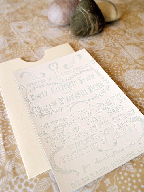
Haley-Letterpress-Wedding-Invitation-hand-lettering-top

At first I  had trouble, thinking my invitations had to be more formal than my save the dates (formality is not my strong suit).  As my wedding planning progressed it was clear that every aspect was going to be pretty DIY and I wanted the invites to reflect that.  I love to draw and I love to hand letter, but I don’t use pencil and I don’t use rulers, haha, so I must have made a billion versions until I finally had one I wanted.

Haley-Wedding-Invitation-hand-lettering-RSVP-detail

I wasn’t sure how I was going to get it printed.  I really had my heart set on letterpress (my love) but had trouble finding someone to do it.  Eventually my co-worker set me up with a printer friend of hers and she wonderfully accepted the project.  She did a beautiful job and printed everything in the AS220 Community Printshop here in Providence.

Haley-Wedding-Invitation-hand-lettering-Envelope-detail

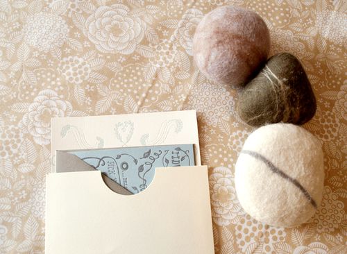
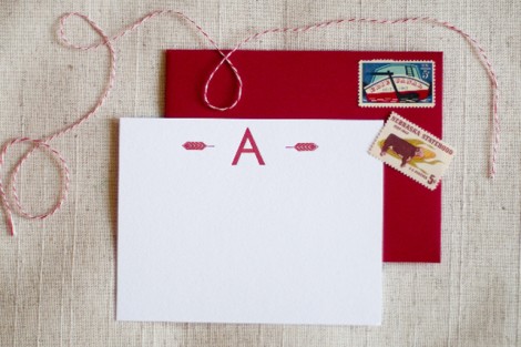
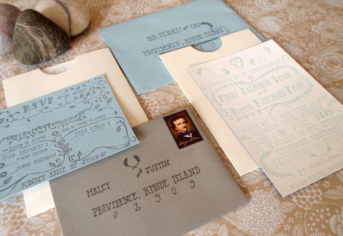
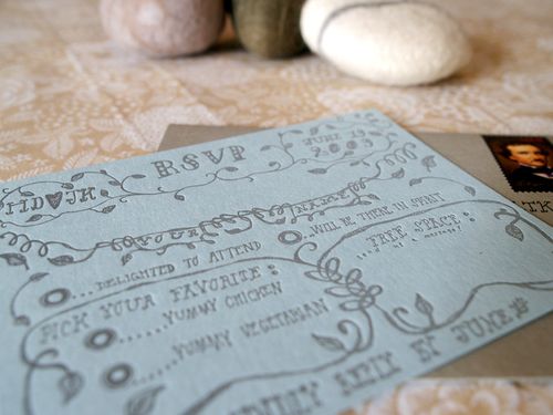
Haley had her invitations printed in a light seafoam color ink on an off-white linen texture paper backed in charcoal gray (see below), while the enclosed rsvp cards were printed in gray ink on light blue paper.  I love how Haley used a consistent color palette of blues, creams, and grays throughout the invitations, from the gray rsvp envelopes (complete with a stamp of Edgar Alan Poe!) to the blue invitation envelopes.  Haley packaged everything together in a half-moon enclosure envelope like these from Paper Source.

Haley-Letterpress-Wedding-Invitation-hand-lettering2

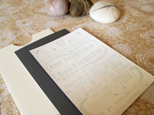
I’m also completely crazy for all of the amazing hand-lettering that Haley did for her invitations!  I can only imagine how effort Haley put into creating the design – although I’m sure it was a labor of love.  Just incredible.  You can see more of Haley’s unique hand lettering in her etsy shop right here.  Thanks so much Haley!

{all photos by Oh So Beautiful Paper}

Fun Wedding Table Numbers + Escort Card Idea

I saw these table numbers and escort cards over at The Bride's Cafe yesterday, and just thought they were the most adorable things ever:

Blue-table-number-signs 

Blue-seating-cards 

I love the bright pops of color!  So perfect for a summer wedding.  And how cute are the blue and yellow ceremony programs?

Blue-yellow-ceremony-programs 

You can check out the rest of the wedding – including the bride's lovely pink dress! – over at The Bride's Cafe and Sweet Monday Photography.


{images from Sweet Monday Photography via The Bride's Cafe}

Postal Press

I love it when my favorite creative bloggers start new ventures!  Alyson from Unruly Things is in the early stages of starting up a stationery shop called Postal Press, where she'll be selling letterpress stationery and packaging goodies:

Unruly-things-postal-press-letterpress-stationery
Unruly-things-postal-press-letterpress-stationery2
The photos above are just a tiny sneak peek… but boy am I excited to see what comes next!  Check out more details over at Unruly Things, and you can also sign up for e-mail updates over at Postal Press right here.  Congrats Alyson!
{images via Unruly Things}

Save the Date Idea – Layered Envelopes

The lovely + talented Cheree Berry is blogging about the details from her recent wedding over at The Bride’s Guide, and today she gave us a more detailed peek into her Save the Dates.  Needless to say, I’m in love:

Cheree-Berry-Save-the-Date-Matryoshka-dolls

Cheree-Berry-Save-the-Date-Matryoshka-dolls-envelope2

Cheree-Berry-Save-the-Date-Matryoshka-dolls-envelope

Cheree’s inspiration for these S/Ds came from Russian Matryoshka dolls – envelopes, each with a different design, were tucked inside each other as nesting layers, revealing the actual Save the Date once each envelope had been opened.  Absolute genius!

{images by Donna Newman via The Bride’s Guide}