Lucas’s Pokemon Birthday Party Invitations

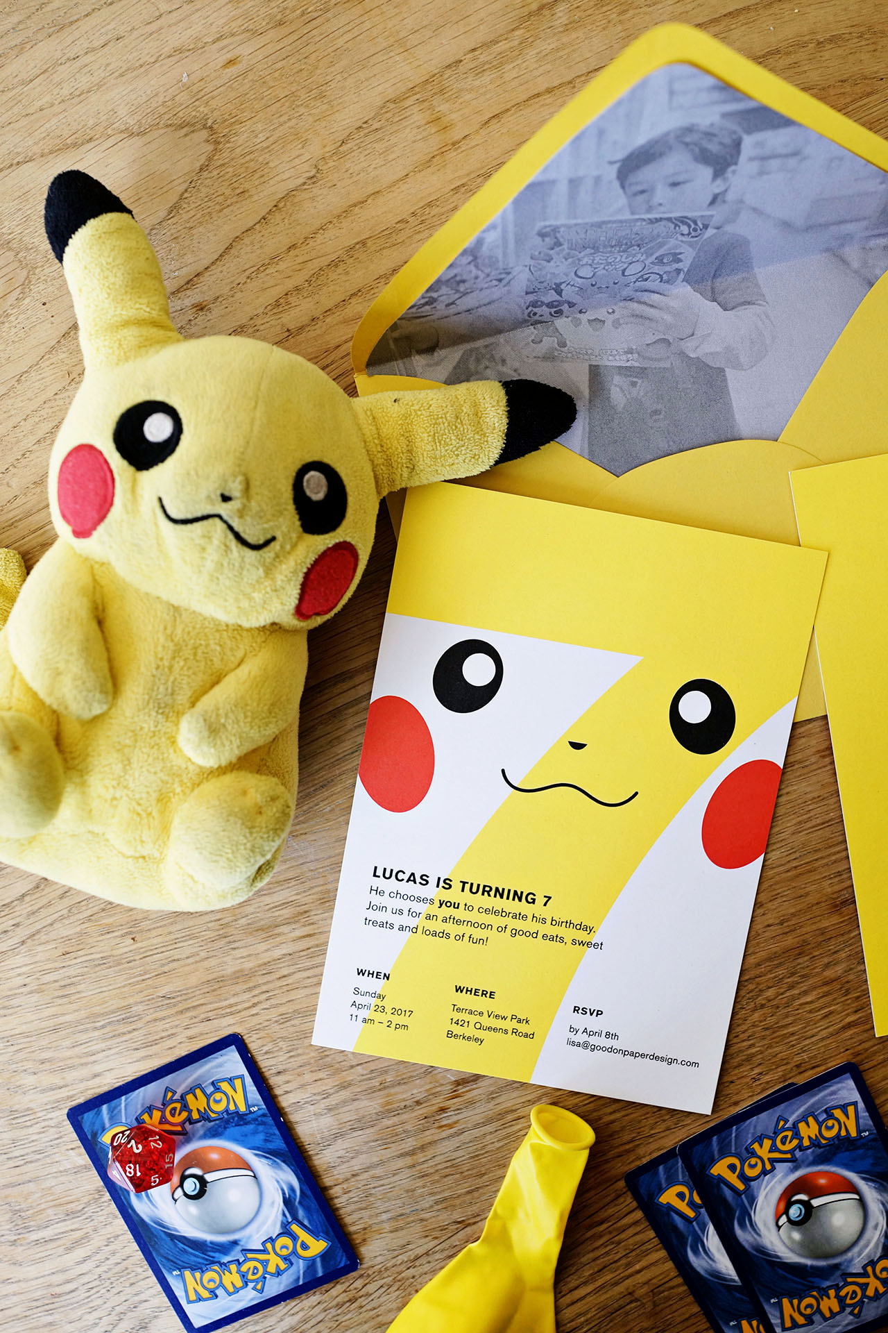
It’s so fun to see how talented designers interpret their kids birthday party theme requests, especially as they get older! I’ve had the pleasure of featuring every single birthday party invitation that Lisa from Good on Paper has designed for her sons Lucas and Theo, and I’ve loved watching the themes evolve from numbers to superheros to animals to magic. For Lucas’s 7th birthday party (!!!), Lisa put her spin on a Pokemon-themed party! For the Pokemon birthday party invitations, Lisa created her own modern take on a Pikachu design complete with a sunny yellow balloon and envelope liners with a photo of the birthday kid. So fun!

Pokemon Birthday Party Invitations from Good on Paper

Pokemon Birthday Party Invitations from Good on Paper

From Lisa: Lucas asked for a Pokemon themed party for his 7th birthday. As usual, I like to put my own modern spin on the theme. I designed the invitations with a simple and modern take on Pikachu’s face. I initially wanted to mail each invitation with a balloon that had a hand drawing of Pikachu’s face but it didn’t quite work out the way I wanted.

Pokemon Birthday Party Invitations from Good on Paper

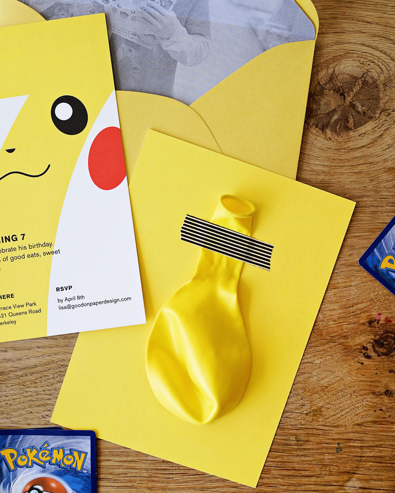
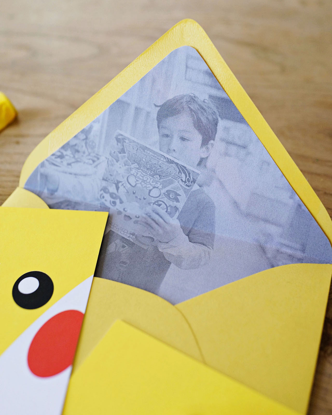
Instead, each invitation came with a yellow balloon taped to the yellow backing of the invitation with some black striped washi tape. The custom envelope liner had a photo of Lucas looking at a Pokemon book written in Japanese from our date to the Kinokuniya bookstore in San Francisco’s Japantown. The invitations were mailed in sunny yellow envelopes and sealed with wraparound address labels.

Pokemon Birthday Party Invitations from Good on Paper

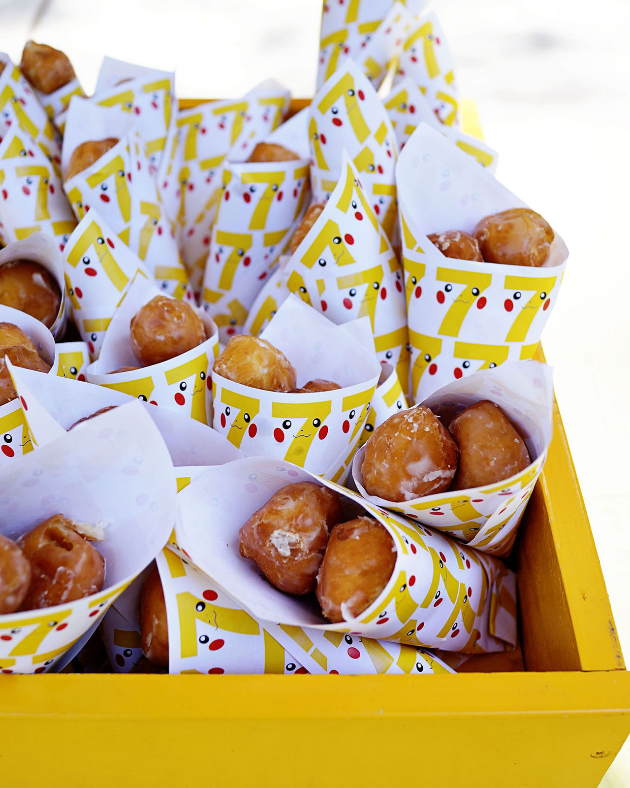
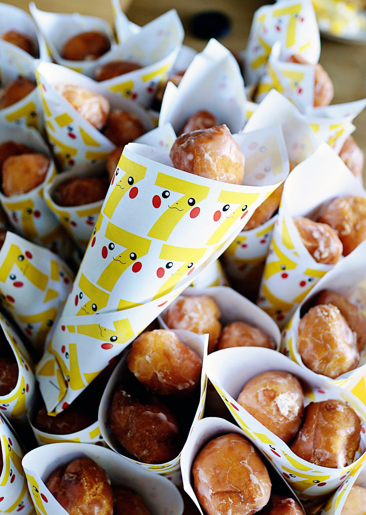
Every birthday party we throw includes donut holes and custom paper cones – definitely a big hit with the party guests!

Pokemon Birthday Party Ideas from Good on Paper

Pokemon Birthday Party Ideas from Good on Paper

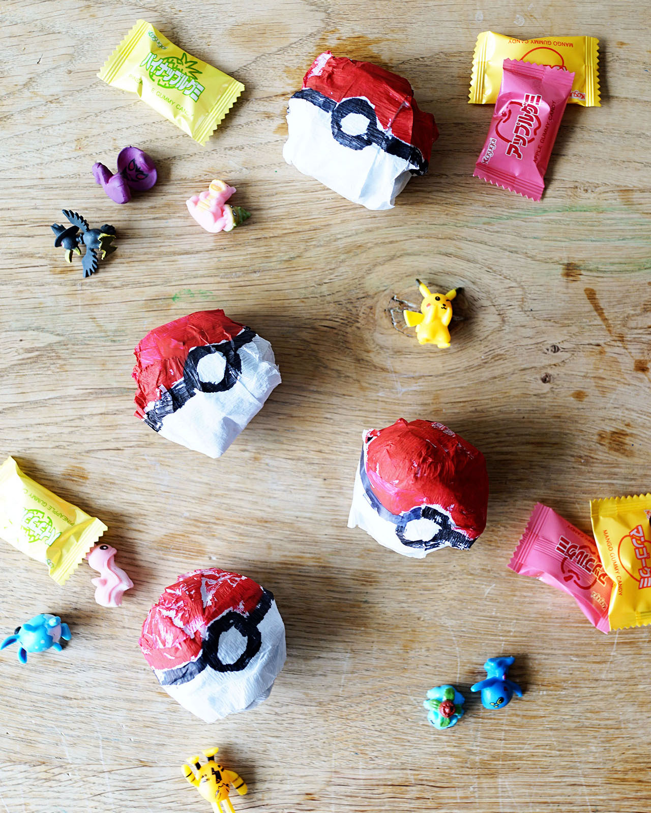
For the party favors, I made Poke Surprise Balls using white crepe paper streamers, a black Sharpie and red acrylic paint. Each Poke Ball included a few Pokemon figurines, Japanese candy, and a colorful whistle.

Pokemon Birthday Party Ideas from Good on Paper

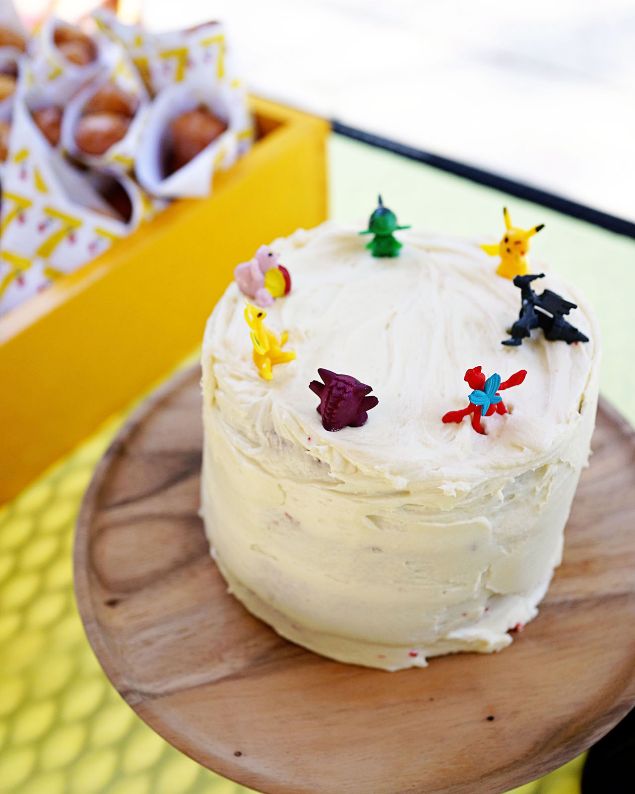
For the birthday cake, I made a super easy red velvet cake and cupcakes with cream cheese frosting. I had seen many Pinterest photos of cupcakes resembling poke balls but I didn’t have the time or energy to go that route. Instead, I just put seven Pokemon figurines on Lucas’s cake and one each on top of the cupcakes. The kids were so excited to get more figurines and negotiated trades.

Pokemon Birthday Party Ideas from Good on Paper

Pokemon Birthday Party Ideas from Good on Paper

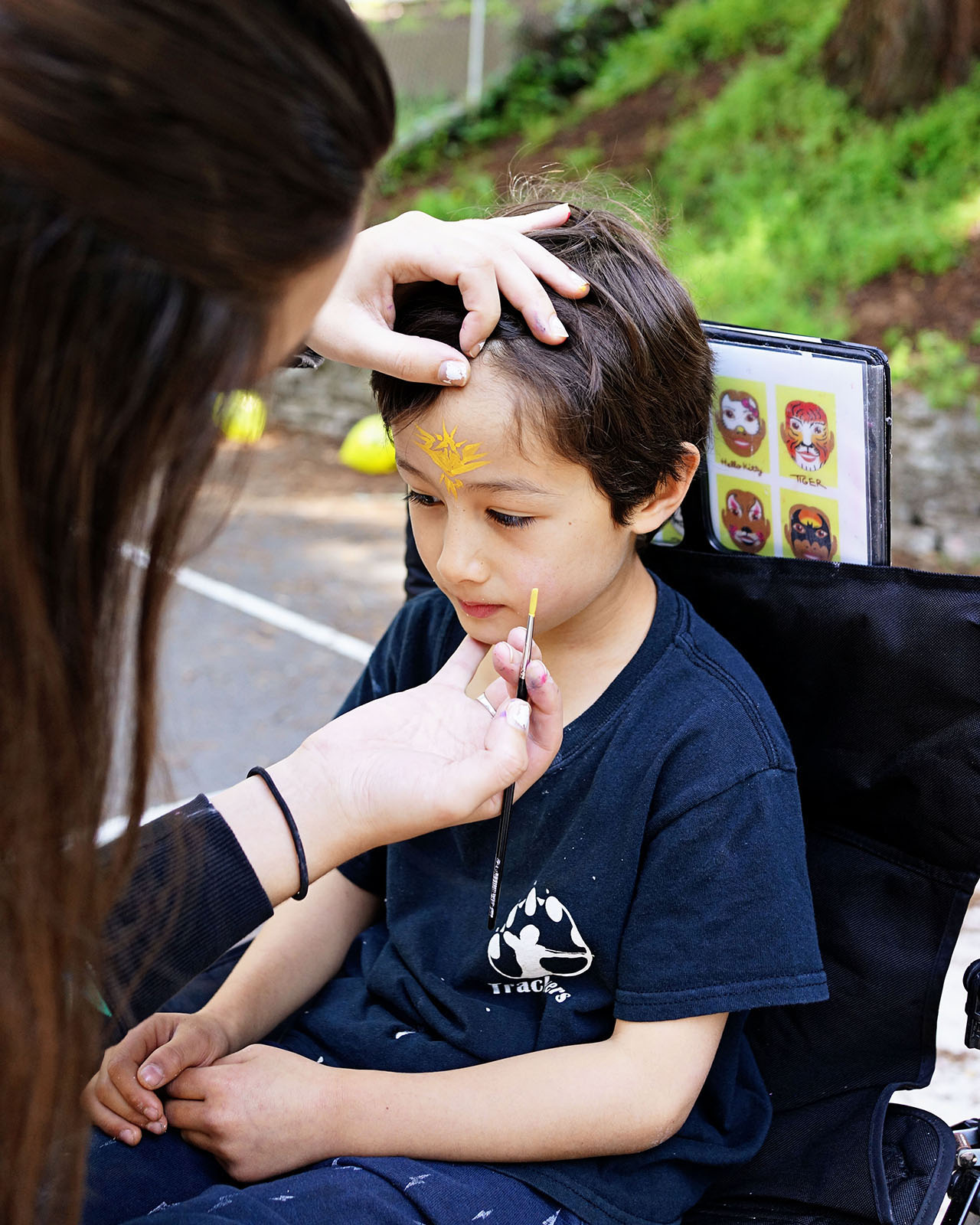
We also hired a face painter who specialized in Pokemon drawings. Some kids had their full face painted and others, like Lucas, just had a character drawn on their face or arm.

Pokemon Birthday Party Ideas from Good on Paper

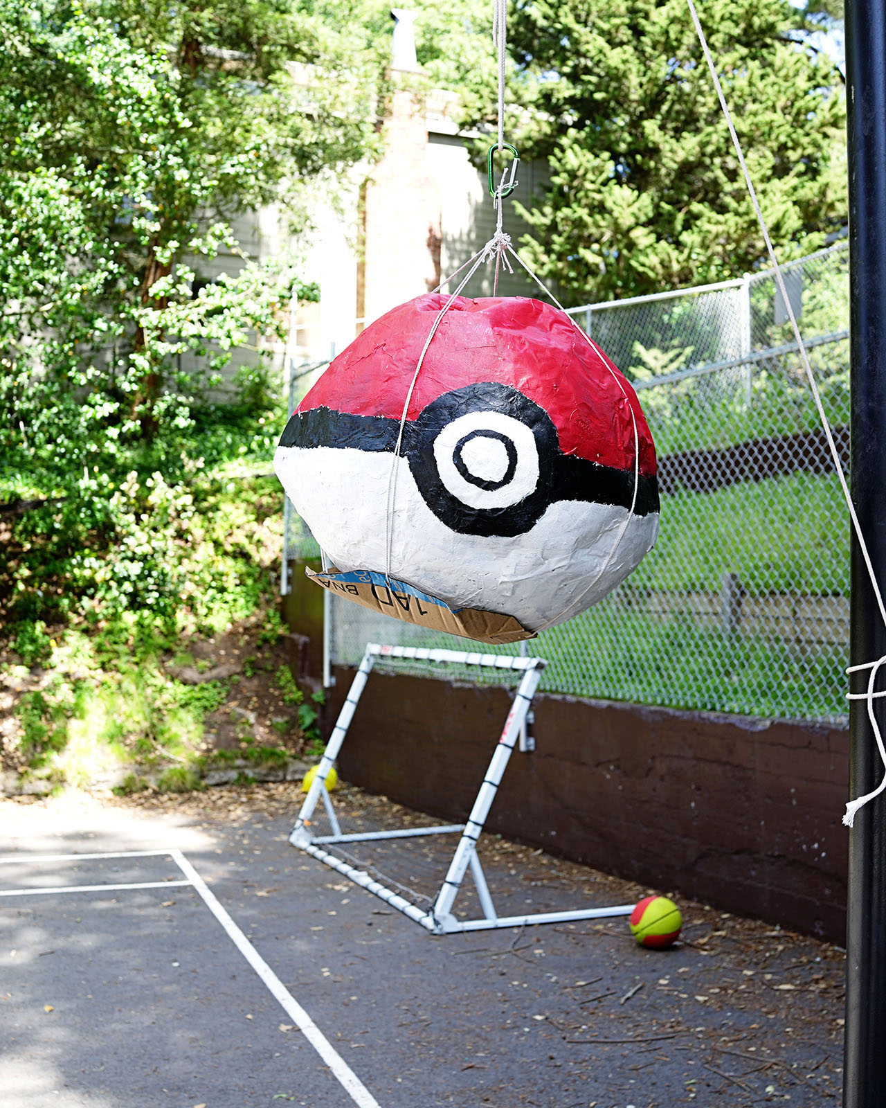
Every year, my husband Nick and I tag team on making the piñata. This year I made a giant Poke Ball using the paper maché method and filled it with Japanese candies and fruit gummies.

Pokemon Birthday Party Ideas from Good on Paper

Thanks so much Lisa! And happy 7th birthday Lucas!

p.s. You can also see the invitations from previous birthdays: 65, 4, 3, 2, and 1.

Photo Credits: Good on Paper

Stationery A-Z: More Graduation Cards

If you saw our post on graduation cards last week, you know that commencement season is in high gear. Before donning that classic polyester robe and mortarboard, take the time to pen a meaningful message of congratulations to celebrate hard-earned success. From food puns to neon typography, we’ve rounded up a wide assortment of cards to congratulate, celebrate and encourage any newly minted graduate on your list. Check out a few more of our selections below! Shauna

Graduation Card Round Up!

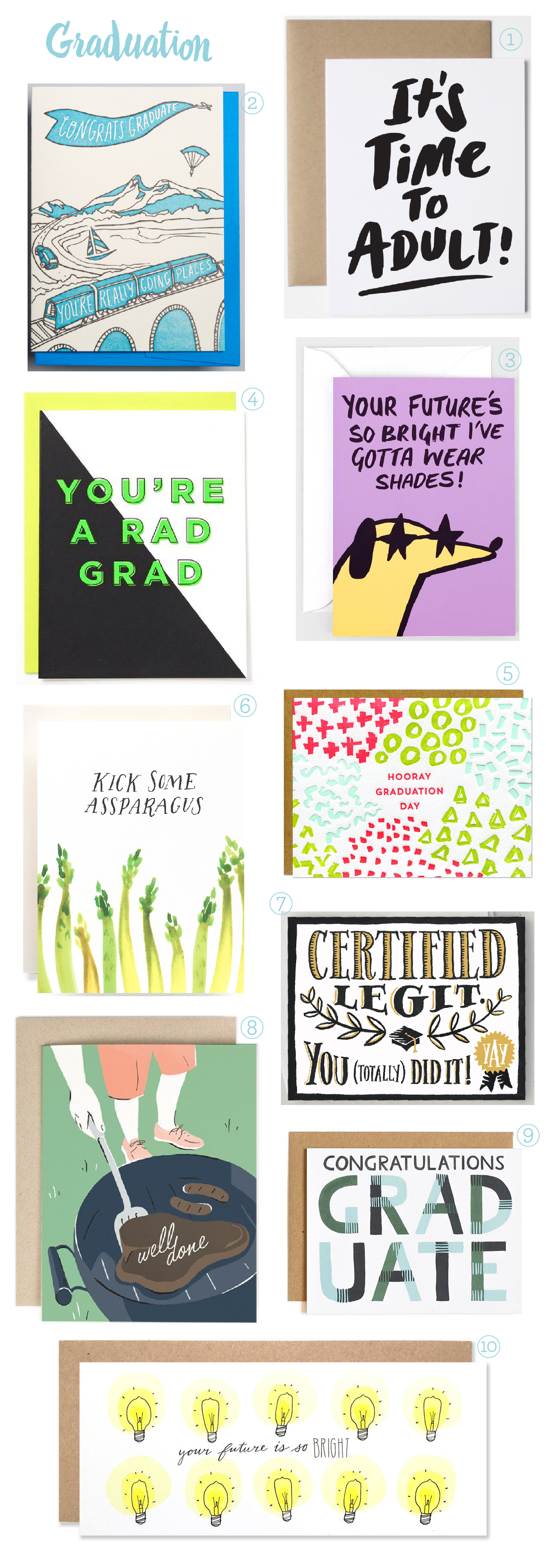
From top right:

1. I’m not sure exactly what ‘adulting’ entails, but I’m guessing it starts somewhere between paying bills and eating cookies for breakfast. From Orlando-based The Paper Cub.

2. Go places with this letterpress printed travel inspired graduation design from Wolf & Wren.

3. Animals in sunglasses. (Glitterati illustrated dog courtesy of Alice Bowsher for Wrap Magazine).

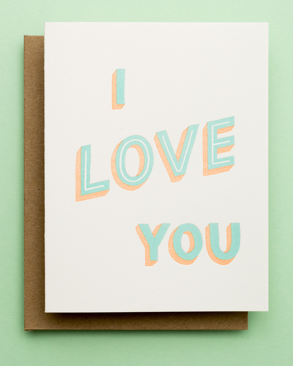
4. Saying it with bold typography and bright neon is the definitive way to get any point across. At least, according to Fig. 2 Design.

5. For those who are unfamiliar with letterpress printing, each individual color requires another run through the press. Which means this Parrot Design Studio card is a downright steal at $5 a pop.

6. Share with your hard-working graduate an encouraging message of posterior strength with this watercolor illustration from Antiquaria.

7. Present this diploma inspired greeting to the now legitimately certified college graduate (as well as some petty cash to get their new adult life going). Illustrated and designed by Idlewild Co.

8. If you know me, you know I literally never tire of a good food pun. This seasonally appropriate, BBQ-inspired design by Amy Heitman in no exception.

9. If your graduate is headed into the workforce, business casual will most likely be a part of their sartorial future. Share a precursor with this plaid greeting from One Canoe Two.

10. Your future IS so bright! Please note this card is the perfect size for a generous check (c’mon – they earned it!). From Hartland Brooklyn.

Behind the Stationery: Cheree Berry Paper

There’s something so incredible about seeing a small business started by one designer turn into a team of 20 employees over the course of 10 years! We’ve admired the work of Cheree from Cheree Berry Paper for every single one of those 10 years, and we’re beyond thrilled to welcome her to our newest installment of Behind the Stationery! Balancing her signature custom work with the retail stationery side of her business, Cheree shares about her team’s design process for both kinds of work and how they maintain that Cheree Berry touch. Take it away, Cheree! –Megan Soh
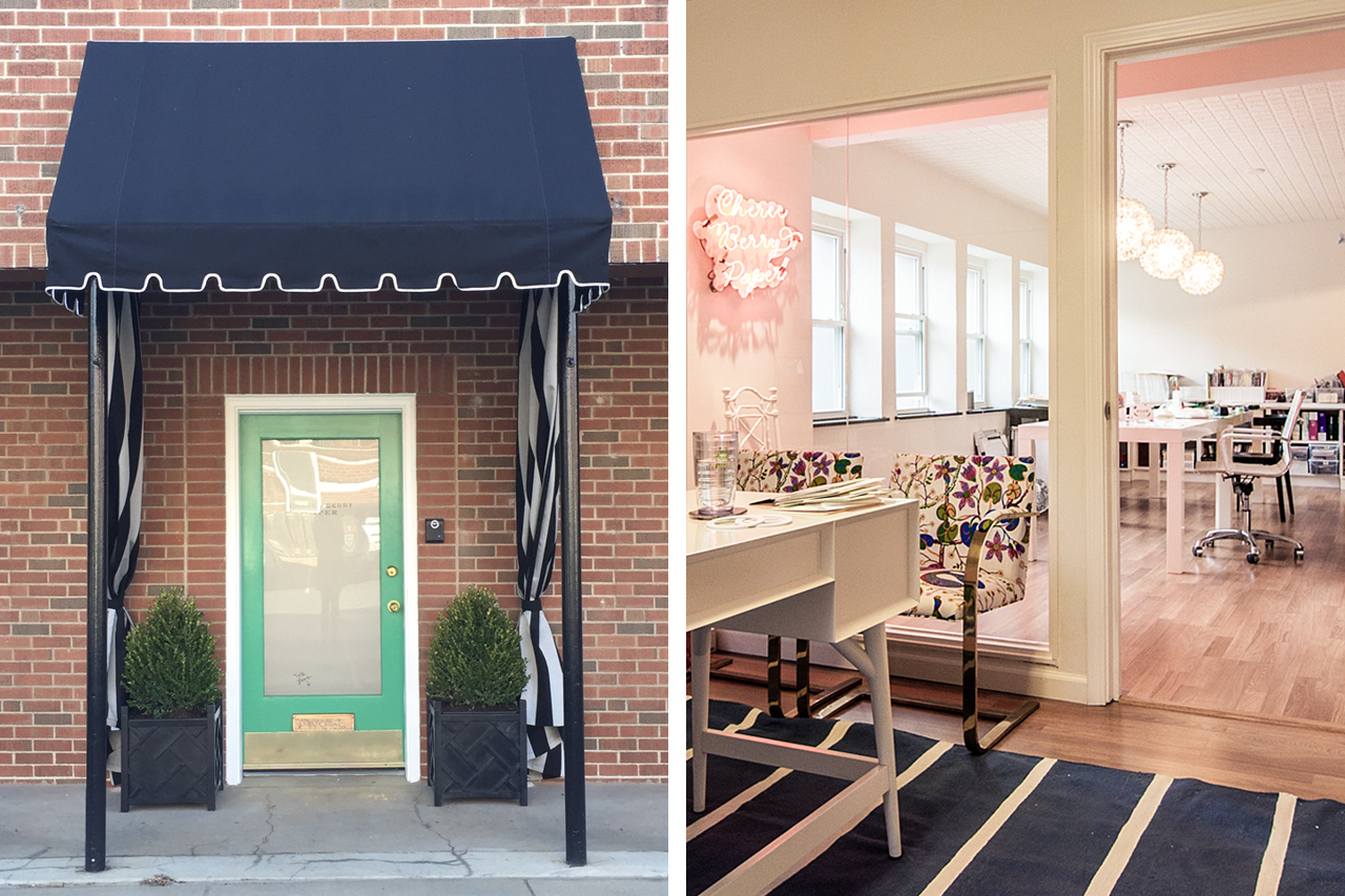
Behind the Stationery: Cheree Berry

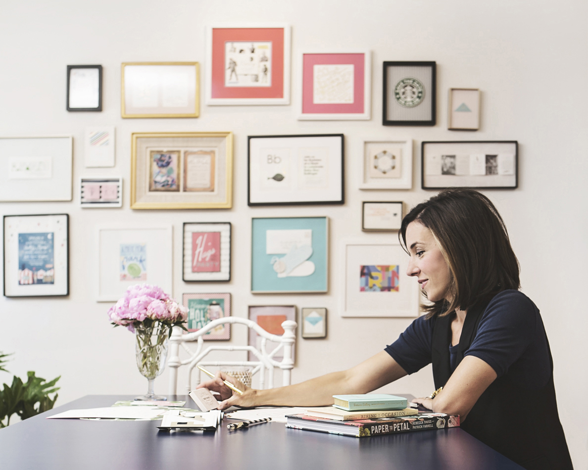
From Cheree: My love of all things paper started as a child. Visiting the Hallmark store was a treasured outing –there was just never enough time to open all of those cards. Fast forward to college, I chose graphic design as my major. With a BFA in hand from Washington University, I moved to NYC for my first design job at the graphic design powerhouse, Pentagram. Shortly after, I landed a position at the fashion company Kate Spade. It was at KS that I really fostered my love for paper, helping to create the company’s wedding stationery line with Crane & Co. In 2006, I returned to the Midwest for a beau (turned husband) and upon my arrival, I quickly started Cheree Berry Paper in my apartment.
Behind the Stationery: Cheree Berry

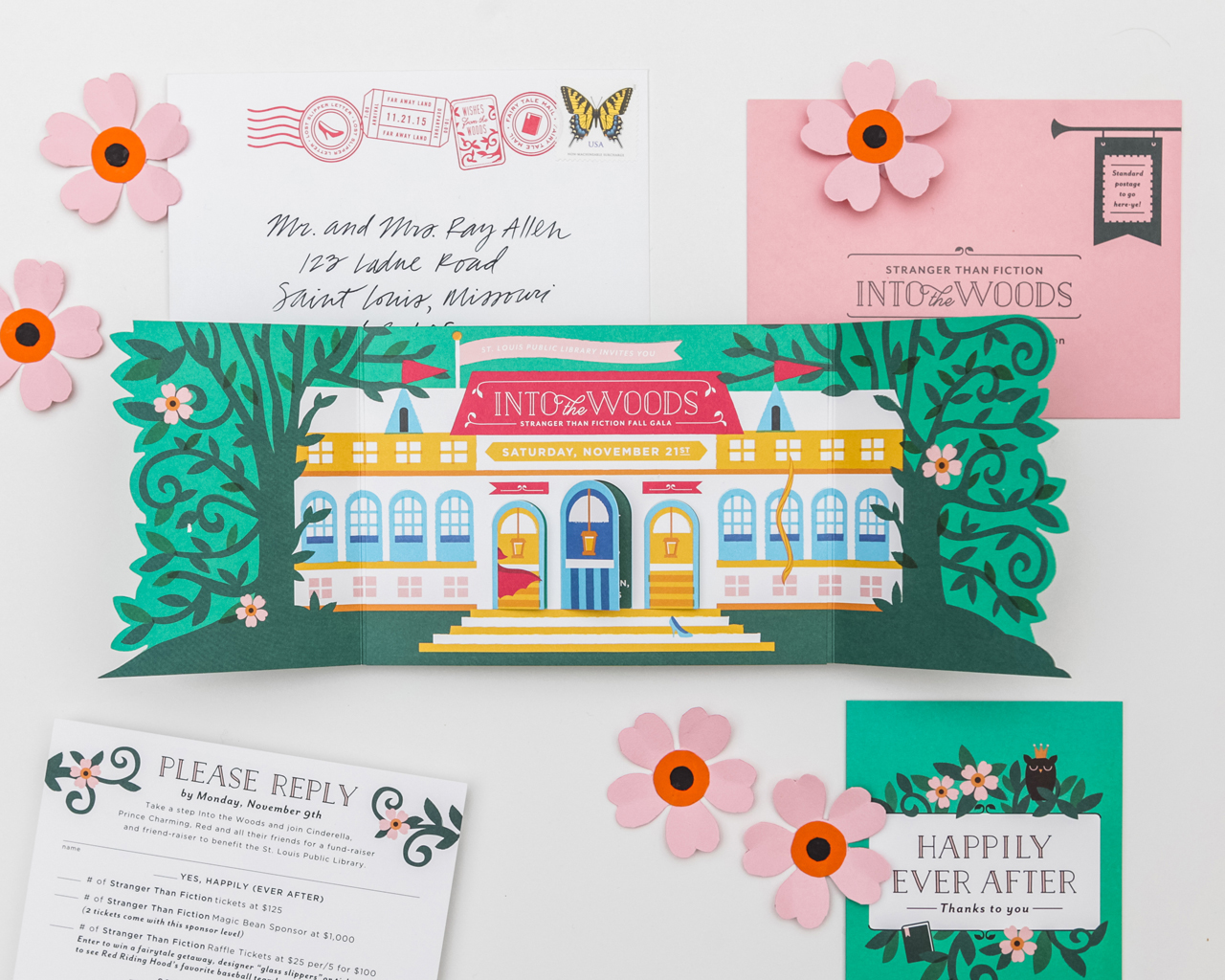
Work started coming in from across the country, and one employee has since turned into over twenty! And now that we are in our tenth year, you could say that we have two businesses camouflaged as one – the custom invitations and graphic design side that our business was built on and now the retail stationery side. Our love is the clever and unexpected. For our custom designs, our challenge is bringing stories to life on paper. For our retail stationery line, it’s creating something that is engaging and supportive of our visual voice.
Behind the Stationery: Cheree Berry

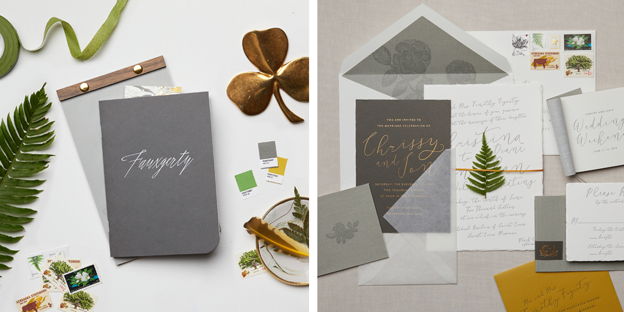
Custom: Our business was started on creating custom solutions for our clients, and this is where our passion still remains today. During the custom process, our first task at hand is to listen to the client’s story and vision. We love leaving a meeting or ending a call with lots of material, but not the exact design solution. After our client interaction, we sketch, research, and refine until we come up with two to three different design solutions to present. From there, with feedback from our clients, we work through revisions and ultimately get to the end result – it’s our job to ensure that our clients are as happy with the design as we are.
Behind the Stationery: Cheree Berry

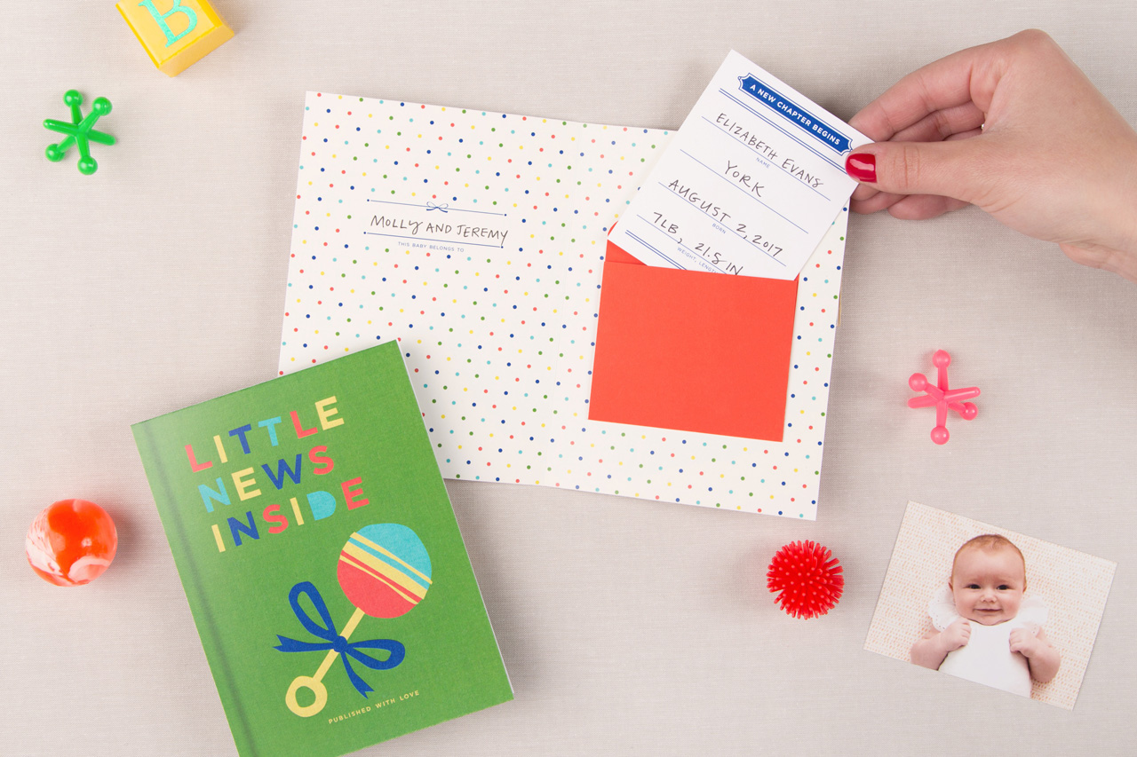
Retail: We are our very own test market. Our first mini line of stationery, produced about eight years ago, was created out of necessity in order to keep our own stationery drawers fully stocked. How do we create a line from scratch? We open our treasure chest of snail mail keeps and think about how these particular pieces made an impact. You’d be hard pressed to find a card in our retail stationery offering that is simply a rectangular card with a pretty design on the front. What you can find in our line? Unexpected formats, clever copywriting, hidden details, fun envelope touches that create anticipation, interactive moments and items that feel personalized without much DIY commitment.
Behind the Stationery: Cheree Berry

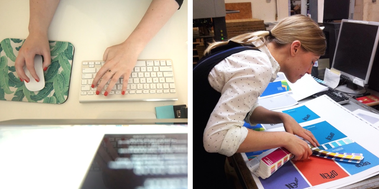
The design process typically starts with a client meeting or call including a project manager and a designer. We listen and ask questions to be able to achieve our ultimate goal – telling a personal story on paper with great design. Often the next step is mood boards or sketches to narrow a design direction. Timelines and budgets are set and then the design phase begins!
Behind the Stationery: Cheree Berry

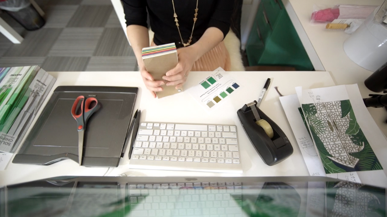
A few design options are presented to the client, then we get feedback and move to revisions before settling on a final design. Most of our designs mix lots of processes – letterpress, foil stamping, painted edges; really, whatever it takes to make the piece a stand-out while maintaining the budget we’ve been given. The final stop? Our production departments applies the finishing touches. We may be tying a booklet, lining an envelope, or placing the stamp just so. We delight in all the details.
Behind the Stationery: Cheree Berry

No one day is like another, but after coffee, I’m ready to check my email and see what happened after midnight. I make my to-do list for the day and the brainstorming, sketching and meetings begin. Lunch is usually at my desk, and when I need to fully focus, you might find me at a nearby coffee shop or bookstore. Four o’clock becomes six o’clock and then I’m rushing home to relieve my nanny. After dinner and a lengthy bedtime routine with my kids (that usually starts with a short dance party and ends with a Mo Willems book), I plug back into work once lights are out.
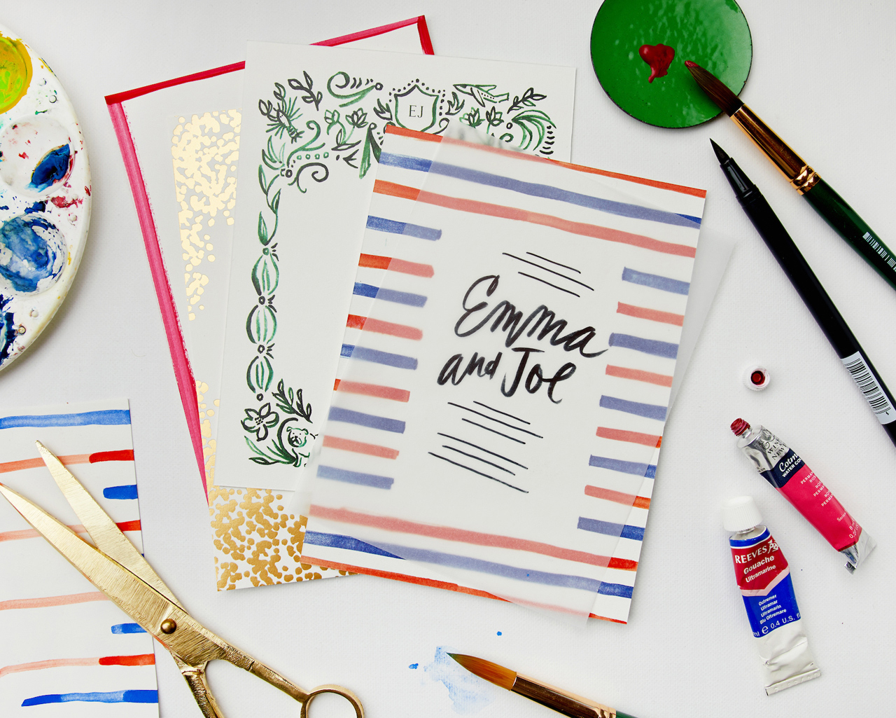
Behind the Stationery: Cheree Berry

Our team consists of designers, project managers, and a full production staff. Every department touches each job throughout the design and printing processes – without one department, our job could not get done! Our design team has a range of talents, so projects are assigned according to the project style and content. For example, we match the designer to the project based on whether the client’s vision includes a custom hand-drawn illustration, more focus on typography, hand lettering, etc.
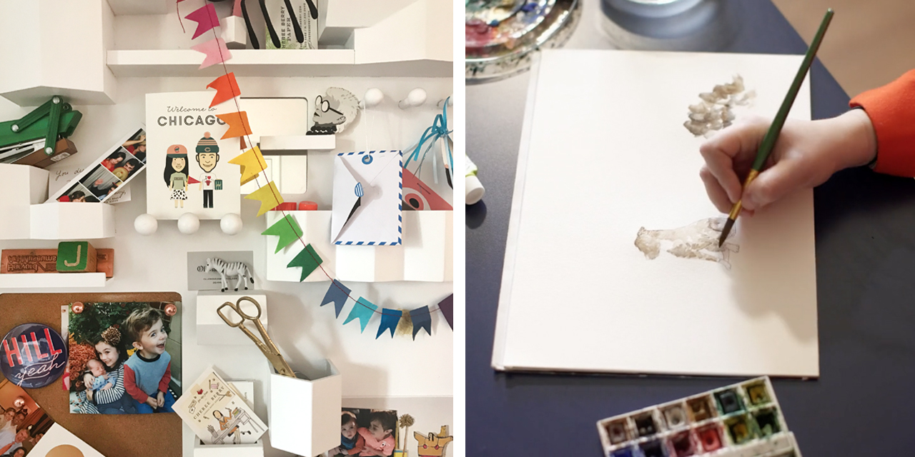
Behind the Stationery: Cheree Berry

Our project managers work very closely with our clients to ensure great communication throughout the process. Once a job has gone to print, it moves through a very thorough production process. There is no piece of stationery that leaves Cheree Berry Paper without being quality checked. Our jobs must finish as strong as they started.
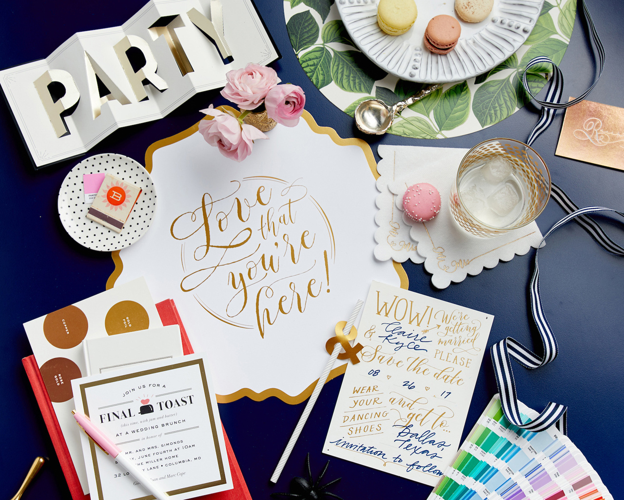
Behind the Stationery: Cheree Berry

The evolution for me is to focus on the big picture. I have a staff of fabulous designers and art directors so their talents allow me to think about vision, voice and concepts. I love connecting with them daily to see the brilliance brewing. Marketing is my big push right now. I am driven to get my Instagram message out there – a place where I showcase our work and occasionally my values.
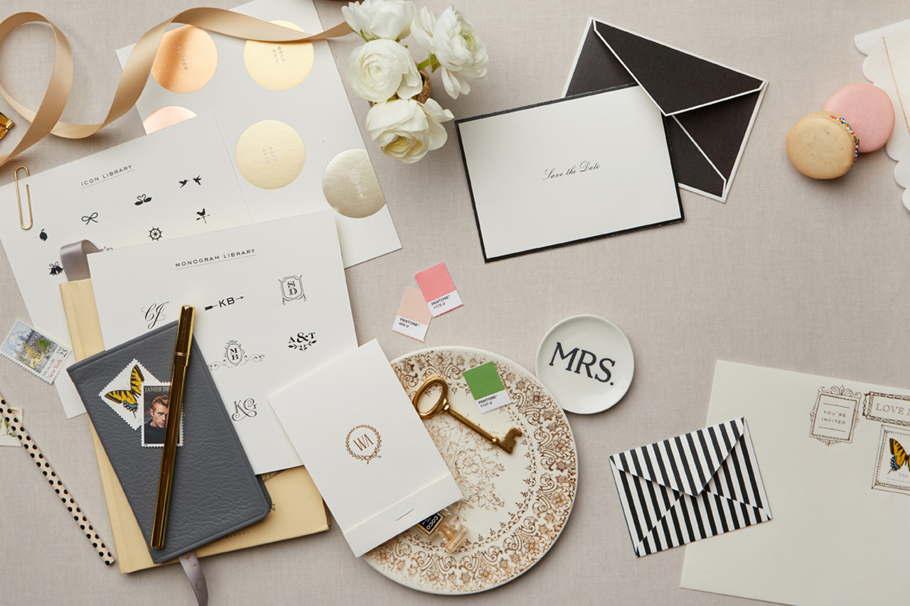
Behind the Stationery: Cheree Berry

I’m hands-on when I need to be but really rely on my personal projects – holiday cards, kids birthday invites, etc. – to get me back to my love for design. And I don’t forget what 10 years ago looked like when I was designing invoices to look pretty and taking too long to send them out and working for what seemed like every minute of every day.

Here’s a very special sneak peek at a brand new line of all-occasion cards by Cheree Berry Paper, produced and distributed by Galison Gifts. The designs will debut at the National Stationery Show this month!
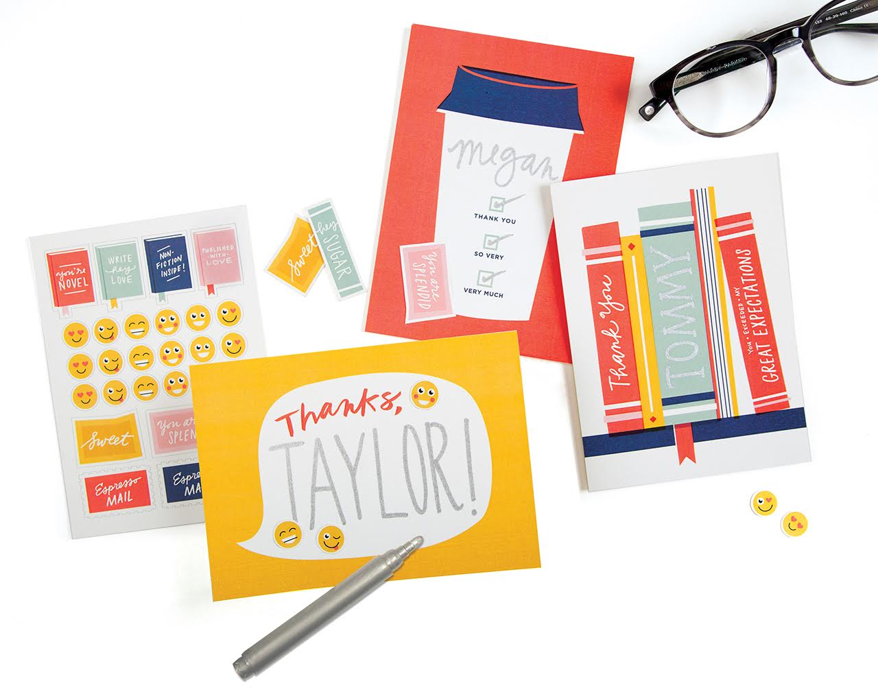
Cheree Berry Paper for Galison Gifts

Write-On Cards offer stickers and spaces to handwrite, so each card can be personalized.
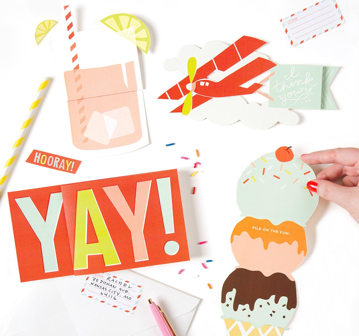
Cheree Berry Paper for Galison Gifts

Expanding Cards unfold and expand to reveal the message.

All photos courtesy of Cheree Berry Paper
NSS 2017 Sneak Peek: Iron Curtain Press

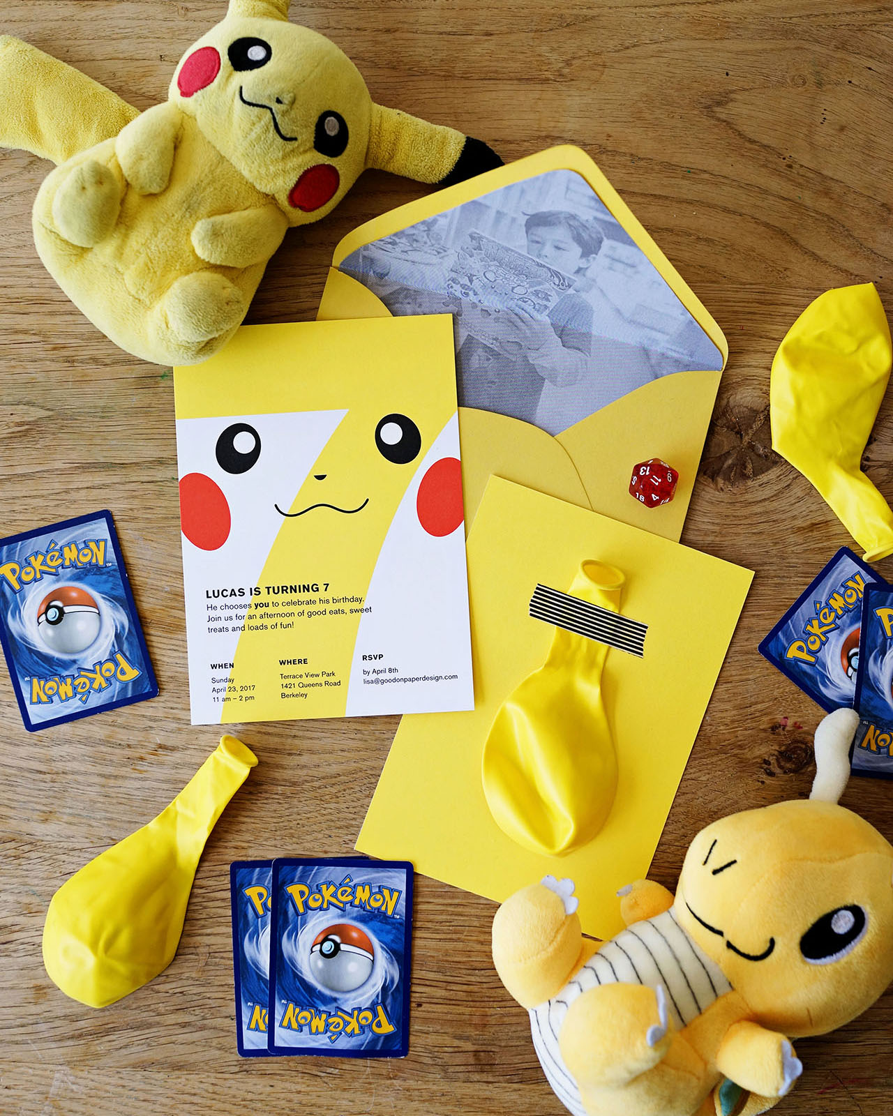
With less than two weeks (!!) to go before this year’s National Stationery Show, I’m super excited to share a sneak peek from Rosanna of Iron Curtain Press and Shop Shorthand (Booth #1763). Rosanna has a bunch of fun new releases planned for this year’s show, including a brand new pocket-size notebook and new marker and pencil pouches! Love! 

NSS 2017 Sneak Peek: Iron Curtain Press

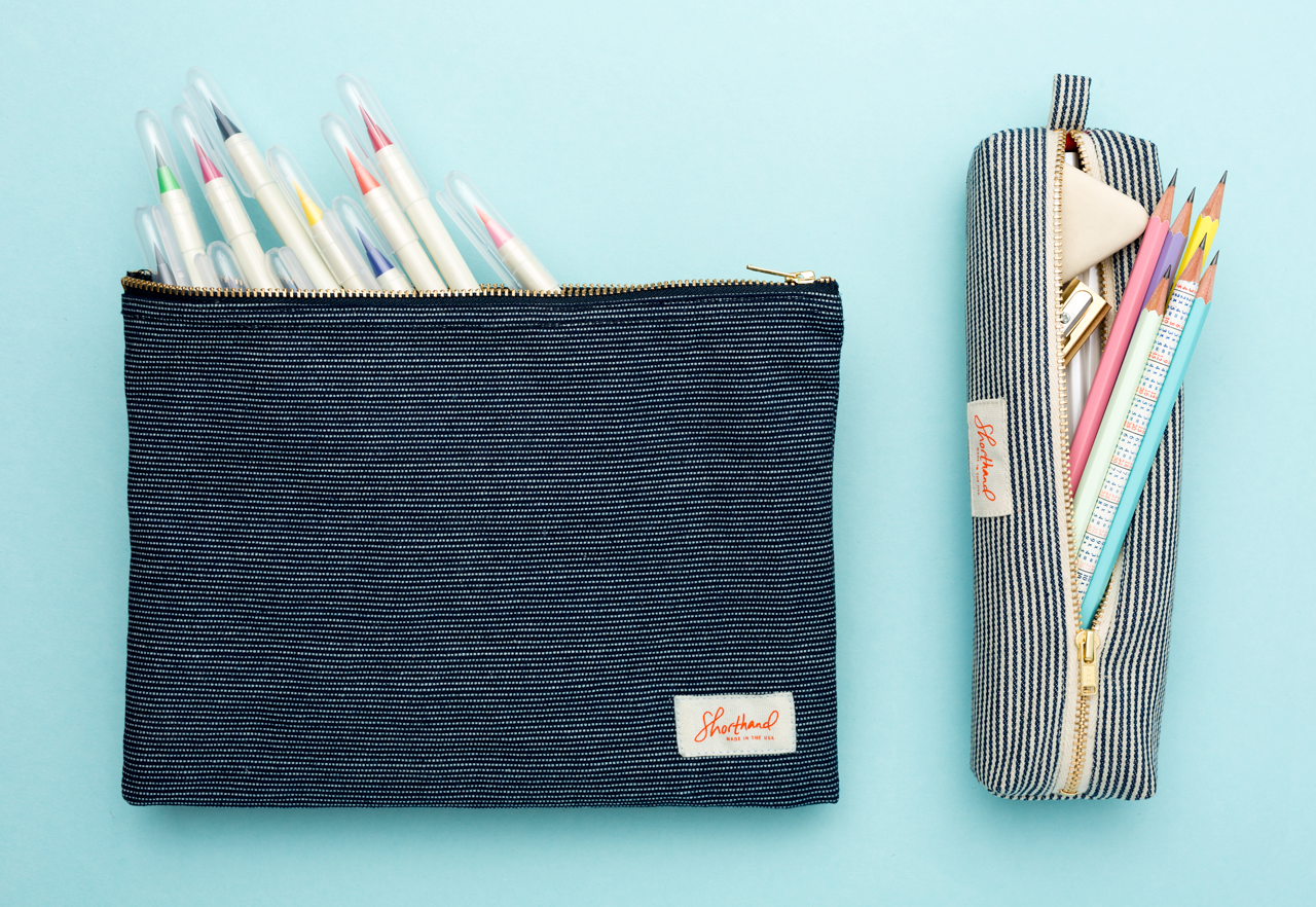
From RosannaIntroducing our new pouches! The Pencil Pouch is made with engineer stripe denim with brass zippers. The Marker Pouch is made with Japanese ticking stripe canvas also with a brass zipper. They are made in Los Angeles. I wanted to create bags that hold the pens I use every day. I’ve found that so many pencil bags aren’t long enough for a brand new pencil, so I made ours a little longer than the standard pencil bag. The Marker pouch came from the idea that sometimes you want to have more than just a few of your favorite pens at your disposal. Plus markers tend to be even longer than pencils, so I wanted a bag that could easily hold them all.

NSS 2017 Sneak Peek: Iron Curtain Press

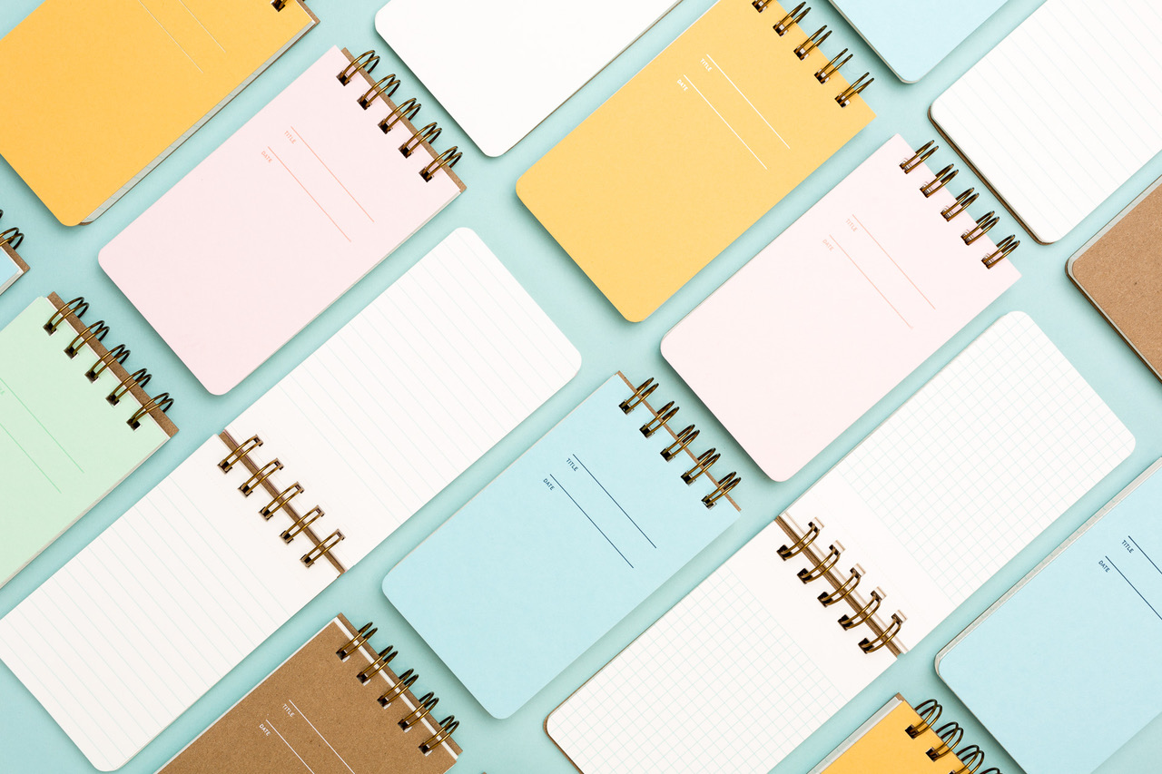
The Reporter notebook is a 3″ x 5” wire-bound notebook, with 80 perforated sheets that come in our standard lined, graph or sketch sheets. They are available in all 5 of our cover colors. Perfect for all your note taking on-the-go.

NSS 2017 Sneak Peek: Iron Curtain Press

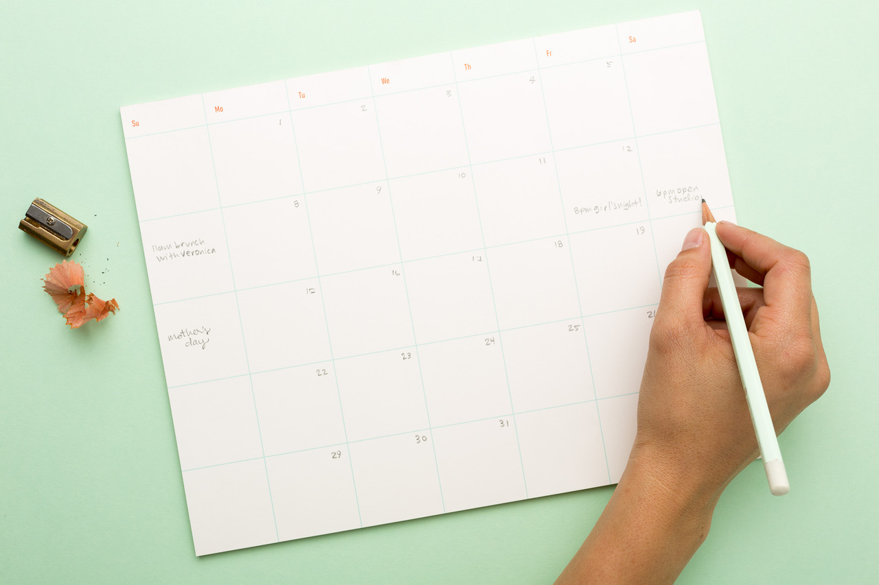
The Calendar Pad is 8.5″ x 11″, with 26 tear off sheets and a heavy chipboard backer. Each month is laid out with five dateless weeks so you can fill it out however you like.

NSS 2017 Sneak Peek: Iron Curtain Press

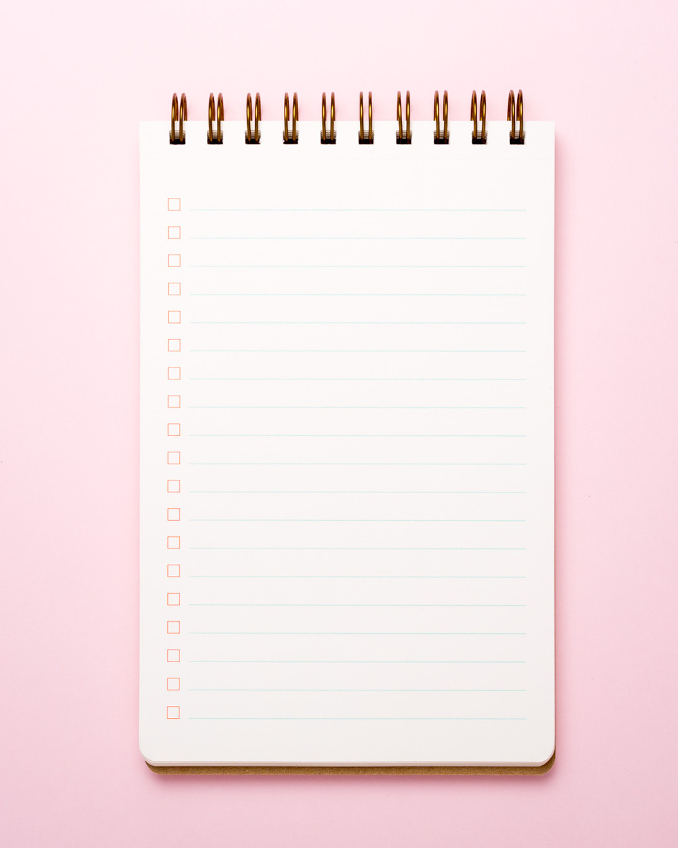
The Task Pad is an 8.5″ x 5.5” wire-bound notebook with 80 perforated sheets of check box glory. Also available in all five of our cover colors. So much productivity in one pad.

NSS 2017 Sneak Peek: Iron Curtain Press

Thanks so much Rosanna!

More from Iron Curtain Press right here and Shop Shorthand here – and if you’re attending the National Stationery Show in a couple of weeks, you can visit them in booth 1763 to see everything in person at the show!

Colorful Patterned Letterpress Wedding Invitations

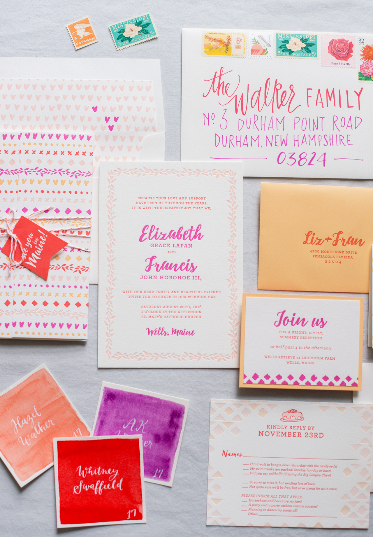
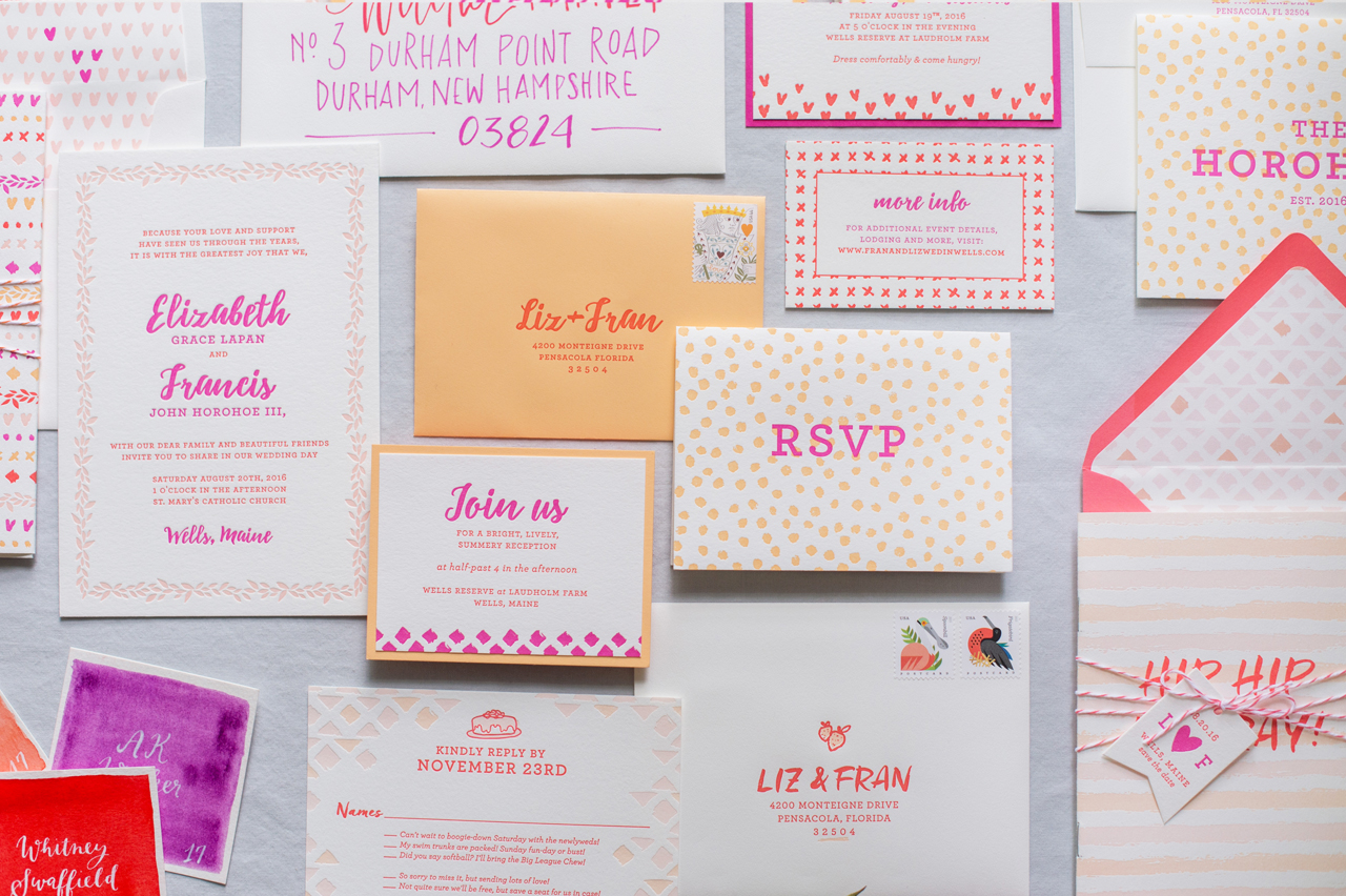
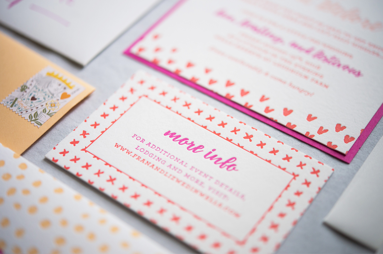
Happy Monday everyone! We had a gray and rainy weekend here in DC, so I wanted to start the week with something bright and cheerful â€“ and I’m not sure it gets more cheerful than these colorful patterned letterpress wedding invitations from Samantha and Whitney of Gus & Ruby Letterpress! Bright and punchy colors! Playful patterns! Each detail is a perfect fit for this coral, red, peach, and pink invitation suite. So perfect for a late summer wedding in Maine!

Colorful Patterned Letterpress Wedding Invitations by Gus and Ruby Letterpress

From Sam & Whit: It is always an exceptional honor to design for close friends! This custom suite was designed for our former store manager (and dear, dear friend) Liz and her lovely guy. They wanted their wedding to reflect the fun punchy colors and bright vibrant feel of late summer in Maine.

Colorful Patterned Letterpress Wedding Invitations by Gus and Ruby Letterpress

Colorful Patterned Letterpress Wedding Invitations by Gus and Ruby Letterpress

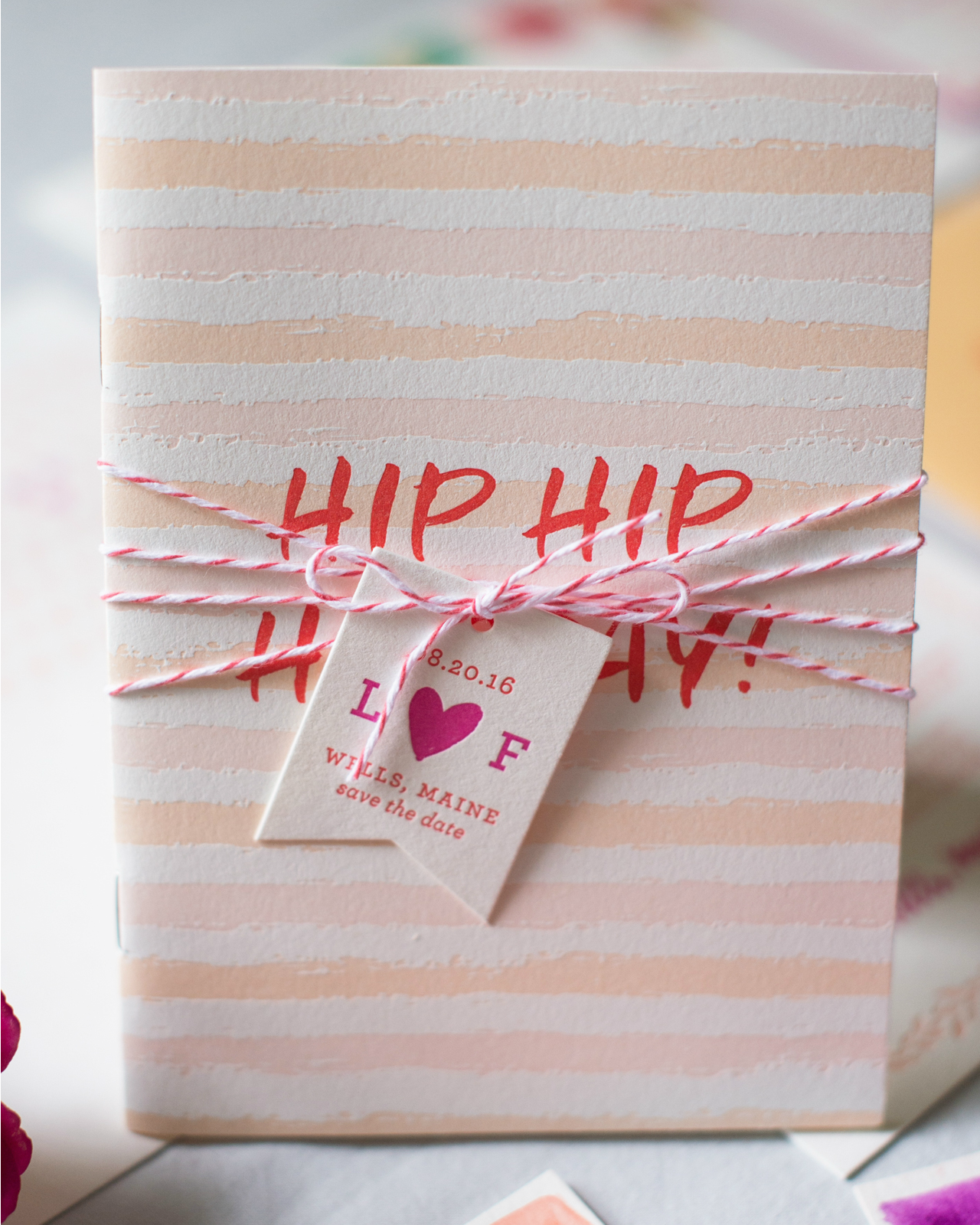
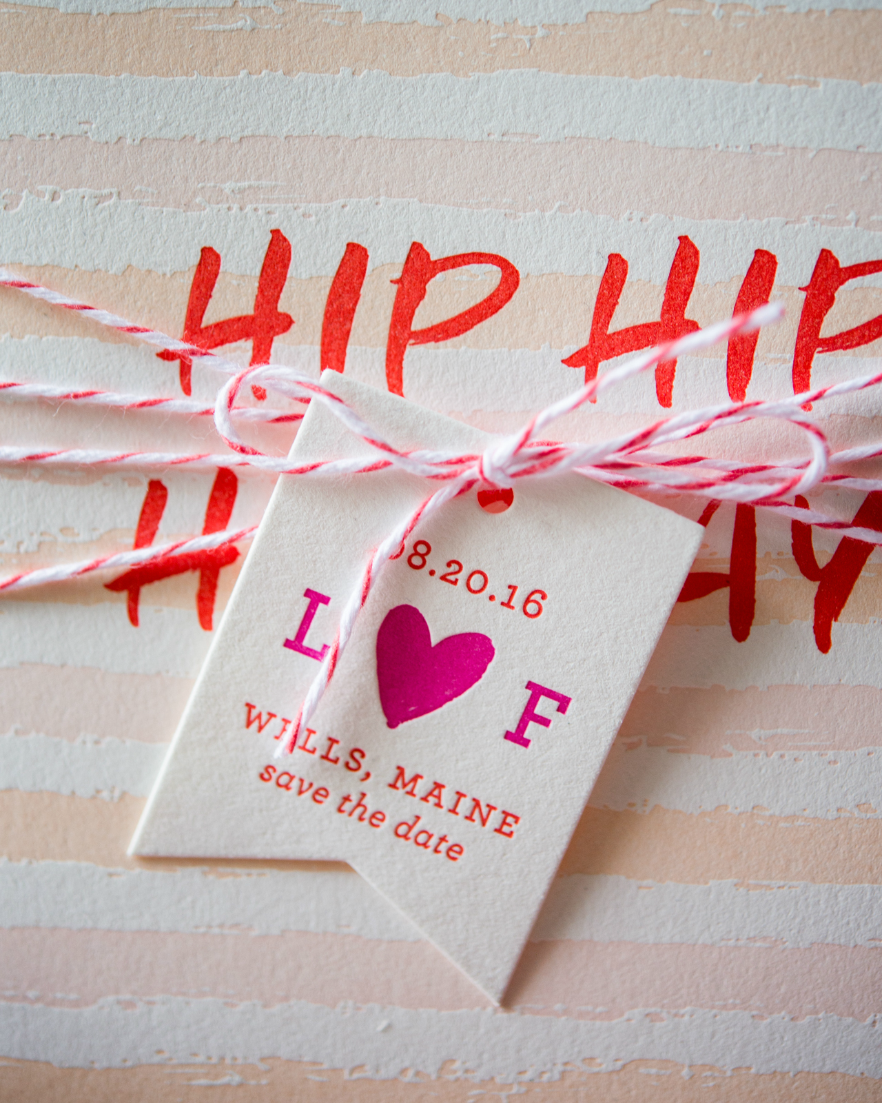
A cheeky save the date booklet started things off and came complete with a reply card full of activities so the couple could further plan fun events for their out of town guests.

Colorful Patterned Letterpress Wedding Invitations by Gus and Ruby Letterpress

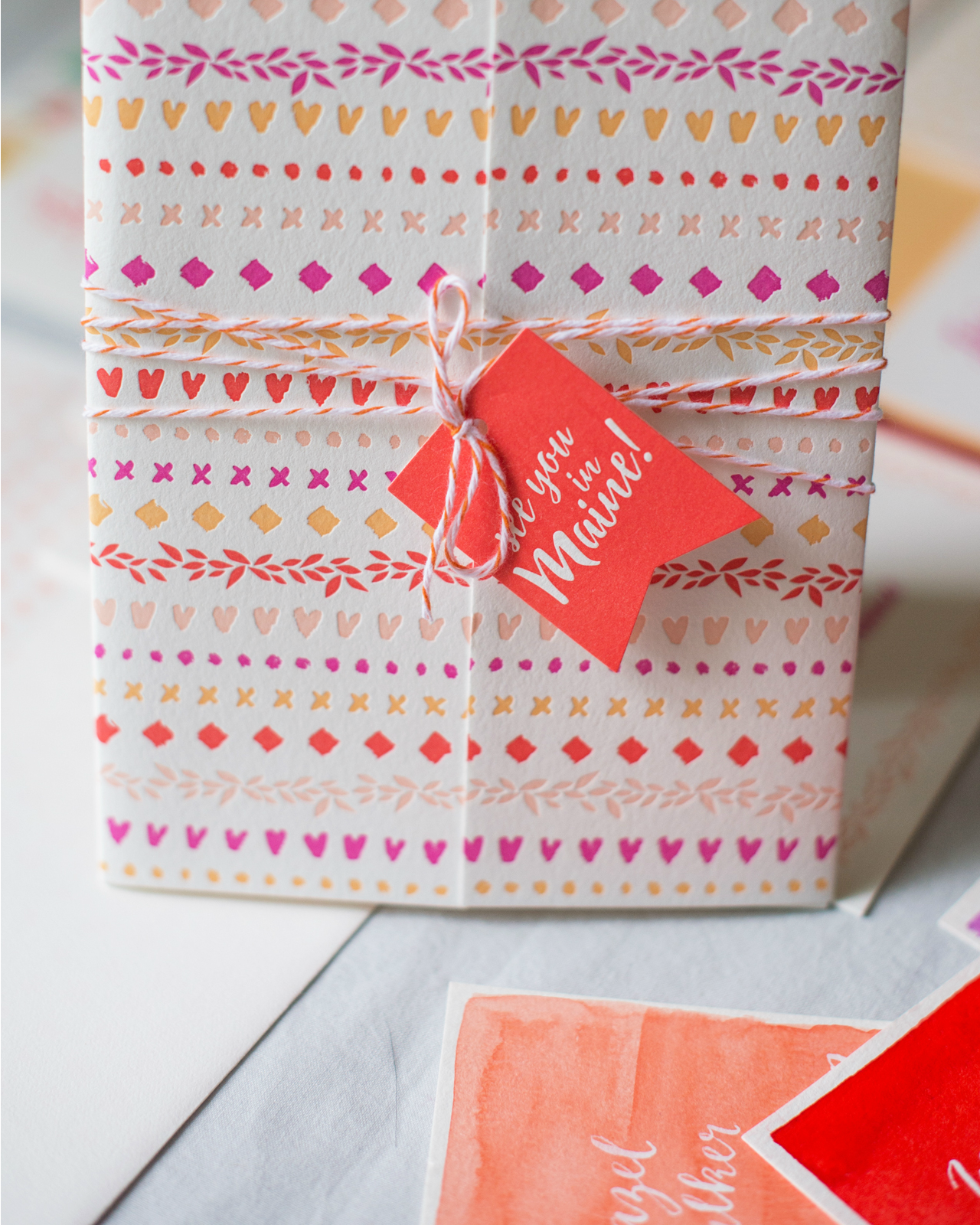
The invitation suite was housed in a 4-color letterpress printed gatefold that was tied shut with twine and a hang tag. It’s the little extra details, such as the hang tag, that make the invitation special for people to open!

Colorful Patterned Letterpress Wedding Invitations by Gus and Ruby Letterpress

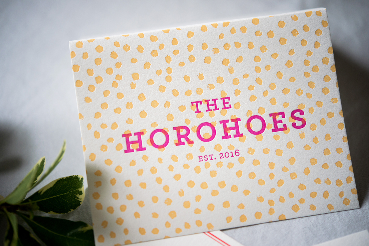
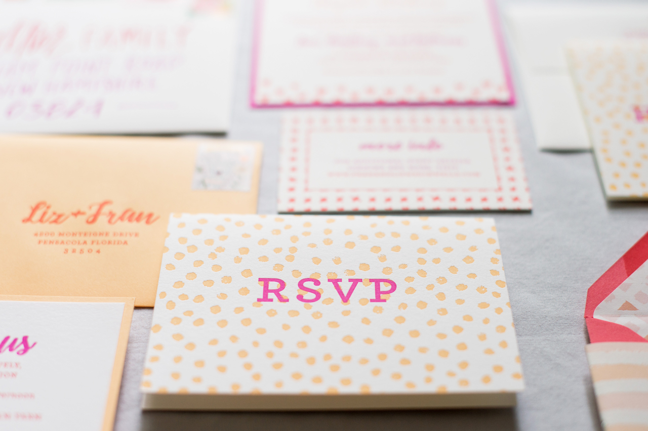
A variety of mixed patterns gave lots of visual interest and a cohesive but interesting vibe. We love playing with patterns and it was fun to layer in multiple fun patterns to grab the eyes of wedding guests and get them excited for the weekend!

Colorful Patterned Letterpress Wedding Invitations by Gus and Ruby Letterpress

For the typography, we paired a whimsical script with a traditional roman font for a mix of romance and fun. The palette of rhodamine red, corals, peach and pinks really gave the whole suite a punchy feel. The type-set invitation was printed on double-thick 100% cotton to give it an elevated and luxurious feel.

Colorful Patterned Letterpress Wedding Invitations by Gus and Ruby Letterpress

We love getting to reinforce the aesthetic of the day with well-crafted day-of wedding stationery items. Gorgeous watercolor painted escort cards, letterpress printed menus, and a program all kept the paper feeling cohesive from the save the date all the way through the day-of elements.
Colorful Patterned Letterpress Wedding Invitations by Gus and Ruby Letterpress

Colorful Patterned Letterpress Wedding Invitations by Gus and Ruby Letterpress

As always, the pieces were lovingly letterpress printed and foil printed by hand on our antique presses on beautiful, textural, super thick 100% cotton paper. What a joy it was to work on the special project for our dear friends!
Colorful Patterned Letterpress Wedding Invitations by Gus and Ruby Letterpress

Thanks Samantha & Whitney!

Design: Gus & Ruby Letterpress

Gus & Ruby Letterpress is a member of the Designer Rolodex – check out more of their beautiful work right here or visit the real invi­ta­tions gallery for more wedding invitation ideas!
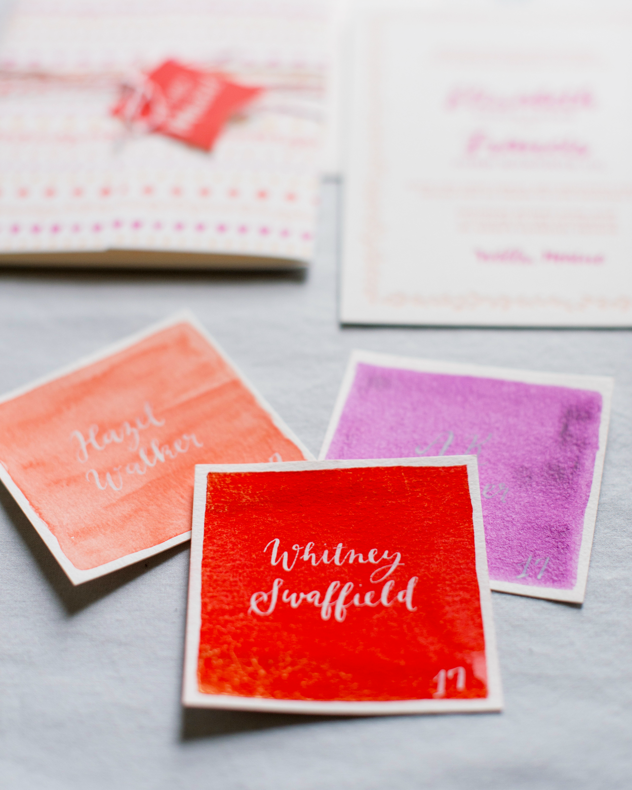
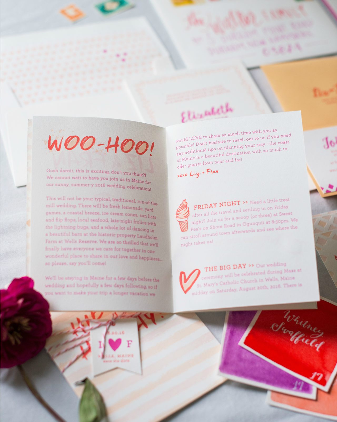
Photo Credits: Brea McDonald Photography for Gus & Ruby Letterpress