Colorful and Creative Business Cards with MOO

This post is sponsored by MOO. I’ve partnered with them to share some colorful and creative business card ideas. All content and opinions are my own. MOO 100% recycled Cotton Business Cards are completely tree free and print vivid, saturated color – all on archival quality paper. Thank you for supporting the sponsors that make Oh So Beautiful Paper possible!

I absolutely LOVE business cards. I think of them as mini works of art, and I keep a bowl full of all the beautiful, inspiring business cards that I’ve received over the years. I was VERY intrigued when I heard about MOO’s new 100% recycled Cotton Business Cards – I wanted to see how the new paper could handle bright colors and delicate illustrations! I teamed up with a few illustrators, stationers, and graphic designers to showcase some of their business card designs printed on MOO’s cotton paper, and share some tips for colorful and creative business cards. And if you’re a new MOO customer and you’d like to check out the cotton business cards yourself, MOO is offering Oh So Beautiful Paper readers 15% off Cotton Business Cards with the promo code OHSOMOO!
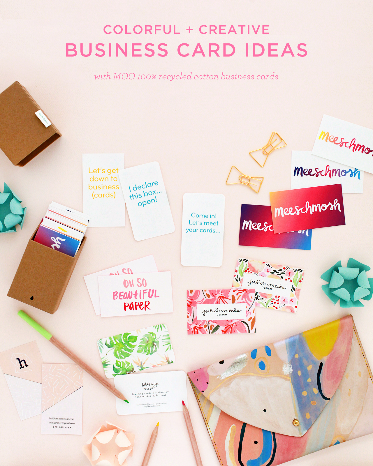
Colorful and Creative Business Cards with MOO Recycled Cotton Business Cards

First, a bit more about the paper! MOO teamed up with one of the best paper mills in the country, Mohawk Fine Papers, to create a modern twist on a traditional cotton rag paper. Made from t-shirt offcuts, the paper is completely tree-free and reuses waste material from the fashion industry to create an archival quality paper at an affordable price point. The 100% recycled cotton paper is bright white, with a subtle texture that looks and feels great in person. And it prints vivid, saturated colors like a dream!
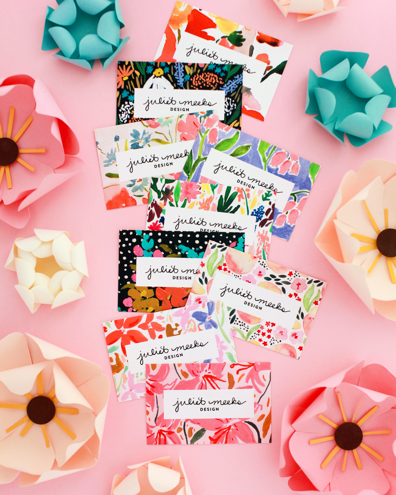
Colorful and Creative Business Cards with MOO Recycled Cotton Paper

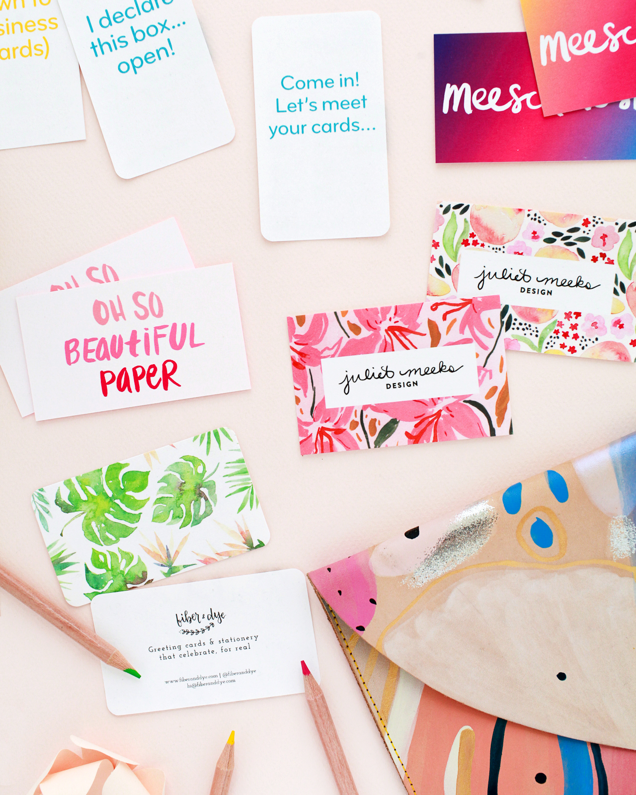
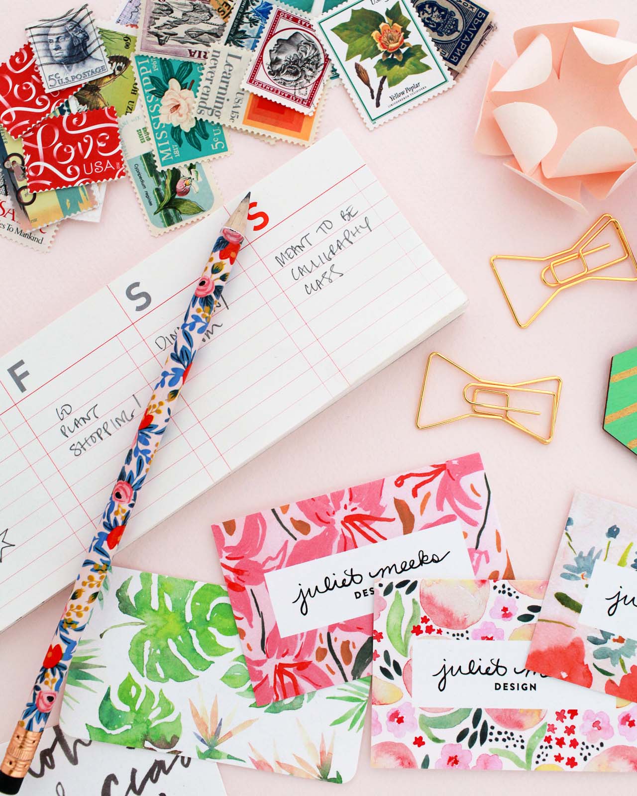
Business card design: Juliet Meeks

Nothing bums me out quite like a cheap, low quality business card, so I love that MOO makes quality paper available at an affordable price! And if you work in a design-related field, it’s especially important to have great business cards. Here are some tips for creating colorful and creative business cards.

1. Stay true to your personal style.

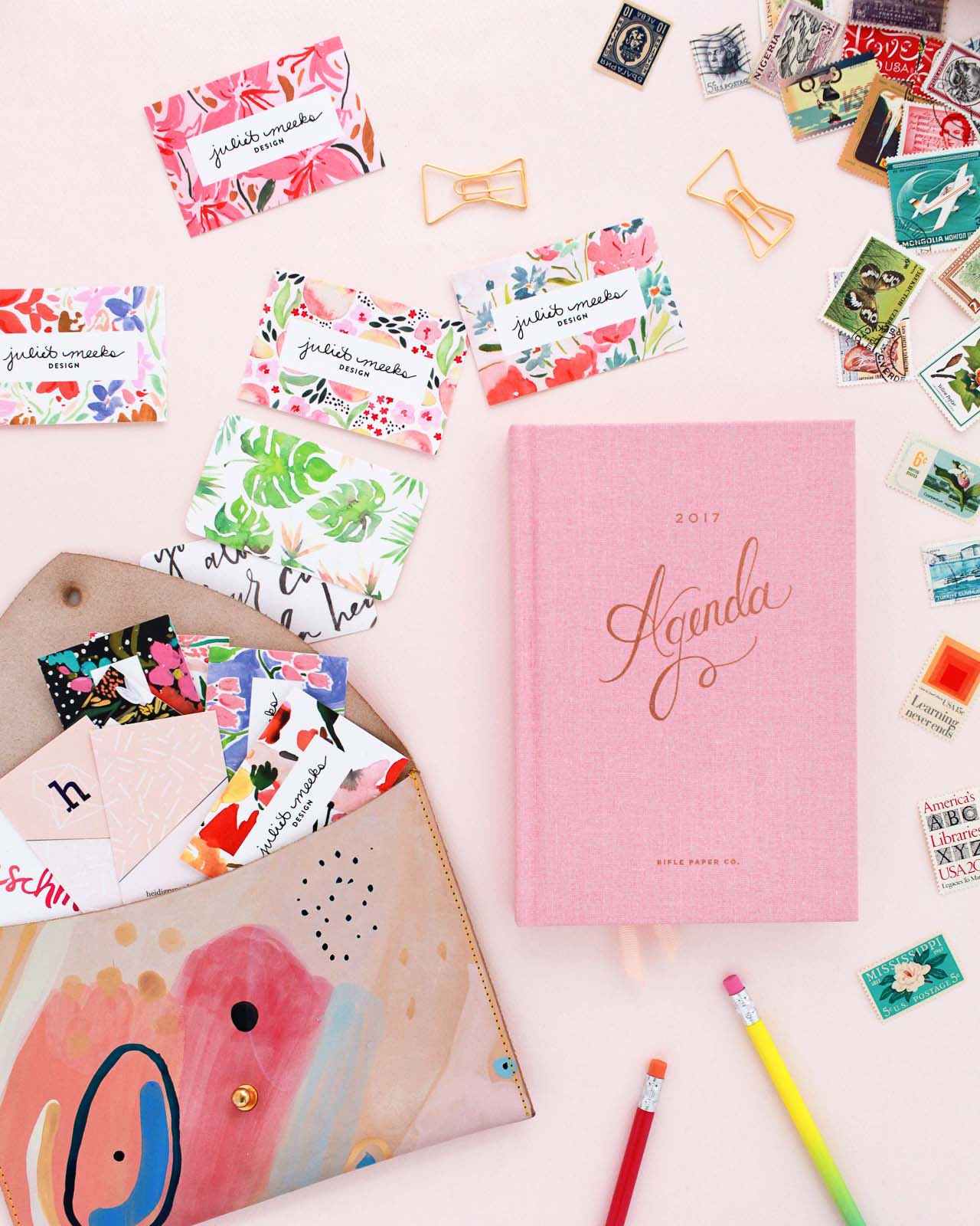
Business cards make a lasting impression and can tell the person on the other end a ton about you. Is your style bright and colorful? Minimalist? Romantic? What colors do you love? Are you playful or serious? Bright white recycled cotton paper allows for really bright, saturated color, which is perfect for colorful styles! Your business cards should reflect your style and personality. I love the way illustrator Juliet Meeks showcased her floral illustration work around her logo!
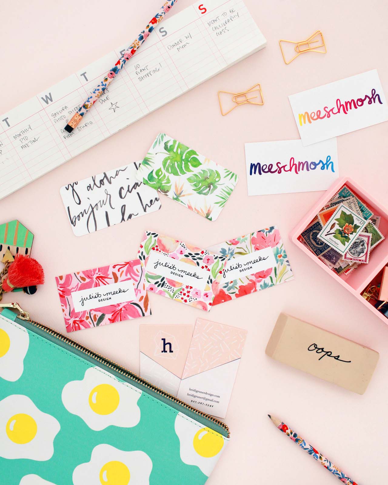
Colorful and Creative Business Cards with MOO Recycled Cotton Business Cards

2. Show your work

If your work is visual, show it on your business cards! This is a thousand times true for illustrators, calligraphers, photographers, and other artists, but I think it’s equally true for everyone from woodworkers to contractors to make up artists.
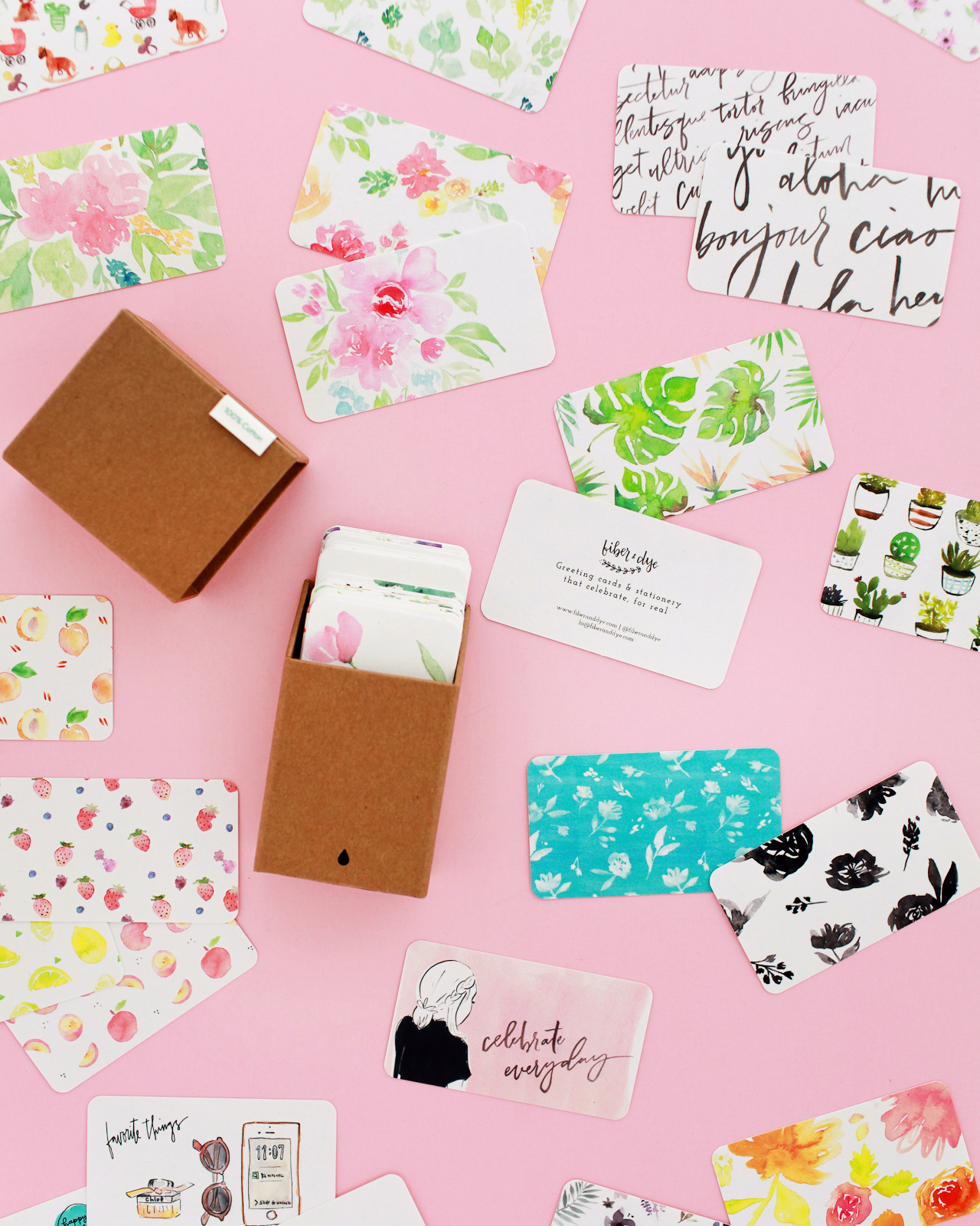
Colorful and Creative Business Cards with MOO Recycled Cotton Business Cards

Business card design: Fiber & Dye

With double-sided printing, business cards are the perfect opportunity to show examples of your work! Lisa of Fiber & Dye used MOO’s Printfinity feature to print different examples of her illustration and hand lettering work on the back of each business card. You can also print professional photos instead of illustrations – just make sure the photos are properly edited and formatted to showcase your work in the best possible way.

3. Think outside the box

I’ve seen business cards of all shapes and sizes: rectangles, large squares, small squares, rounded corners, even circles and unique die cut shapes! The shape of your business card speaks to your personal style, and there’s no need to stick to a traditional rectangular format! Choose the shape that best shows your style and your work.
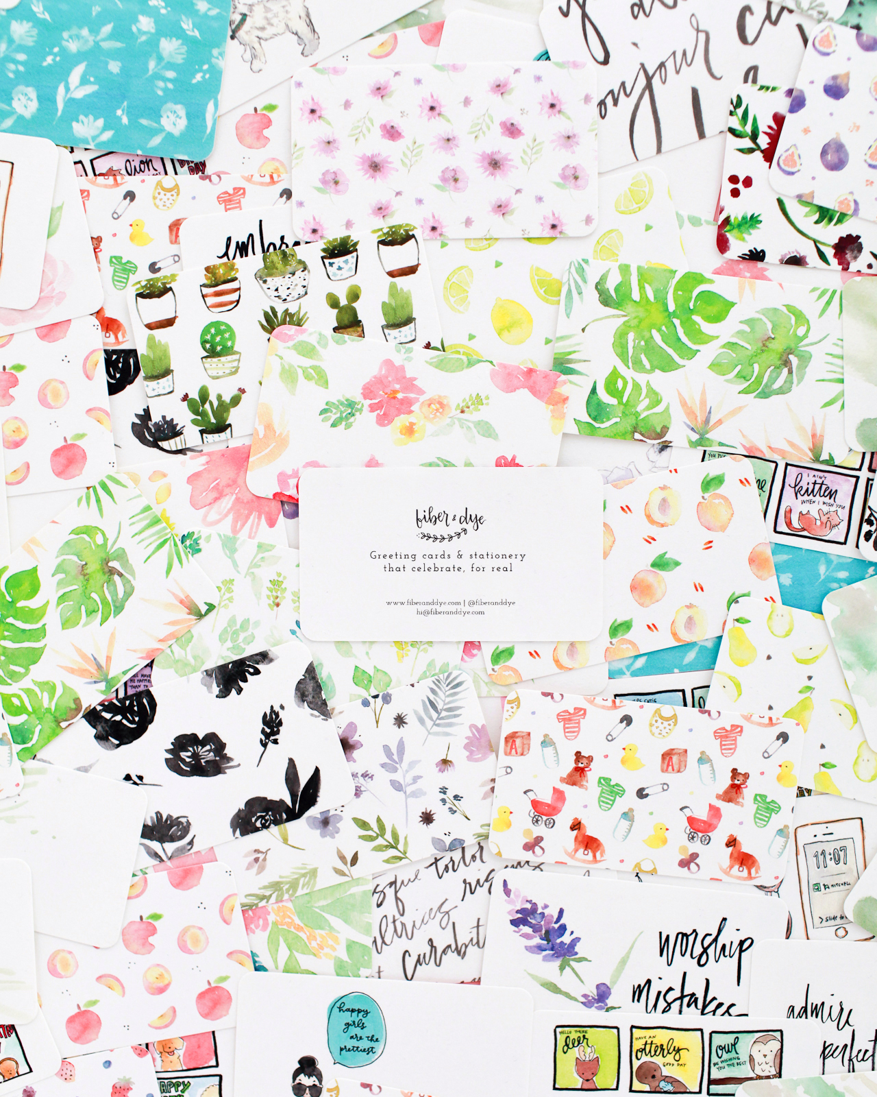
Colorful and Creative Business Cards with MOO Recycled Cotton Business Cards

4. Consider Both Sides

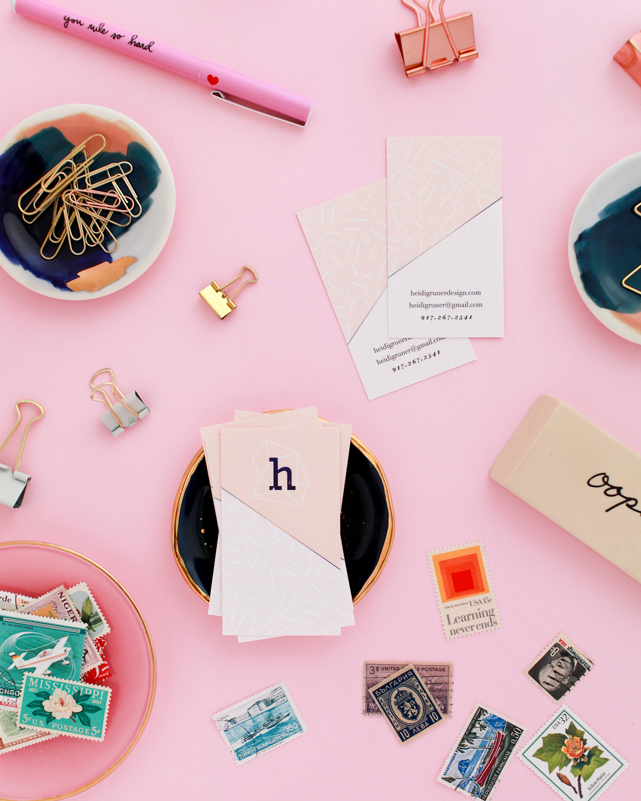
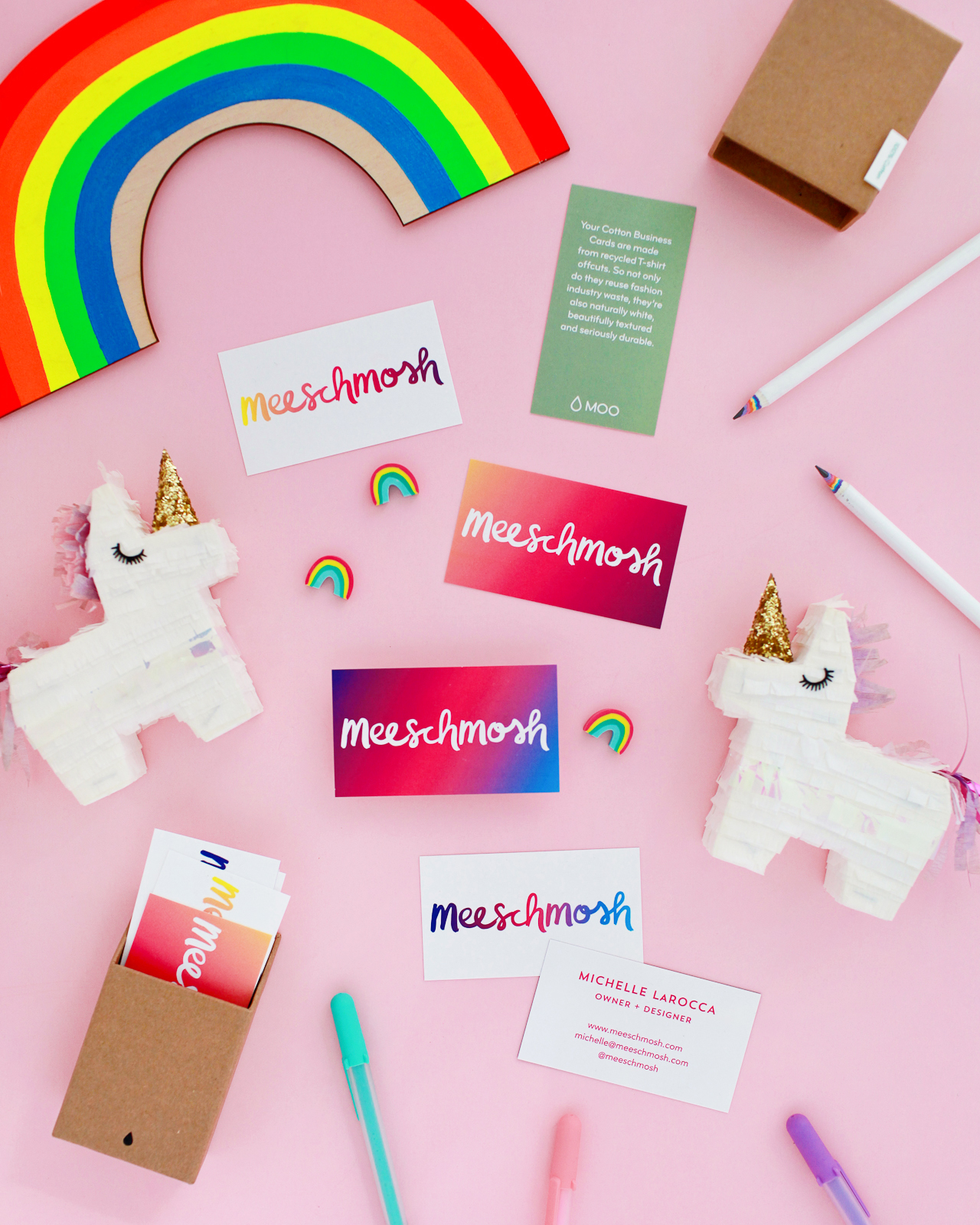
No one-sided business cards here! I’m personally a fan of putting contact info on one side and logo/artwork on the other side, but there are so many options for making that happen. Bright and colorful on one side, white minimalist on the other side? Artwork on both sides? Should the front and back designs mirror each other? MOO’s design guidelines allow for a full bleed on both sides of the card, so your design can go across the whole card without worrying about white edges. I’m loving these full bleed business card designs from Meeschmosh and Heidi Gruner Design.
Colorful and Creative Business Cards with MOO Recycled Cotton Business Cards

Business card design: Meeschmosh

Colorful and Creative Business Cards with MOO Recycled Cotton Business Cards

Business card design: Heidi Gruner Design
Colorful and Creative Business Cards with MOO Recycled Cotton Business Cards

Colorful and Creative Business Cards with MOO Recycled Cotton Business Cards

Colorful and Creative Business Cards with MOO Recycled Cotton Business Cards

Colorful and Creative Business Cards with MOO Recycled Cotton Business Cards

I’d love to hear your tips for creative and colorful business cards! Feel free to share a link to your business cards in the comments. And for new MOO customers out there – don’t forget that you can get 15% off Cotton Business Cards with the promo code OHSOMOO!

Photo Credits: Nole Garey for Oh So Beautiful Paper

This post is sponsored by MOO. All content and opinions are my own. Thank you for supporting the sponsors that make Oh So Beautiful Paper possible!

Happy Weekend!

Happy Friday everyone! And a Friday the 13th at that! It’s finally starting to feel like fall here in DC, which… well, I was really starting to wonder if we’d be having 80-degree days into November! We’re in full Halloween costume planning mode over here, since Sophie has asked to be a “Winter Fairy” this year. I’m not really sure where she got the idea, but we’re planning to DIY an icicle crown and experiment with some white and glittery make up. I’ve been spending lots of time on Pinterest looking for inspiration, and I think this is going to be lots of fun! But in the meantime…

Bright Room Studio / Pumpkins

Watercolor illustration by Bright Room Studio

…a few links for your weekend!

Did you see Jenny’s tutorial for painting your fridge? I went with white for our studio fridge, but maybe I’ll try painting it a pretty mint green!

Yay for sweater season! This slouchy cardigan looks cozy.

Definitely feeling the natural wood trend in the kitchen! 

I’m loving all the planters at CB2 these days. This one might be my fave, or maybe this one?

DC area folks! Pub Dread is offering timed entry tickets to benefit disaster relief efforts in Puerto Rico. You should go!

Sigh. How our current president thinks the U.S. government works. 

I’ve been meaning to get a legit first aid box for my little family – how cute is this one?


This week on Oh So Beautiful Paper:

Romantic wedding invitations with a vellum overlay

Halloween cards, part boo! (aka 2)

Behind the Stationery with Yao Cheng Design â€“ I love her beautiful watercolor florals!

Such pretty gray calligraphy wedding invitations with deckled edges

Beautiful calligraphy inspiration from Angelique Ink


That’s it for me this week. To everyone in northern California, please stay safe out there, friends. I’ll see you all back here next week. xoxo

Gray Vellum Wine Country Wedding Invitations

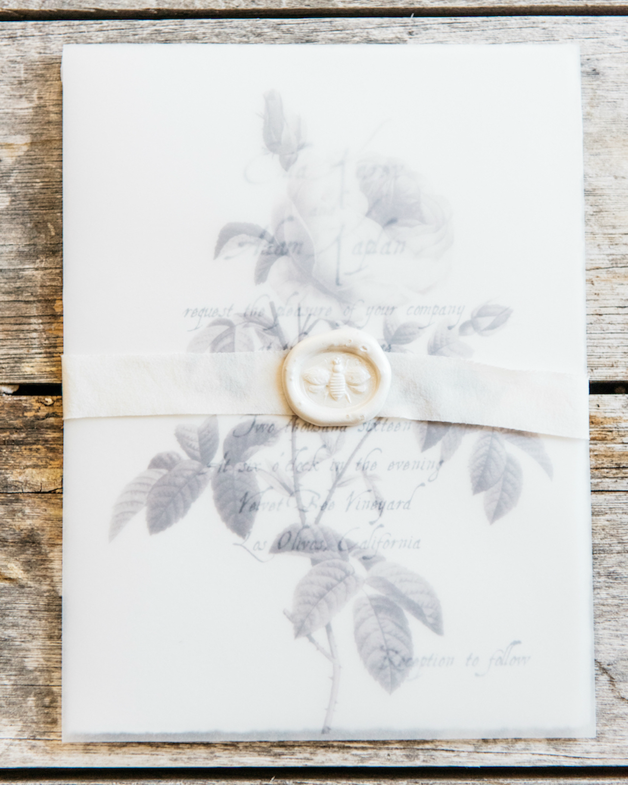
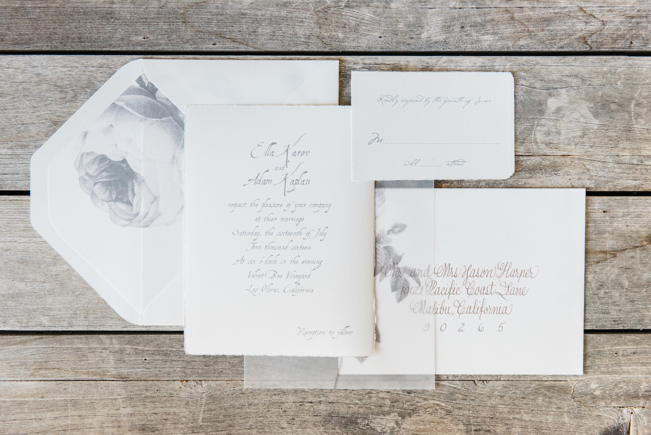
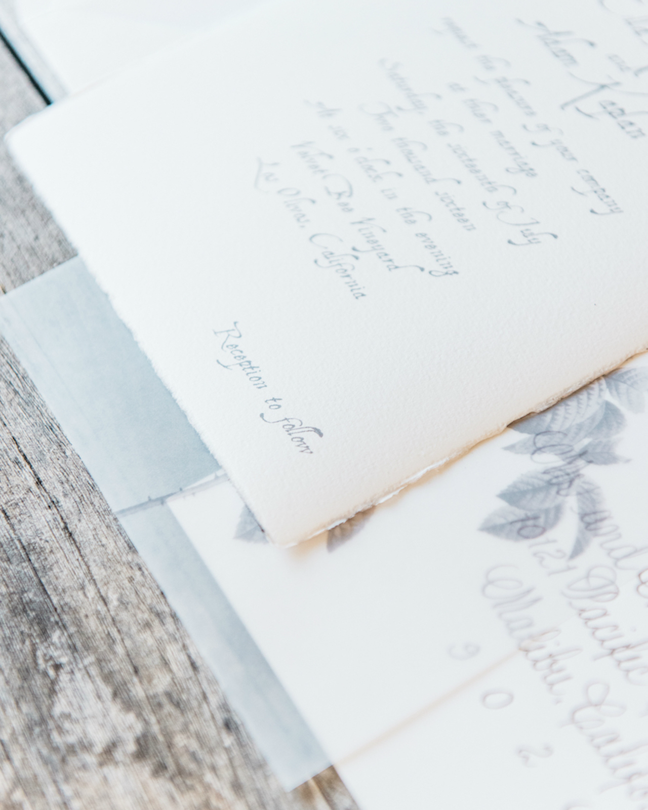
These invitations combine two of my current favorite paper trends: dreamy vellum and romantic deckled edges! Michelle Castle of Honey Paper designed these gray vellum wine country wedding invitations, with a beautiful vellum overlay on invitations printed on the dreamiest Italian paper with deckled edges. The juxtaposition of crisp vellum and textured paper in this suite is simply stunning. More please!

Gray Vellum Wine Country Wedding Invitations by Honey Paper

From Michelle: Guests gathered for an outdoor summer wedding ceremony and reception at The Velvet Bee Vineyard in one of California’s picturesque wine regions. The couple wanted their love and appreciation of the arts to be reflected in every aspect of their wedding day from the hand moulded paper of the invitations to the elegantly handcrafted ceramic dishes.

Gray Vellum Wine Country Wedding Invitations by Honey Paper

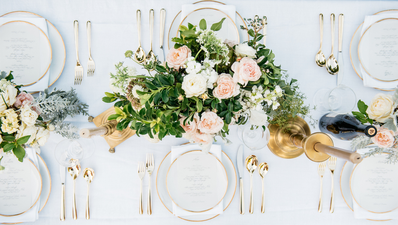
Texture and nostalgia were integral to the atmosphere. Sheets of white linen the color of cut radish covered the tables and each vase held the velvety, pinnate leaves of silver ragwort, clutches of white zinnia and thick downy roses. Bread and butter plates, saucers and glasses resembling 18th-century creamware enhanced the dreamy ambiance.

Gray Vellum Wine Country Wedding Invitations by Honey Paper

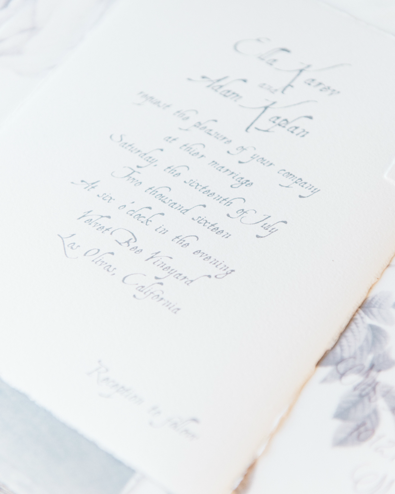
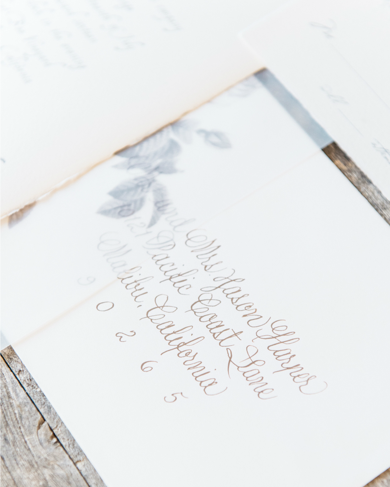
We used a combination of hand moulded Italian papers and vellum for the invitation suite and menus emphasizing the polarity of the textures. The dense, fibrous invitation and reply card were printed with a soft gray ink in a font suggestive of a carefully handwritten letter. The invitations were overlaid with wafer thin vellum printed with drawings of garden roses in gray and wrapped in silk ribbon, an orchestration of texture and tone. Creamy white wax seals impressed with a bee stamp finished the invitations. Envelopes were lined with a drawing of a single rose in gray repeating the botanical style of the vellum pieces. Envelopes were addressed in a thin line calligraphic script in gold ink.

Gray Vellum Wine Country Wedding Invitations by Honey Paper

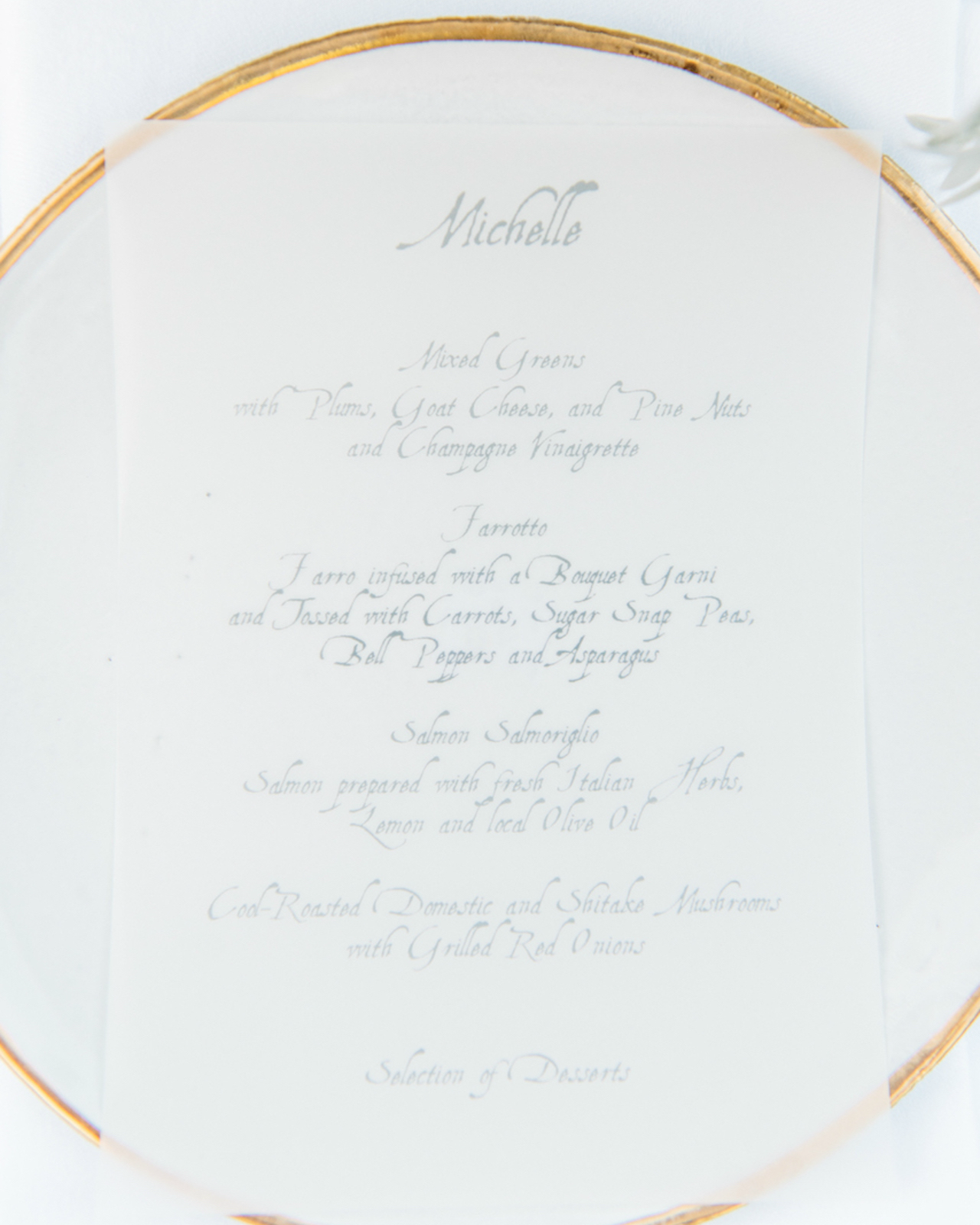
A spectrum of gray, cream and white unified the paper details and ceramics – the slow, rich beauty of stone, slate, ash – gray and its association with the passage of time, memory, storms and wisdom. The menu repeated the vellum of the invitation and was printed with a pale, stone gray ink. Focusing on texture and the subtle tone on tone of transition from white to gray was a nod to the beautifully crafted Astier de Villatte ceramics at the table. Menus were placed atop plates with either gilt edges or beaded rims.

Gray Vellum Wine Country Wedding Invitations by Honey Paper

Gray Vellum Wine Country Wedding Invitations by Honey Paper

The polarity of the clay and glaze, as well as the lightness of the ceramic objects, was something we wanted the stationery and menus to reflect. The lucid, ephemeral quality of the vellum and the feathery edged moulded deckled paper carried those qualities from the invitation suite to the menus.

Gray Vellum Wine Country Wedding Invitations by Honey Paper

Thanks Michelle!

Design & Calligraphy: Honey Paper

Paper: Arturo Italian

Honey Paper is a member of the Designer Rolodex – check out more of their beautiful work right here or visit the real invi­ta­tions gallery for more wedding invitation ideas!

Photo Credits: Cara Robbins Studio

On Speaking Out

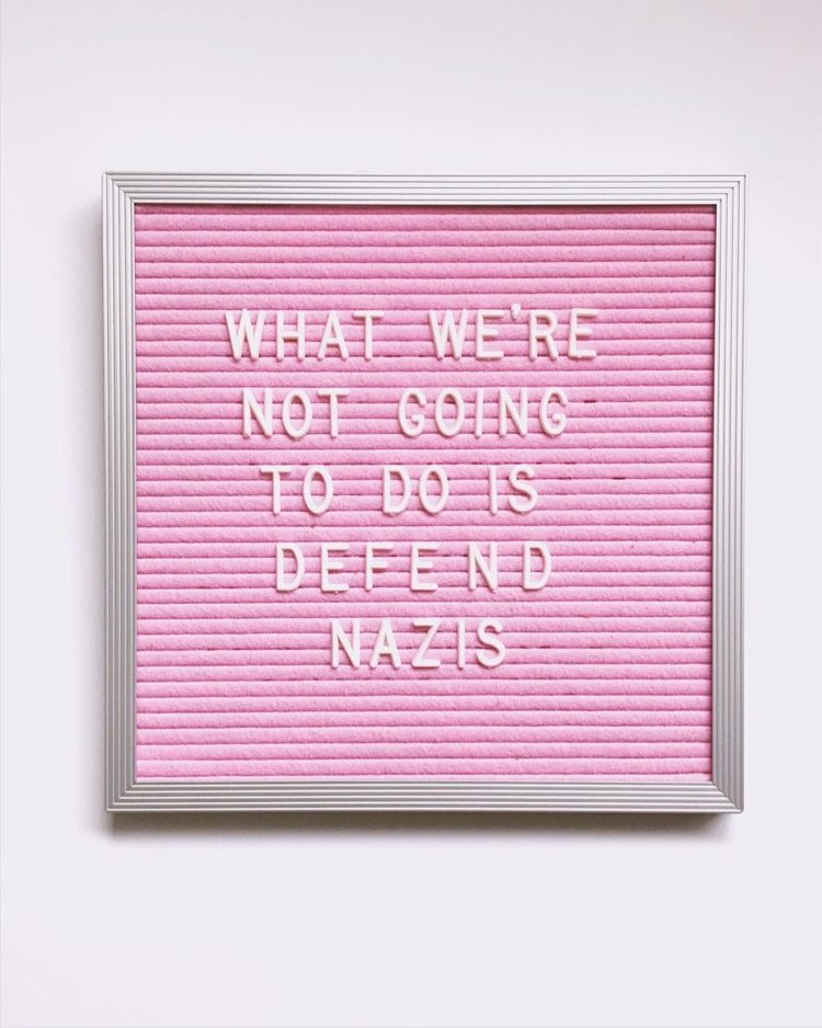
What We're Not Going to Do is Defend Nazis / Image by Darcy Dubose via Oh So Beautiful Paper

Image by Darcy Dubose via Instagram

This week was confusing, exhausting, and completely enraging, as much of the last seven months has been, to be honest. To any readers in Spain, my thoughts are with you. My family took a quick impromptu trip out to the beach for a bit of mental self-care, so I’m a bit late with my Friday links this week. We really needed the time away, even if it was a super quick trip.

When it comes to recent events here at home, I’m still filled with anger at our president’s response to the horrific events in Charlottesville. This isn’t about politics for me. Yes, I am a political person with strong political beliefs, but this isn’t about party affiliation. This is about basic human decency and right and wrong. White supremacists are wrong. Neo-Nazis are wrong. Good people just don’t find themselves “accidentally” marching with people wearing swastikas and shouting hateful, racist speech. If you show up at a rally and are surprised to see people carrying swastikas, you walk away. When one choice involves Nazis and white supremacists, you choose the other side. Everything else is irrelevant.

This is also deeply personal for me. I’m a Jewish American. My grandfather and great-uncle fought against Nazis and their hateful beliefs in WWII. I cannot support a president who gives safe space to those same beliefs and hate groups. 

We have a long way to go towards resolving the deeply rooted issues of racism and bigotry in our country, but in the meantime the best thing we can do is to educate ourselves, teach tolerance and empathy to our children, speak out against hateful ideologies, and deny hate groups the space to fester and grow. I’ll continue to speak up against racism, religious intolerance, and bigotry – and I hope you will, too. Silence speaks volumes in situations like these.

In lieu of my usual weekend links, I’ll leave you with a few videos, articles, and resources that I’ve found helpful this week:

If you have any doubt about what is at stake here, watch this video report by Vice News about the events in Charlottesville (VICE)

This video was released in 1947 to help Americans recognize Fascist rhetoric at home â€“ the similarities with modern day Trump rhetoric are astounding (Washington Post)

Why words matter when we talk about what happened at Charlottesville (Man Repeller)

Nine longread articles on how we got to Charlottesville (the synopses are worth reading if you only have a few minutes – Longreads)

10 Ways to Fight Hate in Your Community (Southern Law Poverty Center)

How to teach tolerance (Tolerance.org)

Raising Race-Conscious Children (Cup of Jo)

How past U.S. presidents exercised moral leadership, from Lincoln to Kennedy to George W. Bush to Obama (NPR)

The week when Trump resigned (The New York Times Editorial)

Happy Weekend!

Happy Friday everyone! It’s raining cats and dogs outside right now (and will for most of the weekend), so I guess we’re in for a cozy weekend at home! For any aspiring calligraphers out there, this is the perfect time to sign up for the Calligraphy Portfolio Challenge with the Modern Calligraphy Summit! It’s a four week email challenge that helps you build your portfolio and attract your first clients! Topics include sourcing supplies, time to write, photographing your work, and sharing your work. And if you haven’t yet signed up for the Summit, you can also do that here! It would be like Calligraphy Summer Camp!

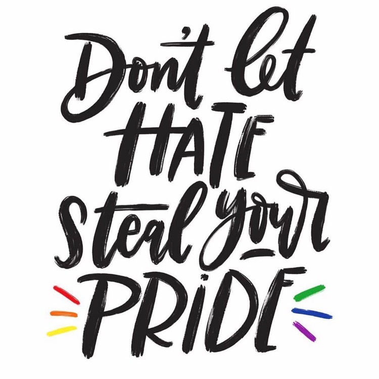
Don't Let Hate Steal Your Pride by Manayunk Calligraphy

Image by Manayunk Calligraphy, because anyone who wants to serve their country, who is willing to risk their life in defense of their fellow citizens, should be allowed to serve regardless of their sexual orientation, gender at birth, race, etc. Full stop.

A few links for your weekend!

The unfolding nightmare in Somalia. I spent eight years working on Somalia when I was at the State Department, so this is an area of the world is near and dear to my heart. The humanitarian situation is absolutely heartbreaking.

Turns out I’m part of a micro generation between Gen X and Millennials. I’ve never really identified as either generation, so this makes SO much sense!

Loving this sputnik-inspired chandelier (it also comes in a gold finish!)

This is interesting: Pantone Diplomacy

How to watch the upcoming solar eclipse safely

I’m on the hunt for a couple cute new pairs of shoes. So far I’m loving these hologram ballet flats, these ruffled sandals and these cute wraparound gingham flats (which are on sale, and an extra 25% off with code FRIDAY!)

Oooh, these chunky sandals are also really cute (and 30% off right now!)


This week on Oh So Beautiful Paper:

I’ve been having so much fun taking classes on Skillshare – and you can get two free months of premium membership!

The most beautiful booth designs and all the lady power vibes at this year’s National Stationery Show

Behind the Stationery with Ramona & Ruth

So many ideas for incorporating acrylic details into your wedding!

You’re going to want to make this Rosé and Blood Orange Sgroppino