Pink and Poppy Bridal Shower Invitations

These modern bridal shower invitations from Lauren at Charm and Fig feature geometric shapes and fun floral patterns! Lauren drew her inspiration from the brunch venue: The Crosby Street Hotel. Such a fun place for a bridal brunch!

Pink and Poppy Brunch Bridal Shower Invitations by Fig and Charm / Oh So Beautiful Paper

From Lauren: Stephanie’s bridesmaids held her bridal shower at the Crosby Street Hotel in New York, and Stephanie sent them my way for her invitations. We used the Crosby’s funky interiors – with its bright colors, mix-and-match patterns, and unique shapes – as inspiration for the invitation design.

Pink and Poppy Brunch Bridal Shower Invitations by Fig and Charm / Oh So Beautiful Paper

The invitations and inserts were digitally printed and feature Stephanie’s favorite florals, color blocking, and a theme of blush and navy throughout. The shower hosts also wanted to include blank cards for guests to write their favorite memory with Stephanie and attach to their gift. I loved this idea, as it didn’t put guests on the spot at the shower.

Pink and Poppy Brunch Bridal Shower Invitations by Fig and Charm / Oh So Beautiful Paper

Pink and Poppy Brunch Bridal Shower Invitations by Fig and Charm / Oh So Beautiful Paper

Thanks Lauren!

Photo Credits: Charm and Fig

DIY Printed Fabric with Rubber Stamps

We had a ton of fun experimenting with today’s tutorial. After hearing feedback from clients over the years that have used screen printing ink and an ink brayer to print with their stamps vs. using a stamp pad, we figured that it was high time to try it for ourselves. The process and results are fun and the options for using the technique are endless. Today, we’re using three of our pattern stamps on linen fabric to make a gorgeous, custom floral print! –Bailey and Emma of Antiquaria

DIY Printed Fabric with Rubber Stamps / Antiquaria for Oh So Beautiful Paper

DIY Printed Fabric with Rubber Stamps / Antiquaria for Oh So Beautiful Paper

Materials

Fabric (we used linen – but cotton fabric would also work)

Camellia Pattern Stamp

Daisy Pattern Stamp

Small Leaves Pattern Stamp

Ink

Brayer

Disposable spoon (or one you don’t plan to eat with again)

Disposable Palette

Scrap Paper

Iron & Scrap of Cloth

DIY Printed Fabric with Rubber Stamps / Antiquaria for Oh So Beautiful Paper

Step 1. Spoon some of ink onto the disposable palette. With the back of the spoon, smear the ink in a rectangle, down the center. Using the brayer, roll the ink onto the palette until you get a thin film of ink in the center. Now you’re ready to start printing!

Step 2. First test your overall pattern on a small piece of fabric. Lay the fabric over a scrap piece of paper to protect the table from ink stains. Lightly use the brayer to roll ink onto your stamp. Start with the largest (most dominant) stamp, before using smaller stamps to fill in the pattern. Place the stamp down, and stamp it as if you were printing on a sheet of paper using moderate and even pressure. Lift the stamp and re-apply ink.

Step 3. Begin stamping on your fabric. Start with the largest stamp (we used our Camellia pattern stamp) until you’ve covered your entire piece of fabric. Use the next smallest stamp (we used our Daisy pattern stamp) to start filling in the negative spaces. The last stamp was our Small Leaves Pattern stamp. Because it’s small, it make a wonderful filler and allows you to really balance the overall design. We found that dipping into the thin layer of ink works best for the small stamps vs. using the brayer.

Step 4. Heat set the ink once you’ve finished printing all of your fabric according to the manufacturers instructions. In our case, we used a dry iron and a scrap piece of fabric.

DIY Printed Fabric with Rubber Stamps / Antiquaria for Oh So Beautiful Paper

DIY Printed Fabric with Rubber Stamps / Antiquaria for Oh So Beautiful Paper

DIY Printed Fabric with Rubber Stamps / Antiquaria for Oh So Beautiful Paper

DIY Printed Fabric with Rubber Stamps / Antiquaria for Oh So Beautiful Paper

DIY Printed Fabric with Rubber Stamps / Antiquaria for Oh So Beautiful Paper

DIY Printed Fabric with Rubber Stamps / Antiquaria for Oh So Beautiful Paper

DIY Printed Fabric with Rubber Stamps / Antiquaria for Oh So Beautiful Paper

DIY Printed Fabric with Rubber Stamps / Antiquaria for Oh So Beautiful Paper

DIY Printed Fabric with Rubber Stamps / Antiquaria for Oh So Beautiful Paper

DIY Printed Fabric with Rubber Stamps / Antiquaria for Oh So Beautiful Paper

This technique excites us so much and we can’t help thinking of all of the possible uses for our very own customized fabric! Imagine stamping your monogram onto linen napkins for your wedding, making tote bags for your bridesmaids, incorporating the print into your handmade wardrobe or even making custom print fabric envelopes for your invitation!

Photo Credits: Antiquaria for Oh So Beautiful Paper

Kendra + Patrick’s California Farm Wedding Invitations

I love the illustrations in these California farm wedding invitations from Irene at Sparkvites! With a mint green and gold color palette, Irene incorporated cloud illustrations to evoke the wedding’s outdoor setting and casual hand lettering. So pretty!

California-Farm-Wedding-Invitations-Sparkvites-OSBP

From Irene: This invitation was created for a California country wedding. Kendra and Patrick wanted a hand-illustrated design for their outdoor wedding overlooking the mountains at Figueroa Mountain Farmhouse. Their ceremony and reception are both going to be held outdoors, and they wanted a country farm theme without the farm animals. It was super fun to work with Kendra on this design and dream about visiting their gorgeous venue.

California-Farm-Wedding-Invitations-Sparkvites-OSBP2

The invitation is letterpress printed on double thick stock. We chose metallic gold to match the vintage country style, and mint green to match the color of her bridesmaid dresses.

California-Farm-Wedding-Invitations-Sparkvites-OSBP4

California-Farm-Wedding-Invitations-Sparkvites-OSBP3

Thanks Irene!

Check out the Designer Rolodex for more tal­ented wed­ding invi­ta­tion design­ers and the real invi­ta­tions gallery for more wedding invitation ideas!

Photo Credits: Sparkvites

Hannah + Seth’s Illustrated Summer Wedding Invitations

A New York wedding with a bit of Southern charm? Sounds like the perfect combination to me! Created by Kara Anne Paper, this wedding invitation suite features whimsical calligraphy and beautiful illustrations to complement their beautiful outdoor wedding venue – all in the most beautiful shade of powder blue!

Illustrated-Southern-Wedding-Invitations-Kara-Anne-Paper-OSBP

From Kara: Hannah and Seth wanted an illustrated wedding suite that had a chic, Southern charm feel to it. Hannah loved the idea of mixing whimsical calligraphy, floral illustrations and a traditional serif font. We used a powder blue letterpress ink for her paper suite to match the color of her bridesmaids dresses. The fresh color and lovely silk ribbon was the perfect touch for their outdoor New York summer wedding at Tug Hill Vineyards.

Illustrated-Southern-Wedding-Invitations-Kara-Anne-Paper-OSBP2

Illustrated-Southern-Wedding-Invitations-Kara-Anne-Paper-OSBP3

Illustrated-Southern-Wedding-Invitations-Kara-Anne-Paper-OSBP4

Illustrated-Southern-Wedding-Save-the-Dates-Kara-Anne-Paper-OSBP

Illustrated-Southern-Wedding-Invitations-Kara-Anne-Paper-OSBP5

Illustrated-Southern-Wedding-Invitations-Kara-Anne-Paper-OSBP6

Illustrated-Southern-Wedding-Invitations-Kara-Anne-Paper-OSBP7

Illustrated-Southern-Wedding-Invitations-Kara-Anne-Paper-OSBP8

Illustrated-Southern-Wedding-Invitations-Kara-Anne-Paper-OSBP9

View More: http://jedphoto.pass.us/hannahseth

View More: http://jedphoto.pass.us/hannahseth

View More: http://jedphoto.pass.us/hannahseth

Thanks Kara!

Design: Kara Anne Paper

Letterpress Printing: Patrick Masterson

Invitation Photos : Colorbox Photographers / Wedding Day Photos: Jessica Eileen Drogosz 

Brick & Mortar: 2015 Daydreams + Unprompted Requests, Part 1

I’m a brainstormer and day dreamer, the old fashioned kind who stares out windows and loses hours (/avoids to-do lists). Lately, I’ve had the good fortune of being in your good graces, so each day brings gorgeous mail, thoughtful emails and social media hellos. It is the perfect amount of fodder for my product inspired daydreams. In these early 2015 days, I want to share a few things that I not-so-secretly hope you’ll make. I’m going to share it in two parts because, it turns out, my daydreams are far more prolific than my t0-do lists. Here’s part one! –Emily of Clementine

OSBPEmilyMcdowellIllustration

Illustration by Emily McDowell for Oh So Beautiful Paper

First, nota bene: these are my daydreams. As a shop owner, I have the luxury of ideating without the hassle of actual production.  These ideas may be impossible, flawed, or unmarketable. They’re also unprompted, they come from little sparks in my mind, not from customer requests or outside suggestions. This is to say: I send them with love but with absolutely no attachment.

PART I . Matchmaker, matchmaker. You know when you have two single friends who you think would be perfect for each other but you’re not sure how to tell them so you decide to do it on the internet without any warning? This is kind of like that except I barely know anyone involved (but if you know any single straight men in NYC, do I have a few amazing friends…).

  • Brown Parcel Press & Andie’s Specialty SweetsWhen I first saw the cards and prints from Brown Parcel Press, I thought: They look good enough to eat. Similarly, upon my introduction to Andie’s Specialty Sweets, I thought: That can’t be real! They look too incredible to eat! Both of these makers mold their material into a truly scrumptious product. I would love to see Andie’s base a little line of candies from Brown Parcel’s card lines. (I would admire them for an appropriate amount of time and then I would totally eat them up.)

Screen Shot 2015-01-20 at 6.32.33 PM

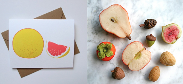
 Brown Parcel Press’s Grapefruit + Andie’s Specialty Candies marzipan fruit

  • Sapling Press + Notabli: Last week, while eating breakfast, my 3 year old turned to me and said “Mama, your eyebrows are too bright.” I reacted like many moms of my generation: I grabbed my phone and decided which social media platform deserved this quip. I chose notabli, a scrapbook-like app that saves your kids moments in photos, audio, video or just a little note. I love the note function because everyone always tells you to “write down what your kids say” and of course you never do, but now I finally am.

Screen Shot 2015-01-18 at 8.17.14 PM

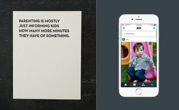
Sapling Press card + a little shot of the Notabli App

A while back, I laughed through my entire Sapling Press order. So here’s my idea: I want these two to join forces. I want Notabli to hold a contest for parents to enter the funniest things their kids say and then I want Sapling Press to print them. Kids do say ridiculous things, but that doesn’t mean they’re not worthy of letterpress. (Spoken like a true parent, I know.)

  • Our Heiday + MCMCI’ve carried MCMC fragrances at Clementine for several years and Anne’s descriptions are just my favorite, vivid and lush, they take you right to a place. Last year, Pat from Our Heiday sent her beautiful intro packet and with each new card I found myself wanting another sense involved. They were like visual ingredient bouquets and I kept wondering: what would these cards smell like? I would love to see what these two would do together: a scent MCMC creates based on an Our Heiday illustration? Or Our Heiday illustrations based on MCMC scents? Either way, I’m in.

Screen Shot 2015-01-18 at 6.58.39 PM

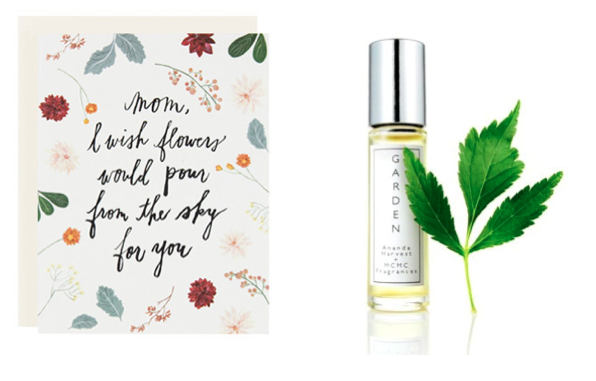
Our Heiday’s Mom Card + MCMC’s Garden Fragrance

  • Anna Joyce + The Hive StudioI have horrible handwriting, so calligraphy truly is magic to me. Though I carry a few calligraphed cards at Clementine, people still think it is reserved for wedding invitations. I would love to see its application expand. Lindsey Buck of The Hive Studio was my Goody Goody Gift Swap mate and I was just floored by her calligraphy, it was bold and graphic, penning in a vibrant teal ink it was raised from the page and I wanted to see it on repeat. Anna Joyce‘s line of accessories has been a Clementine favorite for a while. Her contrast of her fabric and leather makes her accessories rise to art status, especially with her new hand painted series. It seems like a seamless jump to turn Lindsey’s wrapping paper into fabric for a special limited edition line with Anna’s skills.

Screen Shot 2015-01-19 at 3.13.58 PM

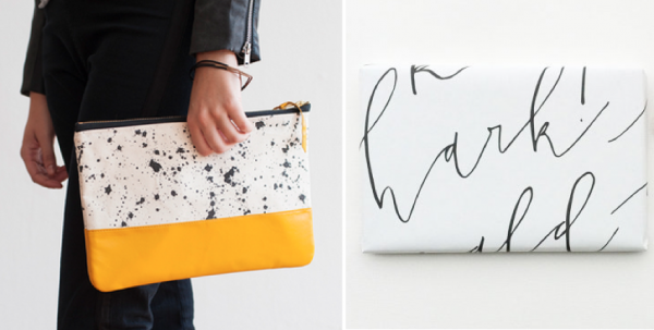
Anna Joyce Design’s Splatter Print Clutch in Yellow + The Hive Studio holiday wrapping paper

  • Red Cap Cards + Hygge & West: I spent my childhood skirting the edge of Vermont’s forests. My little friends and I built endless fairy houses and lived knee-deep in a land of make-believe. Whenever I find a designer able to capture the feeling of that time, I want to live in their world. This is to say: wallpaper. I want them to make wallpaper. Currently, I think Hygge + West is knocking it out of the park translating illustrated designs onto walls and I love scouring Red Cap’s line for illustrators who create the worlds I could live within.

Screen Shot 2015-01-20 at 8.55.03 PM

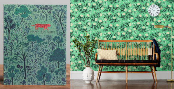
Becca Stadtlander for Red Cap Cards + Hygge + West’s Mint Peonies by Rifle Paper Co

  • Red House Inc + Swiss Cottage DesignsVermont is tiny state, with big state pride. Red House Inc, a fave local maker is creating some fantastic waxed canvas products. I especially love her thoughtful details, like her choices for liner fabrics. Courtney from Swiss Cottage Designs recently sent me a sample card from a Vermont wedding she designed. I was planning to crash the wedding (for the goodie bags) because I love LOVE, but then she wrote to say: let’s make something out of this and I thought: ug, where do I start? Well, I’ll start with fabric. (Then wallpaper, wrapping paper, notepads….). How about these two together:

Screen Shot 2015-01-20 at 10.23.59 PM

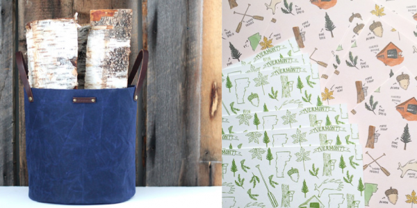
Red House Inc’s extra large tote + Swiss Cottage Designs Vermont illustrations

  • Little Auggie + Clap ClapLittle Auggie is creating some of the softest, sweetest bedding around. I’m especially grateful for their patterns for boys – which don’t fall into the easy rut of sport/superhero/truck themes. Instead each line creates a narrative that even parents can love . Similarly, Clap Clap Design‘s stationery stops me in my tracks with bold colors and a clear story. I would happily pull a duvet cover designed by these two over my head for a long winter nap.

Screen Shot 2015-01-20 at 11.53.14 PM

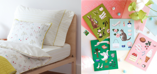
Little Auggie‘s Rabbit Patch Collection + Clap Clap‘s Greeting Cards

  • Julie Song + Pretty Plum SugarIt turns out, these two were well ahead of me. For Christmas, I was gifted a gorgeous robe from Pretty Plum Sugar (long live the pinterest wish list!). I returned to Clementine to find Julie had sent her beautiful 2015 Calendar. As I was dreaming up this post, I had a fleeting thought about how perfect Julie’s designs would be on these robes. Then last week on Instagram I saw that it had already happened, even prettier than I had imagined (and dare, I say the perfect get-up for 2015 tea-drinking bed-lounging daydreams):

Screen Shot 2015-01-21 at 12.12.36 AM

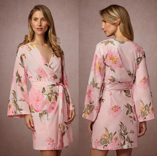
{Julie Song for Pretty Plum Sugar exclusively via BHLDN}

Join me back here soon to day dream about new and expanded products from some of your existing stationery lines. And in the mean time…What brands do you think could partner to create a new product?

xx 2015!