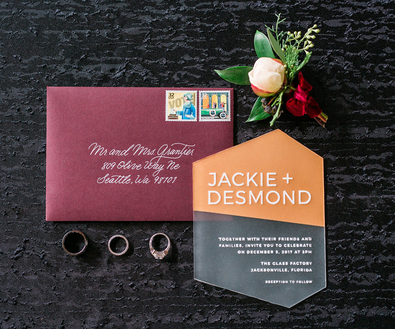
Today’s installment of Behind the Stationery is a very special one, as we sit down with printmaker and business owner Katharine Watson! Katharine carves and prints each linoleum block entirely by hand to produce all kinds goods from stationery to textiles. Today she’s sharing her carving process with us, along with how local shows helped launch her full-time business and why she doesn’t believe in creative block. She’s a longtime favorite here on the OSBP and wrote our guide to block printing if you want more details on that! Take it away, Katharine! —Megan Soh
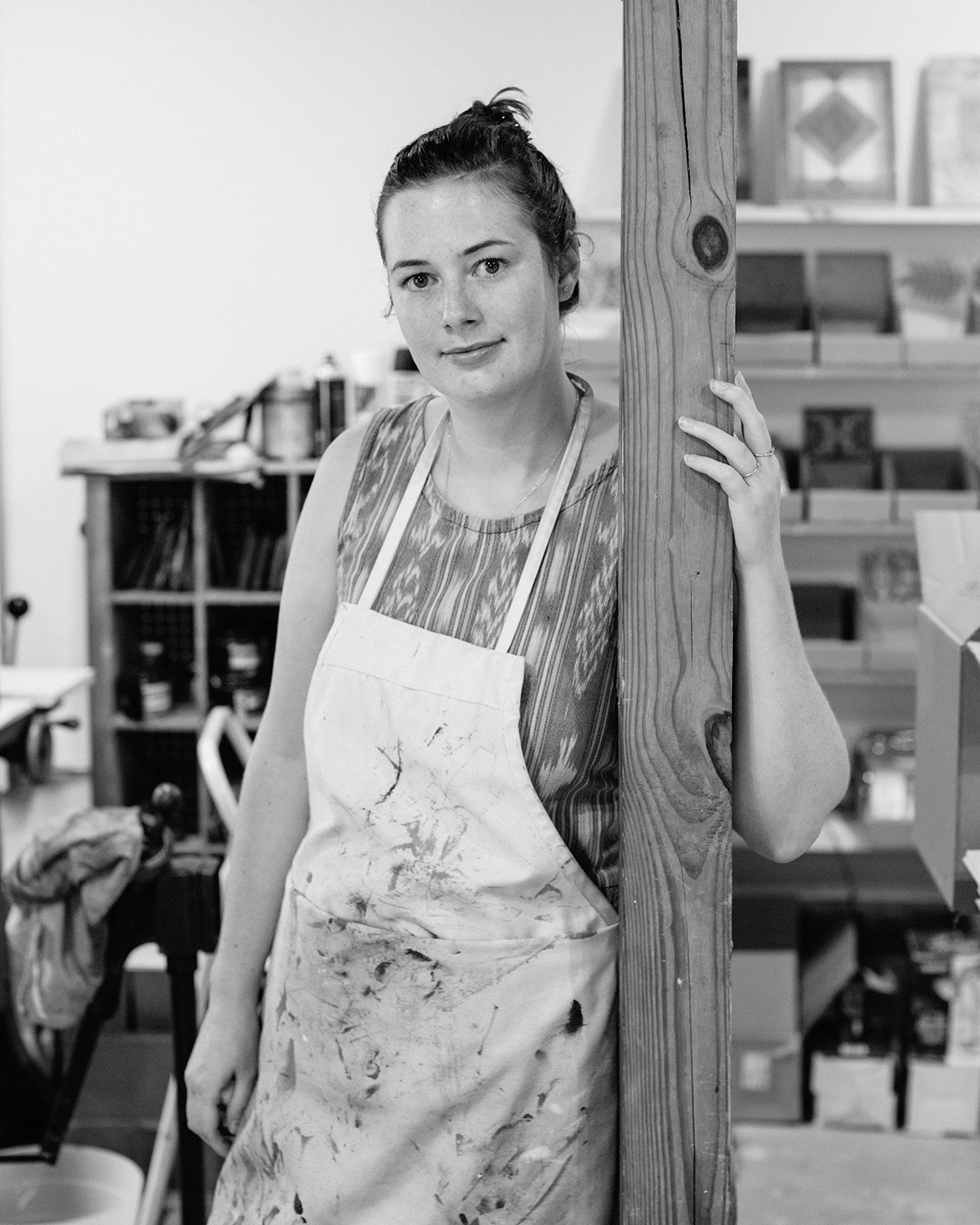
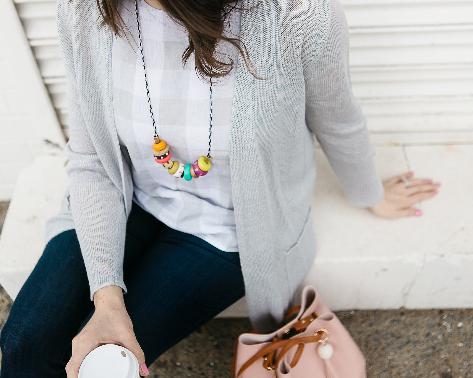
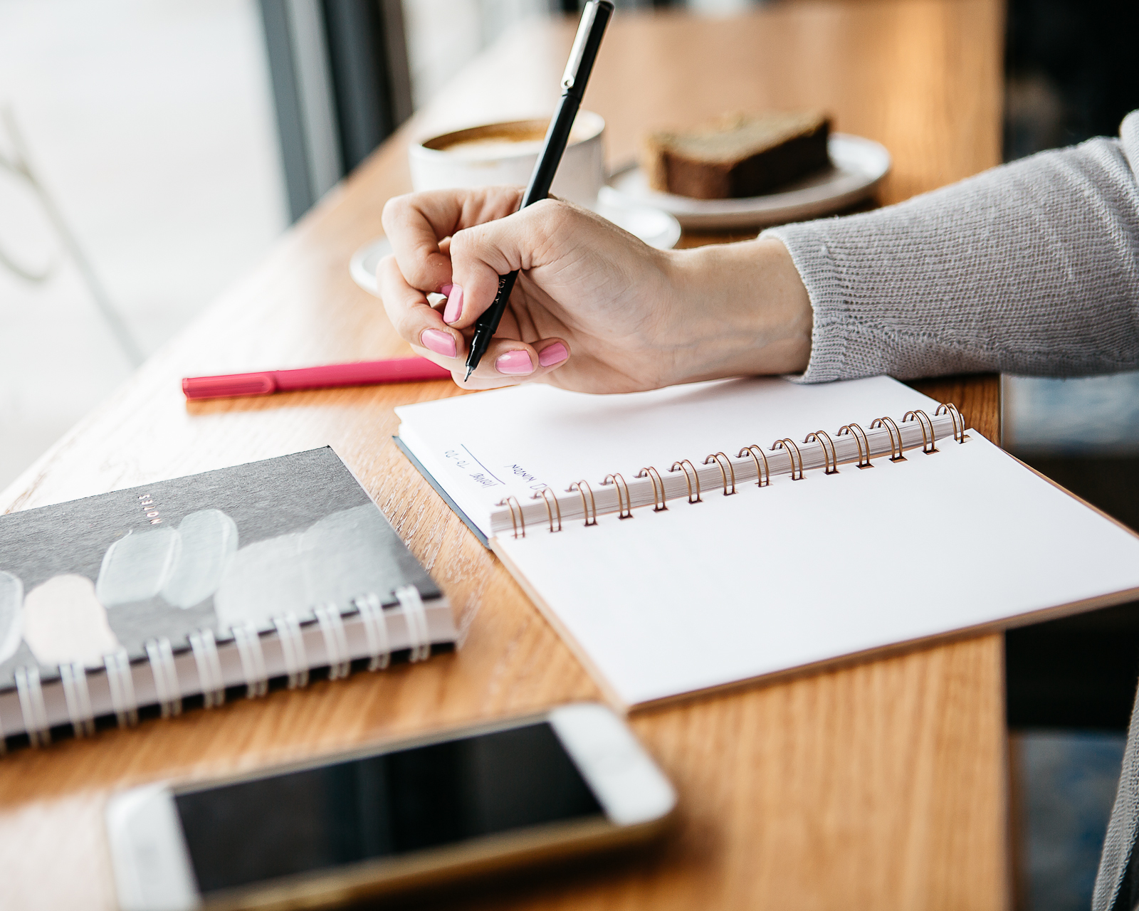
Photo by Maika Lindsay
From Katharine: My name is Katharine Watson and I run my namesake business from my studio in Portland, Maine. I started my business in 2009 after graduating from college and wanting to make the jump into being an artist. I started out doing linocuts on paper and stationery, and have since expanded to working with home goods, doing licensing for other companies, and doing custom design based on my linocuts.
I always knew I wanted to be an artist, but in college it seemed like being a fine art painter was the only real career path. Once I graduated I started working at a stationery store, continued printmaking in my free time, and began to do some small shows where I sold prints and hand-printed stationery. It started going well and I realized that there was a market for printmaking. I was surprised because I didn’t see being an artist as a full-time career option, but after about a year of working like crazy on the side, I was able to quit my other jobs and pursue printmaking and art full-time. I definitely credit doing all those local shows at first for some of my success: it was so helpful to get feedback in the early stages (whether it was vocalized or through what people purchased). It really helped me to figure out what would sell, and seeing people get excited about my work and style in the beginning was an amazing push to get started.

When I started my business I lived in Washington, D.C., and have since lived in rural Vermont and am now settled in Portland, Maine. My studio is in a converted barn behind my house, and that was our main requirement when we were house-hunting. I briefly considered getting a studio a little more separate from our house, but I love being able to work so close from home or run in quickly when I think of a good idea (and the commute is pretty great when it’s snowing).

All of my stationery starts with hand-carved linoleum blocks, and we also offer block printed art prints, home goods, textiles, and custom work. I love stationery and printmaking, and it made sense to me when I was starting out to put the two together. When I first started, I didn’t know of anyone else who was working with linocuts, and that definitely helped me stand out in the beginning. Now, thanks to social media, I know of so many other artists working with linoleum. It’s so great to see other people’s work be more visible thanks to the internet, and also to see the resurgence in interest in printmaking that’s happened in the last few years.

My day usually starts with me working on email and social media messages, and taking care of the less glamorous business tasks like submitting files, tweaking designs, and putting invoices together. Those parts aren’t as Instagram-friendly as some of the other work I do, but I actually love doing it because it’s what allows me to work full-time for myself. I always appreciate every new inquiry or order because it keeps my business going, and I love getting requests that are a little outside of my comfort zone as they help me develop new ideas and styles. One of the nice things about being self-employed is that I don’t really have a set schedule. Some parts of the year I am working twelve hour days and rushing to get shipments out and meet deadlines, and other times I get to be more creative, try new styles, and work a little less. I’ve really gotten used to that balance, but it was one of the harder adjustments to running a business. At first I thought that slower times were a sign that things weren’t going well, and now I am able to recognize them as a necessary time to reset and keep pushing new ideas. I definitely wouldn’t be able to come up with new work if every month were as busy as December.

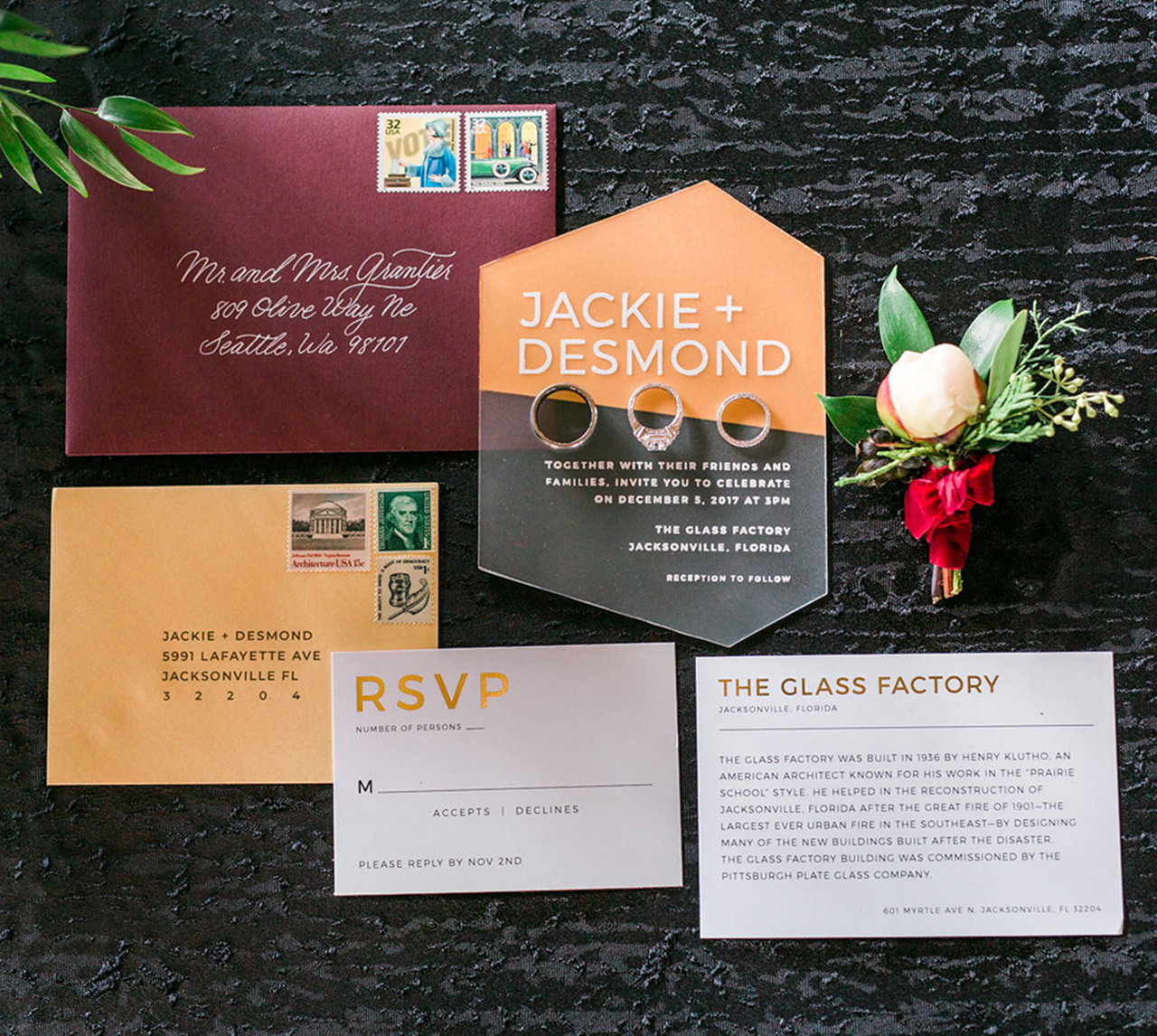
When I’m thinking of a new design or product, I’ll start with a thumbnail sketch, and then draw the design out on linoleum and start carving. One of my favorite things to do is experiment with new patterns and see what I can do with them: after a new block is printed, I might scan it and move it into Photoshop to turn it into a repeat pattern, or use a piece of the design on a new wedding invitation. Usually one new idea will snowball into lots of new ones, and that’s my favorite thing about having a little extra time to create vs. being on a tight deadline. People often ask me about creative block and it’s not something I really believe in: if I don’t have any ideas, I’ll just start doodling or look through old work, get something down on paper and see what happens. I don’t think that a lack of creative block means that you’re consistently doing good work, just that you’re getting ideas out of your head and onto paper, even if they are terrible. I usually find that there is something there worth exploring, and if not I can just keep getting shapes down on paper.

My process starts with a plain piece of linoleum, and I draw the border for the size of the piece I want to make. I always carve on linoleum from Blick, but I always recommend that people try out different types of linoleum to find which one works best for them. Every type has a different feel and a different texture when printed, and it took lots of experimenting for me to figure out what worked best with my style. I carve with Speedball carving tools, and again, different people have different preferences for tools but these are the ones I’ve always liked most.

I start by sketching out my design with a ballpoint pen, usually just drawing freehand and sketching out the lines as I go. Once I have the pattern laid out, I’ll go over it with Sharpie so I can see exactly which lines need to be carved out. From there, I start by carving away the smallest details and work out to carving away the larger background pieces. I then use a wide marker to draw over what I’ve carved so I can see what still needs to be worked on.

Once a block is finished (which can take anywhere from 2 to 20+ hours depending on the size of the block, but most A2-sized blocks take about three hours) I’ll print it on one of our two presses. We have a C&P that we use to print smaller blocks and all our block printed cards (or anything smaller than 8×10), and a Challenge Proof Press that I use for larger blocks and art prints. I mostly use rubber-based VanSon inks, but I also like Speedball oil-based inks.

I love the carving process because I just turn on a TV show or podcast and get in the zone of carving. It’s very meditative and sometimes I can carve for hours without really noticing (until my hand cramps up and I have to take a break). People always ask what happens if I make a mistake and carve out the wrong part, but that’s not usually an issue unless I’m carving text. If I make a mistake on a pattern I’ll just incorporate it into the design and hide it by moving things around a bit, but if it’s text I’ll have to start over. Because of that I always carve the text first, because it’s heartbreaking to get to the end of a carving and then accidentally cut the T off of “Thank You”!

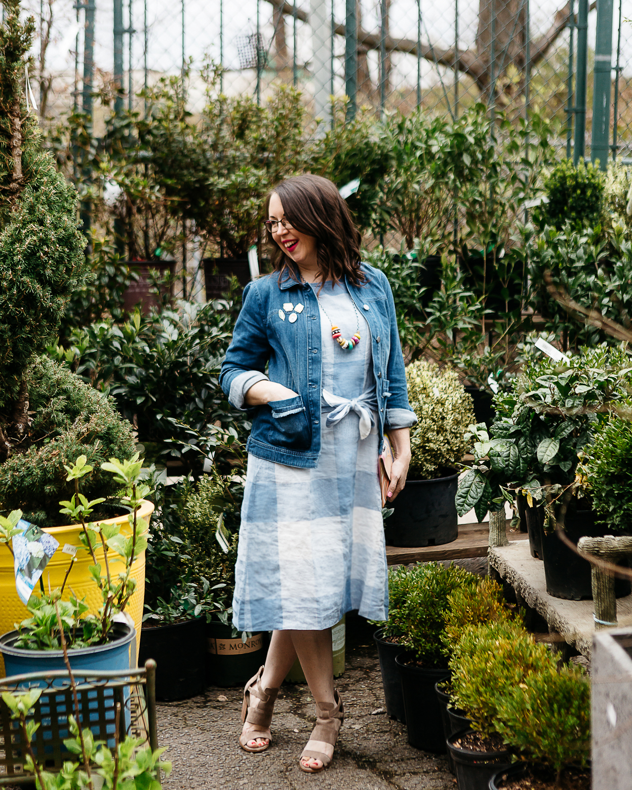
Photo by Maika Lindsay
My favorite thing about the whole process is doing the first test print, when you finally get to see the carving time pay off and see how everything looks. It’s always kind of a surprise because you never know exactly what it’s going to look like, and that makes the process worth it for me!

Photos by Katharine Watson unless noted otherwise.
Want to be featured in the Behind the Stationery column? Reach out to Megan at megan [at] ohsobeautifulpaper [dot] com for more details.