Ben + Maureen’s Floral Illustrated Wedding Invitations

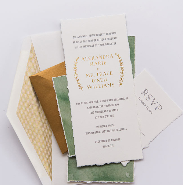
I’m a longtime fan of illustrator Caitlin Keegan – she was the first illustrator that we collaborated with to create recipe cards for our Friday Happy Hour cocktail series! Today Caitlin is back on OSBP to share a wedding invitation that she recently designed featuring dahlia illustrations, Caitlin’s signature hand lettering, and a cheerful yellow and blue color palette. So pretty!

Yellow-Blue-Illustrated-Dahlia-Wedding-Invitations-Caitlin-Keegan-OSBP2

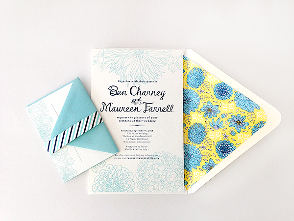
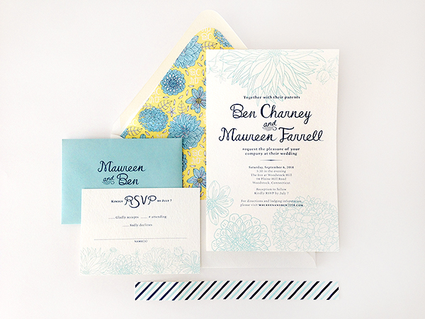
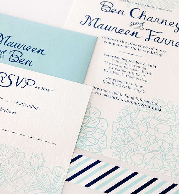
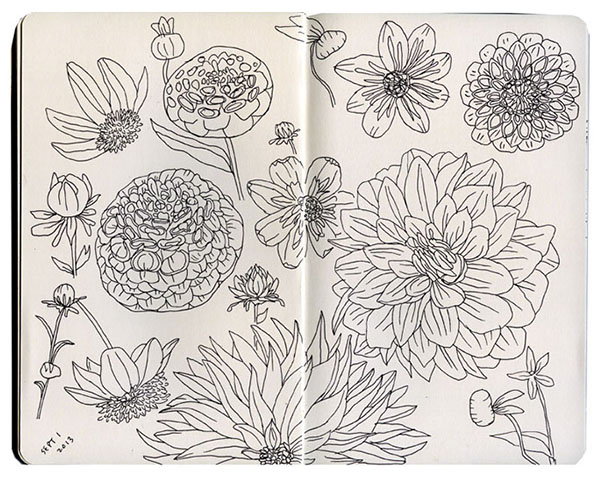
From Caitlin: I designed this wedding invitation for my good friends who were married in September at an inn in Woodstock, CT that had a dahlia farm. The couple asked that this be incorporated into the design along with their wedding colors. I started with some loose drawings of dahlias in my sketchbook and actually ended up using them for the final design, along with some hand lettering which was also carried over onto their favors and program.

Yellow-Blue-Illustrated-Dahlia-Wedding-Invitations-Caitlin-Keegan-OSBP

Yellow-Blue-Illustrated-Dahlia-Wedding-Invitations-Caitlin-Keegan-OSBP4

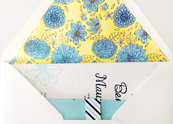
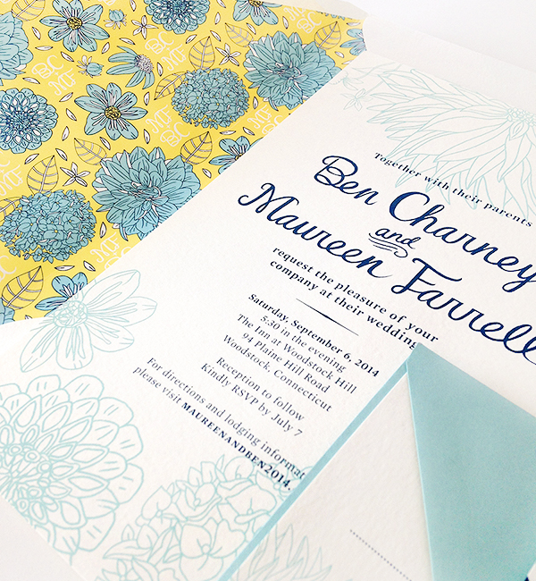
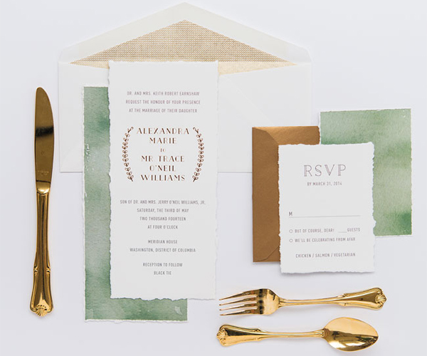
The invitations, RSVP cards, and envelopes were silkscreened by Out of Line Press in Brooklyn and the envelope liners were printed digitally. The bride also used some of the leftover patterned paper to make small notecards for each of the guests, which were distributed with the wedding favors. For the envelope liner, I created a custom dahlia pattern that includes the couple’s initials.

Yellow-Blue-Illustrated-Dahlia-Wedding-Invitations-Caitlin-Keegan-OSBP3

Yellow-Blue-Illustrated-Dahlia-Wedding-Invitations-Caitlin-Keegan-OSBP5

Yellow-Blue-Illustrated-Dahlia-Wedding-Invitations-Caitlin-Keegan-OSBP6

Thanks Caitlin!

Design + Illustration: Caitlin Keegan

Screen Printing: Out of Line Press

Check out the Designer Rolodex for more tal­ented wed­ding invi­ta­tion design­ers and the real invi­ta­tions gallery for more wedding invitation ideas!

Photo Credits: Caitlin Keegan

Sarah + Michael’s Hip Hop Hollywood Regency Wedding Invitations

I love wedding invitations that a) are absolutely gorgeous and b) don’t take themselves too seriously. These stunners from Nichole at Coral Pheas­ant combine Hollywood Regency-inspired details and gold foil with hip-hop inspired lyrics. What more could you possibly ask for?

Art-Deco-Hollywood-Regency-Gold-Foil-Wedding-Invitations-Coral-Pheasant-OSBP

From Nichole: Sarah and Michael and their invitation suite are my favorite client/paper combo to date. They have the best style and an affinity for Hova and Bey. Seriously, what’s not to love? We brought both to their paper story combing the feel of Old Hollywood with hip-hop inspired lyrics.

Art-Deco-Hollywood-Regency-Gold-Foil-Wedding-Invitations-Coral-Pheasant-OSBP8

It all started with their foil stamped save the date. At first glance, you see a super-glamorous card – but wait – the words “wining and grinding” appear in a beautiful foil stamped script. It’s this combination of luxe with lingo that really gets me fired up – in a good way!

Art-Deco-Hollywood-Regency-Gold-Foil-Wedding-Invitations-Coral-Pheasant-OSBP4

The design of their save the date carried over to the invitation suite which was letterpress printed and gold foil stamped on 110# Crane’s Lettra. The main invitation was kept formal with elegant details and traditional wording. It’s on the enclosure cards where we let loose with fun language.

Art-Deco-Hollywood-Regency-Gold-Foil-Wedding-Invitations-Coral-Pheasant-OSBP3

Art-Deco-Hollywood-Regency-Gold-Foil-Wedding-Invitations-Coral-Pheasant-OSBP7

Guests were asked to “Pop champagne and make it rain” and were invited “After the party (to) the hotel lobby” for a recovery brunch. Of course this rap-inspired suite wouldn’t be complete without a mix tape. This cheeky card guided guests to their wedding website for all the celebration details.

Art-Deco-Hollywood-Regency-Gold-Foil-Wedding-Invitations-Coral-Pheasant-OSBP2

Art-Deco-Hollywood-Regency-Gold-Foil-Wedding-Invitations-Coral-Pheasant-OSBP5

Art-Deco-Hollywood-Regency-Gold-Foil-Wedding-Invitations-Coral-Pheasant-OSBP6

Thanks Nichole!

Design + Styling: Coral Pheas­ant

Calligraphy: Calligraphy by Hillary

Coral Pheasant is a member of the Designer Rolodex – you can see more of Nichole’s beautiful work right here or visit the real wedding invitations gallery for more invitation inspiration!

Photo Credits: Athena Bludé Photography

Alexandra + Trace’s Watercolor Gold Foil Wedding Invitations

I stumbled upon these gorgeous invitations by Leslie of Lilly & Louise over the weekend and just couldn’t resist sharing them here with you! Leslie created these invitations for a black tie wedding at a former mansion right here in DC – combining watercolor with gold foil and hand-torn paper to reflect the romantic setting of their venue. Aren’t these gorgeous?!

Watercolor-Gold-Foil-Wedding-Invitations-Lilly-Louise-OSBP3

Watercolor-Gold-Foil-Wedding-Invitations-Lilly-Louise-OSBP4Watercolor-Gold-Foil-Wedding-Invitations-Lilly-Louise-OSBP5

Watercolor-Gold-Foil-Wedding-Invitations-Lilly-Louise-OSBP

Watercolor-Gold-Foil-Wedding-Invitations-Lilly-Louise-OSBP2

Design: Lilly & Louise

Photo Credits: Cara Robbins

Elizabeth + Janelle’s Modern Mint and Gray Wedding Invitations

This wedding took place in a hardware store turned restaurant – how cool is that?! When designing the invitations, Kim at Bright Room Studio wanted to play off the industrial vibe of the wedding venue, combining charcoal gray with a pop of mint and incorporating an illustrated version of the restaurant’s vintage sign into the RSVP. So fun!

Modern-Mint-Gray-Wedding-Invitations-Bright-Room-Studio-OSBP

From Kim: Elizabeth and Janelle were such a fun couple! They wanted their wedding weekend to be all about showing their friends and family their favorite spots around their West Hollywood neighborhood, so we made the invitation the first introduction to the area.

Modern-Mint-Gray-Wedding-Invitations-Bright-Room-Studio-OSBP3

The invitation featured an illustrated streetscape where their wedding took place. They got married in a restaurant that was formerly a hardware store, so we played up the graphic and industrial lines of the shops and then letterpress printed the design with a modern and vibrant pop of mint.

Modern-Mint-Gray-Wedding-Invitations-Bright-Room-Studio-OSBP4Modern-Mint-Gray-Wedding-Invitations-Bright-Room-Studio-OSBP5

The RSVP featured a sign that matched the venue’s vintage hardware sign out front, plus some fantastic tongue-in-cheek language for the accept/decline. Since it was all about the neighborhood, the map was important, so we made it graphic and modern with fun symbols representing the weekend’s events. The suite was all brought together by the unique envelope liner – a floral pattern inspired by the wallpaper in the wedding venue!

Modern-Mint-Gray-Wedding-Invitations-Bright-Room-Studio-OSBP6

Modern-Mint-Gray-Wedding-Invitations-Bright-Room-Studio-OSBP7

Modern-Mint-Gray-Wedding-Invitations-Bright-Room-Studio-OSBP2

Thanks Kim!

Bright Room Studio is a member of the Designer Rolodex  – you can see more of Kim’s beautiful work right here or visit the real invi­ta­tions gallery for more wedding invitation ideas!

Photo Credits: Bright Room Studio

Happy Weekend!

Happy Friday everyone! Poor little Alice and I both have colds and Sophie seems to have come down with a stomach bug – so I’m pretty much just going to go crawl back into bed and hope for the best! But in the meantime…

Peonies-FloretFlower

Photo by Erin Benzakien / Floret Flower

…a few links for your weekend!

This week on Oh So Beautiful Paper:

Check back soon for this week’s cocktail! I hope you all have a wonderful weekend, and I’ll see you back here next week! xoxo