DIY Modern Color-Blocked Easter Eggs

This post is sponsored by The Incredible Egg. All content and opinions are my own. Visit The Incredible Egg for Easter recipes and inspiration!

Easter is such a fun holiday, don’t you think?? I’m partial to any holiday that involves decorating – and eggs are the cutest little canvases that can be decorated in so many fun and colorful ways. And now that my kids are old enough to join in on the Easter egg decorating fun, it’s even better! I love coming up with new Easter egg decorating ideas each year, and this year I’m really feeling inspired to experiment with new color palettes and color combinations. So today I’m partnering with The Incredible Egg to share these fun DIY modern, color-blocked Easter eggs!

DIY Modern Color-Blocked Easter Eggs

DIY Modern Color-Blocked Easter Eggs

My family looks forward to decorating Easter eggs all year long. We typically spend the holiday with my husband’s family, so we gather everyone around the kitchen table on Easter morning to dye eggs together. I love seeing the colors (and color combinations!) everyone chooses for their eggs and all the ways they express themselves creatively. Plus my kids absolutely love both getting to decorate eggs and then hunt for them with their cousins several times in the afternoon!

DIY Modern Color-Blocked Easter Eggs

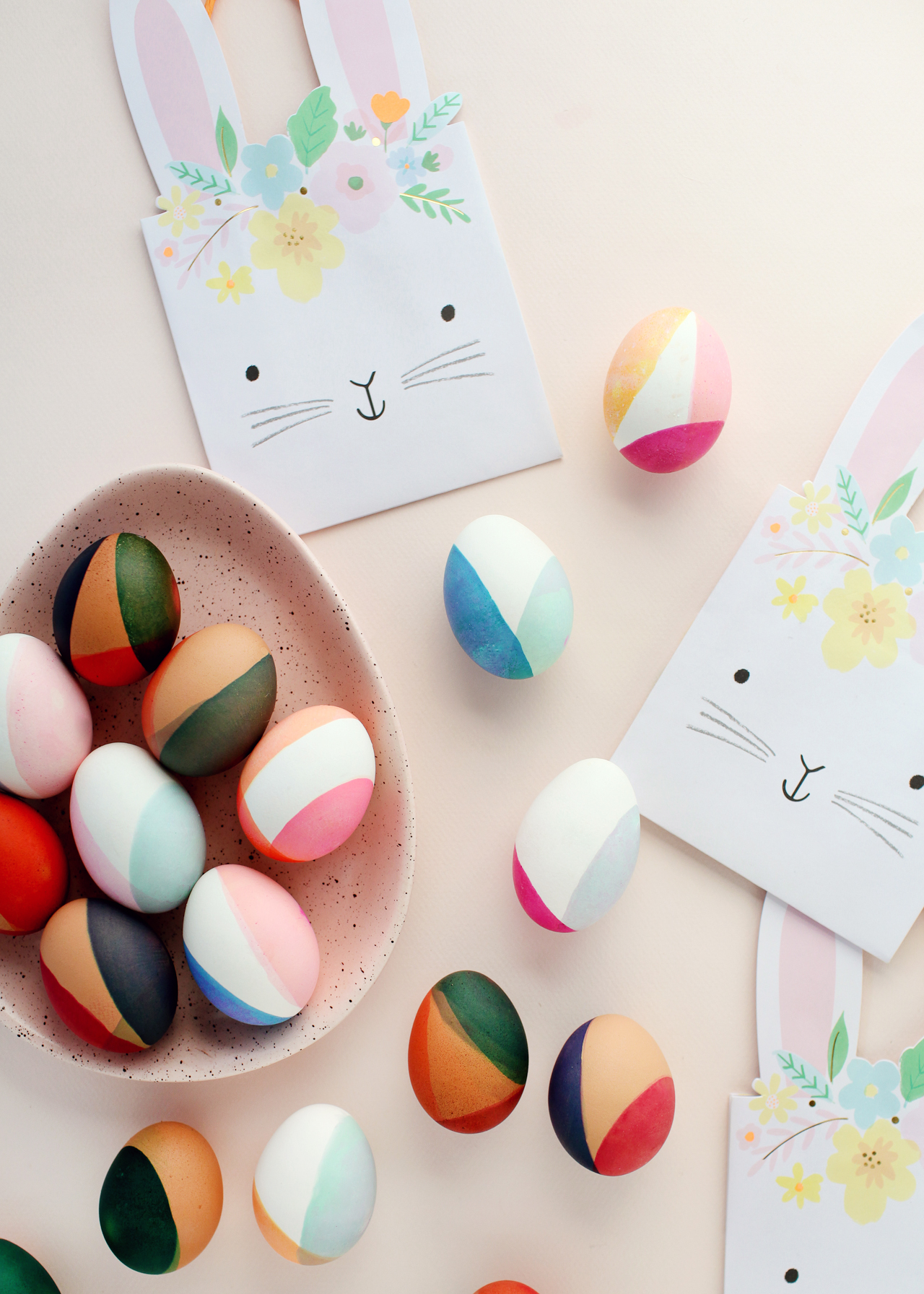
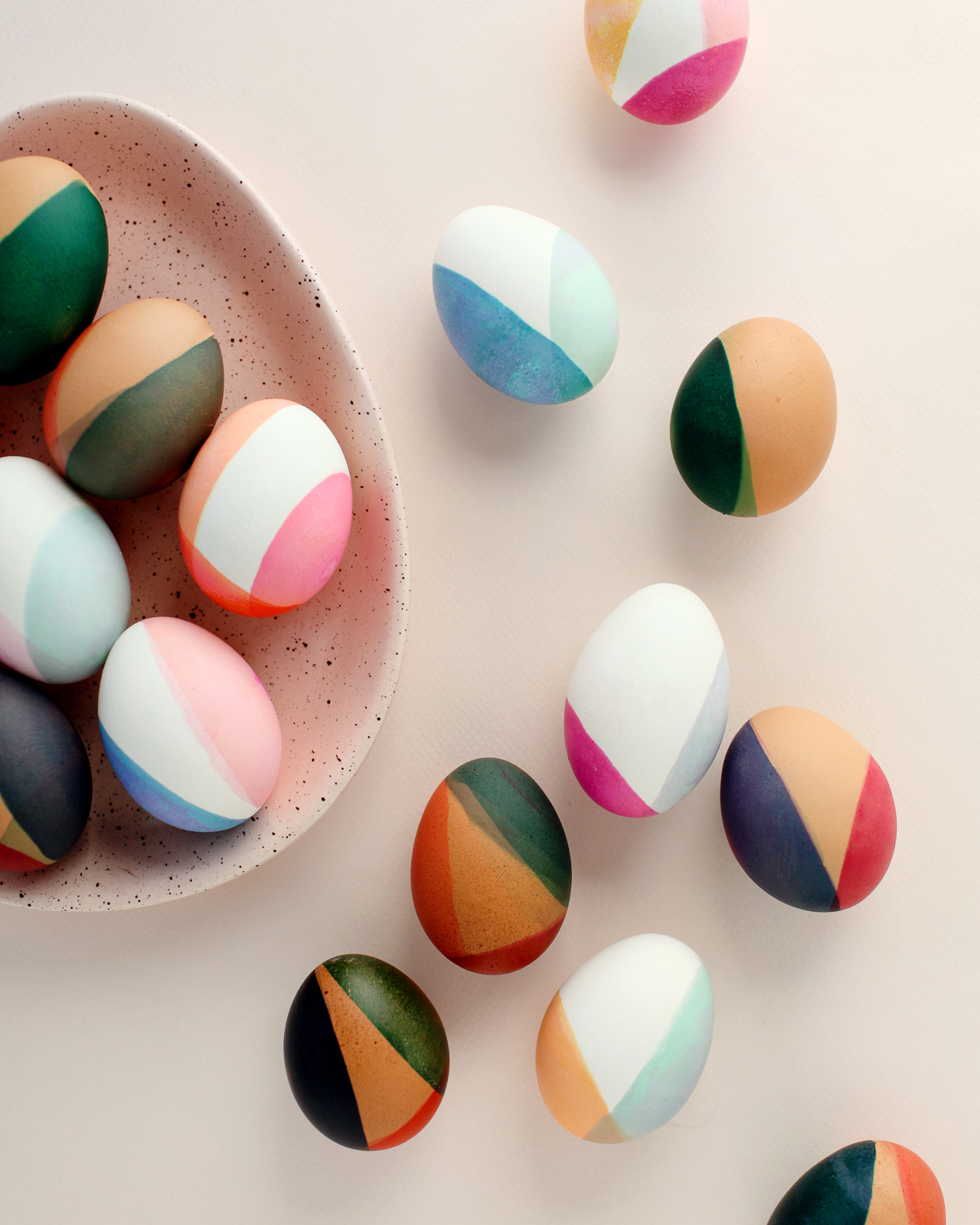
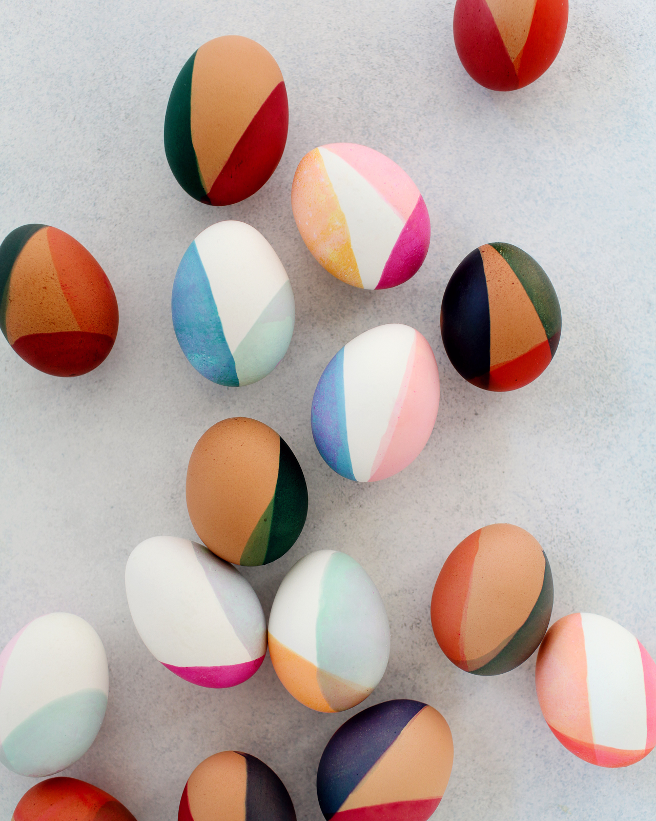
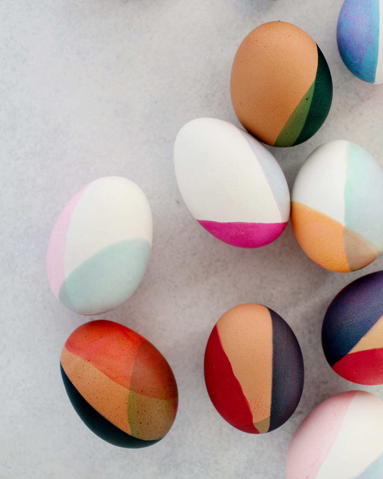
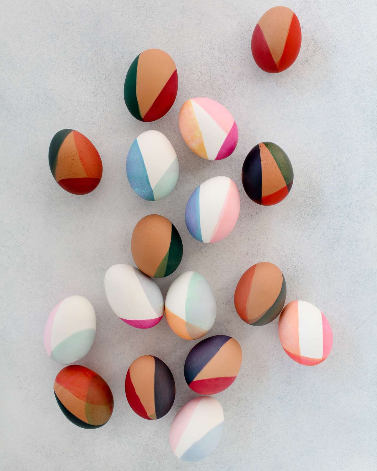
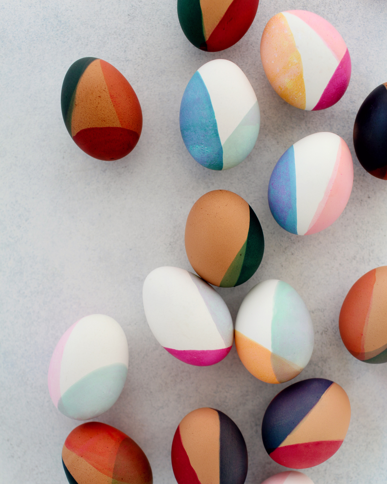
I’ve been feeling really inspired by earthy tones and neutral pastels this year – from bold burgundy and yellow tones to soft pinks and sage green hues. I am especially loving terra cotta paired with navy blue and soft pink paired with mustard yellow. I knew these color pairings would be a beautiful and unexpected application on Easter eggs, especially with a modern, color-blocked dip-dye treatment.

DIY Modern Color-Blocked Easter Eggs

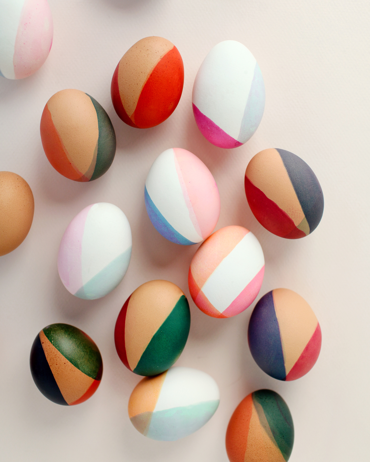
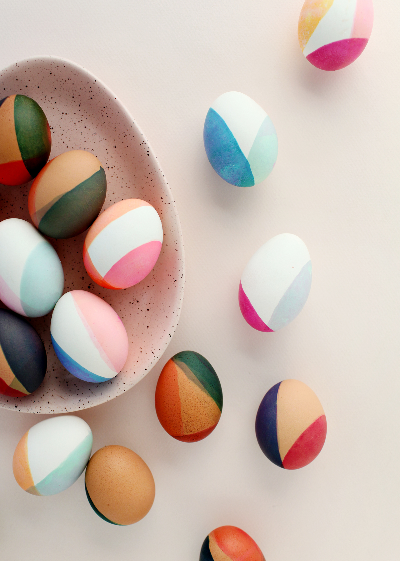
Another exciting development? As you may have noticed, I’m using both white and brown eggs this year! I’ve always dyed white eggs in the past, but brown eggs work so beautifully with the deeper earth tones that I just couldn’t resist. Aren’t they just absolutely DREAMY with the color blocked dip dye?? I also loved the idea of creating different colors and tones using the same color dyes on both brown and white eggs. The lighter pastel tones produced a beautiful color wash effect on the brown eggs, while the deeper hues produced rich jewel tones by leaving the eggs in the dye bath for a longer period of time.

DIY Modern Color-Blocked Easter Eggs

Here’s the color palette that I used as my starting point, along with the food coloring dye formulas that I used to dye the eggs:

DIY Modern Color-Blocked Easter Eggs Color Formulas

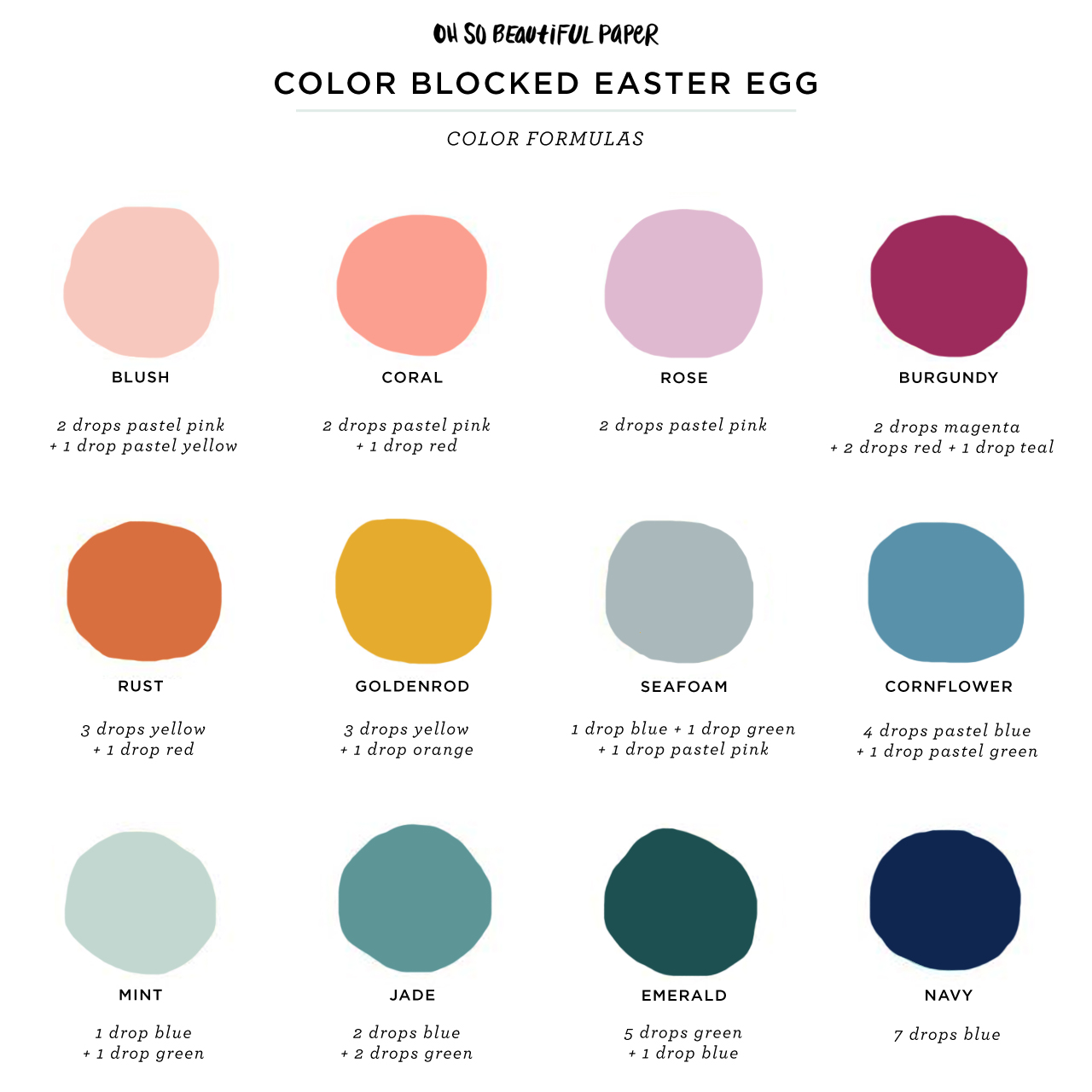
A quick note: The color formulas above achieved *slightly* different results in person – but it’s pretty close to my original color palette objectives! When you make these color formulas at home, always test the colors with a napkin or paper towel before dyeing your eggs!

DIY Modern Color Blocked Easter Eggs

There are a million ways to decorate Easter eggs – from soft painterly pink and gold eggs to tissue paper eggs – and I love putting a modern twist on traditional decorating techniques. All you need is traditional food coloring dye to achieve the gorgeous colors in these DIY modern, color-blocked Easter eggs! Are you ready? Let’s get started!
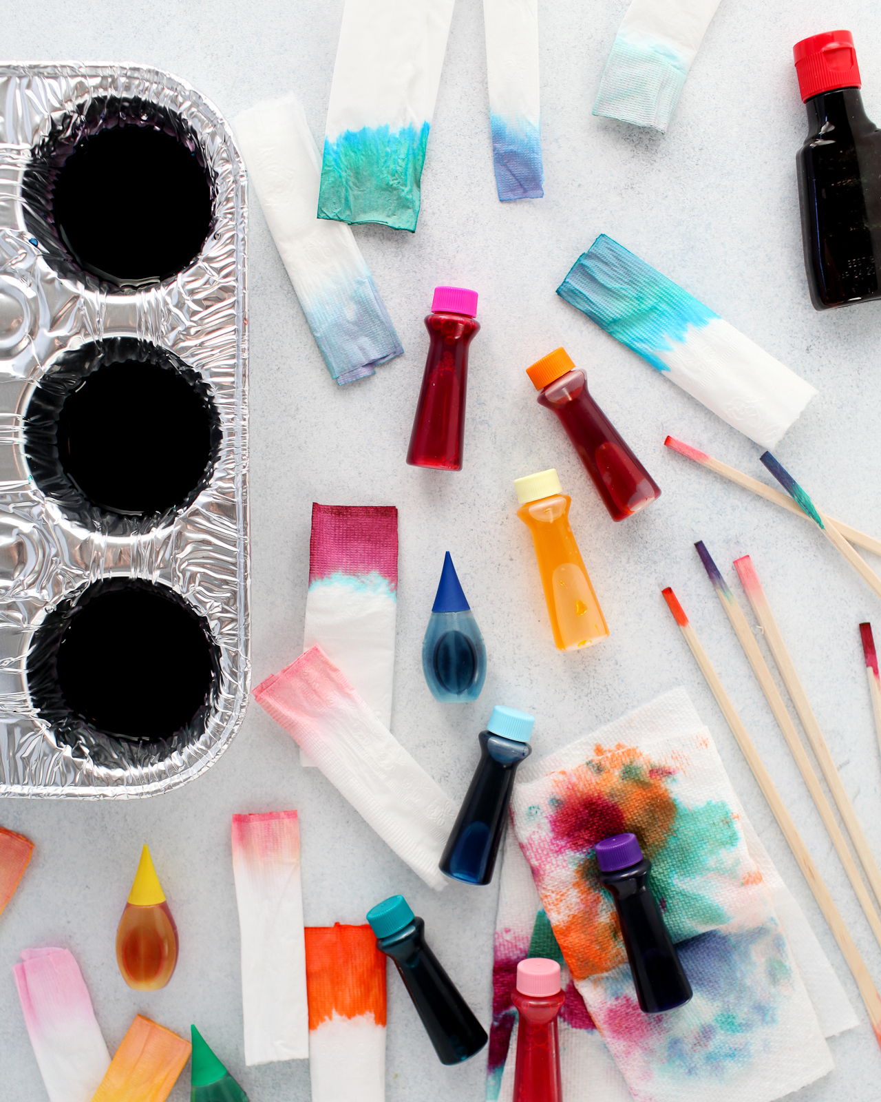
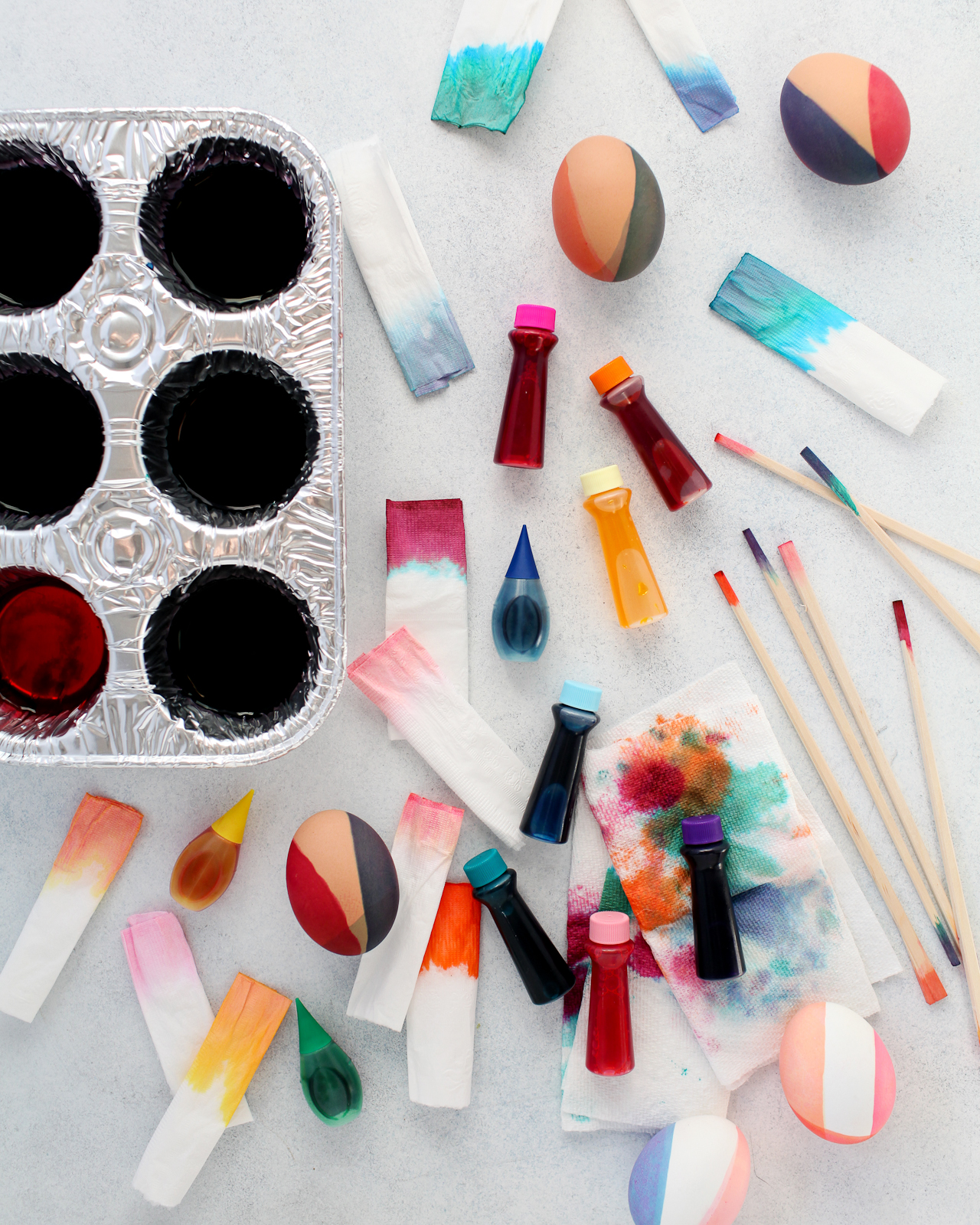
DIY Modern Color Blocked Easter Eggs

Supplies

White and Brown Hardboiled Eggs

Liquid Food Coloring

Muffin pan or small bowls for dyeing the eggs (note: the food coloring can leave permanent stains, so don’t use anything too precious!)

Vinegar

Tooth picks or wood chopsticks for stirring

Paper Towels

Disposable Gloves (optional)

DIY Modern Color Blocked Easter Eggs

To make the DIY modern color-blocked Easter eggs:

Step 1. Boil two cups of water, then add two tablespoons of vinegar to the hot water. Fill the cups of a muffin pan or a small bowl with about half an inch of the hot water. Add liquid food coloring based on the color formulas above or to achieve your own desired color palette. I used a variety of store-bought food coloring to create my dye colors, including standard red, yellow, green, and blue liquid food coloring, pastel gel food coloring, and bright magenta, teal, and orange gel food coloring. Use a toothpick or spoon to stir the food coloring together until completely blended, then give it another quick stir before dipping your egg into the dye bath.

Tip: Test the dye color with a paper towel before submerging your eggs, but keep in mind that a paper towel will absorb the dye much faster than an egg, so you’ll need to leave the egg in the dye bath for a minute or two if you’re hoping to achieve brighter/more saturated colors.

Step 2. Wearing disposable gloves, pick up your egg and gently dip one side of the egg into the dye bath. The dye should not cover the entire egg and you should continue to hold the egg in place while it’s in the dye bath so it doesn’t roll over. Hold the egg in place for several seconds for lighter colors or around a minute for deeper/more saturated colors.

Step 3. Remove from the dye bath and pat dry with a paper towel.

Step 4. Repeat steps 2 and 3 with a second and third dye color (if desired), covering a different portion of the egg with each new dye color.

DIY Modern Color Blocked Easter Eggs

DIY Modern Color Blocked Easter Eggs

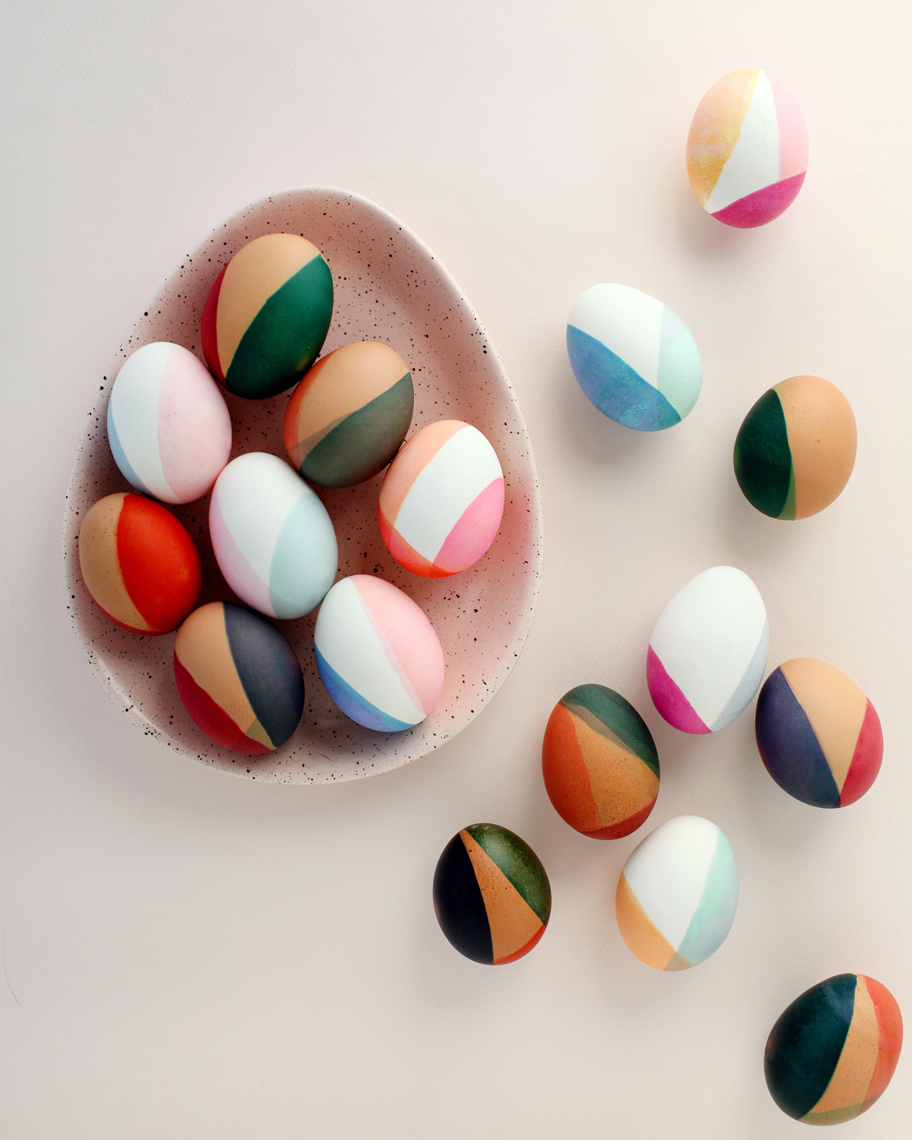
I just can’t stop staring at these colors! I love all the subtle color variations between the white and brown eggs and the different overlapping tones. The non-traditional color combinations are so special and unique!

DIY Modern Color Blocked Easter Eggs

Neutral pastels! Earth tones! Jewel tones! Gah, I just love these eggs SO much! Do you love this color palette as much as I do? Will you be making color-blocked eggs this year?? Let us know if you do! And don’t forget to head over to The Incredible Egg for more Easter inspiration and recipe ideas!

This post was created in partnership with The Incredible Egg. All content and opinions are my own. Thank you for supporting the sponsors that make Oh So Beautiful Paper possible!

A Colorful Shared Girls Nursery + Plans for a Shared Big Girl Bedroom

We’re getting ready to make some big changes in my daughters’ shared bedroom (no more toddler beds!), and I realized that I hadn’t shared photos of their existing room yet (oof). So today I’m finally giving you a peek into their colorful shared girls nursery, starting with photos from a couple years ago when Alice was still in a crib. Our home was built in the 1920s and fairly small at 1,200 square feet. We have only two bedrooms, so the girls share the larger bedroom towards the front of the house. It has two large windows and one very small closet, and it’s a tight squeeze – but we make it work!

A Colorful Shared Girls Nursery / Oh So Beautiful Paper

A Colorful Shared Girls Nursery / Oh So Beautiful Paper

The dresser between the two windows is what you see when you first walk into the room. It’s actually my husband’s dresser from when he was a kid – just painted a light teal. We lived in the house for just over a year before Alice was born, but this room didn’t really start to come together until Alice moved in, so we started with a crib on the left side of the room and a toddler bed on the right. Here’s the original mood board for Sophie’s nursery back in 2013!

A Colorful Shared Girls Nursery / Oh So Beautiful Paper

A Colorful Shared Girls Nursery / Oh So Beautiful Paper

I wanted to keep the walls fairly neutral and bring in color through art and accessories. The walls are Classic Gray by Benjamin Moore, and the ceiling is Pink Cadillac by Benjamin Moore with gold star decals on the ceiling. I also kind of love these decals!

A Colorful Shared Girls Nursery / Oh So Beautiful Paper

A Colorful Shared Girls Nursery / Oh So Beautiful Paper

I’m always curious about how folks organize the closets in kid’s rooms – so here’s a peek at our closet! The large baskets on the bottom row used to hold diapers and wipes (and something else that totally escapes my mind), but now hold some extra blankets and a donation bin for clothing they grow out of. The middle row of baskets holds our sheets and waterproof mattress pads, along with some smaller crib blankets and quilts. Then we have clothing that requires hanging, mostly dresses and a few nicer shirts or sweaters. The top baskets used to hold out of season shoes, Alice’s old crib bumper, and some extra nighttime diapers, but now that we’re out of diapers that basket is used for more out of season shoes (essentially one basket for each girl). The crib bumper is now in storage until I decide what to do with it, so that basket now holds knee pads, goggles, and other assorted equipment. We store out of season clothing in bins under Sophie’s bed (previously under the crib), we have a few costumes hanging on the back of their door, and everything else (t-shirts, pants, PJs, skirts, tights, socks, undies) is folded and stored in the dressers Marie Kondo style. At some point we’ll probably have to redo our system once the girls’ dresses get too long to fit in the current space, but for now it works!

A Colorful Shared Girls Nursery / Oh So Beautiful Paper

A Colorful Shared Girls Nursery / Oh So Beautiful Paper

A Colorful Shared Girls Nursery / Oh So Beautiful Paper

My husband and I love to travel and have been all over the world, so we wanted to pass that love along to our girls from the very beginning. The shelves contain a mix of globes, some travel trinkets, family photos, and art prints.

A Colorful Shared Girls Nursery / Oh So Beautiful Paper

The girls have a separate play area downstairs, so we don’t keep many toys in the room – mostly just books, stuffed animals, and dolls. We moved the markers and drawing supplies downstairs once Sophie started preschool, so there’s now another little book cart in this corner.

A Colorful Shared Girls Nursery / Oh So Beautiful Paper

A Colorful Shared Girls Nursery / Oh So Beautiful Paper

A Colorful Shared Girls Nursery / Oh So Beautiful Paper

A Colorful Shared Girls Nursery / Oh So Beautiful Paper

I wanted something above the crib that would provide color and visual interest – but would be lightweight enough that I didn’t have to worry about it falling down on the crib. Tissue paper fans to the rescue! I put them up using removable 3M velcro strips, and they’ve stayed up for 4+ years!

A Colorful Shared Girls Nursery / Oh So Beautiful Paper

Our beloved pom pom basket is from Eliza Gran and helped inspire the color palette for the nursery! It sadly doesn’t look like her shop is open at the moment, but I’m going to put a couple alternatives into a slideshow at the bottom of the post with shopping links.

A Colorful Shared Girls Nursery / Oh So Beautiful Paper

My favorite Roxy Marj blanket! She no longer sells handmade blankets, but you can find her lion blanket and bear blanket at Crate & Kids on super sale. The rest of our crib and toddler bed bedding was all from Land of Nod (RIP), but you can now find a good selection at Crate & Kids. And did you see that Anthropologie now offers kid bedding? Lots of great options there, too!

A Colorful Shared Girls Nursery / Oh So Beautiful Paper

Eventually, especially once we were ready to potty train Alice, we moved Alice out of the crib and into Sophie’s toddler bed, then put a twin bed in the corner where the crib had been. Sadly I don’t seem to have a great photo of Sophie’s current twin bed, but it’s the very simple wood Tarva bed from IKEA painted a pale pink.

A Colorful Shared Girls Bedroom / Oh So Beautiful Paper

A Colorful Shared Girls Bedroom / Oh So Beautiful Paper

A Colorful Shared Girls Bedroom / Oh So Beautiful Paper

We’ve made even more changes since these photos were taken: the monitors, diaper pail, and changing pad are long gone, some of the furniture has been relocated to other parts of our house, and as of last weekend Alice is no longer in a toddler bed! So now we’re ready for an even bigger change – bunk beds! The girls have been begging us for bunk beds FOREVER, and over the holiday break we decided to just go for it. We passed Alice’s toddler bed on to another family in the neighborhood, ordered a new mattress and bunk bed, and the plan is to put the new bed together this weekend. It’s been a tight squeeze with a bed on each side of the room, so I’m looking forward to freeing up some floor space when we move to bunk beds. I’ll have to take down the tissue paper fans and gallery wall to fit the new bunk bed, so it’s also an opportunity to update the room in a way that makes sense for them at this stage in their lives. I’m still working out the details, but here’s what I’ve got for inspiration so far:

Colorful and Modern Shared Girls Room Moodboard

Bed with canopy | Pink bunk bed | Magic Flag | Cane Chair

Bright and Colorful Room | Mint Green Bunk Beds | Tassel Wall Hanging | Velvet Pillows | Curtain Bunk Beds

We’re planning to get a bed canopy from Target (I can’t decide between this pink one or this tassel one) to suspend from the ceiling over the top bunk and drape down along the side of the bottom bunk. I love the idea of creating a cozy little space for the bottom bunk, so we may also add curtains to the bottom bunk? TBD. We currently have two dressers in the room, but I’m debating trying to replace them with one wider dresser? Also TBD. I’ll need to add a shelf next to the top bunk for books and water bottles. I’d like to fit a desk or work table in here for homework after school, but I think I’ll need to play around with the layout before I make that decision. I’m also looking forward to a fresh start when it comes to wall art and the opportunity to simplify the room décor a bit, so keep an eye out for a sale over on my Instagram sale page!

Okay, phew! That was a loooong post about our shared nursery and plans for a shared big girl bedroom. I think I covered everything, but let me know if you have any questions and I’ll do my best to answer them. Also – let me know if you guys would be interested in posts about our experience with a shared bedroom. I know I looked for resources on sleep training and potty training in a shared bedroom but didn’t find a lot out there, so if it’s helpful I’m happy to share our experiences. 

Best of 2018: Invitations + Gatherings

Happy New Year! My kids go back to school today, which means I finally get to go back to work – yay! I’m planning some big changes here at Oh So Beautiful Paper this year, so I wanted to start the year off by looking back at some of my favorite features from 2018. And of course, I had to start with some of my favorite invitations and gatherings from the year. It’s also sort of a mini trend round up of the year and a peek forward at some trends I’m anticipating for 2019. Let’s take a look!

Deckle Edge Paper and Vellum

If I had to describe 2018 invitation trends in just two words, it would probably be vellum and handmade paper. Both are incredibly romantic on their own, but are even more powerful in combination. I’m excited to see more of these trends in 2019!

Romantic Calligraphy Wedding Invitations on Handmade Paper by Plume Calligraphy

Romantic Calligraphy Wedding Invitations on Handmade Paper by Plume Calligraphy

Minimalist Type-Driven Deckle Edge Wedding Invitations by Every Little Letter

Minimalist Type-Driven Wedding Invitations on Handmade Paper by Every Little Letter

Soft Neutrals

After several years of really bright color, neutrals made a comeback in a big way this year – along with a return to classic type-driven designs. I’m loving the subtle tone-on-tone effect of mixing several neutral shades together and playing around with different ink colors. 

Modern Minimalist Wedding Invitations by Owl Post Calligraphy

Neutral Modern Minimalist Wedding Invitations by Owl Post Calligraphy

Understated Blush and Teal Wedding Invitations by Designed by Jaclyn

Minimalist Patterns and Colorful Paper

I found myself very drawn to abstract shapes, minimalist design details, and incorporating colorful paper into invitation designs – like the simple hand painted brush stroke on our Friendsgiving invitations and white foil on deep green paper for the Paper Party 2018 invitations. These weren’t big trends in 2018, but I think the colorful paper in particular will be a major trend in 2019. We’ll see!

Minimalist Hand Painted Friendsgiving Invitations by Bare Ink Co.

Minimalist hand painted Friendsgiving invitations by Bare Ink Co. / Styling by Oh So Beautiful Paper

Modern Minimalist Invitations with White Foil on Green Paper

Paper Party 2018 Modern Minimalist Invitations / Design by Ramona & Ruth, Printing by Bella Figura on Legion Paper Colorplan paper, Styling by Oh So Beautiful Paper

Pastel Mudcloth Inspired Wedding Invitations by Twinkle & Toast

Pastel Mudcloth Wedding Invitations by Twinkle & Toast

Those are my favorites for 2018, but let’s talk! What do you think? Did I miss any of your favorite trends? Do you agree with me on the trends going into 2019? If you’re a stationer, are you excited to incorporate colorful paper into some of your designs – either for invitations or other custom stationery? I really want to know!

Aquamarine Watercolor and Letterpress Wedding Invitations

Whenever I look at a wedding invitation, I always look for that one special detail that stands out from everything else. Sometimes it’s hand lettering or calligraphy. Sometimes it’s the carefully chosen vintage stamps. In the case of these gorgeous aquamarine watercolor and letterpress wedding invitations from Shana of Iris and Marie Letterpress, it’s the beautiful and ethereal hand painted details that Shana added to each invitation. So perfect for an oceanside wedding!

Aquamarine Watercolor and Letterpress Wedding Invitations by Iris and Marie Letterpress

From Shana: Abbey’s July wedding in Florence, South Carolina was hot, but these cool ocean blues and greens gave her guests a breath of fresh air before the big day. Each invitation and reply card was hand painted with acrylic paint using a special water technique. The design was letterpress printed on a 1920s Chandler & Price letterpress using Crane Lettra cotton paper for the invitation and Cards & Pockets Aquamarine envelopes for the reply envelopes. Three colors were used throughout the suite: medium dusty teal, dark dusty teal & grey-green.

Aquamarine Watercolor and Letterpress Wedding Invitations by Iris and Marie Letterpress

The reply card and envelope featured the darker teal of the suite, where as the invitation and outer envelope featured the medium dusty teal that Abbey picked out. The dusty teal used matched her bridesmaids’ dresses perfectly! To go along with her chill vibe, the grey-green was used on the text of the invitation to compliment the blues going on everywhere else.

Aquamarine Watercolor and Letterpress Wedding Invitations by Iris and Marie Letterpress

At the bottom of each invitation is the hazy water painting created uniquely for each invitation with subtle hints of a bright green. The grey-green ink really helped pull those bright greens out & made the invitation colors flow together. The really cool thing about hand painting each piece of paper is that each guest gets a different suite which in turn makes each invitation feel like its own art piece.

Aquamarine Watercolor and Letterpress Wedding Invitations by Iris and Marie Letterpress

Abbey definitely was excited to see each suite come together and see how every invitation was different than the next. She also wanted to add a floral element, but didn’t want them to overpower the hand painted details. So we printed floral illustrations on top of the painted piece to add extra texture.

Aquamarine Watercolor and Letterpress Wedding Invitations by Iris and Marie Letterpress

Can you spot the other little floral element peeking out from the stamp? Instead of having a plain corner of her reply envelope where a stamp would go, we opted to have a cute little flower coming out of the stamp for some extra personality. Flowers were also added to the outer envelopes by being printed to bleed off the envelope flap to give guests a little insight to what is inside.

Aquamarine Watercolor and Letterpress Wedding Invitations by Iris and Marie Letterpress

There are so many fun elements going on in this one suite that you might think that this wedding definitely does not have a “relaxed” vibe. Heck yes it does! Don’t the blue-greens make you want to sit by the ocean? If I were to give this wedding a new theme it would be: relaxed by the ocean with a flower in one hand and sea glass in the other.

Aquamarine Watercolor and Letterpress Wedding Invitations by Iris and Marie Letterpress

Thanks Shana!

Design and printing: Iris and Marie Letterpress

Envelopes: Cards & Pockets

Looking for more wedding invitation inspiration? Visit our wedding invitations archive for more custom wedding invitation ideas!

OSBP at Home: Nine Stylish Outdoor Coffee Tables

Last year, I shared the reveal of our backyard makeover. We’ve made a few major improvements over the four years that we’ve lived in our home, including building a pergola over the backyard and installing central air conditioning (no more window units, yay!). Earlier this spring, we put in all new windows, which are now black on the outside – I loooooooooove them so much! I owe you guys new photos! But sadly, our DIY outdoor coffee table that you saw in last year’s reveal didn’t make it through the winter, so I’m now on the hunt for a new outdoor coffee table – and I thought I’d take you on the journey along with me!

OSBP at Home: Our Backyard Makeover

Photo Credit: Yetta Reid Photography from Our Backyard Makeover

Our backyard is long and narrow, so I’m looking for either another round coffee table or a narrow rectangular coffee table with a fairly small footprint. I’m hoping to avoid most of the plastic wicker outdoor furniture that we see in most big box stores these days, and I’d love to bring in something with a modern vibe to balance the traditional architecture of our 1920s home. I’m thinking of lighter wood tones paired with a black powder coated base (and maybe staining our current wood bench black??) or cement for durability. But I also found a couple of pretty mosaic options! Here’s what I’ve found so far:

Nine Stylish Outdoor Coffee Tables

From top left:

1. This round coffee table looks like carved stone, but is made from resin and fiberglass – so it’s freeze- and mildew- resistant!

2. + 3. I love that Article is expanding into outdoor furniture! They have two solid outdoor coffee table options with really modern, clean lines in both a rectangle and round shape.

4. I love the clean lines of this industrial chic coffee table, and I feel like it’s a classic shape that we could enjoy for years to come.

5. + 6. Hello, beautiful mosaic tables! This CB2 table has a glamorous capiz shell mosaic with brass hairpin legs, but I love the deep teal tones in this mosaic table from Anthropologie (and it’s currently on sale!)

7. I love, love, love the white washed finish on this rectangular coffee table

8. A cement top paired with a wood base in this Safavieh coffee table (found on Amazon!)

9. I like the juxtaposition of the more traditional shape paired with a modern cement finish on this coffee table (from the Home Depot!)


Okay, help me decide! Which one should I pick??? I’m kind of leaning towards 4, 7, or 9 – but it’s so hard to choose! Also, if any of you have found any stylish outdoor coffee tables lately, please share them in the comments! I’m still on the hunt!