Behind the Stationery: Worthwhile Paper

Today’s installment of Behind the Stationery takes us to Michigan with Kristen Drozdowski of Worthwhile Paper! The beginnings of Worthwhile Paper started by happenstance when they had some extra space screen printing a poster. I’m excited for Kristen to share her unique story about how she dreamt of her business name (and it stuck!), details into her screen printing design process, what inspires her art, and her goals for 2018. Take it away, Kristen! —Megan Soh

Behind the Stationery: Worthwhile Paper

From Kristen: Starting Worthwhile Paper happened organically for me like a story of cause and effect. I first discovered my passion for making cards and smaller prints almost by accident — by using the extra space on a screen when printing a poster. There were a few inches left in the layout of a poster my husband and I were screen printing so I squeezed some little positive sayings on the side and we cut them into postcards. We took them to one of our first local craft fairs and the little positive cards went over well, but more importantly I found myself connecting with the shoppers more over the positive cards than anything else. It made me feel happy and human to make connections like that, which sparked my idea of making more cards.

Behind the Stationery: Worthwhile Paper

Shortly after, I had this dream that I had my own card line and was telling someone in my dream that it was called Worthwhile Paper. I woke up thinking it was such a dorky name, but a little later when I sat down to name my business it just held on. There is this very real idea that sometimes the things that require more thought or work are the most worthwhile things, like climbing a mountain and getting to the top, doing a really long yoga practice to get to the other side of your sense of self, or going through all of the work it takes to screen print cards! It continues to fuel my work. One of my favorite things about Worthwhile Paper is that it is a business that I get to do with my husband. It has been such an adventure for us, a designer and printer love story, and he has been supportive in so many ways along the journey – always encouraging me and helping me feel empowered as a business owner.

Behind the Stationery: Worthwhile Paper

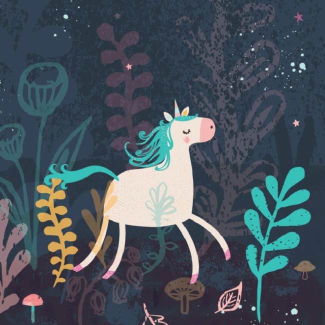
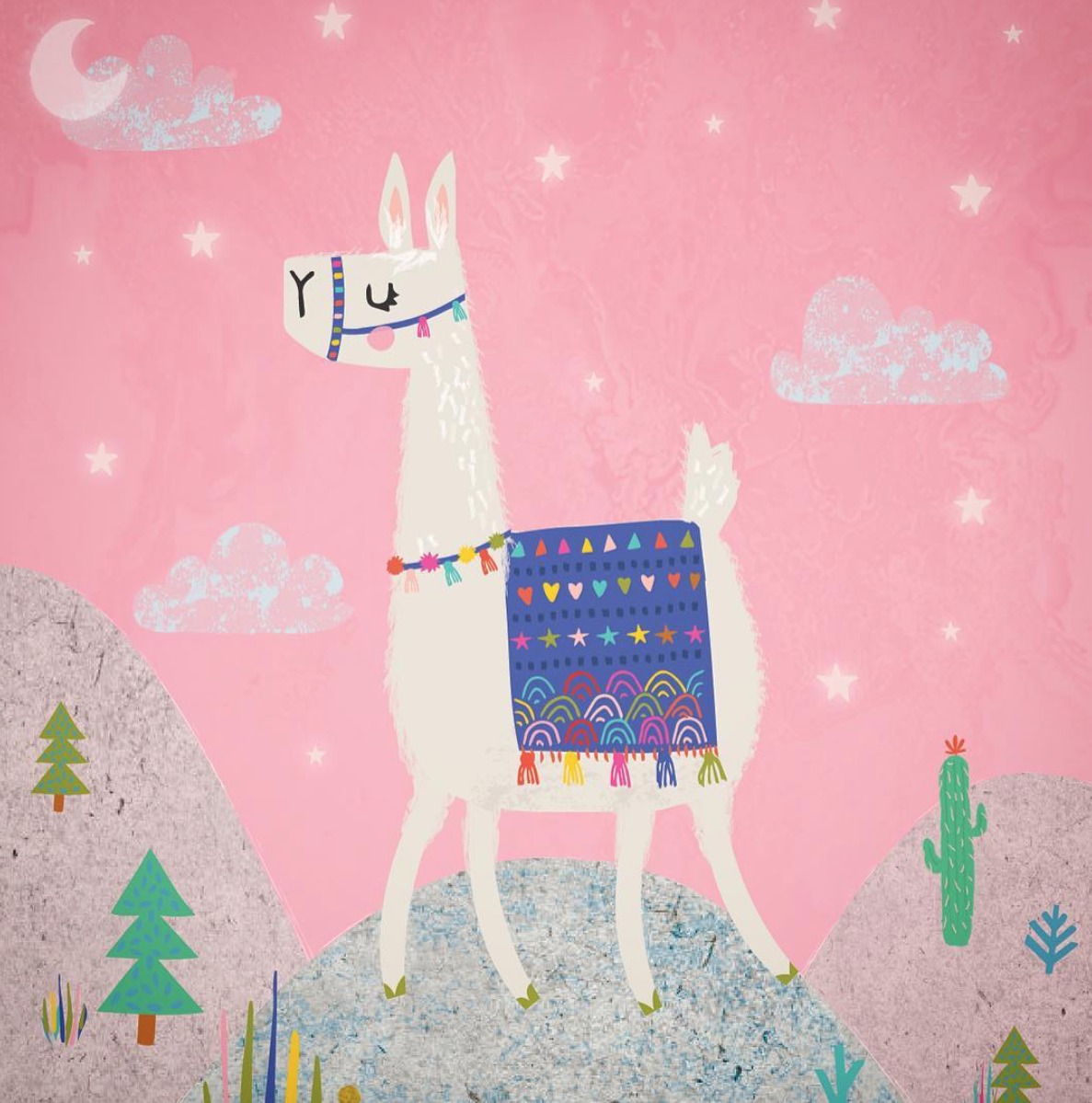
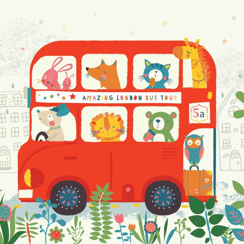
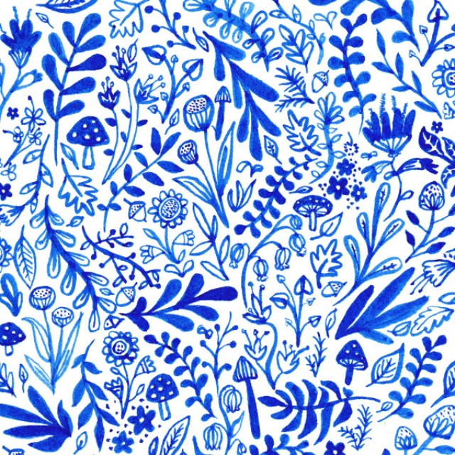
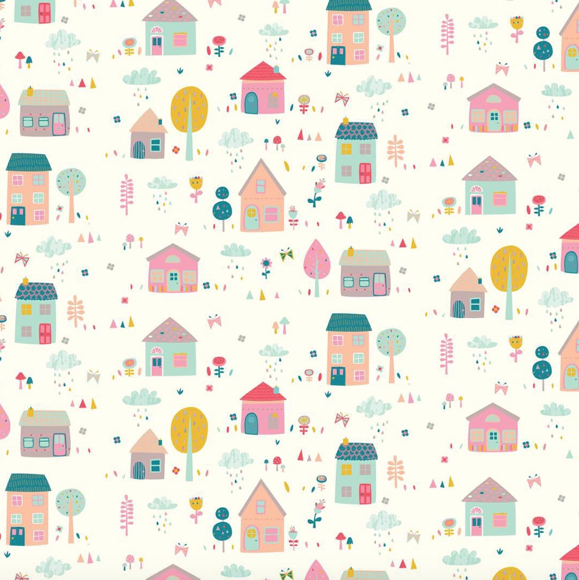
Worthwhile Paper is a collection of lively screen printed paper goods for lovers of nature, magic and meaningful design. We are a wife + husband team who love to create beautiful print work to share with others. Everything we make is drawn and lettered by hand and screen printed with earth-friendly papers and inks. Featuring a unique blend of nature and minimalism, our designs carry a goal to truly bring some positivity and love into the world through meaningful connections – whether that is a personal reconnection to nature or a connection between two people.

Behind the Stationery: Worthwhile Paper

My love for the design and print world feels like it was always here, but really took root for me in college. I was always incorporating hand drawn lettering and designs into my work and I learned how to screen print. Finding this path was more of a process of elimination and discovery than anything else – I had so many interests when it came to what I wanted to do with my design background and I tried to explore them all. At one point, I had two part-time jobs (both in the design industry) and on the side I was taking on freelance design jobs, doing calligraphy for wedding invitations, designing gig posters, and exploring more with personal side projects. But as my schedule shifted after becoming a mom I became stressed in keeping up with everything and I slowly and intentionally started dropping away from the types of work I was offering starting from my least favorite, and eventually dedicated myself to pursue Worthwhile passionately and fully.

Behind the Stationery: Worthwhile Paper

Last summer I made the exciting jump to move Worthwhile out of our house and into its own separate space. I found this amazing building nestled in between houses hiding behind pine trees and a wooden fence — so, not quite a store front but not totally hidden either. I walked inside this place and immediately felt at home. Sprinkled with windows with natural light pouring in and the perfect shade of warm white paint on the walls, it was practically made for us, and at this point I am still in denial that I actually get to work here. Inside lives my drawing studio, office, our wholesale inventory and shipping area, and a large area in the middle that during non-working hours we call “The Guest Room” – our workshop space.

Behind the Stationery: Worthwhile Paper

We have been hosting a variety of creative workshops here including my own design and lettering workshops as well as other crafty events for beginners like weaving, macrame, and terrariums. We’ve been having open shop events and appointment based shopping hangouts with local customers too, and it has been so fun to be able to have a physical space to bring people together. It excites me! Where we print is not a far trek — just down the road is VGKids, the screen printing shop my husband co-owns. They screen print a variety of wonderful things but their specialty is large scale art posters and tee shirts. We print all of our own things there when a press opens up or on the weekends.

Behind the Stationery: Worthwhile Paper

During the day at the studio I am usually either drawing, finishing designs on my computer, making layouts, attending to emails, bookkeeping, taking styled photos for social media, and making tea (and then forgetting about it until it’s too cold). I have a few super amazing women working for me too, to help with managing our wholesale accounts, updating spread sheets, pulling orders and packaging our items. I am so grateful to have a team, I couldn’t keep up at this point without them.

Behind the Stationery: Worthwhile Paper

I am always thinking of ideas. Sometimes when I start a design, it feels like the end of a process instead of a beginning because the idea may have been living in my head for a whole year or so! If you spied on my phone and went through the notes app, you would find hundreds of one line ideas or phrases that pop into my head that I jot down there. (I’m guilty as ever for using my phone instead of a notebook, don’t send the paper police). Once I’ve reached the point where I want to start bringing some ideas to life, I will start with small, very fast thumbnail sketches. This allows me to get the ideas of how I want a design layout to be quickly without judgement about details.

Behind the Stationery: Worthwhile Paper

Then, I work up toward a more finalized design in pencil, using a light tablet to trace over and make revised copies until I get to an original that I draw either with black ink or a combination of black and colored gouache paint. Sometimes if I am working with multiple colors I like to make separate layers because that is how my screen printing brain works, and then I scan everything in, make the final layouts and choose ink colors via the Photoshop Pantone matching system, which is how we determine our screen printing inks.

My design process is usually a very fun and fulfilling challenge. Lately, bringing a collection together has become more slow and organic rather than strategic. For the collection of art prints that will come out soon for spring, I started by simply sitting down and drawing what I liked and wanted to explore. After I had a substantial amount of work, I laid it all out in front of me and chose what I wanted to keep and what I wanted to make out of it. To start, I usually draw from multiple points of inspiration. This ranges from inspiration from nature to deep inspiration that stems from feelings, or sometimes it’s more obvious inspiration from my existing work (maybe I tried something once and want to expand upon it, or there is a certain color palette I want to use more, or a theme/direction I want to pursue further). All in all, the inspiration that I find the most meaningful are my day to day interactions and emotions.

Behind the Stationery: Worthwhile Paper

Phrases in my cards may have started as something I said out loud, wrote in a note once to someone, or something I wrote in my journal. It is really important to me that my approach as an artist who makes material things for sale isn’t centered around what I think will make me the most money or based on the most popular on-trend thing. When I am designing, I want it to feel real, so I always ask myself things like, “Who in my life would I send this card to right now? Where in my house would I hang this print? What would I use this notebook for?”. If the answer is nothing or nobody, than I scrap the idea. If I don’t want to use it, how can I assume anyone else will? It’s an easy game of “do I like this or do I not?”.

If I am being honest, the fact that anything I make resonates with anyone and makes them smile or feel happy truly feels like a gift. Sometimes I can’t believe that this is what I get to do for a living, and I am excited to continue growing and learning.

Behind the Stationery: Worthwhile Paper

The business end of this is fun and all, but I live for the times I am able to turn away from my computer and phone and just zone into the creative abyss in my plant-filled studio where engaging with technology is not allowed (unless you count my light tablet for tracing). I almost never even have a light on because the window light is my best friend. One of my struggles is wishing I had more time to just make art for art’s sake and explore creativity. It is so hard to break away from the mindset of making art that gets turned into a product. I have this deep desire to just make to simply make, to explore and use making as a way to learn things about myself and dig deep, but part of me feels this fear of not even knowing how to anymore.

Behind the Stationery: Worthwhile Paper

I know that even if I lived in a cave in the middle of nowhere I would find a way to make something and share it with someone. Maybe the desire to share is just something we have as humans, and it’s not all that bad. Nevertheless, I am really feeling a nudge to create more space for exploration and fun in the new year. I’ve been getting back into painting and I just installed a mini screen printing setup in the corner of my drawing studio. (Since we print in larger quantities of our products right now with legitimate professional equipment, I haven’t printed something by myself in years). In 2018, I’m looking forward to getting messy, and reuniting myself with the roots of my love for screen printing, and of course continuing to find inspiration for my card and print designs.

Behind the Stationery: Worthwhile Paper

Photos by Heather Nash Photography.

Want to be featured in the Behind the Stationery column? Reach out to Megan at megan [at] ohsobeautifulpaper [dot] com for more details.

Happy Weekend!

Happy Friday everyone! How was your first week of 2017? I spent most of the week cleaning out my office and trying to mentally prepare myself to dive into 2017. The last couple of years have felt VERY chaotic, both personally and professionally, so this year I’m trying to take a step back and focus on building a foundation that will help me grow and move forward in an intentional way. I know we all project a positive, happy, and successful vibe on blogs and social media, but behind the scenes life often feels like the exact opposite! So, last summer, I signed up for Shanna Skidmore’s Blueprint Model program to help me build that foundation. I’m only about two thirds of the way through the 12-week program, but it has been absolutely invaluable in helping me figure out the direction I want to take, both with my business and my life (more on that sometime soon!), and some of the key ingredients missing from my business model. Anyway, I’m looking forward to finishing the final third of the program while things are still fairly quiet in January, and if any of you are interested in doing something similar for your business, I’d definitely encourage you to sign up for the next 12 week round – registration opens today and runs through January 12! And you can even get $100 off your registration with code “THEYTOLDMETOO” at checkout. And if that wasn’t enough, Shanna is offering one-on-one sessions for the first 25 people that sign up. Go NOW! But in the meantime…

Little Arrow Shop / Don't Quit Your Daydream

Don’t Quit Your Daydream Unicorn pin by Little Arrow / Photo by @tokyokittengalaxy

…a few links for your weekend:

  • How stamps get designed. I think this is just the coolest thing ever.
  • Just totally obsessed with this vase – and this matching terrarium
  • The holidays may be over, but I totally want to try Ashley’s recipe for dairy-free Milk Punch (made with almond milk!)
  • Have any of you tried a facial cleansing oil? I tend to get really dry skin in the winter months, so I’m very curious!
  • Can I please get this sweater in my size?? (I’m totally getting one for Sophie – and it’s 40% off with code MUSTSHOP!)
  • The invisible workload. I found this article super interesting. I’m sure in some homes it’s the husband who does most of the invisible thinking work, not to mention households with couples of the same gender, but I’m guessing in most homes the invisible work generally falls to one person. In my home, my husband helps keep track of our grocery list, but I keep track of pretty much everything else. What do you think? Is it the same for you?

This week on Oh So Beautiful Paper:

That’s it for us this week! Have a fabulous weekend, and I’ll see you back here next week! xoxo

Our Bathroom Renovation: Before & After

1920s-Inspired Classic Small Bathroom

Photo by Laura Metzler Photography

Here it is! Our fully renovated 1920s-inspired classic small bathroom! This was my first major home renovation, and it’s absolutely amazing to me how a room can go from being so dark and sad to bright and happy in such a short time. I know it sounds silly, but I’m just so happy to have a fresh space where I can  bathe my kids and brush my teeth every day. It went from being a constant source of stress to one of our favorite rooms in the house!

OSBP Bathroom BEFORE

Oh man, it grosses me out just to look at those photos! When we bought the house, the entire bathroom was painted in the dark teal color behind the Ikea LACK shelves, but I had a fit a few months later and painted the other two walls a medium gray that I already had on hand.We sadly do not have any windows or skylights in our bathroom, and the whole space just felt SO DARK and really sad. We used a series of baskets that we brought over from our old apartment for bathroom storage, but it wasn’t really functional, especially since the top shelf could only be accessed by standing on top of the toilet and tinier things kept getting lost within the baskets. The medicine cabinet was super small and barely held our toothpaste and deodorant. The slate tile around the tub/shower was super dark and felt very claustrophobic, and it was literally crumbling away each time we took a bath or shower (bottom right). My kids loooooved poking the crumbly tile and making bits fall into the tub, which was the total opposite of awesome. You can’t see it in these photos, but the previous tub had water jets, which we never used because the jets scared the kids, and so the whole thing just seemed to breed mildew and was totally impossible to clean. And I know some folks really love a vessel sink, and I wouldn’t have minded it so much if it had been in a half bathroom or some other space not used by kids, but it just wasn’t practical for our only full bathroom. We knew that we wanted to make the bathroom a lighter, brighter, and happier place to be while also restoring some classic design details that felt more in keeping with with the era of our home.

OSBP Bathroom Demo + Install

Snow White 3 x 6 inch Ceramic Subway Tile / Grecian White Octagon 12 x 12 inch Polished Marble Mosaic Tile / Brass Tile Edging (just be sure to search for a size that matches the depth of your tile!)

In mid-November, Home Depot approached us about working on a tile and grout campaign for our bathroom. The deadline was in early January, so it didn’t give us much time to get everything done, but we jumped at the opportunity to remodel our bathroom. So we demo’d the entire bathroom! We hired our favorite local contractor, Chris Forney, to handle demo of the original bathroom, Wedi board installation around the tub and shower, and the installation of the new tub, sink, and toilet. Chris and his team also removed part of the original paster walls behind the sink and installed new framing and drywall to make way for an inset medicine cabinet, although we left the plaster as-is everywhere else. We (well, my husband and my dad) did the tile and grout work over the Christmas holiday. You can read all about our tiling experience right here!

1920s-Inspired Classic Small Bathroom

Aaaaahhhh, so much better! The bathroom is so tiny – only 36 square feet – so we didn’t change the layout of the bathroom, we just changed pretty much everything inside it. The walls were painted Sherwin-Williams Zircon, a warm light gray, with Sherwin-Williams Pure White on the ceiling.

1920s-Inspired Classic Small Bathroom

1920s-Inspired Classic Small Bathroom

Photo by Laura Metzler Photography

We used white subway tile for the tub and shower niche and a gorgeous marble mosaic tile for the floor tile, both with bright white grout. We were originally going to use gray grout with the subway tile, but once the tile started to go up on the walls we worried that the dark gray grout might make the space feel smaller, so we switched to white. I still love the look of dark gray grout with white subway tile, so hopefully I’ll get the chance to use that combination in future bathrooms! And my absolute FAVORITE detail in the entire bathroom is the brass tile edging that we used between the mosaic floor tile and the marble threshold. I want to put it everywhere.

1920s-Inspired Classic Small Bathroom

Photo by Laura Metzler Photography

Top row: Geodesic terrarium (similar) / vintage brass swans / Jenny Vorwaller print / Thimblepress lips print
Middle row: Black and white hotel towel set / nail polish rack (similar) / Fouta hand towels with gold and silver stripes / Metal storage box
Bottom row: Metal storage box / Marble tray / Kera soap pump / Glass apothecary jar set

We worked with our partner Wayfair to make sure that we had the right combination of storage baskets, vessels, and trays to organize everything in the bathroom. I struggled a lot when it came to storage in our old bathroom, both because it is such a tiny room but also because it’s our only full bathroom and we have to pack a LOT of stuff in there. We decided against cabinets since we worried they would overwhelm the room, so we maintained the open shelving but switched to thin pine boards that I had cut down to size and stained myself. The brass shelf brackets are from Signature Hardware. The top shelf holds decorative accessories, including a geodesic terrarium full of seashells collected from my home state of Florida, a couple of favorite prints, vintage brass swans, and a trinket from my travels to Kenya when I worked at the State Department. The other shelves feature our most-used items and a few beauty items that are pretty enough to display – like my nail polish collection and perfumes. With the pedestal sink, we don’t really have a place to store extra toilet paper or things like q-tips and cotton balls (which always come in those giant bags or containers of 1,000), so I put everything into wire storage baskets or apothecary jars to make it look pretty. It’s actually a lesson that I picked up from Jordan at Alt Summit a few years ago: even basic things in the same color palette can look pretty if grouped together in large quantities!

1920s-Inspired Classic Small Bathroom

Photo by Laura Metzler Photography

Whitby medicine cabinet / Kingston polished brass widespread faucet / The Object Enthusiast pink and copper vase / Fouta hand towel in silver and white / the brass hexagon towel ring is sadly no longer available

Our new medicine cabinet is our other storage secret weapon. I upgraded from a small wall-mounted medicine cabinet to the largest inset cabinet that I could possibly find, the Whitby cabinet from Restoration Hardware. This thing weighs a TON! And it made a huge difference in the bathroom – it seriously holds all the things that we previously stored in baskets or on shelves. If you live in a home with a small bathroom, I highly recommend upgrading to the largest possible medicine cabinet to help maximize your storage. I ordered the Whitby cabinet in the Weathered Oak finish, but when it arrived it looked way more yellow than I wanted, so I ended up sanding the whole thing down and going over it with several coats of Dark Walnut stain. I love how it turned out, so it was well worth the extra effort!

1920s-Inspired Classic Small Bathroom

Photo by Laura Metzler Photography

Someone asked about this on Apartment Therapy, so it bears repeating here: we also purged a LOT of the stuff that previously lived on the shelves of the old bathroom. We probably could have gotten rid of half of all that clutter years ago, but with two small kids we just hadn’t gotten to it. I tossed or donated a bunch of old makeup that I’d been holding onto for some crazy reason, expired medicine that we just hadn’t bothered to go through before, and some hair accessories that I used back when I worked in an office but hadn’t touched in years. We also relocated a few things; my hair dryer moved to a new home in my bedroom closet, and there is a basket just underneath the pedestal sink that now holds our extra bathmats. We really wanted to keep the shelves just to the things that we either use every day or are pleasant to look at.

1920s-Inspired Classic Small Bathroom

1920s-Inspired Classic Small Bathroom1920s-Inspired Classic Small Bathroom

1920s-Inspired Classic Small Bathroom1920s-Inspired Classic Small Bathroom

Bottom photos by Laura Metzler Photography

We replaced the vanity and vessel sink with a classic Kohler Memoirs pedestal sink from Wayfair (it’s seriously my dream sink), and we chose beautiful new brass fixtures for the entire bathroom, including the Kingston Brass widespread sink faucet, and a brass shower curtain rod. We selected the Kohler Devonshire tub and shower faucet in polished brass because the classic shape seemed to suit a bathroom built in the 1920s, and it really is the perfect fit. To keep the space from looking too retro, I incorporate a couple of modern accessories that we already had in the home, including brass towel rings and a small brass shelf on the wall next to the medicine cabinet holds a few things that don’t quite fit on the sink, including our tooth brushes, tumbler, hand soap, and a sea grape leaf that I brought back from our vacation in Puerto Rico a couple years ago – it reminds me of growing up in Florida!

1920s-Inspired Classic Small Bathroom

Photo by Laura Metzler Photography

Michelle Armas Michi print / brass hexagon towel ring sadly no longer available / Urban Outfitters peaks shelf / Kera tumbler

1920s-inspired Classic Small Bathroom

1920s-Inspired Classic Small Bathroom

Photo by Laura Metzler Photography

These shower niches are another favorite from the new bathroom. One for the kids, and one for the parents! We constructed the niches using a combination of 6 x 12 inch Grecian white polished marble tiles and 12 inch square marble tiles for the backsplash.

1920s-Inspired Classic Small Bathroom

Brass Wall Hooks (similar) / Antique Botanical Lily of the Valley print (similar, top) / Belinda Marshall print (bottom)

Brass towel hooks on the back of the door, for those of you wondering where we put our damp towels. We debated doing a towel rod on the back of the door, but since this is our only full bathroom for our family of four it makes more sense for us  to have hooks instead. And, below, one more photo of the brass tile edging because I LOVE IT so. much., and the Surya Zahra Classic Iris Rug that lives in the hallway just outside the bathroom and adds a fun dose of color to the entire space.

1920s-Inspired Classic Small Bathroom

Photo by Laura Metzler Photography

There you have it – our 1920s-inspired small bathroom renovation! A huge thanks to Wayfair, the Home Depot, and Sherwin-Williams for being the most amazing partners and helping us create a bathroom that is both respectful of the age of our home and serves our needs as a family of four. I tried to list all of the sources below the photos above, but here are ALL the resources in case you want any of these items for yourself!

Whitby medicine cabinet / Kingston Polished Brass Manhattan Double Handle Widespread Faucet / Kohler Devonshire Vibrant Polished Brass Shower and Tub Faucet / Brass shower rod / Kohler Memoirs Stately 24″ Pedestal Sink with 8″ Widespread Faucet Holes / Umbra Kera Tumbler and Soap Pump / Kohler Highline Toilet / Square Metal Storage Box / Ferm Living Half Moon Laundry Basket / Silver and Gold Stripe Fouta Hand Towels / Black and White Hotel Bath Towels / Soraya Marble Serving Tray / Surya Zahra Classic Iris Rug / Birch Lane Barnett Jars / Birch Lane bath mat / Urban Outfitters peaks shelf / Brass towel hooks / Brass shelf brackets

Photos by Laura Metzler Photography where noted, all other photos by Nole Garey for Oh So Beautiful Paper

The World of Illustration: Emma Haines of Cut and Stick Design

Hi everyone! I’m Jen L’Italien, a Maine-based writer, mama, maker, potty training consultant (yes, that is a thing!), and longtime reader of OSBP (and fan of the lovely Nole and her crew). I’m so happy to be here on OSBP, with a column that scouts illustrators from around the world! For this month’s peek into The World of Illustration, I couldn’t resist rifting off all the unicorn love we’ve been seeing here on OSBP (because I live with a 5-year-old who believes unicorns reign supreme over mermaids, princesses, and sometimes even fairies.) So when I stumbled upon this unicorn illustration by UK-based illustrator and designer Emma Haines, I found my unicorn designing soul sister. Then low and behold, I discovered Emma Haines has a super illustration of a llama, a personal favorite four-legged creature. So let’s peek into the modern illustration world of Emma Haines of Cut and Stick Design and get transported to a magical land of cool design. Jen

The Word of Illustration: Emma Haines of Cut and Stick Design

This illustration is called A Unicorn in a Terrarium, and I love how it’s modern, whimsical — with a spot-on color palette. By the way, if your small human is also obsessed with unicorns, I highly recommend the book Uni the Unicorn by Amy Krouse Rosenthal — it’s a really sweet tale all about the magic in believing what you haven’t yet seen.

The Word of Illustration: Emma Haines of Cut and Stick Design

This modern llama illustration is the bees-knees in my book. Sure, the illustration would be perfect for a child’s room, but honestly, I could picture it in a dreamy meditation room (complete with a colorful kilim rug in the space) or as part of a colorful gallery wall.

The Word of Illustration: Emma Haines of Cut and Stick Design

This double-decker bus illustration (so adorable for a nursery!) is a sweet nod to London. Emma currently designs giftware, gift wrap, and stationery for an art licensing company based in Nottingham. It’s clear to see how she’s inspired by color and children’s picture books.

The Word of Illustration: Emma Haines of Cut and Stick Design

This whimsical botanical illustration is called Inky Jungle Pattern and I would love to see it as a wallpaper in my bathroom (or a big print of it framed for the wall).

The Word of Illustration: Emma Haines of Cut and Stick Design

I imagine this illustration working in so many mediums — the perfect gift wrap for a housewarming gift, a whimsical wallpaper for a playroom, or as a fabric to add in some playful color to a child’s space.

The Word of Illustration: Emma Haines of Cut and Stick Design

And a sweet and snoozy cat seemed the right way to end this jaunt through the amazing work of UK illustrator Emma Haines. See you soon with a peek into the work of another talented gem in the illustration world!

Photo Credits: Cut and Stick Design and Emma Haines

Stationery A-Z: Cactus-Themed Paper Goods

Hey guys! Ashley from Fine Day Press here. Ever since relocating from Brooklyn to the warmer, dryer climate of Austin two years ago, I’ve been pretty much obsessed with all things cacti and succulent related! We’ve been slowly growing our collection of prickly potted friends around the house and in our backyard, and I’ve added a few to our stationery collection too. I’m not the only one – check out all these super cute cactus-themed paper goods:

Cactus-Themed Paper Goods Round Up / Oh So Beautiful Paper

1. Banquet Workshop greeting card
2. Revel & Co. wrapping paper
3. Little Low birthday card
4. Fine Day Press art print
5. Meri Meri puffy cactus stickers via LEIF
6. August & Oak note set
7. Hello!Lucky letterpress card
8. Idlewild Co. gift tags