As the colder months approach, most think it’s time to put color to the side for a while. Maybe you want to save the neon details for a spring or summer wedding, but why not incorporate your favorite colors in a deeper shade using jewel tones? Were you hoping for a bit of pink in your winter wedding? Try a berry shade. Or maybe a pop of green? Try emerald. Here are some of my favorite jewel tone stationery pieces for your wedding day! – Lauren

Spanish inspired place cards in a deep navy. Image by Luna Photo via Style Me Pretty.
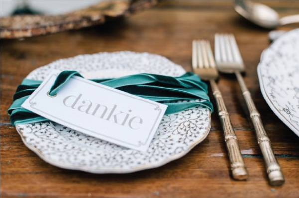
If you want to keep the paper pieces simple, try adding ribbon in a deep shade to add contrast. Image by Christine Meintjes via The Pretty Blog.

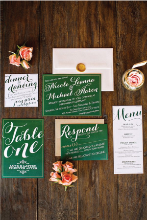
White calligraphy looks gorgeous on a plum card stock. Left Image via Akimbo. Try table numbers in a pop of emerald. Right Image by CHARD PHOTOGRAPHERÂ via Ruffled.
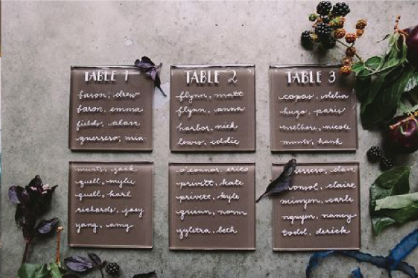
These tiles are a fun alternative for seating charts and you can find them in a variety of colors. Image by SAHARA COLEMANÂ via Seattle Bride.
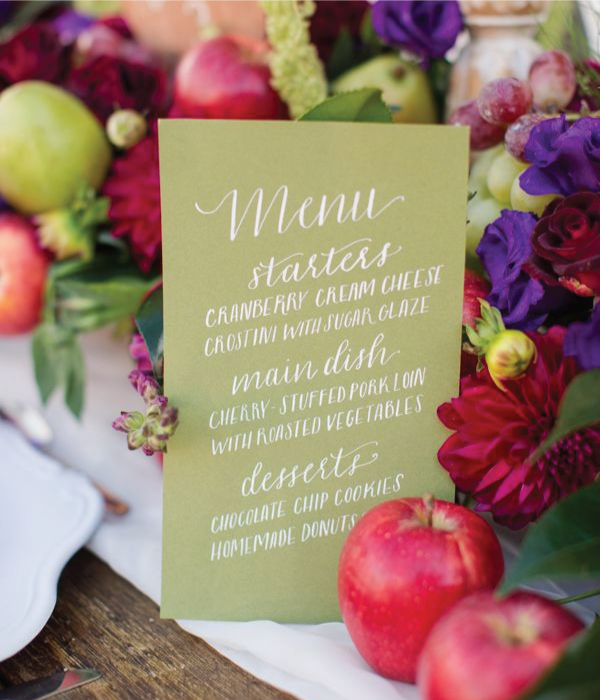
Image by Katelyn James Photography via Wedding Chicks.
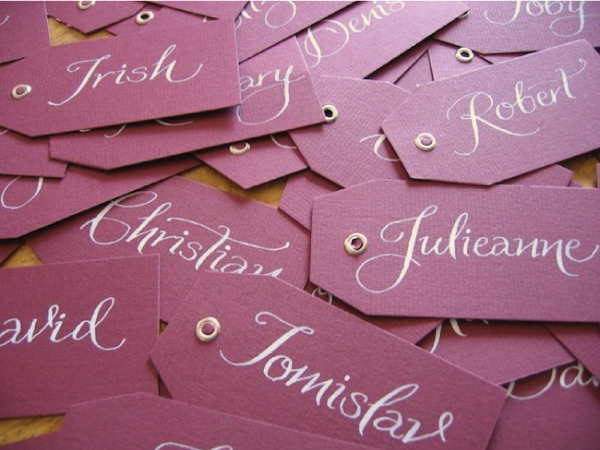
Image via The Bridal Collective.
What are your thoughts on color for the fall and winter? Do you stick with muted tones or continue on with your favorites from the warmer months?

OMG I absolutely adore the tiles idea! I think it looks simply gorgeous and very unique!!