Kimberly and Derek from RageHaus sent over these screen printed Save the Dates that they recently designed for friends Katy and Jason — and I’m loving the mix of ornamental illustrations and bold typography!  Combined with playful text on both the Save the Date and envelope, the entire design has a wonderful sense of whimsy and exuberance:
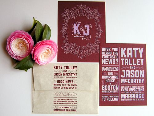
From Kim: Derek and I each played around with a few design concepts before taking our strongest ideas and combining them. Â My style leans towards organic, illustrative typography and imagery, while Derek’s style leans towards brash, rambunctious typography and imagery. Â Between the strong typography and the delicate ornamental elements, both styles are represented in this modern, yet elegant Save the Date.
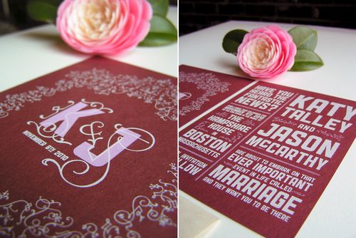
The Save the Dates were two color screen prints on both sides. Katy and Jason went with a lovely white and light pink combo on Wine Speckltone French Paper.  The color palette of maroon, soft pink and white turned out to have a warm, romantic quality — perfect for a November wedding.
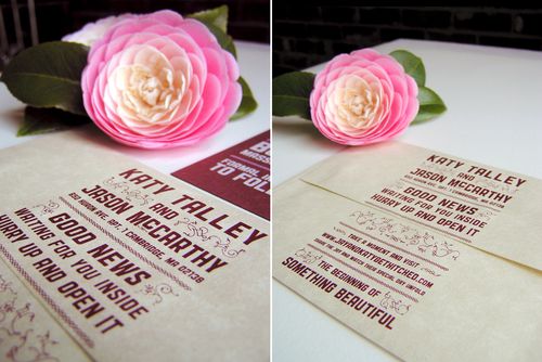
For the envelopes, we wanted to counteract the weight of the dark cards with Aged Parchtone French Envelopes. The ink for the envelopes was matched to the color of the Wine Speckletone.  The entire design was pulled, by hand, in our closet.
Thanks Kim!  Kimberly and Derek have a bunch of additional photos of Katy and Jason’s Save the Dates over on their flickr page — check them out right here!
{image credits: RageHaus}
Amazing!! It’s so beautiful 🙂
I love that they printed the envelopes and that they did it themselves! Screen printing can be quite a chore and these look gorgeous!
Adorable! And I love that red!
I absolutely love the screenprinted envelopes. Such a novel idea!
love the interaction between the script and slab fonts
awesome!
The typography work is really brilliant on these.